Tag: art deco
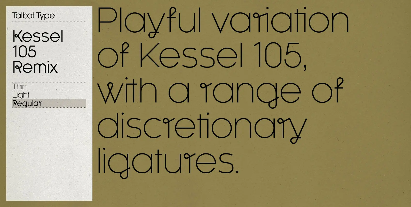
Kessel 105 Remix Font
A remixed variation, available in three weights, of the popular Talbot Type geometric sans Kessel 105. The addition of occasional flourishes at the intersections of strokes, in both upper and lower case, adds character charm, making the font a perfect
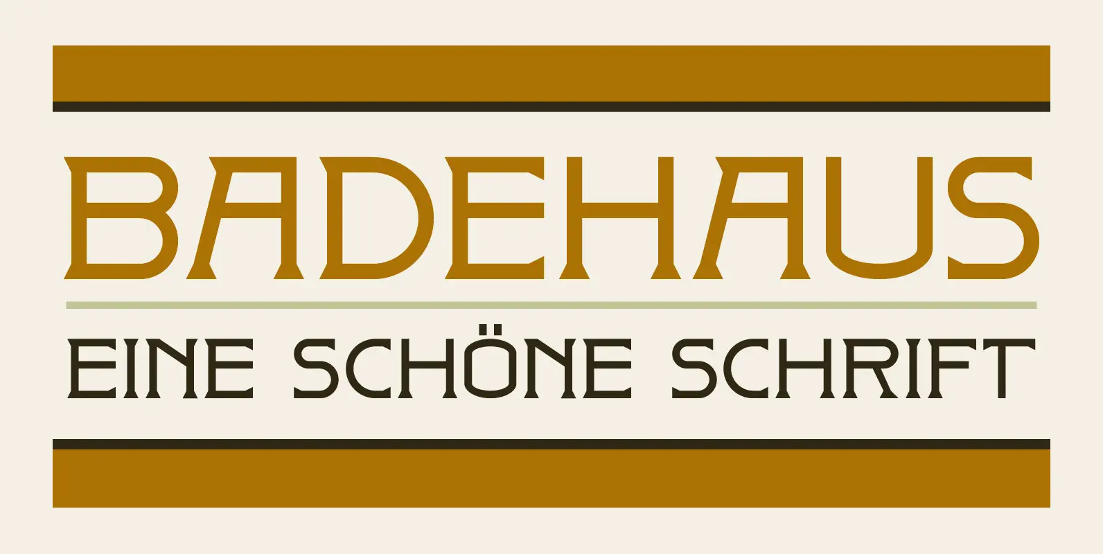
Badehaus Font
In the German city of Bad Neuenahr you can visit a spa called Thermal Badehaus. This beautiful art deco building has an even more beautiful art deco lettering covering its facade. I had to work with only a couple of
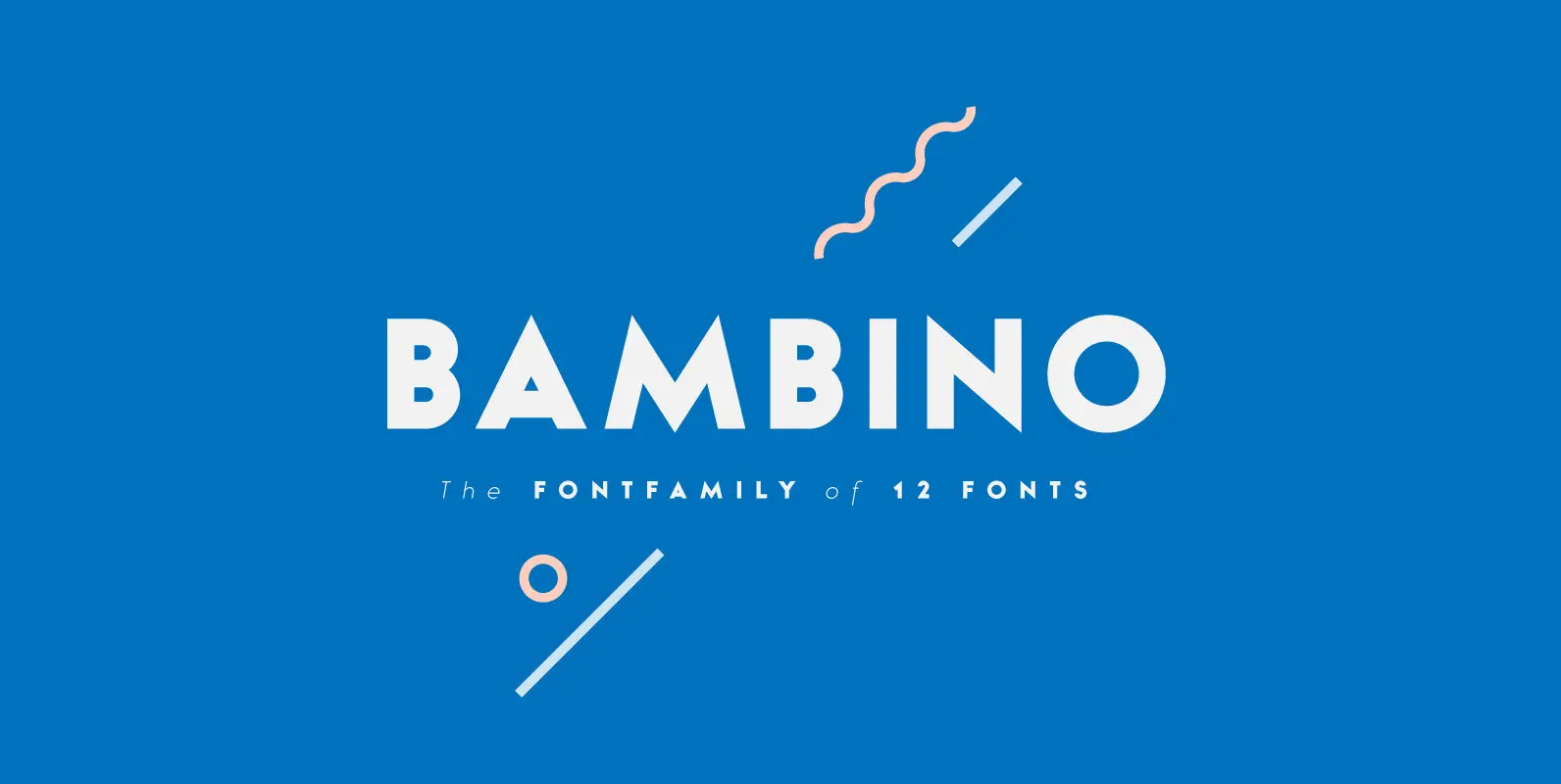
Bambino Font
Bambino Font Family is a typography project by Milos Mitrovic and affiliates. Bambino has an influence of 1920s Futura-like fonts and art deco look and feel. Combining its vintage character with clean geometric form and organic flow, Bambino is shaped
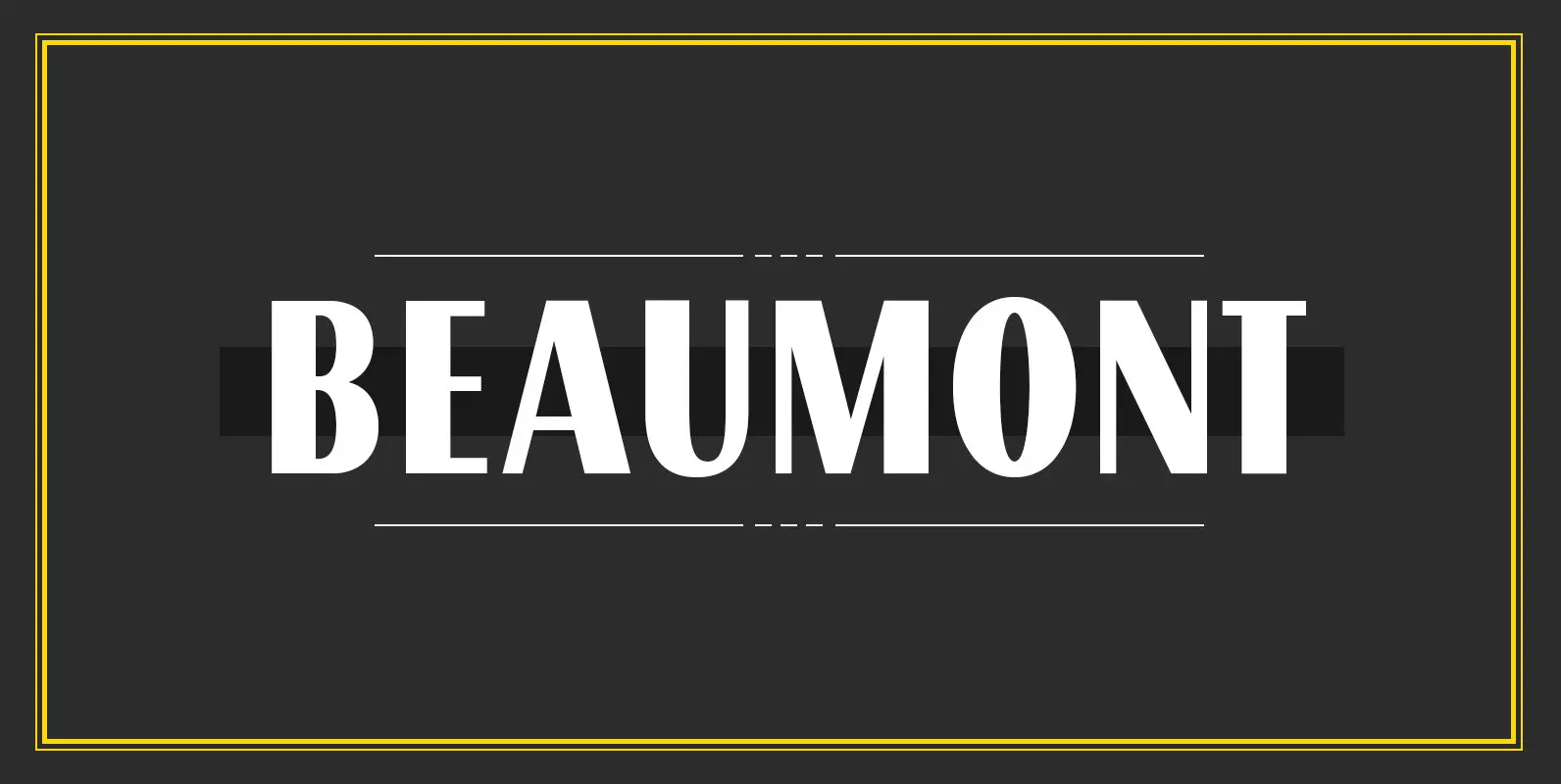
Beaumont Font
Beaumont is a modern take on classic 1920’s type, playing with stroke contrast and art deco forms. The result is a 10 font family, providing options for setting readable body copy or high impact display headings. With full multilingual character
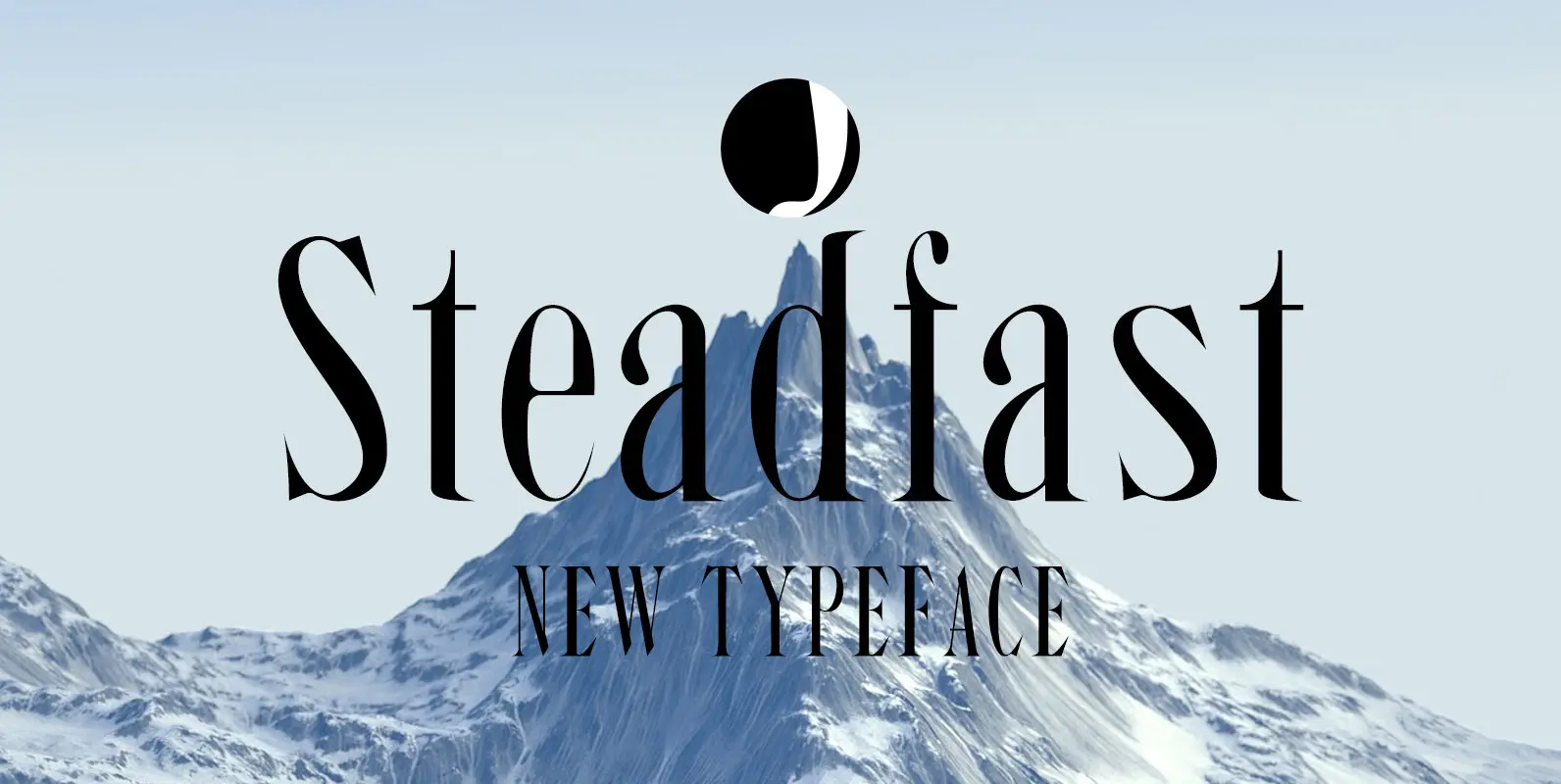
Steadfast Font
Here is another typeface, “Steadfast”, after spending many hours on correcting the contours of this typeface, finally it is out for public release!!. It is a blend of old condensed style with modern typography. Published by Jadugar Design StudioDownload Steadfast
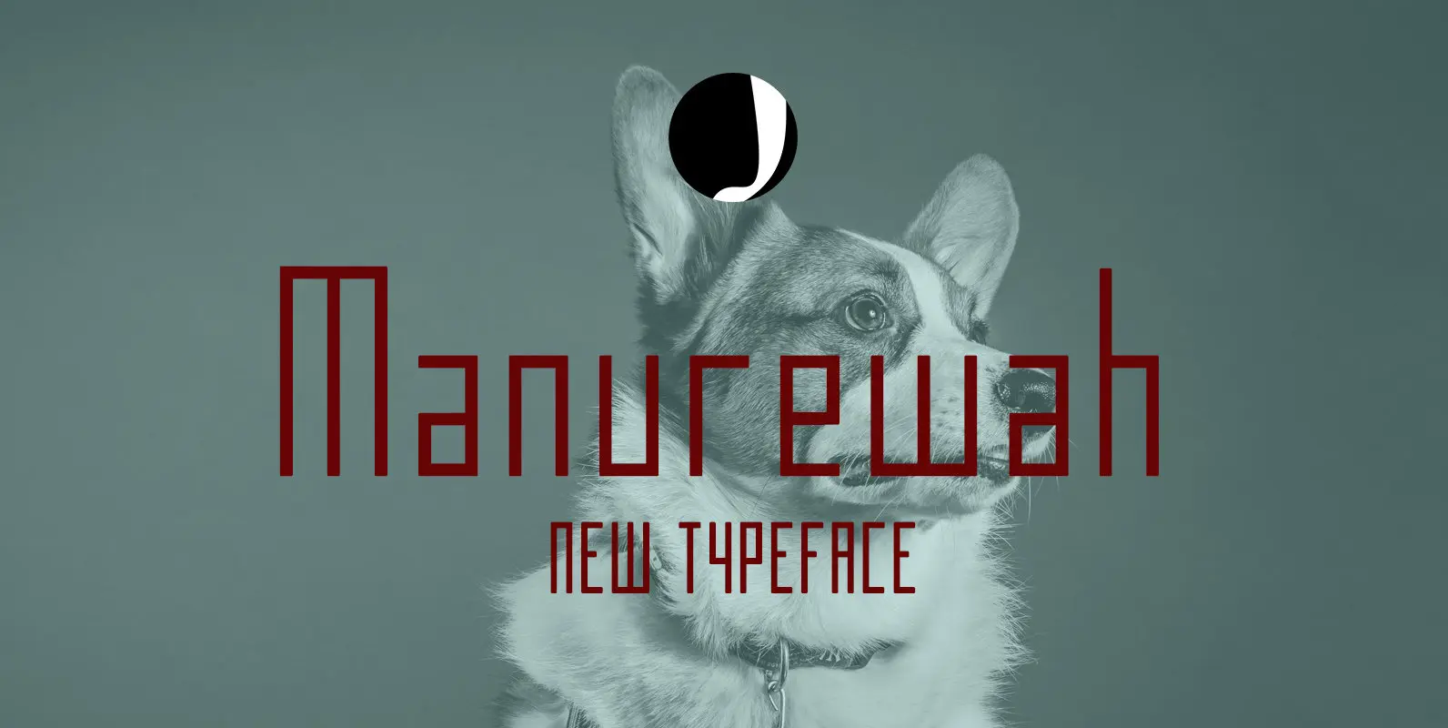
Manurewah Font
Manurewah is a minimal and simple bitmap style typeface designed by Jadugar Design Studio. Published by Jadugar Design StudioDownload Manurewah
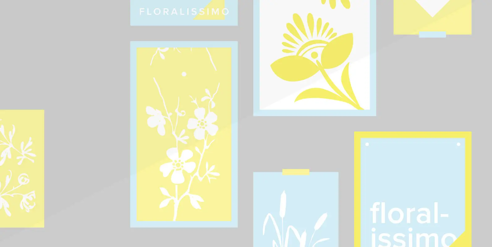
Floralissimo Font
“Floralissimo” are flowery embellishments that I found in several old publishing books dating back over a hundred years. I thought they might be useful for some of you, so I digitised them. Published by Wiescher DesignDownload Floralissimo
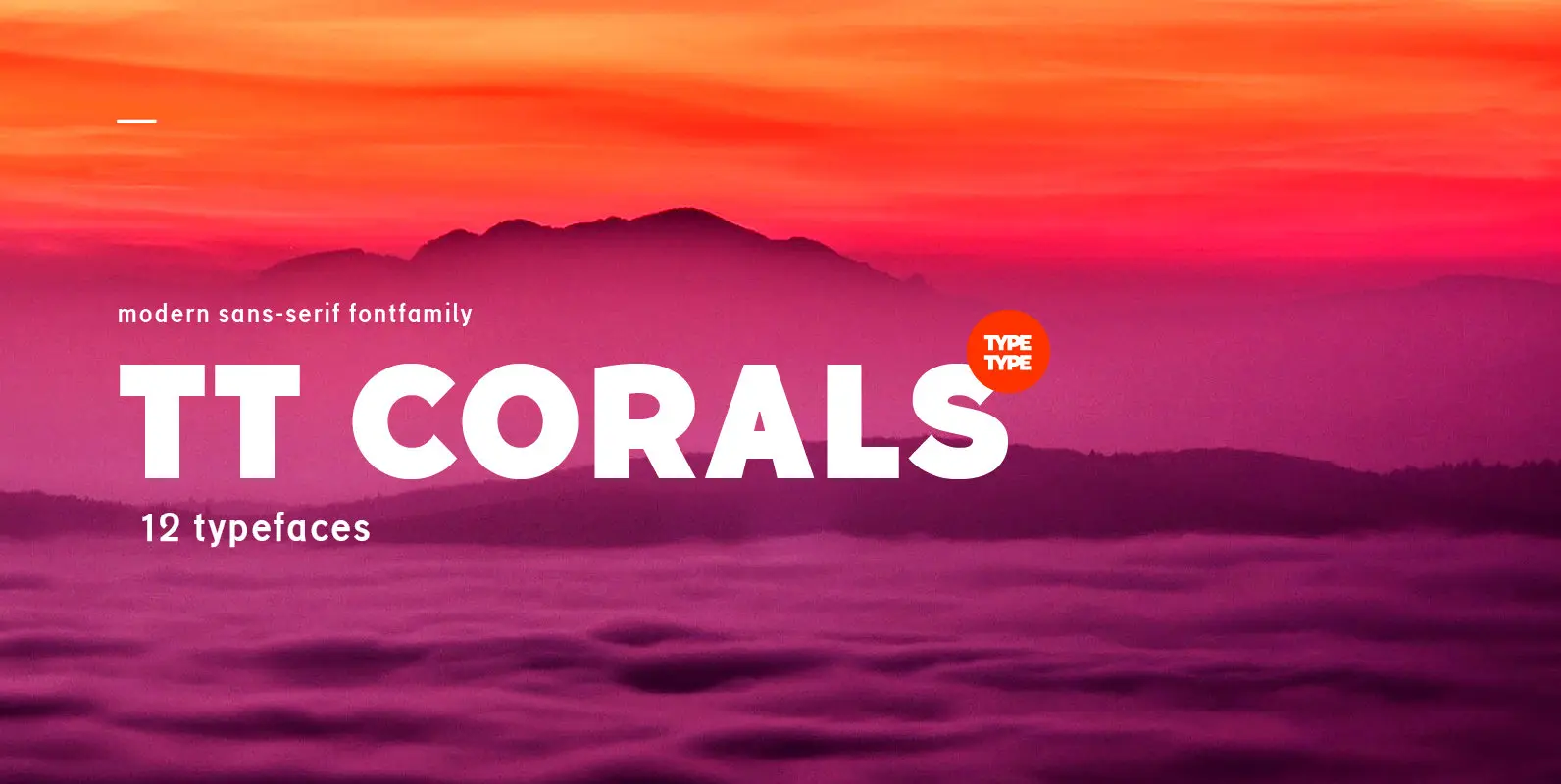
TT Corals Font
TT Corals is a modern humanistic sans-serif which has many typical traits of the beginning of the 20th century. For an increased functionality of the font family we’ve created 6 typefaces of various weights: Thin, Light, Regular, Bold, Extrabold, Black.
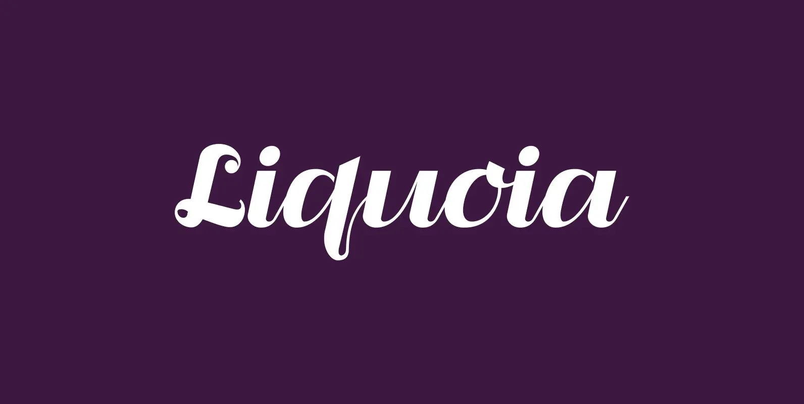
Liquoia Font
“Liquoia” are three scripts with lots of contrast and different embellishments. “Liquoia-A” has the elegant, flaming decoration it blends well with “Fleurons-Six”. “Liquoia-B” has the flowery embellishments and goes very well with my Ornata-A and Ornata-B. “Liquoia-C” is the plain,
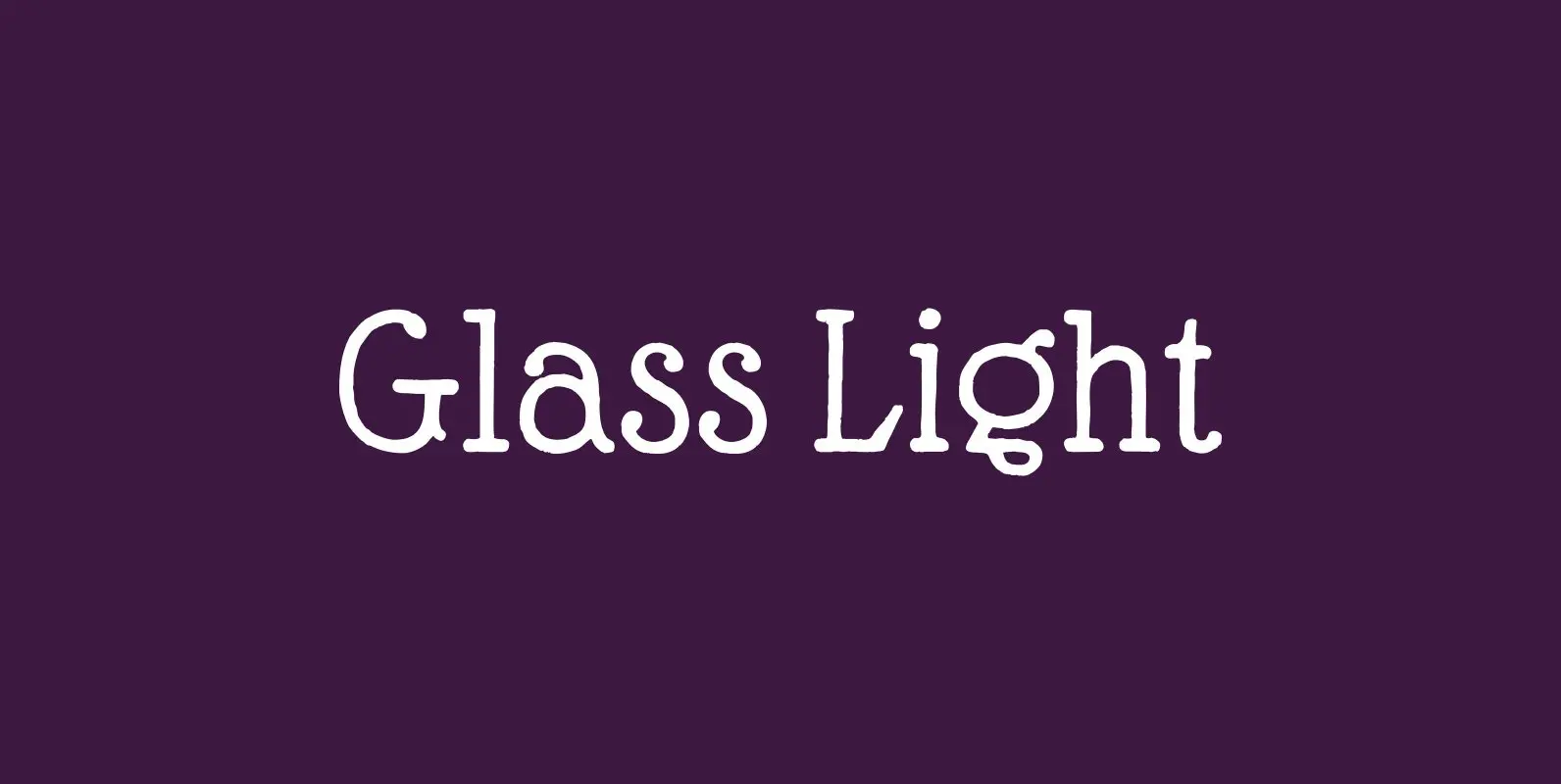
Glass Light Font
“Glass Light” was designed in 1912 by “Franz Paul Glass” for the “Genzsch & Heyse” foundry. The font is stylewise related to the “Lo types” of the same period. Glass designed a lot of decorative elements to go along with
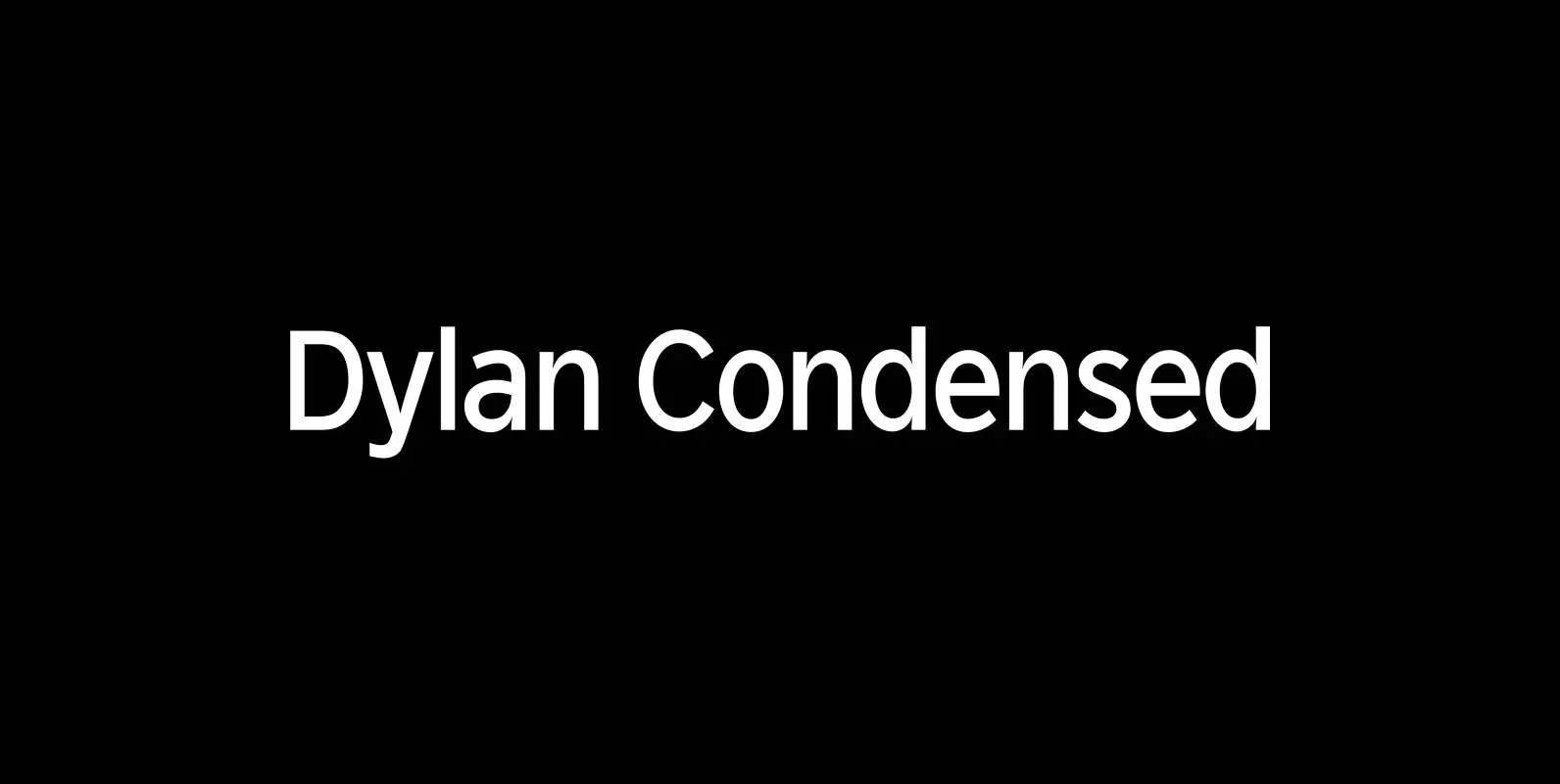
Dylan Condensed Font
Dylan is a Sans typeface in the best American tradition. In order to keep corners open and to make the font more readable in small sizes it has deep cuts where curves join straights. I designed 8 finely tuned weights
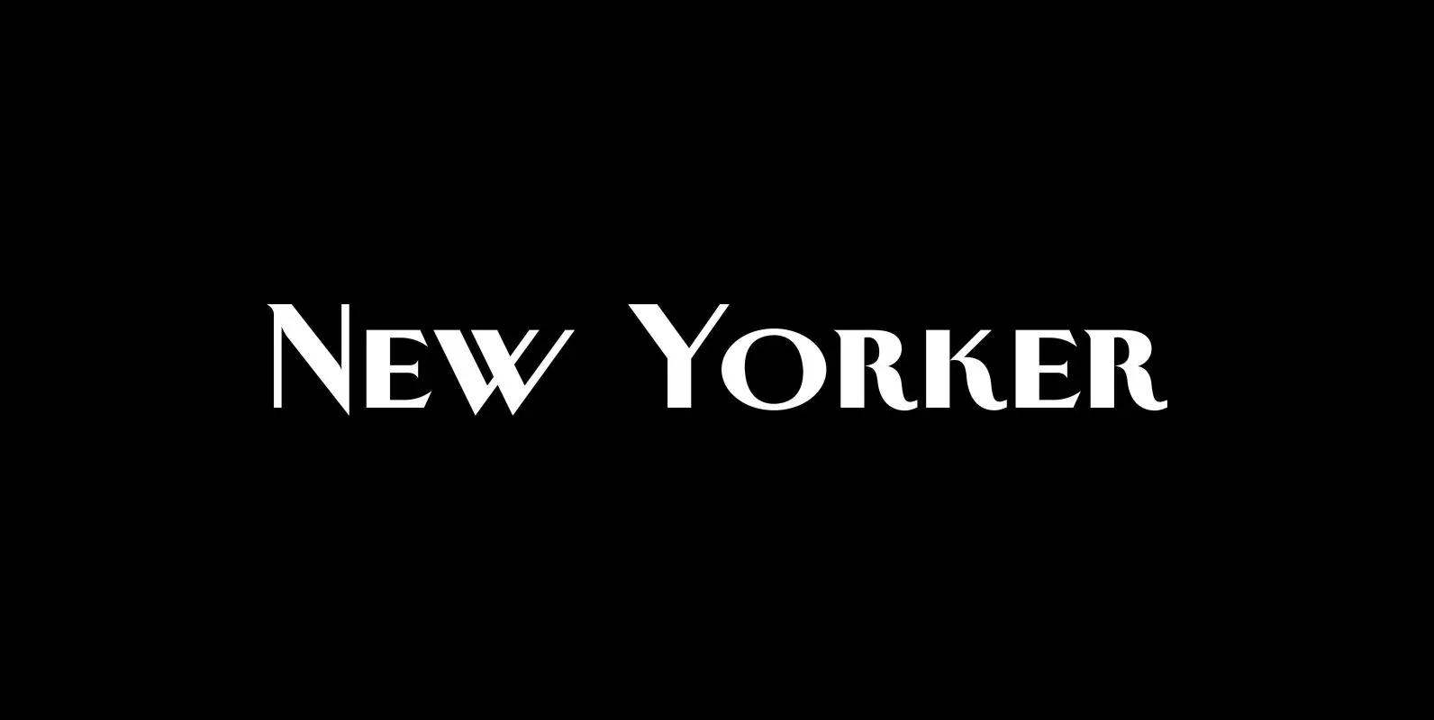
New Yorker Plus Font
New Yorker Type was one of the first typefaces I tried my hand at in 1985. I meant it as a revival of the typeface used by the New Yorker magazine. I did not scan it in, I just looked
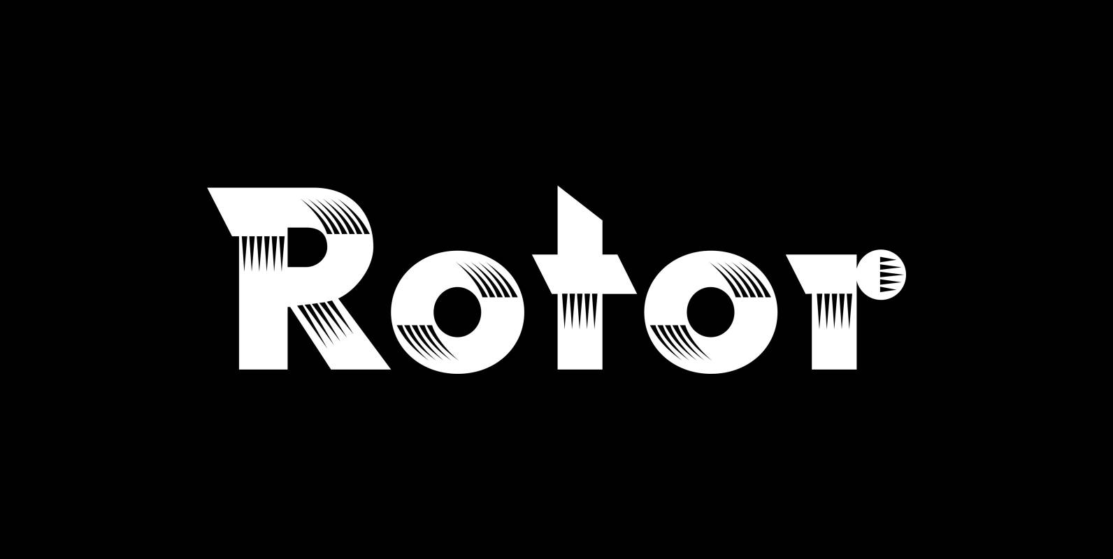
Rotor Font
“Rotor” is a speedy font. In 1929 K. Sommer designed a typeface for Linotype called »Vulcan«, some years later they re-published the typeface and called it “Dynamo”. The early Vulcan design inspired me to do this new, faster typeface in
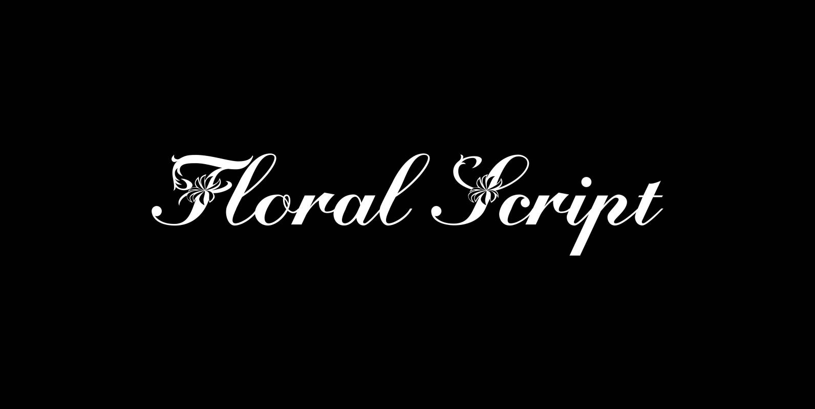
Floral Script Font
“Floral script” is an english copperplate script decorated with flowers and curly leaves. Published by Wiescher DesignDownload Floral Script
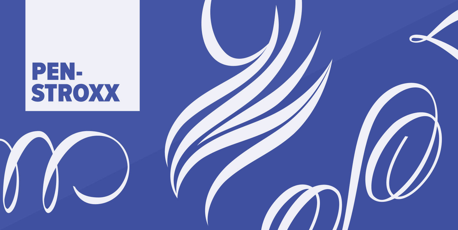
Penstroxx Font
“Penstroxx” is a collection of 5 fonts that are based on the powerful, expressive “Traits de plume” (pen strokes) designed in Paris around 1930 by Alfred Latour. I designed a lot of extra pen strokes to make this a full
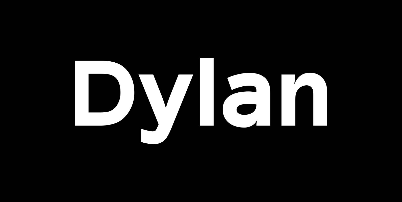
Dylan Font
“Dylan” is a Sans typeface in the best American tradition. In order to keep corners open and to make the font more readable in small sizes it has deep cuts where curves join straights. I designed 7 finely tuned weights
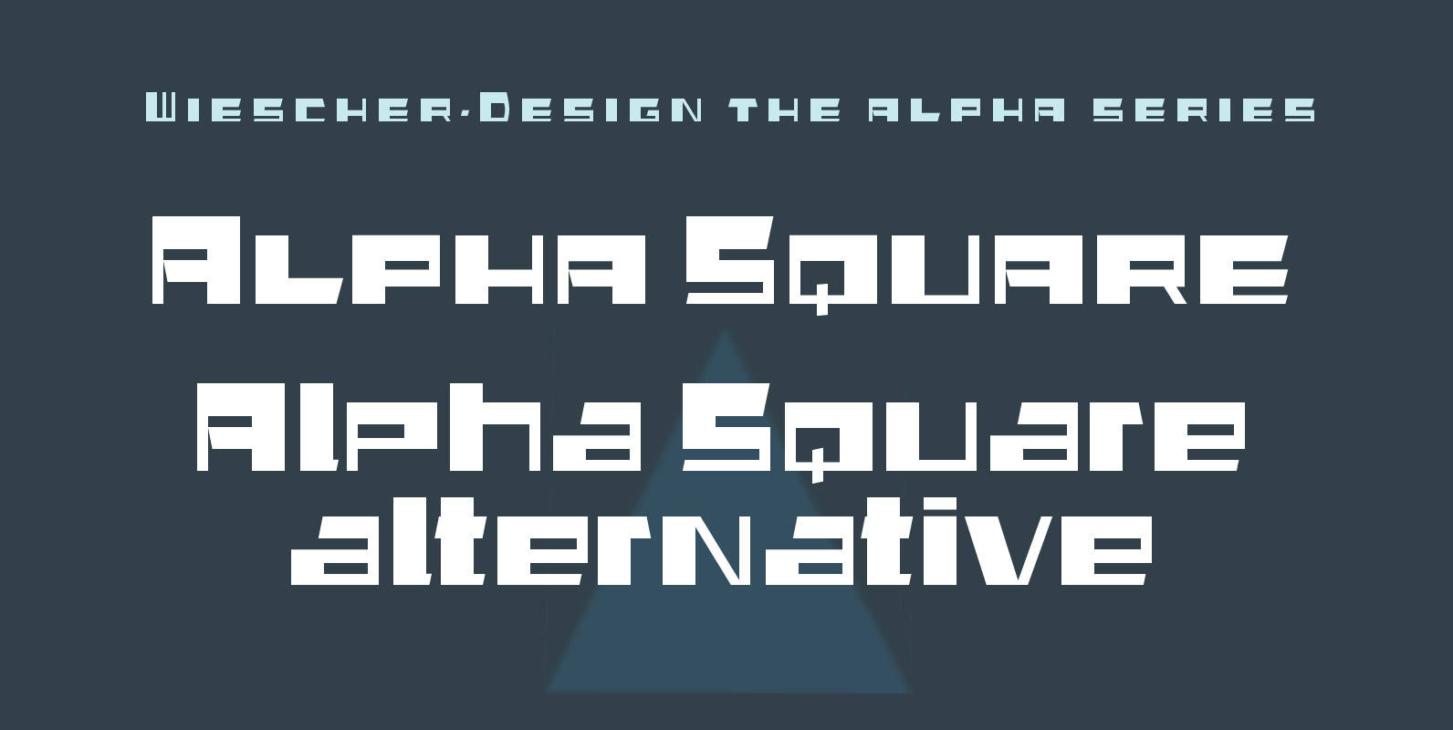
Alpha Square Font
“Alpha Square” is the next font in my alpha-series, my experimental font series. The font is a wider variation of “Alpha Jazz”, it lends itself very good for all kind of modernistic occasions and for Jazz in all forms. You

Binario Font
Binario is a simple and friendly font with three weights and matching italics (obliques). It is an excellent choice for giving a clean, unique, and modern look to headlines or body text. Use it for branding, menus, posters, magazines, and