Tag: Art

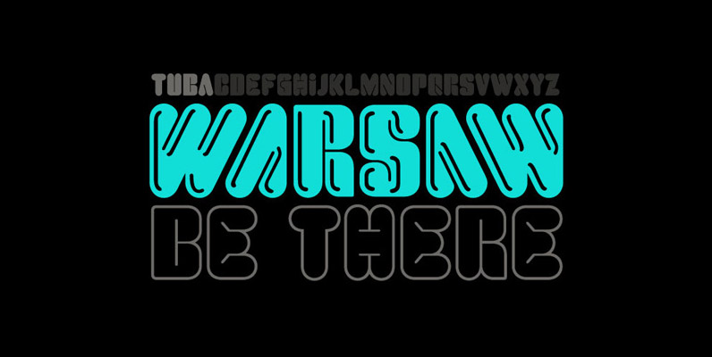
Idler Font
Idler is an all caps, modular display typeface meant to be used for big, bold lettering. Idler's two “main” weights (Idler Detail and Idler Plain) can be used effectively as single colored layers on their own, but the typeface's true
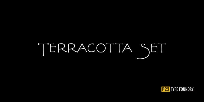
P22 FLLW Terracotta Font
The lettering and 100 Extras for this font set, the third in P22's Wright series, derive from letterforms and decorative embellishments found in Wright's early work (1893-1910) and in his book, The House Beautiful (1896-97). Wright based his delicate graphic
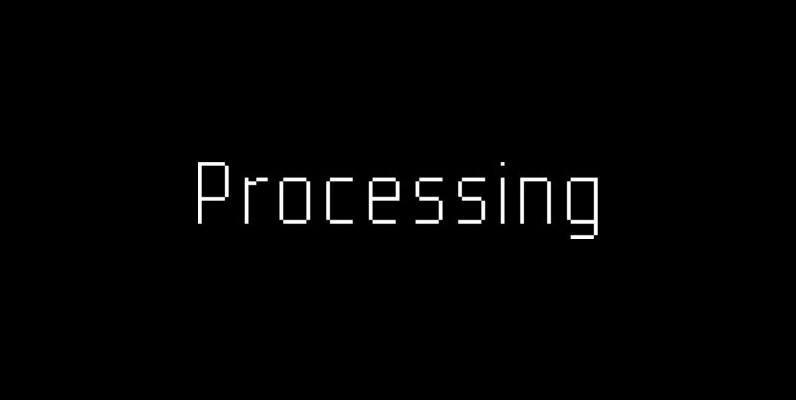
YWFT Processing Font
YWFT Processing was developed in 2001 for Casey Reas, the co-creator of the Processing programming language. We created this display face to be sharp, tall, unique and interesting…much like Mr. Reas himself. The font was derived from an original logo
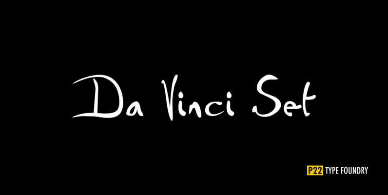
P22 Da Vinci Set Font
The great Italian artist, inventor, and visionary Leonardo da Vinci created an extraordinary variety of work which continues to amaze those who study it. This set faithfully captures Leonardo’s remarkable imagination and includes an exclusive Da Vinci Backwards font (reflecting
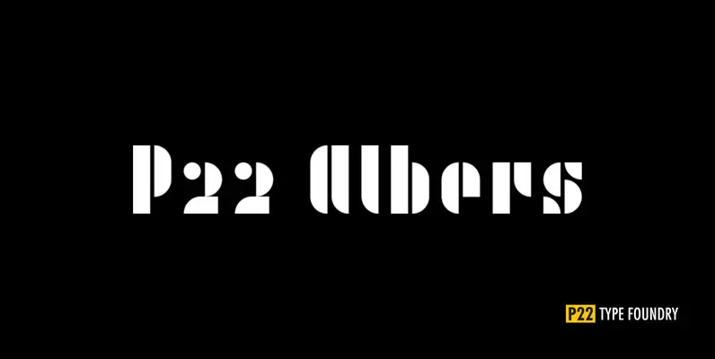
P22 Albers Set Font
This set of typefaces was produced in conjunction with the Guggenheim Museum and the Josef Albers Foundation. Josef Albers (1888-1976) was one of the most important artists and educators of the twentieth century. He was a member of the Bauhaus
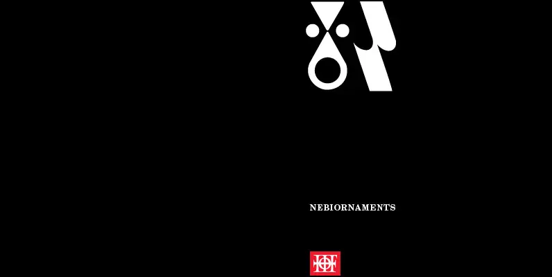
P22 Nebiornaments Font
P22 Nebiornaments contains over 100 ornaments based on the Italian Nebiolo Type Foundry designs of the 1950s. Many of these ornaments are designed to create complex patterns and continuous borders. The simple geometric shapes allow for endless combinations for a

Shearman STD Font
Shearman STD has a simple design, based on industrial fonts, in particular at the typewriters fonts. It’s a geometric font with curves elimination, noting in particular the O and Q letters. It has smooth angles and clean forms which combine
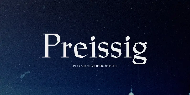
P22 Czech Modernist Set Font
The type designs of Vojtech Preissig show a great affinity for handcraftsmanship and a distinct attempt to avoid appearing too clean and mechanical. Legend tells how Preissig created hand-cut fonts using a knife in linoleum blocks. This font was based

Kokoschka Font
Dense and strong, this family is inspired by the lettering on the poster of a short expressionist play by the astonishing and highly skilled Austrian painter, printmaker and writer Oskar Kokoschka in 1909. If the typeface itself is already deeply
