Tag: artdeco
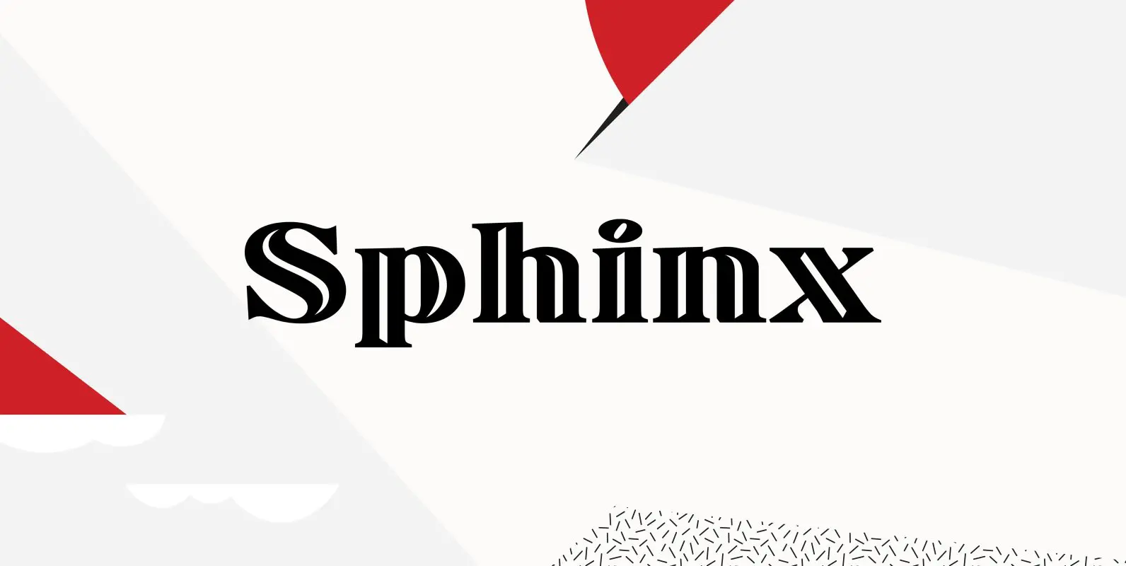
Sphinx Font
Designed by Steve Jackaman, Sphinx is a serif font based on the Deberny & Peignot, circa 1925. Originally, the inline was a capitals only font. Published by Red RoosterDownload Sphinx
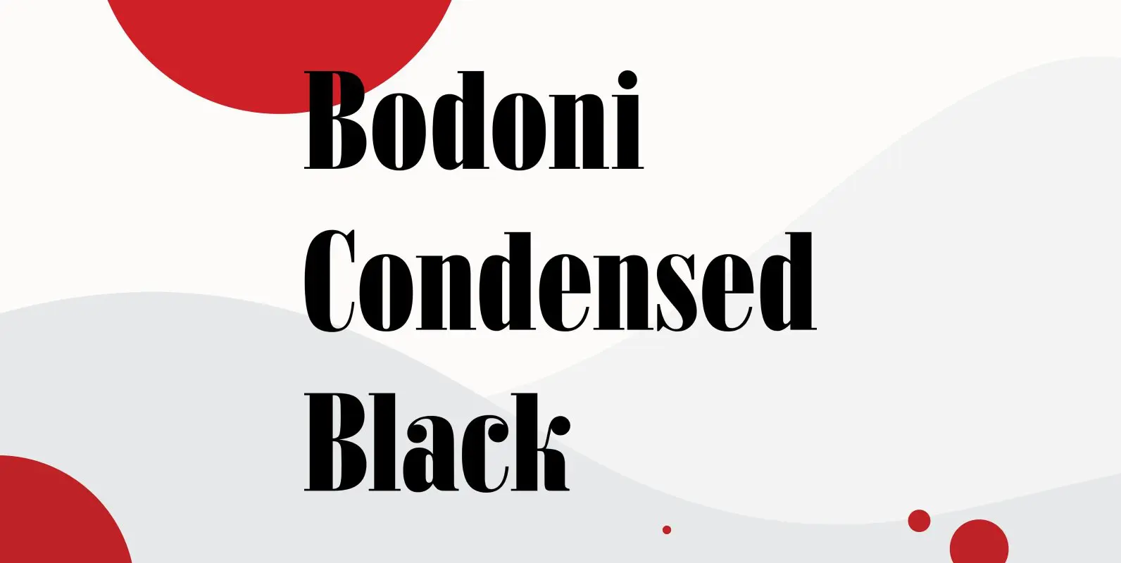
Bodoni Condensed Black Font
Bodoni Condensed Black was designed by R.H. Middleton for Ludlow, circa 1930. Digitally engineered by Steve Jackaman. Published by Red RoosterDownload Bodoni Condensed Black
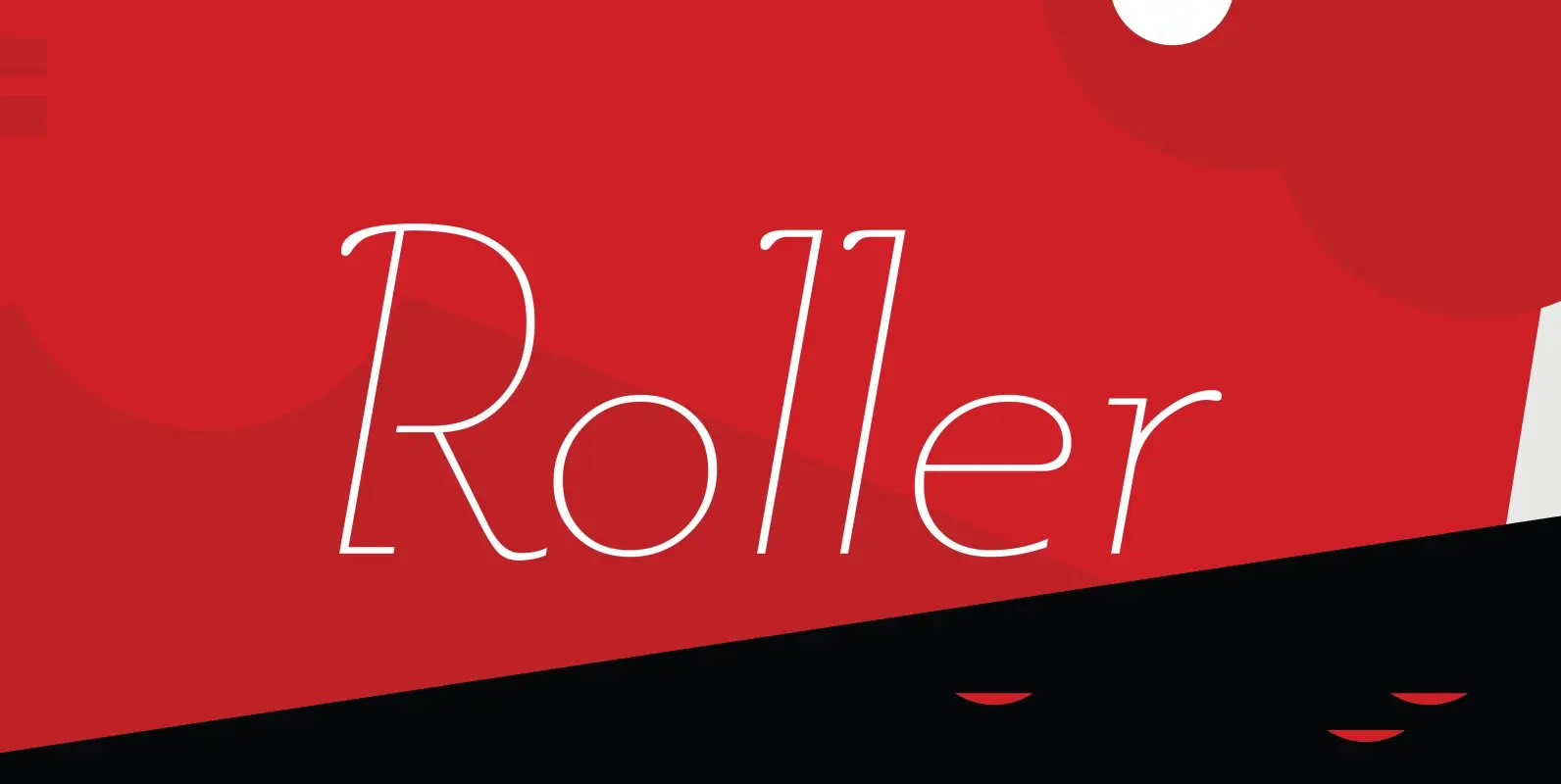
Roller Font
Designed by A. Pat Hickson, Roller is a retro font design based on Iberica by Carlos Winkow for the Spanish foundry, Nacional, circa 1942. Published by Red RoosterDownload Roller
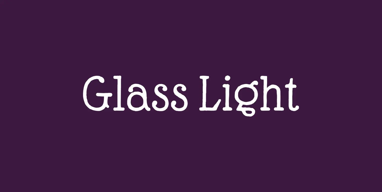
Glass Light Font
“Glass Light” was designed in 1912 by “Franz Paul Glass” for the “Genzsch & Heyse” foundry. The font is stylewise related to the “Lo types” of the same period. Glass designed a lot of decorative elements to go along with
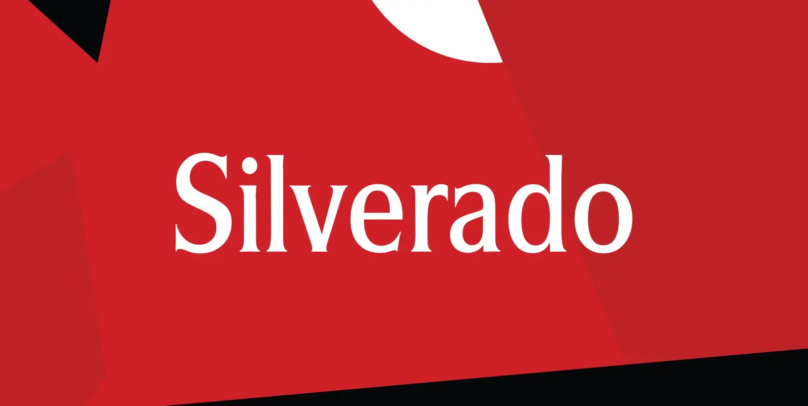
Silverado Font
Designed by Steve Jackaman, Silverado is based on a classic serif type design called Eldorado. Published by Red RoosterDownload Silverado
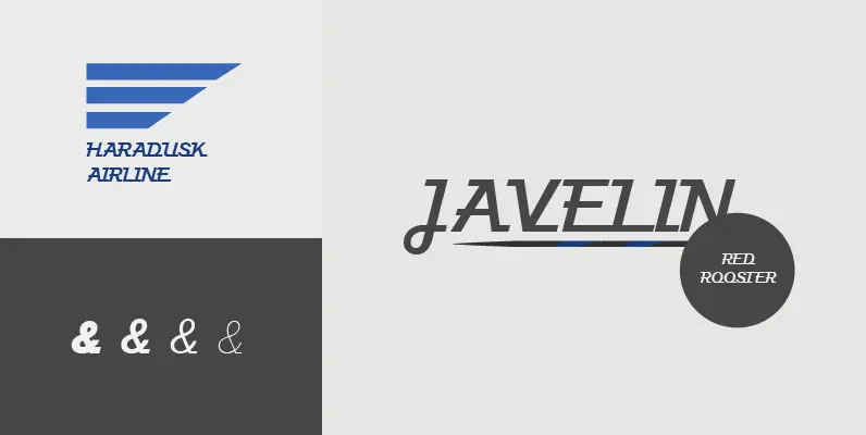
Javelin Font
Designed by A. Pat Hickson, Javelin is a sport-like and retro font design. Published by Red RoosterDownload Javelin
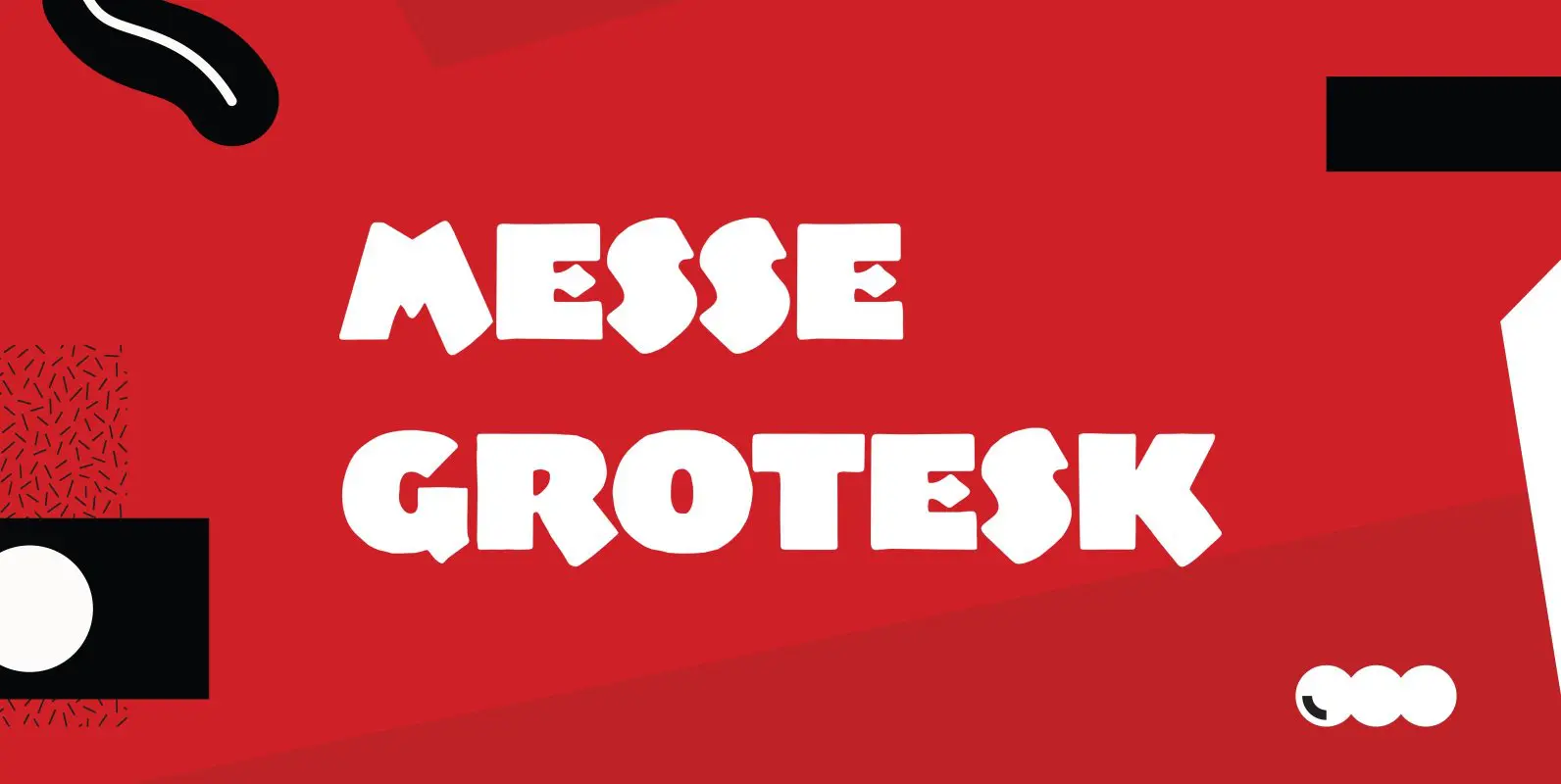
Messe Grotesk Font
Designed by Paul Hickson. Based on the Albert Augspurg design, circa 1921-27. Published by Red RoosterDownload Messe Grotesk
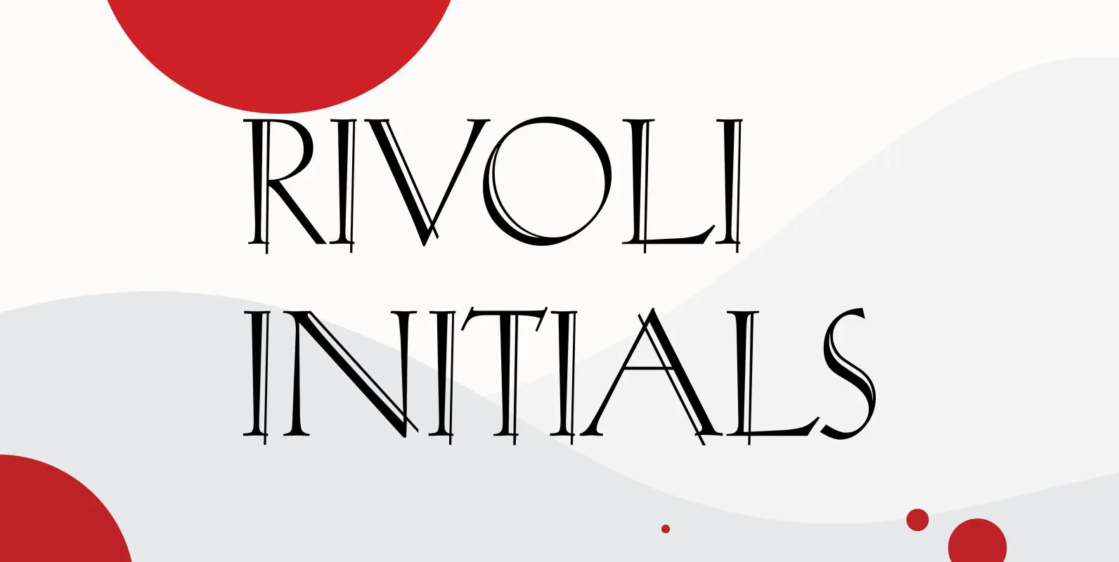
Rivoli Initials Font
Designed by Paul Hickson, Rivoli Initials is a decorative font based on the William T. Sniffin design for ATF, circa 1928. Published by Red RoosterDownload Rivoli Initials
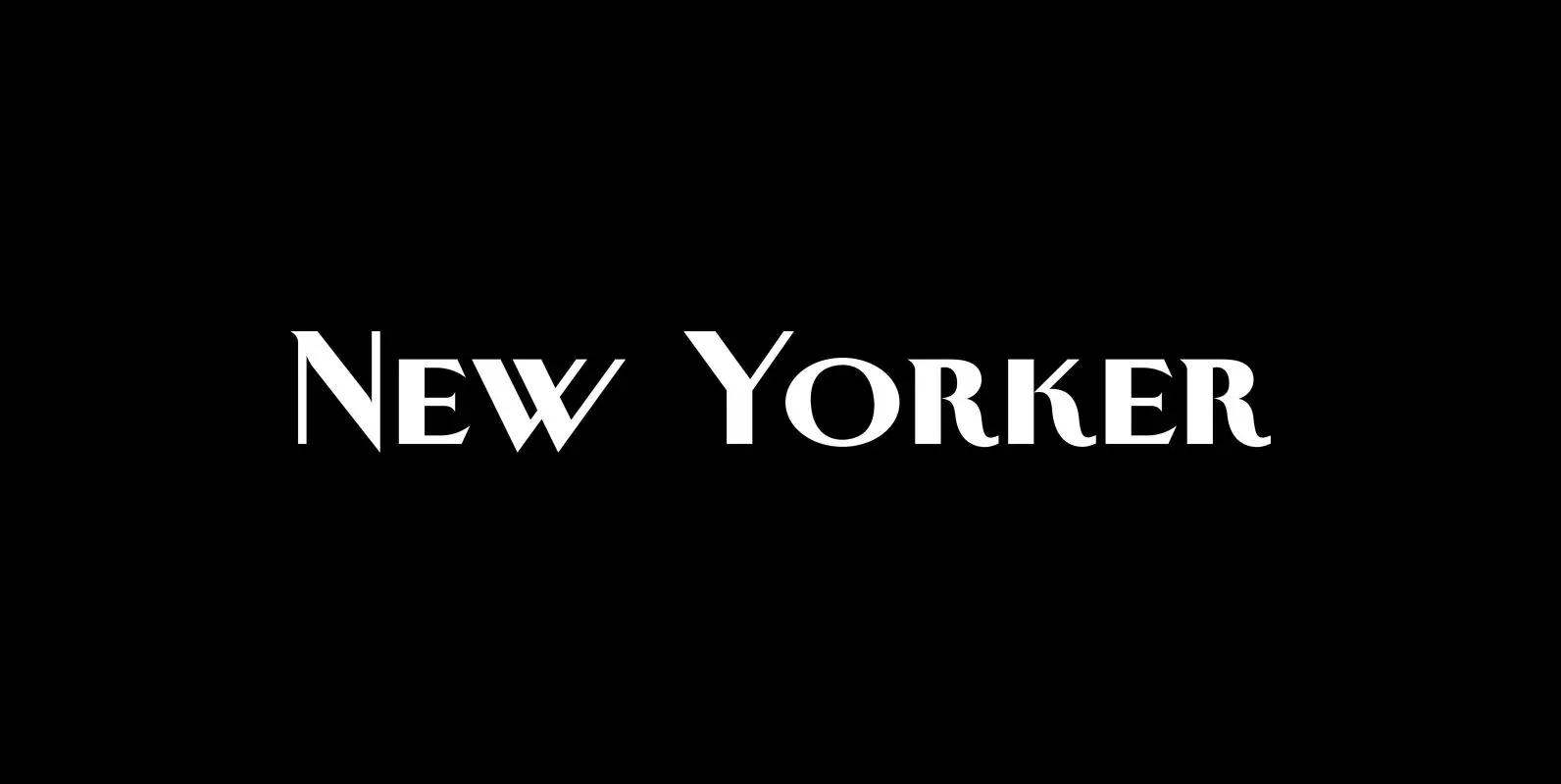
New Yorker Plus Font
New Yorker Type was one of the first typefaces I tried my hand at in 1985. I meant it as a revival of the typeface used by the New Yorker magazine. I did not scan it in, I just looked
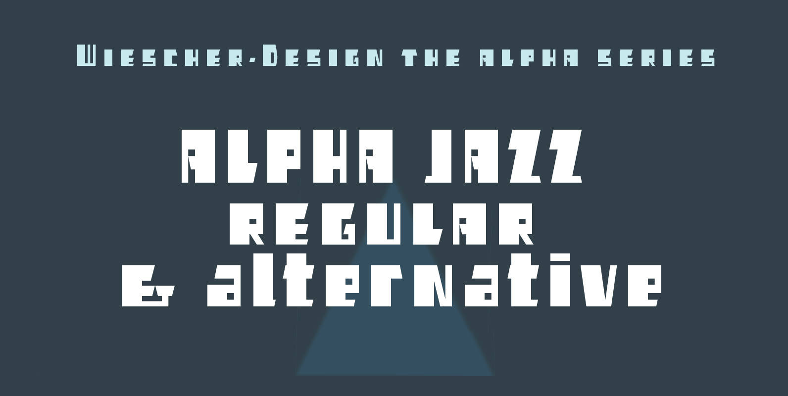
Alpha Jazz Font
“Alpha Jazz” is another font in my alpha-series, the experimental font series. It lents itself very good for all kind of modernistic occasions and for Jazz in all forms. You get 2 fonts (one alterrnative lowercase set) for the price

Supra Extended Font
Supra Extended – designed by Gert Wiescher in 2013 – is the extended version to this new sans typeface family of eight weights. The extended version is designed for sheer elegance and has no italics because they didn’t look nice
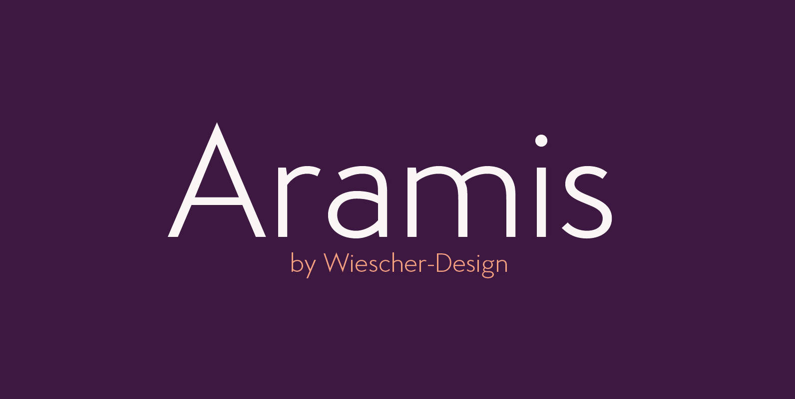
Aramis Font
“ARAMIS” is a new linear Sans with a French touch– designed by Gert Wiescher in 2014 and 2015 – has 7 weights with corresponding italic cuts. The small contrast in the linear Sans makes it not quite so linear and

Decour Soft Font
Decour Soft is the rounded-edged version of Decour. It is a slab serif humanist low contrast typeface. The overall design also features strong curves, making it a very friendly face. The font retains the original elegant features of Decour—based on
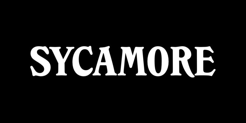
Sycamore Font
Designed by Les Usherwood, Sycamore was digitally engineered by Steve Jackaman. Published by Red RoosterDownload Sycamore
