Tag: asian
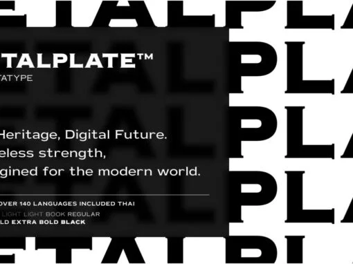
Metalplate Font
For the modern graphic and digital designer, when typography is as critical a design element as color and white space, finding that perfect typeface that communicates the ethos of your design can be quite a challenge. Let us introduce you
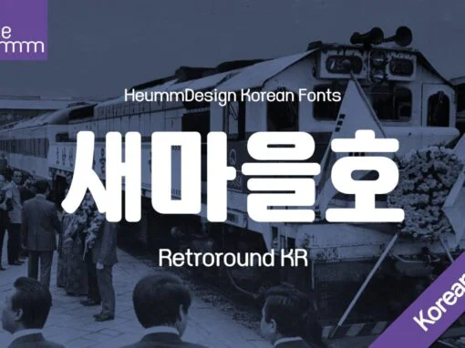
Retro Renaissance: Bringing Koreas Vintage Vibe to Digital Design with HU Retroround KR Font
Immerse yourself into the vibrant world of HU Retroround KR, a Korean digital font that effortlessly transports one back to the time of Korea’s modernization era, when its streets were adorned with the charm of retro signboards. As an incredibly
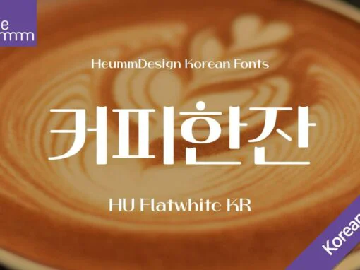
HU Flatwhite KR Font
Introducing a distinctive headline typeface that beautifully blends a retro sensibility with modern typography. This font exhibits a unique charm with its concave initial projections of the vowel and dot shapes, enhancing its vintage appeal. What sets this typeface apart
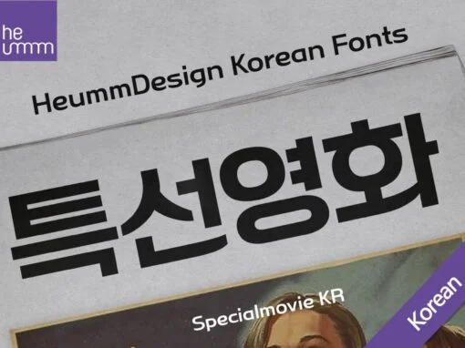
HU Specialmovie KR Font
HU SpecialmovieKR is a retro, wide square typeface, characterized by streamlined, narrow stroke ends such as 'ㄴ,ㅅ,ㅈ'. The first consonants are designed to be large with full modules to improve readability. The grapheme 'ㅇ', which is the face of the
HU Suryeo KR Font
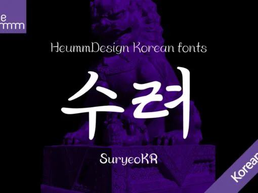
HU SuryeoKR is a new typeface of Heumm's calligraphy that takes the motif from carefully written calligraphy. It follows the calligraphic shape of Korean classics and can be used for titles and body text without distinction. The stroke thickness, strength,
Asakusa Font
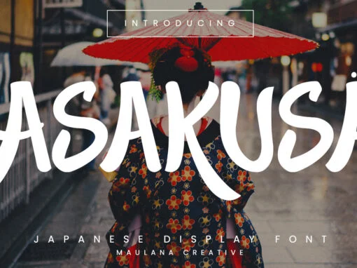
Asakusa is a handwriting font design published by Maulana Creative Published by Maulana CreativeDownload Asakusa
HU Ketchup KR Font
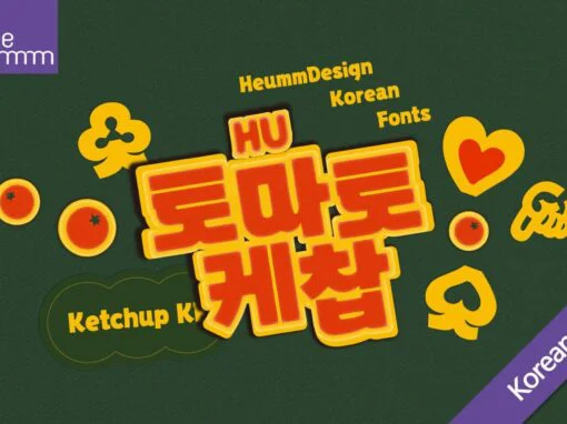
HU Ketchup KR is a bold headline typeface that showcases a unique and playful style. The natural connection between the strokes of consonants and vowels adds writing strength, while the design of vowels 'ㅗ, ㅛ' resembling consonant 'ㅅ' infuses the
HU Mois KR Font
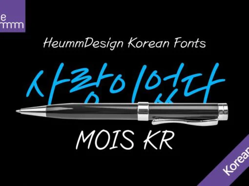
HU Mois KR is a calligraphy font that captures the essence of speed and a naturally slanted feel, reminiscent of fluid handwriting. It embraces the free rhythm often found in personal penmanship, making it an excellent choice for designs that
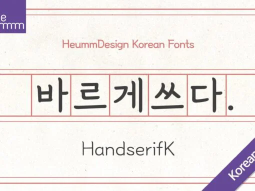
HU Handserif KR Font
Imagine a font that effortlessly bridges the gap between two distinct writing systems, bringing together the best of both worlds in one versatile package. Meet HU Handserif KR, a beautifully crafted typeface that combines the graceful flow of Korean characters
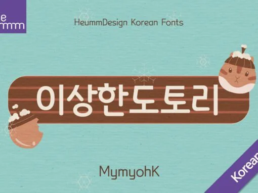
HU Mymyoh KR Font
Introducing HU Mymyoh KR, a captivating typeface that seamlessly unites the elegance of Korean characters with the classic appeal of Latin alphabets. This versatile font is an excellent choice for projects requiring a harmonious fusion of cultural elements while maintaining
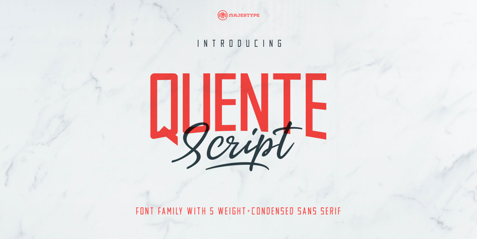
Quente Script and Tamigos Font
Quente Script is a blend of handwritten styles that merge into a font. When you look at this font you will feel a very strong mix of interaction between classic style, handwriting, signature and brush pen. Quente Script comes with
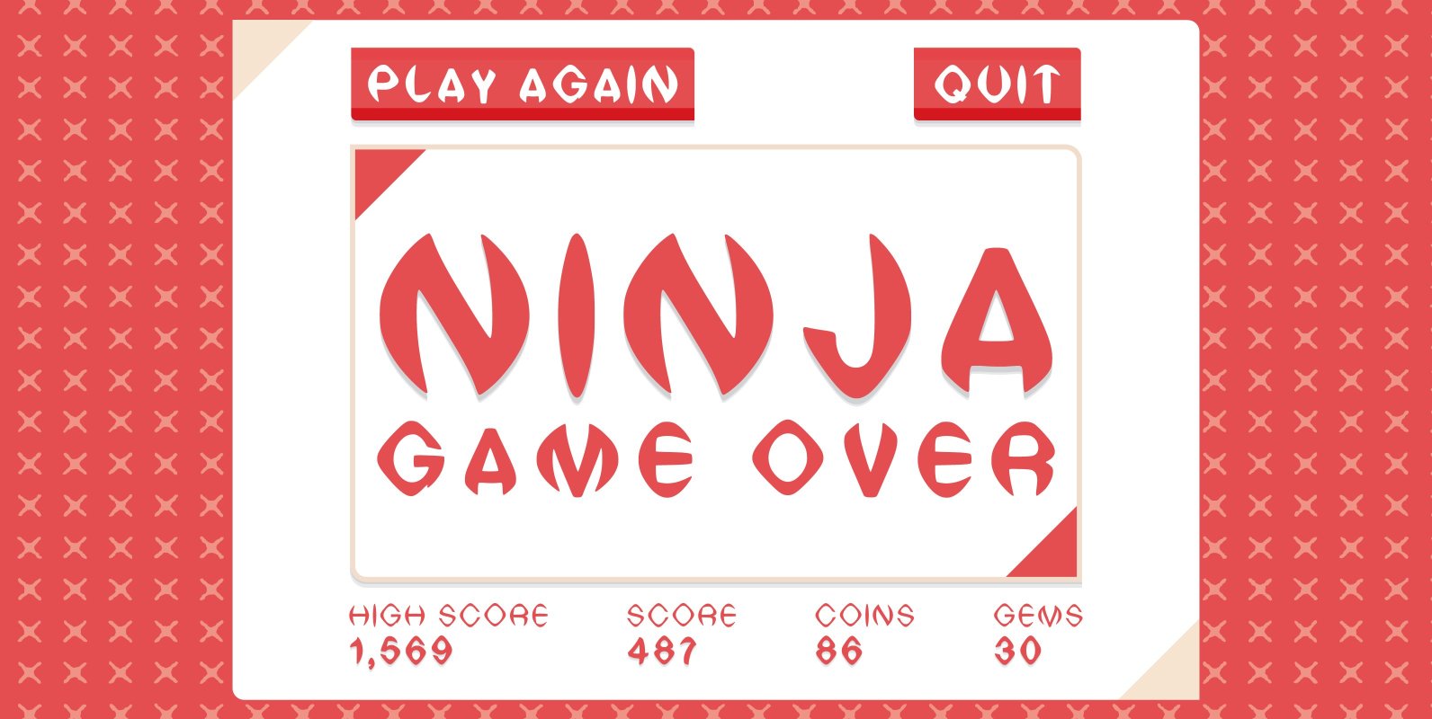
Ninja Font
Fun font with a nod to the far East. for kung fu lovers, samurai fanatics and ninja obsessed this type face contains three killer styles in a cool wide, extended style, you better check your neck! Light, Reg and Bold.
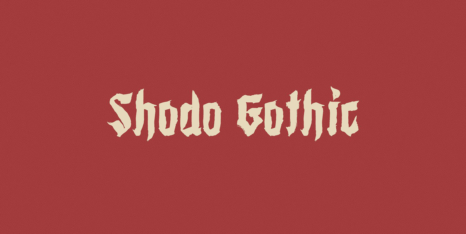
Shodo Gothic Font
Shodo Gothic is a mixture of western black letter typography and asian calligraphy. Published by Mirco ZettDownload Shodo Gothic

Kayto Font
Kayto Script is the second collaboration of Erwin Indrawan as the calligrapher and Dexsar Harry Anugrah of Majestype as the typeface designer. Today the resurgence of calligraphy has reached the summit, with social media as the vehicle, we are now
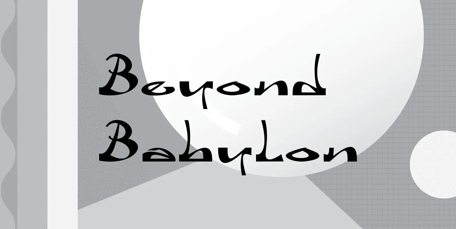
Beyond Babylon Font
Babylon was a civilisation that stretched from Bagdad to the Persian Gulf. There is an Old and new Babylonia, the era of Babylon civilization and the biblical Babylon. The oldest scriptures to be found since the rise of civilisation are
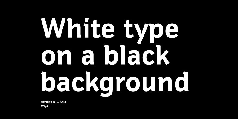
Hermes DTC Font
Both Hermes DTC and Imperial DTC font families are strongly influenced by Schnebel’s work on Latin characters to fit Japanese Kanjis. DTC Hermes is well-suited for office documents, looking good on screens as well as printed. Published by URW Type
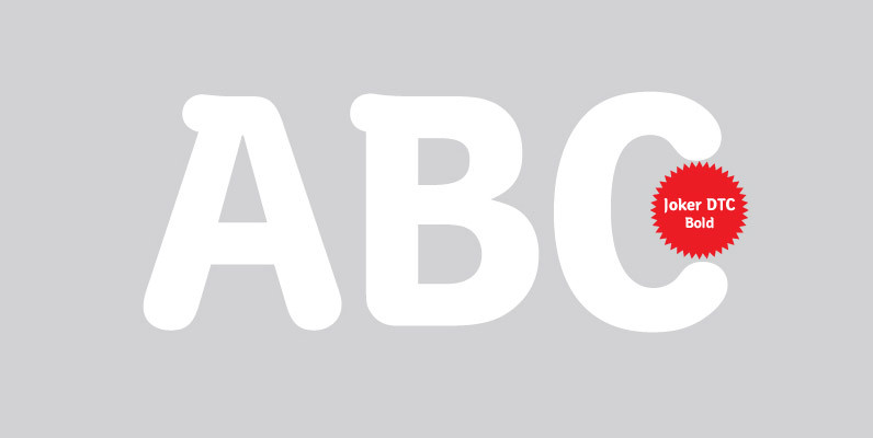
Joker DTC Font
A vintage and classic serif designed by Volker Schnebel, Joker DTC brings elegance and class to any project. Works great in both content and headline usage. Published by URW Type Foundry GmbHDownload Joker DTC
