Tag: atari
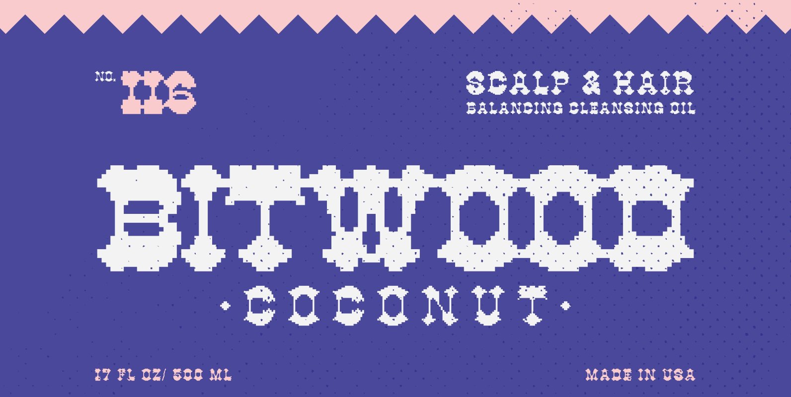
YWFT Bitwood Font
If Pac Man was programmed by Sergio Leone, YWFT Bitwood would provide the commentary. One-of-a-kind, obscure, and sometimes downright obscene, YWFT Bitwood is a unique mashup of old-west saloon type and modern-day game console screens. It takes the idea of
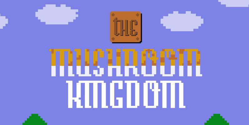
Story Font
Story font is an experiment to convert the script-style calligraphy into bitmap format. Made alongside Tale fonts, with different design. Published by Suomi Type FoundryDownload Story
Vektori Font
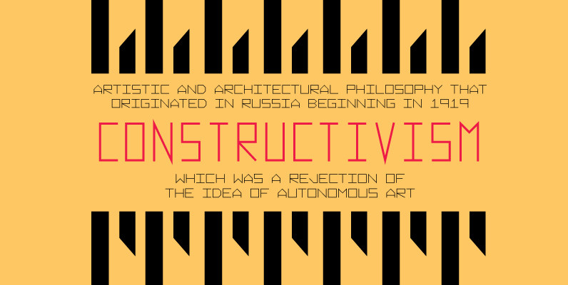
Vektori family comes from those Atari games that had those distinct vector graphics with thin and precise straight lines. Contains 6 very diverse width styles, that make it easy to fit any type layout in need of some digital styling.
YWFT Caliper Font
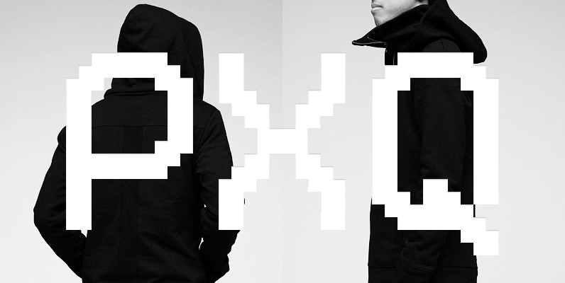
YWFT Caliper was originally created as a unique-yet-readable bitmap typeface. While it works well onscreen at small point sizes, it also can be used at larger sizes for retro-style headers and attention-grabbing statements. YWFT Caliper also contains two free bonus
Vector Font
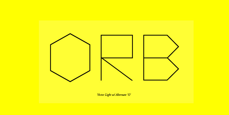
Vector is inspired by the 1979 Atari Asteroids video game UI screen font, yet it has been completely reworked to achieve a more balanced and refined visual aesthetic, loosely adhering to the original source. Letterform widths, angles, metrics and kerning
YWFT Blackgold Font
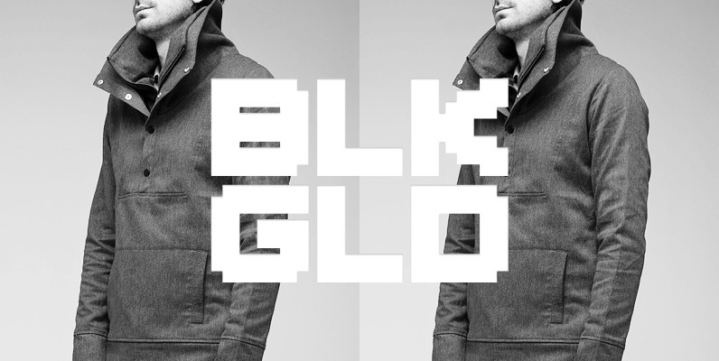
Challenging Stage! YWFT Blackgold was originally designed as a second extension to YWFT Caliper. It is a thick, chunky, video game-inspired pixel font that works great in digital- and retro-themed projects. (And of course for entering your name in the
Tictac Font
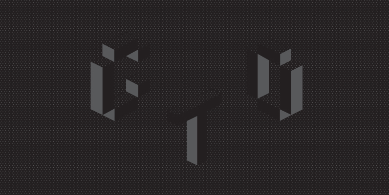
TicTacToe is a two-tone font with axiometric proportions. It is all capitals, but upper and lower case characters differ to achieve more versatile results. It has two variants, open and all closed variant in back, so it leaves no holes
YWFT Processing Font
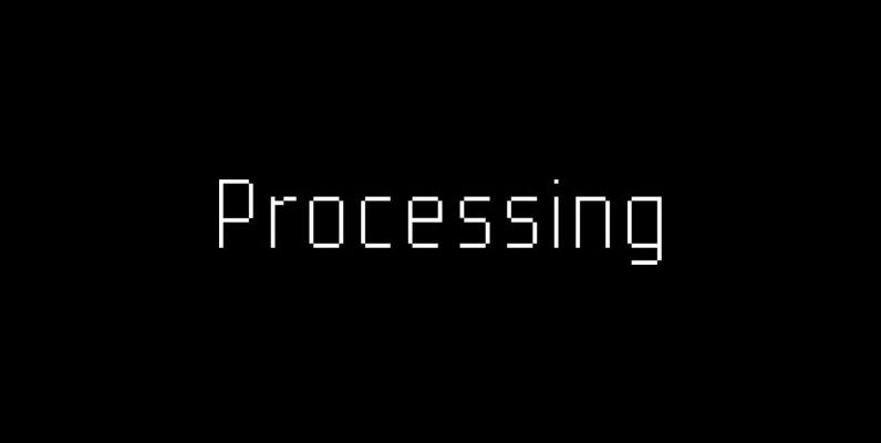
YWFT Processing was developed in 2001 for Casey Reas, the co-creator of the Processing programming language. We created this display face to be sharp, tall, unique and interesting…much like Mr. Reas himself. The font was derived from an original logo
Digitek Font
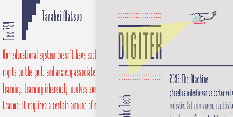
This futuristic looking typeface was inspired by the appearance of coarse resolution computer bitmap output. Because it is condensed, Digitek is most effective in large headline applications with wide letter and word spacing. An excellent choice where a computer or
YWFT Bit Font
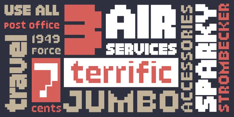
YWFT Bit was originally hewn from raw pixels in 1998, then mastered to working format in 2003. You may think YWFT Bit is your typical bitmap affair, but oh, how wrong you would be. With its variety of weights, and
