Korpus Sans Pro Font
A sans serif body text font family which covers West and East European languages as well as. Cyrillic and Greek. All styles included small caps and old style figures. Published by RMU TypedesignDownload Korpus Sans Pro
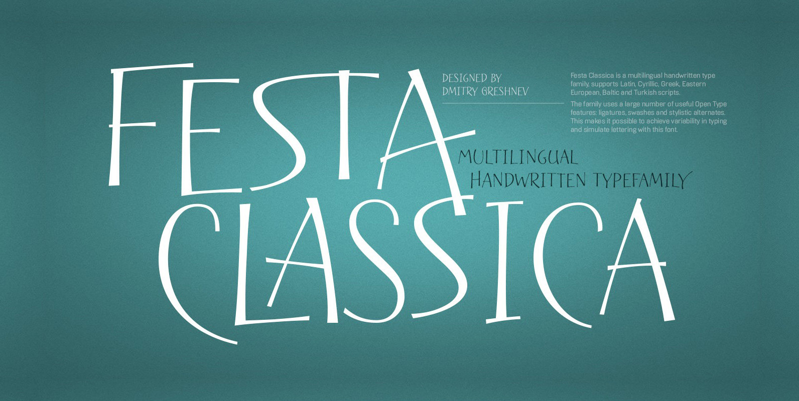
Festa Classica is a multilingual handwritten type family, supports Latin, Cyrillic, Greek, Eastern European, Baltic and Turkish scripts. The family uses a large number of useful Open Type features: ligatures, swashes and stylistic alternates. This makes it possible to achieve

Walter Tiemann’s elegant display font brought to life again and carefully extended with Baltic, Turkish and Central European character sets. Published by RMU TypedesignDownload Daphnis
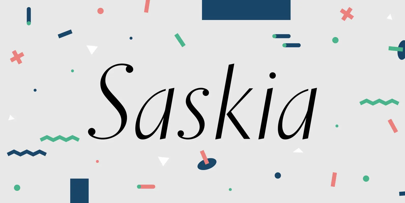
A tribute to Jan Tschichold. His hot-metal font Saskia was released in 1931 by Schelter & Giesecke. This elegant italic font was finally redrawn, extended and digitized for present-day use. Published by RMU TypedesignDownload Saskia Pro

Walter Brudi’s elegant shadowed display font brought to life again and carefully extended with Baltic, Turkish and Central European character sets. Published by RMU TypedesignDownload Orbis Pro
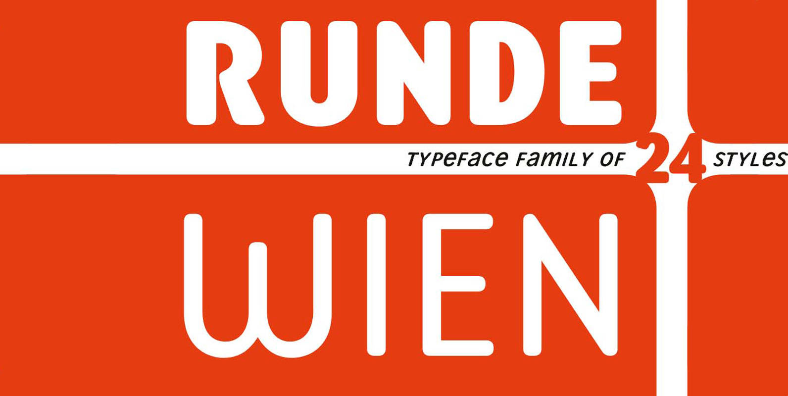
Runde Wien Pro – rounded corners for urban fonts Runde Wien Pro completes the Wien Pro typeface family by the complete font sets with rounded shapes. The more than complete typeface family covers the same weights and styles as the

Based on H. Broedel’s Hogarth Script, Gillray Pro, an RMU design, comes with two weights- Light and Medium. These formal script fonts are ideal for invitations, diplomas,certificats, book titles etc. Published by RMU TypedesignDownload Gillray Pro
A font classic as a RMU redesign – a small yet mighty family with a West and Central European character set plus Cyrillic. All three styles include small caps and oldstyle figures. To get access of those special characters in
A sans serif body text font family which covers West and East European languages as well as. Cyrillic and Greek. All styles included small caps and old style figures. Published by RMU TypedesignDownload Korpus Sans Pro
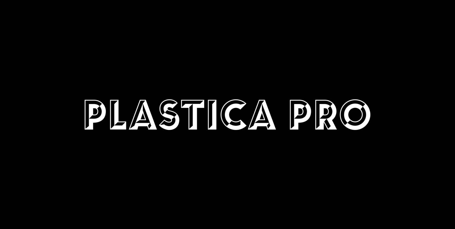
Plastic Pro and Plastica Pro Extended, inspired by a J. Lehmann design, are ideal plastic fonts for posters, logos, corporate identity, headlines, book titles, car and truck design etc. Plastica Pro includes West and Central European languages. To Plastica Pro
Inspired by the former hot-metal fonts of Imprimatur, Gmuender Antiqua Pro is a fresh designed versatile and multilingual serif font family. All five styles contain three different forms of numbers and small caps. Published by RMU TypedesignDownload Gmuender Antiqua Pro
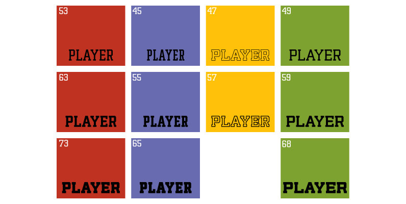
The Player family started as a straight-forward revival of a film face called Ivy League, an early 1970s VGC classic that was very popular with designers of sports paraphernalia. A few hundred liters of coffee later, the revival of a

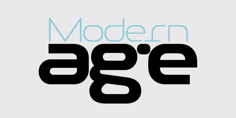
This typeface is the result of an attempt to modernize DIN, by introducing round smooth corners and distinct design elements to several characters like ‘a, g, k, m’, without compromising legibility. In order to retain its sharpness, inner corners as
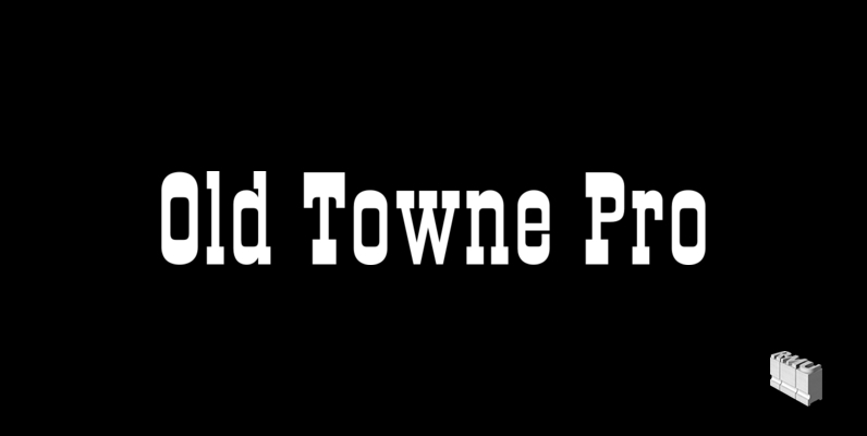
Classic Western slab serif font extended to include old style figures as well as Cyrillic and Greek! letter forms. Published by RMU TypedesignDownload Old Towne Pro
An ultra modern typeface which combined with the proper text font can revive any dull-looking document. The wide simple forms combined with the selective application of a few distinct characteristics has resulted a stylish typeface which shines in the top
The DIN Text series was based on the original standards but was completely redesigned to fit typographic requirements. Completed in 2002, it was first released in 2003 and published in our catalog, as a group of 4 separate families each
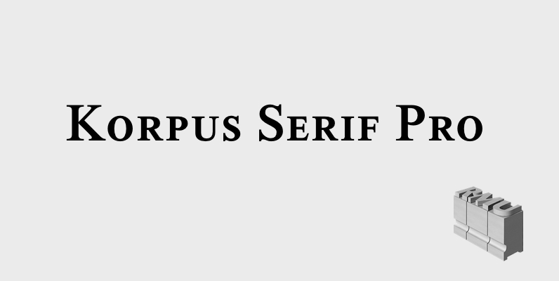
Inspired by Timeless, Korpus Serif Pro is a completely fresh RMU redesign of this former Typoart! font family. All four styles – Regular, Italic, Demibold and Demibold Italic – contain besides West! and Central European glyph tables those of Greek
DIN Display was designed as an alternative to Parachute’s Din Text series. While Din Display seems to retain DIN’s basic characteristics, it shines with its sharper corners and contemporary look. Completed in 2002, it was first released and published in
In 1936 the German Standards committee Deutsches Institut Normung (DIN) proposed DIN 1451 as the standard type of lettering to be used in the field of road traffic. The purpose of this standard was to lay down a style of