Tag: basic
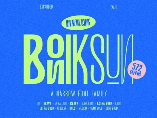
Boniksun Font
Boniksun Typeface, a contemporary sans serif font family, offers a range of weights from Thin to Heavy, featuring a high body for excellent readability at small sizes. With 572 glyphs, it provides extensive typographic options for designers. The condensed version
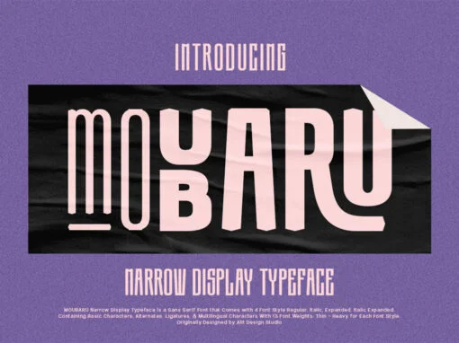
Moubaru Font
Moubaru, a modern sans serif font family, offers an array of weights from Thin to Heavy, ensuring versatility and adaptability. Its tall body allows for easy legibility, even in smaller sizes, while the extensive collection of 680 glyphs expands the
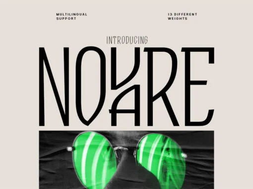
Novare Font
Introducing Novare font, a modern sans serif font family available in a range of weights from Thin to Heavy. With its high body, it remains legible even at small sizes. The font offers 600 glyphs, providing numerous typographic possibilities.
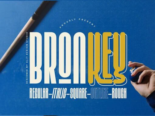
Bronkey Font
Introducing Bronkey, a bold and sporty sans serif typeface with a versatile range of styles like regular, italic, outline, square, and rough. Its high body makes it perfect for headlines, titles, or any project requiring an attention-grabbing font. With
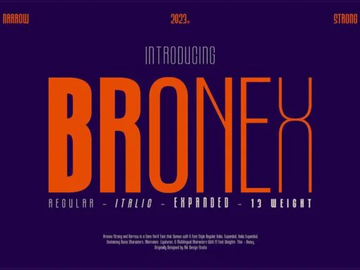
Bronex Font
“BRONEX Typeface” is a modern sans serif font that comes in a variety of weights, ranging from Thin to Heavy. It has a high body, making it easy to read even in small sizes. The font includes 494 glyphs, which
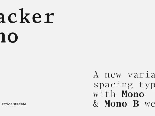
Blacker Mono Font
Blacker Mono was developed out of a brief by Isabella Ahmadzadeh, by Cosimo Lorenzo Pancini and Francesco Canovaro for the editorial project “A beautiful mistake” by OFFF Tlv in 2022. It is a monospaced version of our typeface Blacker, bringing
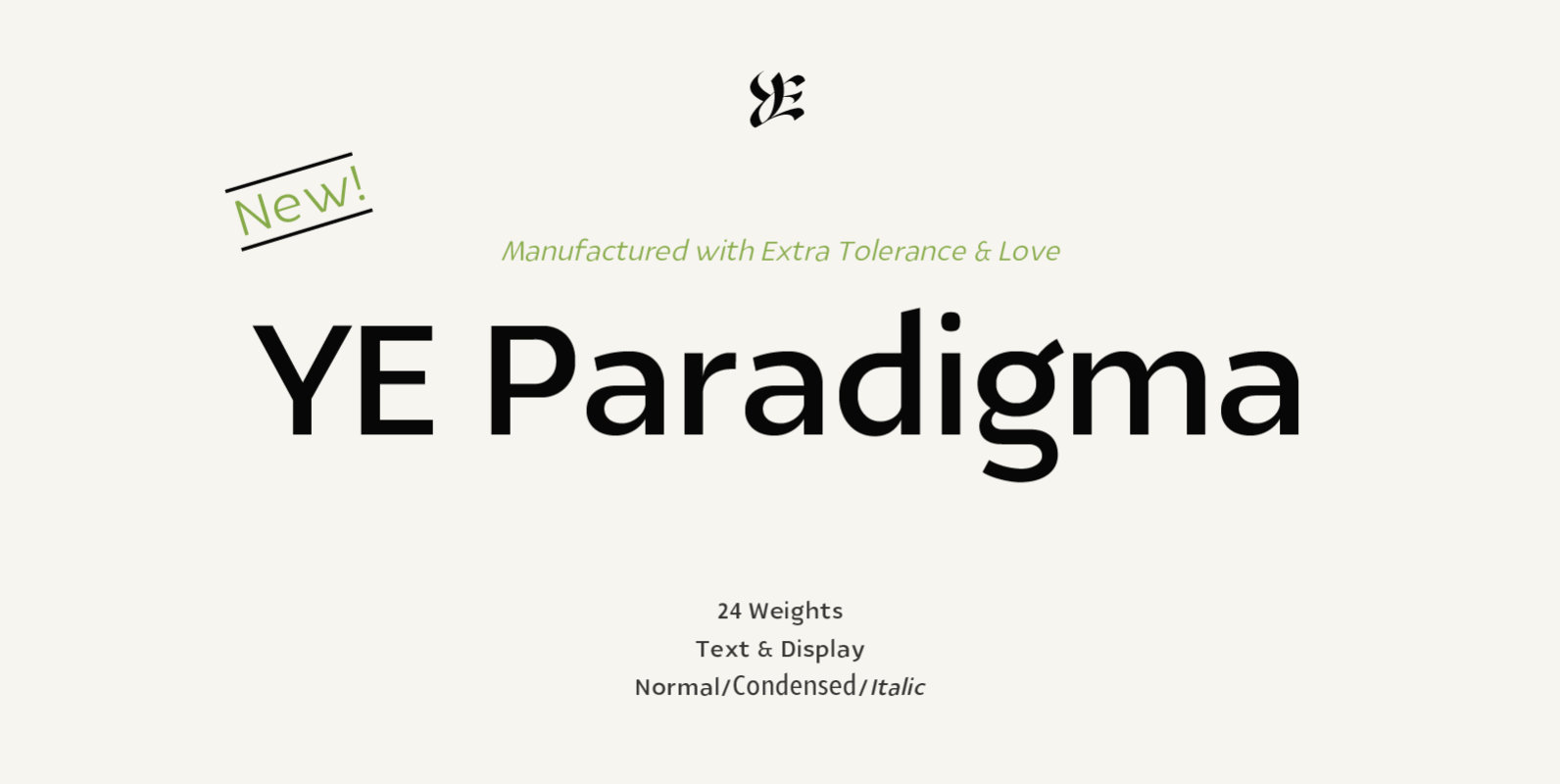
YE Paradigma Font
YE Paradigma is a beautiful sans serif typeface, with 24 weights, including italics & condensed fonts, made with extra tolerance & love! He is so casual that you wouldn’t even noticed him, but still he has a lot to say,
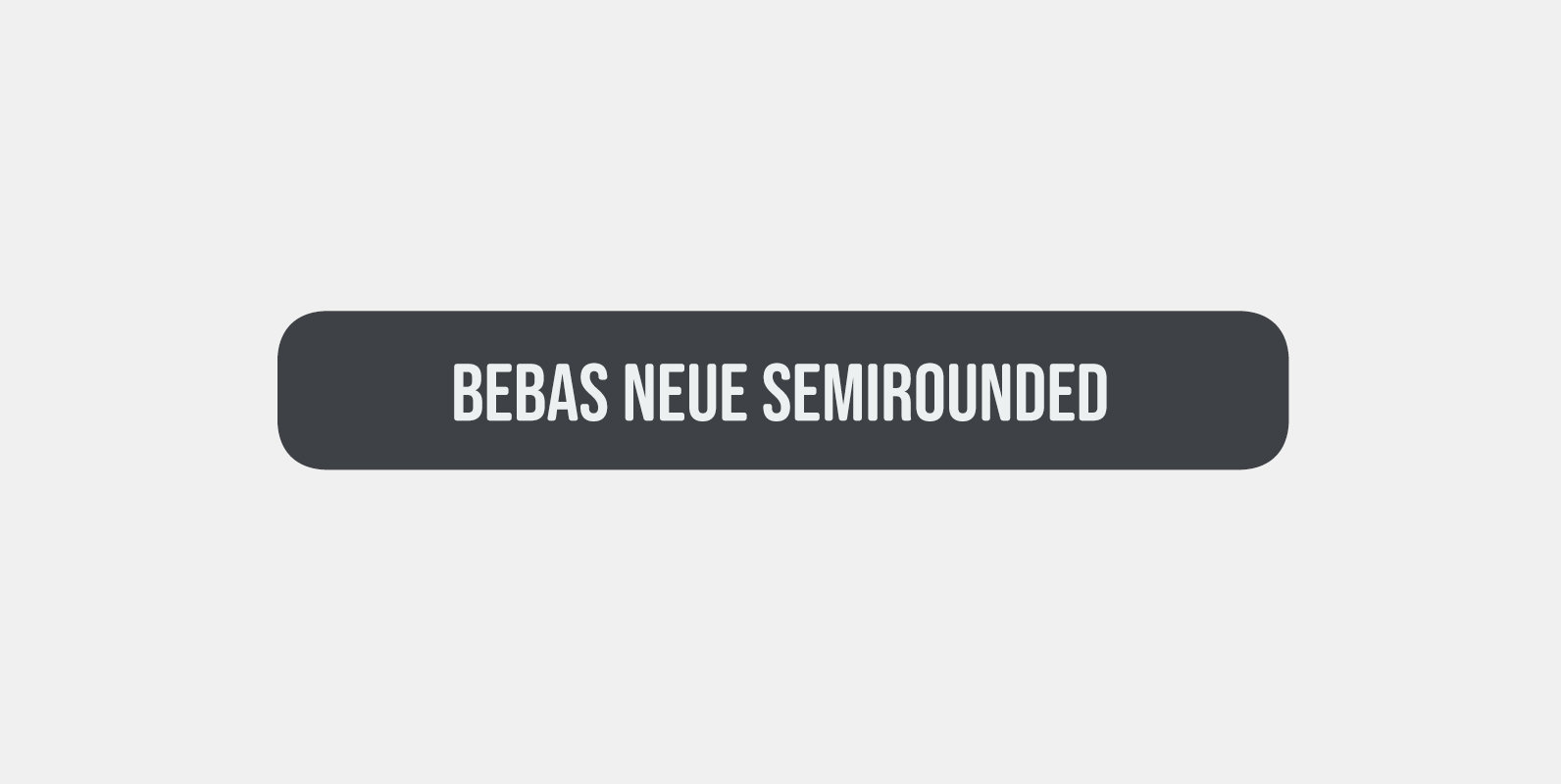
Bebas Neue SemiRounded Font
Bebas Neue SemiRounded is Bebas Neue with rounded corners. As you know, Bebas Neue is the most widely used free font recently. The basic theory and proportion are same as Bebas Neue but rounded shape gives a warm, soft and
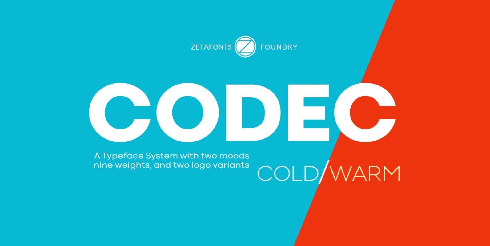
Codec Font
Codec is a geometric sans serif type system, designed by Cosimo Lorenzo Pancini with Francesco Canovaro and Andrea Tartarelli. Codec provides you with two coherent variant fonts built on the same base skeleton: Codec Cold and Codec Warm. In Codec
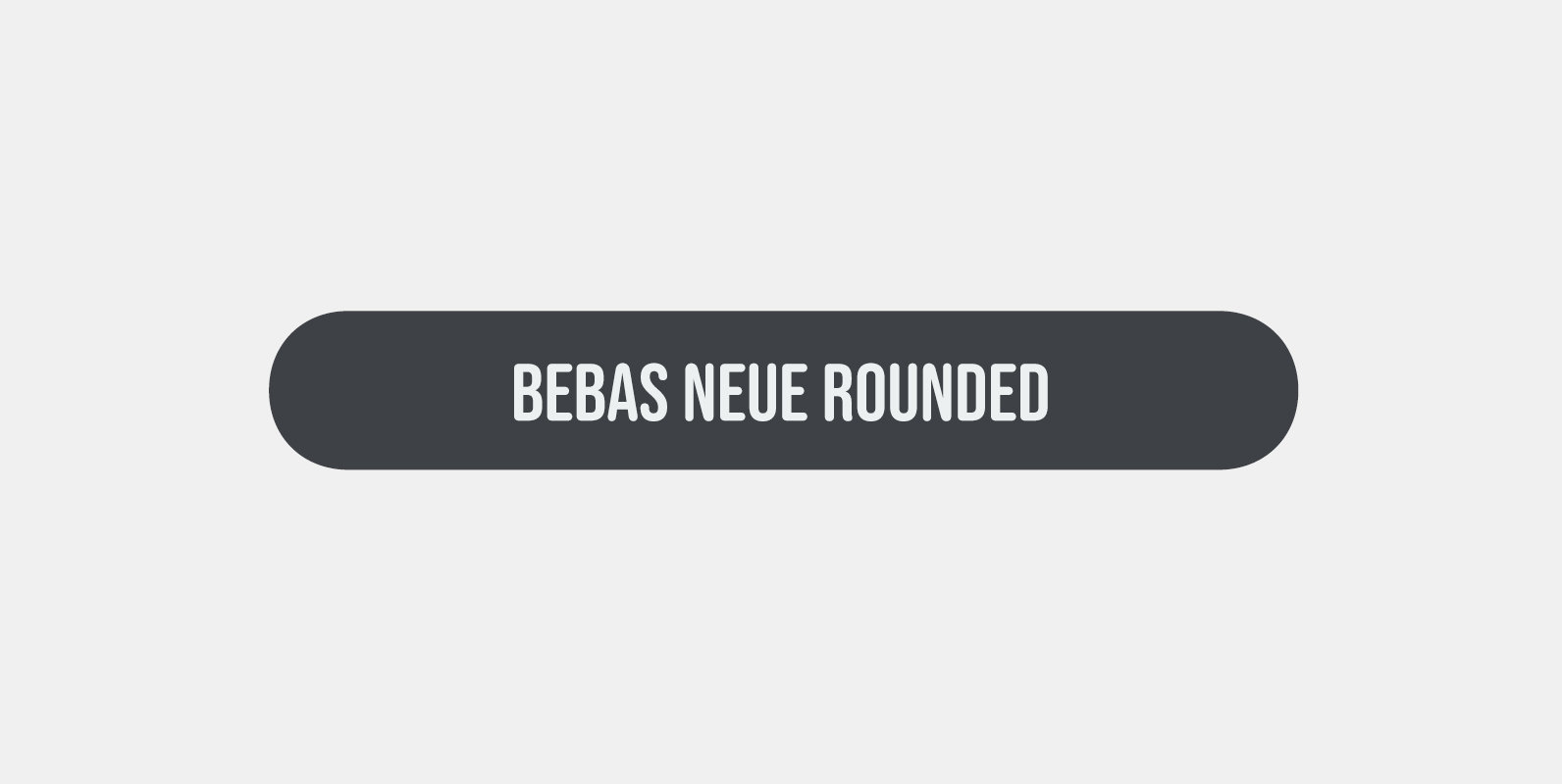
Bebas Neue Rounded Font
Bebas Neue Rounded is the Bebas Neue with rounded corners and terminals. As you know, Bebas Neue is the most widely used free font on the market. This rounded version is a new style where the basic theory and proportion
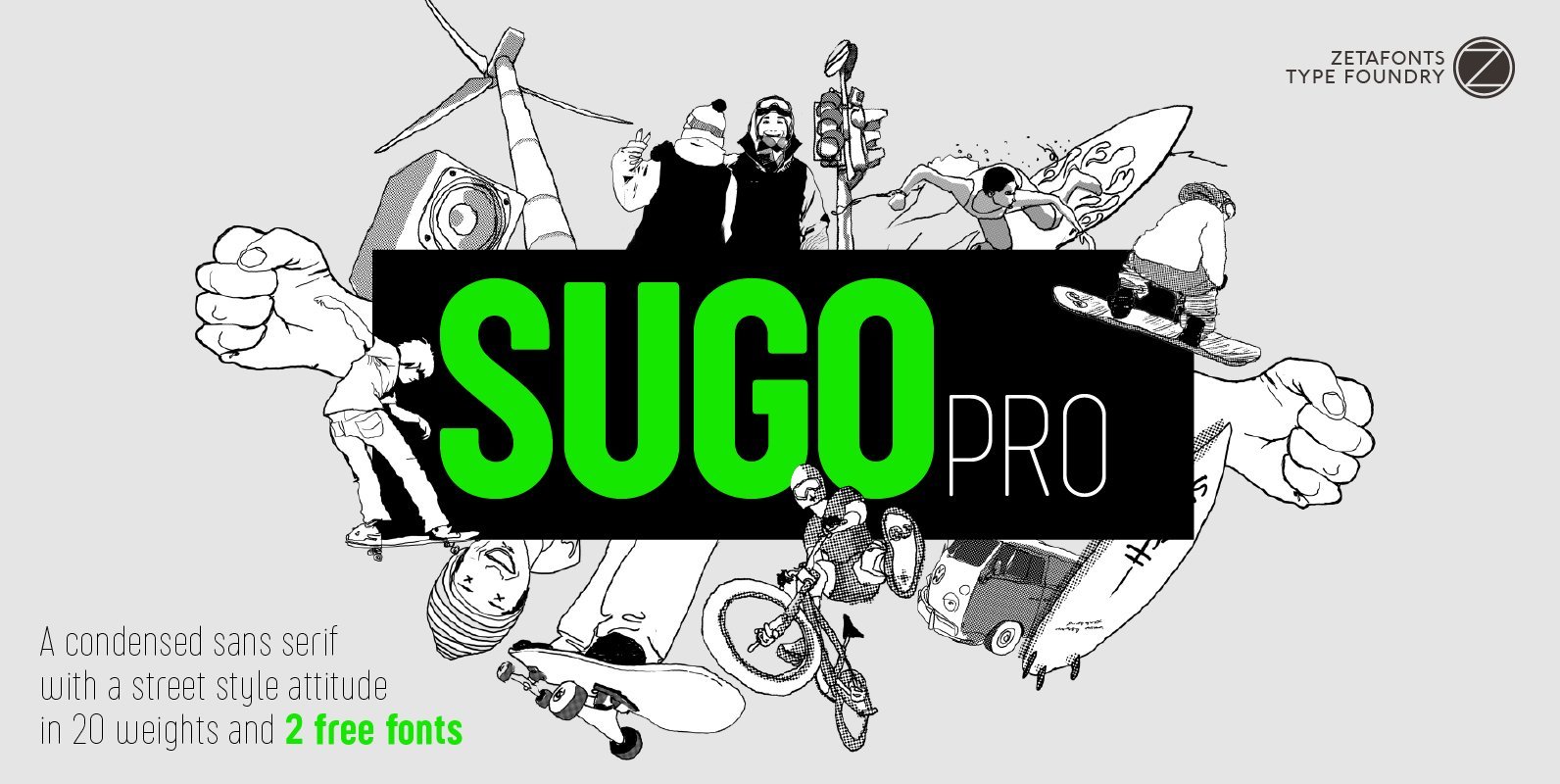
Sugo Pro Font
Sugo Pro is a condensed geometric sans serif with a robust body, slightly rounded corners and no-nonsense street style attitude. The sturdy, robust design of Sugo makes it an ideal choice for sports branding and street-style editorial use. Lighter weights
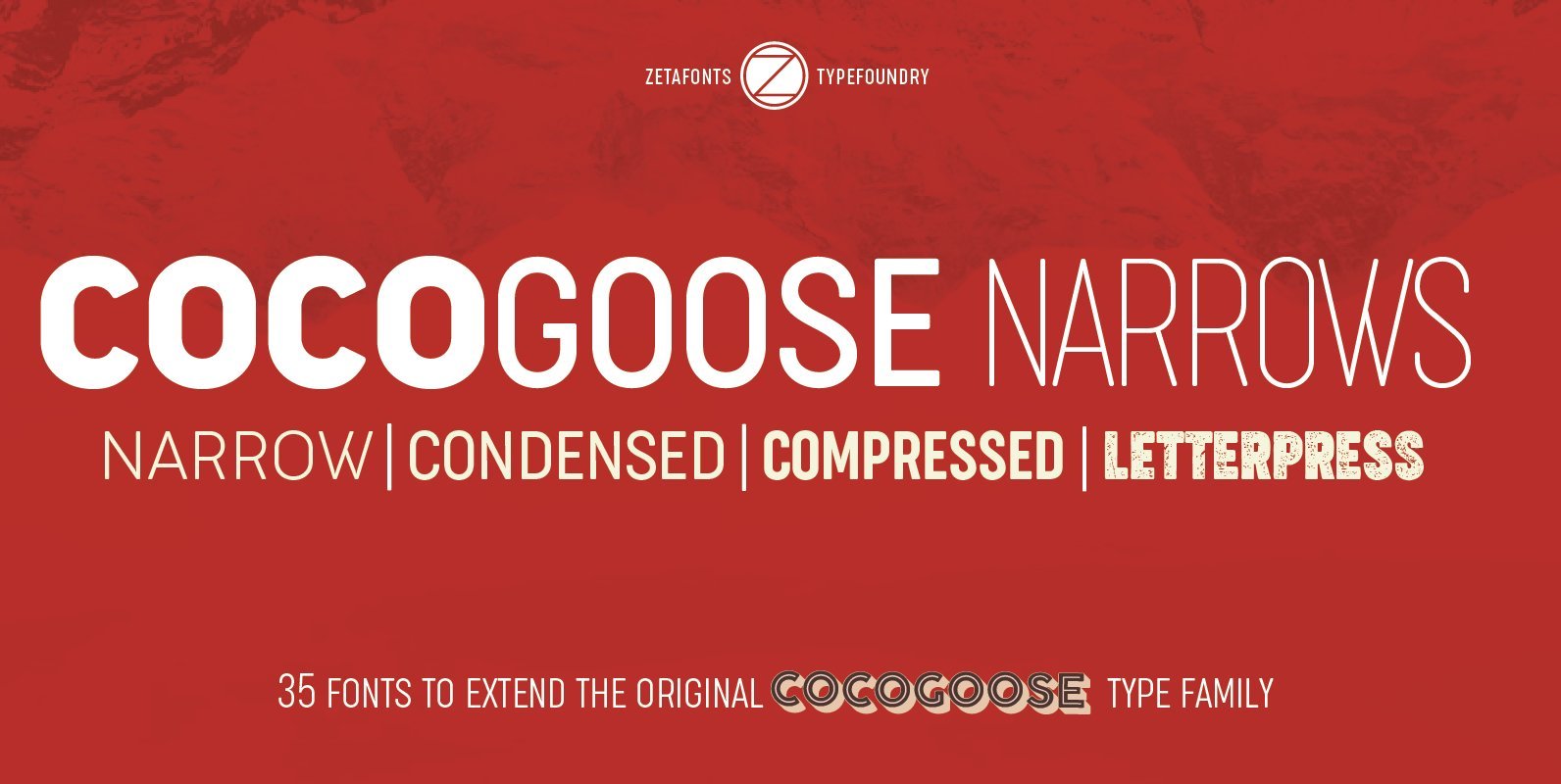
Cocogoose Narrows Font
Cocogoose is a geometric sans serif typeface designed with straight, monolinear lines and circular or square shapes. Its strong, modernist look has been softened by rounded corners and slight visual corrections that make Cocogoose not only perfect for logos and
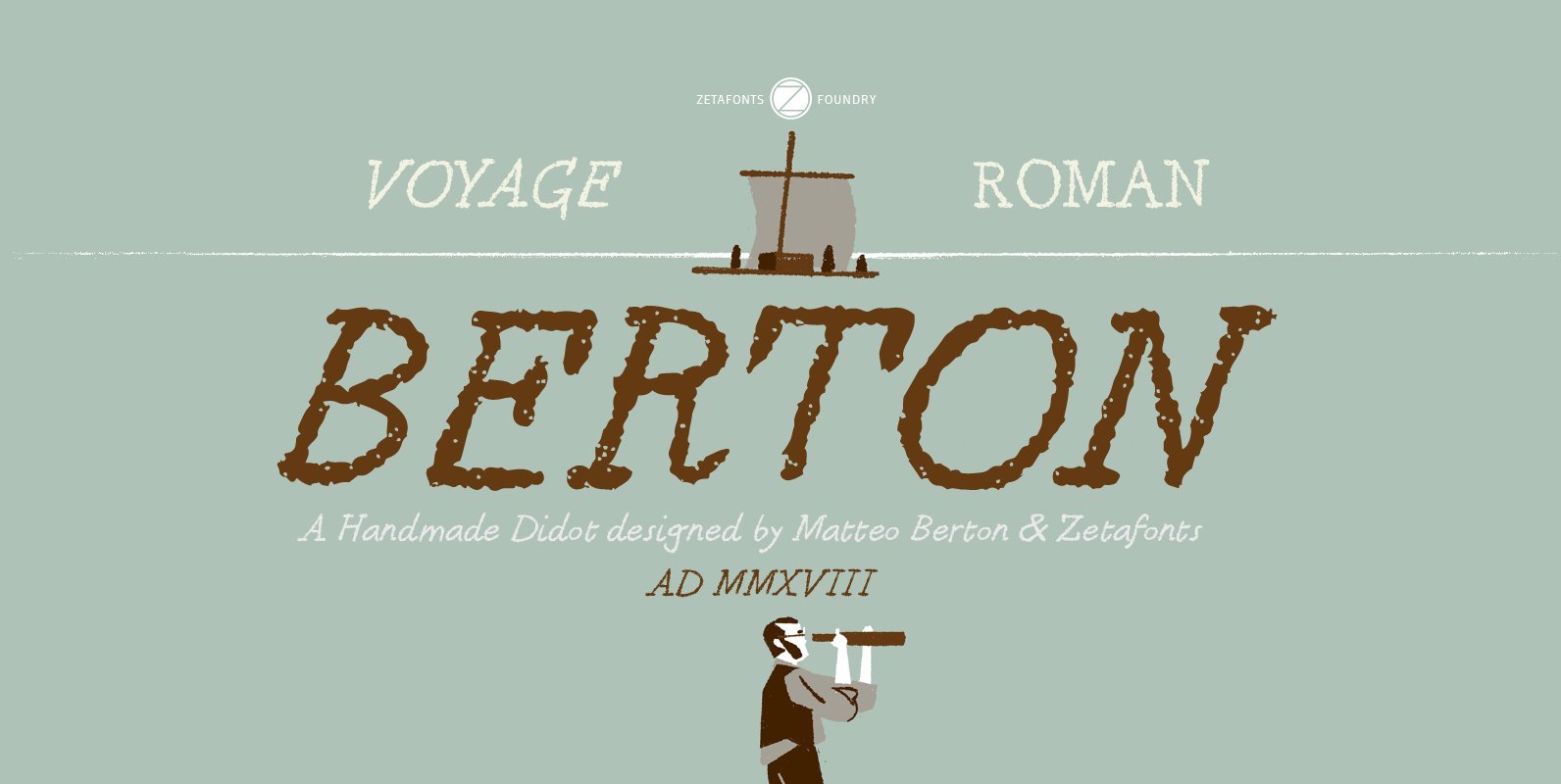
Berton Font
Berton – the third in the Zetafonts Signature artist-designed fonts – was hand drawn by italian illustrator Matteo Berton and lovingly digitized by Zetafonts to be used as main lettering font of the graphic novel “Voyage au Centre de la
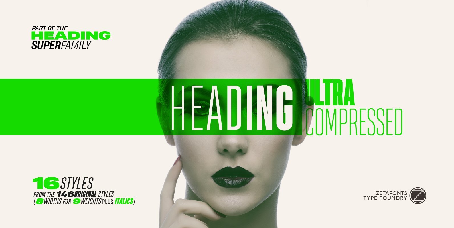
Heading Pro Ultra Compressed Font
Heading Pro Ultra Compressed is a variant of the original Heading Pro typeface designed by Francesco Canovaro for Zetafonts. Each Heading Pro typeface includes over 800 characters with coverage for 100+ languages using latin, cyrillic and greek alphabets. A full
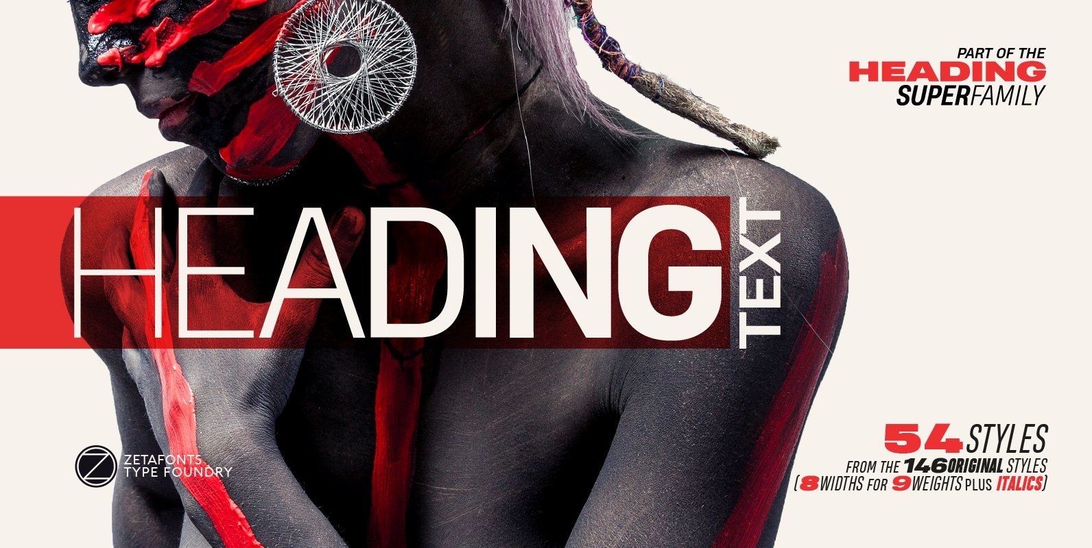
Heading Pro Text Font
Heading Pro Medium, Heading Pro Double and Heading Pro Treble are three variants of the original Heading Pro typeface designed by Francesco Canovaro for Zetafonts. These three medium width families have been added to the original condensed width family to
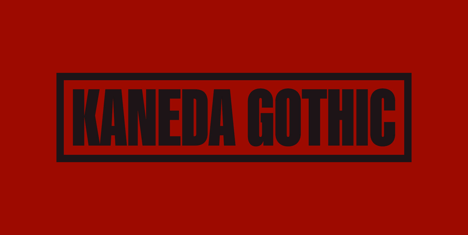
Kaneda Gothic Font
Kaneda Gothic is a whole new basic gothic. Philosophically, Kaneda Gothic is the one of the niche answers in the interspace between these antinomies. Image of near-future and giant metropolis in 80s, 90s vs our real life in the 2010s,20s.
