Tag: bauhaus
Dylan Condensed Font
Dylan is a Sans typeface in the best American tradition. In order to keep corners open and to make the font more readable in small sizes it has deep cuts where curves join straights. I designed 8 finely tuned weights
Dyane Font
Dyane is based on monolinear scripts from the Bauhaus time. But it is very special for its counter strokes in the lowercase letters a, h, m and n that gives the script a very distinct rhythm. Published by Wiescher DesignDownload
Byblos Font
“Byblos” is the name of a town in Lebanon and the name of a famous hotel in St. Tropez. Some time ago I discovered their old logo in an old french magazine, just 5 by 3 centimeters small without any
Purissima Font
“Purissima Bold” and “Purissima Light” is the decorated extension to my “Pura” family. I only offer all 5 cuts together but for a very advantageous price.. The “Bold” and “Light” cut has no embellishments. The “A” and “B” cuts are
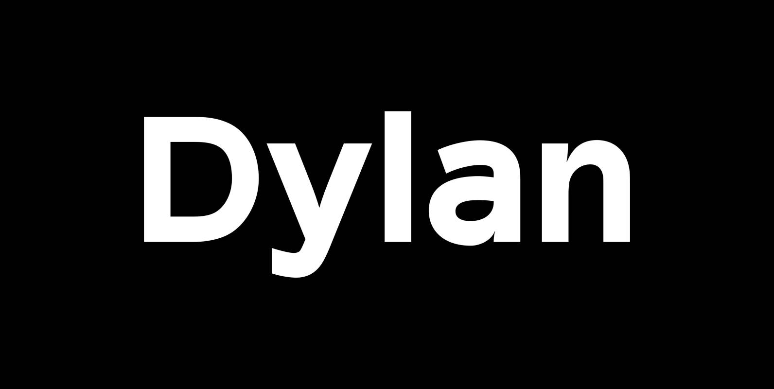
Dylan Font
“Dylan” is a Sans typeface in the best American tradition. In order to keep corners open and to make the font more readable in small sizes it has deep cuts where curves join straights. I designed 7 finely tuned weights
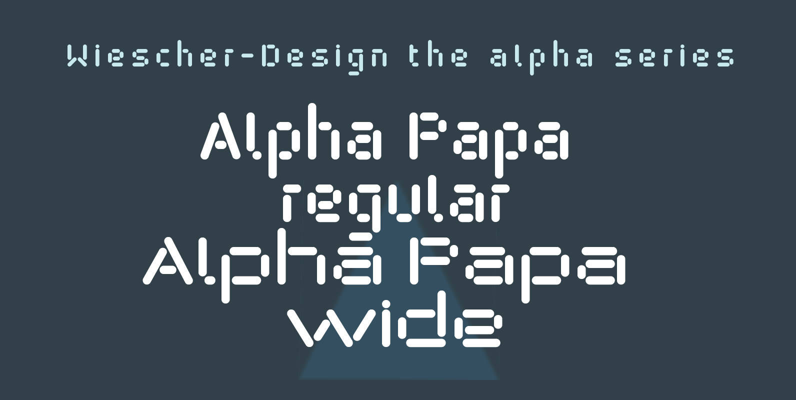
Alpha Papa Font
“Alpha Papa” is another font in my alpha-series, the experimental font series. It lents itself very good for all kind of modernistic occasions in all forms. You get 2 fonts (one alternative width set) for the price of one! Published
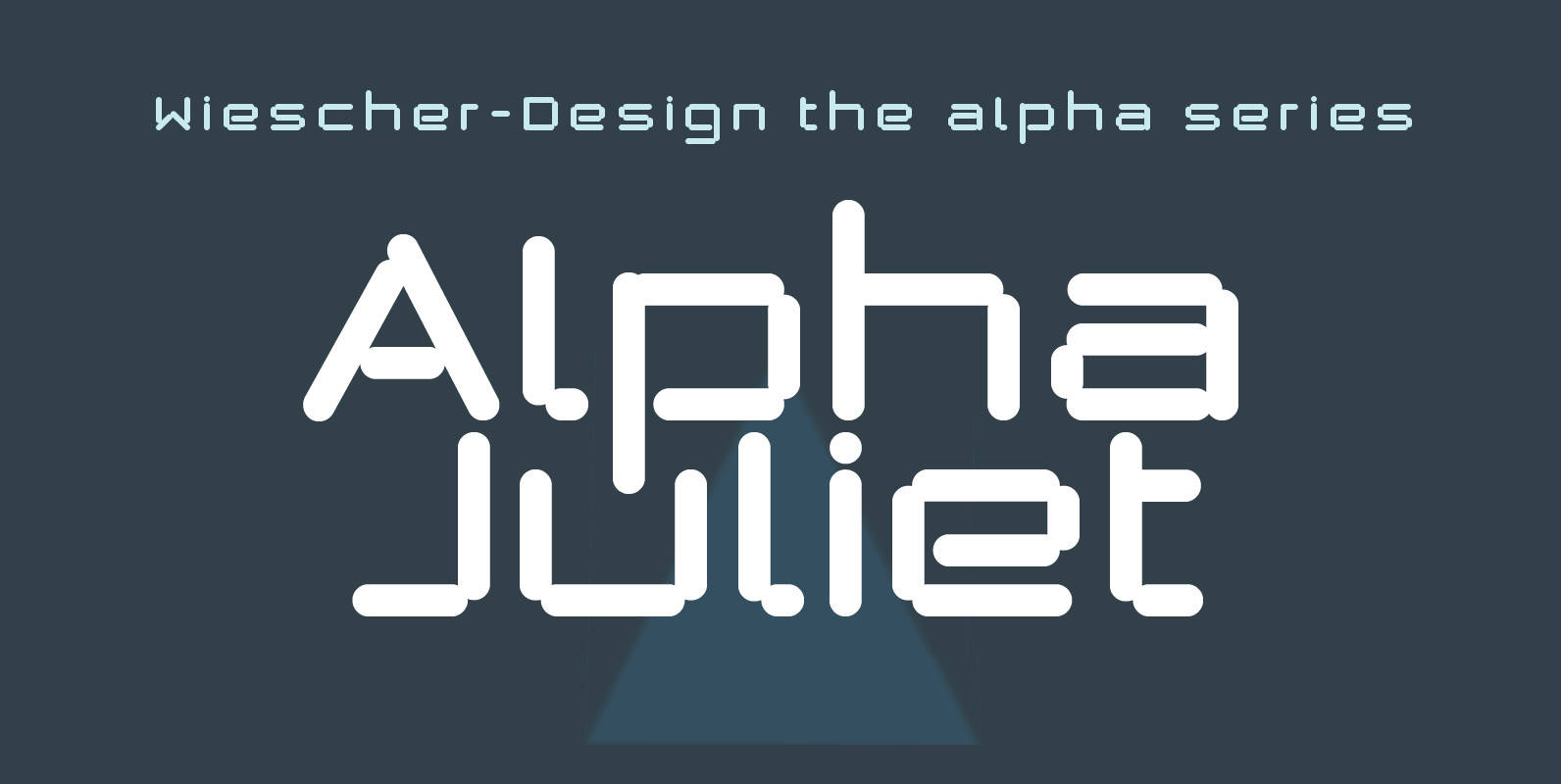
Alpha Juliet Font
“Alpha Juliet” is another font in my alpha-series, the experimental font series. It lends itself for modern designs in all forms. The font can be used together with “Alpha Papa” since it has the same origins. Published by Wiescher DesignDownload
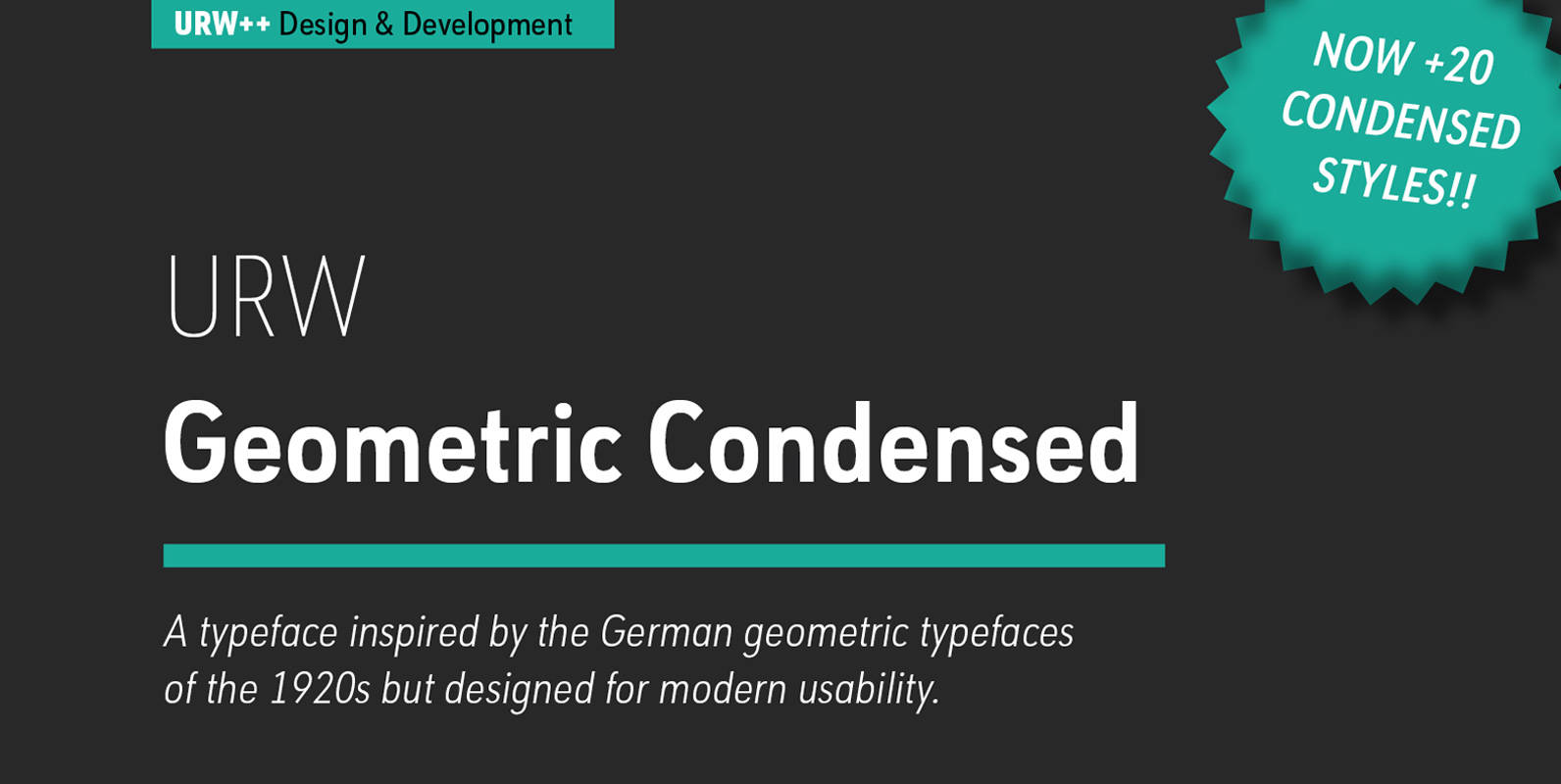
URW Geometric Condensed Font
URW Geometric Condensed is the matching complement for the URW Geometric. Including 20 additional condensed styles the URW Geometric Condensed is the space-saving alternative in the URW Geometric family. URW Geometric is a sans serif typeface inspired by the German
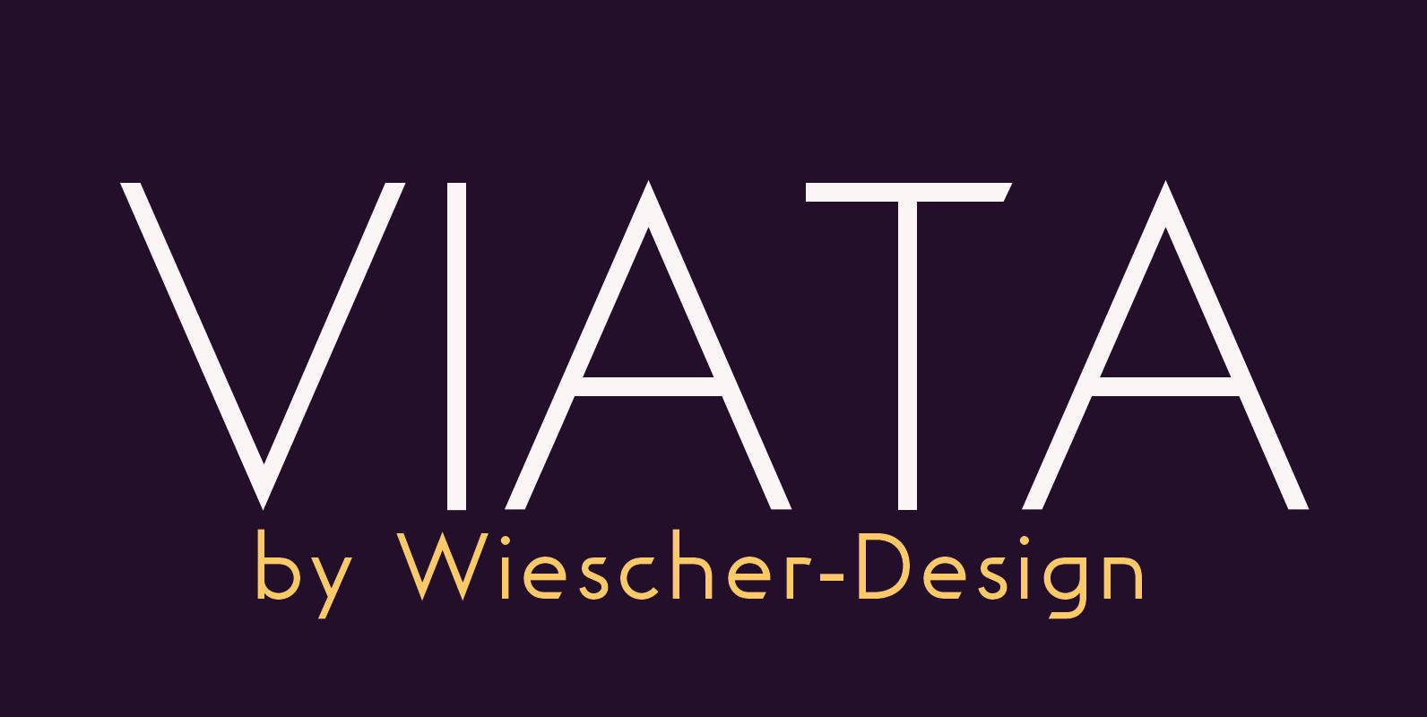
Viata Font
“VIATA” is my new experimental Sans again based on the modernistic, constructivist letterforms of the “Bauhaus” era. The names Herbert Bayer and Paul Renner come to mind as design beacons of that time. “VIATA” has flat tops and round bottoms,
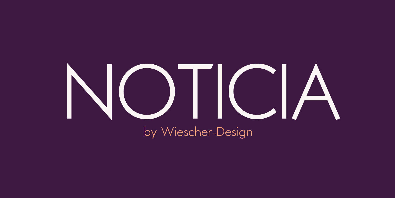
Noticia Font
“NOTICIA” is my new Sans based on the modernistic, constructivist letterforms of the “Bauhaus” era. The names Herbert Bayer and Paul Renner come to mind as design beacons of that time. “NOTICIA” is different in its proportions and long ascenders
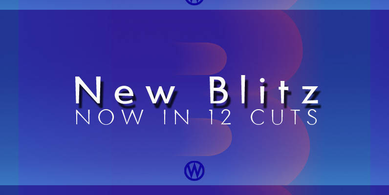
Blitz Font
A very glitzy Blitz! I always wanted to design a typeface that was top heavy, but I never new how not to make it look like Antique Olive, until recently I had an idea. My new family is very readable
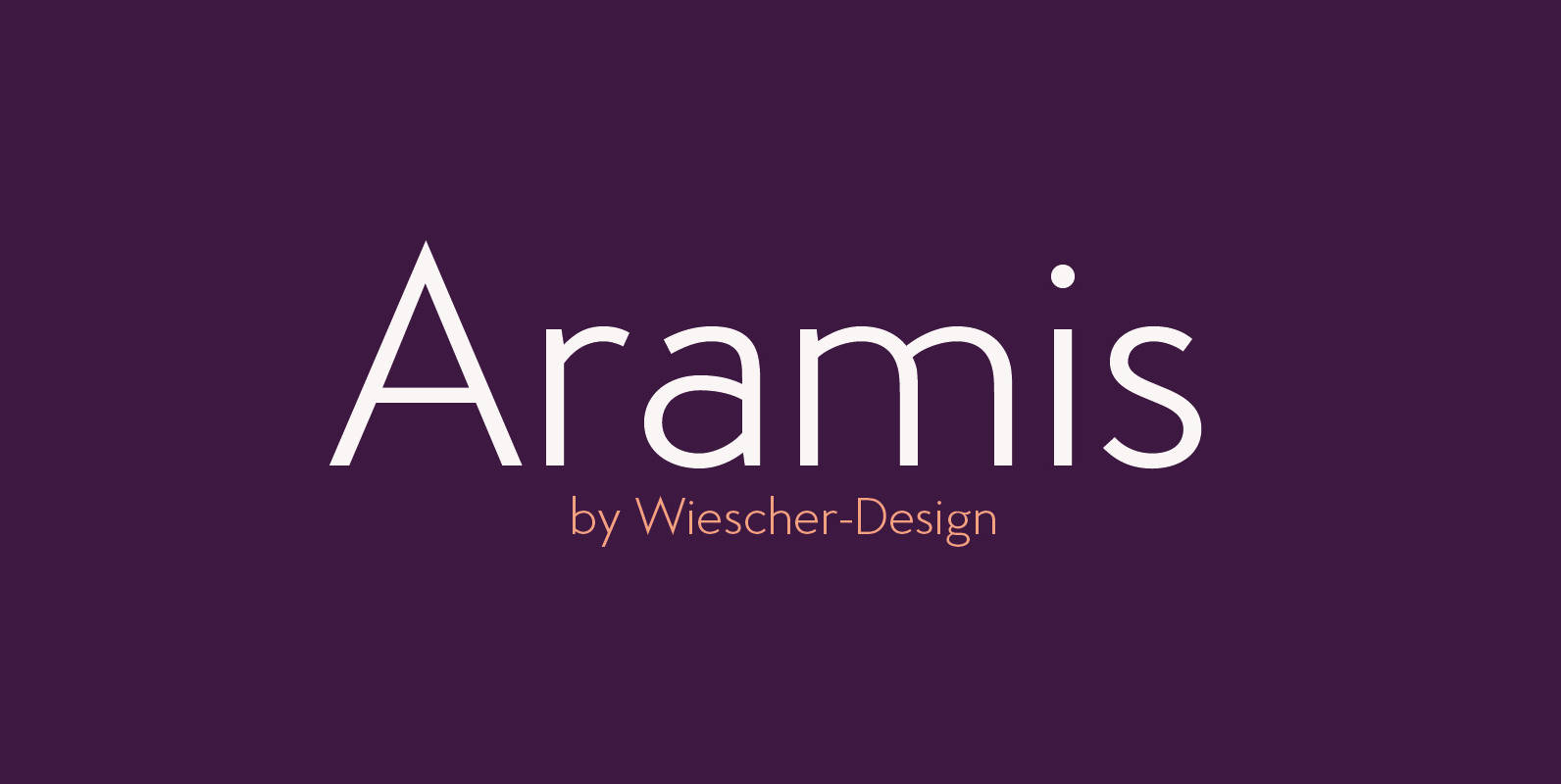
Aramis Font
“ARAMIS” is a new linear Sans with a French touch– designed by Gert Wiescher in 2014 and 2015 – has 7 weights with corresponding italic cuts. The small contrast in the linear Sans makes it not quite so linear and
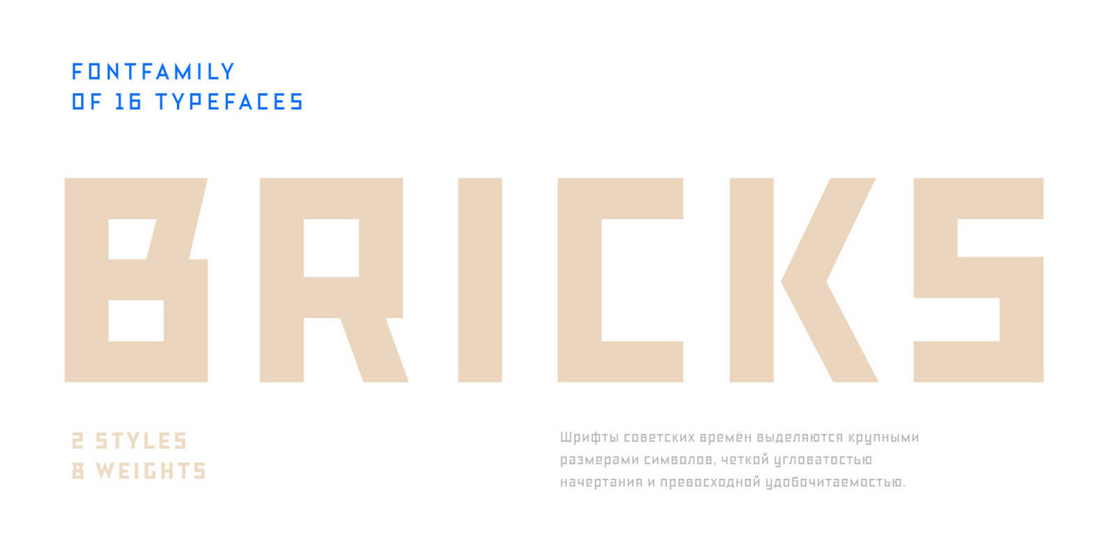
TT Bricks Font
Do you love the early Soviet visual culture as much as we do? We’ve tried going back a hundred years and rethinking the constructivist era. We’ve created an extensive fontfamily that consists of the simplest triangle and rectangle forms. TT
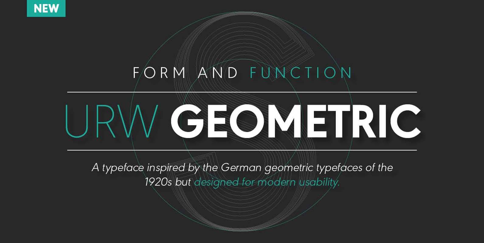
URW Geometric Font
URW Geometric is a sans serif typeface inspired by the German geometric typefaces of the 1920s but designed for modern usability. The character shapes have optimized proportions and an improved balance, the x-height is increased, ascenders and descenders are decreased.
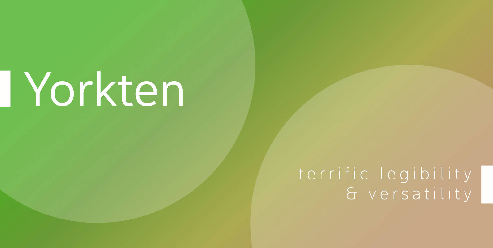
Yorkten Font
Clean and welcoming, the distinct look of Yorkten is remarkably satisfying to the eye. Straight to the point, Yorkton features a fashionable, geometric composition with angled main stems. There are no fewer than fifty-four fonts in the family, all of
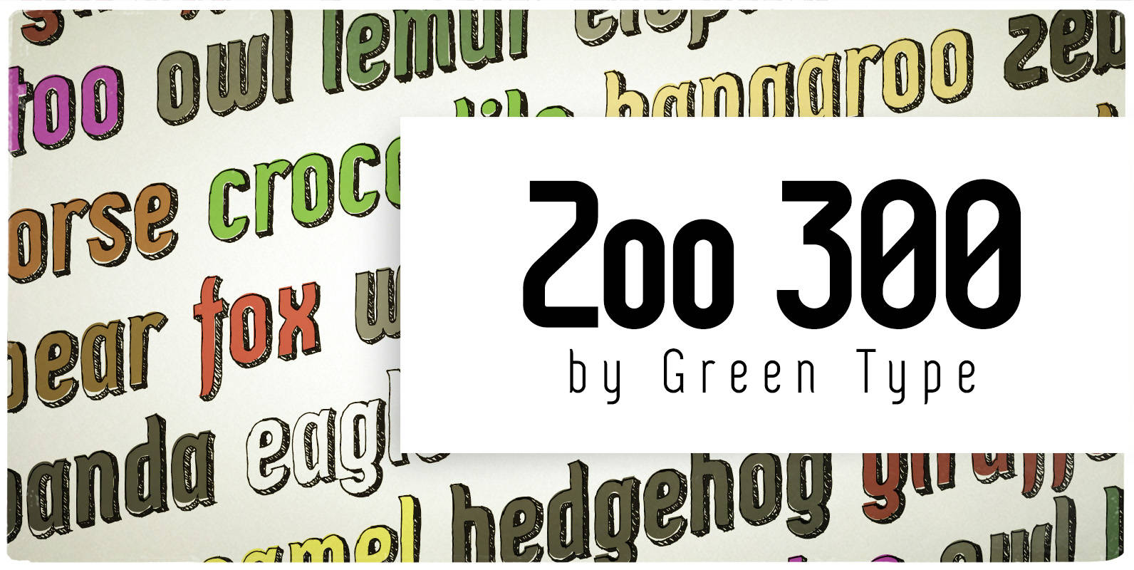
Zoo 300 Font
Zoo 300 is a narrow techno sans font family with handwritten shadow styles. Published by Green TypeDownload Zoo 300
Abrade Font
Abrade is a geometric sans serif with rational design choices for contemporary functionality. The family is designed with a medium x-height to provided great legibility in both display and text sizes. The forms are refined to work well in print