Tag: bauhaus
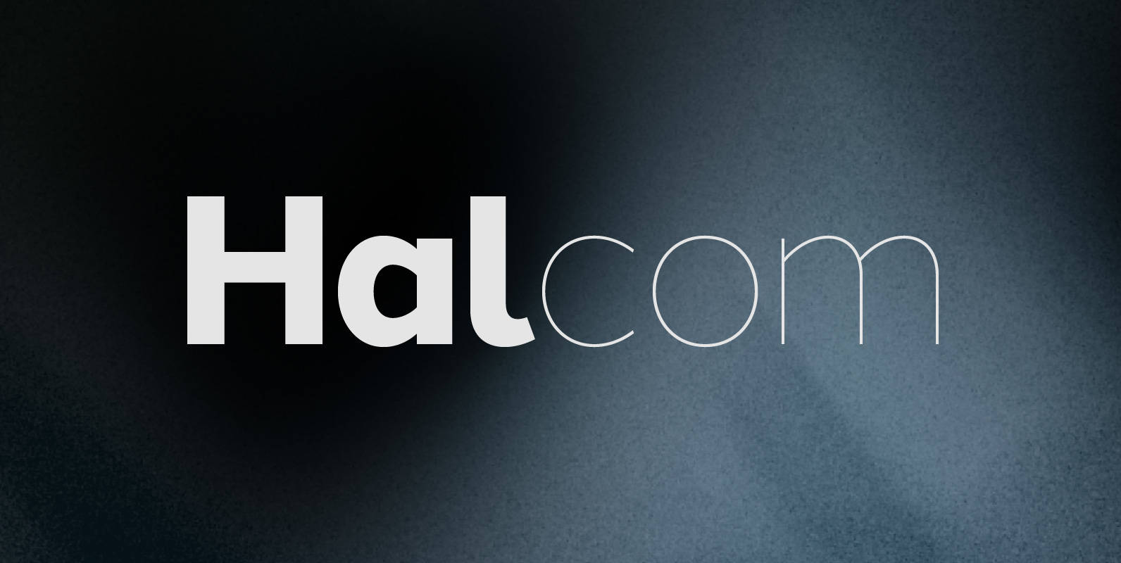
Halcom Font
A modern sans serif typeface inspired by the historic geometric’s of the 1920’s, specifically Futura. The design is not a simple pastiche of what went before this is much more than that. It is a close investigation to how Futura
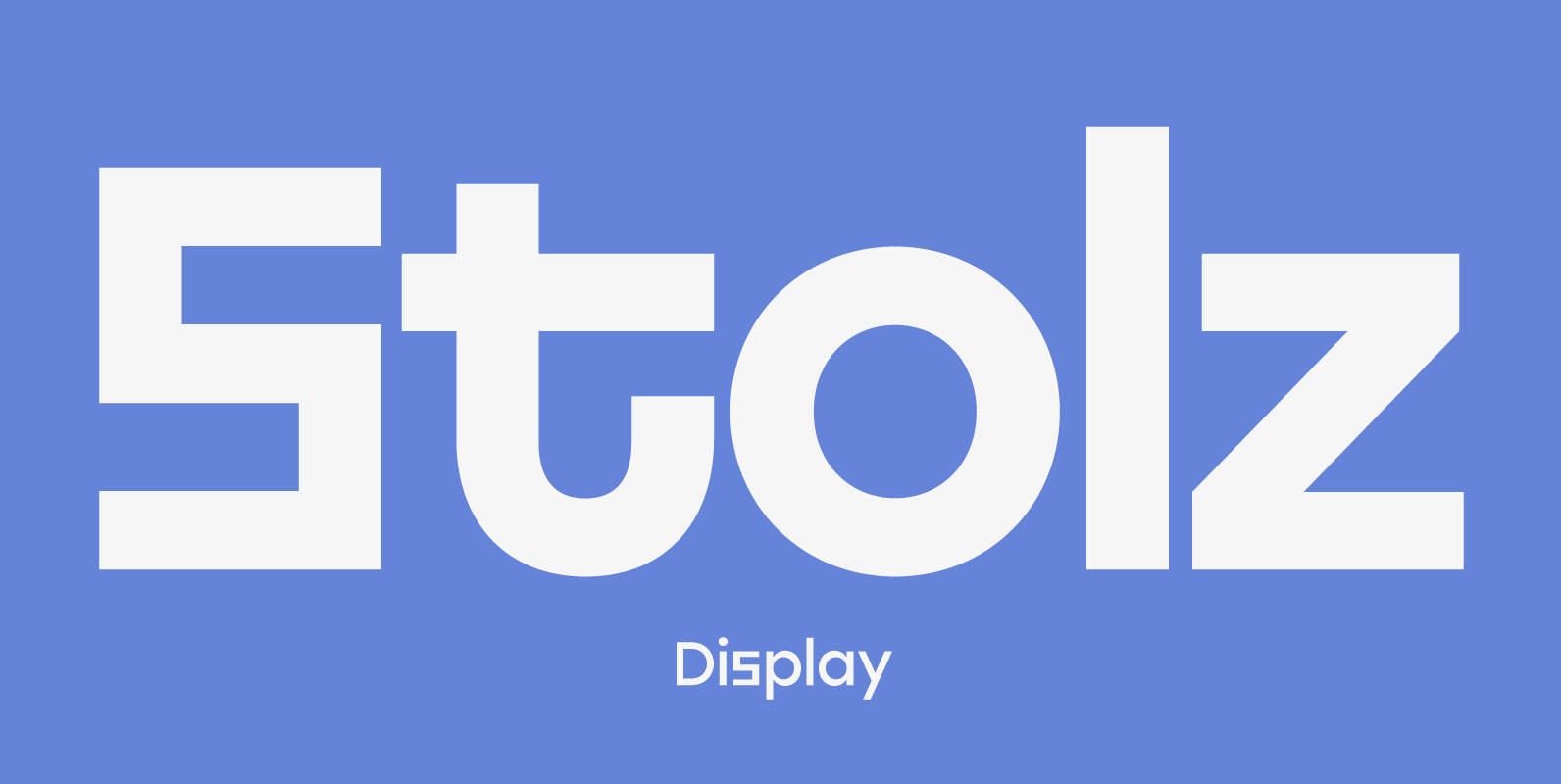
Stolzl Display Font
Stolzl Display is an original font family designed for headlines, titles and subtitles. Based on the combination of contrasting shapes, the harmony of form and rhythm is fundamental to the design. Inspired by Bauhaus, Stolzl represents, not just the significant
Les Tres Font
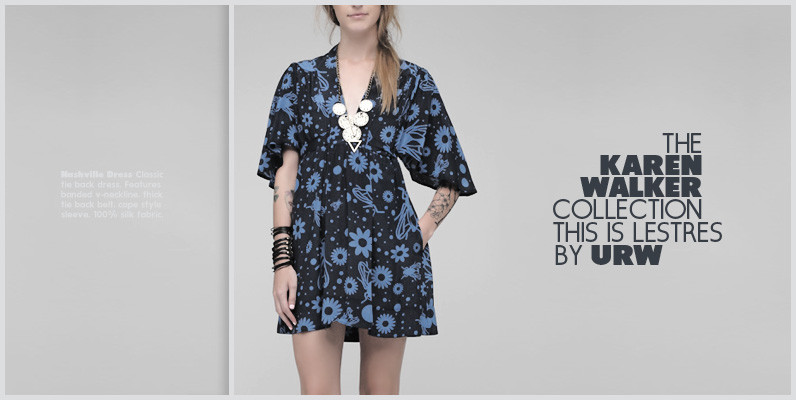
German designer Claudia Kipp has stated that she sees design as a “necessity to improve and enrich the visual world,” and her modern and clean sans typeface Les Tres certainly does its share. Working with great efficiency and great impact,

HAUS Sans Font
HAUS Sans is inspired by Bauhaus and historical grotesk typefaces of the 1930s. Available in 6 weights, from “Ultra Light” to “Extra Bold” regular and italic versions. The font includes 389 gliphs, with subscripts, superscripts, ligatures and support almost all

Newcastle Font
Newcastle gives you great opportunities for spicy typography. If you find some similarities to one of our fonts, ‘Blitzplakat’, you are right. We took it to the next level and made it even better: We extended the range of letters,
Retro Font
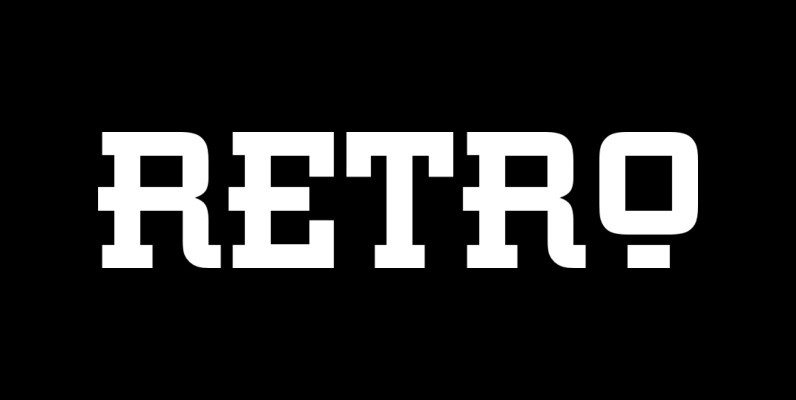
This all capital, slab serif typeface was inspired by elements of early 20th century Constructivist, Bauhaus, Art Deco and Streamline graphic movements. Retro Bold has a strong graphic appearance, a selection of alternative letters and is suitable for a wide
Cera CY Font
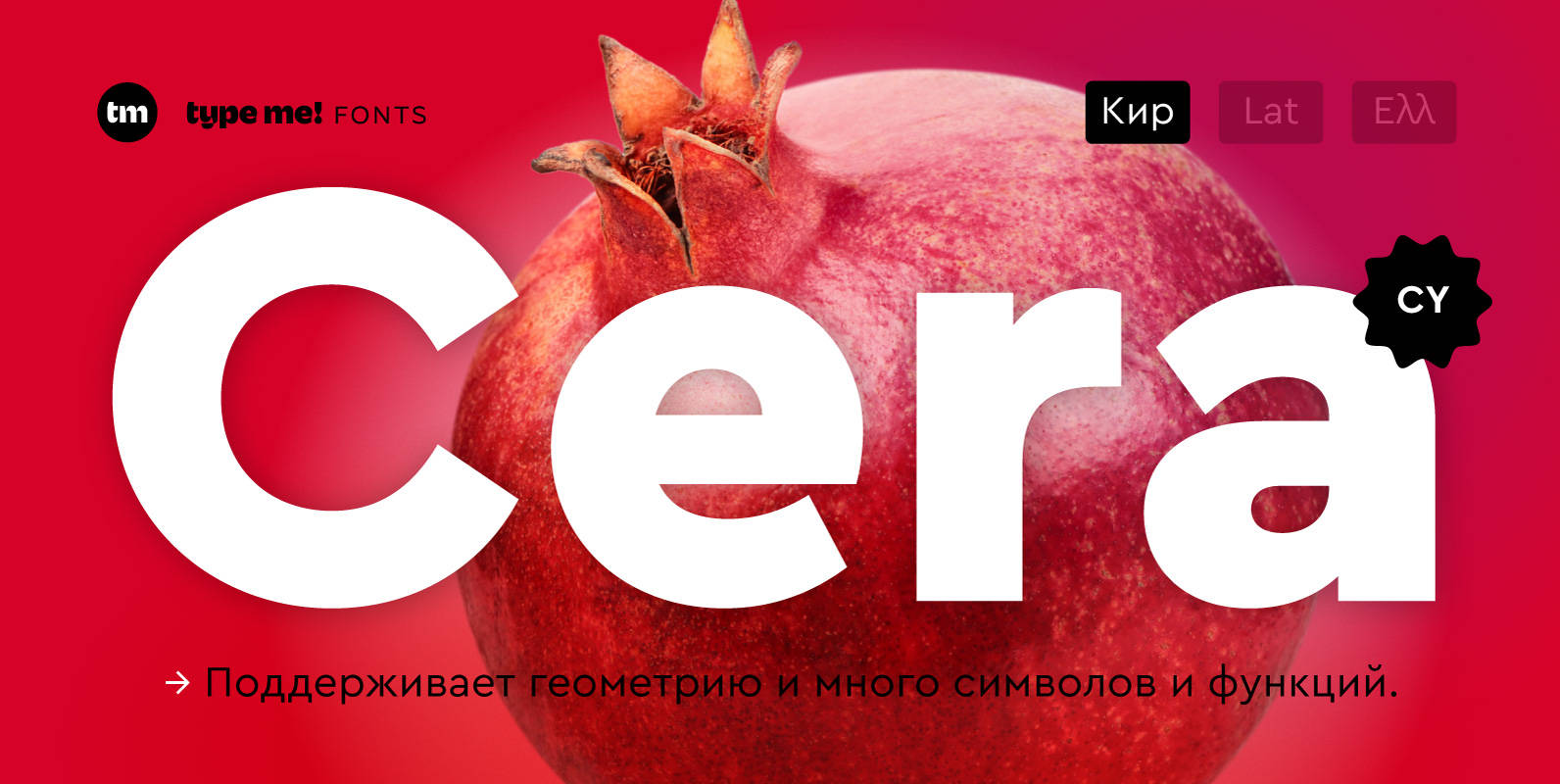
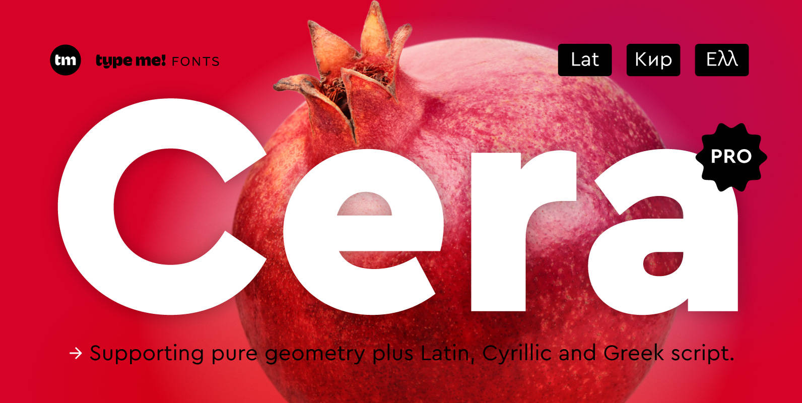
The sans-serif typeface – designed between 2013 and 2015 – is supporting pure geometry plus Cyrillic script and basic Latin letters. With over 490 glyphs per weight Cera CY cares about localized letter shapes plus ordinals and provides matching OpenType
Cera Stencil PRO Font
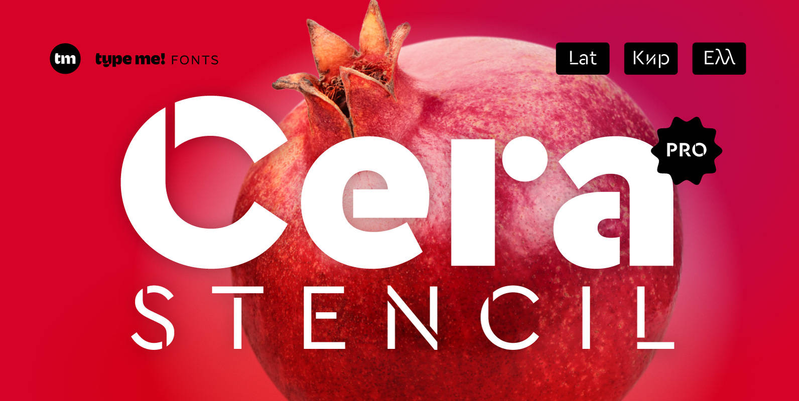
Cera Stencil Pro is part of the Cera Collection is driven by pure geometry and containing the bestselling Cera, its stenciled counterpart Cera Stencil and the hand-crafted display companion Cera Brush. Cera Stencil, with six weights, useful dingbats and arrows,
Cera PRO Font
Cera Pro is part of the Cera Collection driven by pure geometry and containing the bestselling Cera, its stenciled counterpart Cera Stencil and the hand-crafted display companion Cera Brush. With six weights, a clean italic – carefully slanted 10 degrees

Santino Font
Santino is a rounded monoline, post-bauhaus geometric font with smooth extremes and a touch of modern sensuality. It is named after Ariel Negro Di Lisio’s son. Published by SudtiposDownload Santino

Erbar Neo Mini Font
Erbar, designed by Jakob Erbar for Ludwig & Mayer in the early 1920s, is truly a key design from a historical viewpoint. None other than Paul Renner studied Erbar and used this knowledge in the desing of his famous Futura.
Futura Font
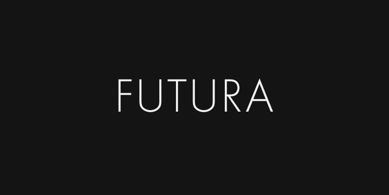
Futura. The very name brings to mind jet-age splendor of the highest order, and indeed the text on the commemorative plaque left behind on the Moon by the Apollo 11 astronauts in July, 1969 is set in Futura. There is
Ainslie Sans Font
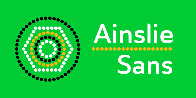
The original Ainslie was inspired by Mt. Ainslie and the city of Canberra’s inner suburb of the same name. Canberra is Australia’s capital–a planned city designed by American architect Walter Burley Griffin. Griffin’s style and geometric design for the city,
Simplo Soft Font
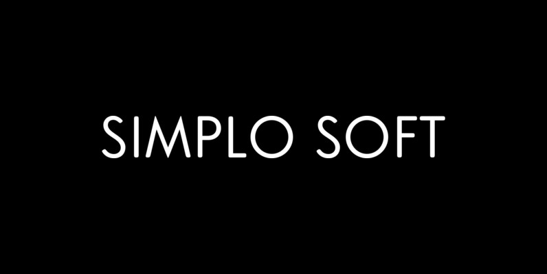
Simplo Soft is the soft companion of Simplo. In Simplo Soft, Simplo’s original sharp geometrics have been tempered by the moderate rounding of the edges of its characters — creating a softer and friendlier geometric typeface. Simplo Soft is ideal


