Tag: bauhaus
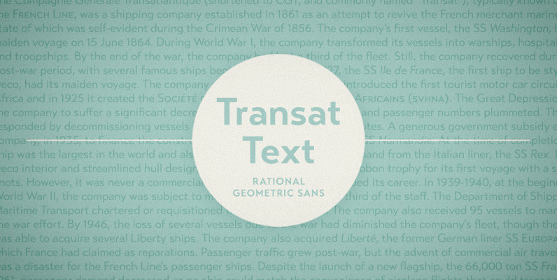
Transat Text Font
Transat Text is a geometric sans serif typeface, and is the more rational sibling to the unabashedly Art Deco “Transat”. Transat Text has a slightly taller x-height than its counterpart, making it easier to read at small sizes, but also
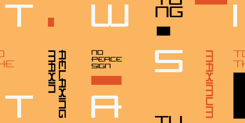
Flywheel Regular Font
Although Flywheel™ was designed in the early 90s, its design was popular in the 80s and remains popular today as an iconic look for futuristic themes: books, movies, arcade games and packaging. The design is rigid, geometric, straightforward and yes,
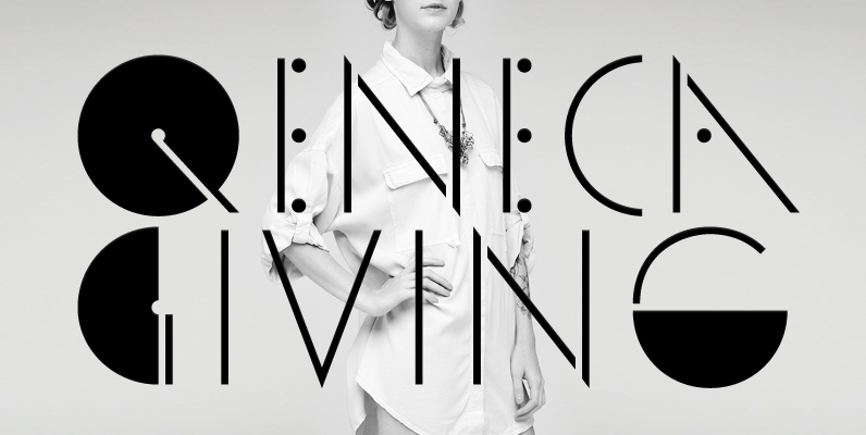
YWFT Valley Font
YWFT Valley is a thin, lean and fashionable sans-serif, display font which takes the notion of ball and stick form quite literally. The pattern of dots plays between letters adding to the rhythmic pacing when typeset. YWFT Valley pays homage
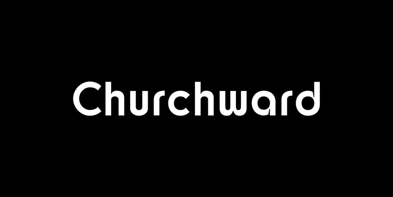
Churchward Design Font
Churchward Design Lines is the latest addition to the Churchward Design family. The family now consists of nine unique fonts, all based on a classic, straightforward geometric glyph forms, with the addition of Churchward’s quirky details. Published by BluHead StudioDownload
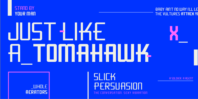
Flywheel Condensed Font
Although Flywheel™ was designed in the early 90s, its design was popular in the 80s and remains popular today as an iconic look for futuristic themes: books, movies, arcade games and packaging. The design is rigid, geometric, straightforward and yes,
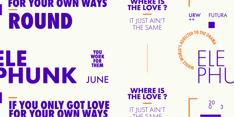
Futura Round Font
Futura. The very name brings to mind jet-age splendor of the highest order, and indeed the text on the commemorative plaque left behind on the Moon by the Apollo 11 astronauts in July, 1969 is set in Futura. There is

Aquarius Font
Designed by Steve Jackaman, Aquarius is based on the popular 1968 VGC typeface drawings. Published by Red RoosterDownload Aquarius
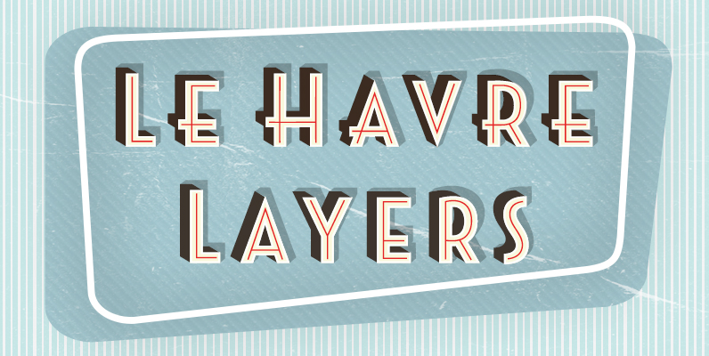
Le Havre Layers Font
Play around a bit with the potential of Le Havre Layers. Build effects which include realistic 3D appearances reminiscent of the storefronts of old and adding centerlines, dotted centerlines, and shadow variations. Inspired by the affable appearance of vintage signage
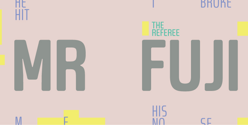
Dieselis Economic Font
Designed by Samy Halim, Dieselis Economic is a FAMILY of 6 monoline sans serif fonts: light, medium and bold weights with Italics. Contemporary, clean, trendy and condensed. Excellent for print or web. Published by FontHausDownload Dieselis Economic

Moderna Condensed Font
Moderna Condensed is a modern condensed Sans-serif font, simple and neutral, especially for short texts, headlines, and sub-headlines, logos, posters and branding, includes some alternate characters, arrows and labels. Published by Los Andes TypeDownload Moderna Condensed
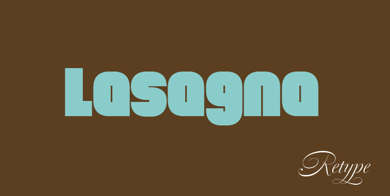
Lasagna Font
Lasagna’ began as an experimental font used by designer Yomar Augusto in CDs and posters. It is an ironically geometric typeface suitable for contemporary design work. The font was named after a dinner in Rotterdam with ReType’s staff where lasagna
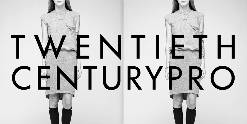
LTC Twentieth Century Pro Font
20th Century is a modern sans serif with apparent geometry yet it still has a certain warmth in its design. It is based on Paul Renner’s Futura and was redrawn by Sol Hess for Lanston Monotype. The new digital revival
