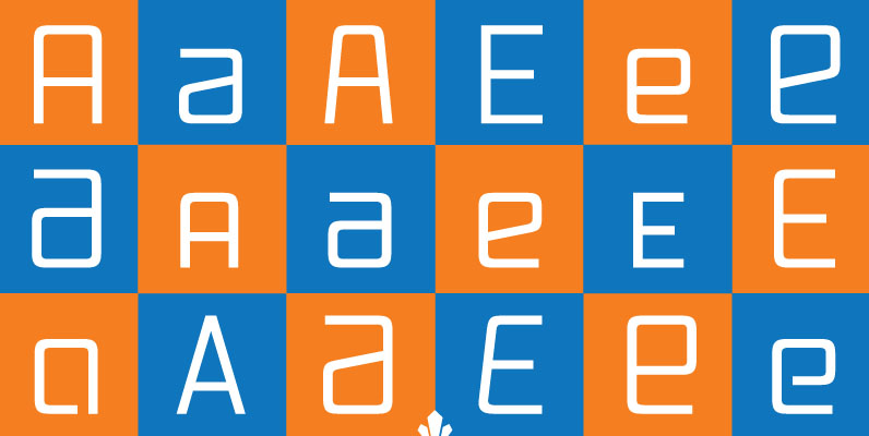
Tag: Biform
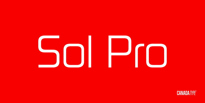
Sol Pro Font
Based on the classic Sol design by Marty Goldstein and C.B. Smith, published by VGC in 1973, Sol Pro goes above and beyond the call of revival/retooling to include plenty of optical improvements to the original design, more weights, italics,

Bango Pro Font
Bango Pro is a lively, heavyweight font with a strong cartoon feel, perfect for poster design, packaging, and anything that needs to draw attention – in an informal way. Initially released in 2011, Bango Pro is now in its third
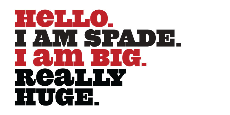
Spade Font
It's big. It's very big. Spade is a double whammy of pure slab footprint, sharp and soft, cowboy and cowgirl, country and western, shot and chaser, settlement and new frontier. It's also quite modern in many aspects, not the least
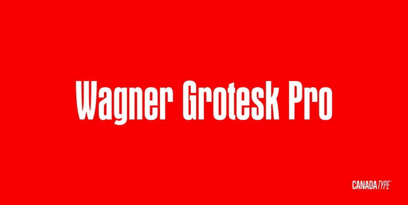
Wagner Grotesk Pro Font
This is the elaborate digital version of Edel Grotesque Bold Condensed (also known as Lessing, Reichgrotesk, and Wotan Bold Condensed) a 1914 typeface by Johannes Wagner, which was later adopted by pretty much every European type foundry, exported into the
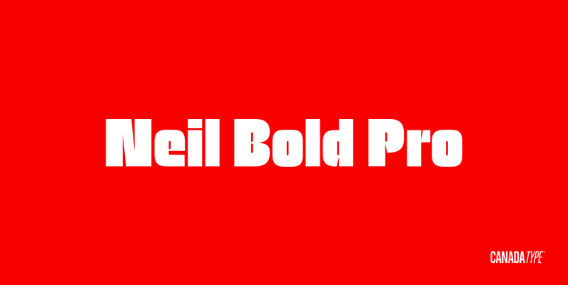
Neil Bold Pro Font
This is the one and only Neil Bold, designed by Wayne Stettler in 1966 and originally published as a Typositor typeface. An award-winner and instant celebrity upon its release, Neil Bold became synonymous with magnified modernism for a whole generation.

Wagner Round Font
This is the rounded, softer version of Canada Type's popular Wagner Grotesk. Originally done in 2011 for a global publisher, this font has already seen plenty of magazine and book cover action, perhaps even more than the sharp condensed face
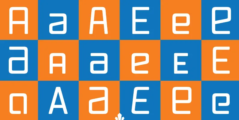
Vox Round Font
Vox Round is the softer version of the Vox family. The original brief for Vox was a extensive monoline typeface that can be both precise and friendly, yet contain enough choice of seamlessly interchangeable variants for the user to be
