Tag: black

Filson Soft Font
Filson Soft is the rounded version of the popular Filson Pro. At first sight, the main feature of Filson Soft are the distinctive letters ‘K’, ‘Q’ and especially ‘R’ that make the font family very elegant. With its rounded terminaisons,
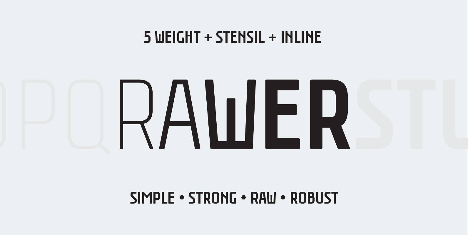
Rawer Font
Another borrring sans? No way! Rawer – simple, strong, raw, robust sans with stencil and inline weights. And again it’s inspired by soviet typography. Published by GaslightDownload Rawer
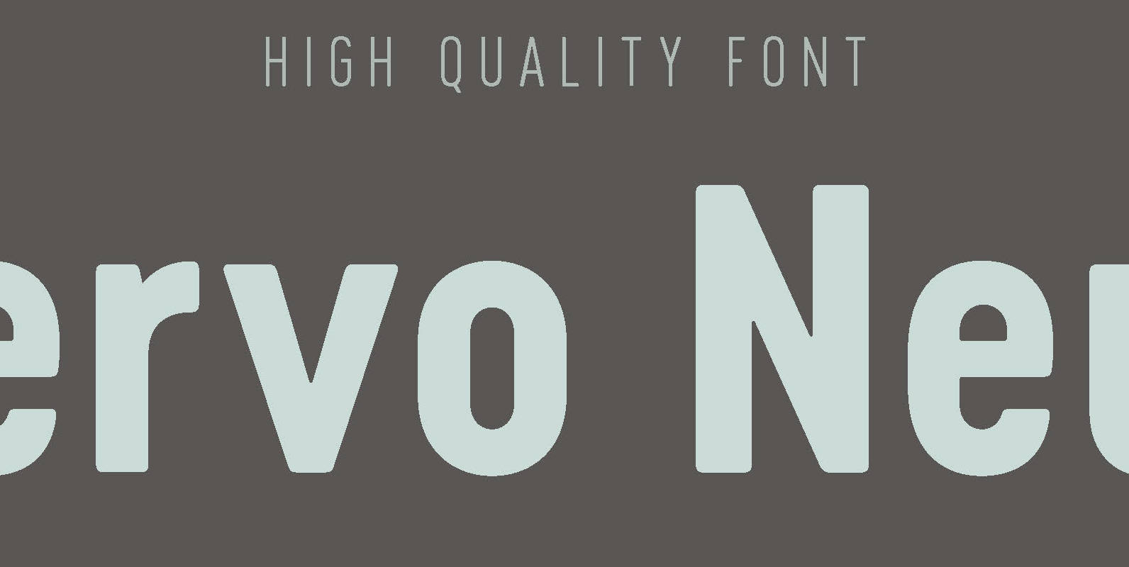
Cervo Neue Font
Font Cervo Neue is the new perfected and extended version of Cervo containing 18 varieties. It differs from its previous version with the higher accents over glyphs, enlarged punctuation, nautical numerals and newly added varieties Semi Bold, Bold, Extra Bold

Mongoose Font
Mongoose is a condensed sans serif, made for posters, headlines and logotypes. Caps and x-height were made to match the ultra wide Briller, so it could be fun to combine these two highly contrasting type families. Thanks to the OpenType
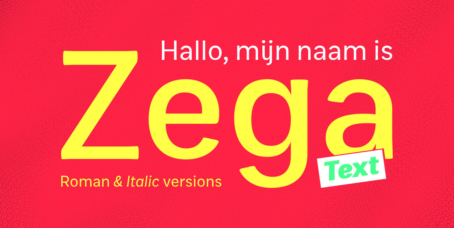
Zega Text Font
Zega Text is a top-heavy sans family, inspired in the imprecisions of letterpress printing. Zega has 14 versions that give to your text (printed or on screen) a delicious sense of old printing. Give an exclusive touch to your text
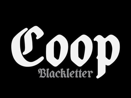
Coop Blackletter Font
Coop Blackletter’s core concept was to create a more friendly blackletter typeface by pulling together two very different sources of inspiration. The design is a synthesis of the rounded, affable features and heavier weight of Cooper Black with the underlying
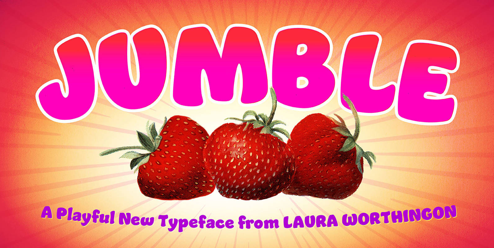
Jumble Font
A font this friendly, welcoming, and easy-to-read is a treat for the eyes. Jumble draws you in with its thick, curvy strokes, jaunty counters, and a whimsical variety of counterforms – no two are alike, even within a single m
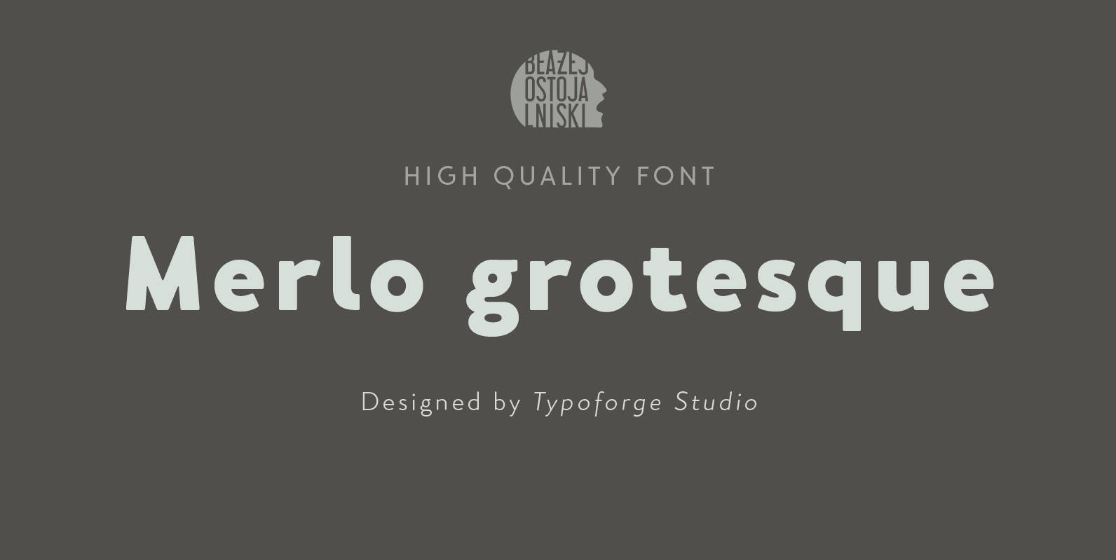
Merlo Grotesque Font
Font Merlo Grotesque is the younger brother of Merlo Regular & Merlo Round is characterized by eighteen different varieties – lower and uppercase characters. It is inspired by a You And Me Monthly published by National Magazines Publisher RSW “Prasa”
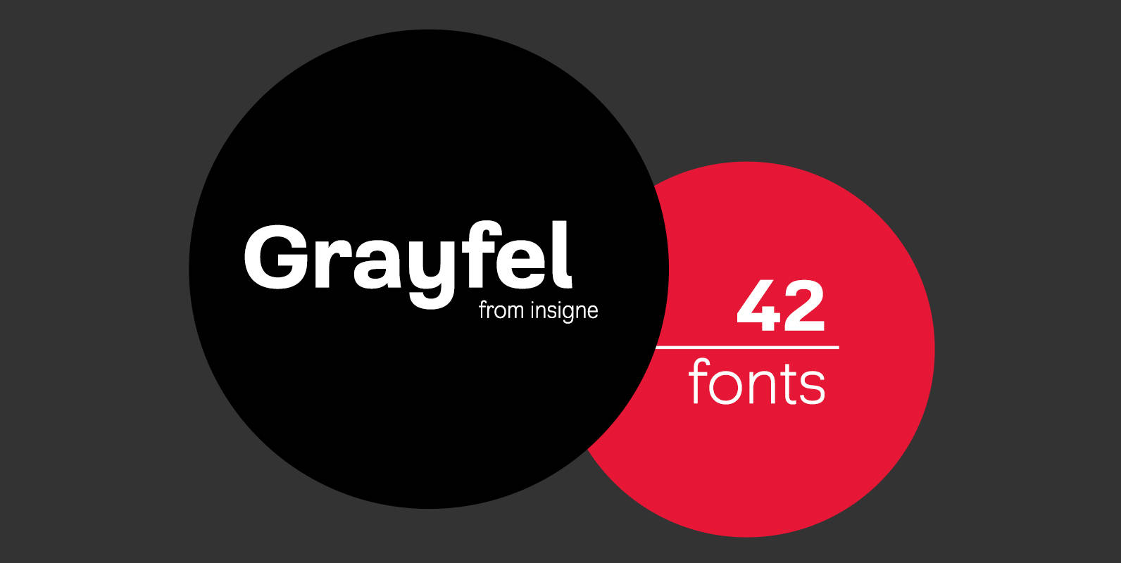
Grayfel Font
As designers, we seek perfection and originality. The more we step back and look at our work, the more changes we tend to find necessary. Drastic modifications are inevitable. The same is true of Grayfel. Grayfel began as an exercise
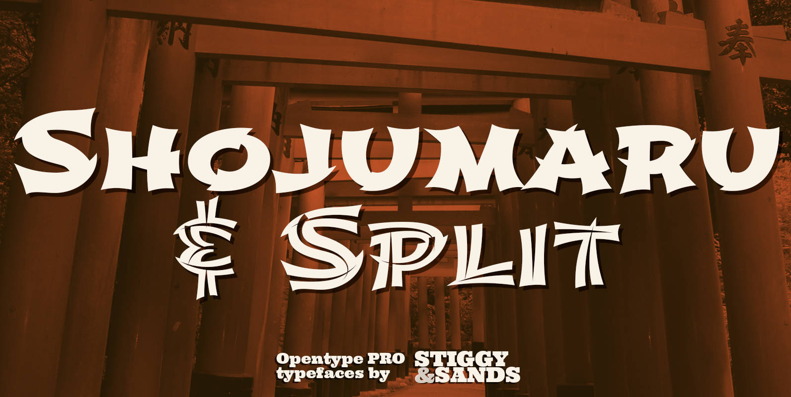
Shojumaru Pro Font
A Japanese chop-style typestyle. Shojumaru draws inspiration from a movie poster for a 1957 film titled Sayonara, starring Marlon Brando. It breaks the formula of a chop suey style by mixing chop suey and traditional letterforms to create a powerful

Ultra Pro Font
Our Ultra Pro is an ultra bold slab typeface with nods to wood type styles like Clarendon and Egyptian. Its powerful and dramatic letterforms are both serious in form but friendly in appearance yet it is still easily legible. Perfect

Conto Slab Font
Conto Slab — a further family member of the sans serif Conto — is an individual and significant slab serif typeface in eight weights. It is mainly designed for corporate identity along with the editorial design and advertising. An almost
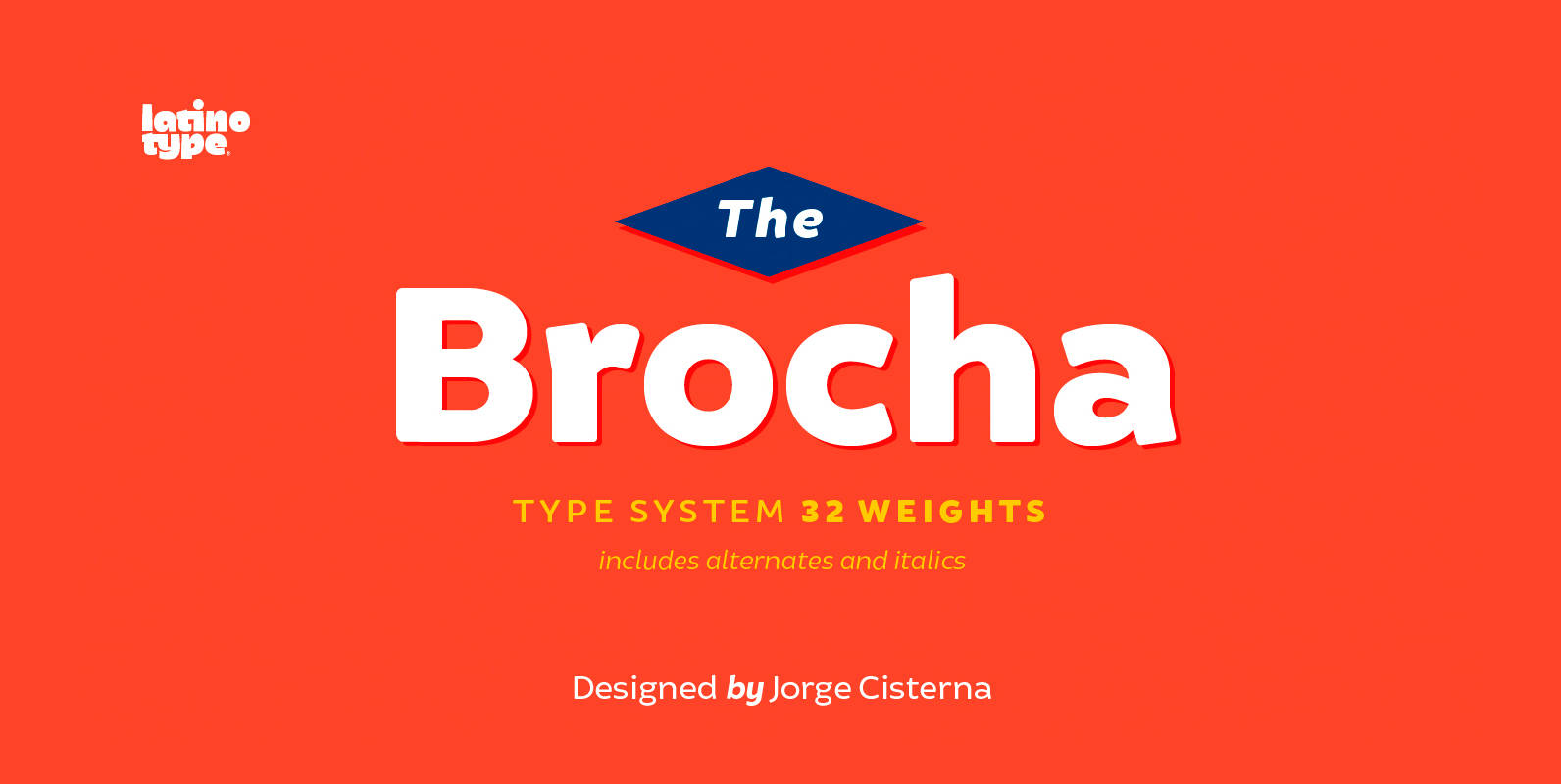
Brocha Font
I made the first sketches for Brocha when I first visited Easter Island in 2011. I took inspiration from pre-Columbian art for such sketches, but I must say that they were kind of rough and clumsy; it was an experimental,
