Tag: body
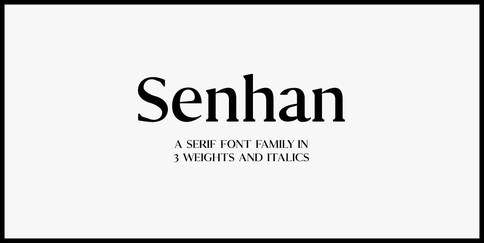
Senhan Font
Like wearing a pair of slip-on Vans® with a suit, the Senhan font family makes a statement with confidence. Defined by sexy, sharp, angular contours when used in headline and display scenarios, this family of 3 weights and italics is
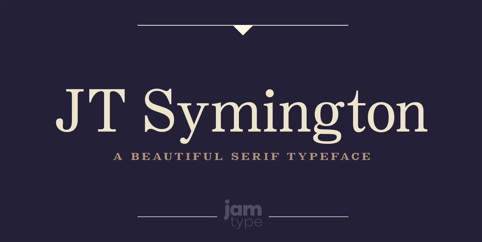
JT Symington Font
JT Symington was inspired by the classic serif typefaces of the 20th century. Its well defined serifs make it well suited to headlines as well as large chunks of body copy. Published by JAM Type DesignDownload JT Symington
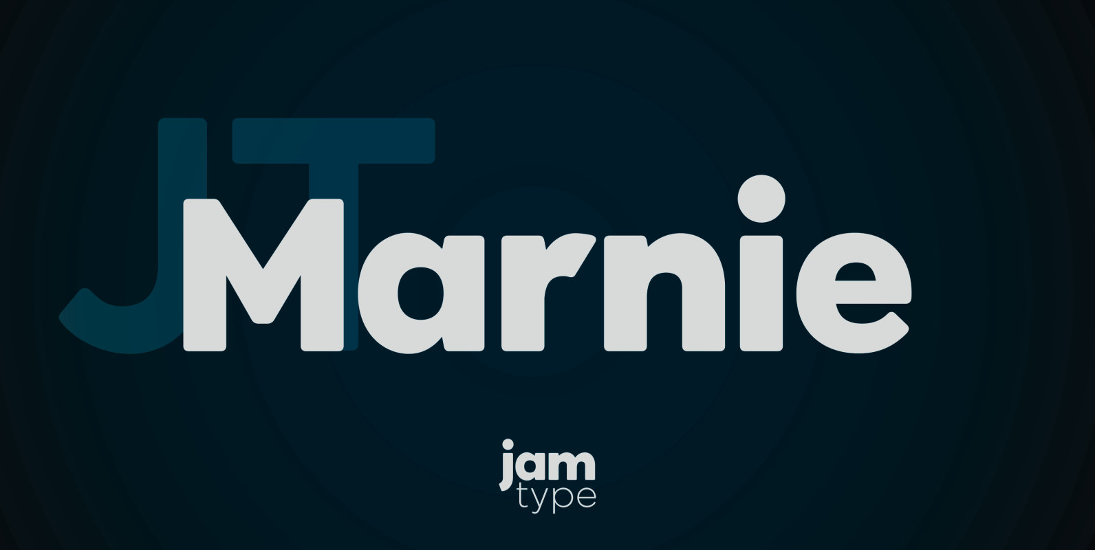
JT Marnie Font
The design is influenced by the geometric style sans serif faces which were popular during the 1920s and 30s. The JT Marnie font family is well suited for headlines and small blocks of text, particularly in advertising and packaging. Published
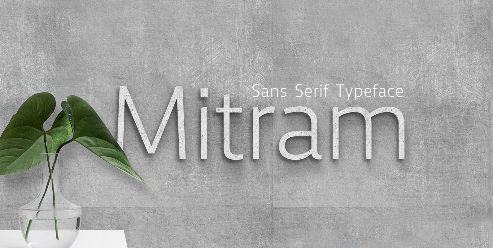
Mitram Font
The Mitram family has 7 weights, ranging from Thin to ExtraBold (including italics) and is ideally suited for advertising and packaging, book text, logo, branding and creative industries, small text, wayfinding and signage as well as web and screen design.

Oakes Grotesk Font
Oakes Grotesk is a more corporate take on the Oakes typeface. It explores a set of brand new metrics that allow it to be more legible in body text as well as headings. The letter ‘g’ has been tweaked to
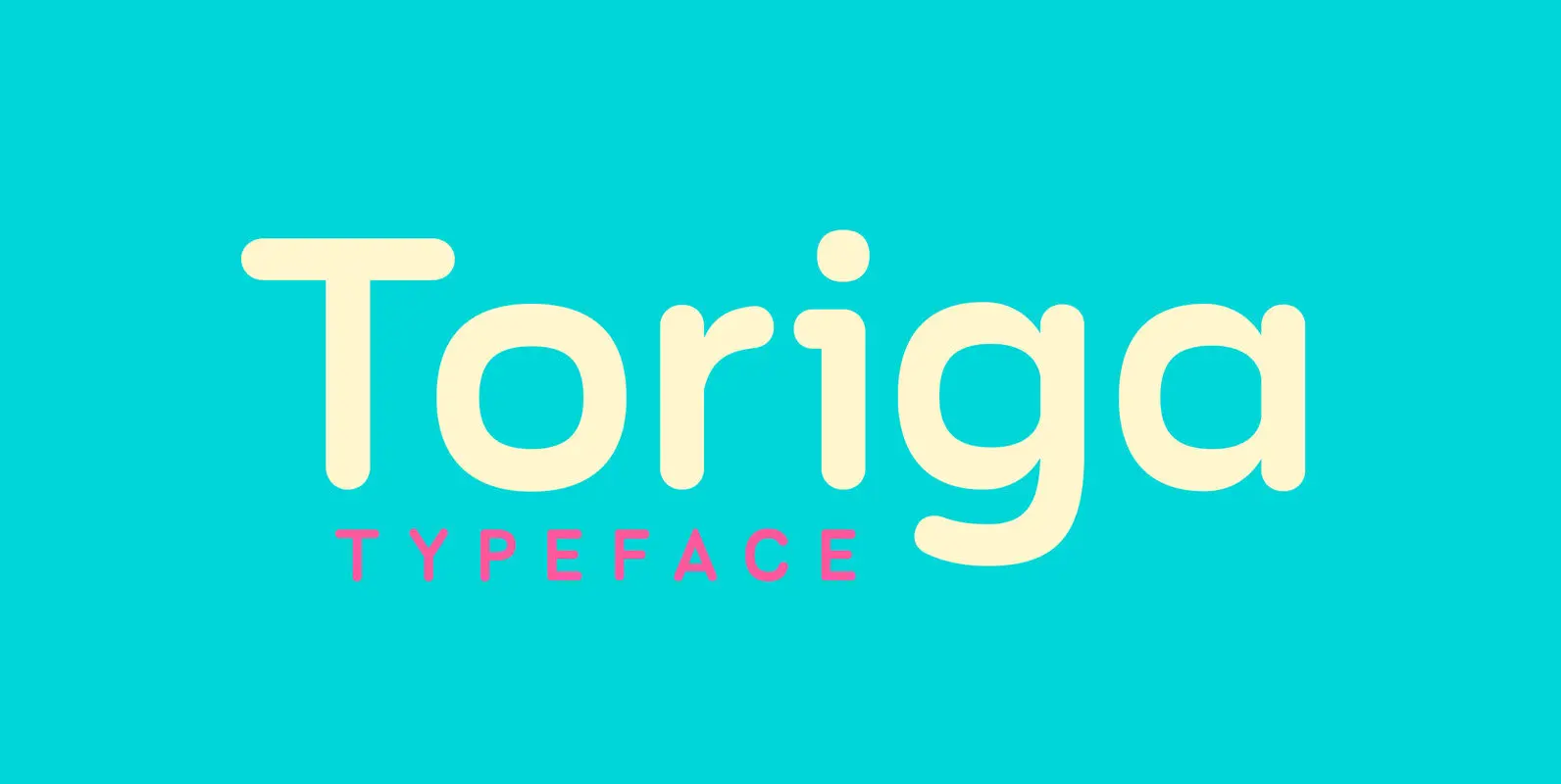
Toriga Font
The Toriga typeface was named after the Portuguese grape variant known as Touriga Nacional. This fun typeface boasts the features of a well-balanced, versatile, modern sans which is highly legible as a text font and with a clean, elegant look
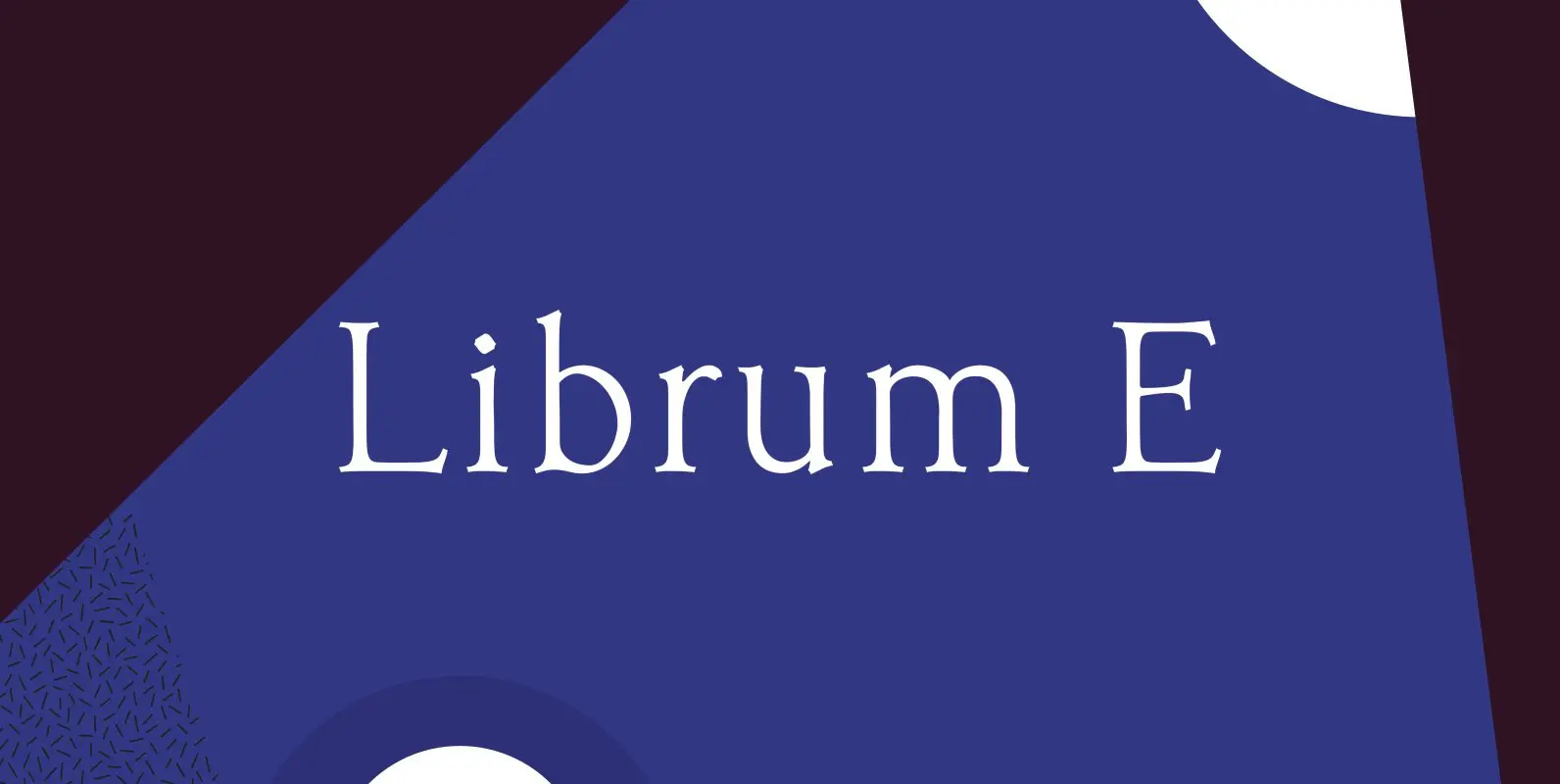
Librum E Font
The major focus of my life and ministry at this point is book design. In the brave new world of 21st century self-publishing a new paradigm has arisen: the indie small shop. One of the problems is that all books
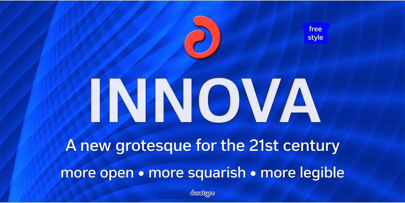
Innova Font
Innova. A new grotesque for the 21st century. More open. More squarish. More legible. After the many grotesques which have been designed over the years, is it still possible to improve this genre? Innova is a new design—a contribution to
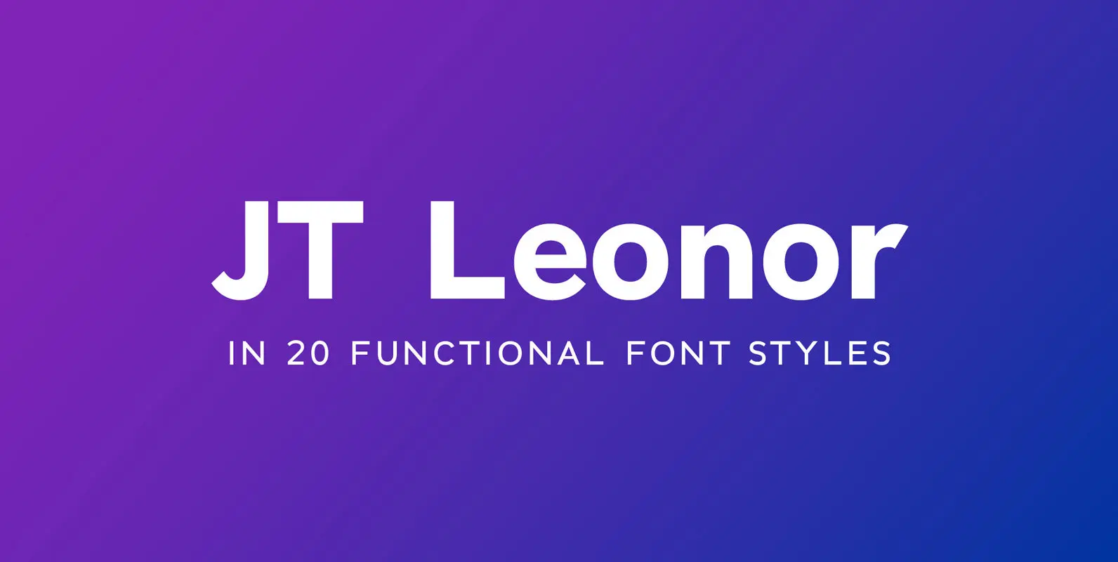
JT Leonor Font
JT Leonor is inspired by the world renowned Gotham typeface but with a more square feel in its light weights and a rounder bold range, this typeface is perfectly suited to both large chunks of body copy as well as
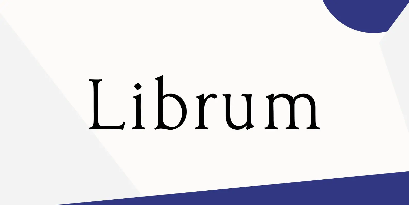
Librum Font
This is the serif text family for the book design group of font families which David designed in the process of writing “Practical Font Design With FontLab 5”. The letterspacing is set wide for body copy use. The main purpose
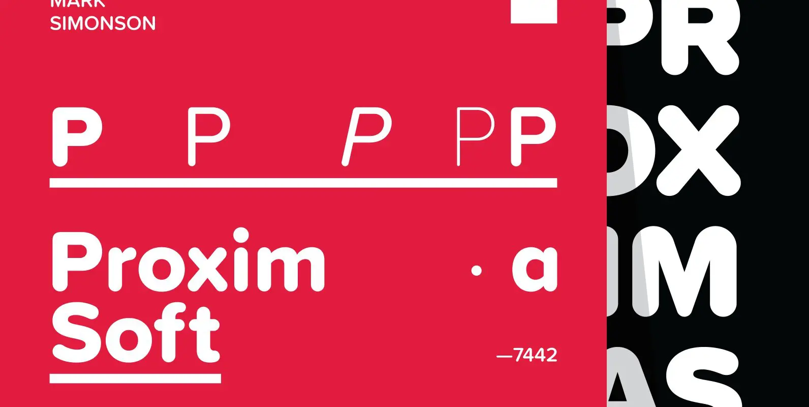
Proxima Soft Font
Proxima Soft (2017) is a rounded version of Proxima Nova. With the same forty-eight styles (eight weights in three widths, plus italics), Proxima Soft fits the bill when you want something a bit warmer and more playful than its older
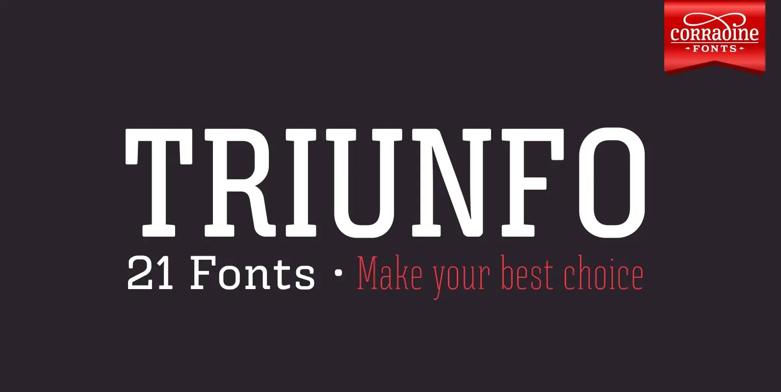
Triunfo Font
Triunfo is a modern slab serif font family with sports flavor. It comes in 21 variants of weight and wide that allows you to choose the best option to use in your work. Published by Corradine FontsDownload Triunfo
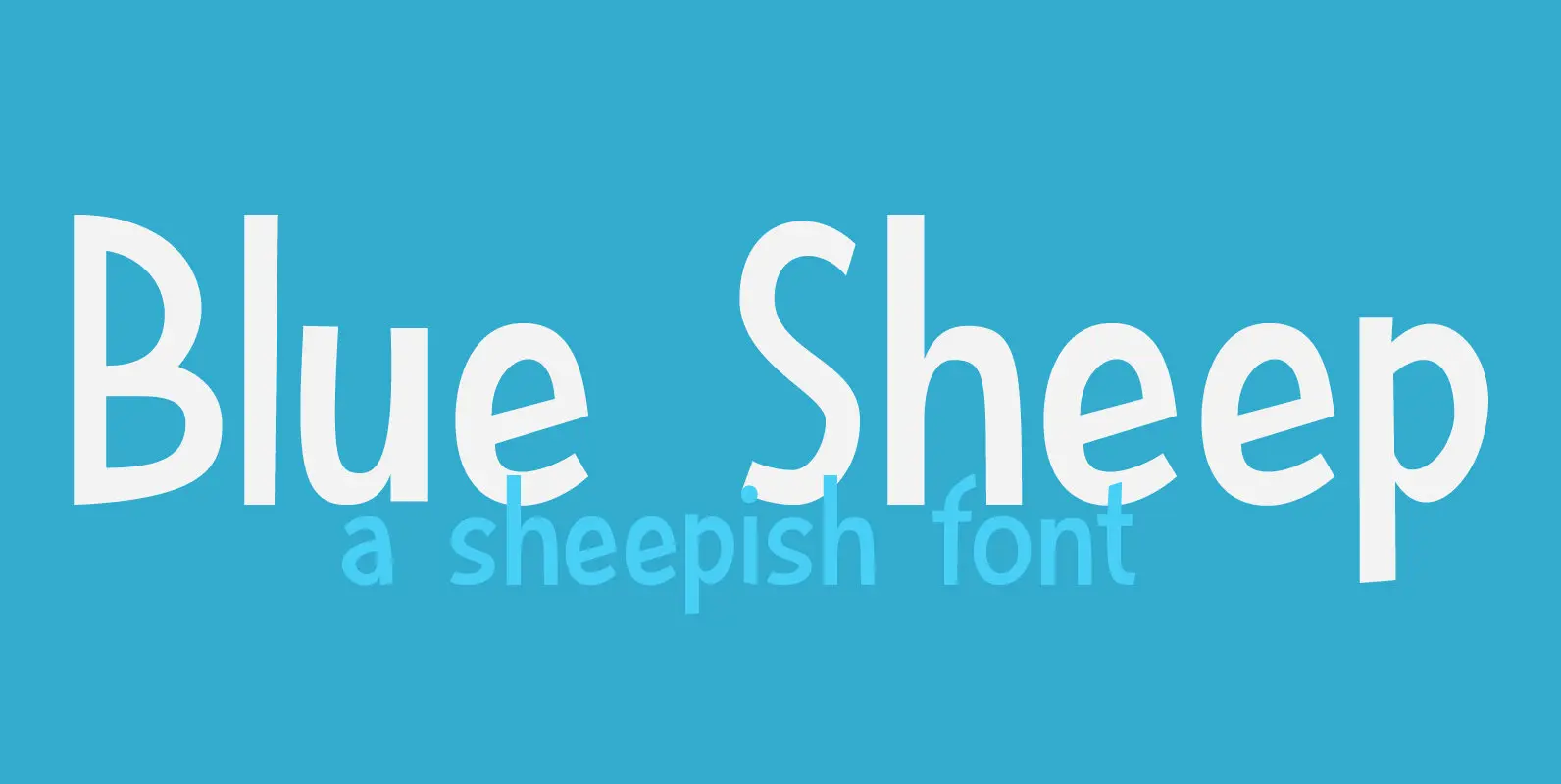
Blue Sheep Font
It’s been a while since I named a font after a sheep, so I figured it was about time. The Blue Sheep, or Naur (Pseudois nayaur), is actually an existing species of sheep. It is found in the Himalayas and
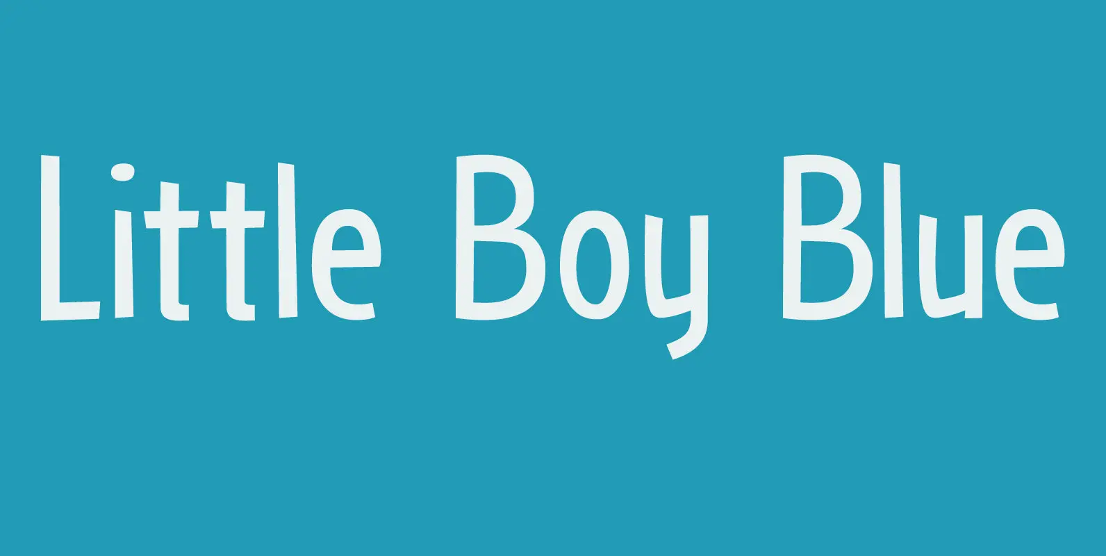
Little Boy Blue Font
I believe it was Picasso who had a Blue Period between 1901 and 1904. It seems that I have one myself – really not comparing myself to Picasso btw… Recently I created Blue Sheep font and now this one: Little
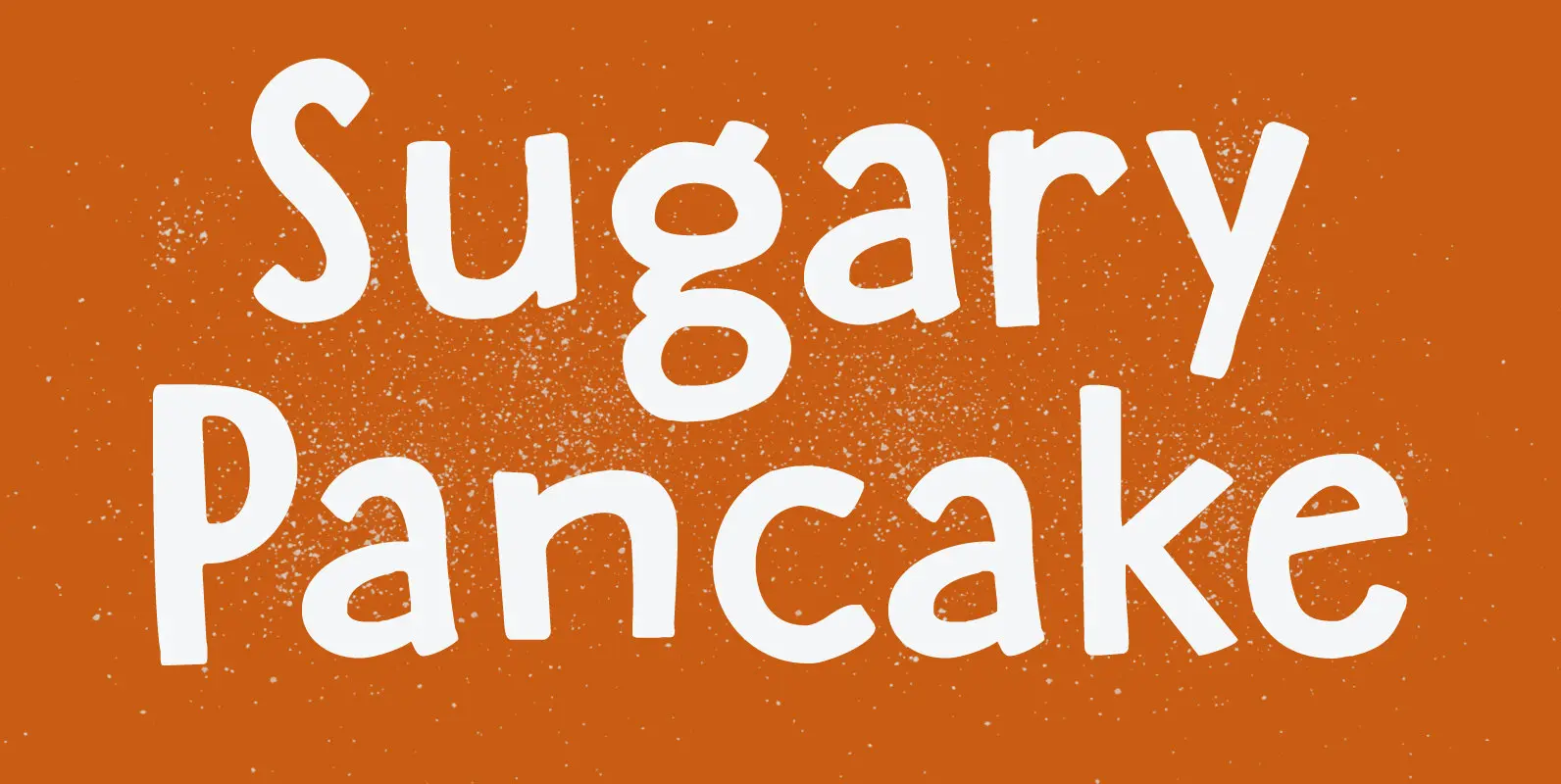
Sugary Pancake Font
enough as it is. This calorie-rich font is ideal for Children’s Books and posters: it is fun, bouncy, very legible and full of character. Comes with a topping of diacritics and a stack of happiness. Published by HanodedDownload Sugary Pancake
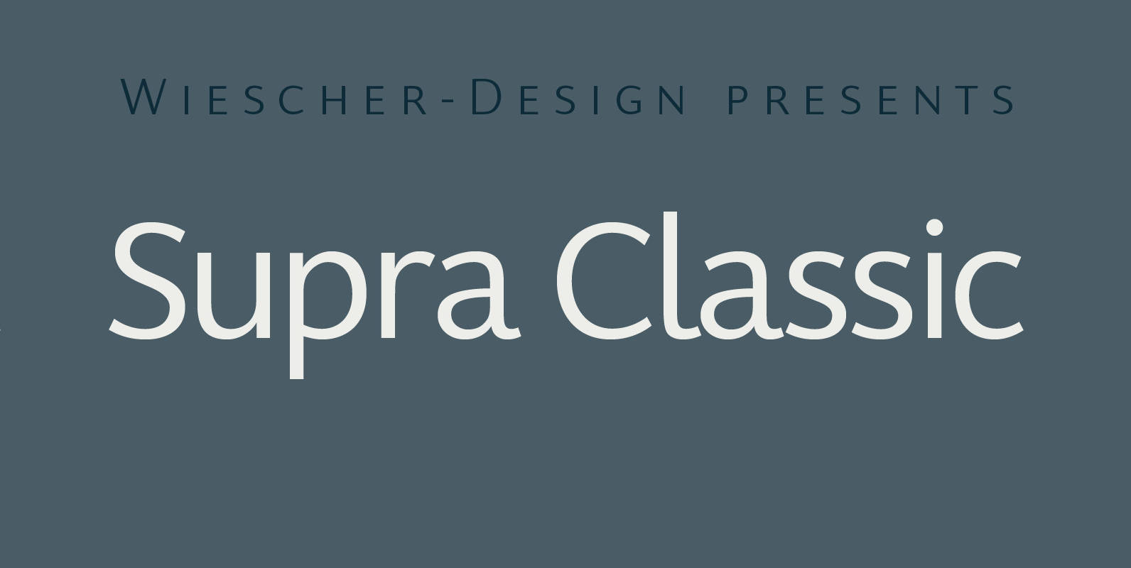
Supra Classic Font
“Supra Classic” designed by Gert Wiescher in 2014 – has 10 weights with corresponding italic cuts. The designs elegant contrast in the up- and downstrokes makes for better legibility and a pleasing personality. The dominant x-height with its high ascenders
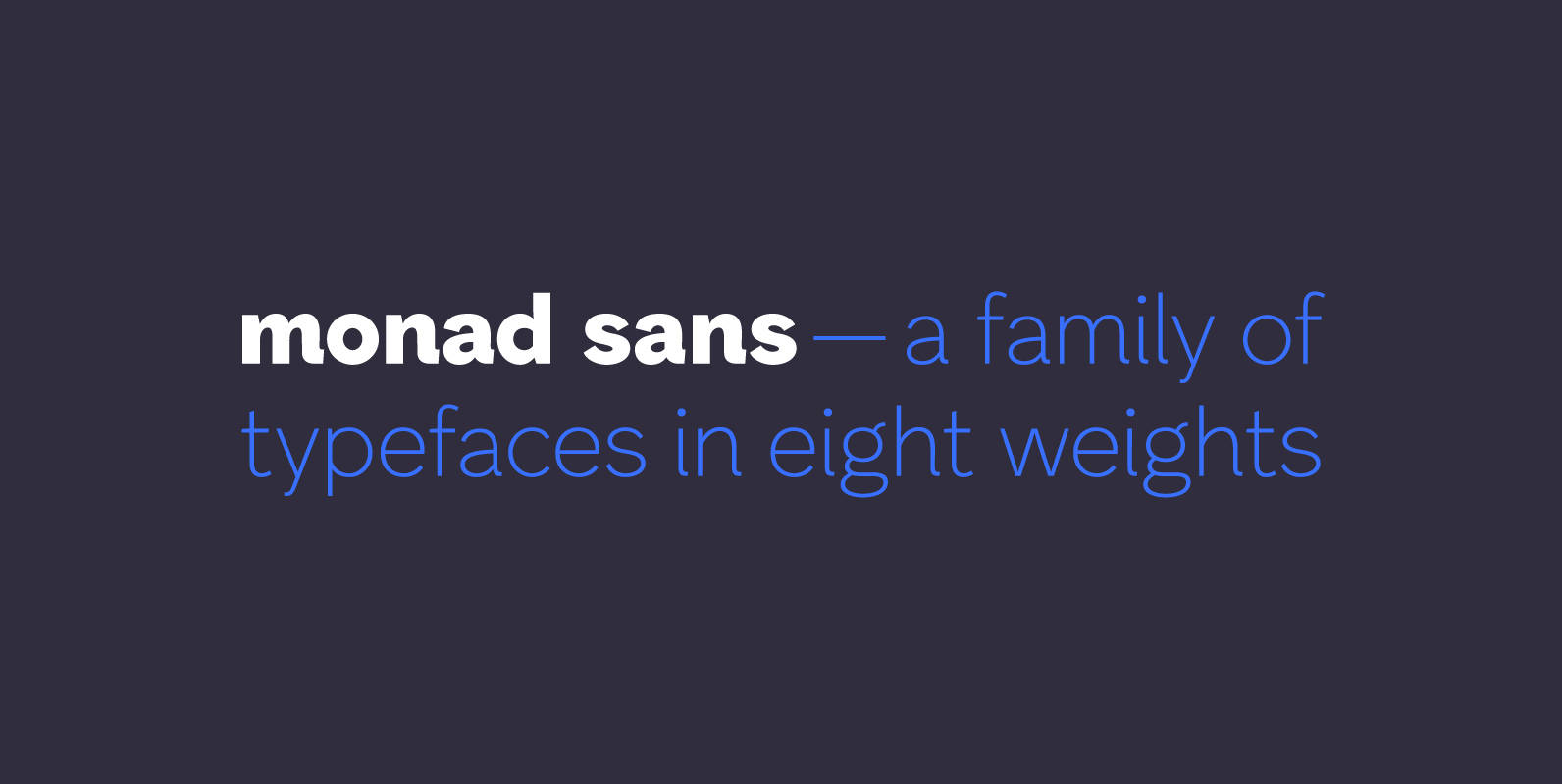
Monad Sans Font
Monad Sans is a typeface that builds on traditional and modern grotesques — aspiring to be a modern workhorse, rugged but not wooden, geometric yet limber. Available in eight weights, it has a medium x-height and generous character width. The
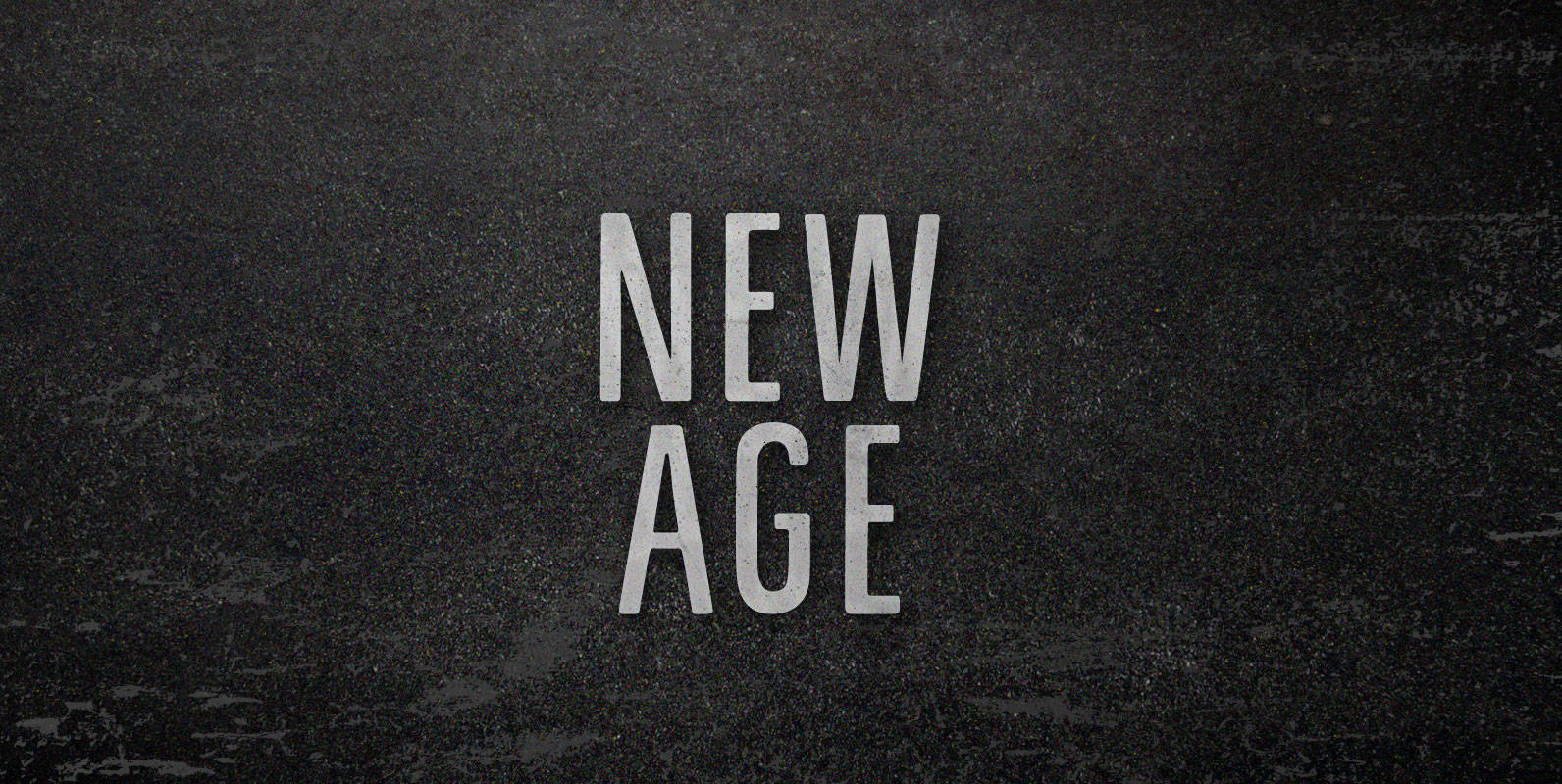
New Age Font
We never tuned into robots. They didn’t come to our commune to kill, but to commercialize. We were living in a New Age and it wasn’t new enough. As fast as we dropped out of being drones, real drones took