Tag: body
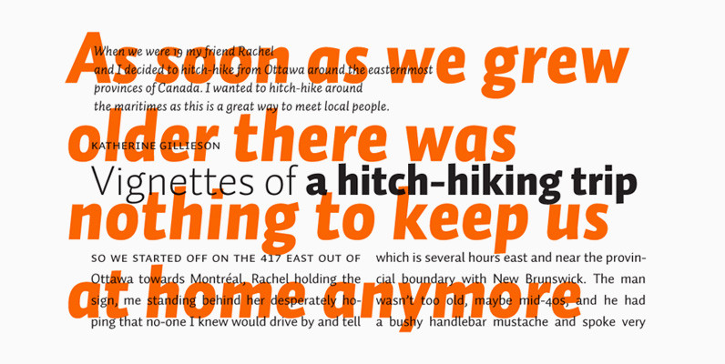
Les Tres Font
German designer Claudia Kipp has stated that she sees design as a “necessity to improve and enrich the visual world,” and her modern and clean sans typeface Les Tres certainly does its share. Working with great efficiency and great impact,
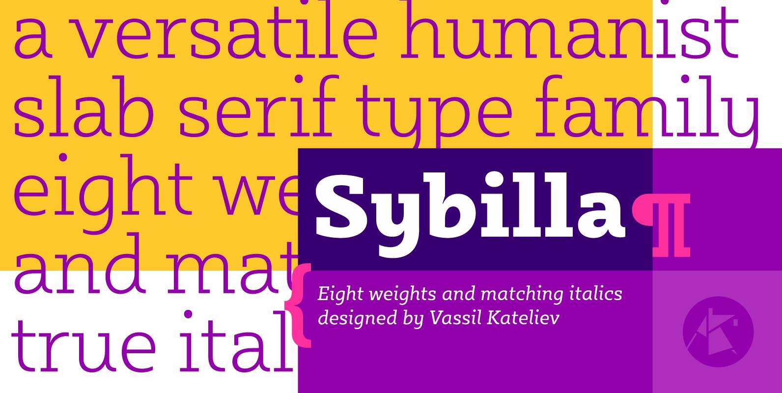
Sybilla Font
Sybilla is a robust, yet friendly, humanist slab serif well suitable for broad range of design projects. A true workhorse and superb text type family, Sybilla was especially designed with legibility in mind. Its soft almost cursive shapes and generous
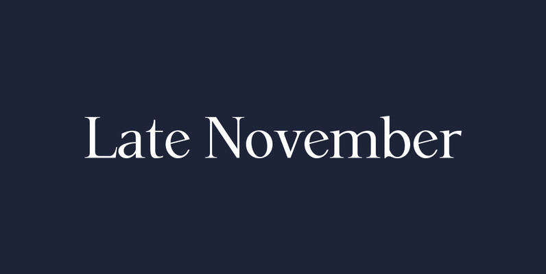
P22 Late November Font
P22 Late November is a new font family from Norwegian type designer Torliev Sverdrup. The font is a transitional Antiqua-inspired type design great for text and display uses Late November is a transitional Antiqua-inspired type design. Says Torliev: “I started
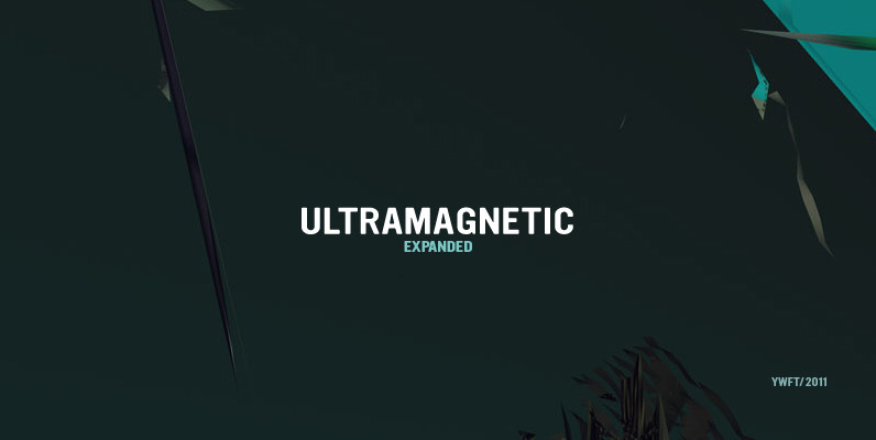
YWFT Ultramagnetic Expanded Font
YWFT Ultramagnetic is one of our hall of famers. In fact, from 2002-2006, it ranked in our Top Ten–spending a majority of that time at Number One. YWFT Ultramagnetic has been used by Harley Davidson, Starbucks, Disney Channel, Best Buy,

Solido Compact Font
Solido is a very versatile and usable type system with five widths: Solido, Solido Constricted, Solido Condensed, Solido Compressed and Solido Compact, in a total of 35 fonts with many of alternate characters. Published by DSTypeDownload Solido Compact
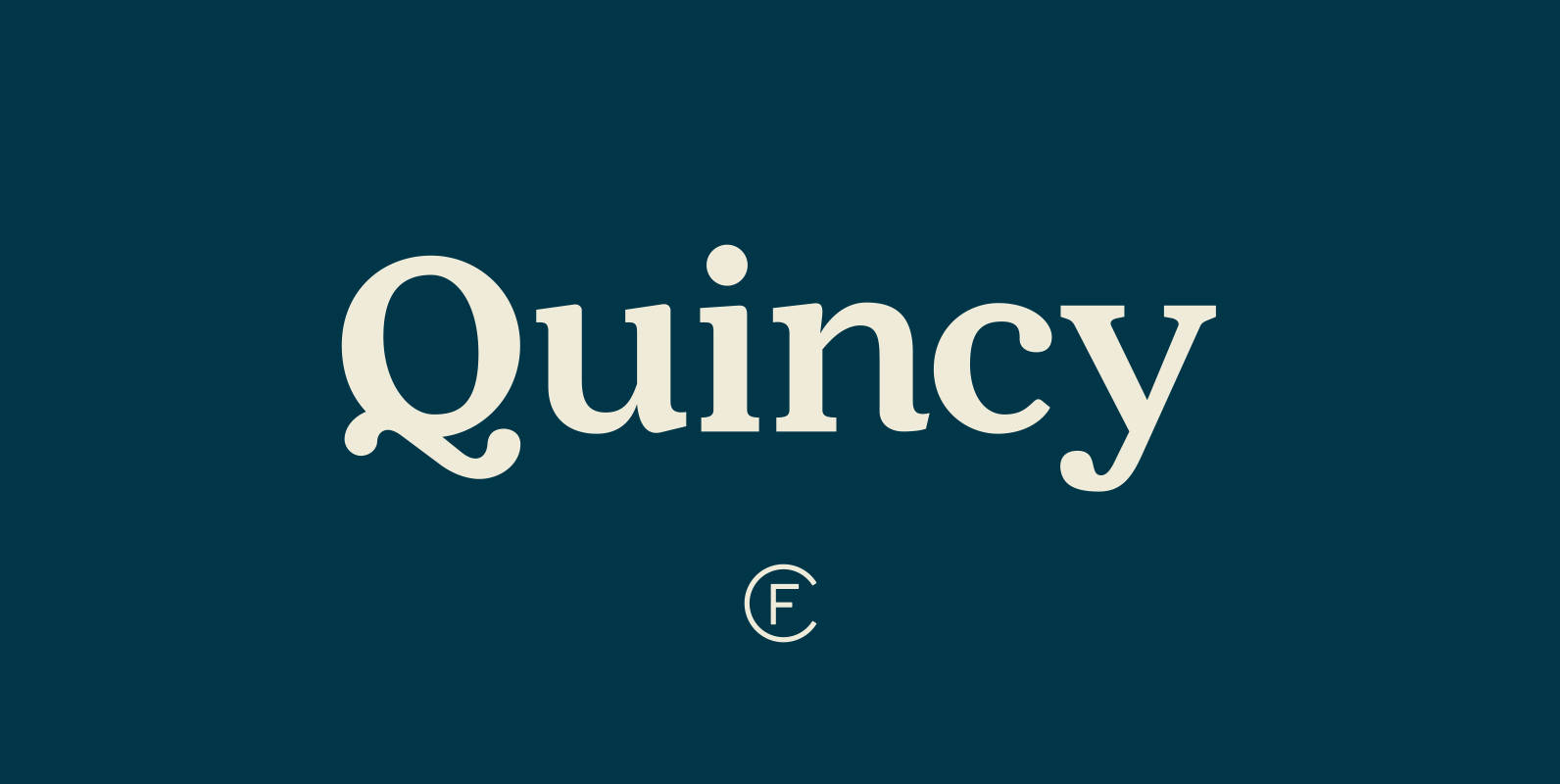
Quincy CF Font
The warm letterforms and medium contrast of Quincy© CF give any text a smooth, flowing motion. Small variations and human touches add charm, with Quincy’s boldest weights especially strong as large and medium display type. New in version 4.1: Quincy
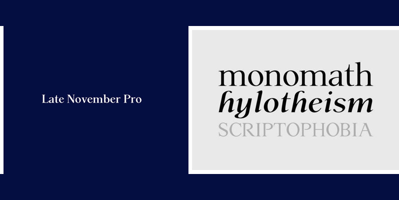
P22 Late November Pro Font
Late November is a transitional Antiqua-inspired type design. From the designer: “I started working with the design one dark, late November night, two years ago. After two years of work, I felt I had to draw the line and consider
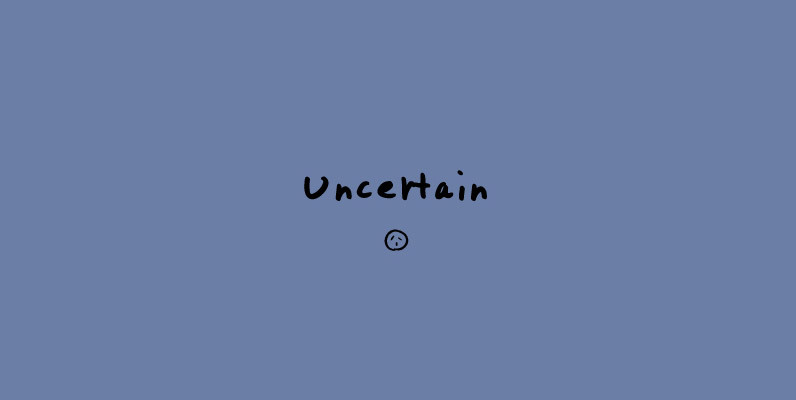
Uncertain Font
I wanted to write some thick letters. I wrote them in one quick breath, and thought that it was essentially myself. It’s distorted, flat, and dull, but it has a certain harmony to it. Coincidentally, I think it became a
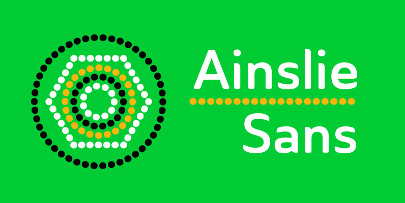
Ainslie Sans Font
The original Ainslie was inspired by Mt. Ainslie and the city of Canberra’s inner suburb of the same name. Canberra is Australia’s capital–a planned city designed by American architect Walter Burley Griffin. Griffin’s style and geometric design for the city,

Caturrita Display Font
Caturrita Display is a new version of Caturrita. Better for titles and small pieces, with a large contrast in the heavy weights. It preserves the same structure of Caturrita, but with a more calligraphic touch, in the ligatures and almost

Solido Font
Solido is a very versatile and usable type system with five widths: Solido, Solido Constricted, Solido Condensed, Solido Compressed and Solido Compact, in a total of 35 fonts with many of alternate characters. Published by DSTypeDownload Solido
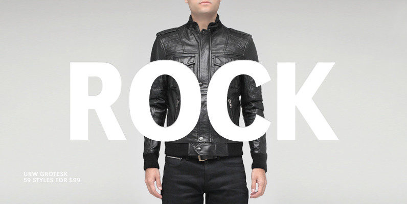
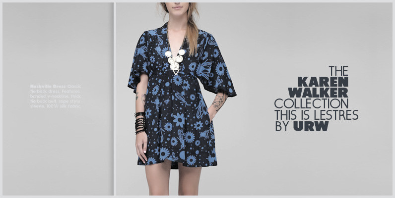
URW Grotesk Font
URW Grotesk was designed exclusively for URW by Prof. Hermann Zapf in 1985. At the same time, Zapf designed URW Antiqua to go with URW Grotesk. At that time, we were working with a large German publishing house (Axel Springer)

Filmotype Manchester Font
Originally released in the late 1960s, Filmotype expanded it’s Grotesque typeface category with the introduction of its Miner, Marlette and Manchester typefaces offering its own original take on this modern sans serif style Type designer Rian Hughes refined and further

Solido Compressed Font
Solido is a very versatile and usable type system with five widths: Solido, Solido Constricted, Solido Condensed, Solido Compressed and Solido Compact, in a total of 35 fonts with many of alternate characters. Published by DSTypeDownload Solido Compressed
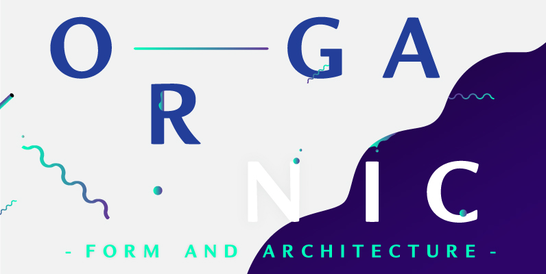
Organic Font
Organic was designed to be highly legible and flexible. I wanted to create a very refined sans-serif that could be used for display or body copy, for print or digital. The Opentype flexibility allowed me to expand the look of
Abandon Font
A sans-serif font family of five weights designed for headline and text use, with old style numerals and small caps, and extensive kerning. Published by Suomi Type FoundryDownload Abandon

Titillation Font
Titillation is a rounded, tall and modern styled sans, works great in both header and content uses. Published by Suomi Type FoundryDownload Titillation