Tag: body
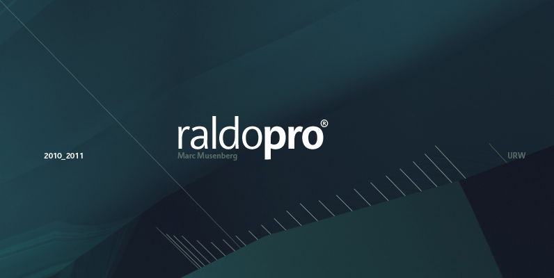
Raldo Re Pro Font
Quite unusual, Musenberg started his Raldo design with the italic. However, he managed to preserve the temperament and vividness of the italic in the roman without questioning the stability of the individual characters. Raldo is a modern Sans Serif family
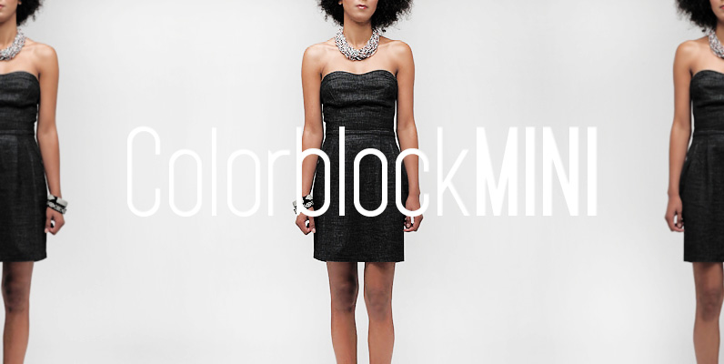
YWFT Pakt Font
YWFT Pakt is a condensed, sans-serif typeface consisting of ten different weights. While the design of YWFT Pakt is conservative, serious and authoritative, it still manages to maintain that fresh feeling that more venerable names just don’t have. Great attention

Maxima Font
Released in 1990 by German type foundry URW Studio, and designed by G. Wunderlich, Maxima is a clean, simple and effective sans-serif font design. Published by URW Type Foundry GmbHDownload Maxima
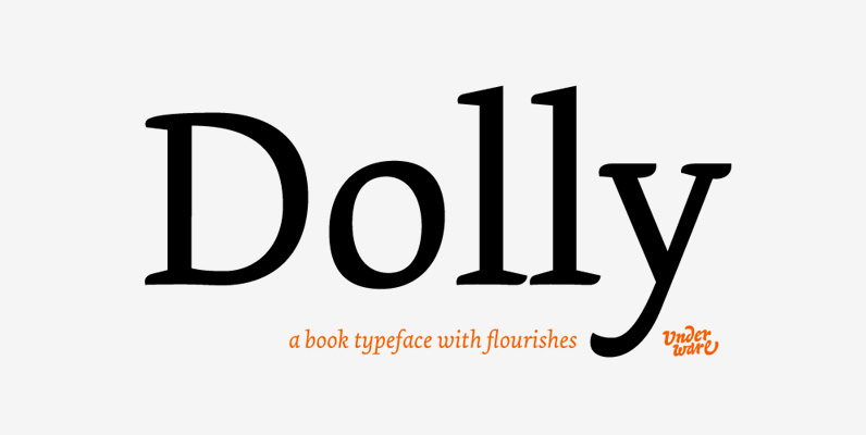
Dolly Font
Dolly is a book typeface with flourishes. The family consists of four fonts, which provide a healthy palette for solving most problems within book typography. Dolly Roman is neutral and useful for long texts. Dolly Italic is narrower and lighter

Air Superfamily Font
In B-movie awesomeness, Air began as Grotesk vs. Grotesque. I was trying to unify the prevailing traits of German and English Grotes(que/k)s in order make something different but familiar. I am NOT trying to reinvent Helvetica (snore), so get that

Familiar Pro Font
This family was inspired by a Type Battle over at Typophile: How would you design a font metrically compatible with Helvetica, but better than Arial? Working with preset letter widths was an interesting constraint, both a relief and a limitation
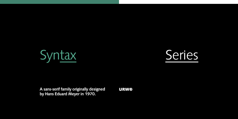
Syntax Series Font
Syntax Series is a sans-serif family originally designed by Hans Eduard Meyer in 1970. Published by URW Type Foundry GmbHDownload Syntax Series
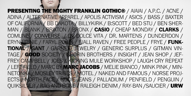
Franklin Gothic Font
This is URW’s digitization of the famous Franklin Gothic, the realist sans-serif typeface originated by Morris Fuller Benton in 1902. The typeface continues to be seen in many high-profile situations, from books to billboards, was featured on the cover of

Pinch Remix Font
Pinch Remix is a recreated version of a typeface I made in 2007. The form hasn’t changed at all, but I composed the family by increasing the weight and revising the spacing and kerning. At first it was created from
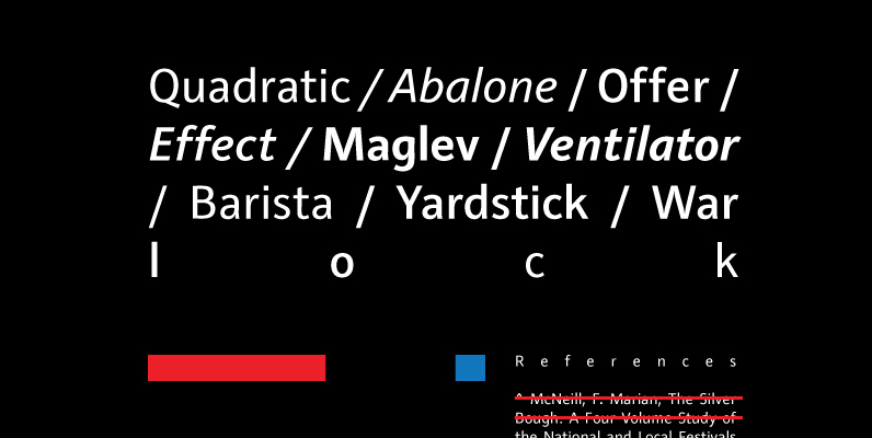
Raldo Font
Quite unusual, Musenberg started his Raldo design with the italic. However, he managed to preserve the temperament and vividness of the italic in the roman without questioning the stability of the individual characters. Raldo is a modern Sans Serif family

Scylla Font
Scylla is a clean, modern and very elegant sans-serif font, designed by Hans Schumacher in 2004. Published by URW Type Foundry GmbHDownload Scylla
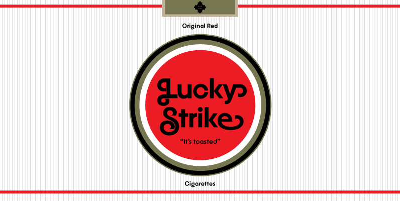
YWFT Agostina Alternate Font
YWFT Agostina became one of YouWorkForThem’s most successful typefaces upon its release in 2008. With nearly 300 characters, special swash options and full Latin letter designs among other special features, YWFT Agostina offered up truly endless typographic possibilities and is
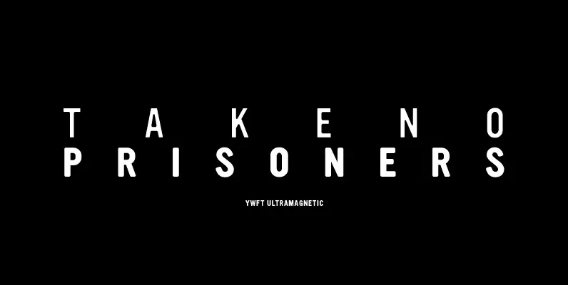
YWFT Ultramagnetic Font
How to make soft-yet-gothic? Countless hours spent researching, and years of refinement, that’s how. YWFT Ultramagnetic was finally mastered to postscript/truetype format in 1999 and has gone on to be one of the most widely-used YWFT exclusives of all time.
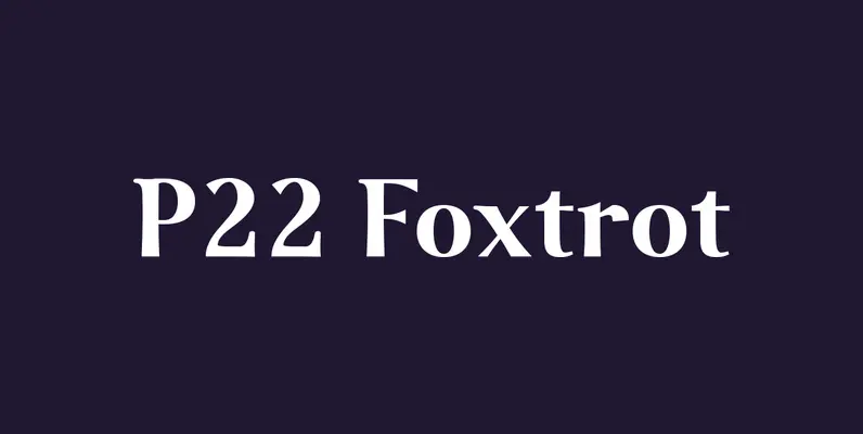
P22 Foxtrot Font
The design of P22 Foxtrot is inspired by the lively ballroom dance of the same name. Foxtrot is a transitional antiqua with rounded serifs that features ligatures, small caps, old style numbers and full Central European support for those with

Latienne Font
Latienne is a large serif font family design, including 19 style options in the complete family. This font family also includes beautiful swash styles adding a more dynamic bounce and range to your type settings. Latienne was designed and released
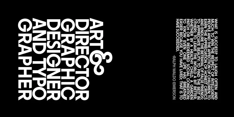
YWFT Agostina Font
With almost 300 characters, YWFT Agostina is both a workhorse and a must-own typeface. Must-own, because it’s a modern sans-serif design that contains both beginning caps and ending lowercase swash letters, available easily via opentype. These special swash options open

