Tag: book text
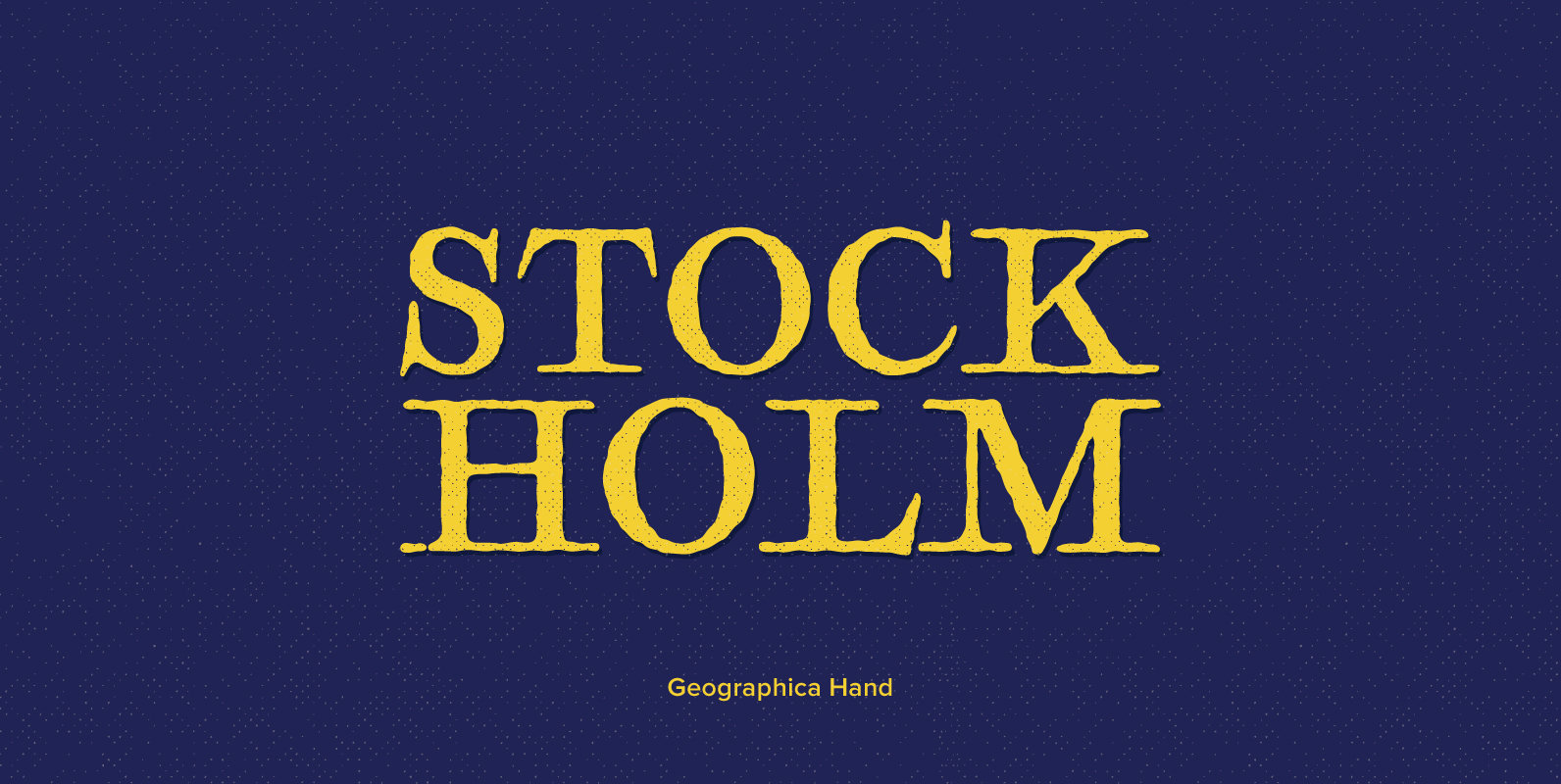
Geographica Hand Font
Geographica hand replicates the neat hand-lettering typical of engraved British maps of the 18th century, including the work of cartographers Emanuel Bowen (circa 1694–1767), geographer to king George ii, and Thomas Jefferys (circa 1719–1771) Geographica to King George iii. a
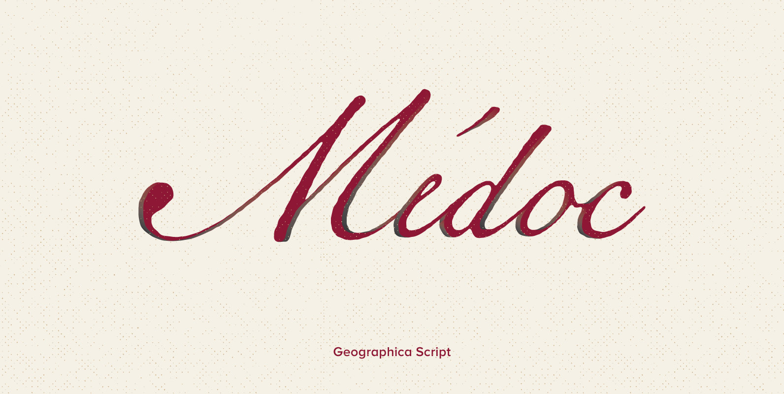
Geographica Script Font
Thank you for purchasing Geographica Script™, a member of the 3IP Type Library. We appreciate your business very much. Time-tested elegance is what you’ll get with Geographica Script, a handwritten typeface steeped in 18th century sophistication. Source materials include the
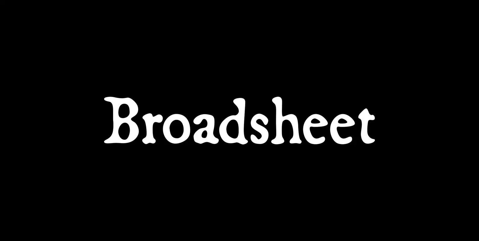
Broadsheet Font
Broadsheet simulates old newspaper text from the 1700s, chiefly from two specimens: an original copy of The New-England Weekly Journal, published in Boston on April 8, 1728, and a commemorative reprint of the Massachusetts Sun, published in Worcester, Mass., on
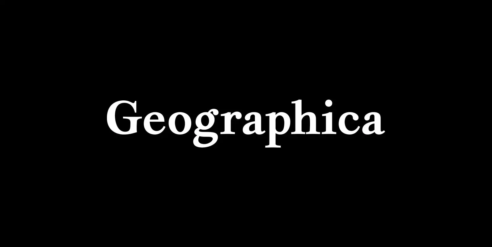
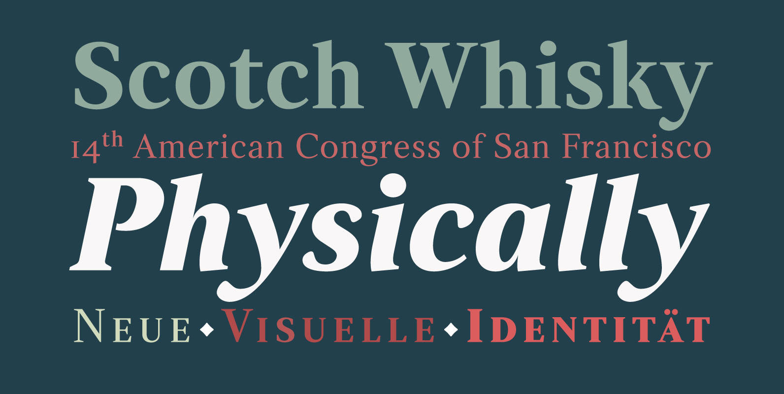
Geographica Font
Geographica is a four-style serif text-type family modeled after the neat hand-lettered place names and peripheral text on the maps of Thomas Jefferys (ca. 1710–1771), the best-known map engraver in 18th-century England. Although he won (and hyped) the title “Geographer
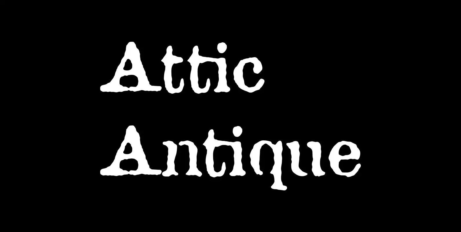
Attic Antique Font
Attic Antique replicates the warn, weathered text in a friend’s old copy of John Burroughs nature essays. It shares the wide spacing and ample serifs of the Century faces. Use it to represent age, to suggest photocopied archives, or to
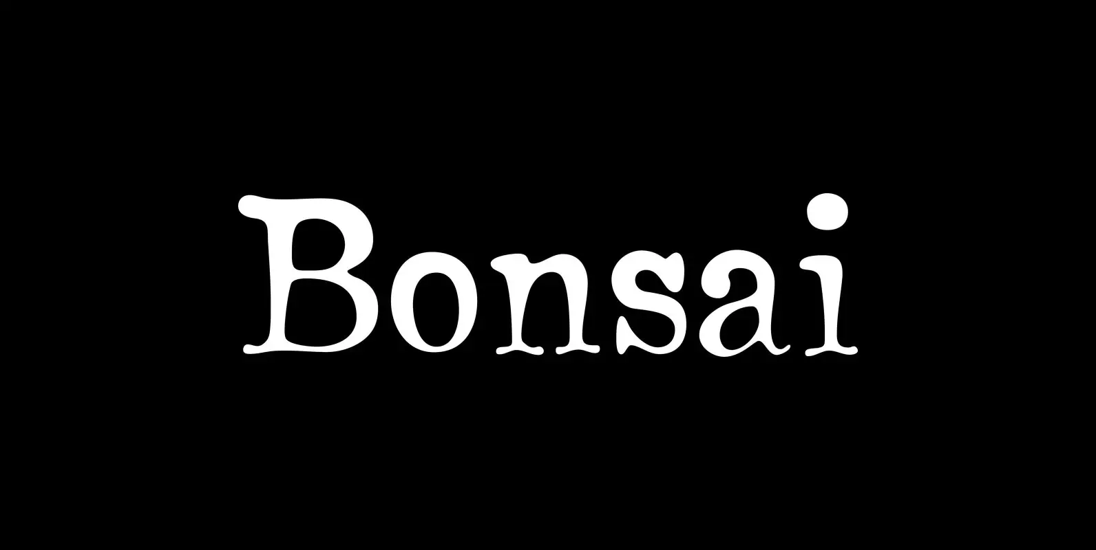
Bonsai Font
The name “Bonsai” seems appropriate for this font for two reasons: its source of inspiration—some top-heavy text type I found in an old handbook on bonsai from the Brooklyn Botanic Garden—and its glyphs’ resemblance, however vague, to the ancient miniature
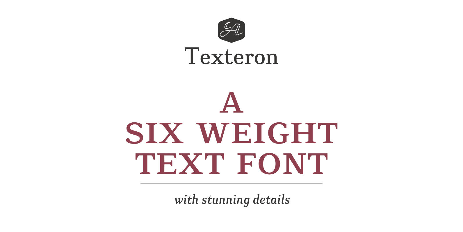
CA Texteron Font
CA Texteron is a modern text-font family to cover the most common typographical needs with a minimum of weights. It is aiming for a serious but unconventional look, which is achieved by combining round and edgy forms in the same
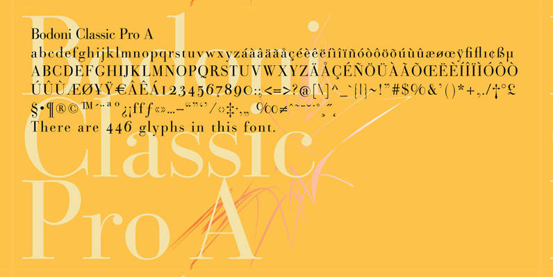
Bodoni Classic Pro Font
This is my new, completely worked over and fine-tuned Bodoni Classic for Europe (no Greek and Cyrillic). I have added a set of elegant Swashes (B) and 2 alternating uppercase swirly Initials (C) as well as two lowercase end-letters (D).
Strato Pro Font
Strato Pro font family is a modern serif typeface family with readability and legibility in mind. Inspired by Classic Roman typeface design, Strato Pro has 16 weights, ranging from book to black with small caps and an ornament set if
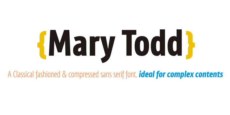
Mary Todd Font
MaryTodd was created for small texts with a variety of hierarchies. Is condensed to save space. It has a rich set of glyphs: small caps, old style figures, monospaced numbers, numerators and denominators for fractions, etc. It is ideal for
Vekta Neo Font
The Vekta Type System is part of a larger, interconnected grouping of 3 families: Neo, Sans & Serif. The goal was to develop a family designed along a common skeleton and matrix that would allow for interchangeable usage along a
Dieselis Economic Font
Designed by Samy Halim, Dieselis Economic is a FAMILY of 6 monoline sans serif fonts: light, medium and bold weights with Italics. Contemporary, clean, trendy and condensed. Excellent for print or web. Published by FontHausDownload Dieselis Economic
Vekta Complete Font
The Vekta Type System is part of a larger, interconnected grouping of 3 families: Neo, Sans & Serif. The goal was to develop a family designed along a common skeleton and matrix that would allow for interchangeable usage along a
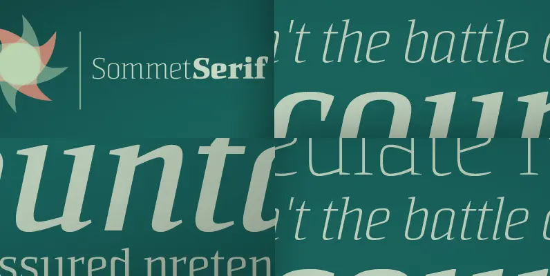
Sommet Serif Font
The Sommet superfamily has been updated with a new serifed member. Expanding on Sommet’s successful design principals, Sommet Serif is there when you need legibility for continuous text. Its interesting forms lend it to use as headlines as well. Sommet
Vekta Sans Family Font
The Vekta Type System is part of a larger, interconnected grouping of 3 families: Neo, Sans & Serif. The goal was to develop a family designed along a common skeleton and matrix that would allow for interchangeable usage along a
Filo Pro Font
Filo Pro is a very beautiful and highly legible typeface family as regular, medium and bold. It is a quite characteristic, modern interpretation of the humanistic serif. The serifs of Filo Pro are not too dominant, and its forms are