Tag: book
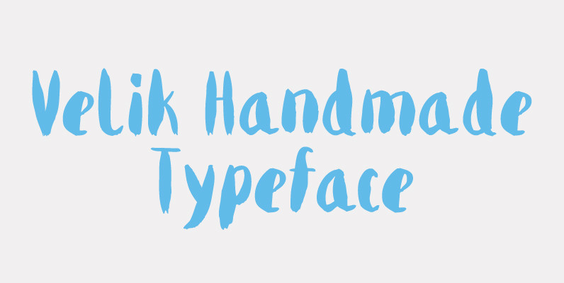
Velik Font
Velik is a hand drawn typeface, originally painted in ink and translated into a digital format for you to work and play with. My font journey so far was about embracing love for rational geometry but there is another child
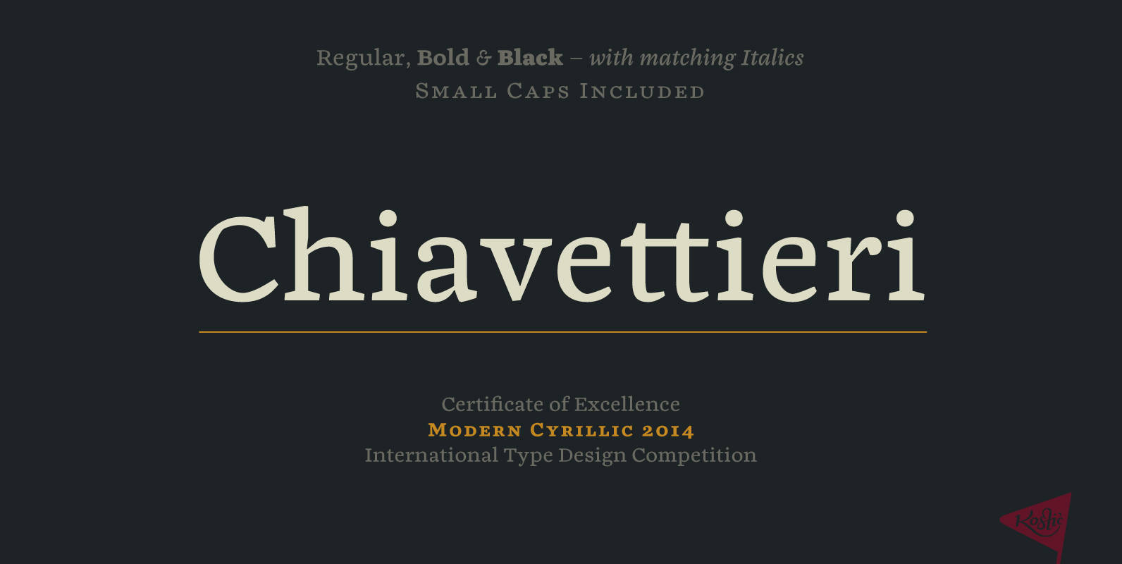
Chiavettieri Font
Chiavettieri draws inspiration from Humanist types, marked by low contrast between thick and thin strokes and the angle of stress in the bowls of letters. On the other hand, generous x-height, clean angled serifs and sharp cuts in the ball
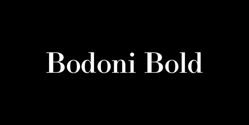
LTC Bodoni Bold Font
Bodoni Bold was drawn by London based type designer Dave Farey for Lanston Type during one of his alter-ego bouts as Giambattista Bodoni in the early 1990s. This font presents the unusual opportunity to use a Bodoni as body copy.
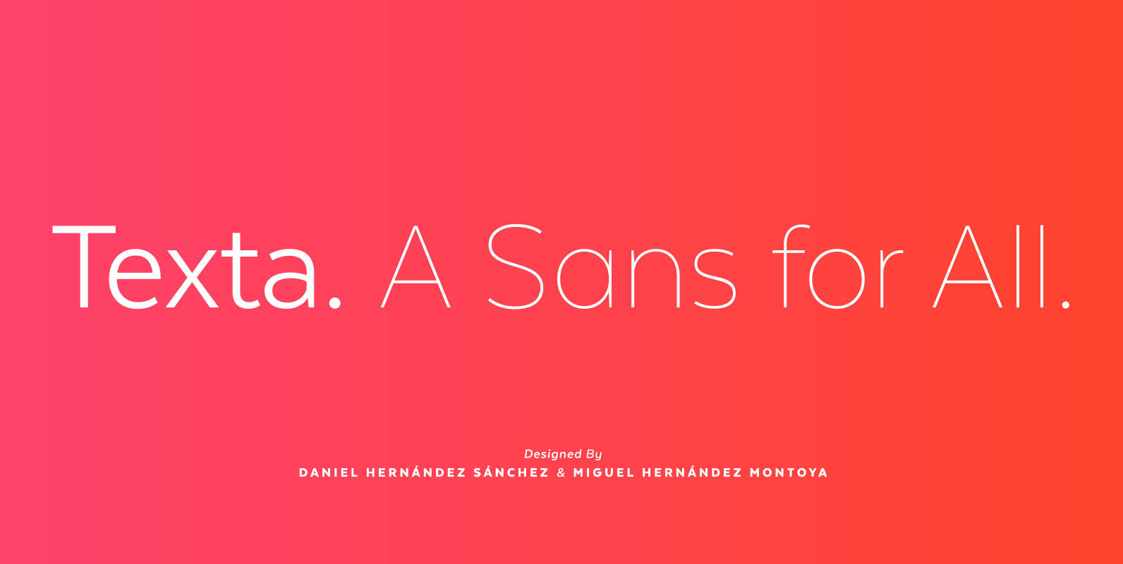
Texta Font
Texta. A Sans for All. Through studying humanists’ models from Edward Johnston to Adrian Frutiger and the Gothic Alphabet made by sign painters comes Texta, a contemporary, rational, transparent and useful Sans to compose all kind of texts. We incorporated

Merel Font
Merel is a modern geometric typeface with humanist attributes. Geometry and logic are at the heart of this 6 weight font family. Humanist touches give it a number of distinctive characteristics, as well as aid legibility. Despite being rational and
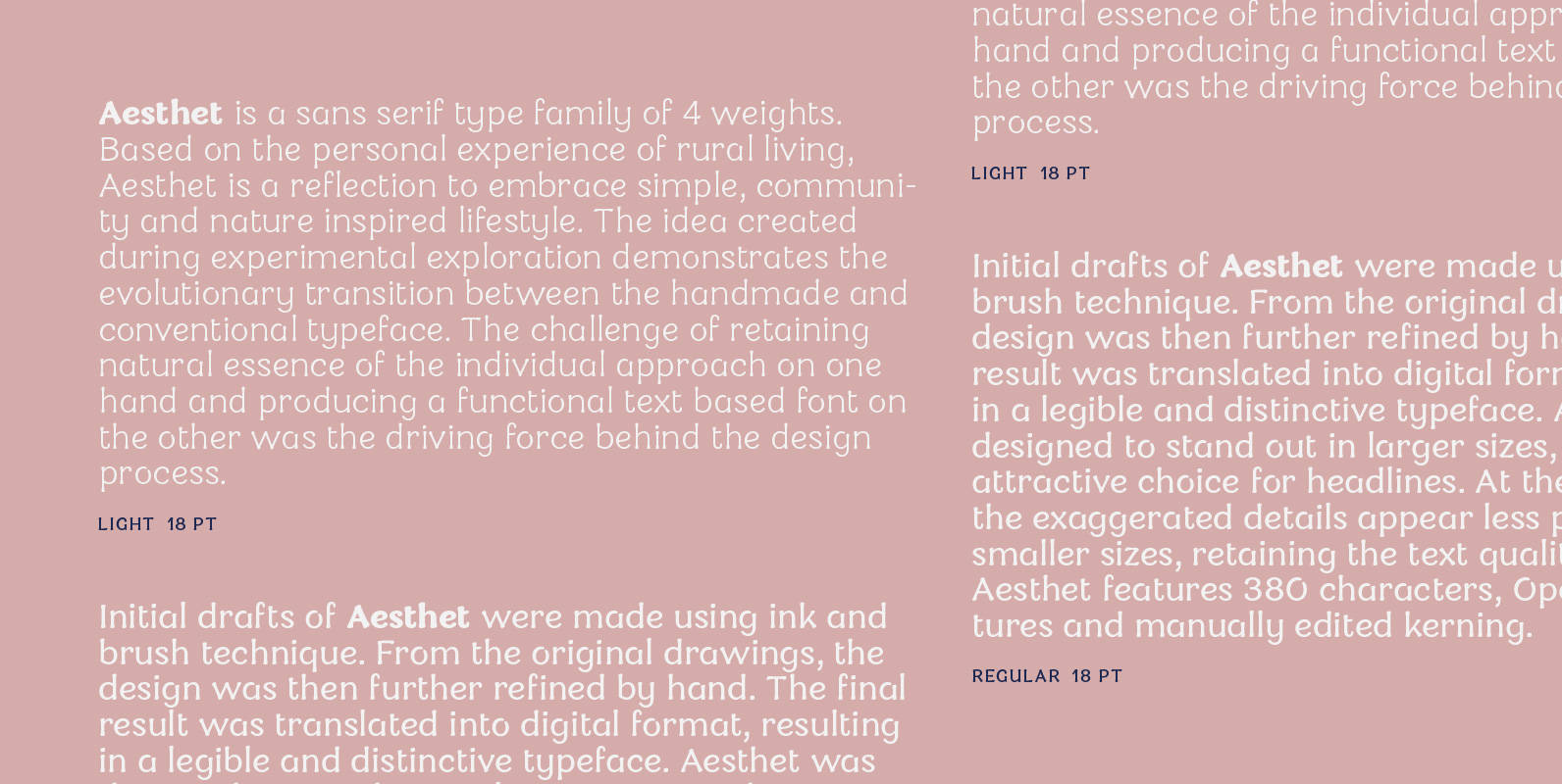
Aesthet Font
Aesthet is a sans serif type family of 4 weights. Based on the personal experience of rural living, Aesthet is a reflection to embrace simple, community and nature inspired lifestyle. The idea created during experimental exploration demonstrates the evolutionary transition
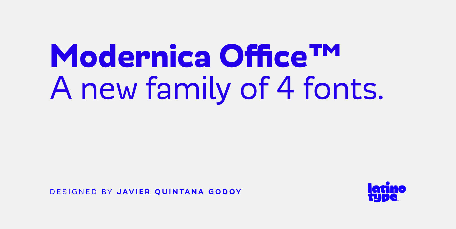
Modernica Office Font
We have adapted the version of our Modernica font for use in Microsoft Office. It only has 4 variants: regular, italic, bold and bold italic. Font weights have been named in a way that can be clearly shown up in

Cervo Font
Font Cervo is the younger sister of Kapra. It is characterized by eight different varieties – lower and uppercase characters and in contrast to Kapra is “slimmed” version (from Medium to Thin). It is inspired by a You And Me
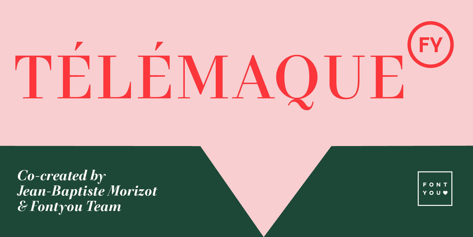
Telemaque FY Font
Télémaque FY is a contemporary didone style typeface with a lot of personality. Both rigid and elegant with its modern sharped terminals and its generous curves, this 4 weights font family will be for sure your new typographic companion for
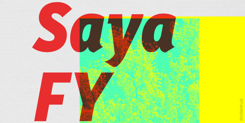
Saya FY Font
Saya FY is a fresh sans serif font suitable for text and display use. The lightly condensed letterforms are built up of a harmonized mix between well rounded curves and pointed endings. These calligraphic details afford a unified structure in
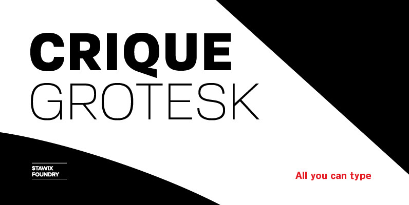
Crique Grotesk Font
The Crique Grotesk This contemporary typeface is inspired from Neo-humanist and Geomatric industrial tone presented the late 2000s typeface. The font family is also composed of the normal width and display width in order to support the different applications on the delicate
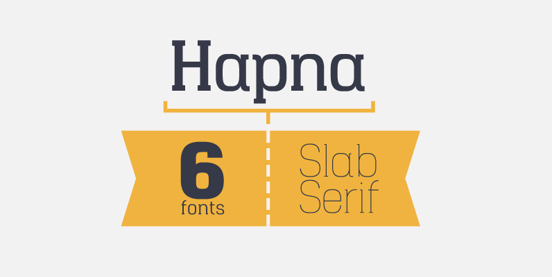
Hapna Font
Hapna is a geometric slab serif designed as an alternative to other slab style fonts available on the market. The typeface was originally released in January 2013 as a free monospaced single weight slab serif called Hapna Mono. This new
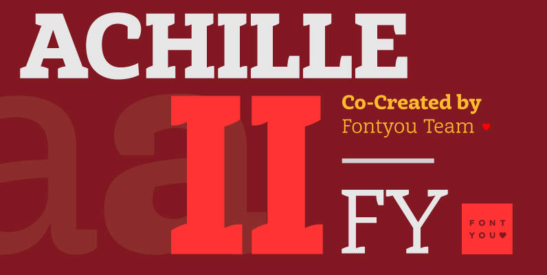
Achille II FY Font
More than one year after the release of our first font Achille FY, we are proud to introduce Achille II, an enhanced version of the original one with two more weights. This Slab serif typeface is characterized by its curved
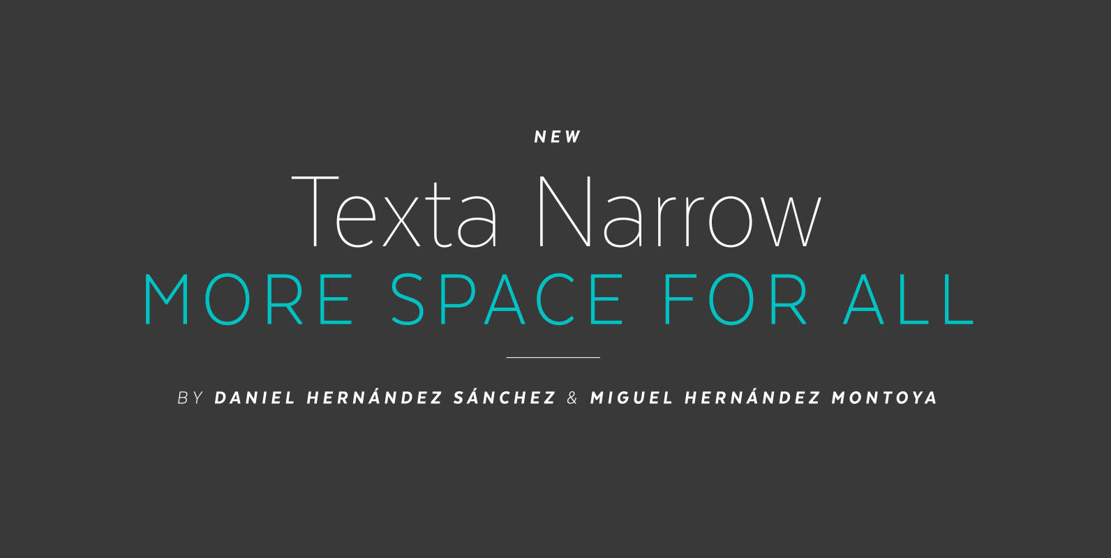
Texta Narrow Font
Texta Narrow. More space for all. Through studying humanists’ models from Edward Johnston to Adrian Frutiger and the Gothic Alphabet made by sign painters comes Texta Narrow, a contemporary, rational, transparent and useful Sans to compose all kind of texts.
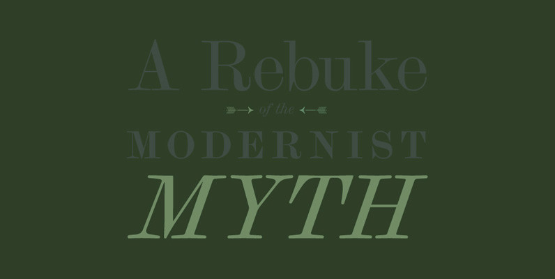
Scotch Modern Font
Scotch Modern is a revival of the typeface used in the book New York State Cabinet of Natural History. This beautiful genre of type, so popular in books, magazines and advertisements during the Victorian era and much of the 20th

