Tag: book
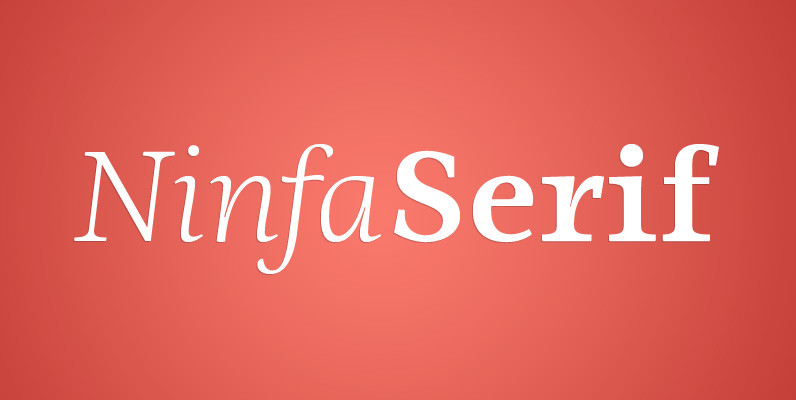
Ninfa Serif Font
Using the genetic inheritance of semi-serif typography Ninfa, designed in 2008, “Ninfa Serif” has 10 styles and designed to fulfill all needs in the design of text – books and magazines. Published by dooTypeDownload Ninfa Serif
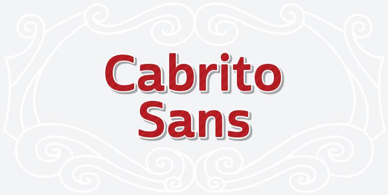
Cabrito Sans Font
A quick recap: the original Cabrito is an insigne Design slab serif produced for the kid’s book The Clothes Letters Wear. It’s been pretty well-received–even more than I expected. I promised to grow the family with a free-standing inverted style
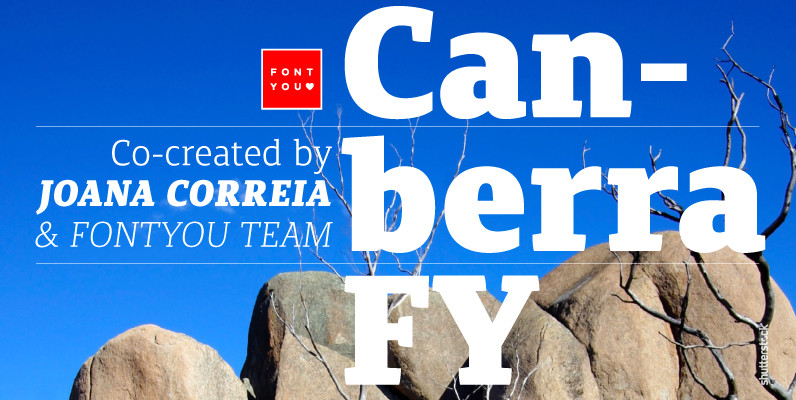
Canberra FY Font
Canberra FY is a contemporary and low-contrast serif typeface that shows legibility with personality. Its asymmetric and short serifs render a versatile look, always usable and friendly. As Canberra FY is very legible with its book style in small sizes,
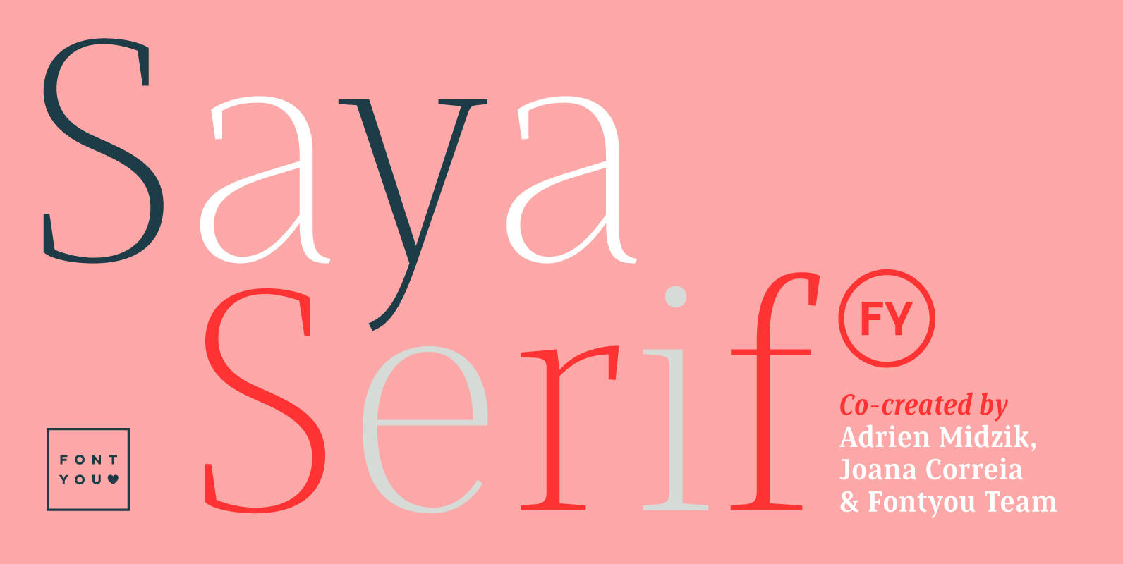
Saya Serif FY Font
Here comes the serif! After her big sisters version, Saya Sans and Saya Semi Sans, meet Saya Serif! With its lightly condensed letterforms and its elegant sharped serifs, this font family is both suitable for text and display use. It’s

Arquitecta Office Font
We have adapted the version of our Arquitecta font for use in Microsoft Office™. It only has 4 variants: regular, italic, bold and bold italic. Font weights have been named in a way that can be clearly shown up in
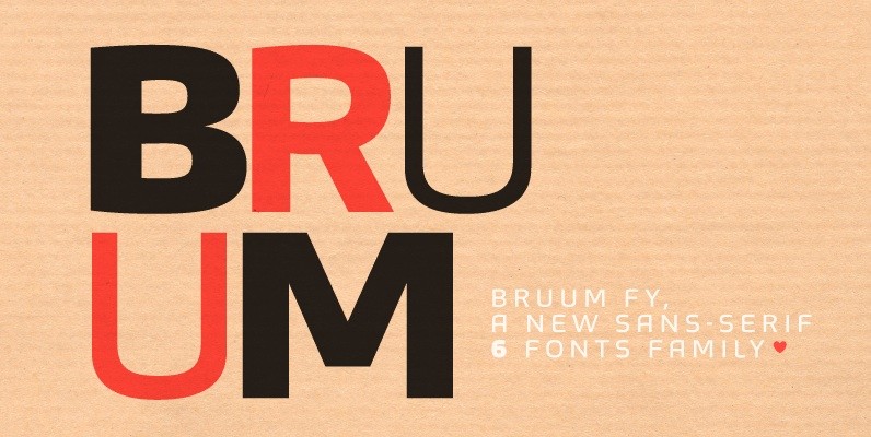
Bruum FY Font
This sans-serif font family alternates between curved and angular shapes, which give its a technical and robust style and make it both legible in small size and powerful in big for headlines. Bruum FY was co-created by Gia Tran, Alisa
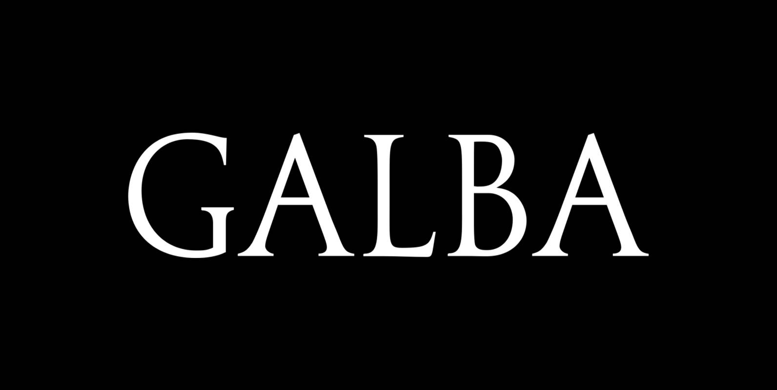
Galba Font
Galba is a font design released for the Mecanorma Type Collection. Copyright 2004 Trip Productions BV. Published by MecanormaDownload Galba
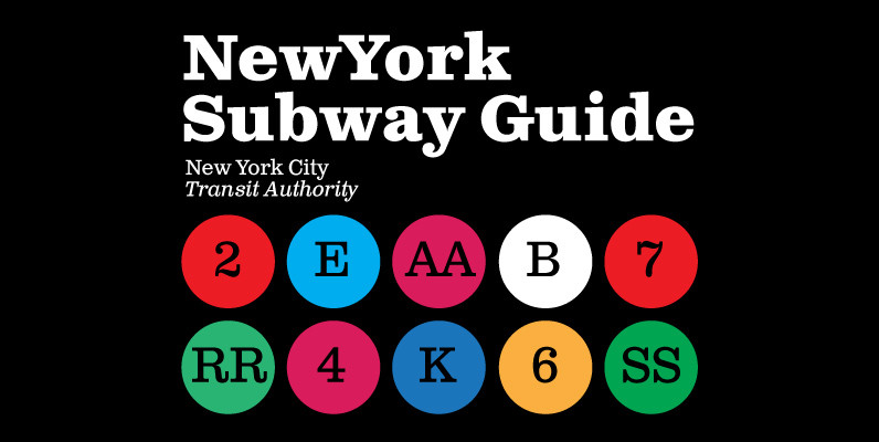
Clarendon Text Font
Clarendon Text is a contemporary remake of the truly classic slab serif typeface with a distinctively clear and legible visibility. It is a widely usable text type suited equally well to advertising, books, publications, and a wide range of corporate
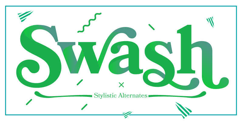
Bookmania Font
Bookmania (2011) is a revival of Bookman Oldstyle (1901) and the Bookmans of the 1960s, but with all the features you would expect in a modern digital font family. Feature Summary: – 5 weights: Light, Regular, Semibold, Bold, and Black
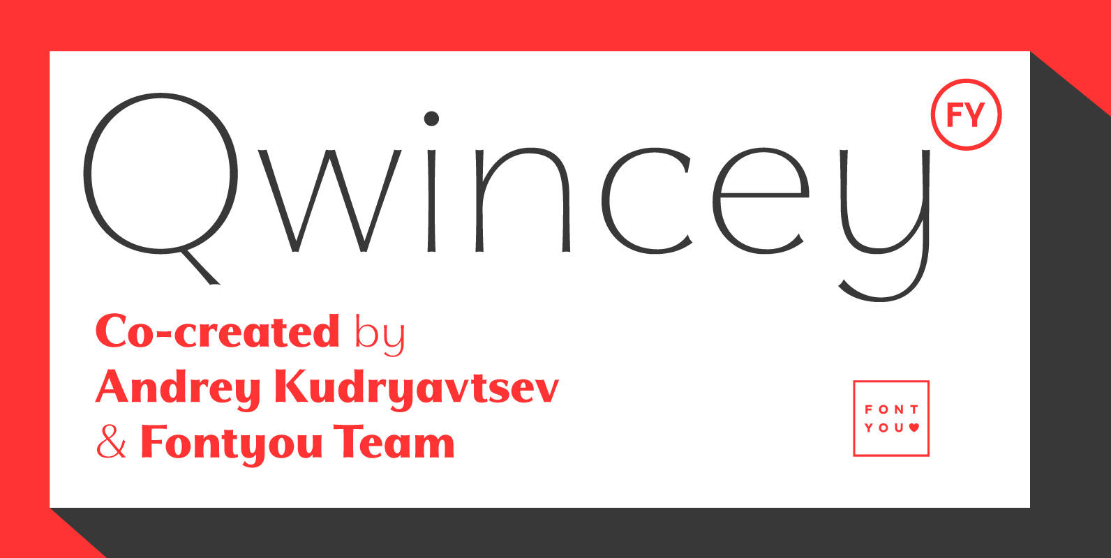
Qwincey FY Font
Qwincey is a new fresh & elegant font family available in five weights. With its flared and sharped endings, this font will give beautiful style to your layouts. With its round and generous proportions, its single storey lowercase a, open
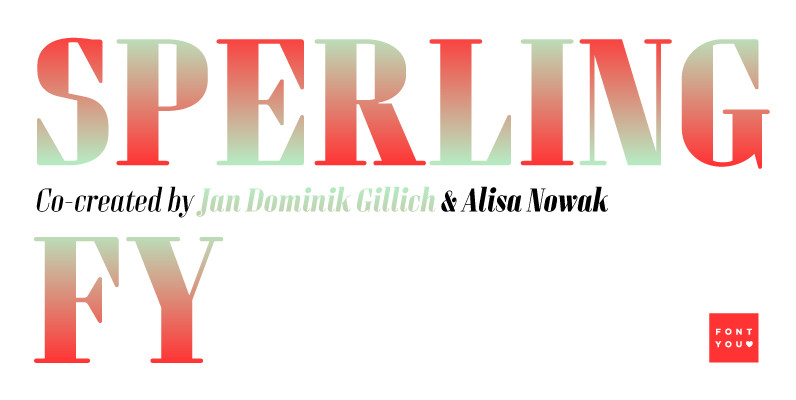
Sperling FY Font
Sperling FY is a geometric and condensed high contrast font, characterized by its long vertical serifs. Its big i-dot as well as some other deliberately naive disproportions like the W are wonderful signs to identify Sperling FY. The accompanying italic
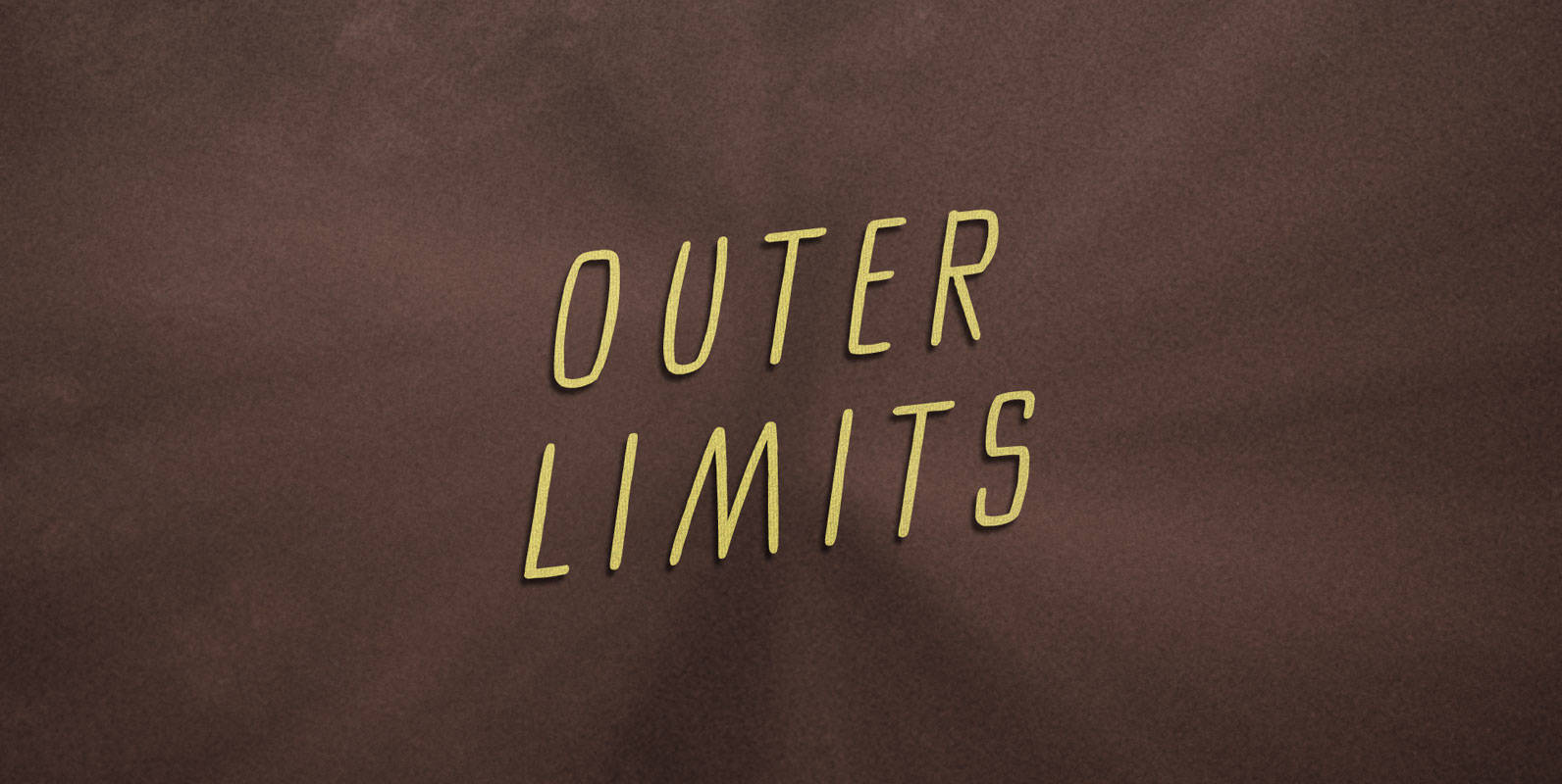
Outer Limits Font
There is nothing wrong with your monitor. Do not attempt to adjust the picture. We are controlling the image. We will control the horizontal. We will control the vertical. We can adjust the focus to a soft blur, or sharpen

Caturrita Display Font
Caturrita Display is a new version of Caturrita. Better for titles and small pieces, with a large contrast in the heavy weights. It preserves the same structure of Caturrita, but with a more calligraphic touch, in the ligatures and almost

Gauthier Next FY Font
Our famous Gauthier FY is now available with an extended character set, including small caps! Inspired by Renaissance typefaces, Gauthier FY is a contemporary old-style serif typeface with big x-heights and quite small caps. Accompanied by a lovely and detailed

Gilman Sans Font
Gilman Sans is the family member of Gilman, the serif that it was derived from. The idea for Gilman started simple enough, a serif typeface that works well for large amounts of text. However, after many struggles creating a quality
