Tag: book
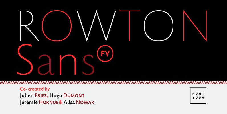
Rowton FY Font
Rowton FY digs its roots in Eric Gill’s views on typography in his book “An essay on Typography”. This typeface has the very British feel of the 20th century. Taking as inspiration the calligraphic illustrations of the book, Julien Priez,
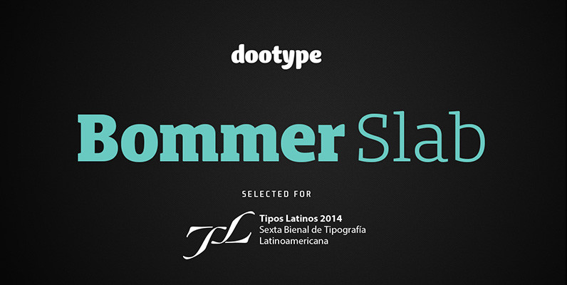
Bommer Slab Font
Bommer project started in January of 2014 and I am happy to announce the first family – Bommer Slab – is now ready for release. This family includes 14 weights – been seven uprights and seven italics. This font has

Servus Slab Font
This family is very special to me. I started working on it right after my first son was born. I decided to name the typeface “Servus” which means “Hello” in my country. The whole idea of the family symbolizes a

Telltale Font
Telltale is classic serif design made for headline and text use mainly. Contains two styles, book and italic, that work together quite beautifully when used together at different point sizes. Published by Suomi Type FoundryDownload Telltale
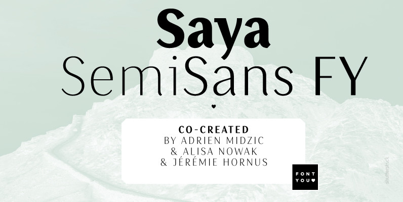
Saya SemiSans FY Font
Our Saya FY family is growing with its new SemiSans version. Like the name already indicates, Saya SemiSans is more contrasted but still keeps its lightly condensed letterforms as well as its beatiful harmonized calligraphic details. As fresh and elegant
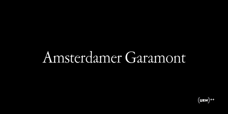
Amsterdamer Garamont Font
Amsterdamer Garamont is an old style serif that was originally designed by Morris Fuller Benton in 1917. Published by URW Type Foundry GmbHDownload Amsterdamer Garamont
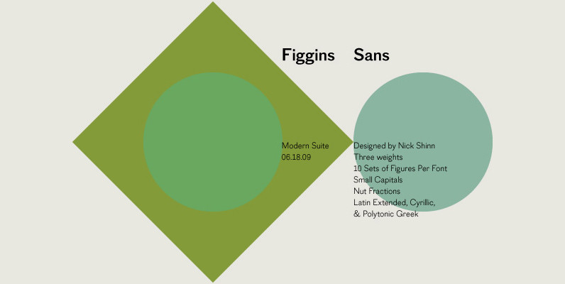
Figgins Sans Font
The first sans serif types were made in London in the early 19th century. They were severely modern, all caps and bold. The Figgins foundry, inventor of the term sans serif, showed a fine example in its specimen of 1836.
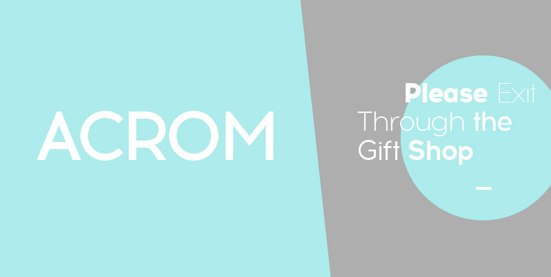
Acrom Font
Acrom is a geometric sans serif typeface with a minimal stroke contrast. It was designed with a modern, contemporary context in mind. Acrom is not merely mechanical, it can also be recognised as a natural typeface with subtle geometric aesthetics. The humanist
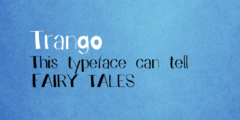
Trango Font
A funny childish handwritten font, with a spirit. This typeface can tell fairy tales. Trango is a sans serif that goes well with the slab serif Besley Hand. Published by Juraj ChrastinaDownload Trango
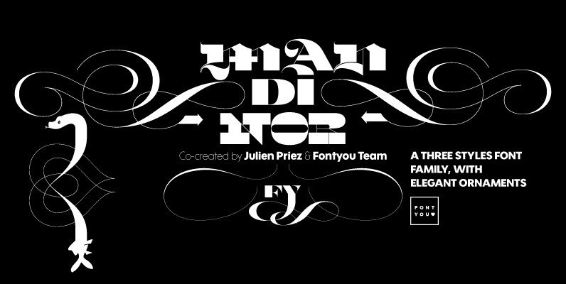
Mandinor FY Font
Normandie FY is a victorian modular family of 3 different typefaces very contrasted: Modern, Gothic & Italian. Perfect for headlines and any other titling creations, this font family feels very good when used in super poster size. Ornaments, letters (and
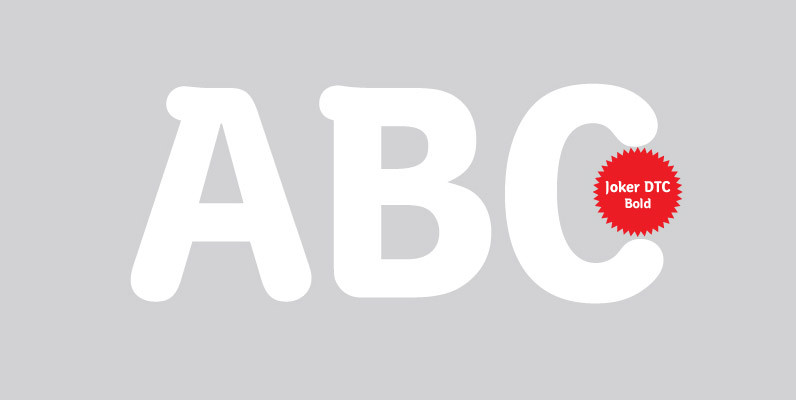
Joker DTC Font
A vintage and classic serif designed by Volker Schnebel, Joker DTC brings elegance and class to any project. Works great in both content and headline usage. Published by URW Type Foundry GmbHDownload Joker DTC

Lasta Font
Lasta is small serif font family with simple elegant shapes, refreshing Italics and poetic endings. Containing 2 weights and 2 italics, with lower x-height which brings more air (empty space, white space…) into paragraphs making text more graceful and legible.
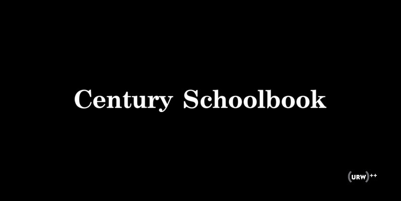
Century Schoolbook Font
Century Schoolbook is a classic and elegant serif font, originally designed by Morris Fuller Benton in 1917. This typeface contains West European language support as well as East Mediterranean languages such Turkish or Baltic ones among others that make up
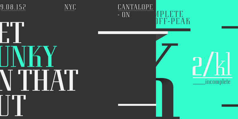
Eden Pro Font
Based on the original 1934 Ludlow drawings by Robert Hunter Middleton, we created two additional weights that round out the family. Eden contains all the high-end features expected in a quality OpenType Pro font. Published by Red RoosterDownload Eden Pro
Papermade PRO Font
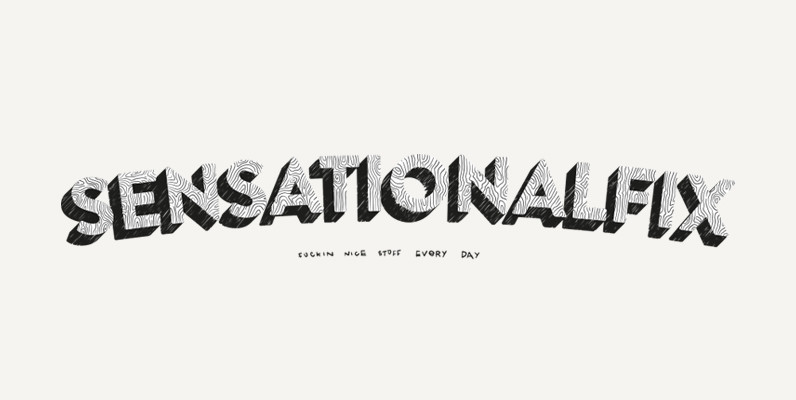
Papermade PRO is an experimental uppercase typeface handmade that looks so cool in headlines and short descriptive texts. Even in long decorative texts like for illustrated books, etc. So hipster, so nice. The font contains a single weight, capitals and
Caslon Extra Condensed Font
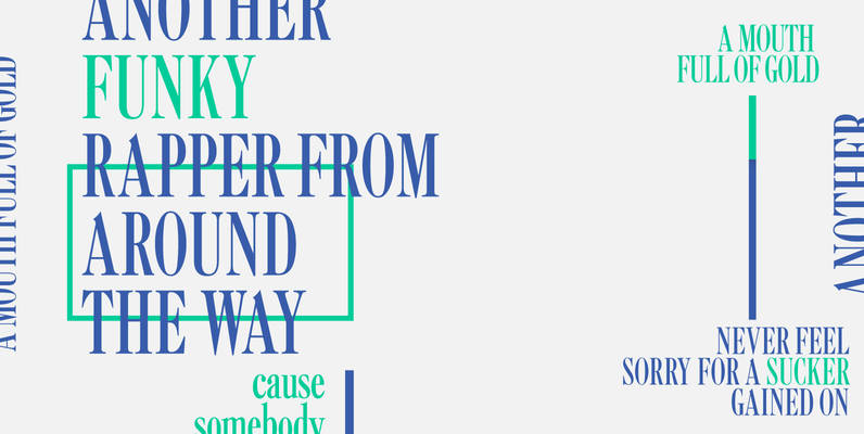
Designed by Steve Jackaman, Caslon Extra Condensed is based on the Ludlow/ATF versions of this great typeface. Published by Red RoosterDownload Caslon Extra Condensed

