Tag: book

Achille II Cyr FY Font
For our first cyrillic font, we choose to complete Achille FY, one of our favorite Fontyou fonts. Its robust and solid structure was an excellent opportunity to make a cyrillic version of it. Like its latin cousin, Achille II Cyrillic
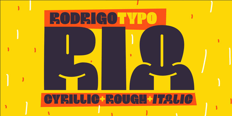
Ria Family Font
Ria Family is a retro and funky type design, that explores playing with form. Published by RodrigoTypoDownload Ria Family
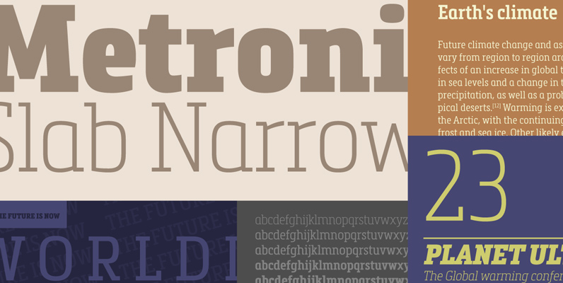
Metronic Slab Narrow Font
Metronic Slab Narrow is the condensed version of the Metronic Slab font family. This condensed style is designed for space-saving typography but with high legibility and versatility in mind. This Family also improved the needs of developers and graphic designers
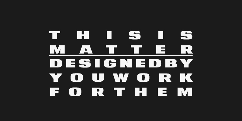
YWFT Matter Font
Take the Matter into your own hands. YWFT Matter, that is–a wide, bold and grotesque typeface design based on several concepts from Victorian-era science texts and manufacturing/marketing materials. YWFT Matter features alternate characters, like a “two-story” lowercase “a,” that are
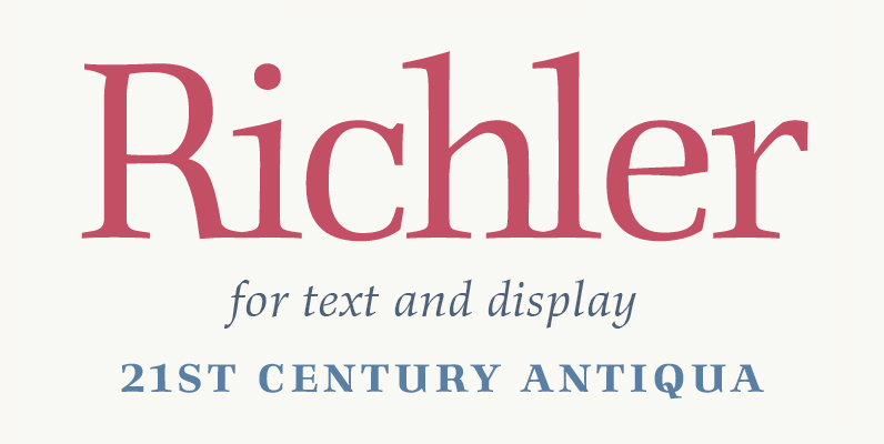
Richler Font
An open, evenly spaced book face designed for quality headlines and enhanced readability in text. Published by ShinntypeDownload Richler
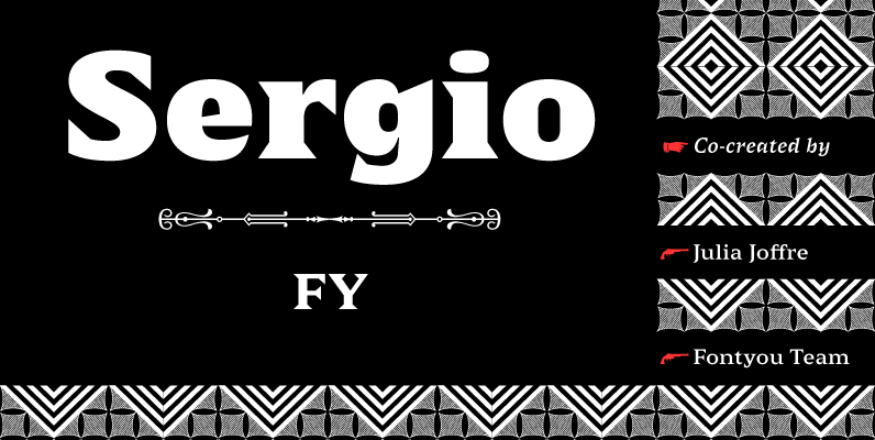
Sergio FY Font
Sergio FY is an antique latin font family inspired by a 19th century wooden type font, found in an italian print – Gazetta Musicale di Milano, 10 Guigno 1897. This typeface is characterized by its large, sharp, and triangular serifs,
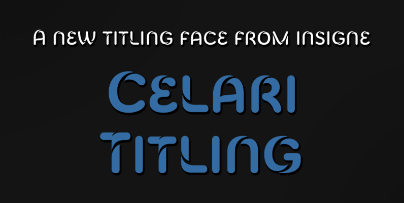
Celari Titling Font
The speed and agility of Celari is built for nothing less than a headline. Use the larger-than-life power of this face for any number of oversized applications–mastheads, posters, web headlines, flyers. It provides excellent performance for service-oriented ads where efficiency

Gauthier FY Font
Inspired by Renaissance typefaces, Gauthier FY is a contemporary old-style serif typeface with big x-heights and quite small caps. Accompanied by a lovely and detailed italic – inspired by artworks from the punchcutter Granjon – Gauthier FY is perfect for
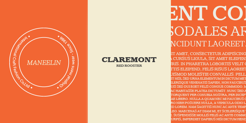
Claremont Font
Designed by Les Usherwood. Digitally engineered by Paul Hickson. Les never released this completed typeface before his untimely death in 1983. Published by Red RoosterDownload Claremont
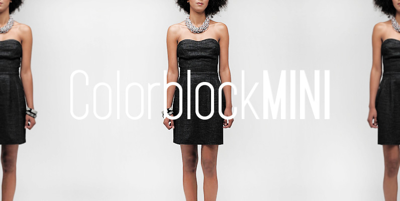
YWFT Pakt Font
YWFT Pakt is a condensed, sans-serif typeface consisting of ten different weights. While the design of YWFT Pakt is conservative, serious and authoritative, it still manages to maintain that fresh feeling that more venerable names just don’t have. Great attention
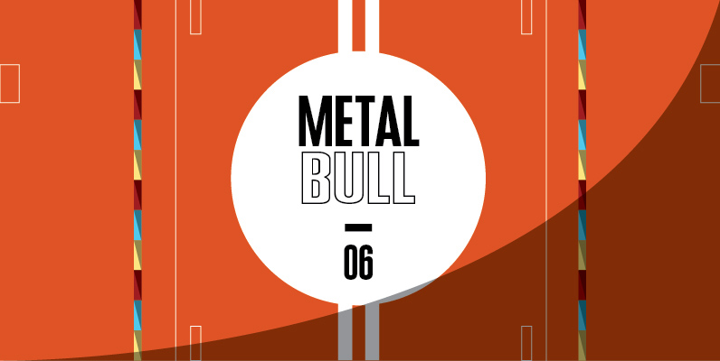
Expansion Font
Expansion is a clean and simple sans-serif designed by Claudia Kipp in 2004. Although being designed in 2004, Expansion contains a certain mid-1900’s, American feel to it. Works great in corporate, clean and masculine oriented projects. Published by URW Type
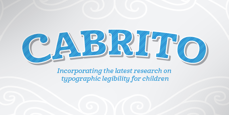
Cabrito Font
After my son was born, I found myself reading him a lot of books. A LOT of books. Some were good, some were great, but I found myself wanting to develop something using my skills and interests to make something
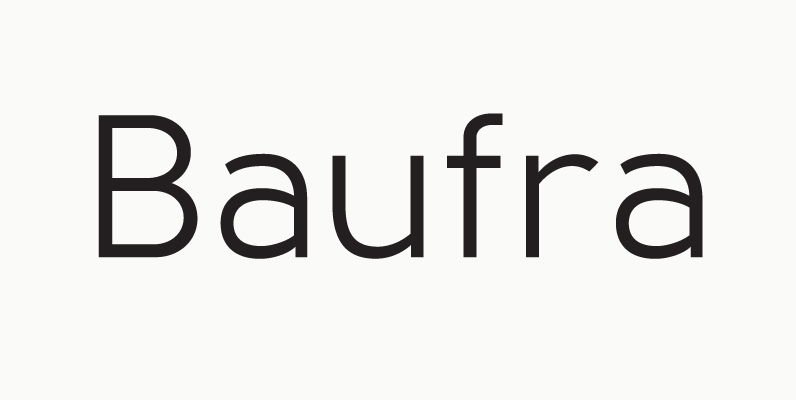
Baufra Font
Baufra is a humanist sans-serif typeface. It is based on the sans-serif typefaces of the early 20th century. A characteristic feature of Baufra is its geometric design combined with an earthy naturalism. Baufra family includes 6 weights, 435 characters, manually

Kropotkin Font
Kroptokin was created just by observing. At the time I was looking at a lettering book. A certain typeface caught my eye. The typeface was introduced by Helvetica, but it didn’t come off as anything like the Helvetica I knew.
