Tag: booktext
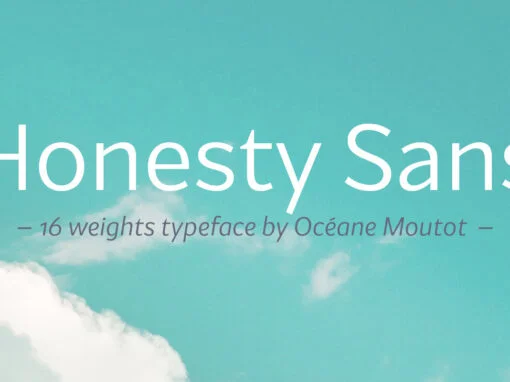
Honesty Sans Font
Honesty was the first font published by the Studio in 2020. It was a typeface with flared stems. 2 years later, we are now publishing Honesty Sans. It is inspired by the original design but is revisited as a sans
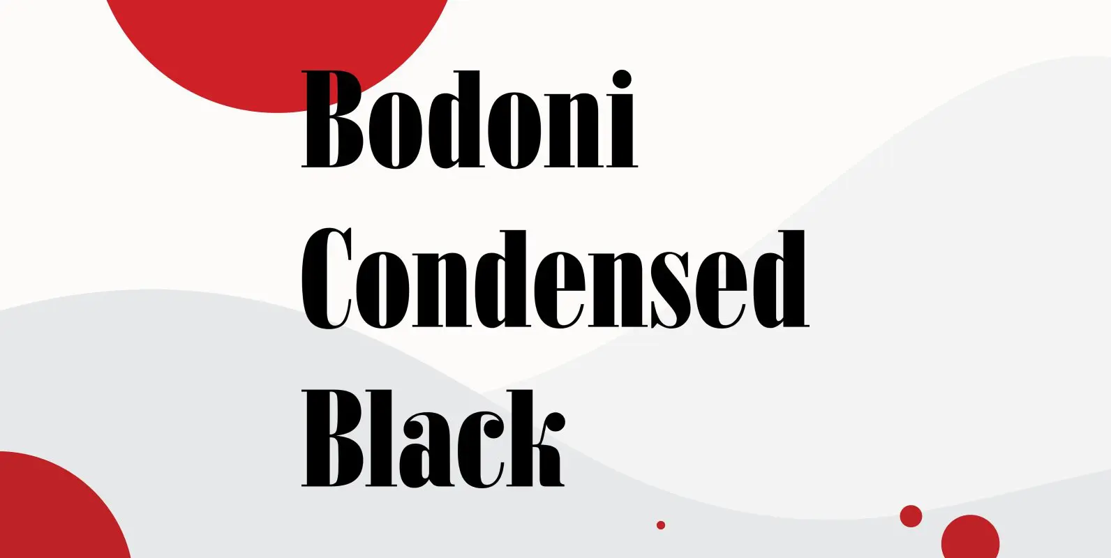
Bodoni Condensed Black Font
Bodoni Condensed Black was designed by R.H. Middleton for Ludlow, circa 1930. Digitally engineered by Steve Jackaman. Published by Red RoosterDownload Bodoni Condensed Black
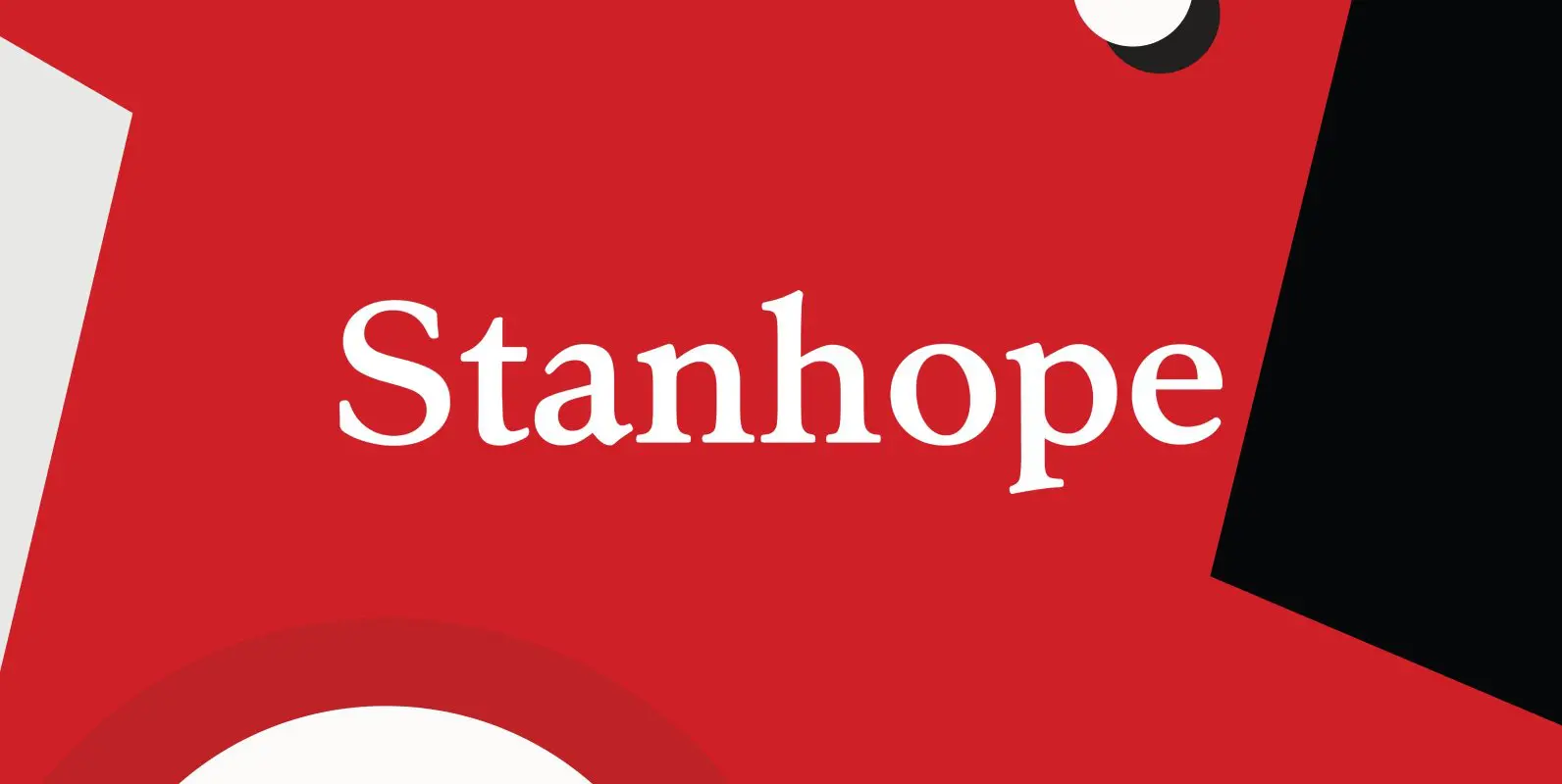
Stanhope Font
Designed by Les Usherwood. Digitally engineered by Paul Hickson. Les based the design on a turn-of-the-century typeface of the same name. The foundry is believed to be Soldans & Payvers, circa 1904. Published by Red RoosterDownload Stanhope
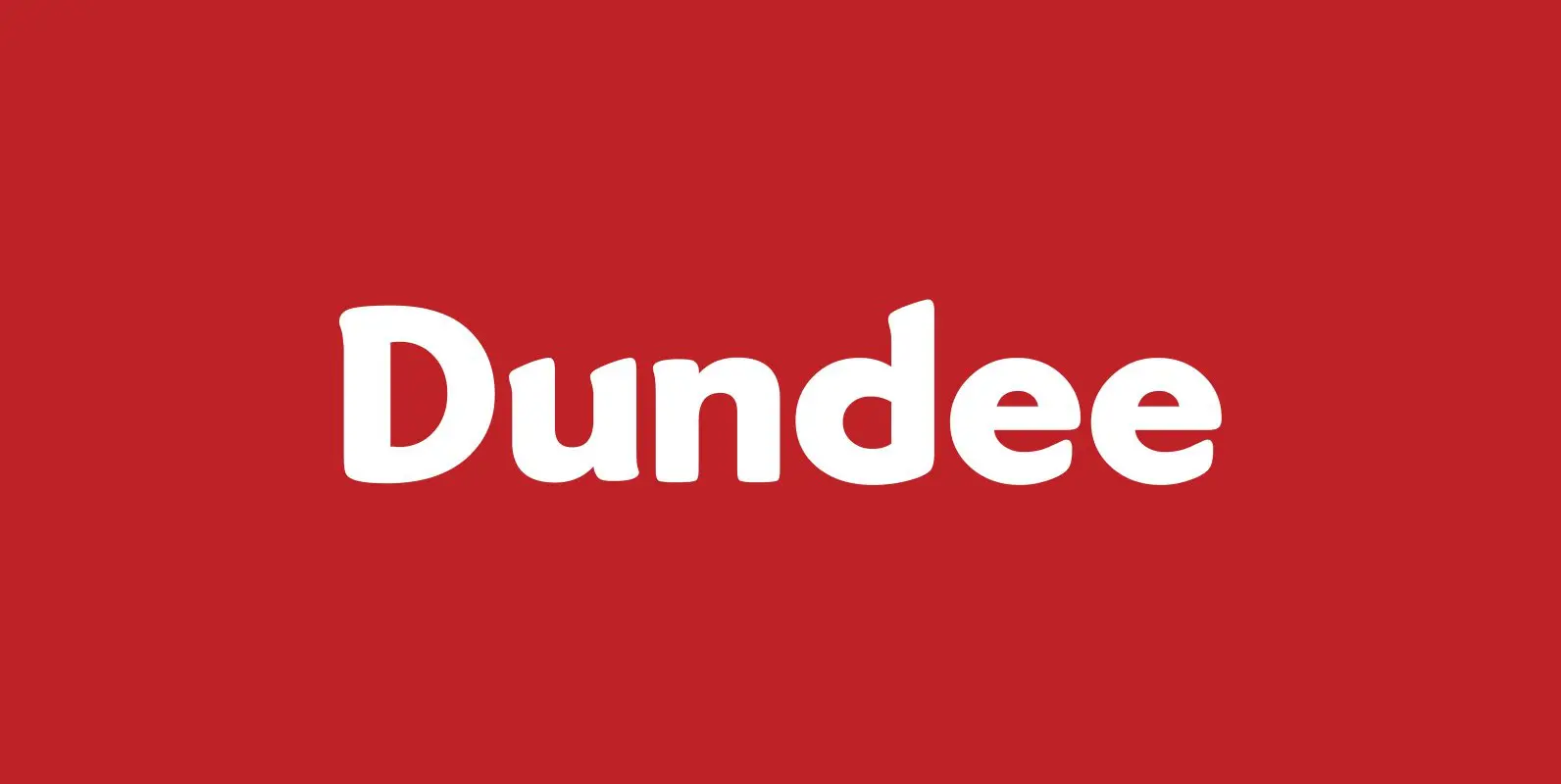
Dundee Font
Designed by A. Pat Hickson, Dundee is a new design inspired by the various mastheads used in children’s comic books in England, published by D.C. Thompson of Dundee, Scotland. Published by Red RoosterDownload Dundee

Administer Font
Designed by Les Usherwood. Digitally engineered by Steve Jackaman. A few weights were originally released by another foundry; but this complete version of the family is a better match to Les original drawings! Published by Red RoosterDownload Administer
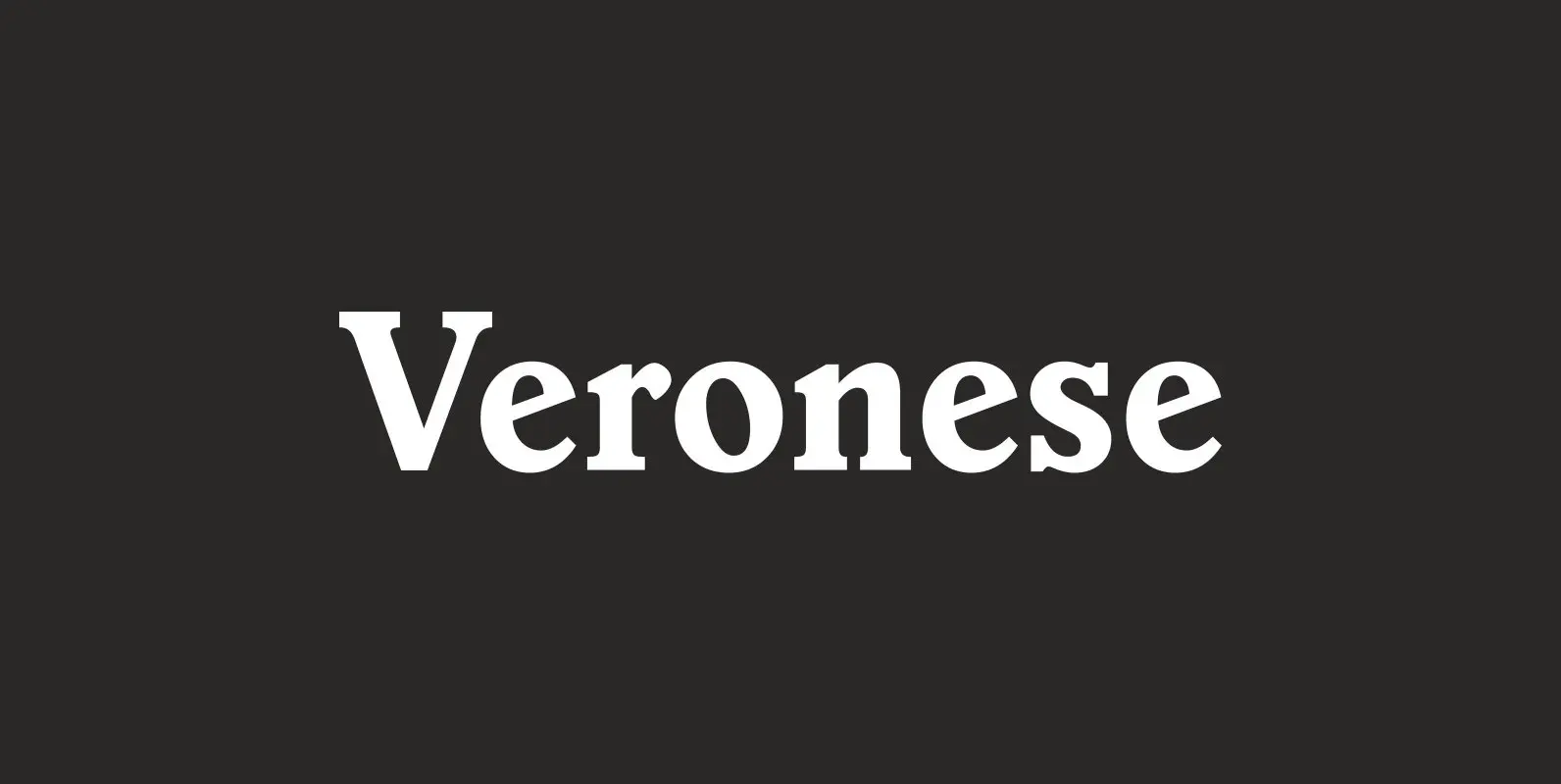
Veronese Font
Designed by Steve Jackaman, Veronese is based on the early original Monotype design, you can definitely see the influence of Italian Old Style, Jenson and Morris Golden Type. Published by Red RoosterDownload Veronese

Leighton Font
Designed by Paul Hickson, Leighton is a clean serif based on Lectura, a design by Dick Dooijes of the Amsterdam Foundry (1966). Published by Red RoosterDownload Leighton
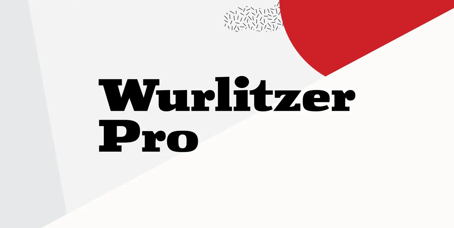
Wurlitzer Pro Font
Designed by Steve Jackaman & Ashley Muir. This design was inspired by an early 20th century woodtype. Wurlitzer contains all the high-end features expected in a quality OpenType Pro font. Published by Red RoosterDownload Wurlitzer Pro

Edito Font
“Edito” is a completely new body copy-font. The special thing about this font is, that all serifs have the same height. So no matter if you take the thinnest cut (A) or the fattest (F), you will always have aligning
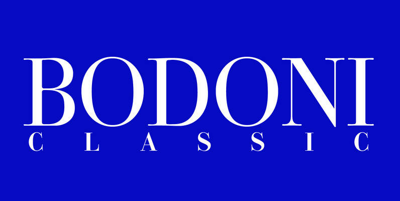
Bodoni Classic Font
I became interested in designing Bodoni Classic because of a lazy graphic designer at Jacques Damase publishing house. He had to change a single letter on a bookcover about J. B. BODONI. The French call him Jean Baptiste instead of
Copacabana Font
Copacabana is heavily based on one of my favourite typefaces Goudy Old Style Italic. It is sharper and more clearly defined than Goudy yet still retains it old style characteristics. The face is slightly angled so is basically upright whilst

Brigade Font
In searching for a Roman to use there were bits of Bembo,Times,Garamond etc., that I liked and bits that I did not. So I set out to take the best bits of all my favourite Romans and tried to create
Caslon Extra Condensed Font
Designed by Steve Jackaman, Caslon Extra Condensed is based on the Ludlow/ATF versions of this great typeface. Published by Red RoosterDownload Caslon Extra Condensed
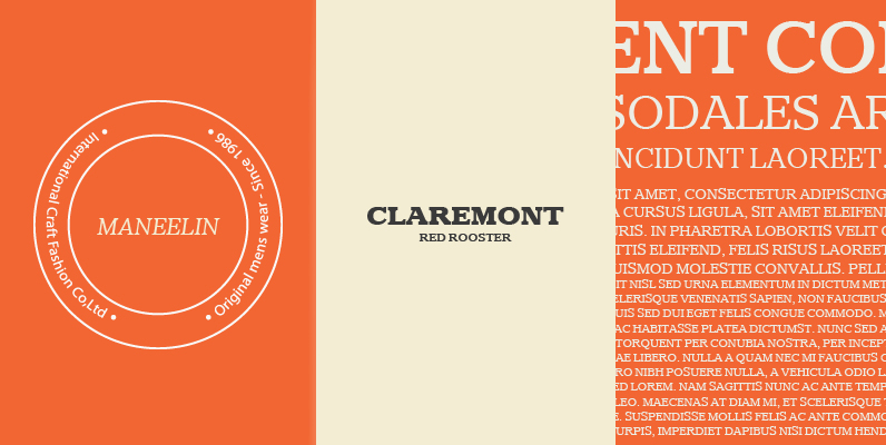
Claremont Font
Designed by Les Usherwood. Digitally engineered by Paul Hickson. Les never released this completed typeface before his untimely death in 1983. Published by Red RoosterDownload Claremont
Consort Font
Designed by Steve Jackaman, Consort is a serif design based on the original Stephenson Blake typeface design. Published by Red RoosterDownload Consort
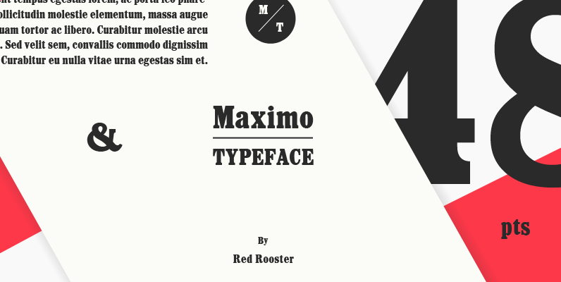
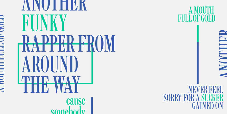
Maximo Font
Designed by Les Usherwood. Digitally engineered by Steve Jackaman. Published by Red RoosterDownload Maximo

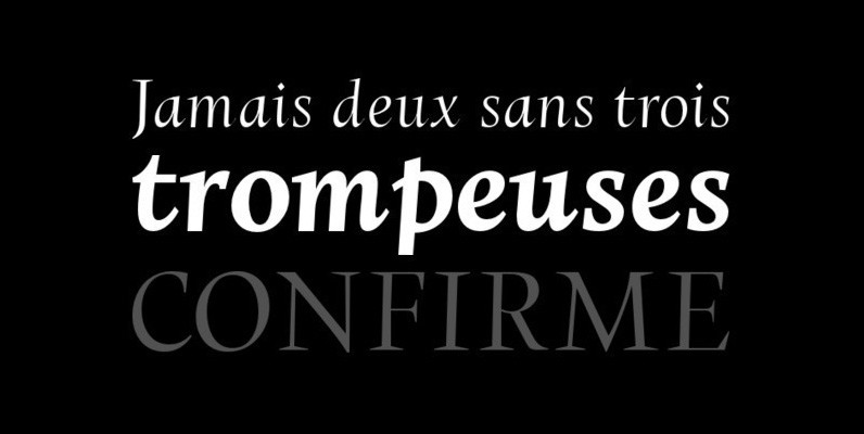
Karmina Font
Karmina is a text typeface developed mainly for pocket books and budget editions. It was built to withstand the worst printing conditions: low quality papers, high printing speed with web presses and variations in the ink level of the printing
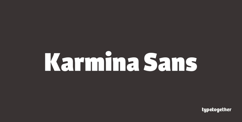
Karmina Sans Font
Karmina Sans was conceived as a larger type family, six weights with matching italics, that could perform alongside it's serifed cousin, but that had its own features and personality. It shares the same technical excellence and has the same basic