Tag: branding
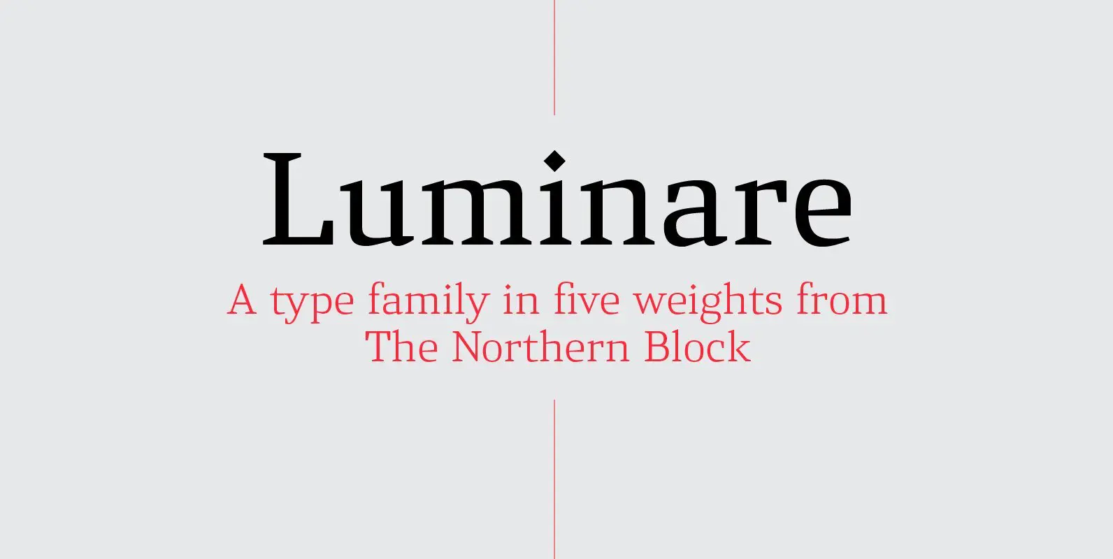
Luminare Font
Luminare is a serif type family with a strong rhythmical structure, clean cut serifs and balanced proportions. Luminare began life as a personal and academic enquiry into stencilled lettering. The key sources of this research where found in liturgical manuscripts
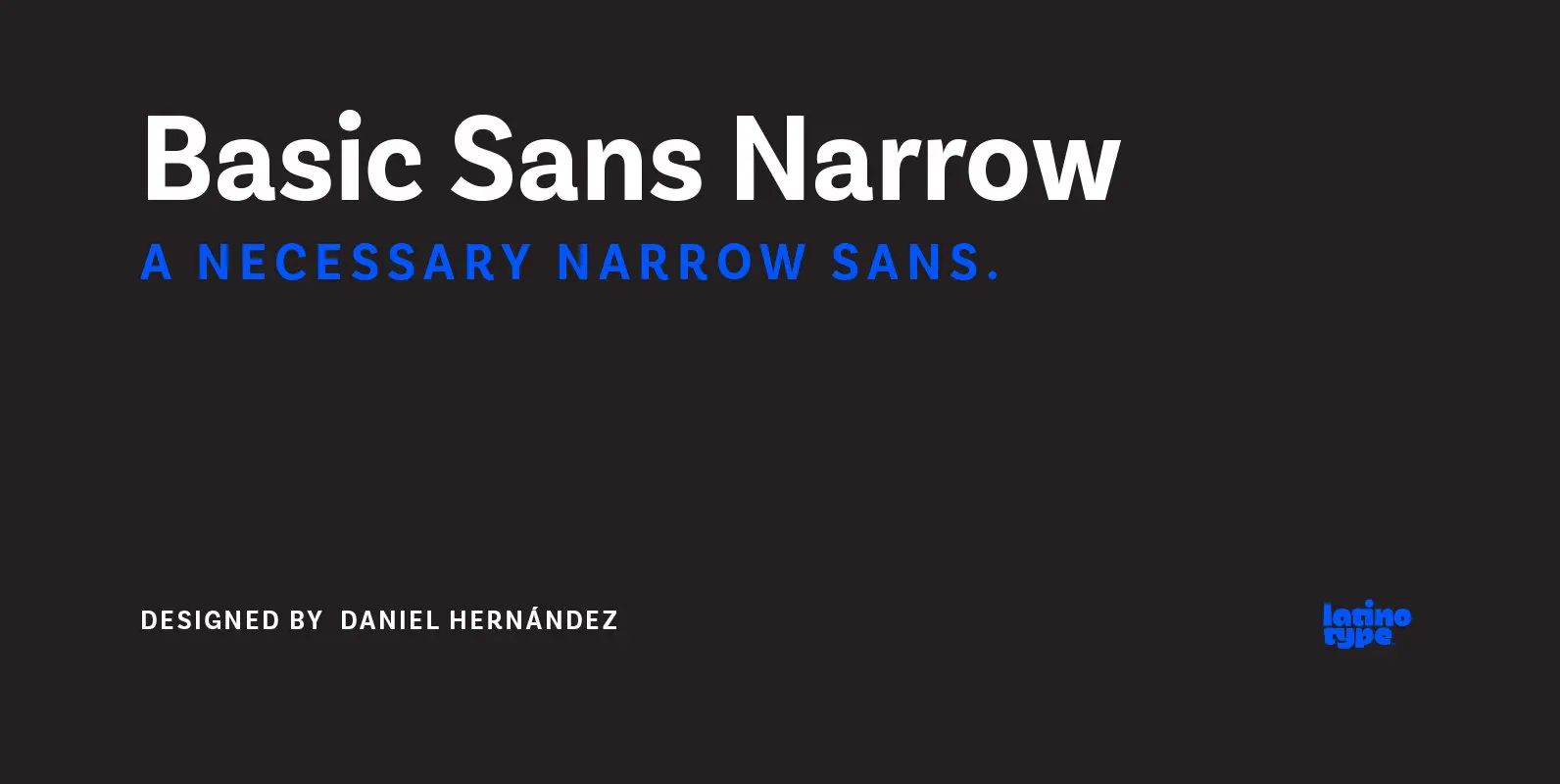
Basic Sans Narrow Font
Basic Sans Narrow is a narrower version of Basic Sans. It is a family of Grotesque features with a functional, neutral and seeming clean style that looks to keep a neutral (or basic) appearance on paper, but including lots of
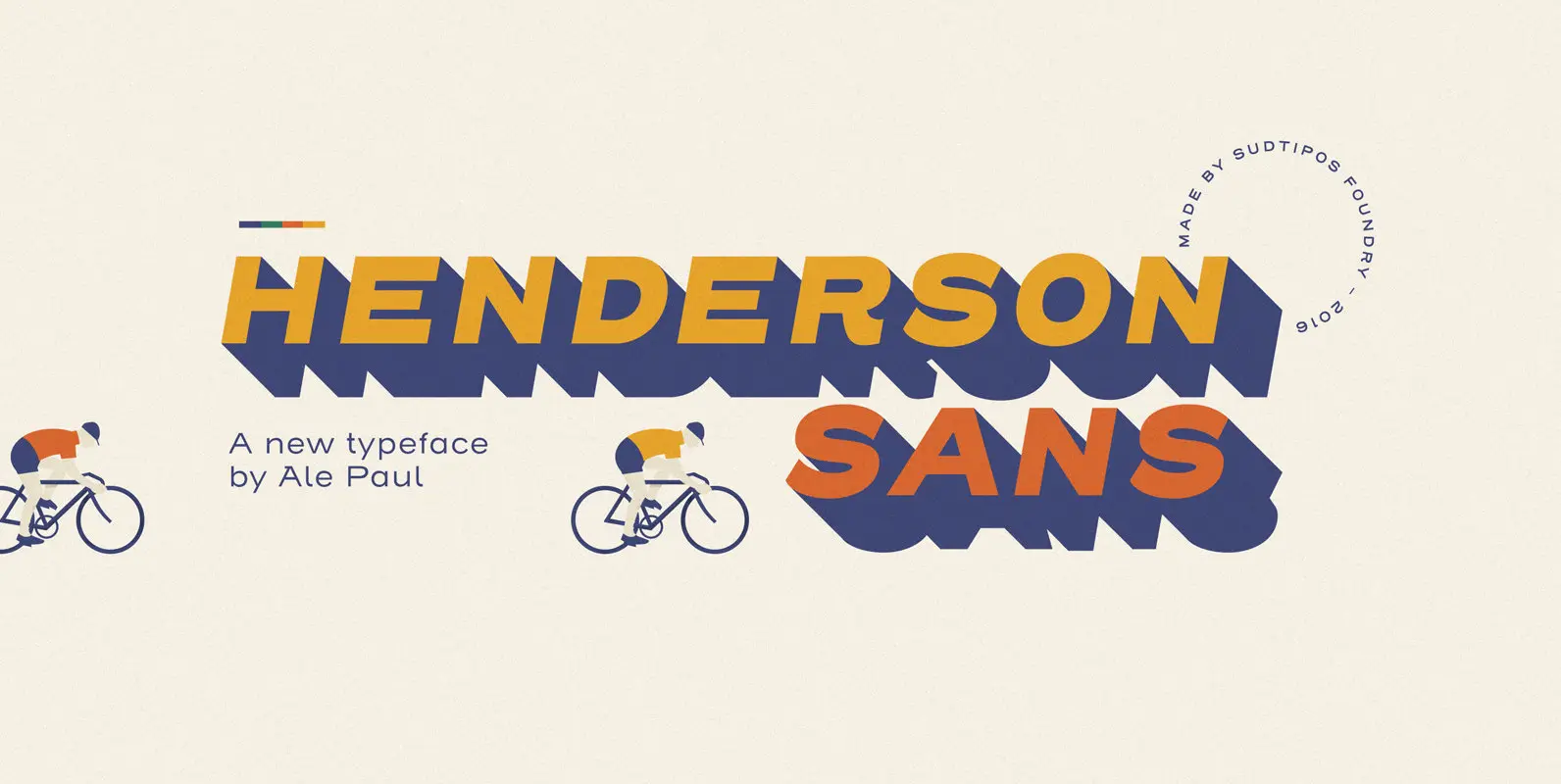
Henderson Sans Font
The first thought that crosses a type designer’s mind upon seeing a slab serif is: I wonder what it would look if it was serifless. And so, after building Henderson Slab, I followed my instincts and gave it a sans
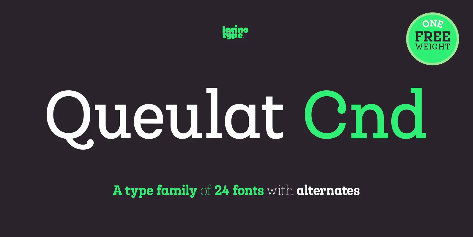
Queulat Cnd Font
This font is the condensed version of Queulat, but keeping the same features as the original typeface. Queulat Cnd is a hybrid typeface that combines different styles, reflecting charm, freshness and, especially, a strong personality. Since it is a condensed

Henderson Slab Font
A few bold caps drawn by Albert Du Bois for the 1906 Henderson Sign Painter book started me in the direction of looking at how sign painters approached slabs after the industrial revolution. The usual happened from there. My exercise
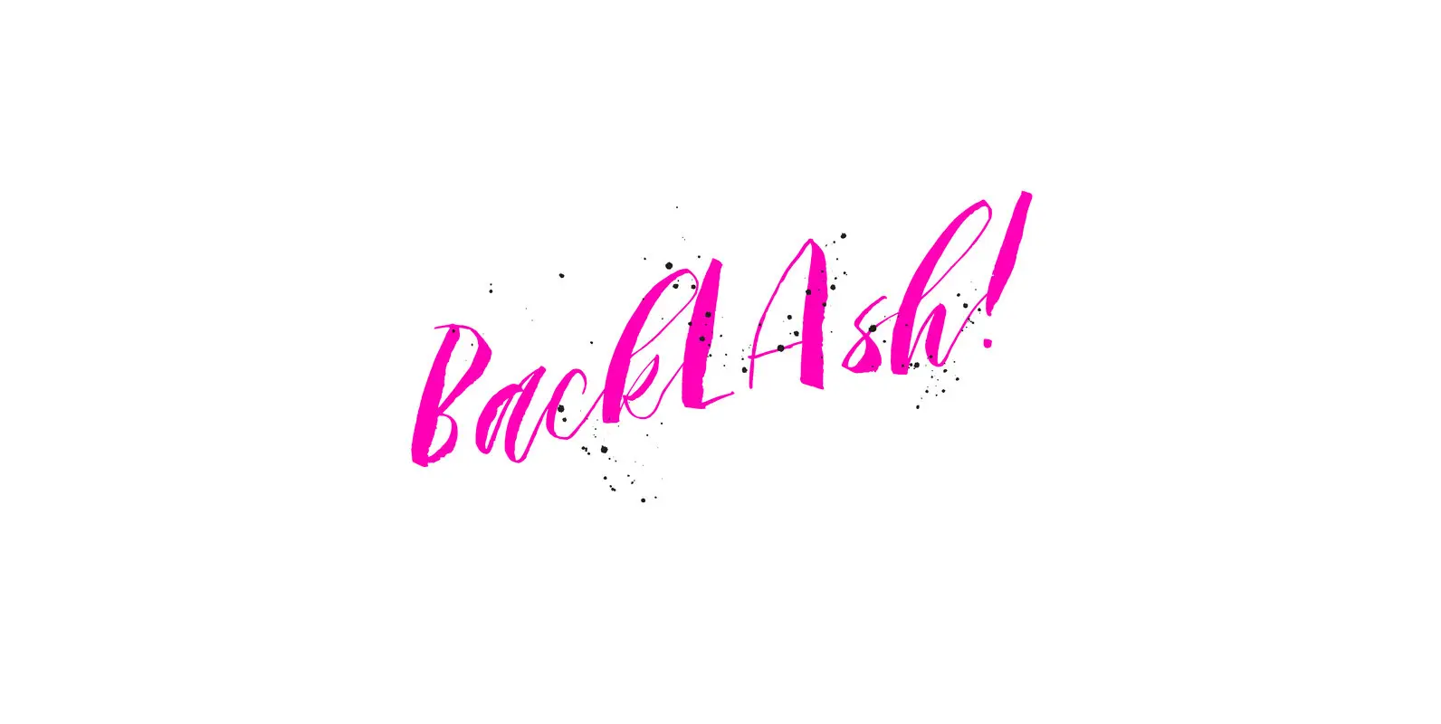
Backlash Font
A hand painted script style font that adds instant cool factor to any project. This font strives to bring a real hand-illustrated touch to designs as the variation in line weights, textures, and letter forms creates a one of a
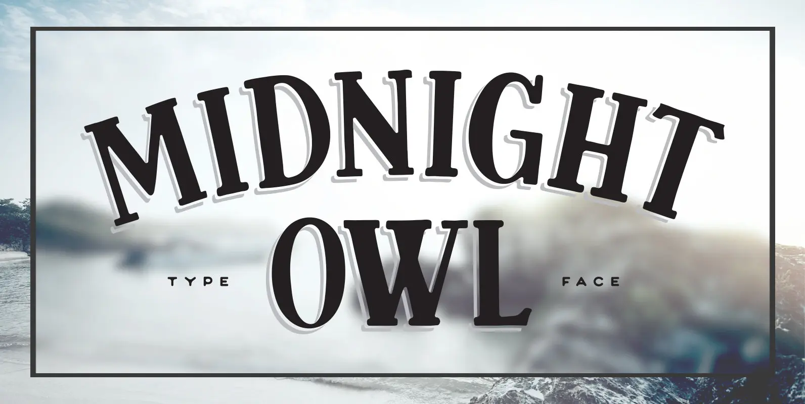
Midnight Owl Font
Midnight Owl is a condensed, hand lettered display font that was based on modernist-serif letterforms and packs a ton of quirky character into one single font. Use it clean, or dress it up a bit with the bonus decorative layers,
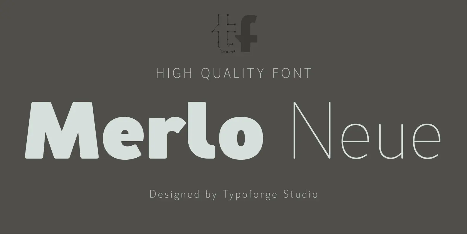
Merlo Neue Font
Merlo Neue is the younger brother of Merlo. New family received refreshed, more square proportions and a new shape of many glyphs. However, what is the most important in new Merlo, is the wide range of instances – nine new weights,
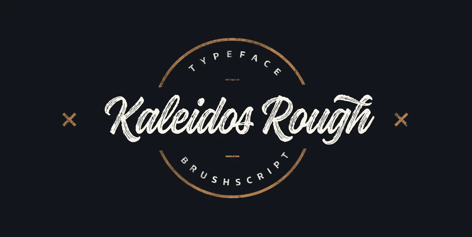
Kaleidos Rough Font
Kaleidos Rough lining brush script. It has two versions; Kaleidos Rough and Kaleidos Textured. Rough version has rough edges to mimic authentic brush strokes. Textured version has also those rough edges and in addition it has brush stroke texture to
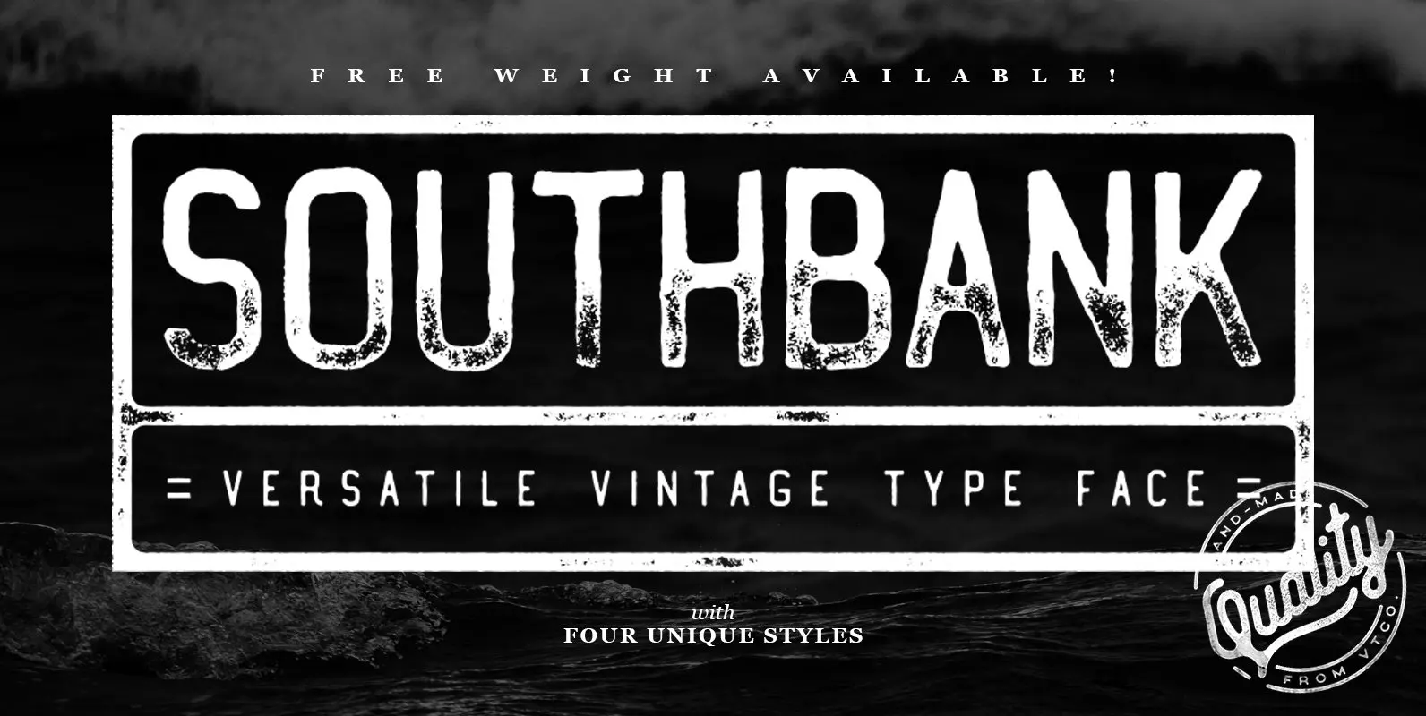
Southbank Font
Southbank Display Font is the latest font from Vintage Type Co. and comes with packed 4 unique condensed styles, each with an italic, and inked counterpart. Whatever you’re designing, one of these styles is sure to fit your needs! Aside
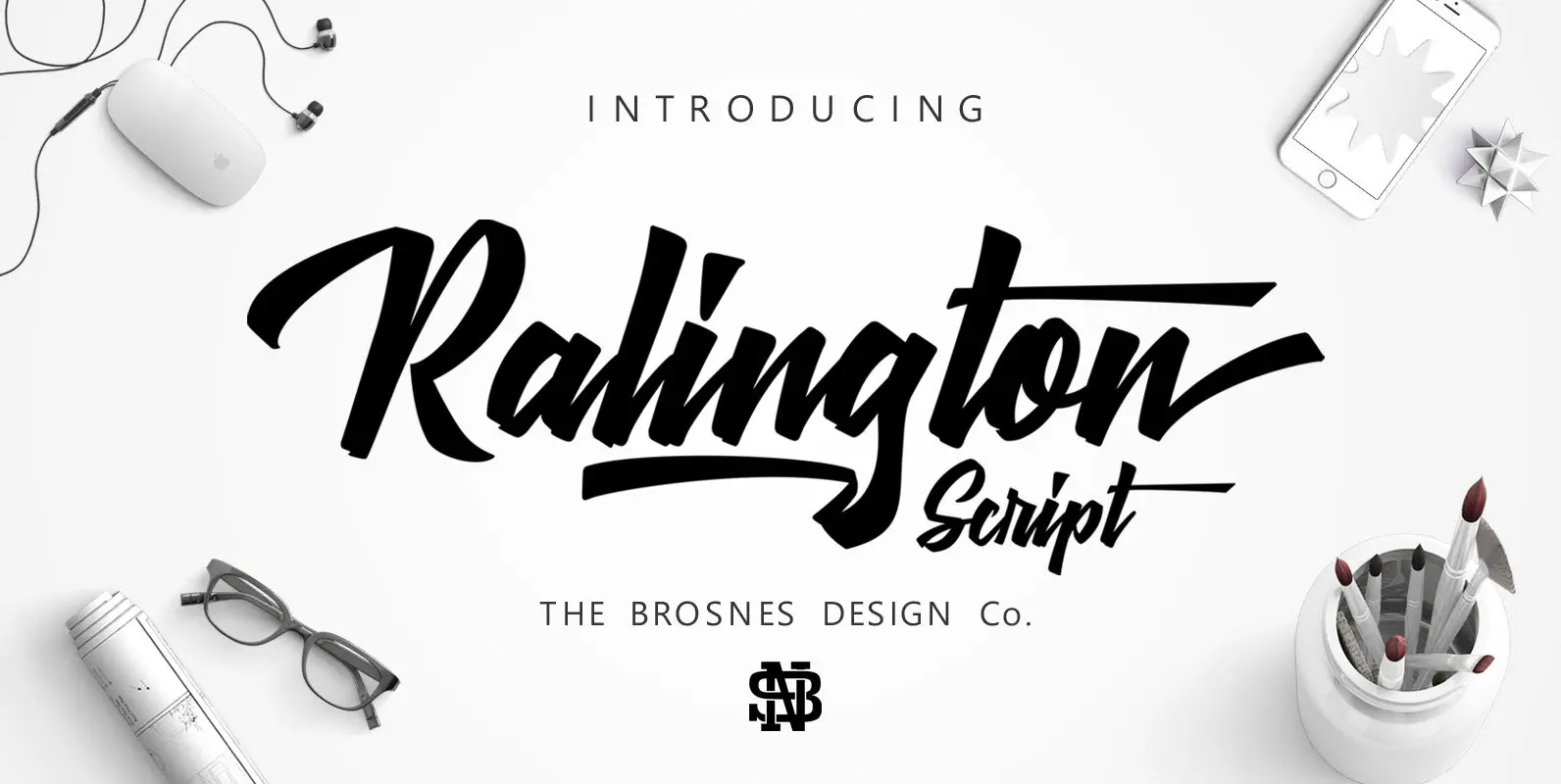
Ralington Script Font
Ralington script is design inspired by street art and brush hand lettering. Ralington Script comes with lowercase and uppercase, as well as multi-lingual support, currency figures, numerals, and punctuation. Published by THE BROSNES.Download Ralington Script
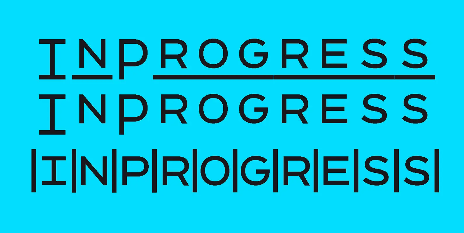
InProgress Font
InProgress is a playful multi-spaced sans-serif typeface that can turn typesetting into grid making. Stacked together, the lines of type create serendipitous alignments, with text blocks becoming dynamic checkerboards of geometric letterforms. The resulting patterns are best suited for posters,
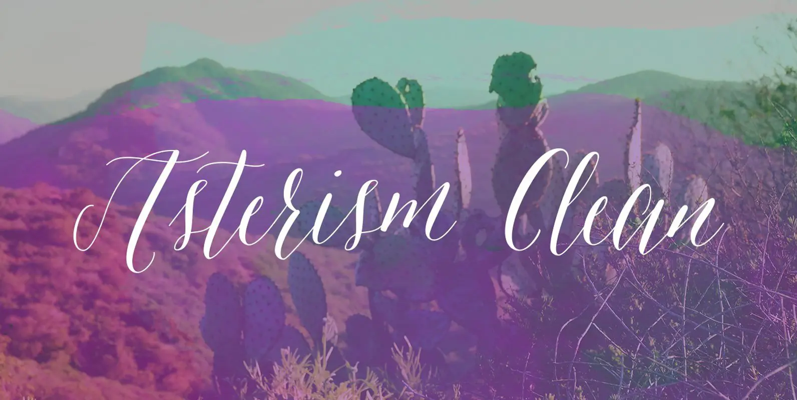
Asterism Clean Family Font
Asterism Clean is the smooth lined version of Asterism. It is a calligraphy style font with a moving baseline and lots of shining personality. Also contains a bold and a monoline version. This hand written style font is based on

Francesco Font
A new tribute to old ways Franck Jalleau’s flexible and vigorous typeface is inspired by Venetian faces of the Renaissance, especially those cut by Francesco Griffo who lends it his name. Adopting old-style classicism and manual drawing, Francesco is soft
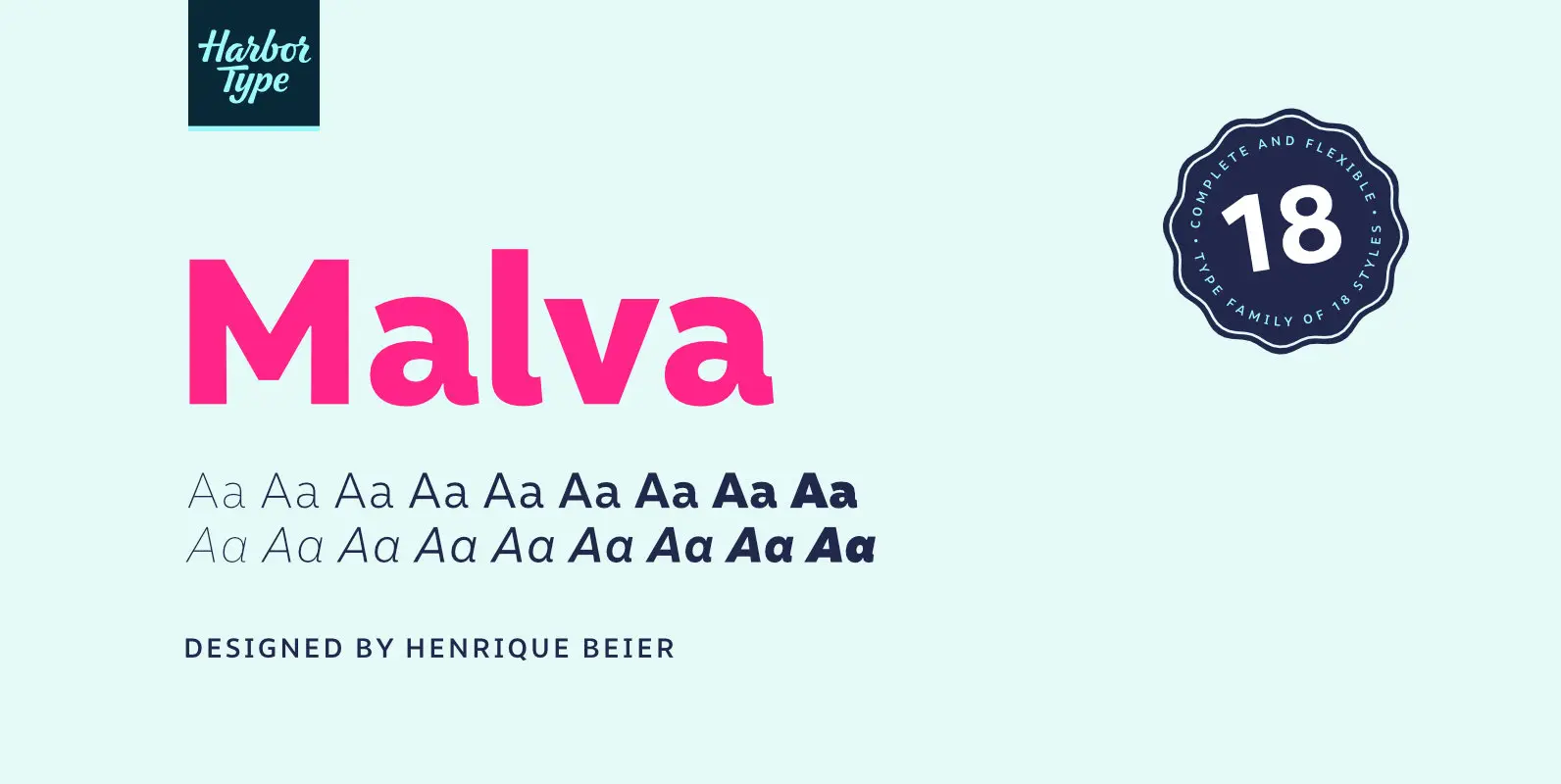
Malva Font
Malva was designed to perform as a branding element, providing a clean look for visual identities and publications. It brings a touch of friendliness to the communication without compromising the professional look every brand strives for. Legibility was one of
