Tag: branding
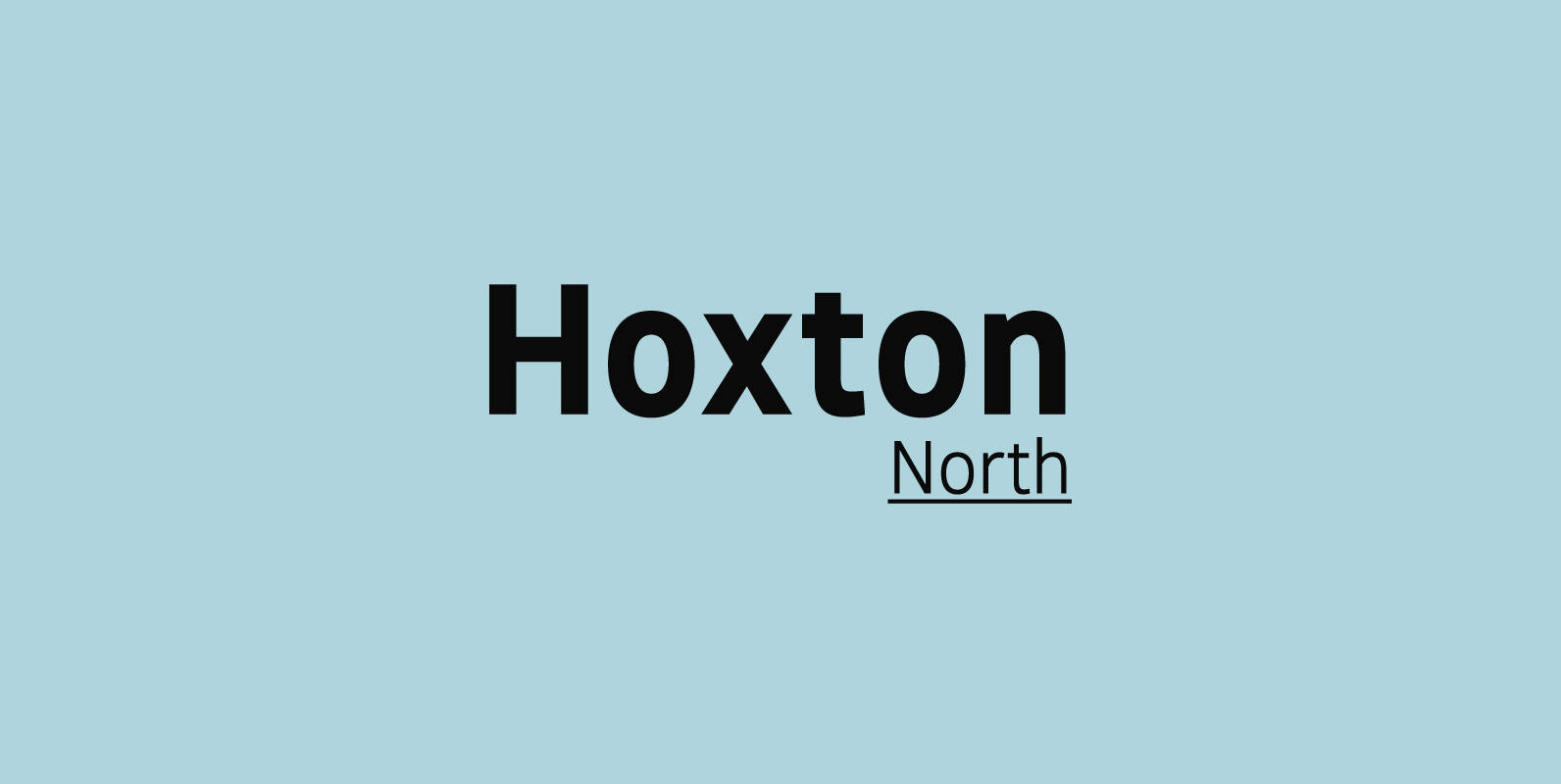
Hoxton North Font
Hoxton North came out of the concept to create something distinctly British, drawing on modernist influences such as Edward Johnston's typeface for the London Underground and Gill Sans. A humanistic san serif typeface with a British modern quality. Open forms
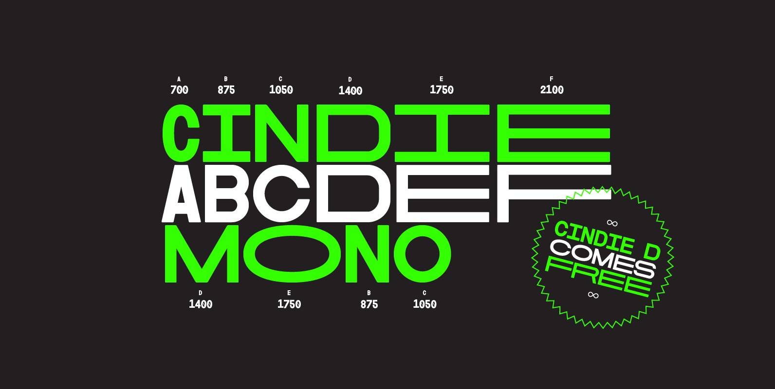
Cindie Mono Font
Cindie Mono is a multi-width display font. Six different widths – A (condensed) through F (super extended) – mathematically correspond with one-another creating a stackable type family. Each face contains all caps full West, Central and East European language support.
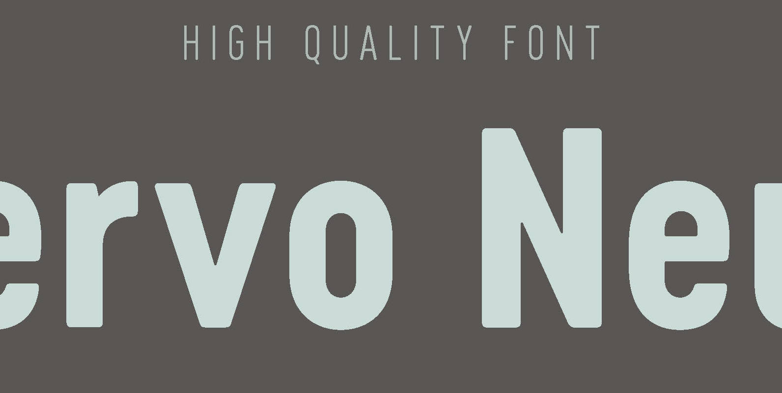
Cervo Neue Font
Font Cervo Neue is the new perfected and extended version of Cervo containing 18 varieties. It differs from its previous version with the higher accents over glyphs, enlarged punctuation, nautical numerals and newly added varieties Semi Bold, Bold, Extra Bold

Erbaum Font
Erbaum is a display square sans serif type family. It is straight-forward in overall structure, simple and rational in details. Erbaum was designed to maximise clarity, with an emphasis on construction and pragmatic aesthetics. The concept behind this typeface was
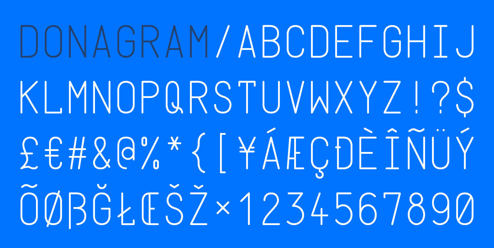
Donagram Font
Donagram is a typeface inspired by telegrams from the 1940s. Available in three weights, it’s roots are in the functional usage of the telegraph machine. Donagram has been developed into a modern, clean and elegant typeface. Published by AtworkDownload Donagram
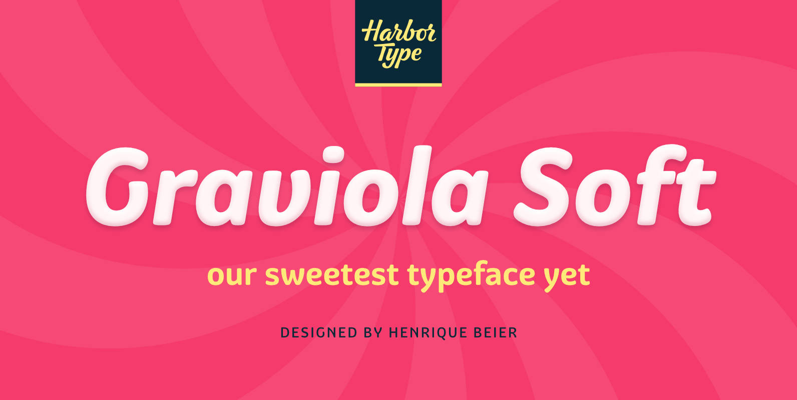
Graviola Soft Font
Graviola Soft is a juicy type family. It is based on our Graviola typeface, but we didn’t just round its corners. We redrew every stem and terminal so they would look just right. Combined with curved diagonal strokes and alternate
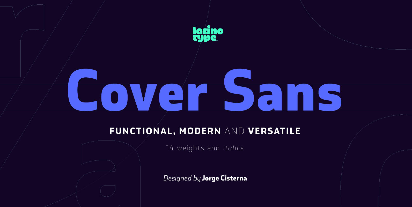
Cover Sans Font
Cover Sans is a humanist geometric typeface with an orthogonal structure, which provides stability when composing a text. Open shapes and low x-height give this font balance and make it an air-breathing typeface. Cover Sans is a stable and strong
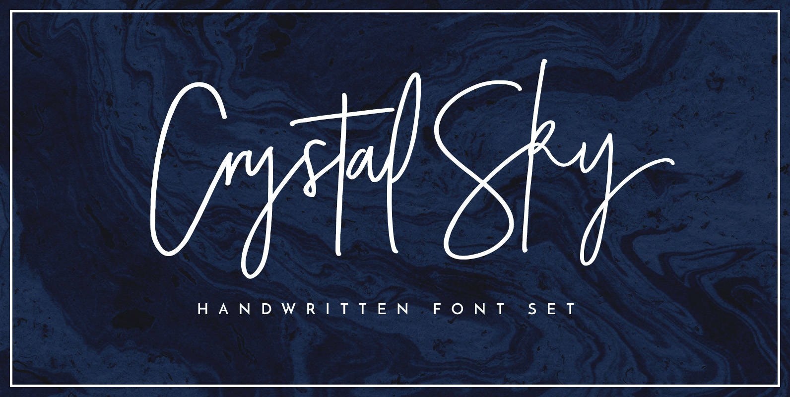
Crystal Sky Font
Add a little sparkle to your designs with Crystal Sky! A clean & modern signature-style font set, perfect for creating authentic hand-lettered text quickly & easily. With exaggerated strokes and an extra bouncy baseline, Crystal Sky has an unmistakable charm;

TT Moons Font
TT Moons is a slim and contrast serif. This font family works especially smart in classic design themes. TT Moons is a typeface of the glyptal modern font family. The ideal application range for this typeface is magazines, books and
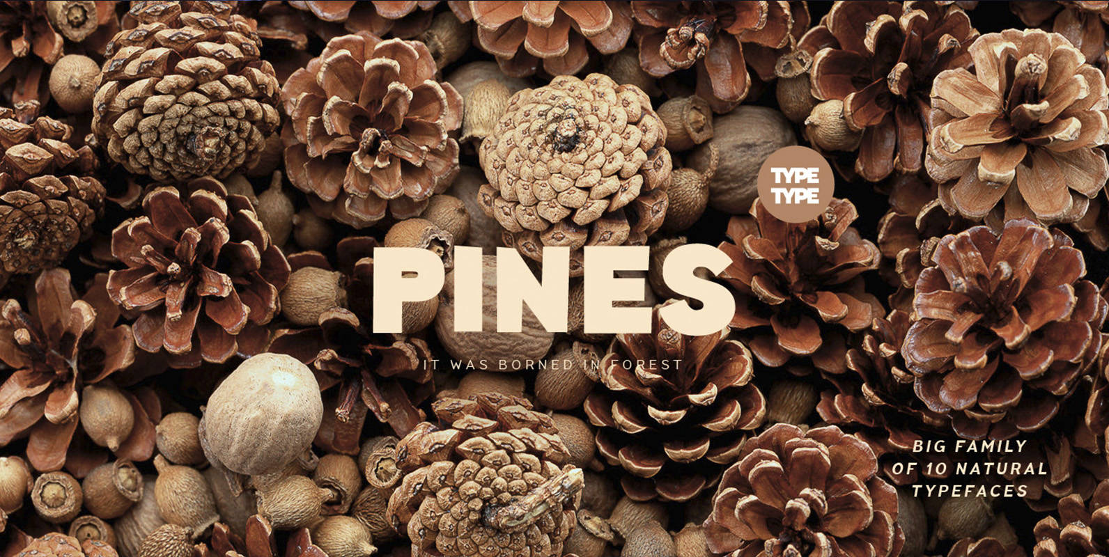
TT Pines Font
Imagine you've decided to cut letters out of paper thereby creating a modern sans-serif for a broad application range. What result would you get? We already know the answer! TT Pines is a fontfamily that we've carefully cut out of

Corporative Sans Rounded Font
Corporative Sans Rounded is the rounded version of Corporative Sans. Its curved terminals provide it with a marked personality and distinctive traits, but turn it into a friendly face at the same time. The font works well at both display
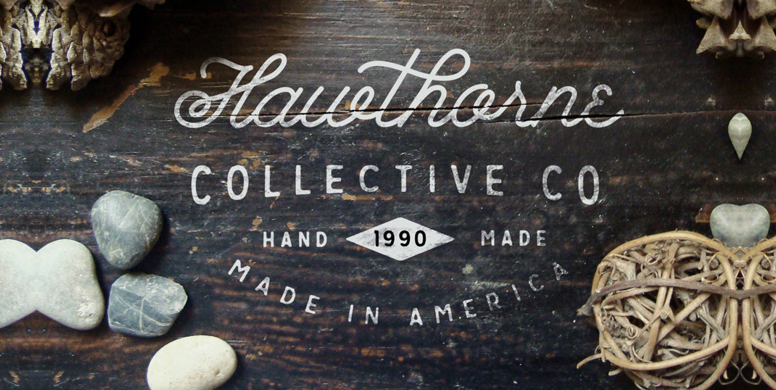
Growler Script Font
Without further ado… & freshly brewed, Growler Script is here! A Mono-Weight Script Font. This is a first from Hustle Supply Co! Growler Script is heavily based on the modern era of Type-based traditional Logo design. As a logo designer

Yonder Font
I created this font in response to the huge demand I see for typefaces of this style. It couples very well with script fonts and gives each piece a sense of character. Look no further for a playful typeface that
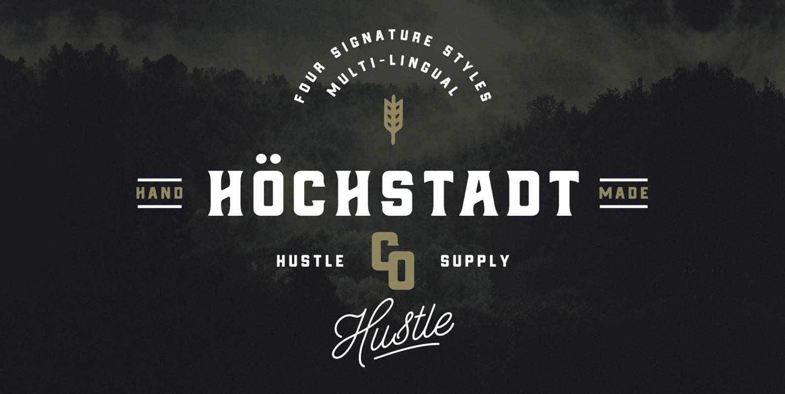
Höchstadt Font
Introducing Höchstadt, a Multi-Lingual (Western European Supported) Typeface with 4 Styles. Höchstadt also includes CSS Webkits for each style for use on web. Inspired by Old Whiskey Labels, Höchstadt is a must have in your Type collection. It’s industrial feel
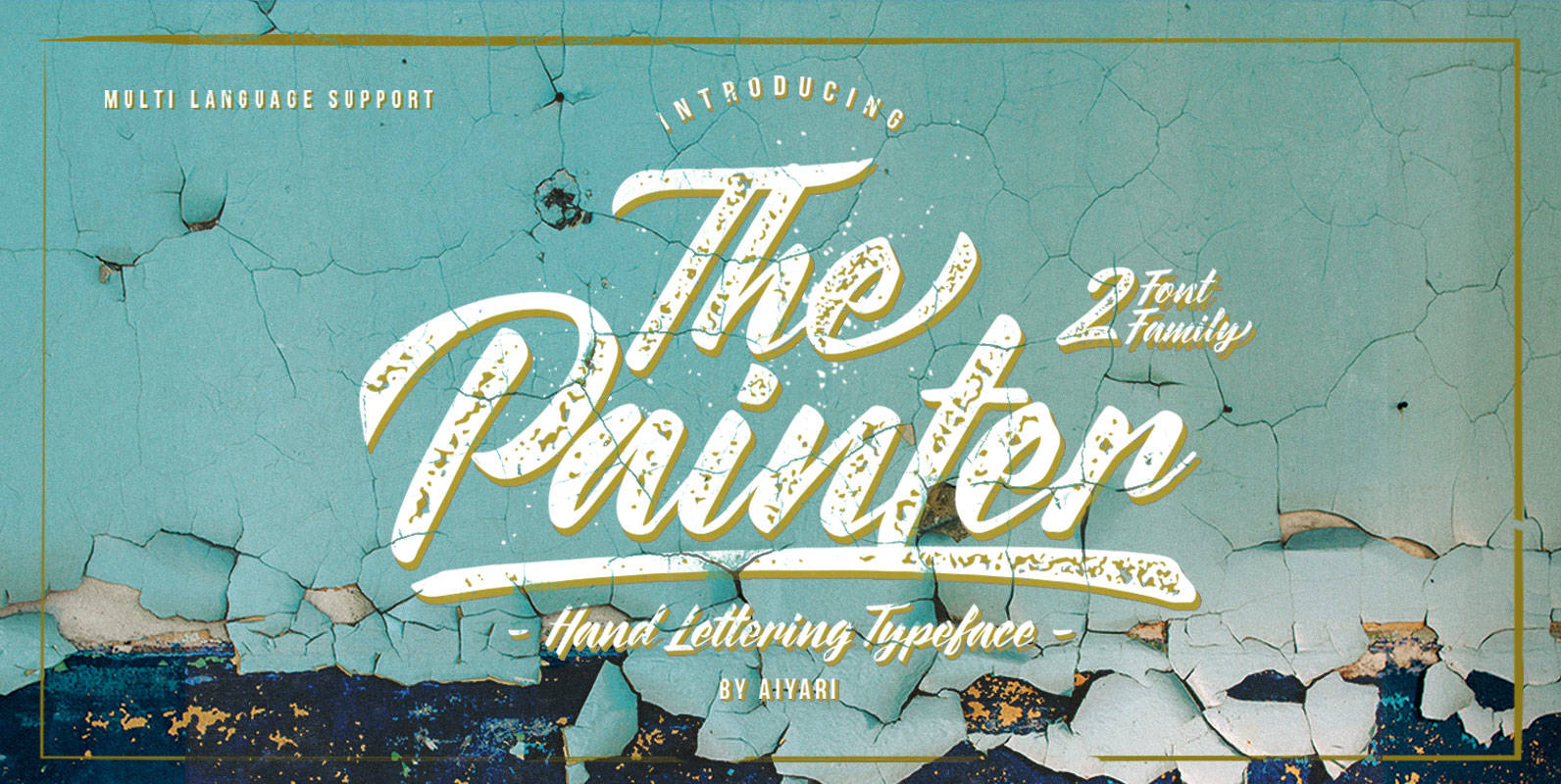
The Painter Font
The Painter is a typeface inspired by traditional sign and brush lettering.The typeface family includes two styles (regular & rusty) along with OpenType features such as: stylistic alternates, stylistic sets, ligatures, and swashes. Published by AiyariDownload The Painter
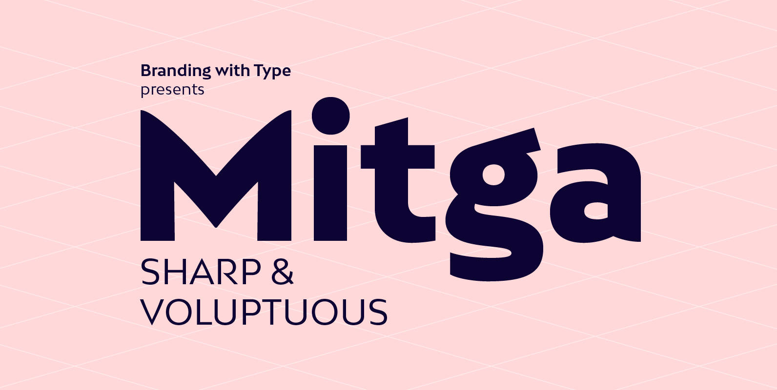
Bw Mitga Font
Bw Mitga is a sharp & voluptuous sans serif. A consistent 16° angle running through all the weights is topped with subtly bowed diagonals, giving Bw Mitga its unique and strong personality. It’s available in 4 styles and it’s suited
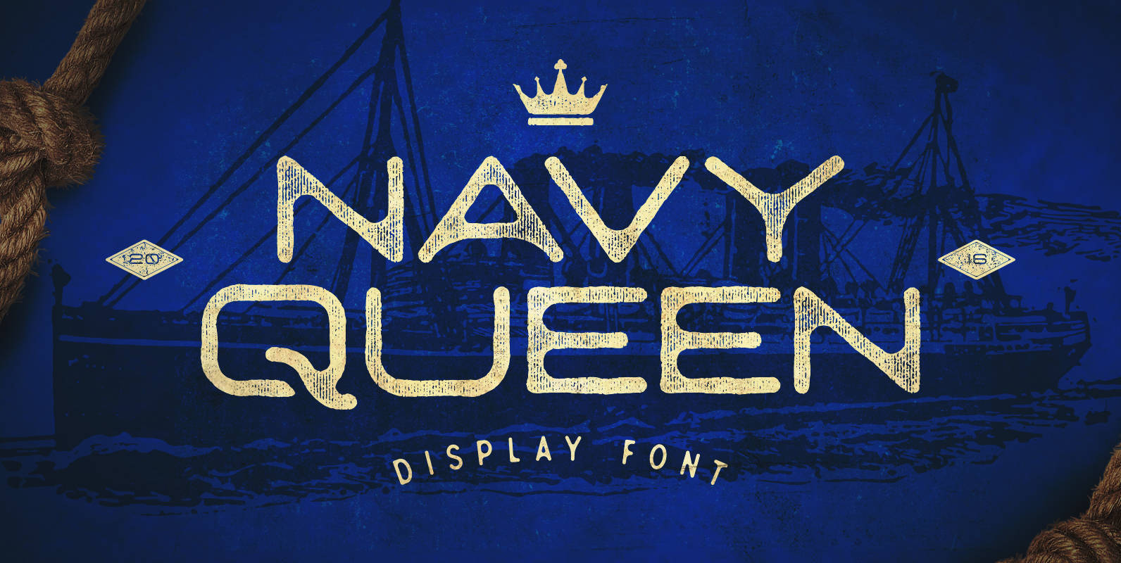
Navy Queen Font
Navy Queen is a over-extended, geometrically designed sans serif display font that pays homage to simpler times. This font will act as a great addition to any vintage design project including posters, logos, crests, packaging, and so much more! Navy
