Tag: brochures
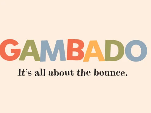
Gambado Font
‘Bounced’ is the traditional term for a higgledy-piggledy style of lettering in which characters are shaken up by a combination of rotation and vertical displacement from the presumed norm of upright stance on a baseline. Now, by utilizing pseudo-random contextuality
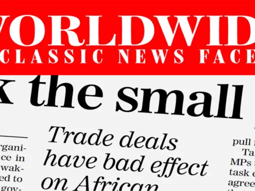
Worldwide Font
Proven in scores of magazines and newspapers around the globe since 1999, Worldwide is a semi-condensed, large x-height Century revival designed to elegantly fit large amounts of text into compact spaces while retaining maximum readability and apparent size. Its Regular
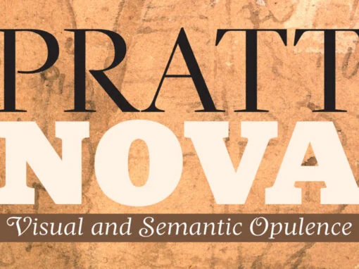
Pratt Nova Font
Shaped by constraint to accommodate a large character count, Pratt Nova has massive form: semi-condensed, large x-height, short descenders and capitals. And yet it transcends its restrictive origins in abundance, expressing a spirit of visual and semantic opulence, equipping the
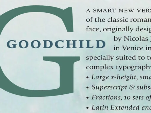
Goodchild Font
Goodchild Pro is a pragmatic text face, equipped for sophisticated academic typography. The face has a large x-height, as there is little point in adding to the stock of rangy “book” Jensons. Despite this departure from the archetype, in other
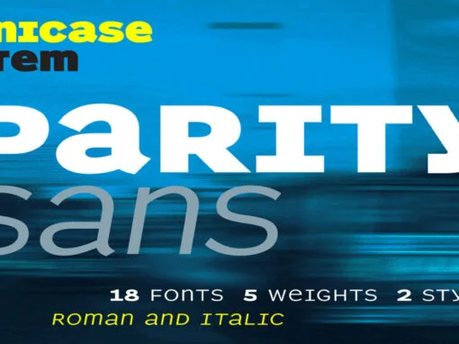
Parity Sans Font
There is a lot to choose from in this unicase megafamily, with roman and italic, six weights, text and display styles, and both proportional and monowidth versions! Published by ShinntypeDownload Parity Sans
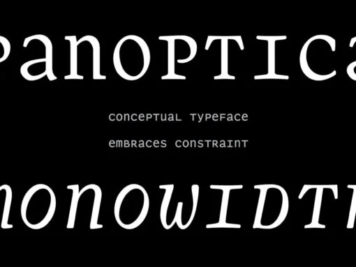
Panoptica Font
Monowidth, unicase: the alphabet imprisoned in cell blocks. With current concern over surveillance and identity as backdrop, Shinn suggests that there are no exemptions, the universality of this proposition indicated by the diversity of genres to which the Panoptic effect
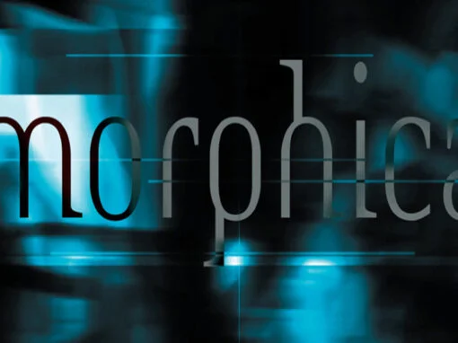
Morphica Font
This critique of the utilitarian is a perverse and disjunctive mash-up of thematic devices: sans mixed with serif, stroke contrast applied to techno armature, body parts displaced and elided. We are asked to admire the virtuosity that conjures the sweet
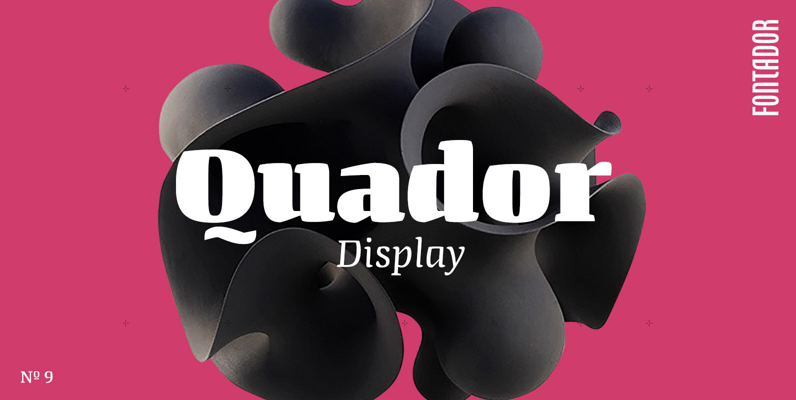
Quador Display Font
Quador Display is a serif, especially designed for contemporary typography on print and screen. The superellipse-based forms and high x-height allow large and open letterforms, perfectly adapted to the pixel grid on screen. The font contains 6 weights from light
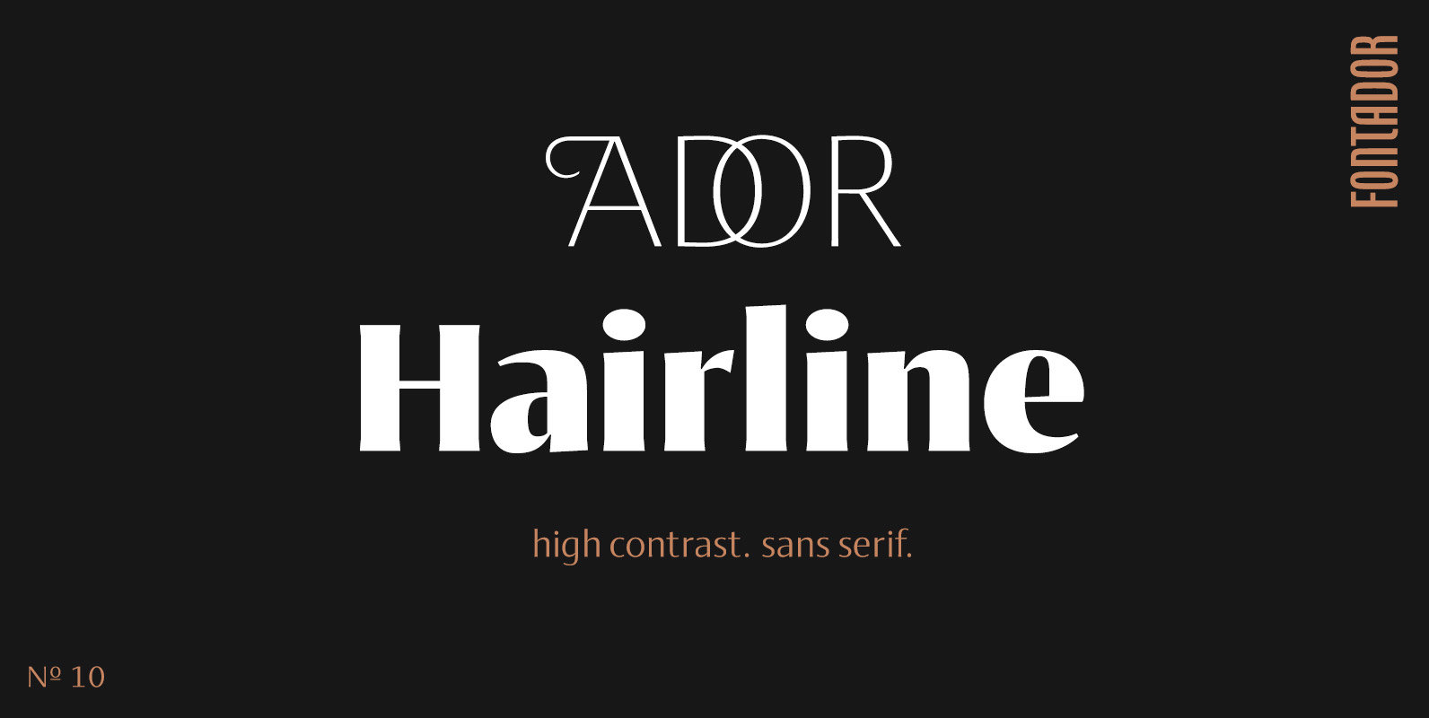
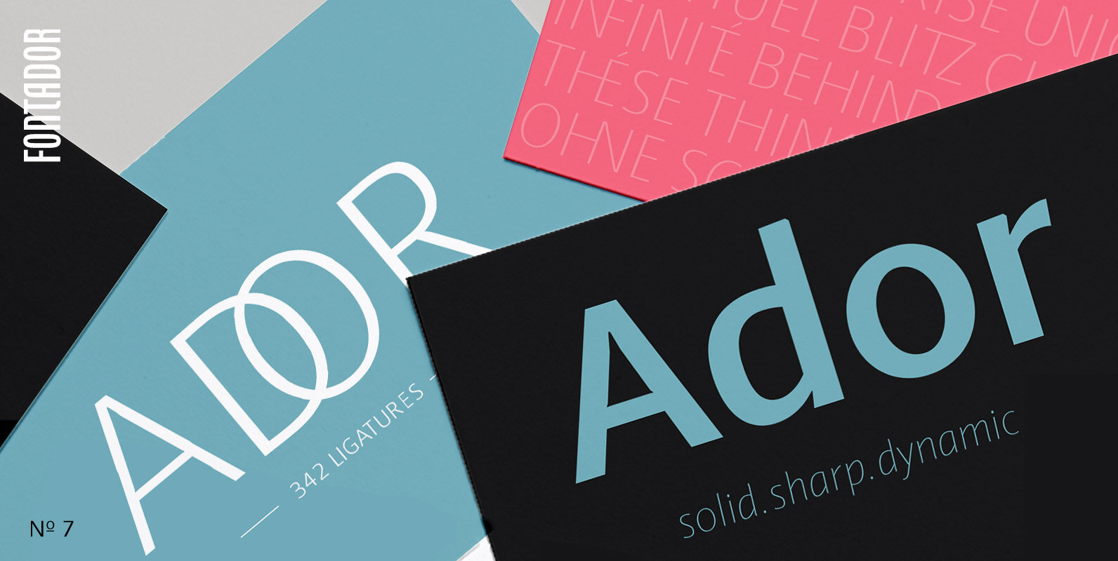
Ador Hairline Font
Ador Hairline is the high contrast version of Ador. A humanist sans serif that falls in the “evil serif” genre, especially designed for contemporary typography and comes up with 7 weights from extralight to black plus true italics and 293
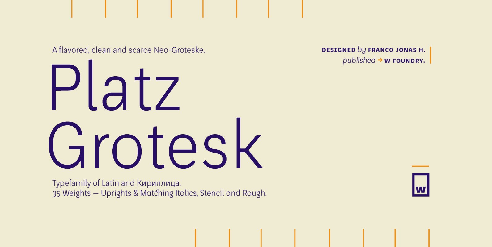
Platz Grotesk Font
Platz Grotesk has been designed parallel within the neogrotesque universe of typefaces and is inspired by humanist proportions and humanist-grotesk features. Firstly, this hybrid has a smaller x height, thus it possesses wider typeface whites in order to be legible
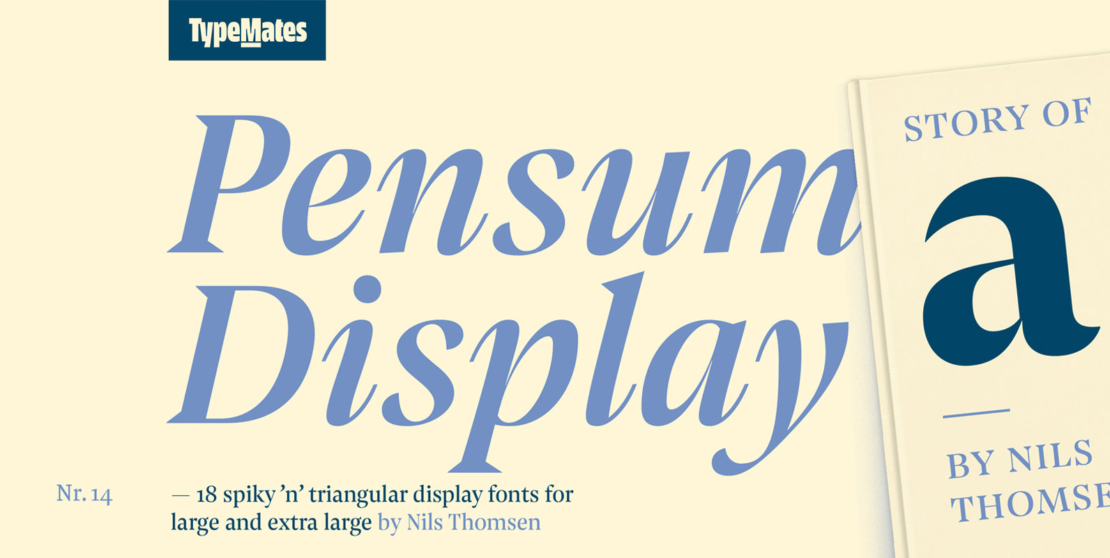
Pensum Display Font
Pensum Display is the triangular and spiky packmate of text monster Pensum Pro. Designed to be used for anything big and for nothing that isn’t big, Pensum Display is a sharp, high contrast design ready to take on display and
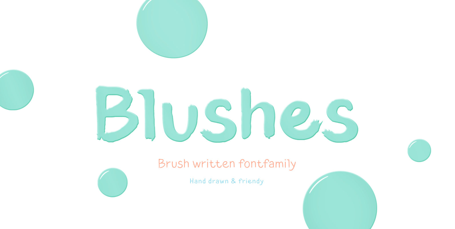
Blushes Font
Glitter, flashing cameras and fame – now you know how to deal with this stuff! Freshness and brightness is what defines the Blushes font family, which is created for beauty and fashion industries. Blushes is a vibrant part of you
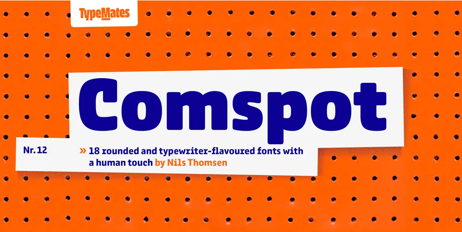
Comspot Font
Comspot is a rounded, typewriter-flavoured font family with a human touch. Originally designed as a custom typeface Comspot’s nine weights — razor-thin hairline to ultra black — and 14 stylistic alternates fulfil every need, from extended to display text. Comspot’s
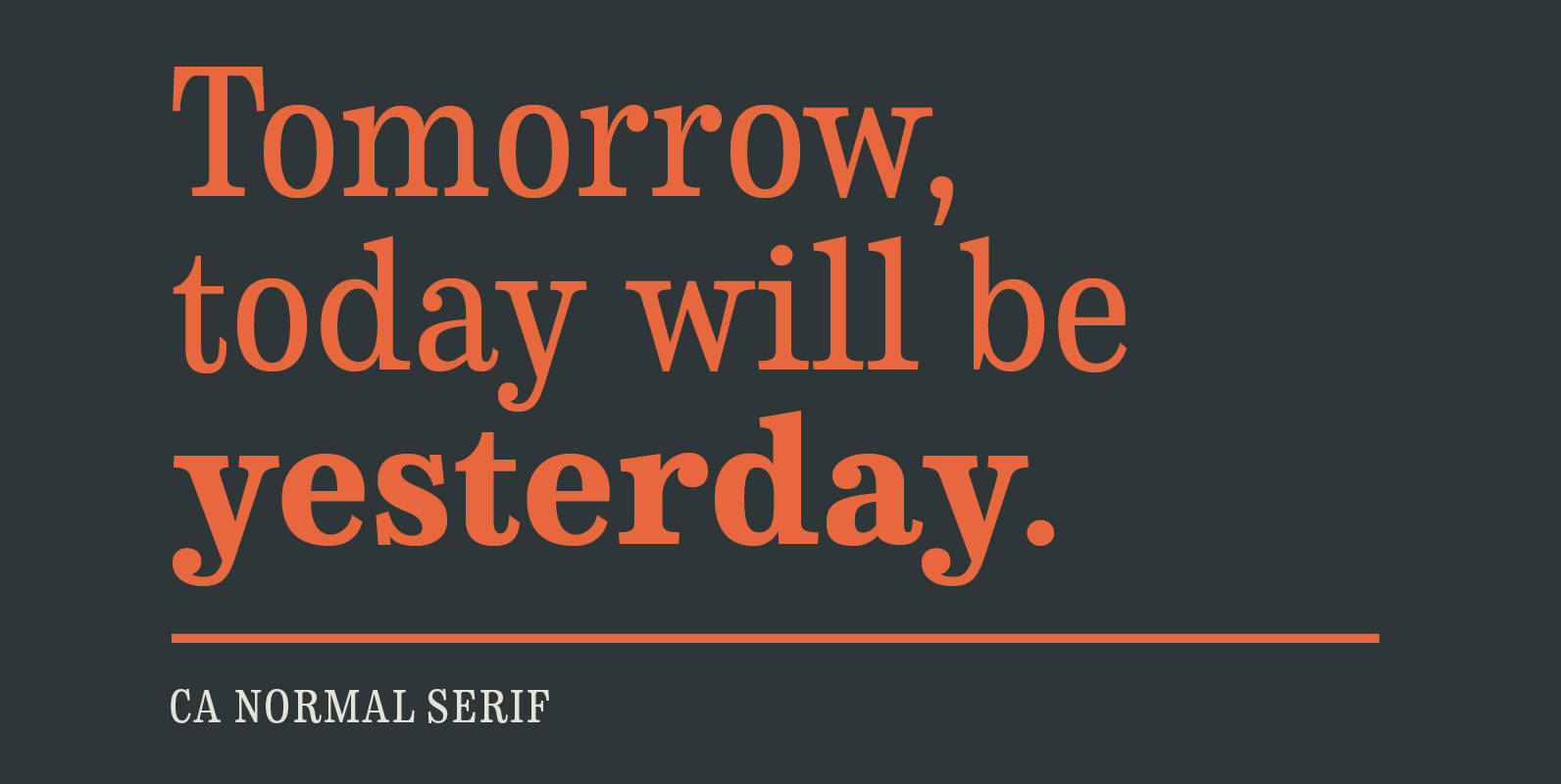
CA Normal Serif Font
CA Normal Serif is the perfect companion to its grotesque brother CA Normal. But it is not just a serifed equivalent. It has a character of its own while preserving the principal proportions and the idea of quirkiness. It was
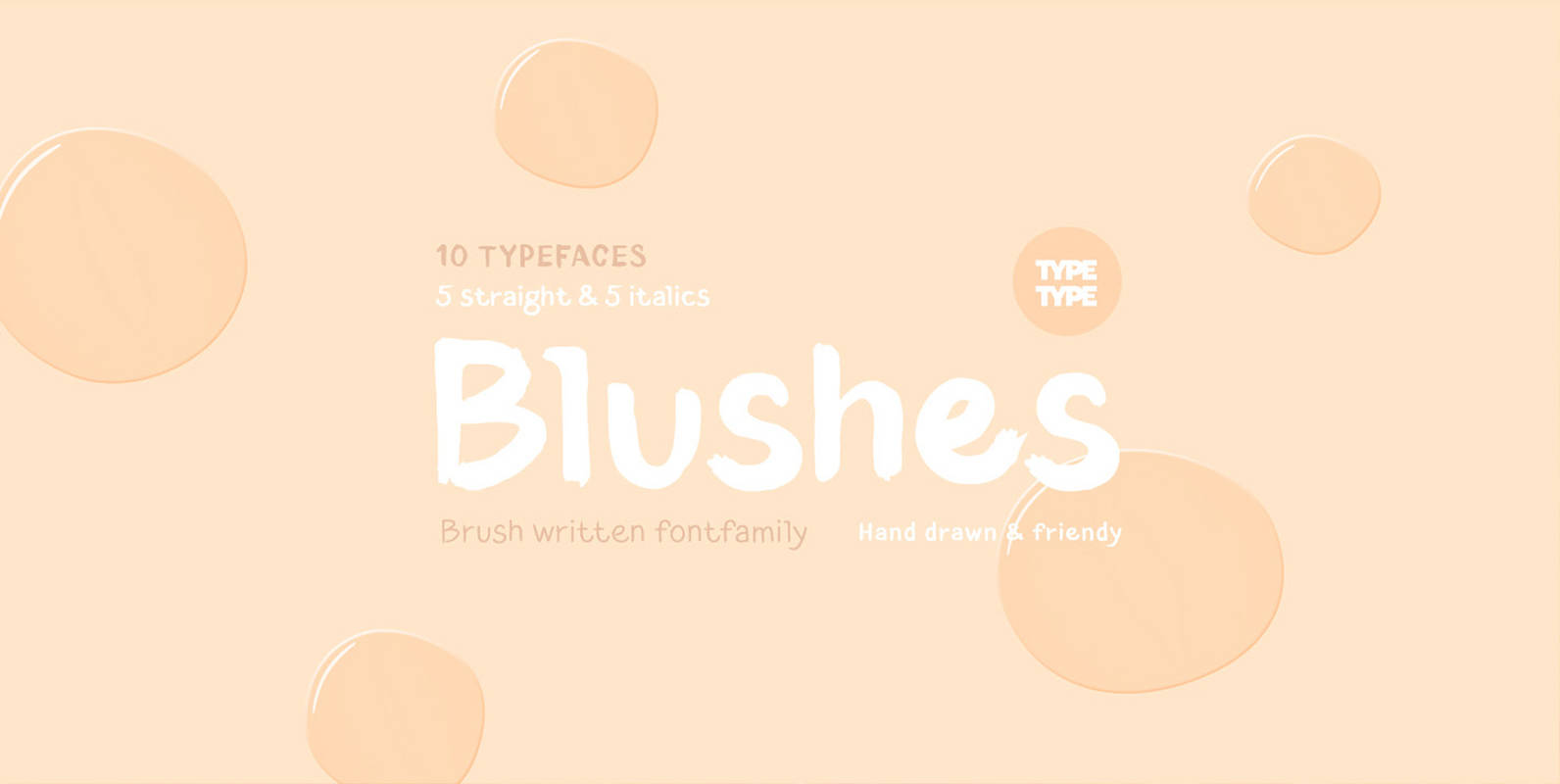
TT Blushes Font
Glitter, flashing cameras and fame – now you know how to deal with this stuff! Freshness and brightness is what defines the Blushes fontfamily, which is created for beauty and fashion industries. TT Blushes is a vibrant part of you
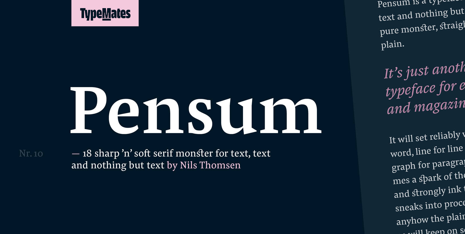
Pensum Pro Font
Pensum is a typeface for text, text and nothing but text. A pure monster, straight and plain, it will reliably set word after word, line after line and paragraph after paragraph. Sometimes a spark of the sexy, curvy and sharply
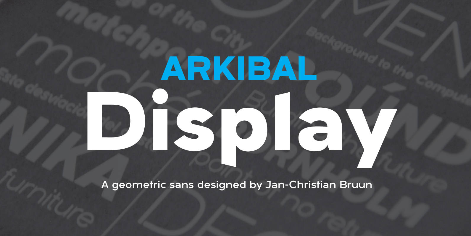
Arkibal Display Font
Display version is a little different from Sans family, where “a” is the center of the whole font. And letters “l, b, d, p, q and t” is the moved slight angle. The idea was to make two versions with