Tag: calligraphic
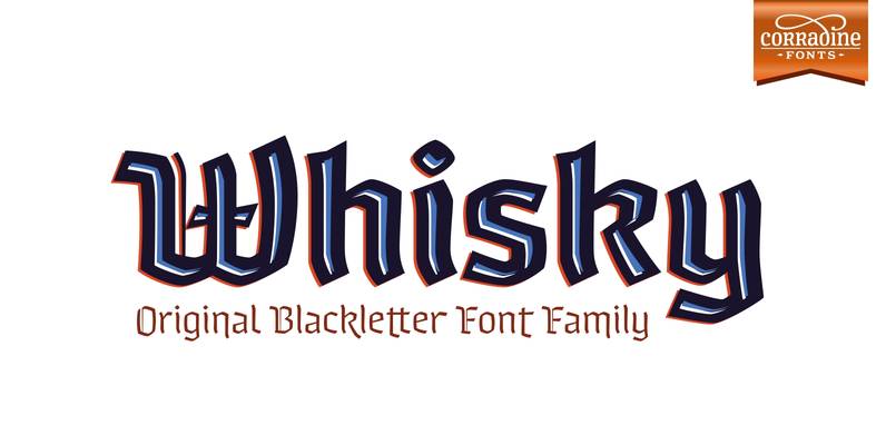
Whisky Font
Whisky is a blackletter font family with a casual touch that makes it look friendly and current. The stroke varies its thickness and angle endings making it form very dynamic bodies of text. The family includes seven weights, each with
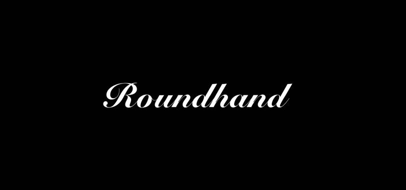
Roundhand Font
Roundhand was created by Matthew Carter in 1966 on the basis of handwriting by Charles Snell, an English calligrapher of XVII-XVIII known in particular by his ‘The Pen-man’s Treasury Open’d’ written in 1694. The typeface has continuous cursive shapes with

Filmotype Homer Font
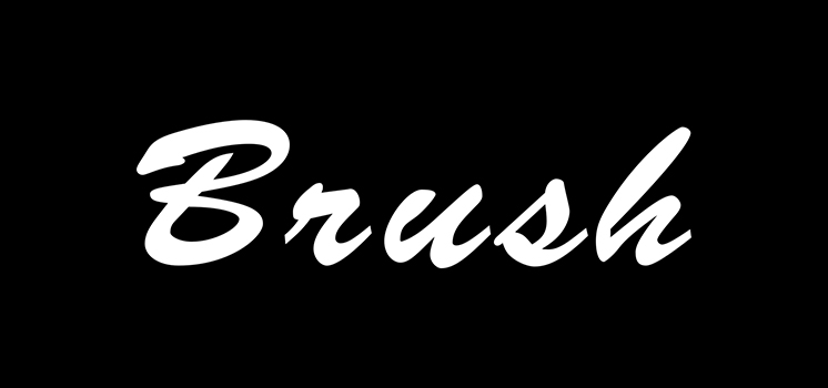
Introduced by Filmotype in the early to mid-1950s, Filmotype Homer was created in response to customer demand for a wider brush script expanding on Filmotype’s popular sign painter sho-card lettering styles used in the late 1940s through the 1950s. With
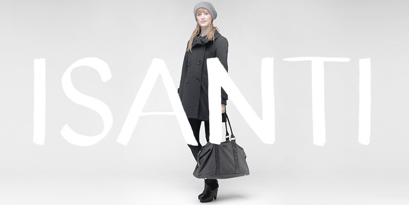
YWFT Isanti Font
Named after one of the most Swedish-American counties in Minnesota, Isanti is a hand lettered calligraphic font made to honor our nordic heritage, Lutheran illumination, and European newsstands. Generous spacing was given to Isanti to help with legibility at smaller
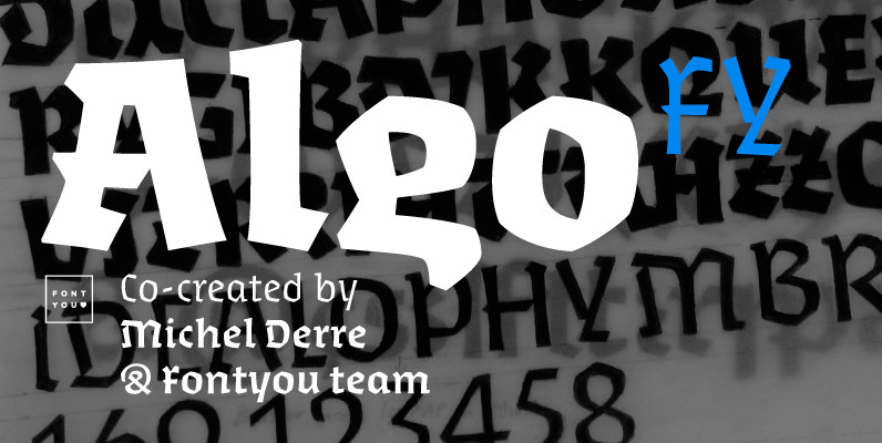
Algo FY Font
Algo FY is a singular font family with broken ductus and blackletter aspect. Clearly inspired by calligraphic shapes, each of the three weights have been especially designed as if the tool has changed. With its special articulations and its differentiated
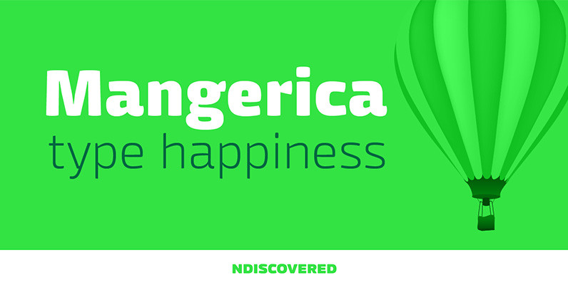
Mangerica Font
This design incorporates different styles into a consistent look. A pinch of script, a little of geometric and some humanistic shapes as well create a very distinguishable sans-serif. It has an overall good feeling specially on the heavier weights that
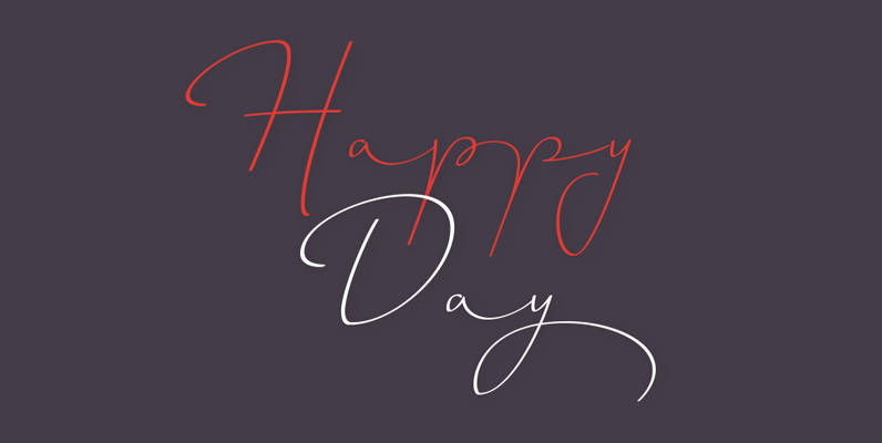
Horizontes Script Font
Horizontes Script is the result of Panco is personal experimental calligraphy project. Designed with the goal of finding a balance between spontaneity, elegance and beauty, his first typography was born and inspired on the horizon´s blue line from the city
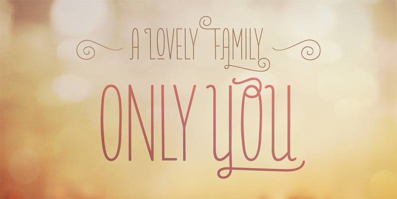
Only You Pro Font
Only You is hand made, and specially romantic. It was made to brighten your projects, turning everything more beautiful. The special encounter between uppercase letters and lowercase letter is perfect. Only you is unicase, with 888 Glyph’s, and what’s better:
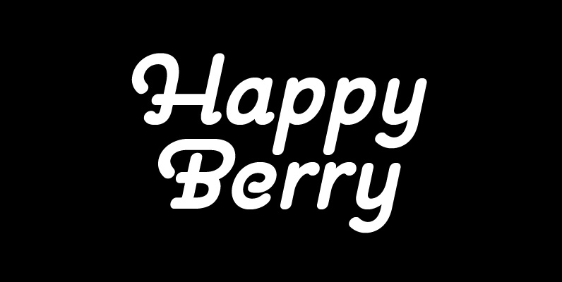
Pauline Font
Pauline is a sans serif with a strong influence from retro scripts. Pauline is a geometric face formed with slow and deliberate rounded brush strokes. The tall ascenders give it a useful touch of naïveté. It’s a face suitable for
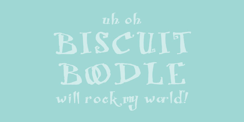
Biscuit Boodle Font
Biscuit Boodle is a fun and uplifting script from Portland Studios Illustrator Justin Gerard. The characters are brush drawn with a slight texture. The font comes packed with OpenType alternates and ligatures. Included are small caps, old style figures, titling

Beauty Script Font
Beauty Script is a modern interpretation of the classic formal script style. You could notice in it a special feeling due its subtle wavy rhythm to mimic the natural movement of handwritten calligraphy. Because its strong contrast and the fluidity
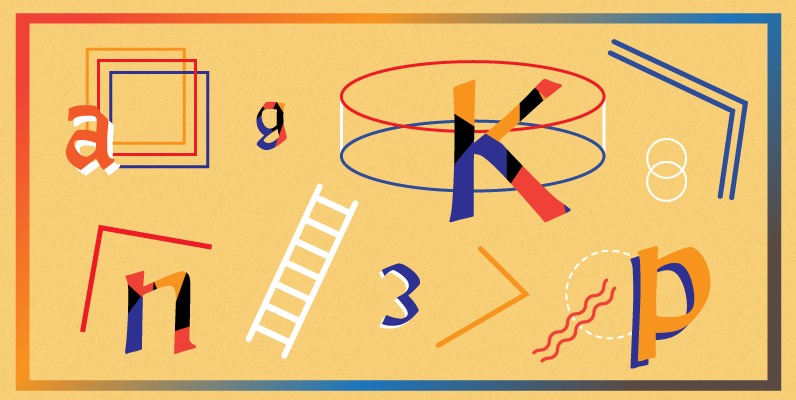
Alexander Quill Font
Alexander Quill was originally designed in the early 1980s to be cut in 14 point for casting into foundry type for the setting and printing of limited edition books at Pie Tree Press, Jim Rimmer’s private sanctum. This alphabet exhibits
Hauser Script Font
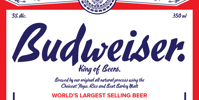
Designed by George Hauser, Hauser Script was digitally engineered by Steve Jackaman from original Ludlow drawings, circa 1936. Published by Red RoosterDownload Hauser Script

Meritage Font
OpenType users benefit from alternate lowercase characters, crossbar ligatures, case sensitive quotes and smart apostrophes. Other goodies include optional old style numerals and a few clip-on swash elements, accessible by keyboard or supporting application’s OpenType glyph menu. Published by AerotypeDownload
Lily Wang Font
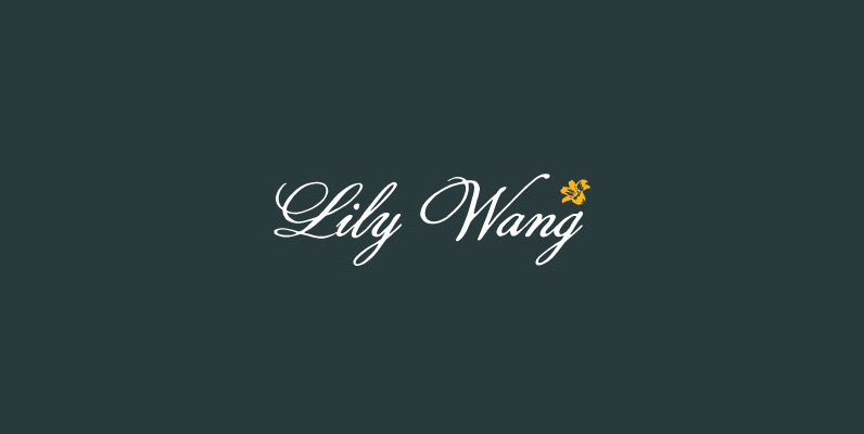
Based on Hong Kong ladies f script from the 19th century. The inky texture in this design gives it a realistic handwriting appearance. Published by Dharma TypeDownload Lily Wang
Jeeves Font
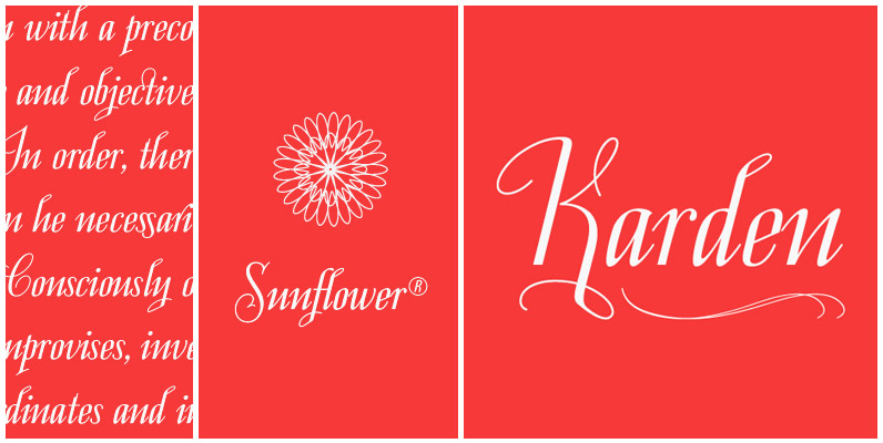
The inspiration for Jeeves came from Leslie Carbarga’s wonderful book “LETTERHEADS, One Hundred Years of Great Design, 1850-1950.” It was based on a secondary type usage for the letterhead for Sutherland in New York. The rest of the letterhead had
