Tag: Capital
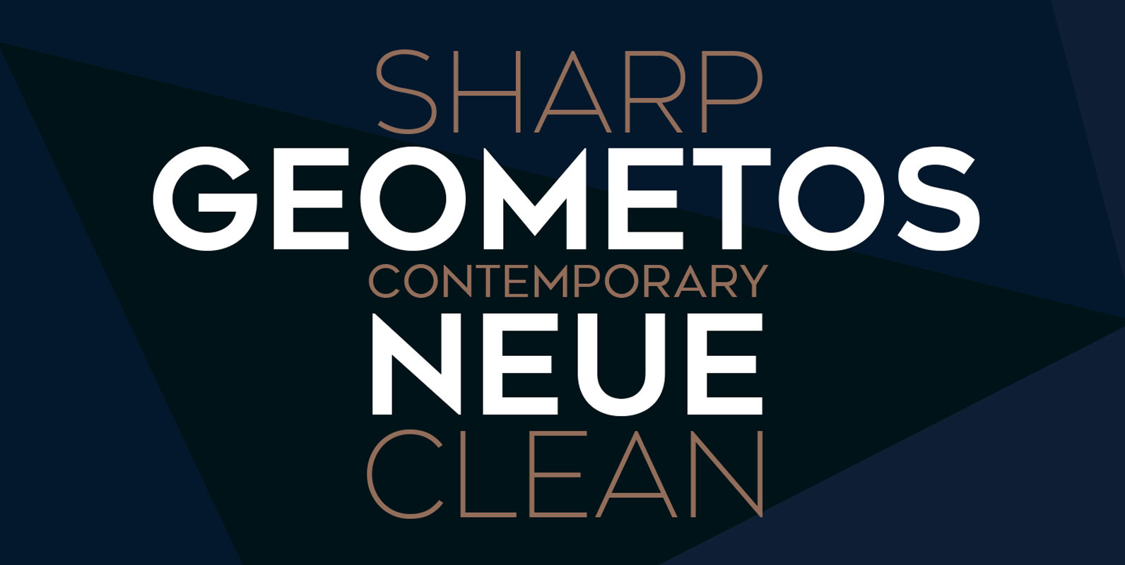
Geometos Neue Font
Geometos Neue is a geometric sans-serif typeface which comes in seven weights. An all caps display font family, Geometos Neue has a clean, sharp and emphatic form especially suitable for headlines, headings, branding, posters, packaging, titles and logos. Published by
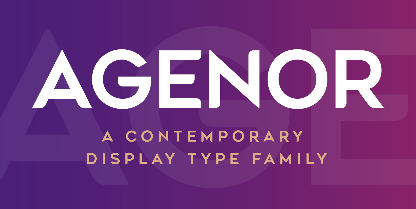
Agenor Font
Agenor is an all caps display typeface family. It comes in five weights and is suitable for headlines, headings, branding, posters, packaging, titles and logos. Published by Deepak Singh DograDownload Agenor
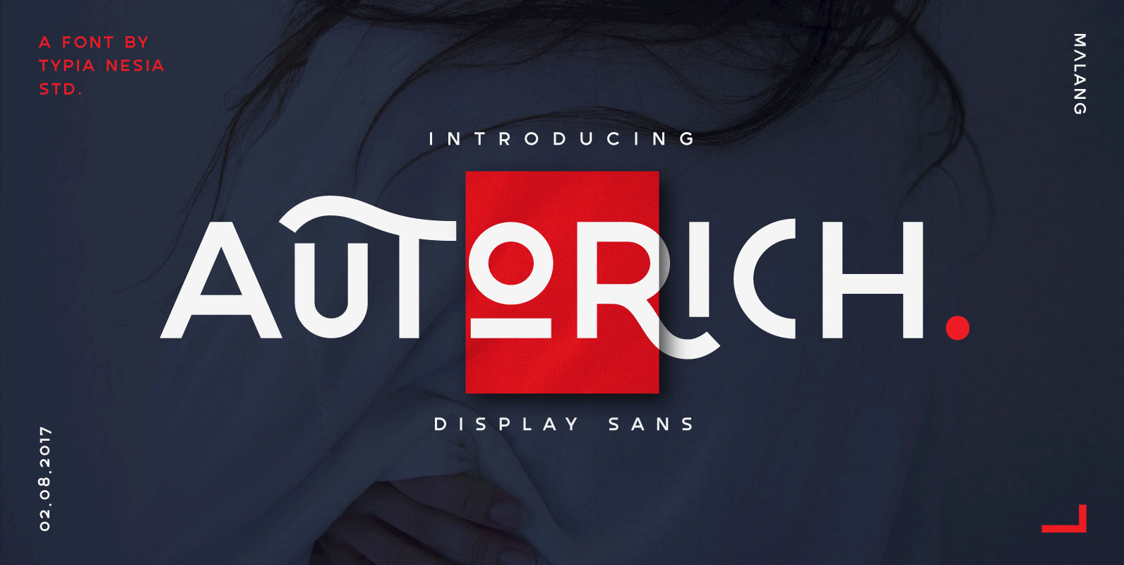
Autorich Font
Autorich Sans is a display sans font comes with 2 set of upper case (all caps), 58 ligatures and some alternate. Great for brand identity, poster design, website / display, editorial, and more. FEATURES : – Basic A-Z – Numbers
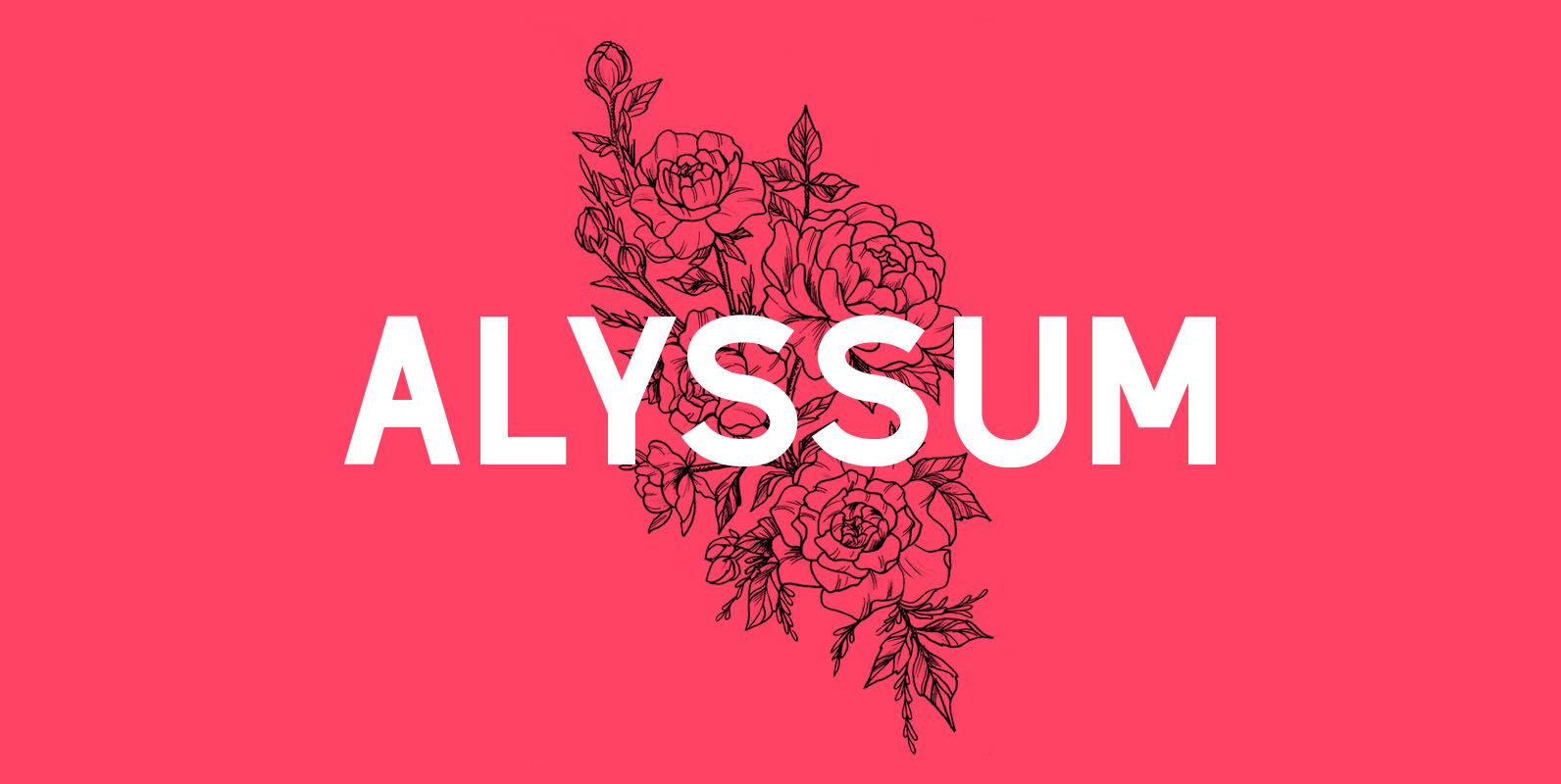
Alyssum Font
Alyssum is a beautiful sans serif font that can be used in different projects such as for wedding invitations, magazine headlines, social networks, signage, etc. What is in the package: Alyssum font in OTF format All Caps Font Language Support:
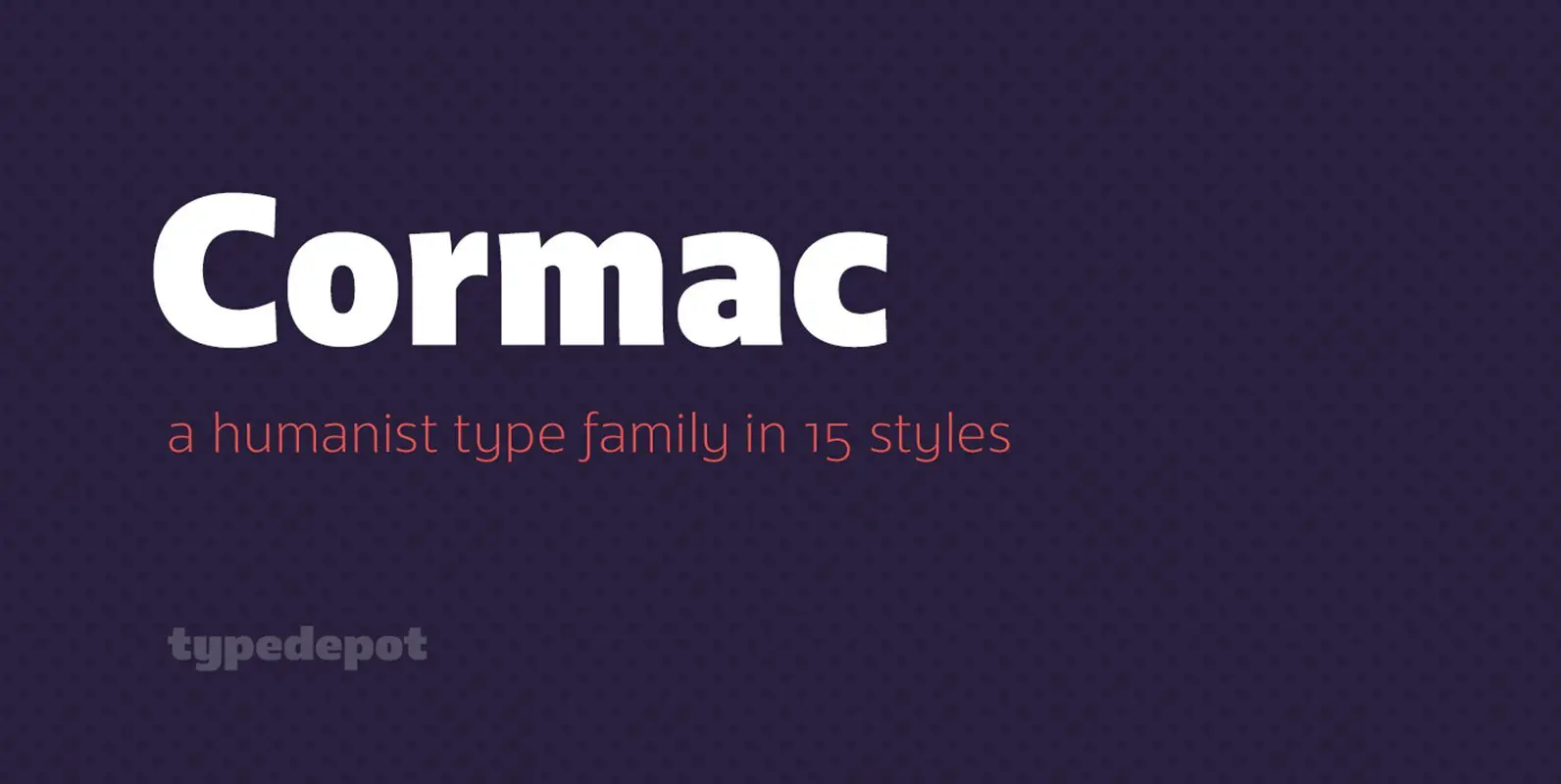
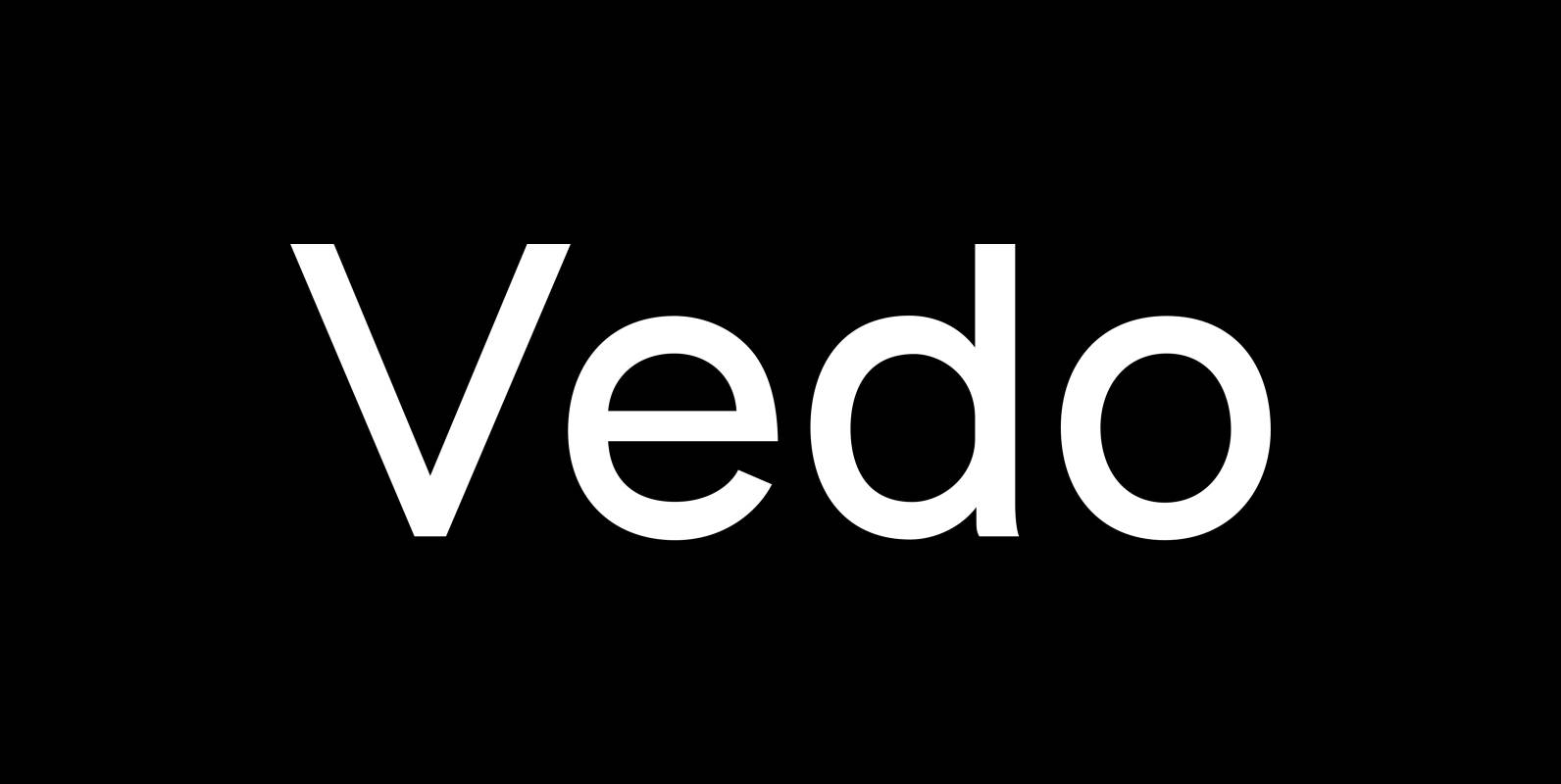
Cormac Font
Cormac is a humanist typeface characterized with it’s large x-height and slightly flared stems. The word that best describes our ideas in the beginning of the project is “simple” – the idea behind it was to strip the letter forms
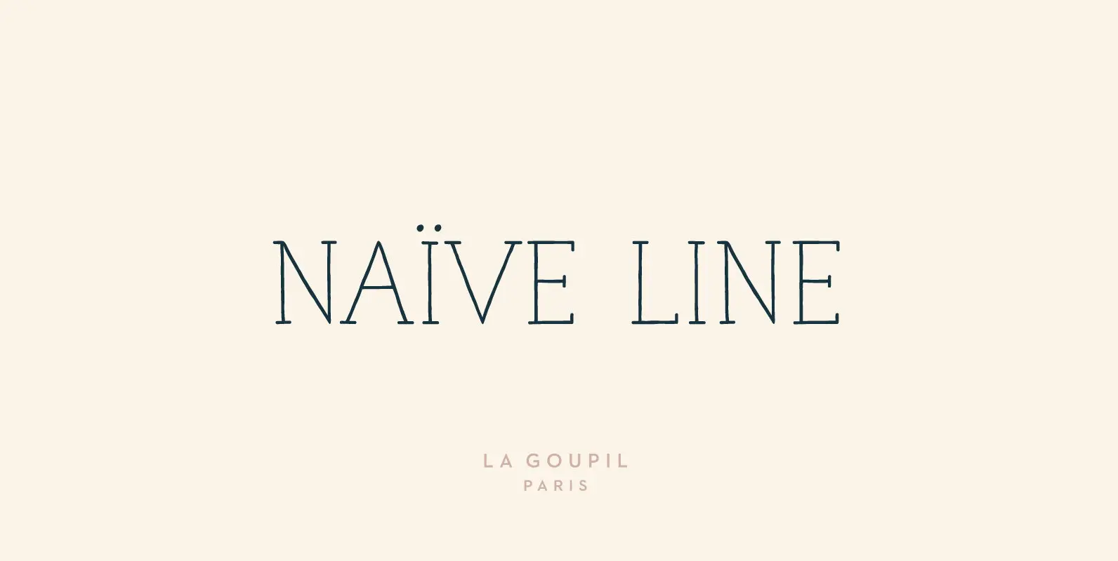
Naive Line Font
Naïve Line is an unusual handwritten serif font designed by Fanny Coulez and Julien Saurin in Paris. Our goal was to draw a font with finely irregular lines that give a human and whimsical feeling. We designed five weights, finely
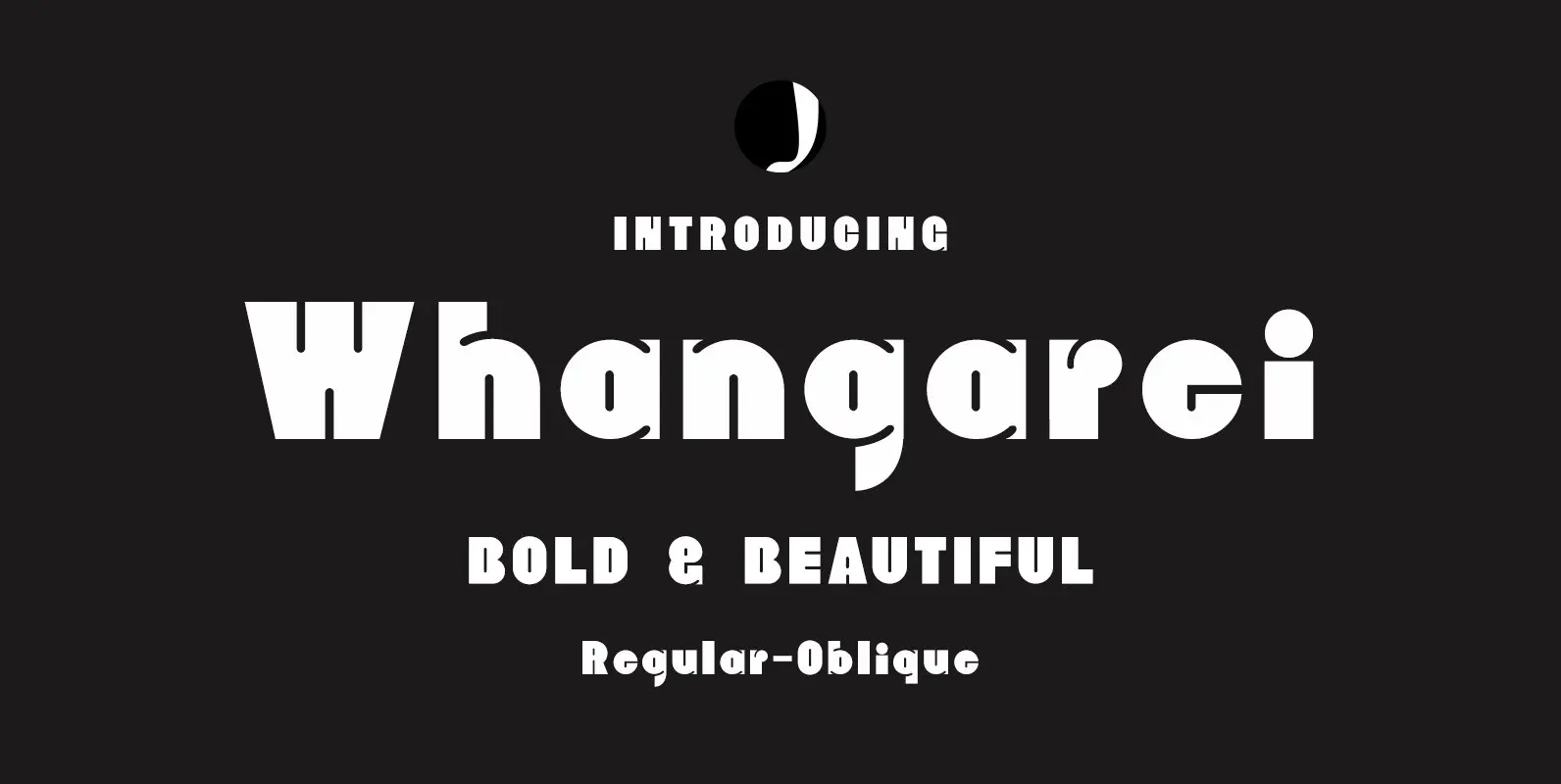
Whangarei Font
Whangarei is a bold, retro styled design that contains 2 styles. Published by Jadugar Design StudioDownload Whangarei
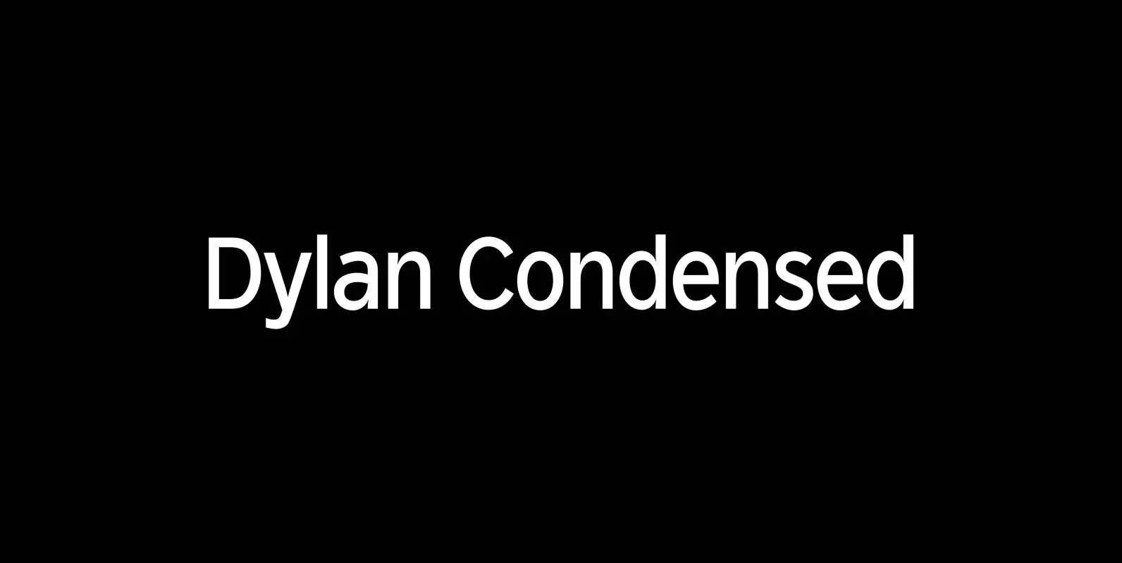
Dylan Condensed Font
Dylan is a Sans typeface in the best American tradition. In order to keep corners open and to make the font more readable in small sizes it has deep cuts where curves join straights. I designed 8 finely tuned weights
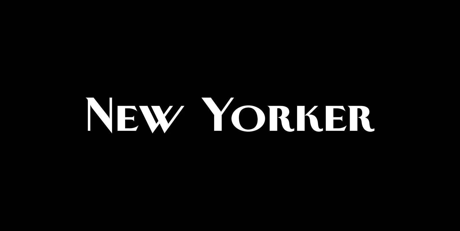
New Yorker Plus Font
New Yorker Type was one of the first typefaces I tried my hand at in 1985. I meant it as a revival of the typeface used by the New Yorker magazine. I did not scan it in, I just looked
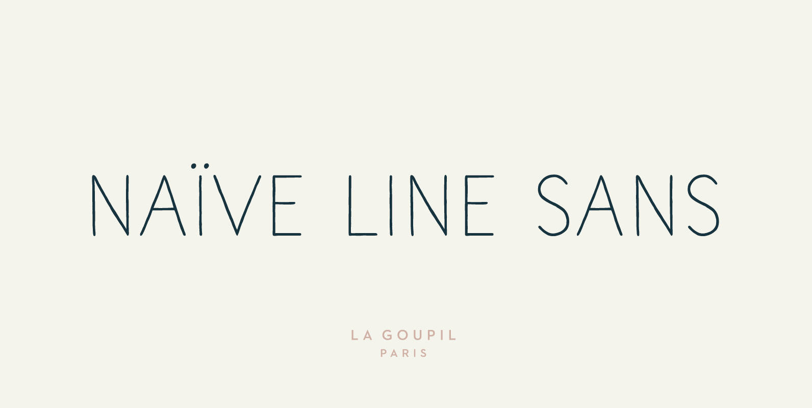
Naive Line Sans Font
Naïve Line Sans is an unusual handwritten sans serif font designed by Fanny Coulez and Julien Saurin in Paris. Our goal was to draw a font with finely irregular lines that give a human and whimsical feeling. We designed five
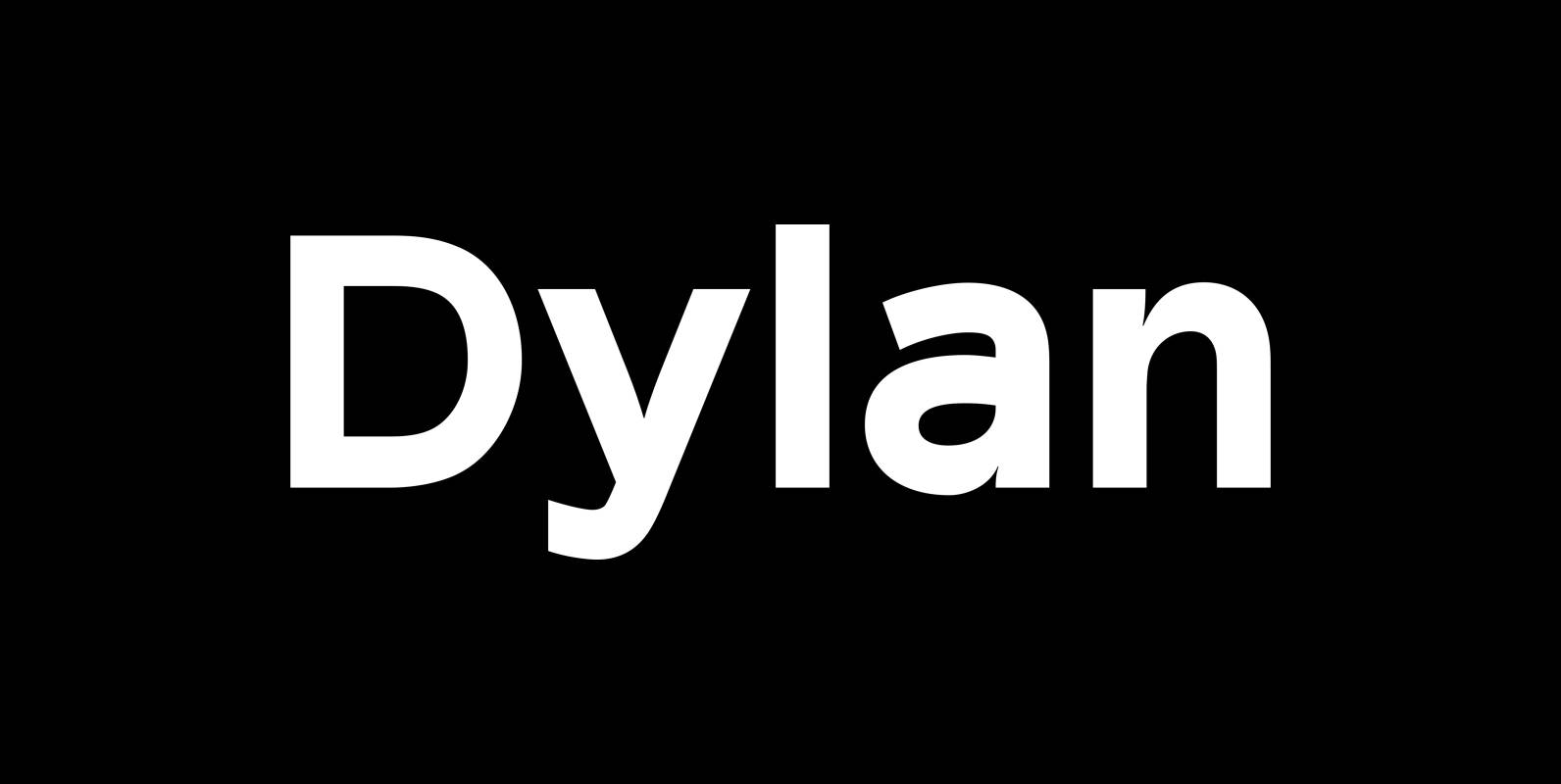
Dylan Font
“Dylan” is a Sans typeface in the best American tradition. In order to keep corners open and to make the font more readable in small sizes it has deep cuts where curves join straights. I designed 7 finely tuned weights
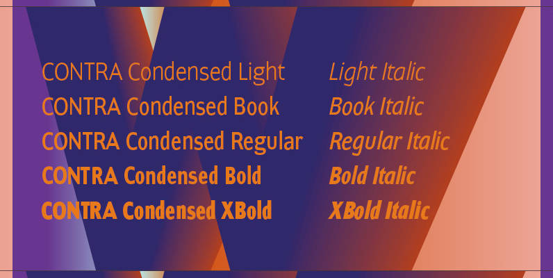
Contra Condensed Font
Contra Condensed is the condensed version of my Contra family of fonts. It is very condensed, but not yet narrow. It is well suited in all situations where one needs to save space. Published by Wiescher DesignDownload Contra Condensed
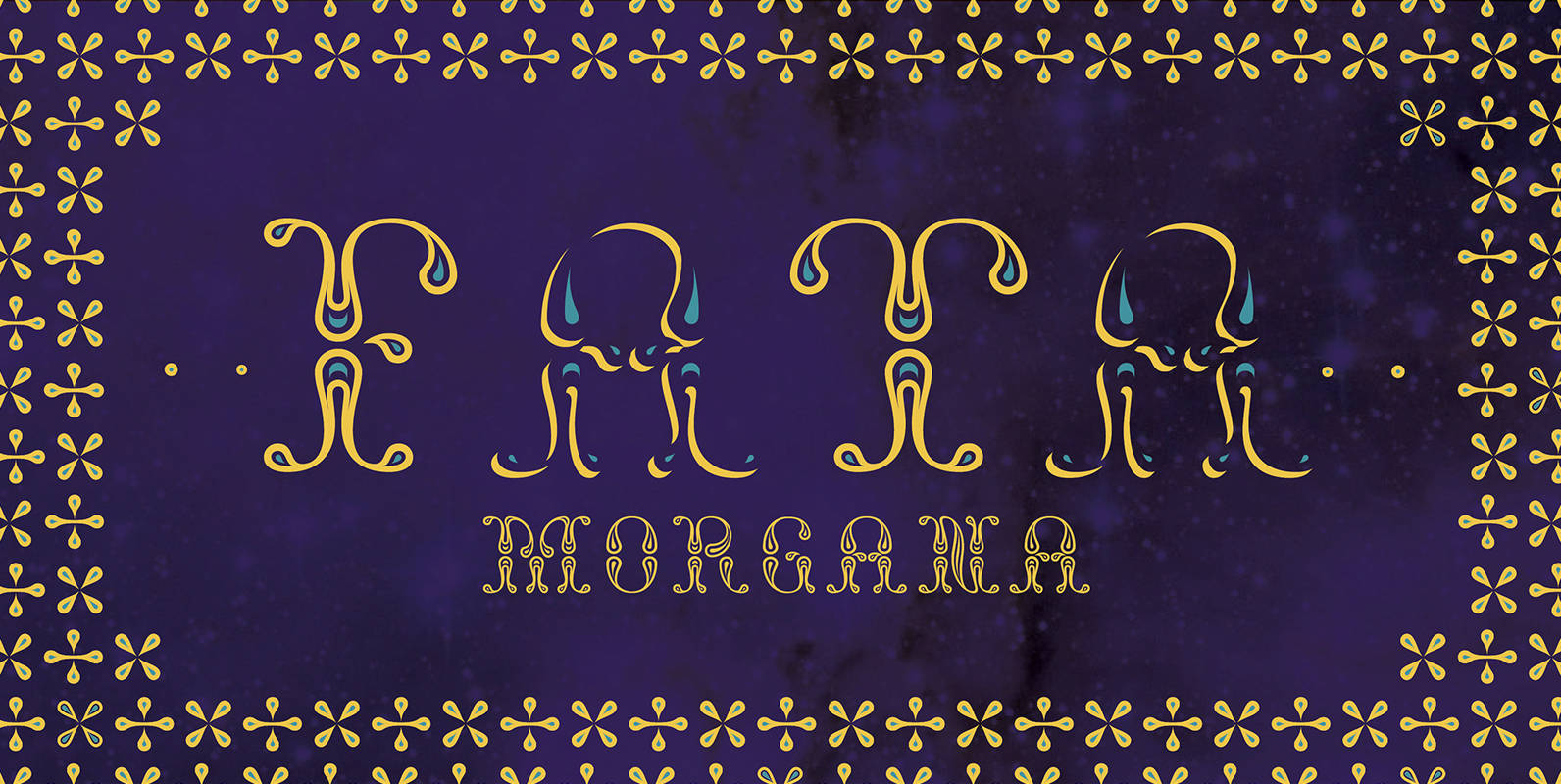
NT Fata Font
NT Fata is a decorative multi-layered font. It allows endless possibilities. The ornamental shapes refer to middle eastern patterns, giving the type a mysterious and imaginative feel. The glyph set contains elegant ornaments, enabling you to decorate your design even

Naive Font
Naïve is a serif handwritten font designed by Fanny Coulez and Julien Saurin in Paris. Our goal was to draw a font with finely irregular lines that give a human and whimsical feeling. The three weights of this subtle Parisian
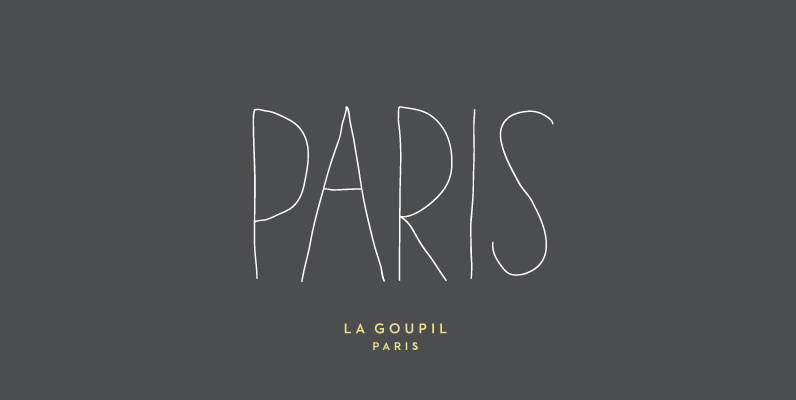
Paris Font
Paris is an avant-gardist handwritten font designed in Paris. It’s an all-caps thin font, with extended glyphs for many languages. But the little difference of Paris from other handwriting typefaces is the Art Deco feeling that brings it a retro
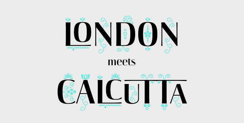
Darjeeling Font
Darjeeling combines British Elegance and Indian Flavor. It is flared like Optima, with a scent of Bodoni. By layering Regular and Ornaments over each other You will create astounding pieces of colorful typography. Additionally there is a Regnaments style which