Tag: capitals
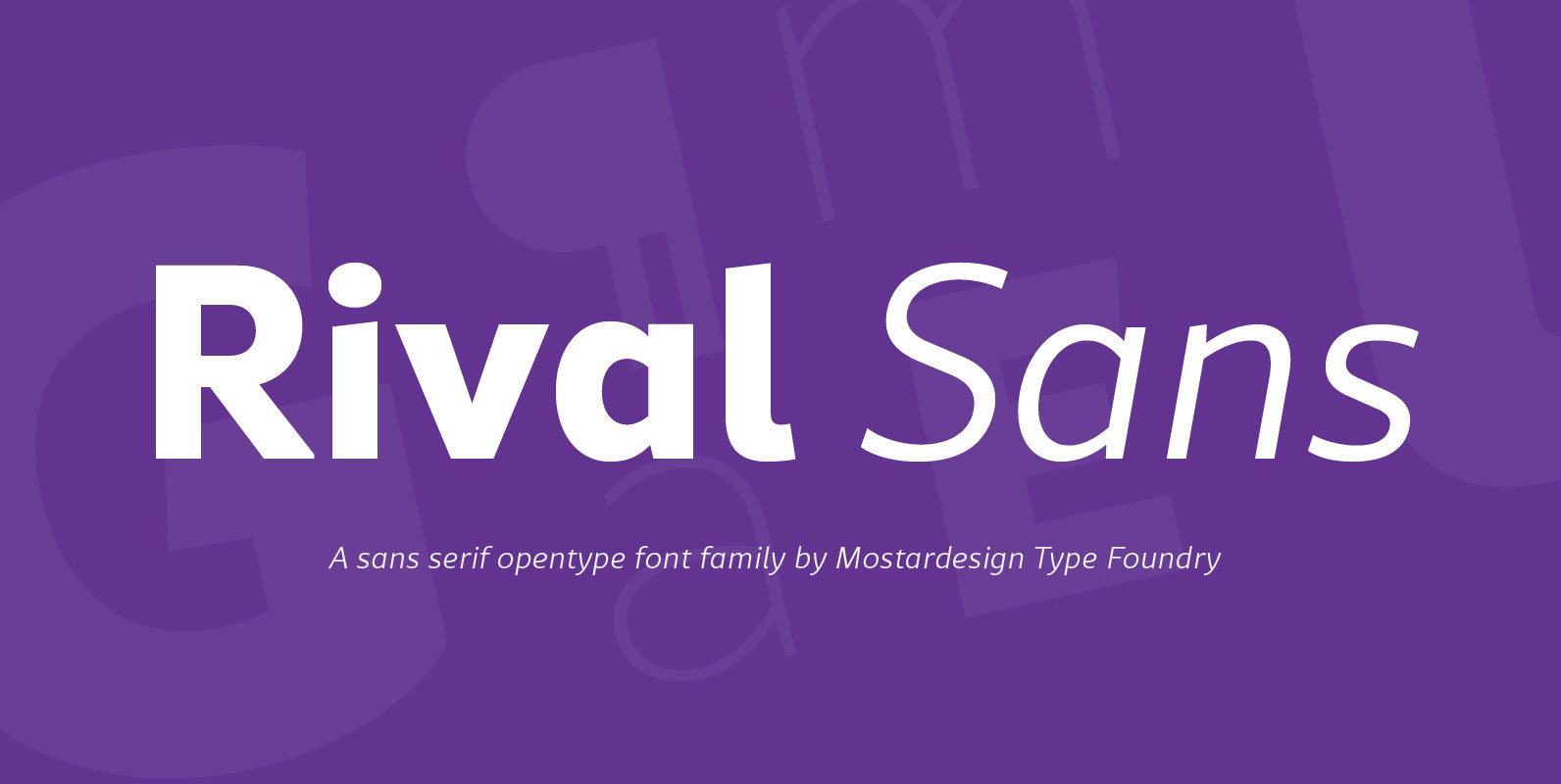
Rival Sans Font
Rival sans is clean sans serif font family and it characterized by excellent readability and its contemporary aspect. It provides advanced typographical support with features such as case sensitive forms, small caps, ligatures, alternate characters, fractions, slashed zero, circled figures,
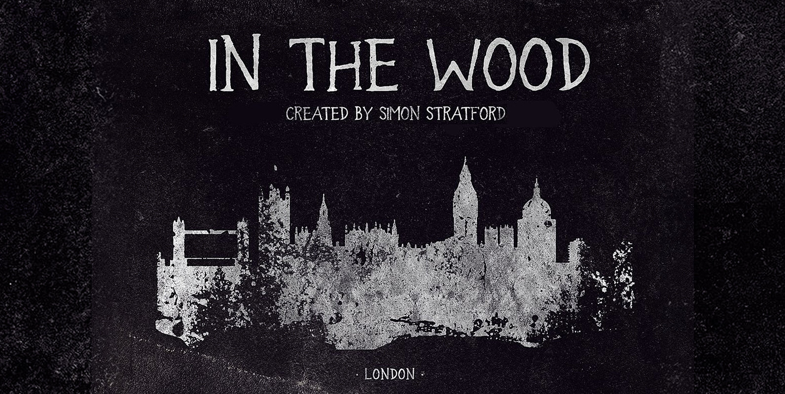
In the wood Font
In the wood font hard to classify but I was aiming for an old American gothic feel. It’s a uppercase display typeface. 100% handmade. It looks a bit spooky, a bit scary and it’s quite distressed. It’s not full-on horror,
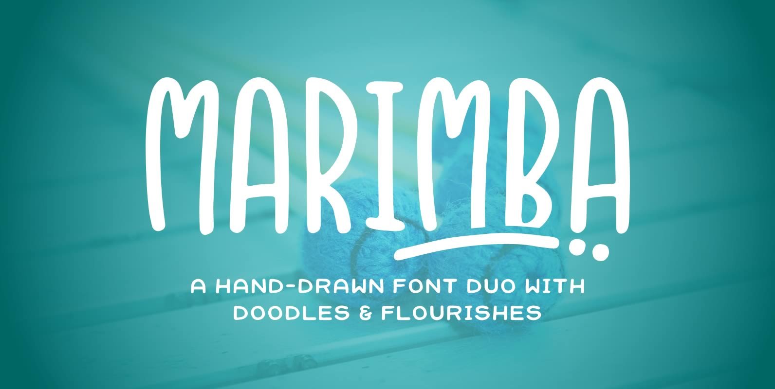
Marimba Font Duo Font
Marimba is the kind of font you'll be reaching for over and over again. It pairs great with all sorts of styles and provides a clean, readable font, with a touch of fun. Comes in both a sans and a
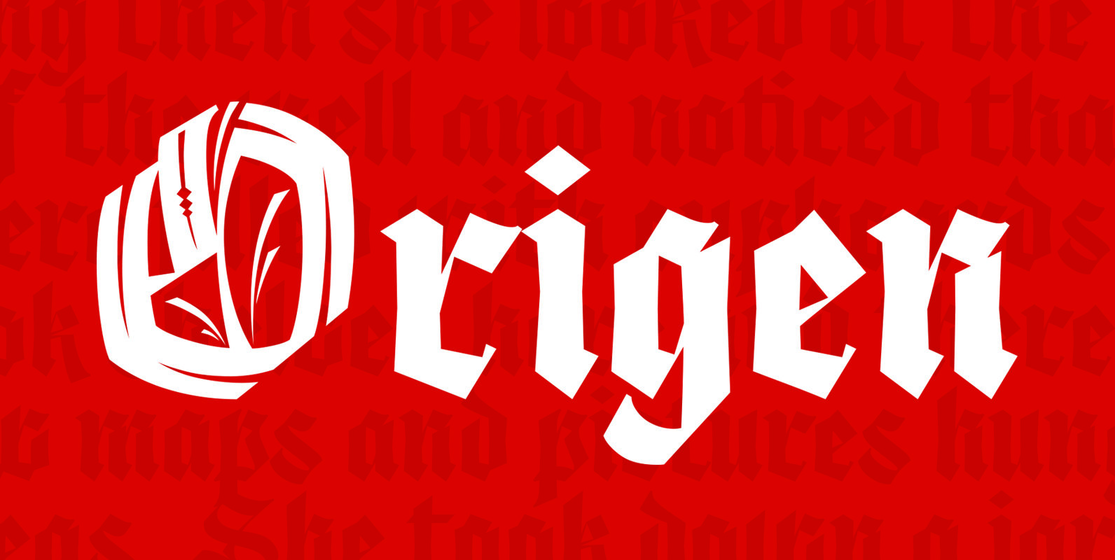
Origen Font
Origen is a typeface inspired by the illuminated manuscripts whereby the text is accompanied by a decorative capital letter at the start of the text. The family is formed by three different weights (light, regular, bold) and an additional decorative
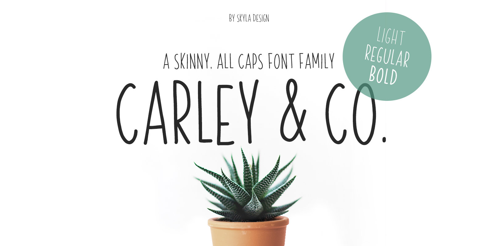
Carley & Co. Font
Carley & Co. is a skinny, all caps font family that comes in a Light, Regular & Bold version. This condensed sans-serif will look great on your cards & invites, and it works perfectly when paired with other fonts. This
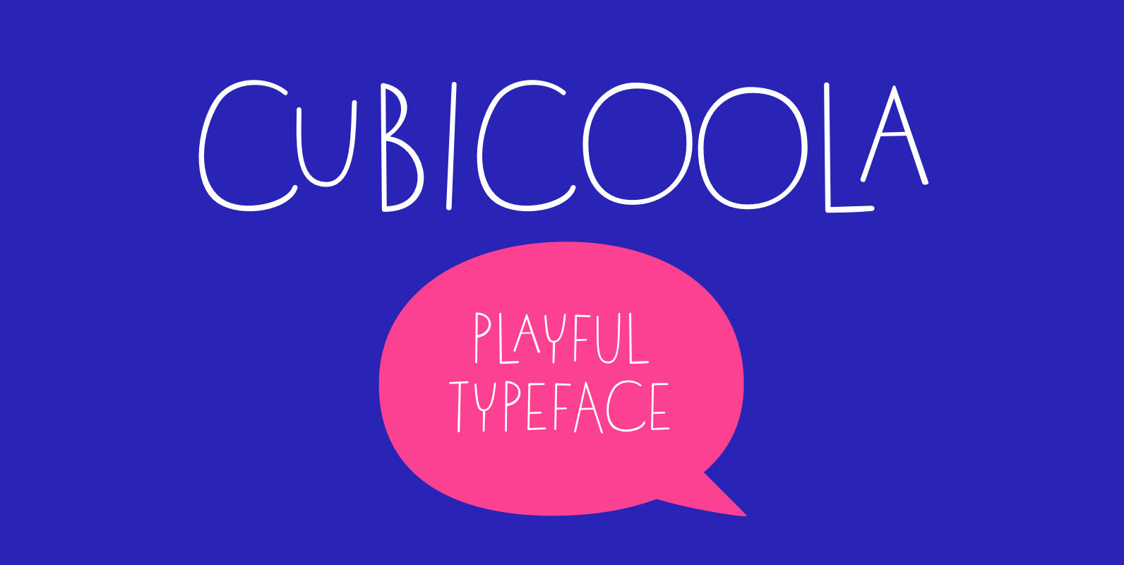
Cubicoola Font
Cubicoola is a playful, friendly and distinctive all-caps typeface inspired by hand-drawn posters. The deliberately wide width of some characters along with the gently variated angle, creates playful combinations. A symmetrical thin stroke with rounded endings makes it modern and
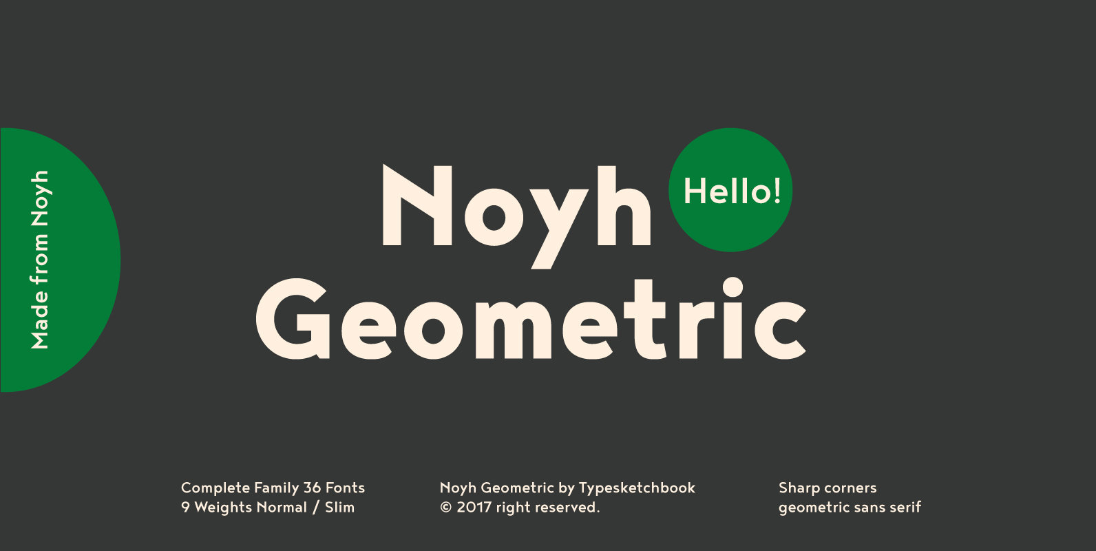
Noyh Geometric Font
Noyh Geometric is an alteration of the original Noyh typeface that was published in 2015. In this new version, Typesketchbook has added sharper corners for a more geometric presentation, including an overall adjustment to the structure of typeface. As well,
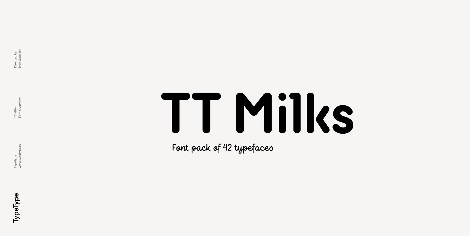
TT Milks Font
Initially the idea for TT Milks was to create a collection of typefaces to be used for packaging and branding of dairy products. We’ve started by creating a main sans-serif and a supporting script, worked on their compatibility, and created
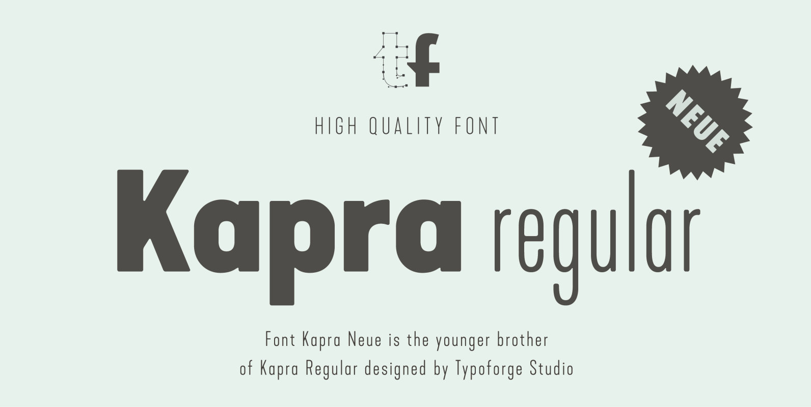
Kapra Neue Font
Kapra Neue is a younger sister of Kapra. New family has refreshed proportions, rounded corners, and a new shape of glyphs. It is characterised by a wide range of instances – 24 new weights, from Thin Condensed to Black Expanded,
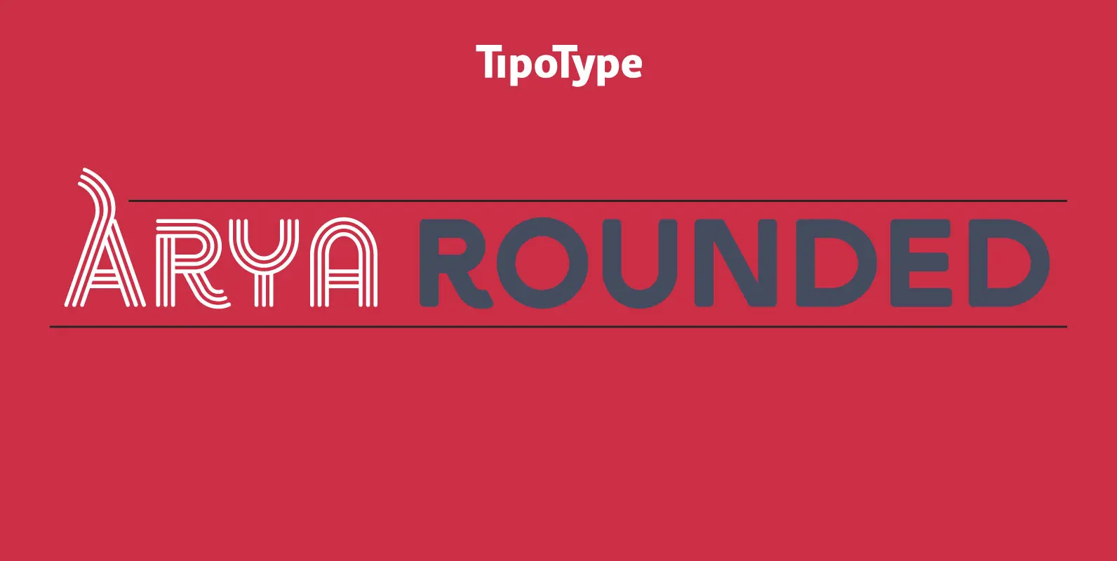
Arya Rounded Font
Arya Rounded is a display typeface, based on Roman proportions. It has three versions, differentiated by the amount of the drawn lines. Single is solid. Double is sturdy but light. Triple is versatile and includes alternatives. They can be combined
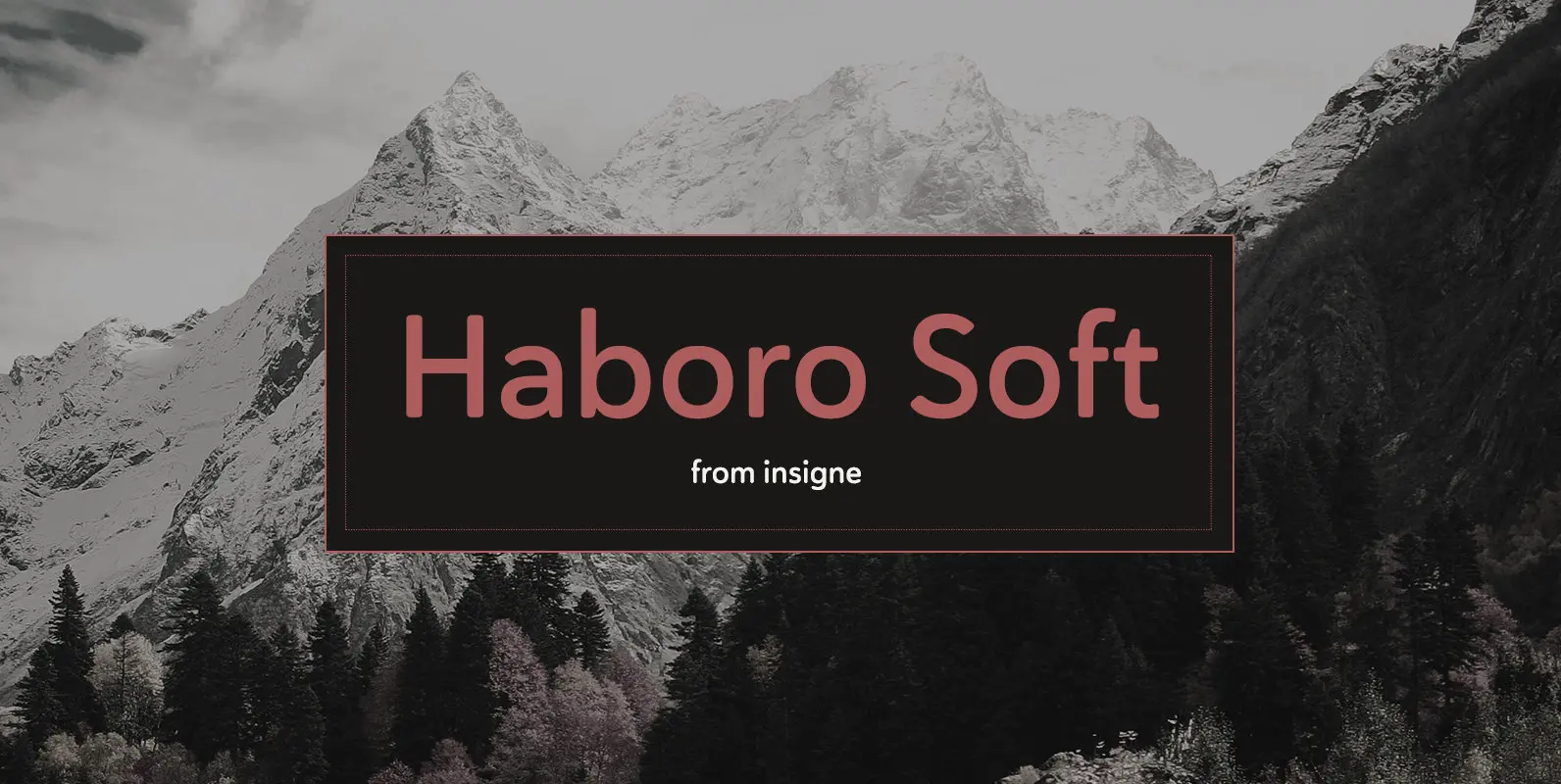
Haboro Soft Font
Stop trekking through the thick, wintery font forest, and step lightly into the fresh life of the Haboro hyper family. Though simple in nature, the Haboro hyper family provides you with a variety of options. Take, for instance, Haboro Soft,
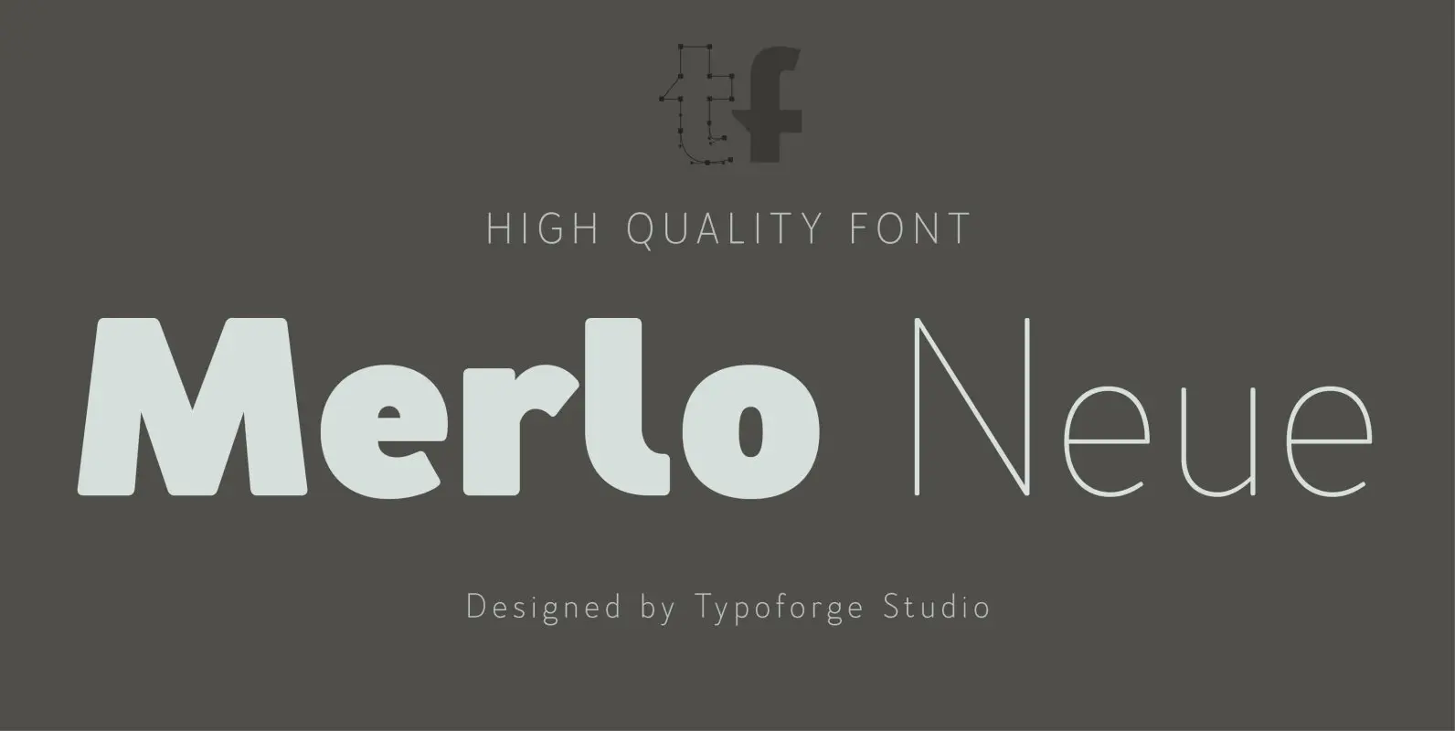
Merlo Neue Font
Merlo Neue is the younger brother of Merlo. New family received refreshed, more square proportions and a new shape of many glyphs. However, what is the most important in new Merlo, is the wide range of instances – nine new weights,
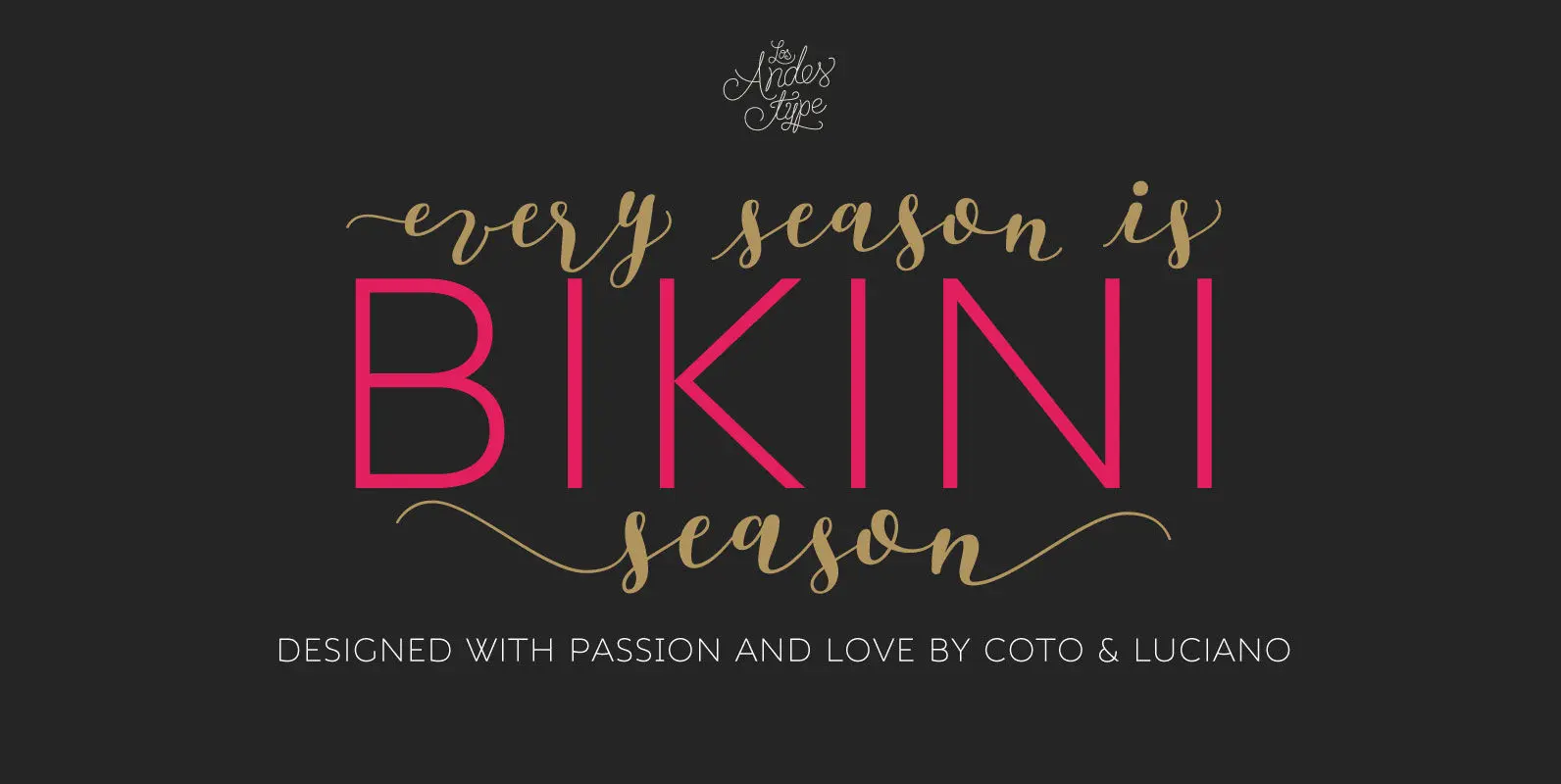
Bikini Season Font
Summer has come! Boho girl is going on her beach vacation. Relaxed, spontaneous, feminine, irreverent, though. Like a girl with a Gipsy soul, she just grabs her Bikini and turns away! This is the new font duo by the couple
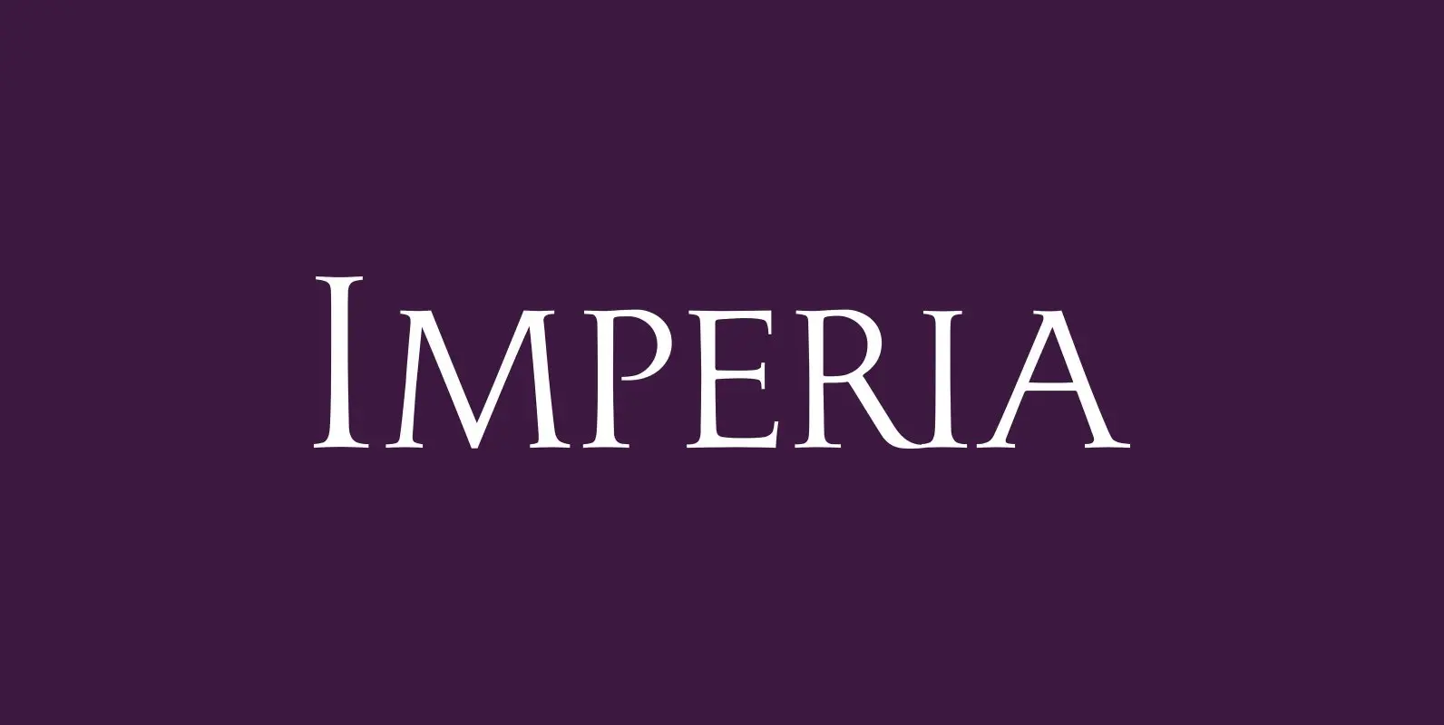
Imperia Font
“Imperia” is derived from my Classic font “Imperium” – the Roman Original from the ‘Trajan column. I pushed “Imperia” a lot further, added two versions of swings. To make the family more usable threw in my own version of lowercase
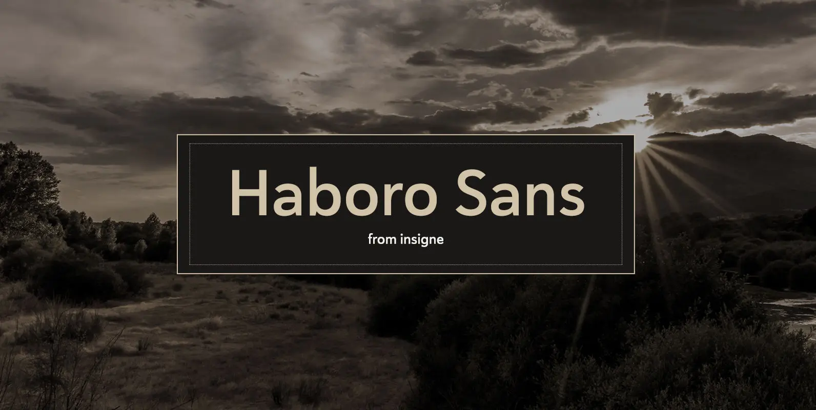
Haboro Sans Font
Quit trudging through the thick with encumbering fonts, and spring to the front of the pack with the cutting edge sans serif, Haboro Sans. With nothing to clutter up your work, your editorial designs, websites, and software will be sharp
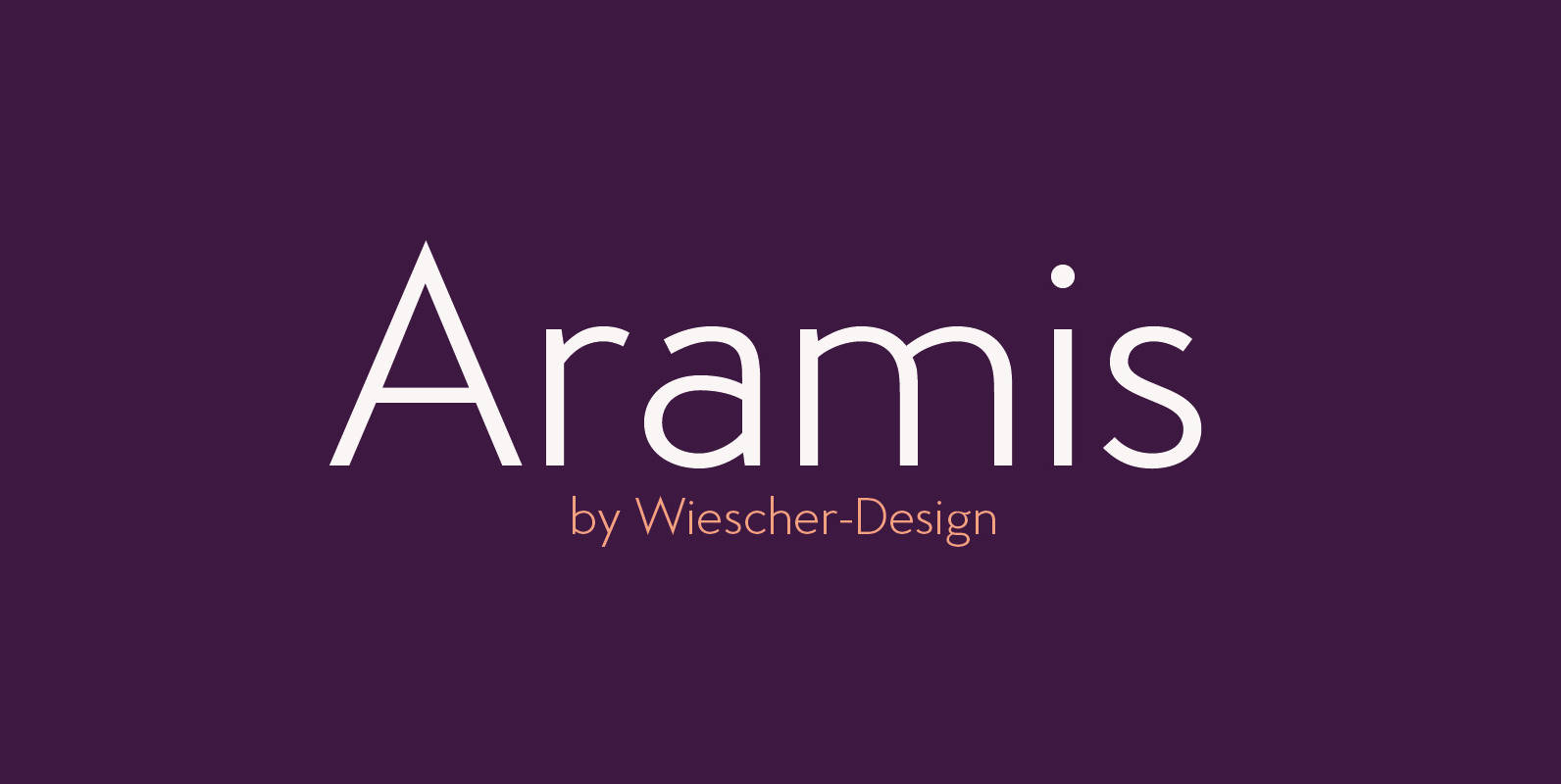
Aramis Font
“ARAMIS” is a new linear Sans with a French touch– designed by Gert Wiescher in 2014 and 2015 – has 7 weights with corresponding italic cuts. The small contrast in the linear Sans makes it not quite so linear and
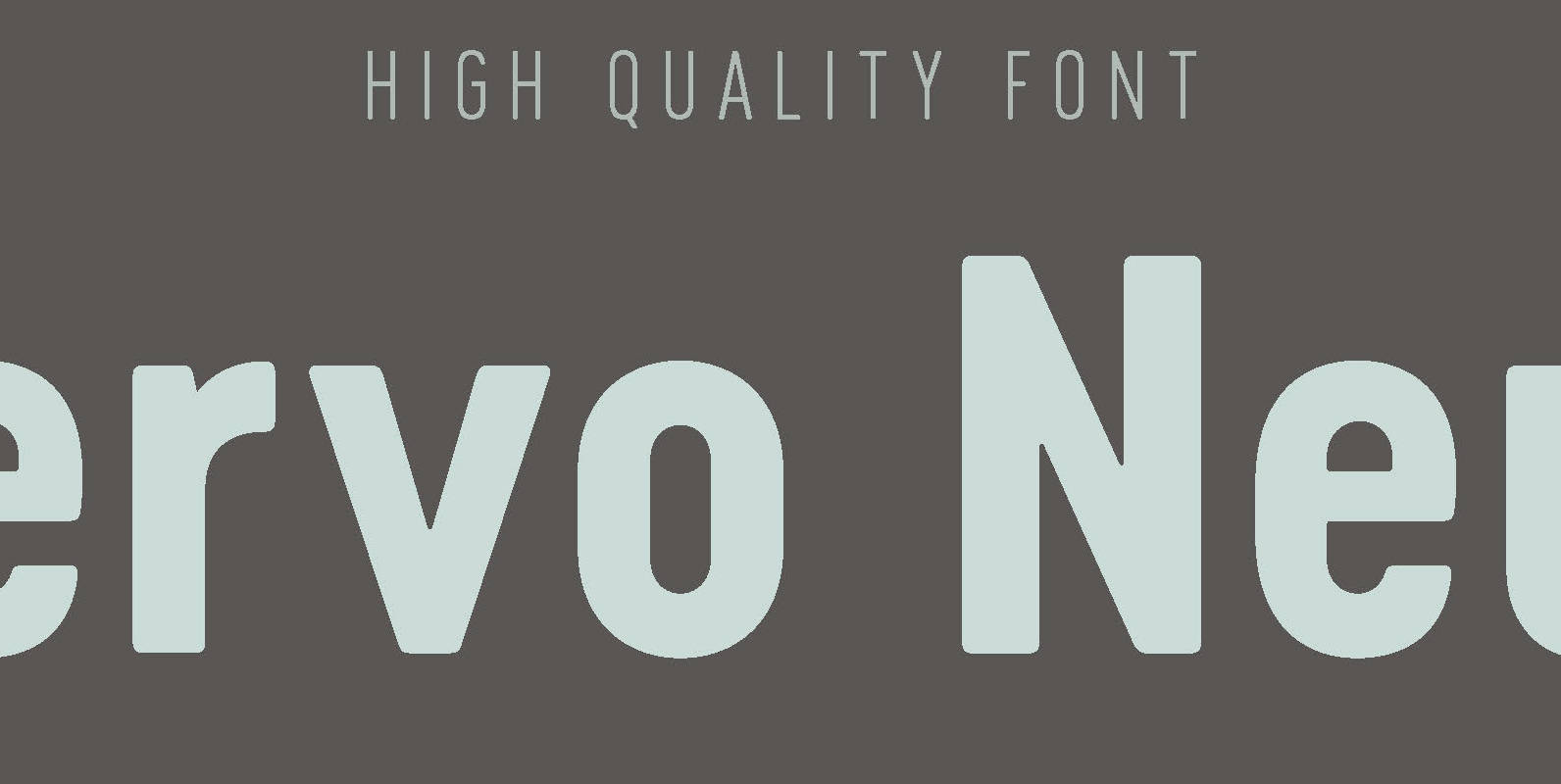
Cervo Neue Font
Font Cervo Neue is the new perfected and extended version of Cervo containing 18 varieties. It differs from its previous version with the higher accents over glyphs, enlarged punctuation, nautical numerals and newly added varieties Semi Bold, Bold, Extra Bold
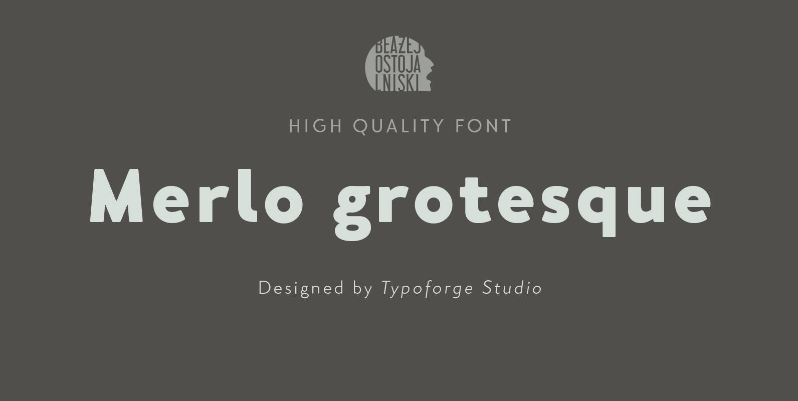
Merlo Grotesque Font
Font Merlo Grotesque is the younger brother of Merlo Regular & Merlo Round is characterized by eighteen different varieties – lower and uppercase characters. It is inspired by a You And Me Monthly published by National Magazines Publisher RSW “Prasa”