Tag: caps

Snappy Font
Snappy is a friendly and curly font. It is influenced by the typical coffee house typefaces in france. It comes along with four weights and one outline font. Published by Jorg SchmittDownload Snappy

Elastica Font
Elastica is a new handwritten type system created by Resistenza, it is based on humanistic sans serif fonts of early 20th century. Irregular handwritten strokes that gives a D.I.Y feeling perfect to get a close sense of communication. When using
Code Pro Font
Code Pro is a font family inspired by the original Sans Serif fonts like Avant Garde or Futura, but with a modern twist. It is clean, elegant and straight-to-the-point. Code font is applicable for any type of graphic design: web,
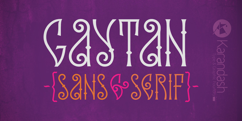
Gaytan Font
Gaytan (Bulgarian for braid) is a fresh new insight on archaic letterforms. A family of two unicase typefaces – a modern looking sans and more classic looking serif, equipped with many alternates, so they can suit any typographic taste. Gaytan’s
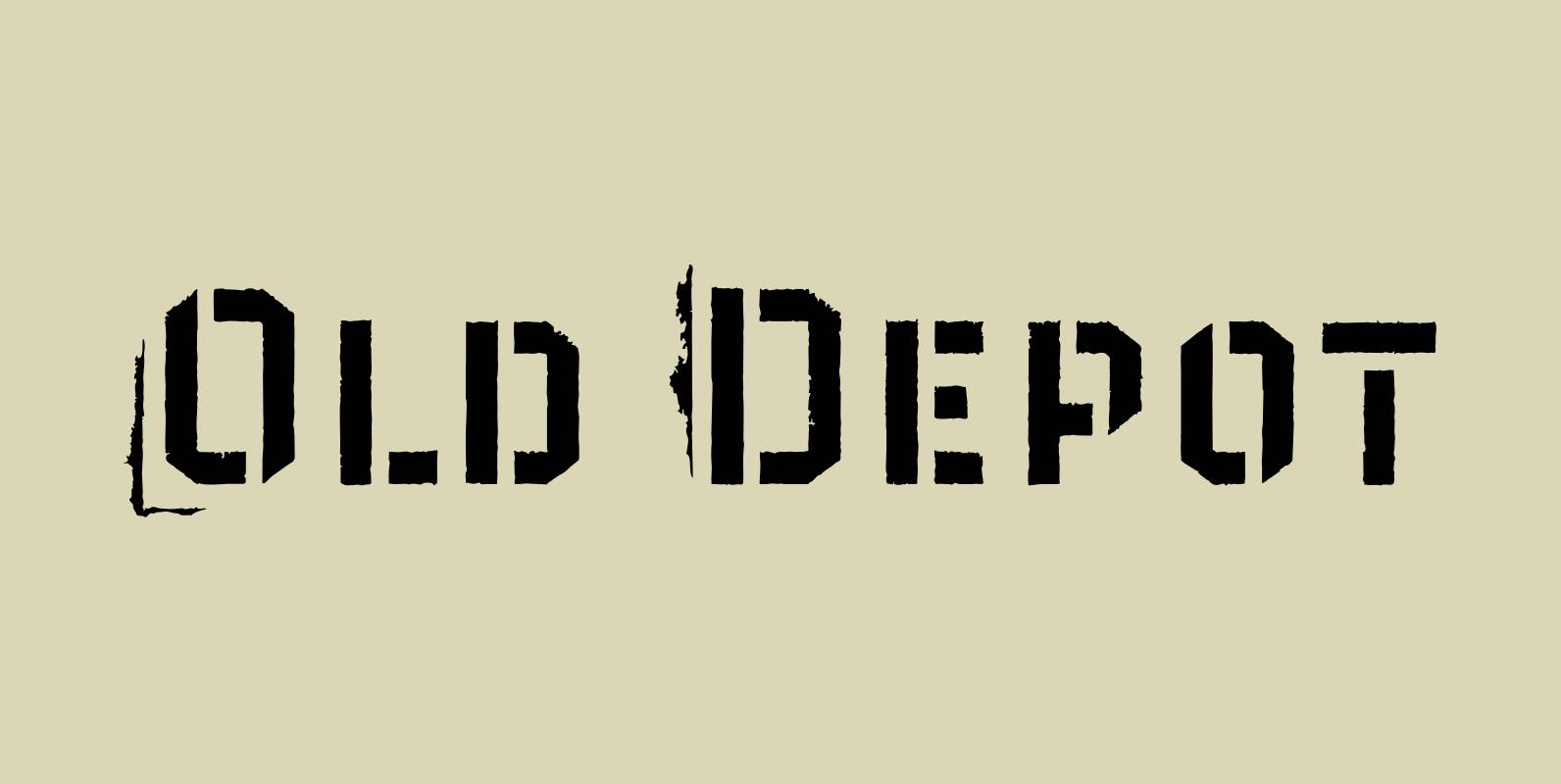
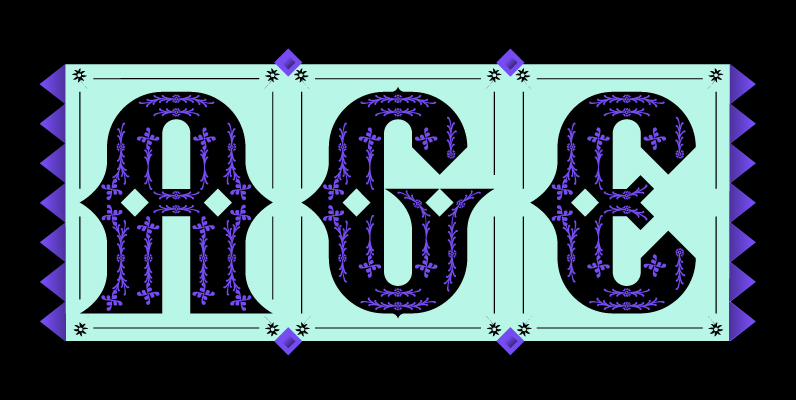
Old Depot Font
Old Depot is a newly reworked idea for the Depot Trapharet 2D font. It supports more languages and is available in more lettering. Old Depot stands out with its industrial nature of archaic spirit. It is a wonderful choice for
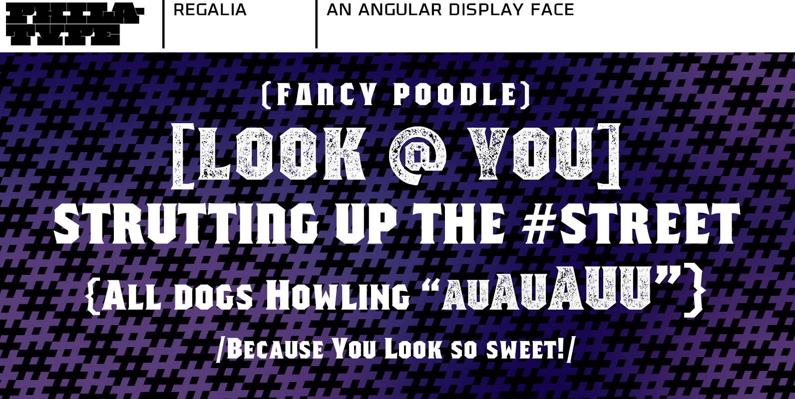
Regalia Font
Regalia is an angular display face created with octagonal forms. There are 4 fonts to suit your needs. Regalia Basic and Regalia Basic Stamped includes only the alphabet and numerals; perfect for simple poster or logo work. For more comprehensive
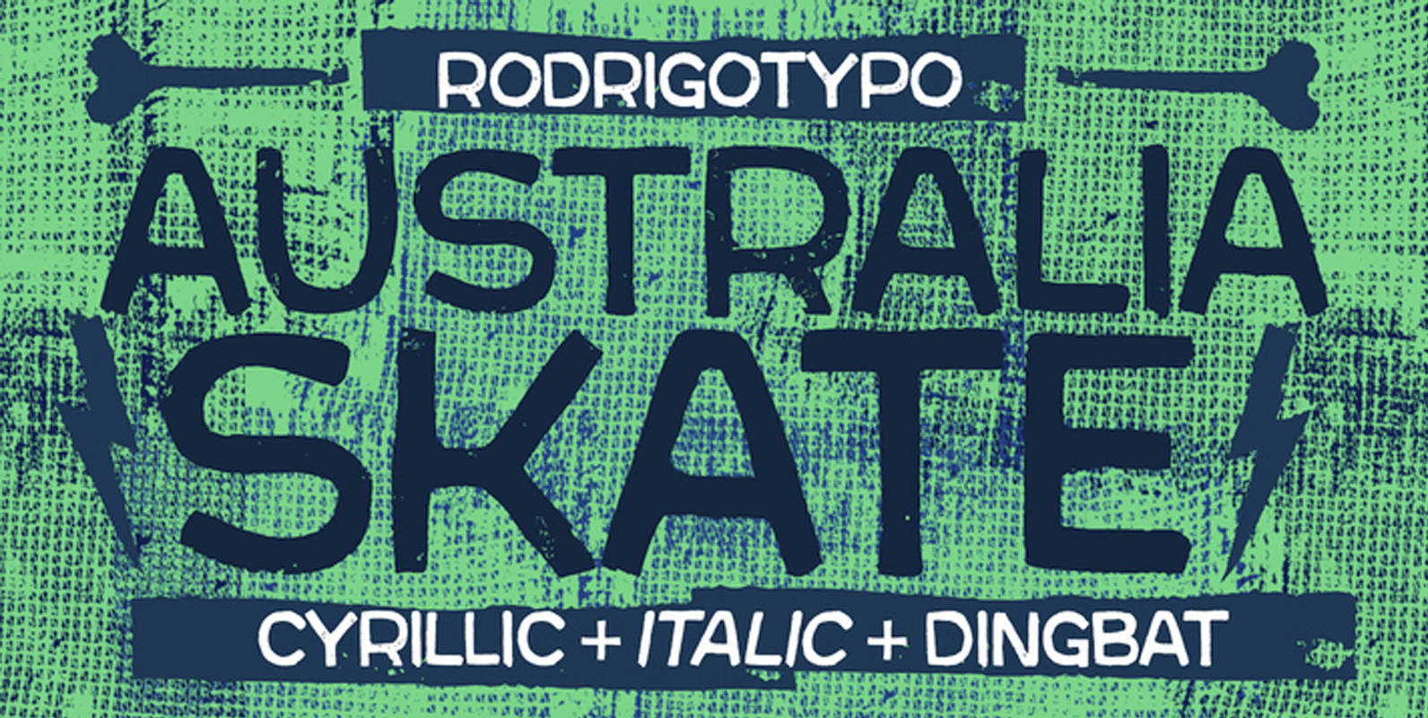
Australia Skate Font
Australia Skate is a typeface that shows power, destruction, and skate-inspired style, designed by Rodrigo Araya Salas. Published by RodrigoTypoDownload Australia Skate
Al Fresco Font
Al Fresco is a breezy, light, yet expressive typeface perfect for packaging products and titling work that call for a youthful, delectable flair. Its elegance carries a subtle earthiness; its beauty is unconventional, both stylish and exuberant. Al Fresco is
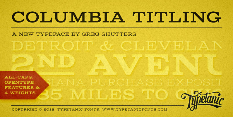
Columbia Titling Font
Columbia Titling is an titling-caps display family based on wide Clarendon-style wood type and industrial signage design from the late-19th and early-20th Century. Columbia Titling includes a small set of OpenType features, including both tabular and proportional figures, special superscript
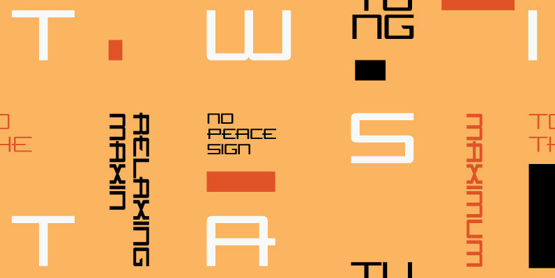
Tremendous Font
Strong and somewhat rough but absolutely warm-hearted, this Tremendous family is quite versatile and will find the right tone to deliver your message in a nice way. It can be friendly, it can speak out loud, it can be almost

YWFT Victoria Font
YWFT Victoria has the feel of a traditional serif face, yet defies many of these implications due to its hand drawn origins and uniquely inconsistent line weights. This unicase typeface includes all of the characters you would find in a
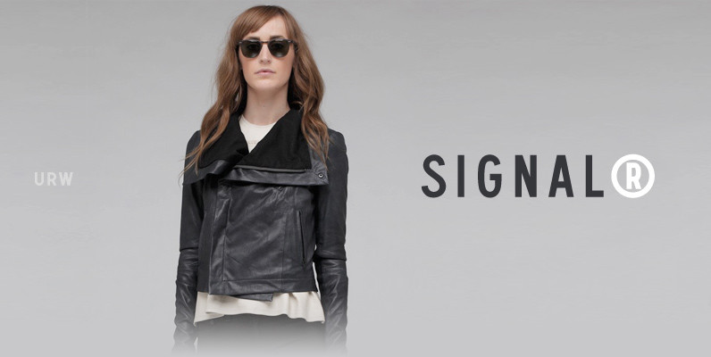
Signal Font
Whether road or railroad, air terminal or ferry terminal, URW Signal has the clean, simple authority to guide the way. This sleek beauty clearly directs both models on the fashion runway and planes on the airport runway, and also makes
Alphabet Soup Pro Font
Designed by Steve Jackaman. In the early 1980’s, Steve worked at Typographic House in Boston, Massachusetts. At the time, ‘Typo’ House, as it was affectionately known, was the largest type house in New England. This font was designed and produced
Raleigh Gothic Font
Designed by Steve Jackaman. Based on the ATF typeface by Morris F. Benton, circa 1934. Steve created two additional new weights. Published by Red RoosterDownload Raleigh Gothic
Flywheel Regular Font
Although Flywheel™ was designed in the early 90s, its design was popular in the 80s and remains popular today as an iconic look for futuristic themes: books, movies, arcade games and packaging. The design is rigid, geometric, straightforward and yes,
Flywheel Condensed Font
Although Flywheel™ was designed in the early 90s, its design was popular in the 80s and remains popular today as an iconic look for futuristic themes: books, movies, arcade games and packaging. The design is rigid, geometric, straightforward and yes,