Tag: caps

Drop Cap One Font
Drop Cap One is a drop cap or an initial cap font. Even though it has all the letters of the alphabet it is not an alphabet font to be used for headlines or body copy. It has no kerning
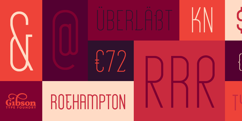
Roehampton Font
Roehampton is a classy, condensed, sans serif font available in 2 weights – Avenue & Boulevard. With over 280 glyphs, Roehampton is as versatile as it is stylish. It is comprised of all capital letterforms and uses stylistic variants for
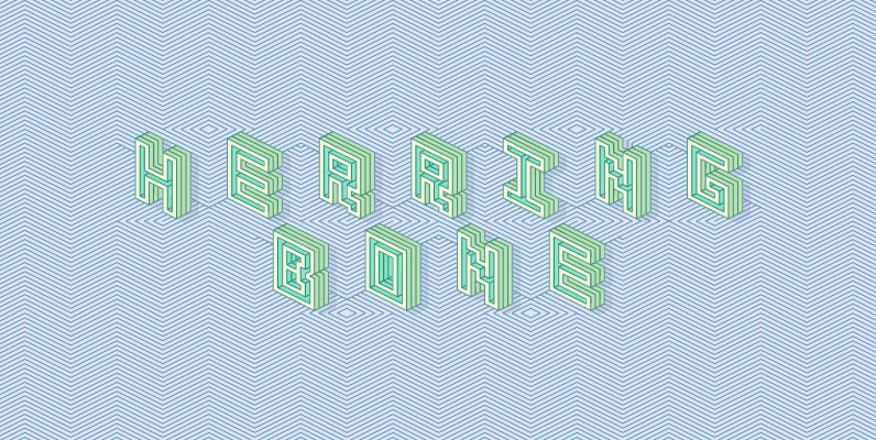
Herringbone Font
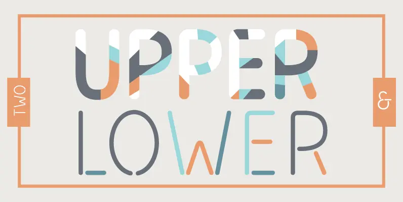
Herringbone is a unique geometric display face. Letters and words align with a diagonal pattern, alternating with upper and lowercase characters. Use the solid accompanying fonts “knockout, extrude, outer, and inner” to colour in between the lines by stacking layers
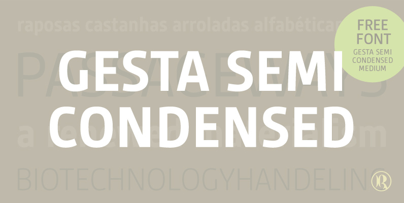
Gesta Semi Condensed Font
Gesta Semi Condensed is a narrower version of Gesta typeface. With it's clean shapes and slightly curved strokes, Gesta Semi Condensed combines a distinctive and warm feel with a modern look. It is available in four weights from light to
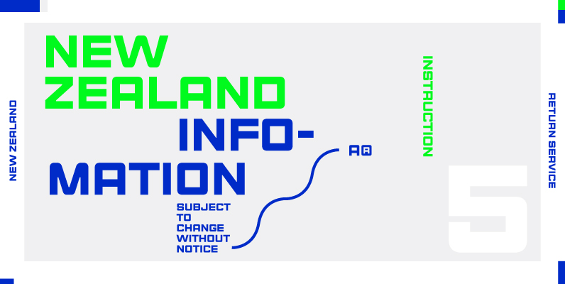
Steelworks Font
Steelworks is a headline font based on lettering on a plaque of the Henry Avenue Forge in Winnipeg, Manitoba, Canada. Published by Suomi Type FoundryDownload Steelworks
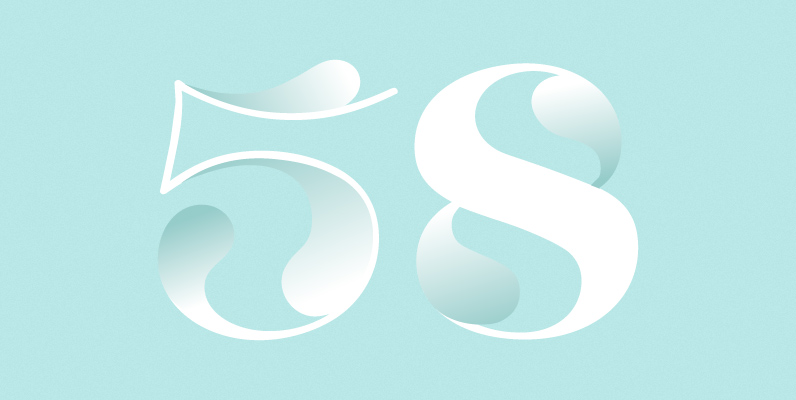
HGB Lombardisch Font
In mediaeval times, Lombardic initials were popular for embellished upper case in handwriting. Also, in ancient print products of the reanaissance, like e.g. in the Schedelschen Weltchronik of 1493, Lombardic initials were used to mark indentions. In other cases, Lombardic

Railroad Gothic Font
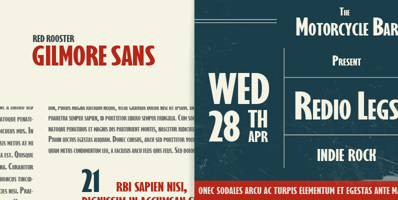
Digitally engineered by Steve Jackaman, Railroad Gothic is a strong sans-serif design based on Ludlow, circa early 1900. Published by Red RoosterDownload Railroad Gothic

Grover Slab Font
The object of Grover was to join two distinctive typeface designs: the basic European gothic of the late nineteenth century and the ’rounded’ style found in 1960s America. The result is a clear, friendly face with subtle yet unforgettable features.

Avenida Font
Architect and designer John Chippindale was inspired by the lettering styles found on buildings constructed in Spain’s Andalucian region in the 1930s and 1940s when he created Avenida. The Art Deco, condensed geometric capitals are supplemented by a smaller, slightly
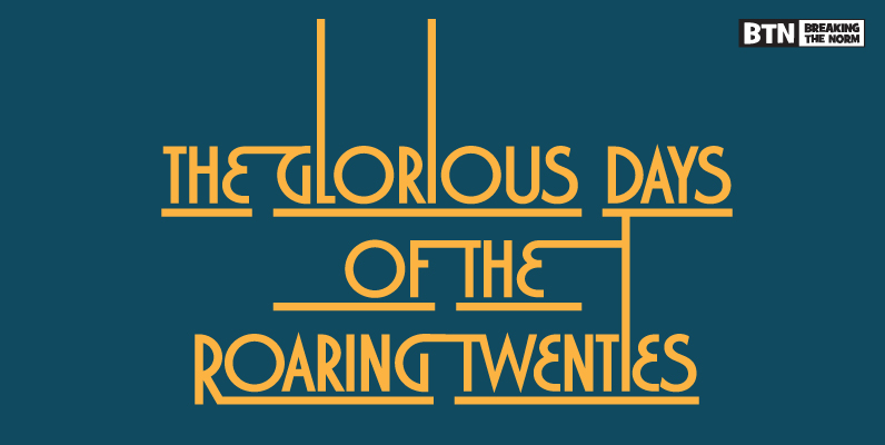
Marquisette Font
Marquisette is a typestyle full of deco flair, with a dominant caps vs. smallcaps character set. It comes complete with weight and style variants including a lined style which is perfect for headlines and logos. Published by Breaking The NormDownload
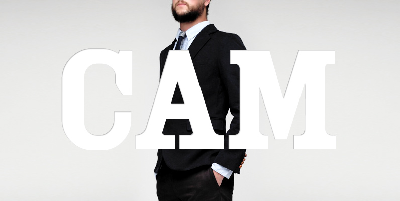
YWFT Cam Font
It ain’t good for some fonts to live too long, pilgrim. That’s why YWFT Cam was designed, as a fresh and unique wood-type typeface option for designers. YWFT Cam is a uni-case typeface design but also uses the lowercase to
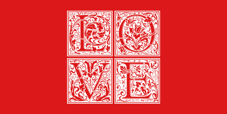
LTC Goudy Initials Font
LTC Goudy Initials has been a best-seller since it was reformatted to font format by P22 in 2005. We decided that while it works very well at medium sizes, when it was used extra large, the outlines were not as
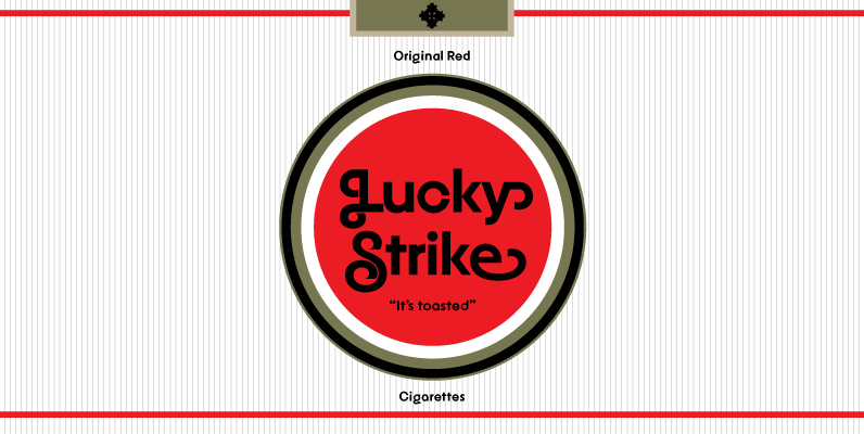
YWFT Agostina Alternate Font
YWFT Agostina became one of YouWorkForThem’s most successful typefaces upon its release in 2008. With nearly 300 characters, special swash options and full Latin letter designs among other special features, YWFT Agostina offered up truly endless typographic possibilities and is
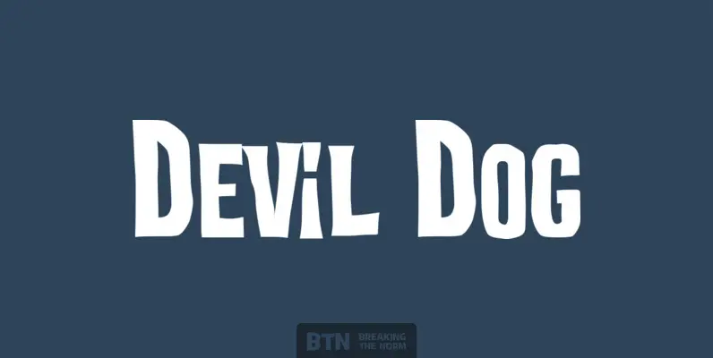
Devil Dog Font
Devil Dog is a fun yet scary typestyle inspired by retro Frankenstein and other horror movie posters. It’s big, it’s bold, it’s caps and smallcaps, it’s a typeface monster. Published by Breaking The NormDownload Devil Dog
