Tag: casual

Plz Script Font
Plz Script is a very popular Outside the Line font. It is a warm and friendly script font that can be used as body copy or for headlines. Great with Architectural Lettering or Plz Print. Published by Outside The LineDownload

Follies Font
This striking 1940’s-style sans serif typeface has a unique inline feature and is excellent for application where a strong graphic headline is required. Beautifully designed by British lettering designer Alan Meeks. Published by LetrasetDownload Follies

Becka Script Font
A wide casual typeface based on a refined brush stroke style makes this font suitable for a wide variety of large display work. For maximum visual impact, Becka Script should be closely letter and word spaced. Created by talented British


Aquitaine Initials Font
These beautifully designed initials were created by talented American designer Steven Albert. Aquitaine looks best when the more straightforward characters are used to set words and the decorative alternatives are used to provide exciting initialling complements. A unique style with
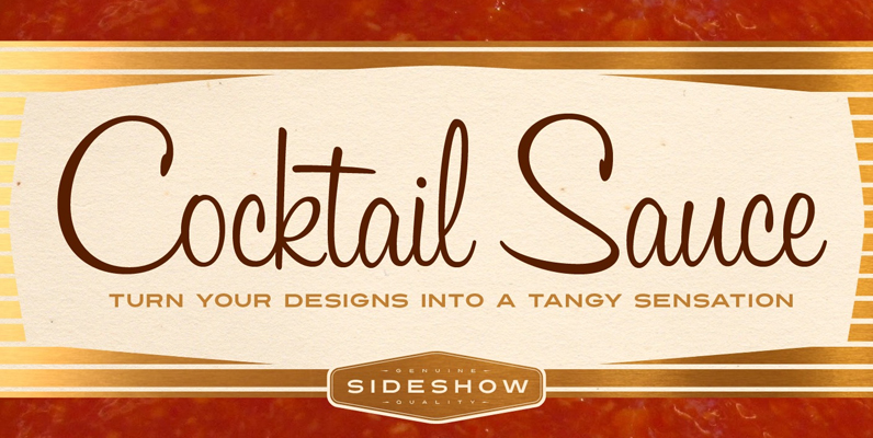
Cocktail Sauce Font
Spice up your designs with Cocktail Sauce! This tasty handwritten script is loaded with OpenType magic that gets your designs dancing with tangy sparkling flavor! Inspired by brushscript hand lettering of the 1950s, this casual upright script will turn you

Adios Script Font
Romantic, decorative Adios Script is one of Alejandro Paul s most elaborate and technically refined faces to date. Inspired by designs in how to commercial lettering guides of the 1940s, it has been refined and brought into the 21st century

Delight Script Font
Delight Script is a fresh and original Angel Koziupa design that takes its cue from post-WWII advertising scripts. Casual, bouncy and playful, this upright script is built and engineered by Alejandro Paul with tons of alternates that can make every
P22 Platten Neu Font
The P22 Platten font family has been revisited and expanded by designer Colin Kahn. Platten is based on lettering found in German fountain pen practice books from the 1920s (you may have seen the similar Speedball books in the US).

Coptek Font
Coptek derives its name from the high-tech, computer-generated look based on the traditional lines of a copperplate script. Once again David Quay has succeeded in making a difficult design objective work to good effect. The capitals are initials which provide

Viento Font
Viento is the evolution, devolution and revolution of the classic Brisa font. Drawn in a rough way for quick times in a fast culture, this font is a top-of-the-range option for casual text, invites, recipes, menus and of course, packaging
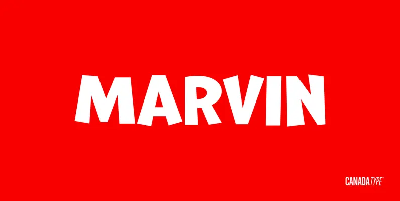
Marvin Font
The objective of this font was to try and find out how far back in the designer’s life this obsession with letters began. The challenge was to draw, from memory only, two sets of caps that recall older Looney Tunes
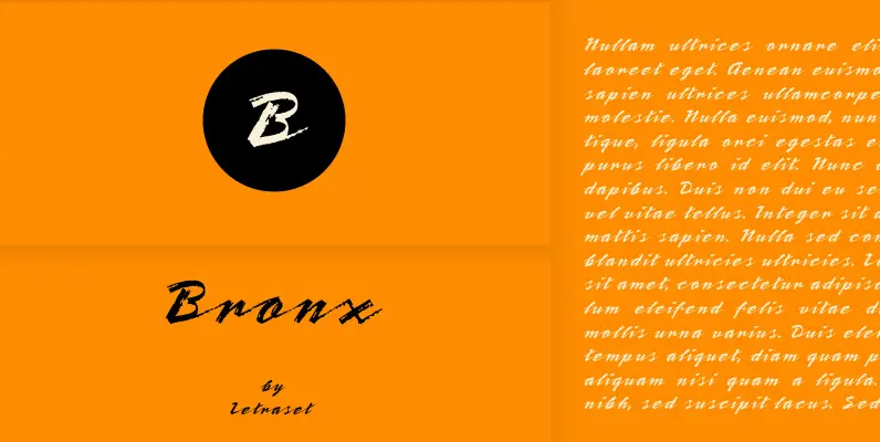
Bronx Font
A contemporary, highly stylized script style that captures the effect of a quickly rendered brush letter. The capitals are intended only for initialling purposes, but may be joined with the lower case letters, which can also be linked together. Bronx
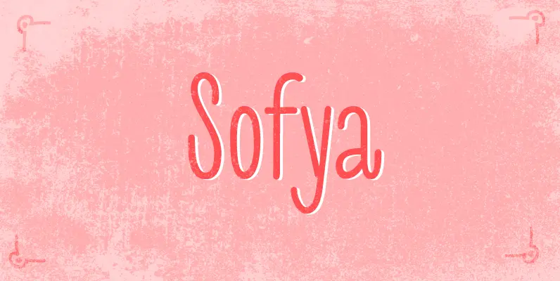
Sofya Font
Sofya is funny script font based on the logo which we did. It will look great on the package, restaurant menus, logos and magazine headlines. A large number of ligatures help you vary your design. Published by GaslightDownload Sofya
Filmotype Leader Font
Introduced by Filmotype in the early 1950s, Filmotype Leader was inspired by speedy sho-card bold lettering styles prominently featured in automotive advertising and editorial designs of the late 1940s and early 1950s to express speed and urgency. Remastered and expanded

Kiddy Font
Kiddy is simple and slightly rough on one side and light and funny on other side. Kiddy have two set initials (realised as Contextual and Titling Alternates) and numerous decorative elements. Published by GaslightDownload Kiddy
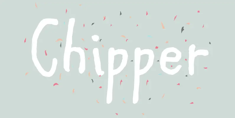
Chipper Font
If a style bubbling with innocent mischief is what you’re after, this one will delight you! Chipper looks as though it was created by a child’s slightly shaky hand, but the even color of the line weights reveals a professional,

Prague Font
Prague is a strong, angular Roman typeface with classical overtones. It is suitable for use across a wide spectrum of advertising work requiring a traditional or classical approach. The exciting vibrancy of this typeface typifies Type Designer Michael Gills’ work,