Tag: catchwords
Quotes Font
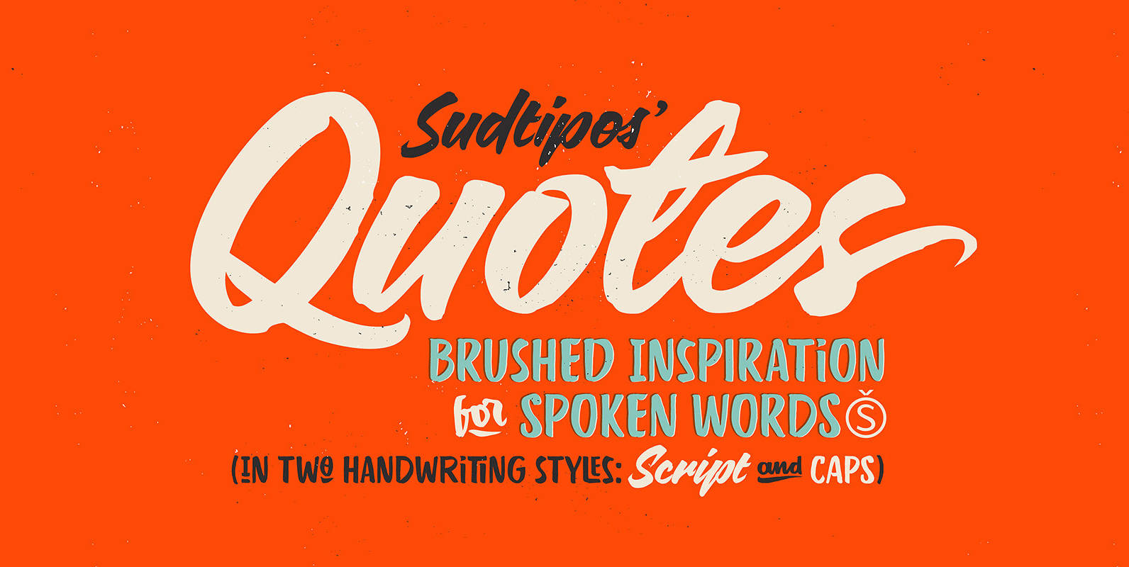
“Quotes” is the second typeface calligraphed by Yani Arabena, designed along with Guille Vizzari and Ale Paul, for Sudtipos. Being thrilled by the use of the pointed brush, spontaneous messages, gesture and freshness to represent inspirational phrases and quotes written
Wanderlust Collection Font
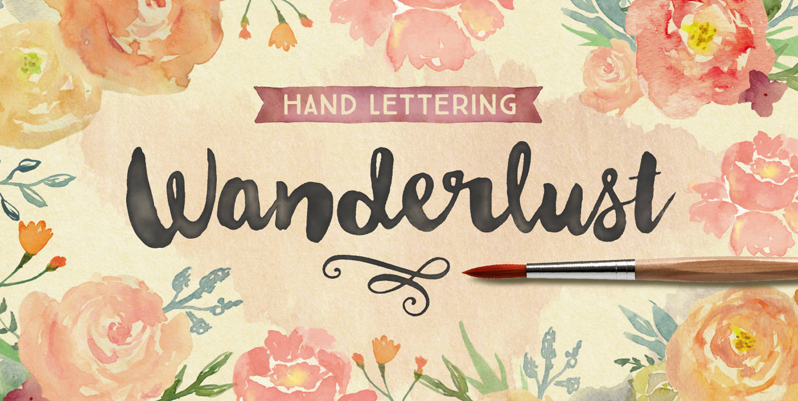
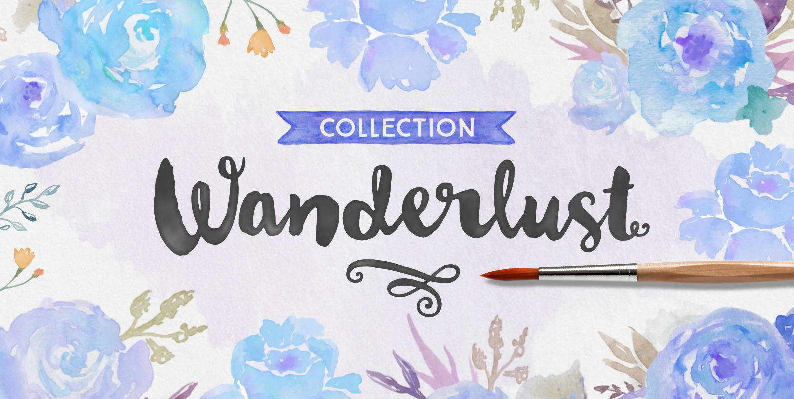
Wanderlust Letters has returned, but now offered in a beautiful collection of hand painted scripts. New versions include Wanderlust Letters Pro, Decorative, Boho, Chic, Shine, Gold, Caps, and Ornaments. Wanderlust Letters Pro is an extended version of the immensely popular
Mamute Font
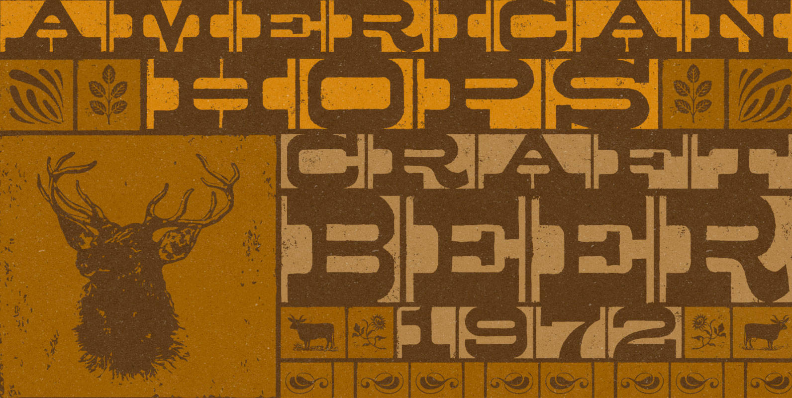
Mamute is a block rockin’ family with a cool letterpress look. Its upper- and lower-case slots hold glyphs with slightly different textures for a natural look. Numbers and punctuation marks also have alternate versions. Just trigger the Contextual Alternates feature
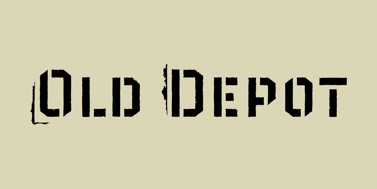
Old Depot Font
Old Depot is a newly reworked idea for the Depot Trapharet 2D font. It supports more languages and is available in more lettering. Old Depot stands out with its industrial nature of archaic spirit. It is a wonderful choice for
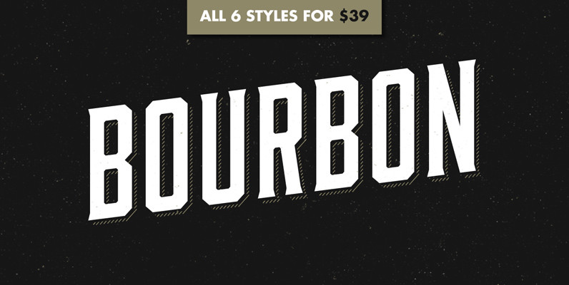
Bourbon Font
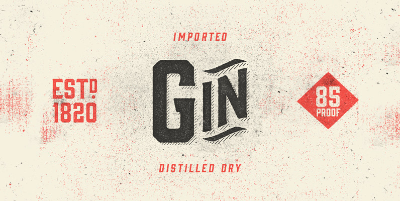
Like a brother to Gin, Bourbon is a condensed display typeface inspired by the likes of whiskey bottles and vintage serifs. It enjoys long walks with subtle, distressed textures or a nice, good-ole script. Bourbon Rough works great in larger

Garden Font
Last year, we visited Brazil and we were totally captivated by its cheerful and warm people. Its wild nature is absolutely amazing and very noticeable in textile printing as well as in floral design. That was precisely what inspired us
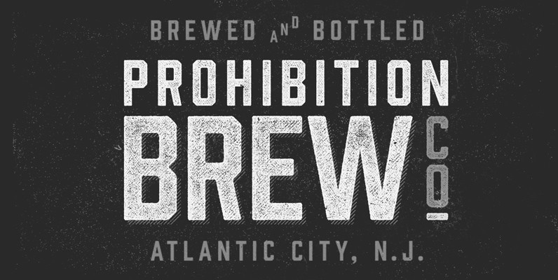
Prohibition Font
The ban on serifs is at hand! Bourbon and Gin thought they could get away with their spirited serifs, but Prohibition has arrived and cut them off. Packed with some new surprises, this vintage sans typeface takes queues from classic
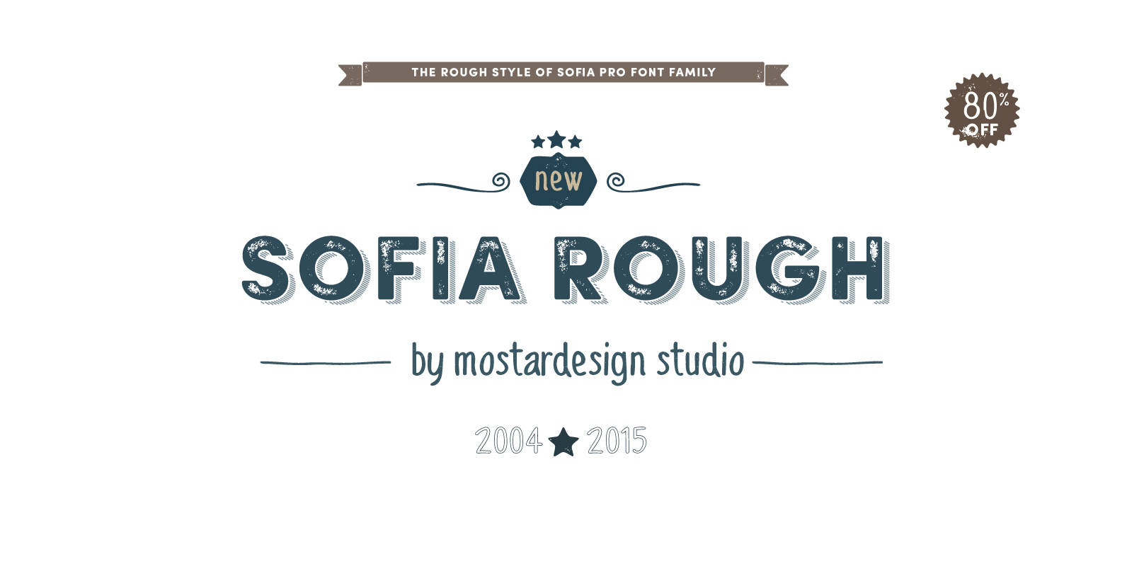
Sofia Rough Font
Based on the popular Sofia Pro typeface, Sofia Rough is a multifaceted font family with different eroded variations. Sofia Rough contains sixteen fonts and two eroded sub families. With Sofia Rough Black for uppercase and Sofia Rough Script for lowercase
