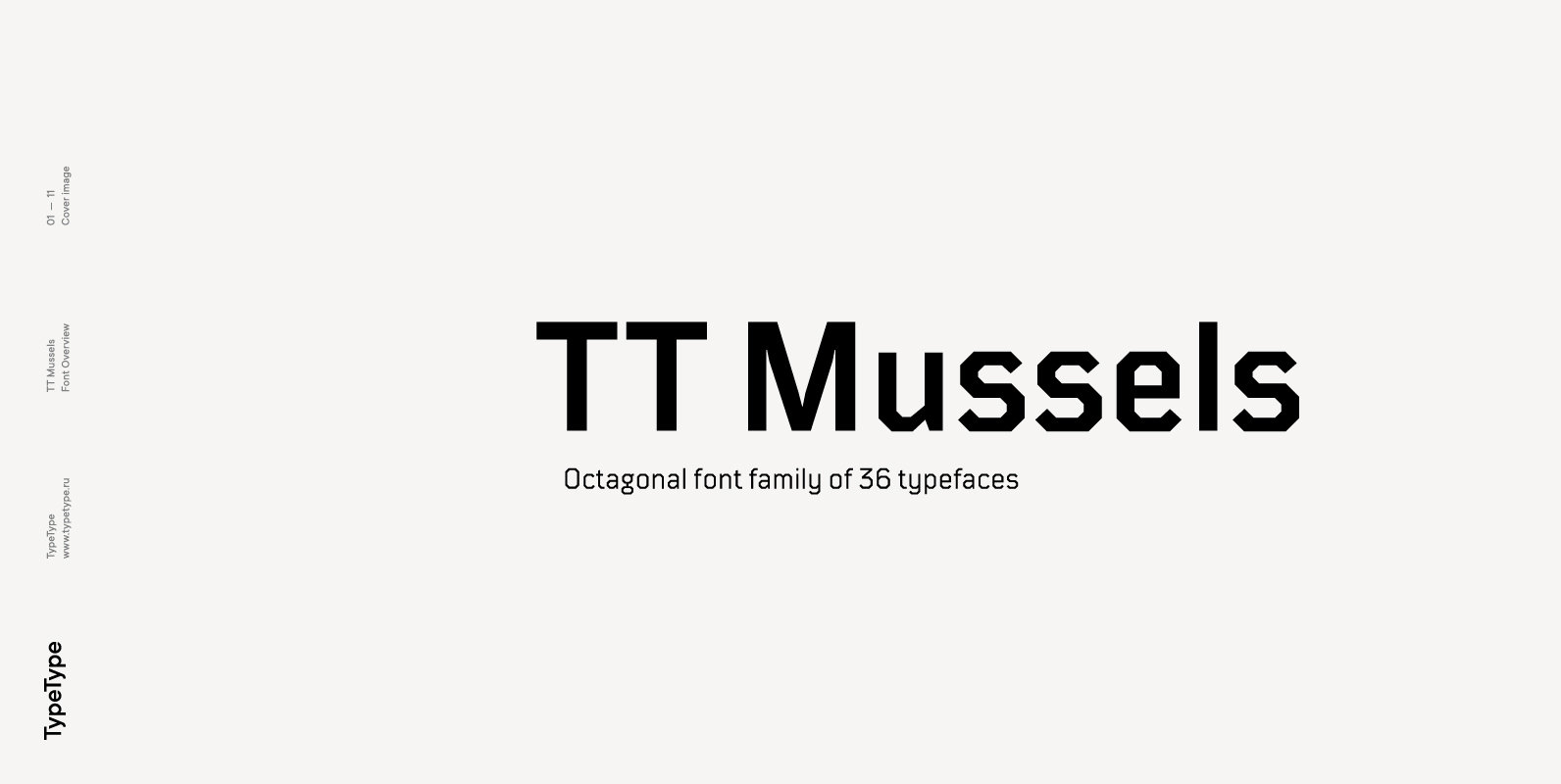
TT Mussels Font
The TT Mussels font family is the successor of such popular fonts as Bender and TT Squares. At the same time, TT Mussels has a number of fundamental differences that make it a unique font family that stands out from

Winner—Classic athletic aesthetics, finally as a versatile contemporary font family. Just when you thought there was nothing left to add to the classic sports design, we lifted it to a whole new level. Whatever you want to set in whatever

The TT Mussels font family is the successor of such popular fonts as Bender and TT Squares. At the same time, TT Mussels has a number of fundamental differences that make it a unique font family that stands out from
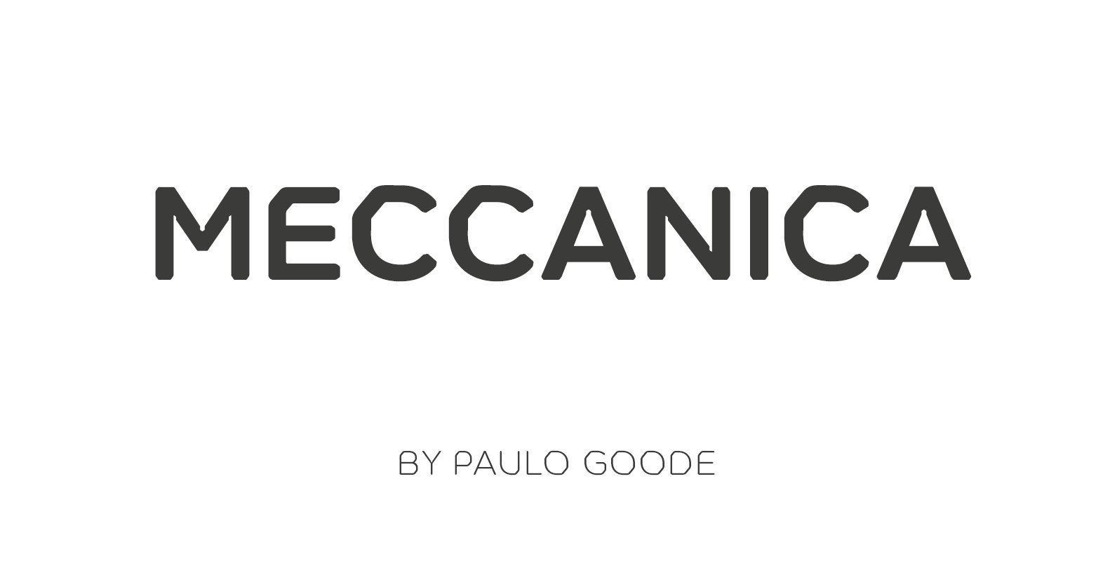
Meccanica is a geometric sans typeface like no other, its defining features include soft, chamfered edges, angular bowls and shoulders, angled/hexagonal terminals, and semi-hexagonal ink traps (in a nutshell). Inspired by the mechanics of engineering – the humble nut and
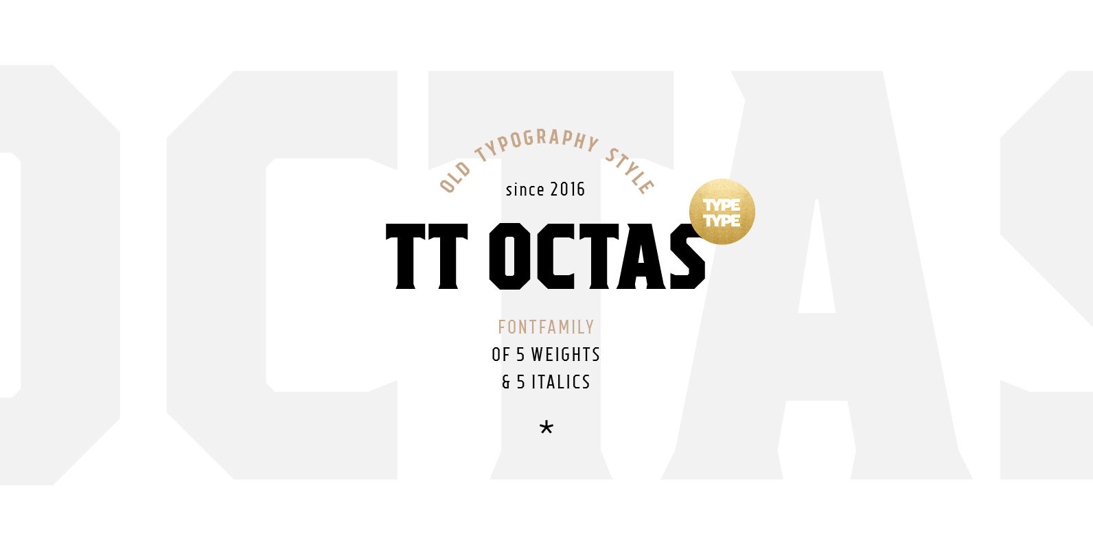
TT Octas is a narrowly proportioned font family built upon the principle of octagonal forms: all circles in this font family are actually octagons. Thanks to small serifs, TT Octas has a saturated and vintage character to it. Simple depiction
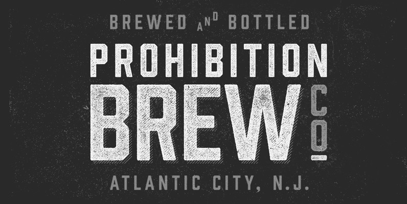
The ban on serifs is at hand! Bourbon and Gin thought they could get away with their spirited serifs, but Prohibition has arrived and cut them off. Packed with some new surprises, this vintage sans typeface takes queues from classic
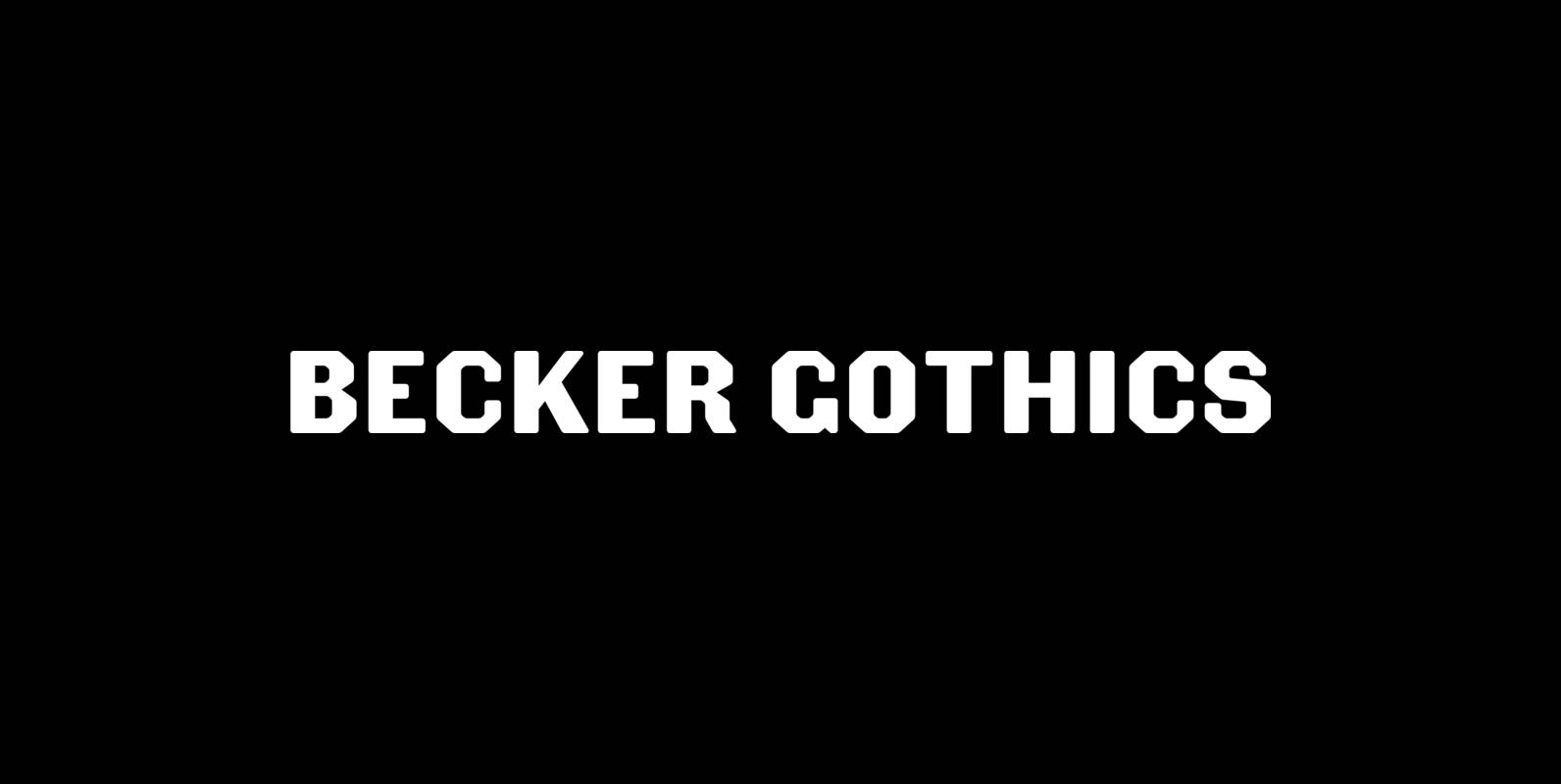
The Becker Gothics pay homage to the nineteenth century American lettering master George Becker. Designer James Puckett has given new life to the ingenious gothic alphabets found in Becker’s 1854 lettering manual Ornamental Penmanship. Use this quintet of typographic voices
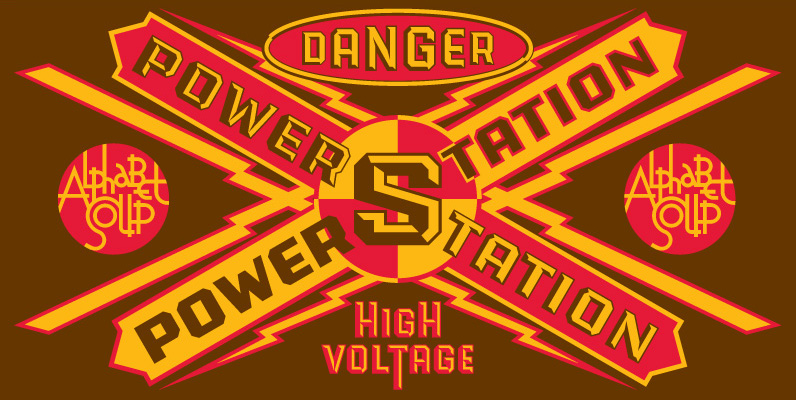
Originally conceived as part of a unique display design created for Hershey’s Times Square flagship store, the PowerStation family is the perfect choice when looking for a font that speaks of strength, solidity and character. It comes in two faceted
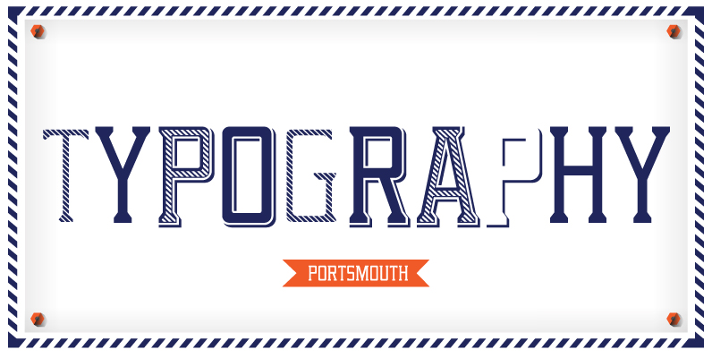
Portsmouth is a strong, sturdy typeface with historical character. Its inspiration comes from the height and strength of the wooden tall ships that sailed into port in their day. With caps and small caps, this typeface is great for headlines