Tag: clarity
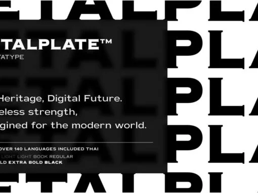
Metalplate Font
For the modern graphic and digital designer, when typography is as critical a design element as color and white space, finding that perfect typeface that communicates the ethos of your design can be quite a challenge. Let us introduce you
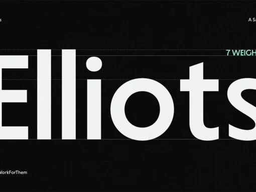
YWFT Elliots Font
In a world driven by visual communication, typography plays a central role in creating clear, effective messages. Among countless typefaces, YWFT Elliots, a YouWorkForThem exclusive, stands out as a precision-driven condensed sans-serif that meets today’s digital and branding needs with
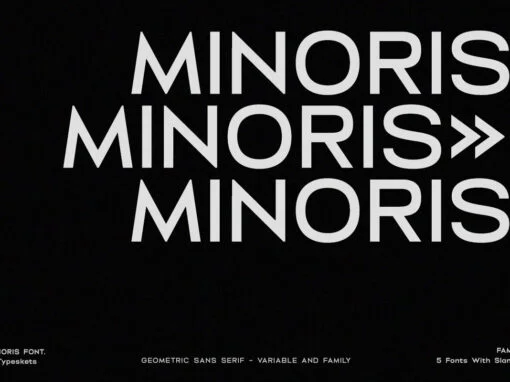
Minoris Font
In the realm of digital design and typography, the search for the perfect font is a continuous journey. But, lo and behold, a touchstone has come into view. Enter the Minoris Font; a one-of-a-kind sans serif geometric typeface that is

Miguer Sans Font
Inscribed within the annals of typographical delightful discoveries is the marvel that is Miguer Sans. This exquisitely crafted, high-contrast modern sans-serif typeface with its unique aesthetic imbues any design undertaking with a distinctive touch of class and sophistication. A notable
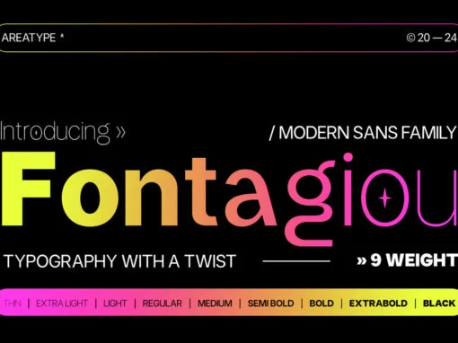
Fontagiou Font
Fontagiou presents a delightful marriage of traditional craft and contemporary style in the realm of typeface design. Celebrated as a graceful sans serif font, Fontagiou exhibits smooth curved lines ensuring a modern and flexible impression that breathes life into any
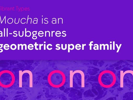
Moucha Font
Moucha is a geometric super family offering the proportions of all subgenres. Find a vintage and a modern variant and play with all the sea foam that happens in between. The variable font is your typographic toolbox with the perfect
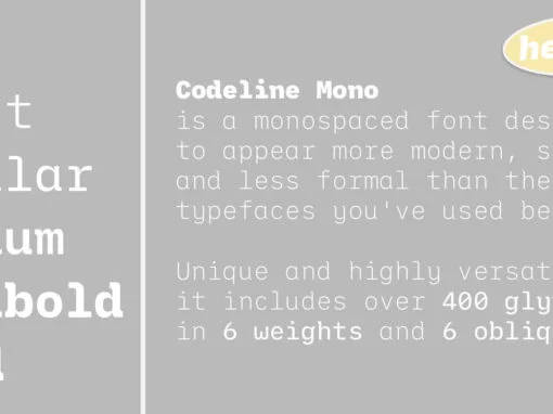
Codeline Mono Font
Codeline Mono is a friendly monospaced typeface designed to appear more modern, softer and less formal than the usually robotic and strict mono fonts. Unique and highly versatile, this family includes over 400 glyphs in each of its twelve styles
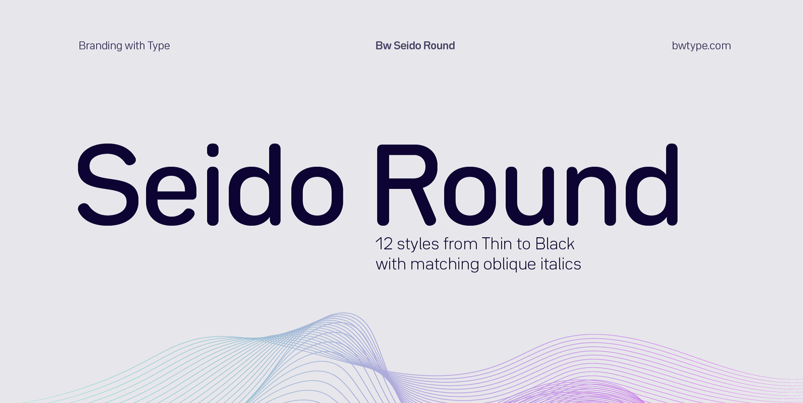
Bw Seido Round Font
Designed by Alberto Romanos, Bw Seido Round is a semi condensed font family with rounded corners striking a gentle balance between minimal strict geometry and typographic refinement, conveying a subtle industrial yet friendly feel. It consist of 12 styles (6
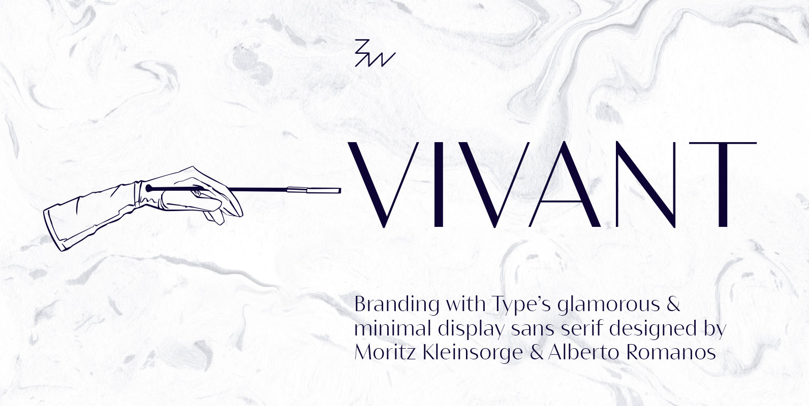
Bw Vivant Font
Designed by Moritz Kleinsorge & Alberto Romanos, Bw Vivant is a glamorous sans serif font family. It marries the visual appeal of deeply modulated serif typefaces with a minimal geometric approach, discarding any accessory element on the hunt for the
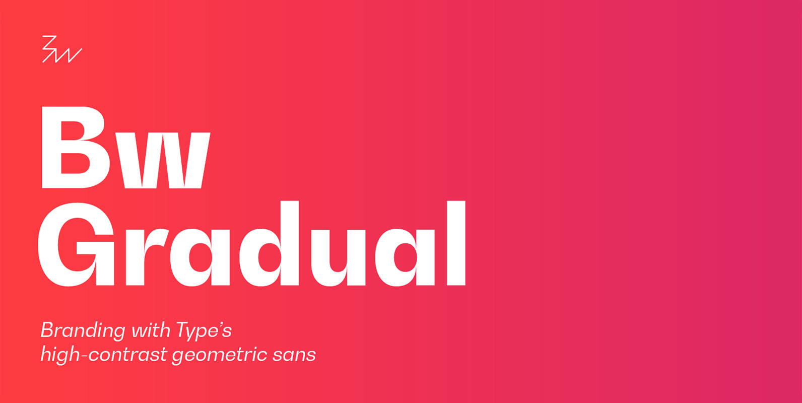
Bw Gradual Font
Bw Gradual brings together the pragmatic feel of the geometric grotesque genre with the visual appeal of its very deep joins. Pure shapes and fast curves coexist on this versatile font family that claims for attention when used large, but
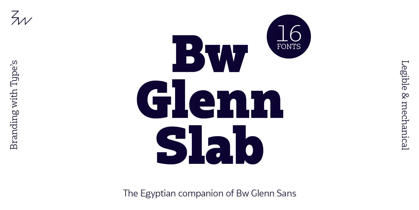
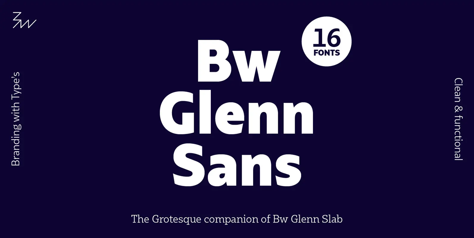
Bw Glenn Slab Font
Bw Glenn Slab is a confident and robust font family with a sturdy feel offering no concessions for ambiguity. Its strict geometry and open shapes provide a very legible and clean texture, performing well on print and screens alike. It’s
