Tag: class
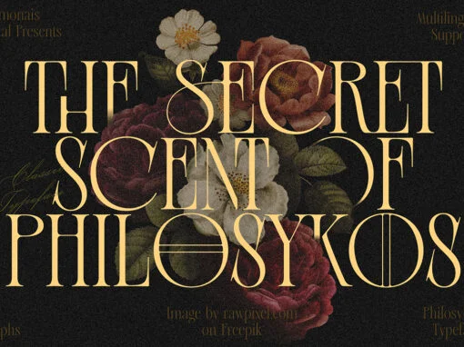
Aesthetic Fonts: Unveiling the Timeless Charm of Old Money Fonts
Step into a world of refined elegance and sophistication with Old Money Aesthetic Fonts. These captivating typefaces possess a timeless charm that transcends eras, making them an ideal choice for designers seeking to infuse their projects with a touch of
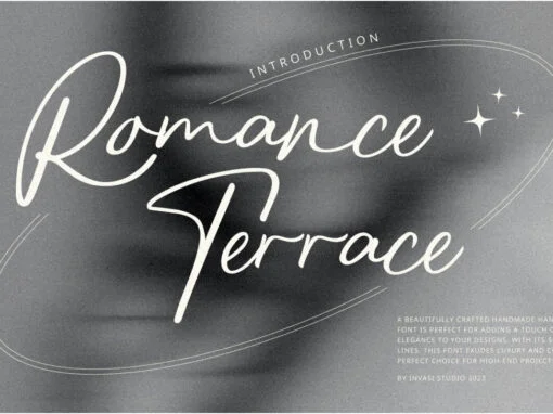
Romance Terrace Font
Romance Terrace is the perfect font for adding a touch of luxury and elegance to any design project. Its stylish script brush style exudes sophistication and class, making it ideal for use in branding, wedding invitations, packaging, menus, and more.
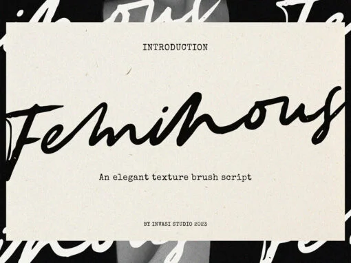
Feminous Font
Introducing Feminous Font, the latest font that’ll give your designs a fresh and fun twist! This brush script font has got the perfect blend of sophistication and playfulness, making it the perfect choice for all your creative projects. The brush
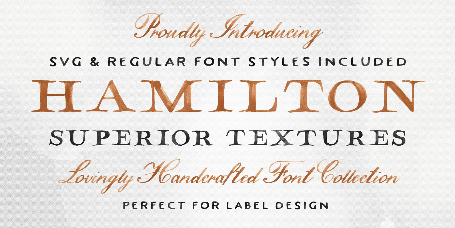
Hamilton SVG Font
The Hamilton SVG Font Family features a serif, sans serif, and script; each boasting exquisite and hand painted textures throughout. Inspired by vintage maps, wine, and whisky labels, Hamilton was designed to be a classy cat perfect for packaging design,
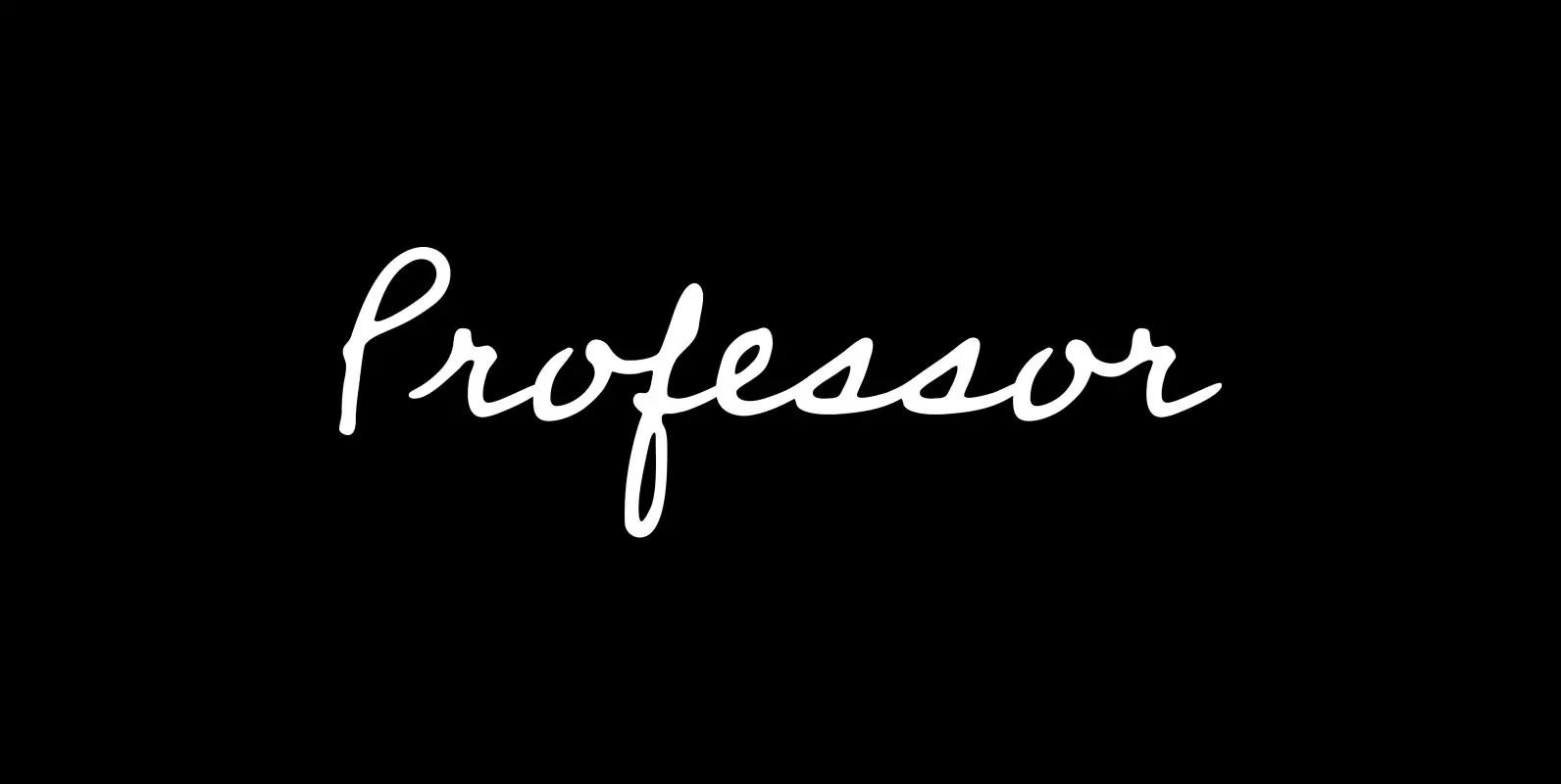
Professor Font
Professor is modeled after the handwriting of an actual professor emeritus whose cursive script displays just the plain-yet-handsome, casual-yet-legible feeling I’d been looking for in a contemporary hand—one that might prove as useful in a personal letter as, say, on
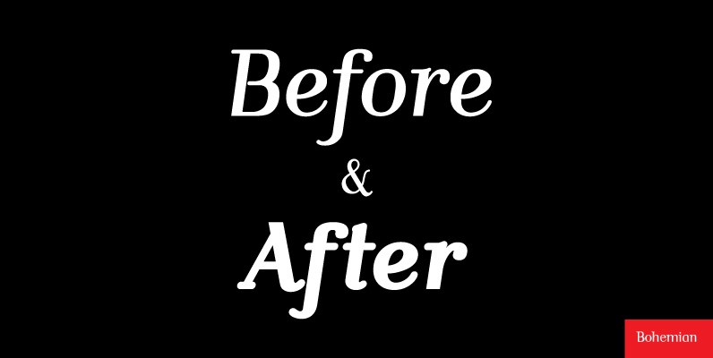
Bohemian Font
Mixed designs of Futura and Bodoni (Fudonis) are quite popular. Apart from being contemporary, such fonts provide excellent readability. However, most of the existing mixtures were not good enough in terms of balance for P. Kraft. He was finally inspired