Tag: classic
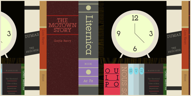
YWFT Motown Font
YWFT Motown is a geometric slab serif that contains a total of 5 weights. Although it was intended to be used as a display face, YWFT Motown’s heavier weights can be used effectively for text as well. The angled crossbars
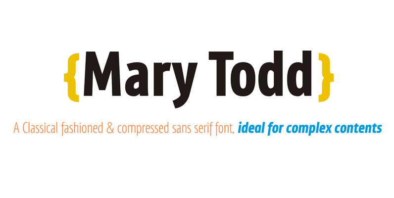
Mary Todd Font
MaryTodd was created for small texts with a variety of hierarchies. Is condensed to save space. It has a rich set of glyphs: small caps, old style figures, monospaced numbers, numerators and denominators for fractions, etc. It is ideal for
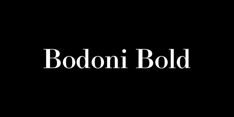
LTC Bodoni Bold Font
Bodoni Bold was drawn by London based type designer Dave Farey for Lanston Type during one of his alter-ego bouts as Giambattista Bodoni in the early 1990s. This font presents the unusual opportunity to use a Bodoni as body copy.
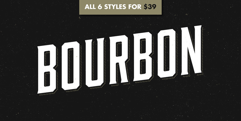
Bourbon Font
Like a brother to Gin, Bourbon is a condensed display typeface inspired by the likes of whiskey bottles and vintage serifs. It enjoys long walks with subtle, distressed textures or a nice, good-ole script. Bourbon Rough works great in larger

Merlo Font
Font Merlo is characterized by eight different varieties – lower and uppercase characters. It is inspired by a You And Me Monthly published by National Magazines Publisher RSW, Prasa that appeared from Mai 1960 till December 1973 in Poland. Published

Merel Font
Merel is a modern geometric typeface with humanist attributes. Geometry and logic are at the heart of this 6 weight font family. Humanist touches give it a number of distinctive characteristics, as well as aid legibility. Despite being rational and
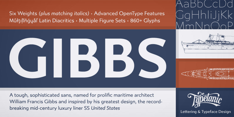
Gibbs Font
Gibbs is a tough, sophisticated sans, named for prolific maritime architect William Francis Gibbs and inspired by his greatest design, the record-breaking mid-century luxury liner SS United States. Taking various cues from the unique cast aluminum signs found on board,
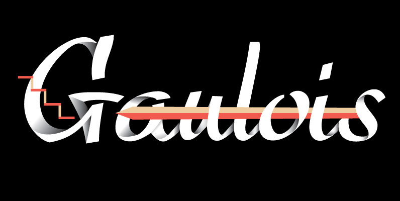
Gaulois Font
A couple of years before the second World War, Marcel Jacno, the popular French graphic designer who in the 1930s designed iconic posters for Gaumont and Paramount and famously illustrated the Gaulish helmet that first adorned the Gauloises cigarette packs
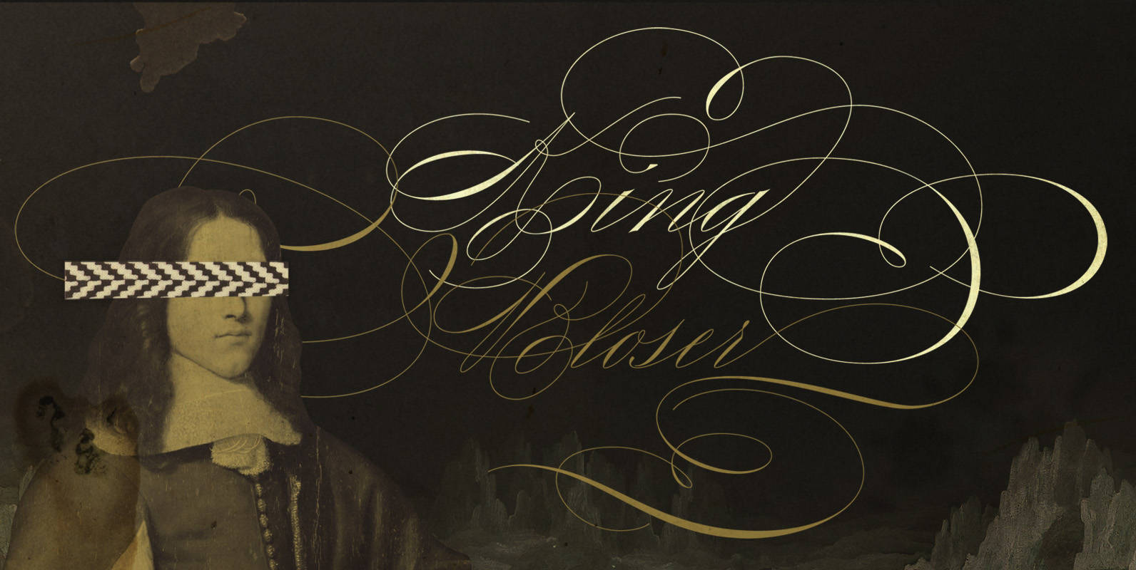
King Bloser Font
King Bloser Is a calligraphic font family inspired by Masters of Penmanship. The name King Bloser is a homage to penman E.W. Bloser from the 18th century; While the typeface has nothing from Bloser’s work, he was one of the
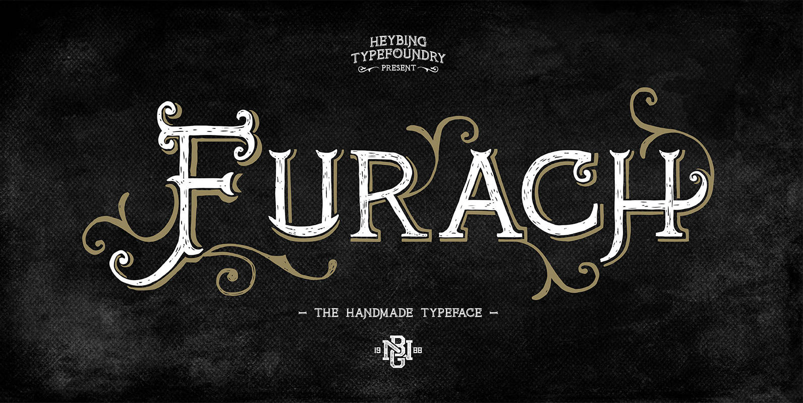
FurachTypeface Font
Furach is a typeface inspired from graphics and vintage posters, that is done entirely by hand, made with a simple style, classic look, elegant and natural. The Furach typeface includes a full set of capital and lowercase letters as well
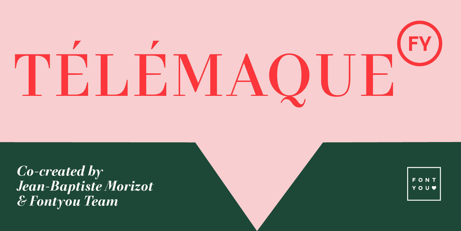
Telemaque FY Font
Télémaque FY is a contemporary didone style typeface with a lot of personality. Both rigid and elegant with its modern sharped terminals and its generous curves, this 4 weights font family will be for sure your new typographic companion for
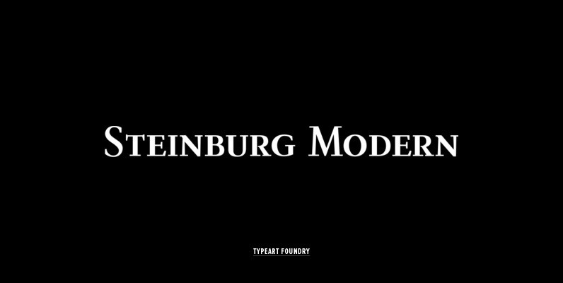
Steinburg Modern Font
Steinburg Modern™ is largely a variation on a Garamond-styled typeface with differences in some character designs and in the overall character proportions. In addition, the curved brackets that were a distinctive part of Garamond’s 16th century design are perhaps the

Aries Ranging Figs Font
In 1995, FontHaus came upon a rare opportunity to create a revival of Aries, a little known and previously unavailable typeface designed by the legendary Eric Gill in 1931. Discovering a lost typeface by one of the major designers of
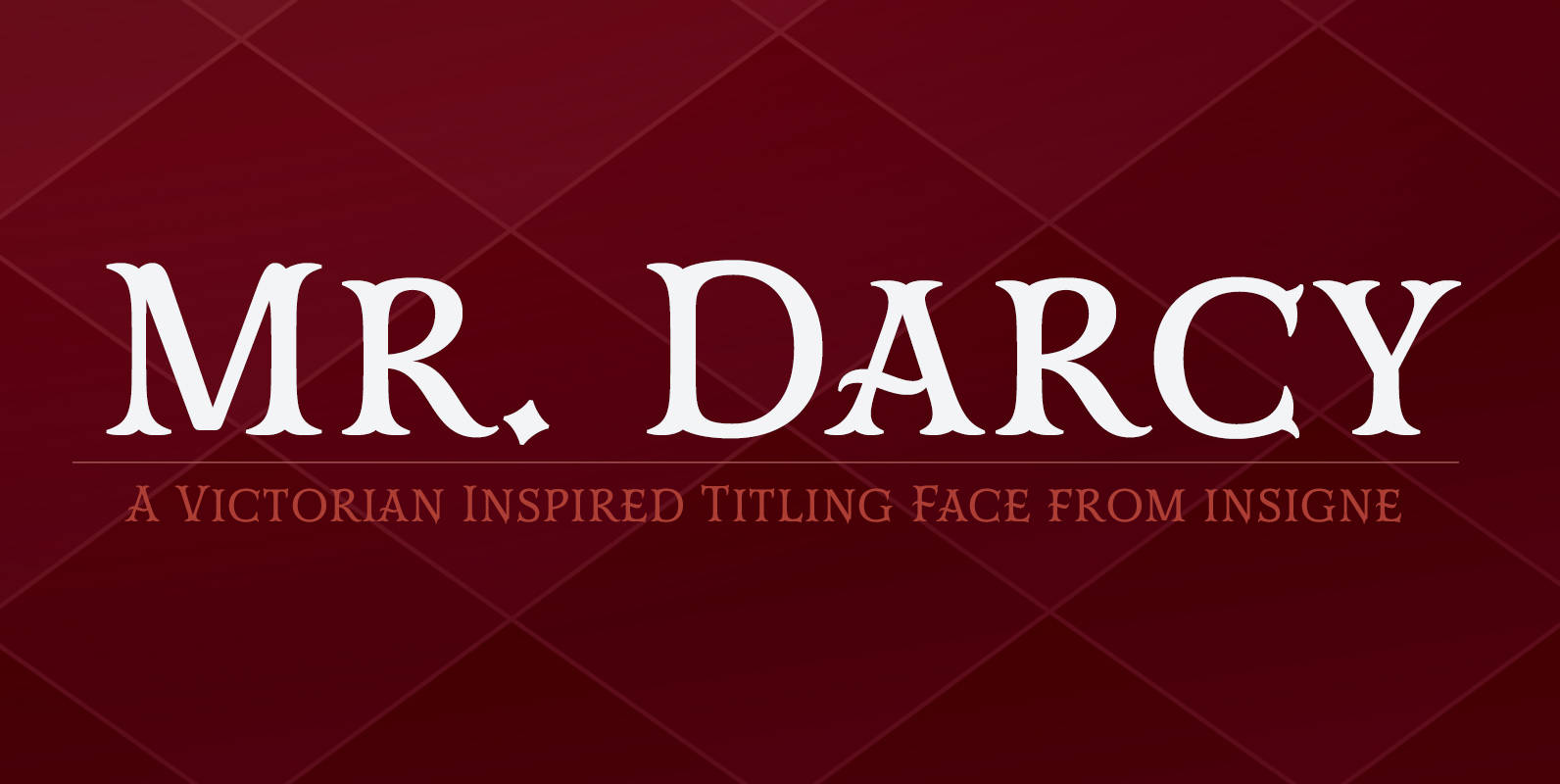
Mr Darcy Font
The elegant and very graceful Mr. Darcy is sufficiently compete with its additional characters–to be stated more precisely, over 136 defining alternates. These optional features are carefully displayed within the supplied brochure. The employ of the Mr. Darcy family moreover
