Tag: classic

Clasica Sans Font
Clasica Sans is a fresh and contemporary typeface, consisting of 7 standard fonts plus italics. It is perfect for publishing and print design. Clasica Sans comes in various weights, working well into paragraphs with small and large text sizes. Regardless
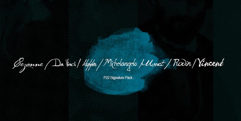
P22 Signature Pack Font
The P22 Artist Signature Font Pack includes 17 handwriting and dingbat fonts inspired by famous artists including Leonardo da Vinci, Edward Hopper, Vincent van Gogh and of course the ever popular Cezanne font. The design of artist handwriting fonts was
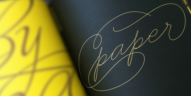
Business Penmanship Font
Business Penmanship is an ode to the business handwriting from the era penmanship was a highly-valued part of business education and practice. In the early 1800s, Platt Rogers Spencer (1800-1864) created what would become the most widely accepted and prized

Memphis Font
Memphis is a modern and fashionable slab-serif originally designed by Rudolf Wolf, brought to us by the german type foundry URW. Contains a simple but powerful family set with options from extra-light to bold. Memphis works great in an a

Jason Uncial Font
Jason Uncial, a unicase font, was created by Dutch designer Coen Hofmann. Uncial hand writing began to spread in Europe at the time of the late Roman Empire (200 A.D.). It influenced both the Carolingian Minuscule as well as our
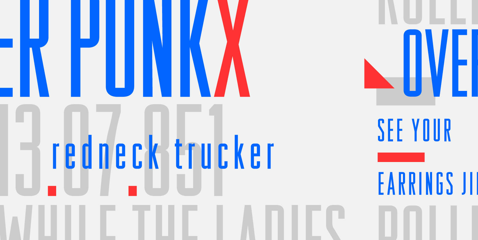
Raleigh Gothic Condensed Font
In 1932, the great American type designer, Morris Fuller Benton was busy directing the creative departments of ATF and designing type. Big on his plate during that period was the development of the Bank Gothic® family among other typefaces like
Clarendon Text Font
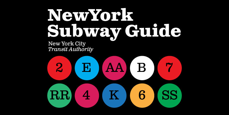
Clarendon Text is a contemporary remake of the truly classic slab serif typeface with a distinctively clear and legible visibility. It is a widely usable text type suited equally well to advertising, books, publications, and a wide range of corporate
Azo Sans Font
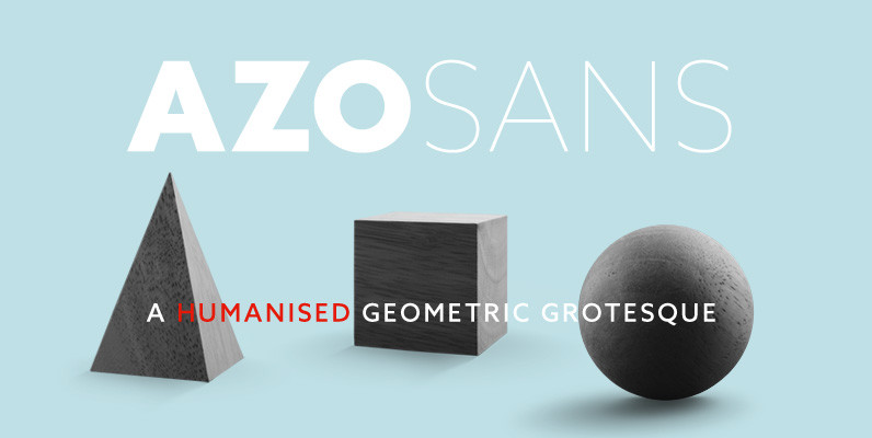
Azo Sans is a new sans serif loosely based on the elementary forms of geometry. It is constructed in a geometric manner and inspired by the constructivist typefaces of the 1920’s, but is instilled with a humanistic quality. Azo Sans

Tempest Font
Tempest is a small-x-height serif font for headline use. Tempest will bring a thin, sharp and classic approach to your layout, and at the same time keep an elegant and fashionable flow to the project. Published by Suomi Type FoundryDownload
Seizieme Pro Font
In 1905 the Parisian typefounders Peignot & Cie. issued their Série 16. This clear roman with a large x-height and an italics soon enjoyed a great popularity. Coen Hofmann’s drawings made for the Seizième follow the original Peignot Série 16
YWFT Victoria Font
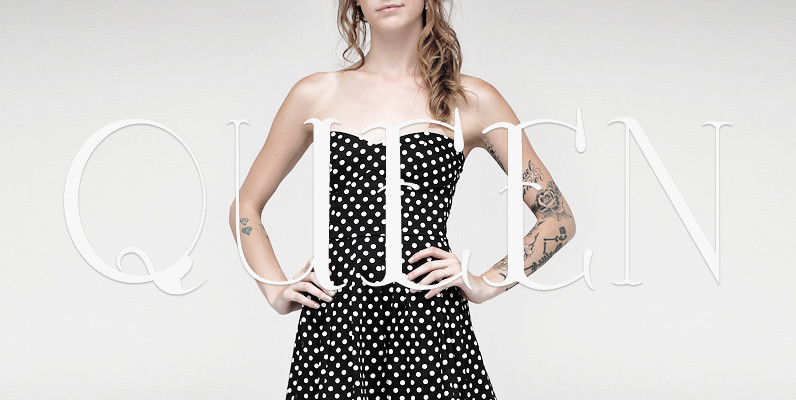
YWFT Victoria has the feel of a traditional serif face, yet defies many of these implications due to its hand drawn origins and uniquely inconsistent line weights. This unicase typeface includes all of the characters you would find in a
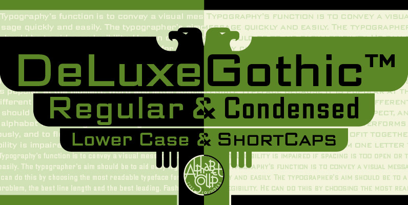
DeLuxe Gothic Font
Michael Doret was always very aware of the fact that Morris Fuller Benton’s classic Bank Gothic, a longtime favorite of his, didn’t contain any lowercase characters. So he set out to remedy that by designing his all new DeLuxe Gothic,

Caturrita Display Font
Caturrita Display is a new version of Caturrita. Better for titles and small pieces, with a large contrast in the heavy weights. It preserves the same structure of Caturrita, but with a more calligraphic touch, in the ligatures and almost
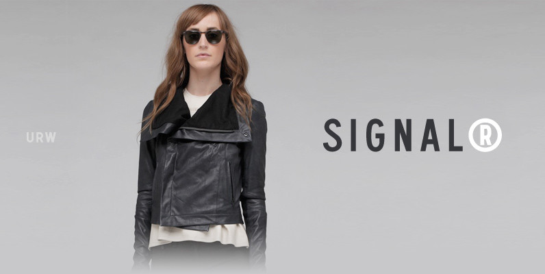
Signal Font
Whether road or railroad, air terminal or ferry terminal, URW Signal has the clean, simple authority to guide the way. This sleek beauty clearly directs both models on the fashion runway and planes on the airport runway, and also makes

Schillerplatz Font
Schillerplatz is a fresh, very well done retro styled font, designed by Hellmut G. Bomm in 2008. Schillerplatz is a very European styled design and works great in fashion or retro themed design projects. Published by URW Type Foundry GmbHDownload
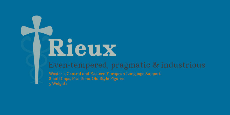
Rieux Font
Named after the steadfast doctor from Albert Camus’ The Plague, Rieux is an even-tempered slab-serif that is confident without being cocky and approachable without being casual. The aesthetic of Rieux is inspired by the industrial age. While the design is
