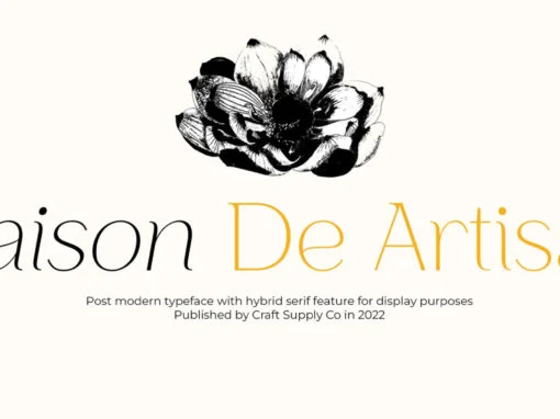
Tag: clean
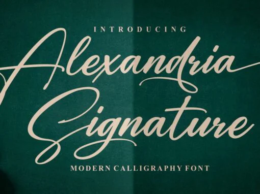
Alexandria Signature Font
Alexandria Signature is a script font design published by Ergibi Studio Published by Ergibi StudioDownload Alexandria Signature
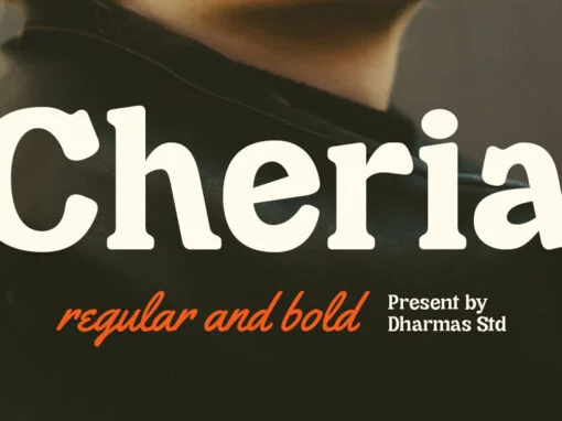
Cheria Font
Cheria is a serif font design published by Jamaludin Published by JamaludinDownload Cheria
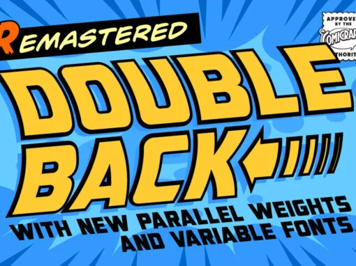
Double Back Font
Great Scott, Marty! This font is your density, charged up to 1.21 gigawatts through the Power of Love! Originally created by Comicraft for the official BACK TO THE FUTURE fan club, Remastered DOUBLEBACK has been rebuilt from the ground up,
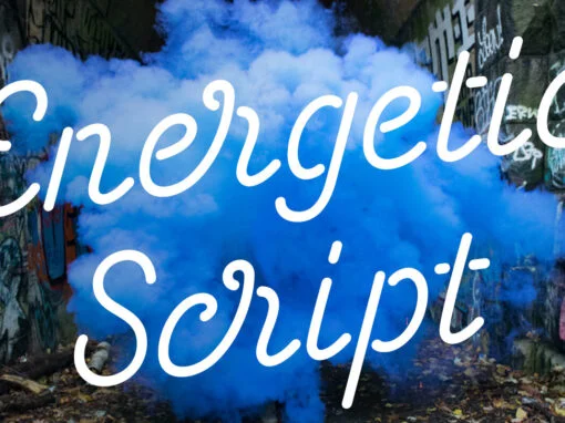
Energetic Script Font
Energetic Script is a script font design published by Sjoerd Kulsdom Published by Sjoerd KulsdomDownload Energetic Script
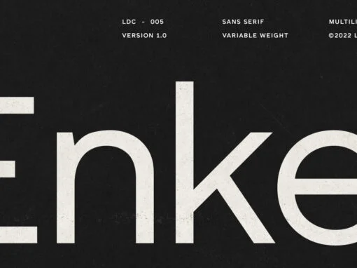
Enkel Font
Enkel is a sans serif font family with multiple stylistic sets and variable weights. It is a versatile mix of Geometric and Neo-grotesk design which offers the power of a display face at large sizes and ease of legibility in
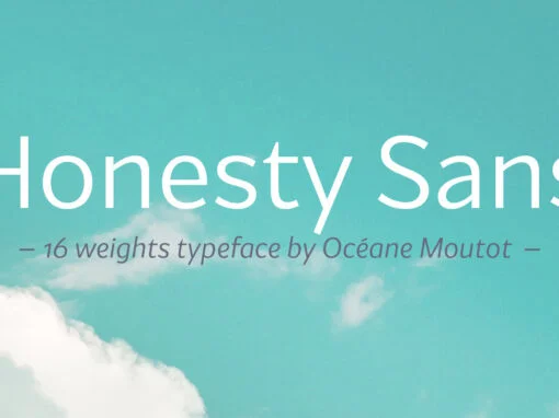
Honesty Sans Font
Honesty was the first font published by the Studio in 2020. It was a typeface with flared stems. 2 years later, we are now publishing Honesty Sans. It is inspired by the original design but is revisited as a sans
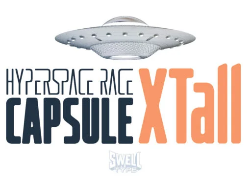
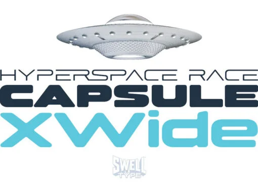
Hyperspace Race Capsule XTall Font
Welcome aboard the Hyperspace Race Capsule! Let the weight of gravity slip away as our interplanetary transport system takes you around the solar system in unparallelled style and comfort. Our reclaimed UFO has been remodeled with soft, luxurious curves on
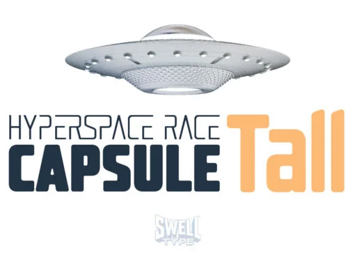
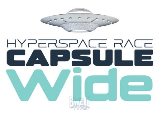
Hyperspace Race Capsule Tall Font
Welcome aboard the Hyperspace Race Capsule! Let the weight of gravity slip away as our interplanetary transport system takes you around the solar system in unparallelled style and comfort. Our reclaimed UFO has been remodeled with soft, luxurious curves on
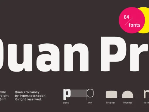
Quan Pro Font
The new Quan Pro font is a refreshed version of the popular family from Typesketchbook. It includes an updated structure, corners and shapes for each letter–making it perfect in many different applications like headlines or small texts! Published by TypesketchbookDownload
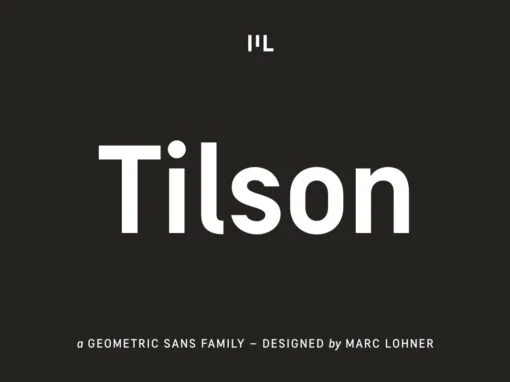
Tilson Font
Meet Tilson, a versatile workhorse family for both texts and headlines based on a geometric and straight-lined design. It will give your apps, websites, logos, posters and so much more a techy and masculine look and feel. However, some friendly
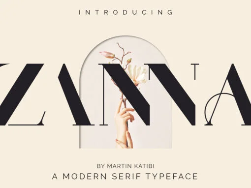
Zanna Font
Zanna is a modern typeface with lots of style and elegance. The Zanna typeface was inspired by the high contrast Didot look, which has been synonymous with fashion for decades. The Zanna typeface also has a very thin hairline and
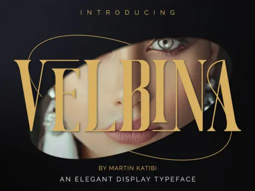
Velbina Font
Velbina is a beautiful luxurious display typeface, which comes with creative and elegant ligatures. The Velbina typeface has a sophisticated and professional look and feel, its unique alternative characters make it perfect for luxury-themed projects. The Velbina typeface comes in
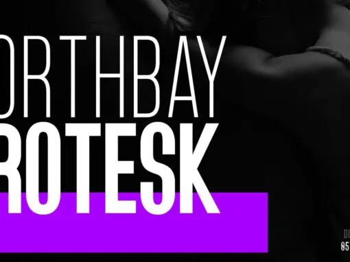
Northbay Grotesk Font
Northbay Grotesk is a sans serif font design published by FoxType Co Published by FoxType CoDownload Northbay Grotesk
