Tag: clean
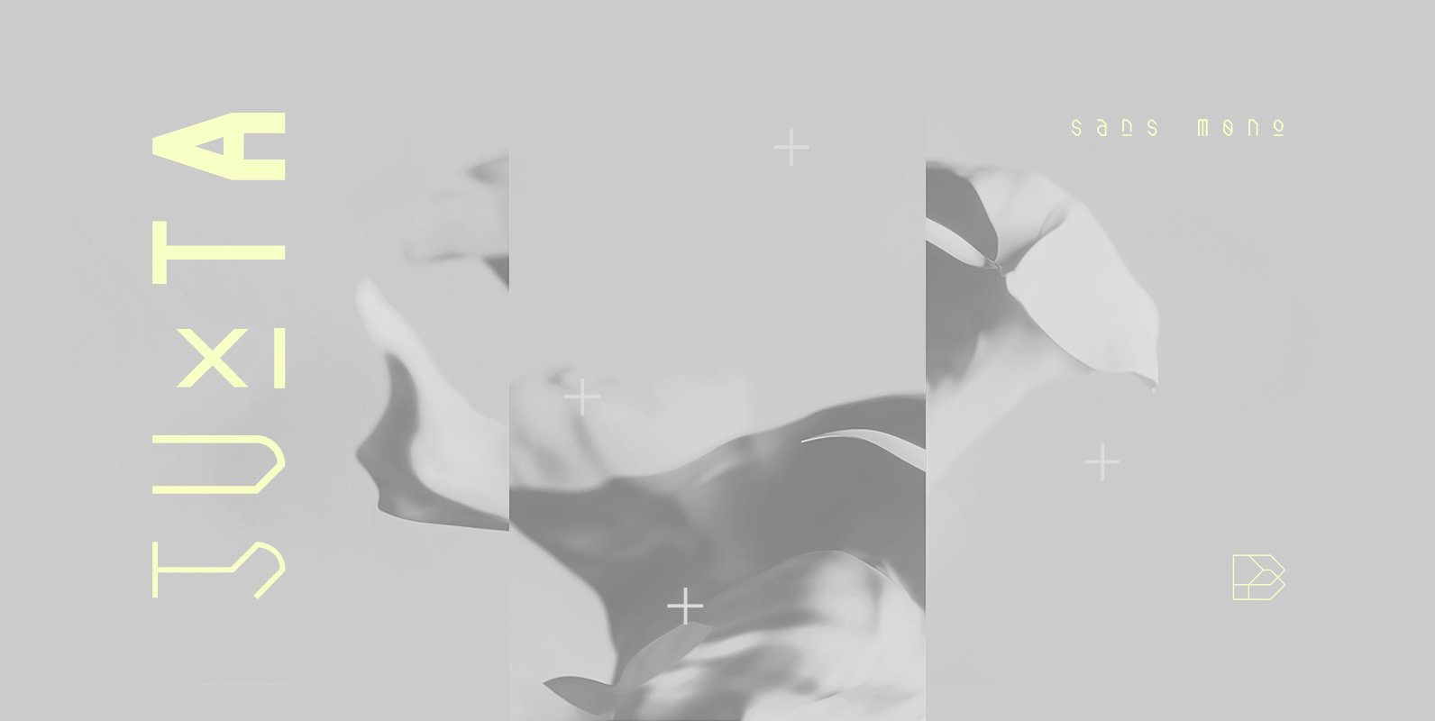
Juxta Sans Mono Font
Juxta Sans Mono is a tech font design published by NaumType Published by NaumTypeDownload Juxta Sans Mono
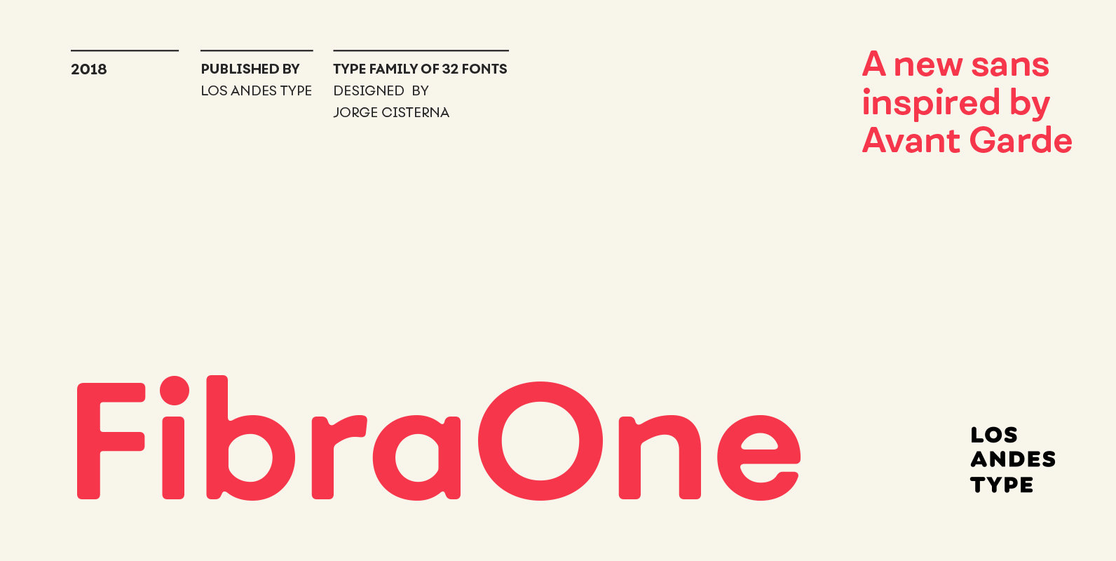
Fibra One Font
Fibra One looks like a “soft” version of the Fibra font, but it is actually more than that—the second part of its name suggests that it is a reinterpretation of the original typeface. While this new version maintains the overall
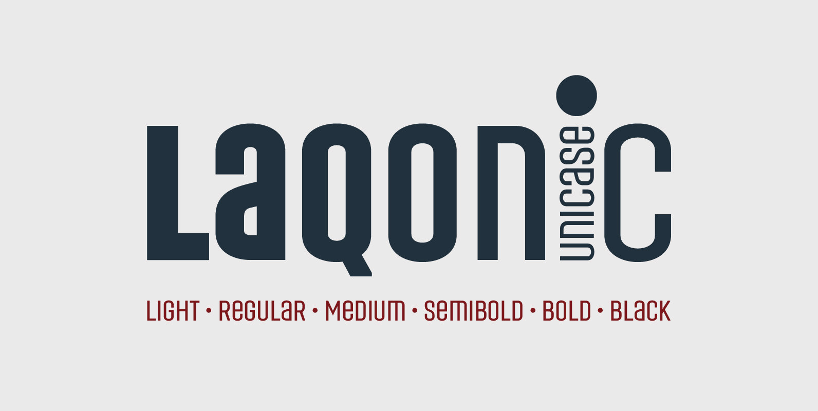
Laqonic 4F Font
Laqonic 4F is a geometric modular grotesque with a technological character, perfectly suited for signage, logos and loud headlines. Published by Sergiy TkachenkoDownload Laqonic 4F
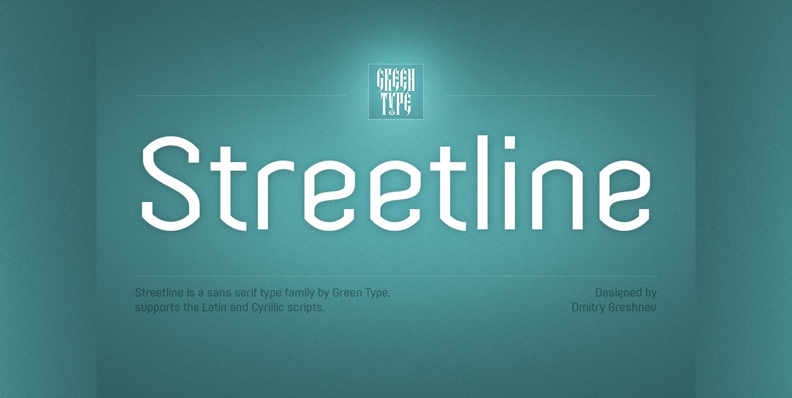
Streetline Font
Streetline is a sans-serif font family includes a 10 styles (5 weight and italics), support Latin, Cyrillic, Eastern European, Baltic and Turkish scripts. Streetline is font with wide sphere of application, legible from very small size to very large ones.
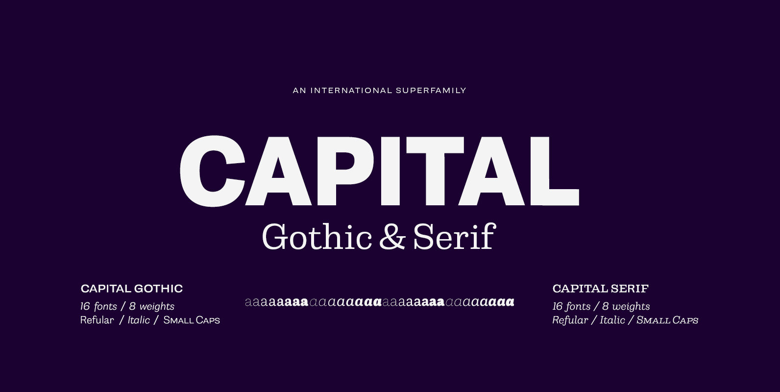
Capital Font
Capital is a multifunctional super family with modernist roots. It is comprised of two distinct subfamilies: Gothic and Serif. Both share the same structure and proportions and come in seven weights – thin, light, regular, bold, extra bold and black,
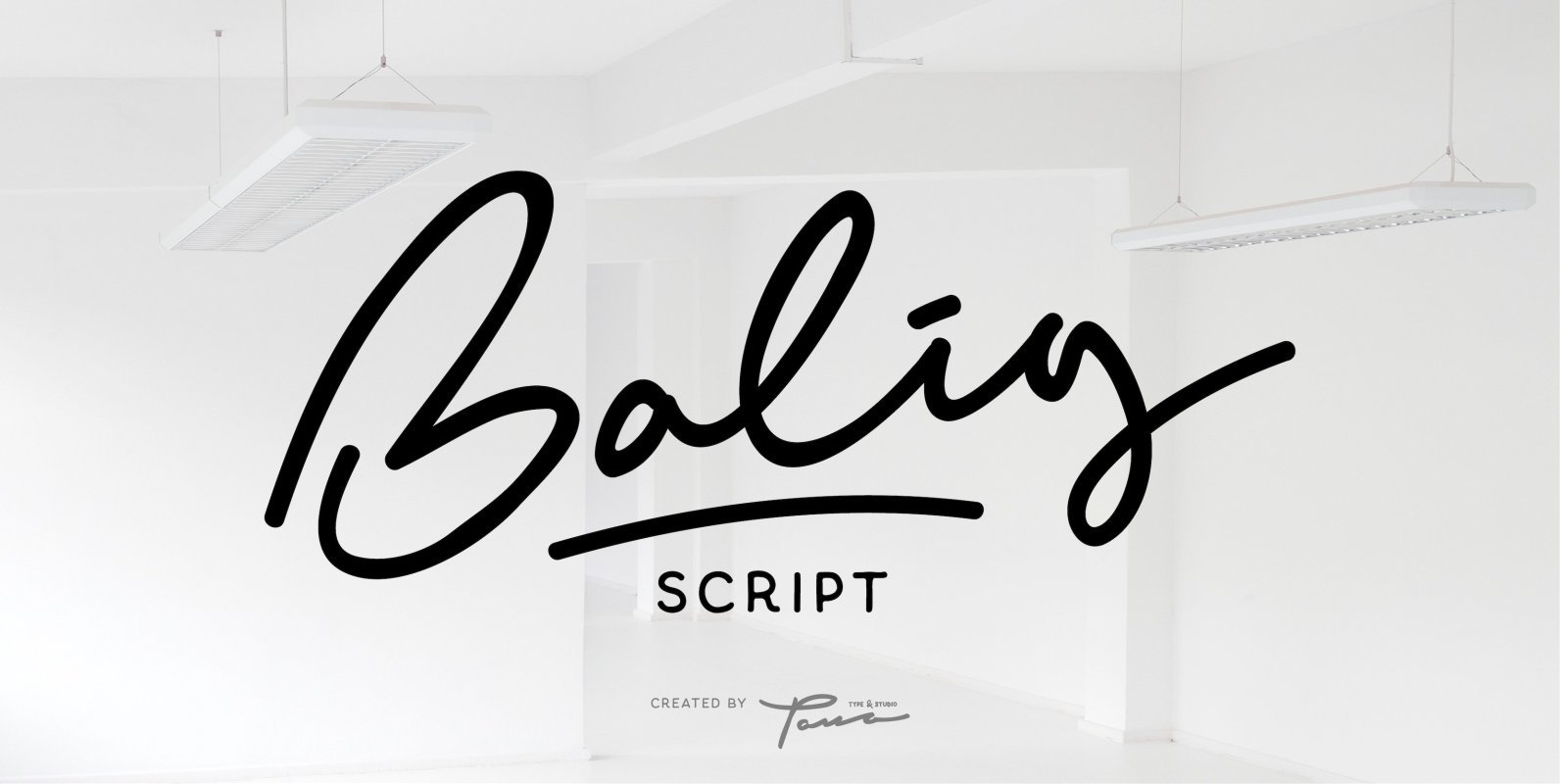
Balig Script Font
Balig Script is a script font design published by Pana Type Studio Published by Pana Type & StudioDownload Balig Script
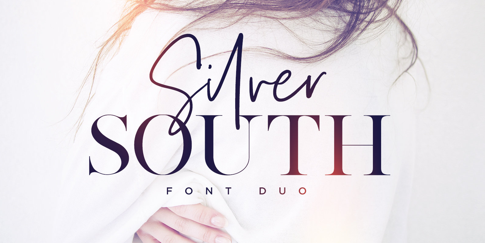
Silver South Font
Introducing the Silver South Font Duo, a classy, contemporary pair of script and serif fonts. With a stylish didot-style serif font and a free-flowing, expressive script companion, Silver South offers beautiful typographic harmony for a diversity of design projects, including
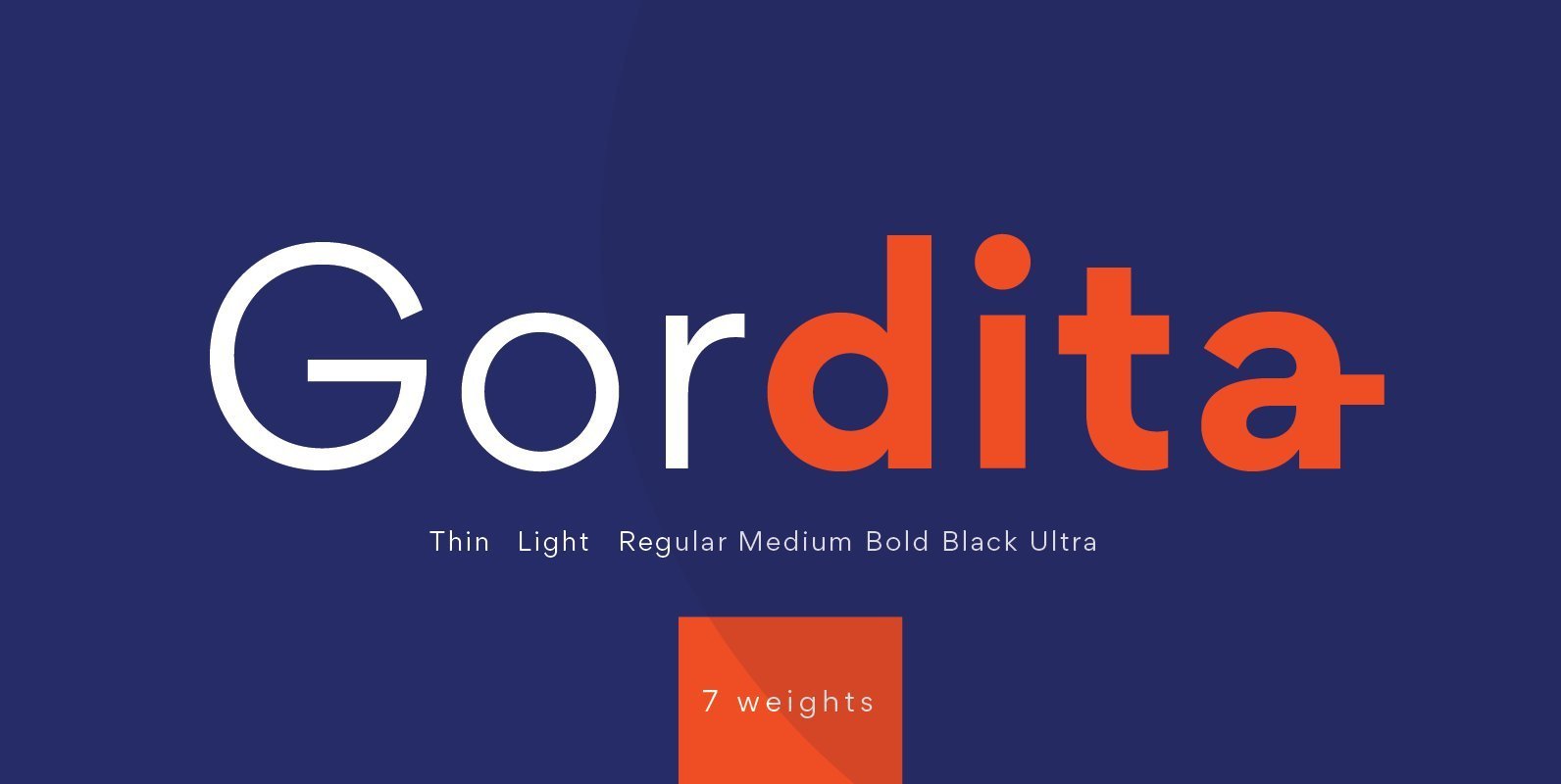
Gordita Font
Gordita is a minimal sans serif typeface with a geometric foundation that has been built upon with modern details that result in an optically balanced, friendly typeface. When designing Gordita referring to features in Futura were influential as were the
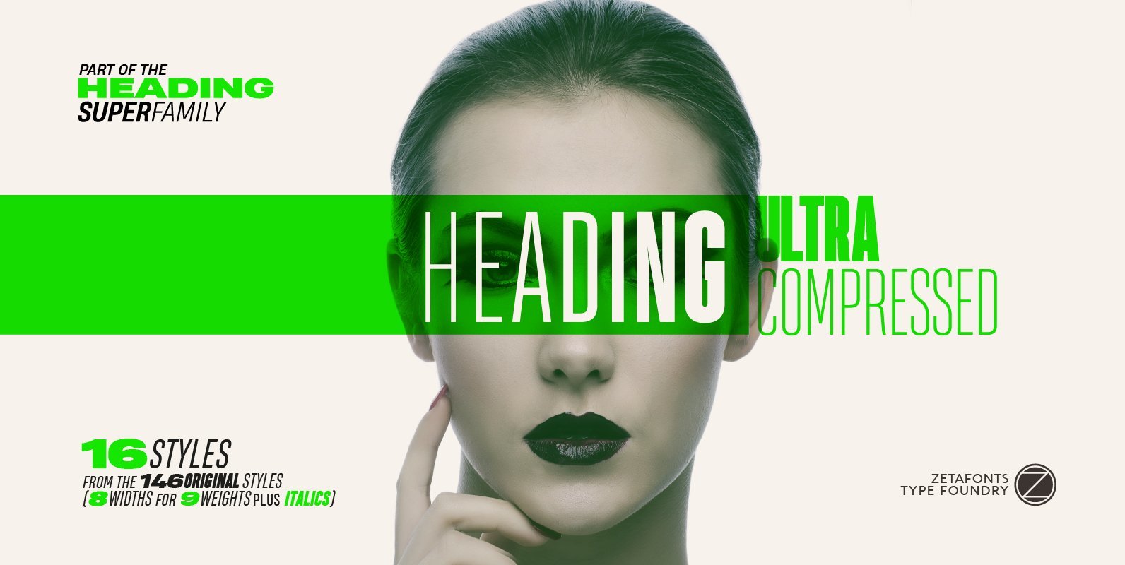
Heading Pro Ultra Compressed Font
Heading Pro Ultra Compressed is a variant of the original Heading Pro typeface designed by Francesco Canovaro for Zetafonts. Each Heading Pro typeface includes over 800 characters with coverage for 100+ languages using latin, cyrillic and greek alphabets. A full
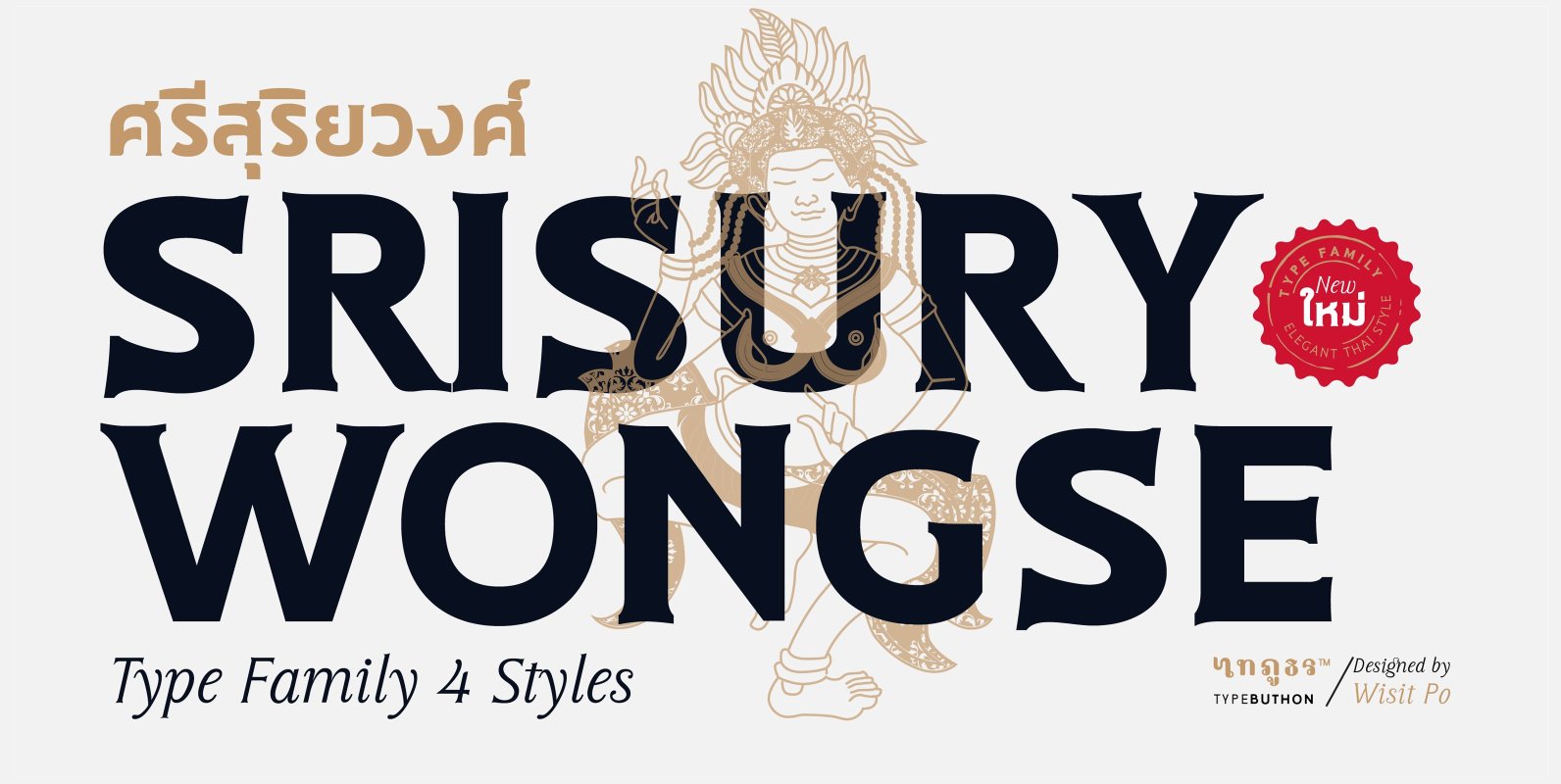
Sri Sury Wongse Font
Srisurywongse is a serif typeface inspired by a mix between both latin serif style & the Thai modern style. The main goal was to bring a bit of modernism to serif fonts by working on the curves of classical serif
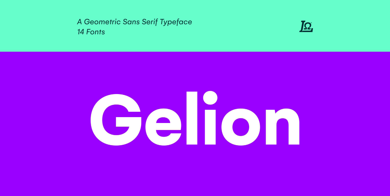
Gelion Font
Gelion is a Sans serif with a geometric touch with a minimal contrast of strokes, inspired by Futura, Avant Garde, Avenir and neo-grotesque Akzidenz-Grotesk, Helvetica form remaining true to the gracefully geometric look of the early 20th-century typefaces, that ticks
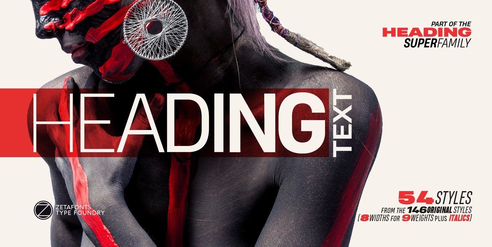
Heading Pro Text Font
Heading Pro Medium, Heading Pro Double and Heading Pro Treble are three variants of the original Heading Pro typeface designed by Francesco Canovaro for Zetafonts. These three medium width families have been added to the original condensed width family to
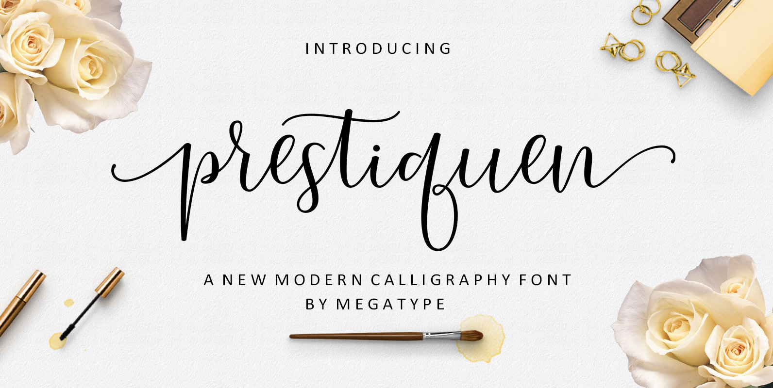
Prestiquen Font
Prestiquen is a script font design published by Megatype Published by MegatypeDownload Prestiquen
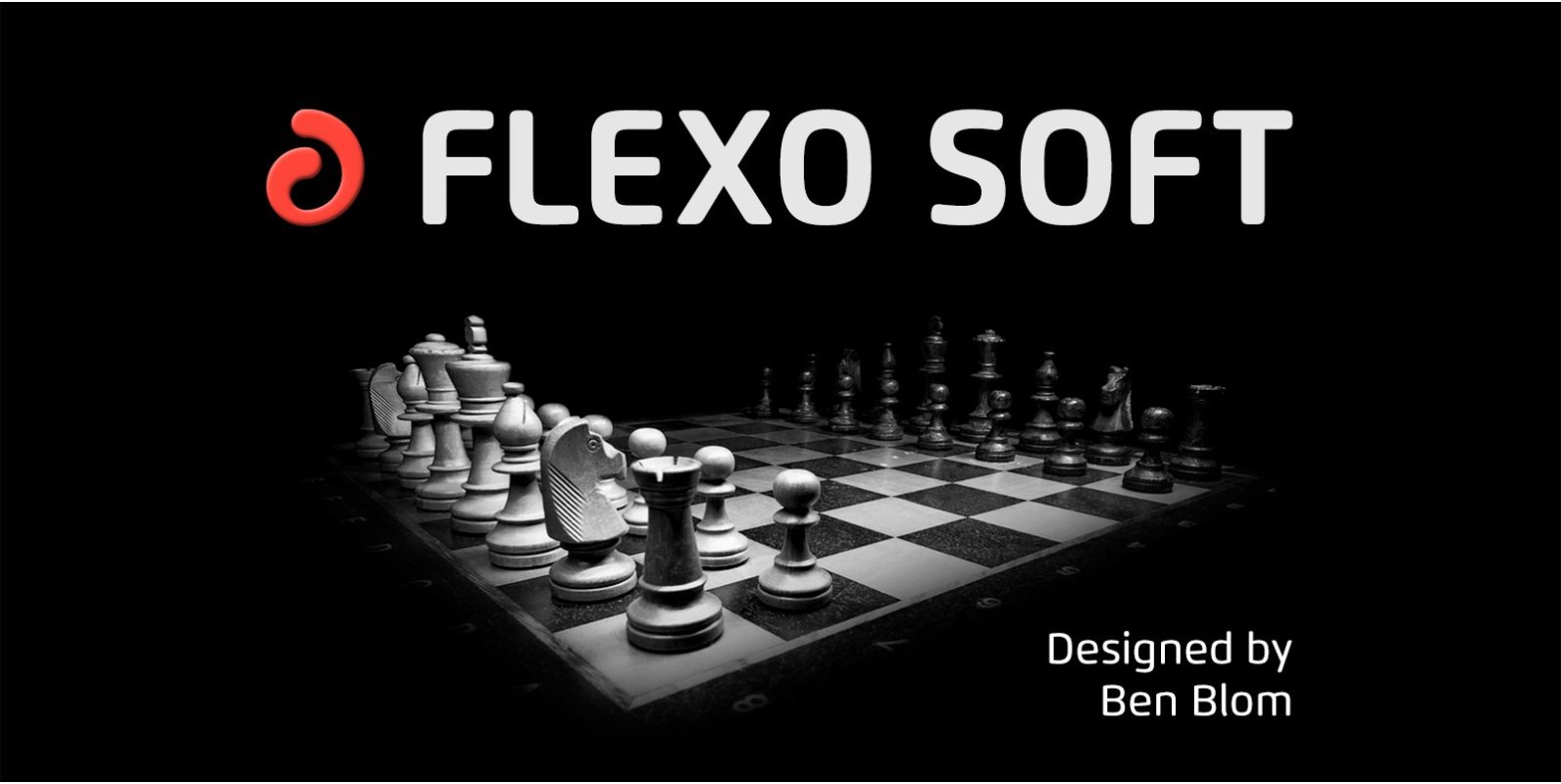
Flexo Soft Font
Flexo Soft is the soft companion of Flexo. In Flexo Soft, the sharp edges of Flexo’s characters have been tempered by a moderate rounding—creating a softer and friendlier typeface. Flexo Soft has a squarish design, making it stand out in
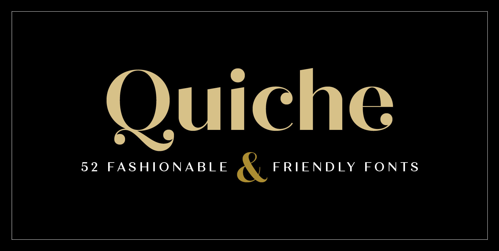
Quiche Font
Quiche is a high-contrast, sans serif typeface featuring ball terminals and angled stems. This 52 font superfamily is a complete branding suite. The 4 subfamilies—Display, Fine, Stencil, and Text—were created to work harmoniously together based on the need. With weights
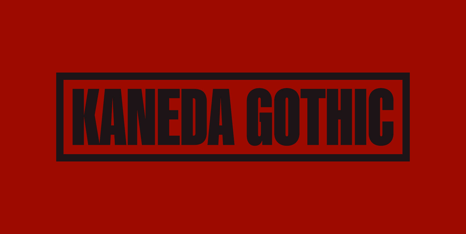
Kaneda Gothic Font
Kaneda Gothic is a whole new basic gothic. Philosophically, Kaneda Gothic is the one of the niche answers in the interspace between these antinomies. Image of near-future and giant metropolis in 80s, 90s vs our real life in the 2010s,20s.
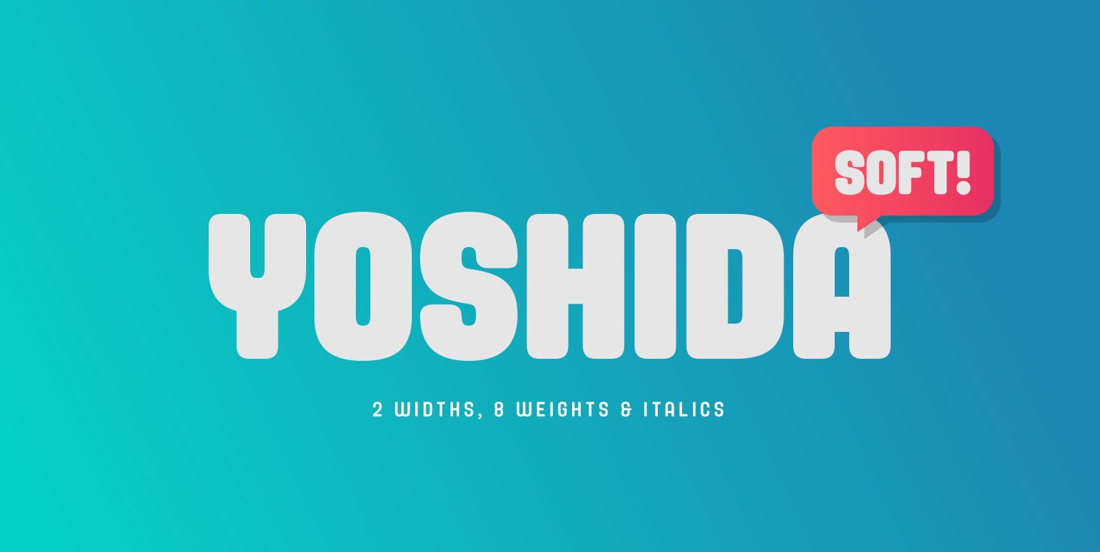
Yoshida Soft Font
Yoshida Soft is the cheeky partner in crime to Yoshida Sans. Based on the original sans, we’ve gone heavy with the curves to create a unique font that again comes in 2 widths and 8 weights and which has a
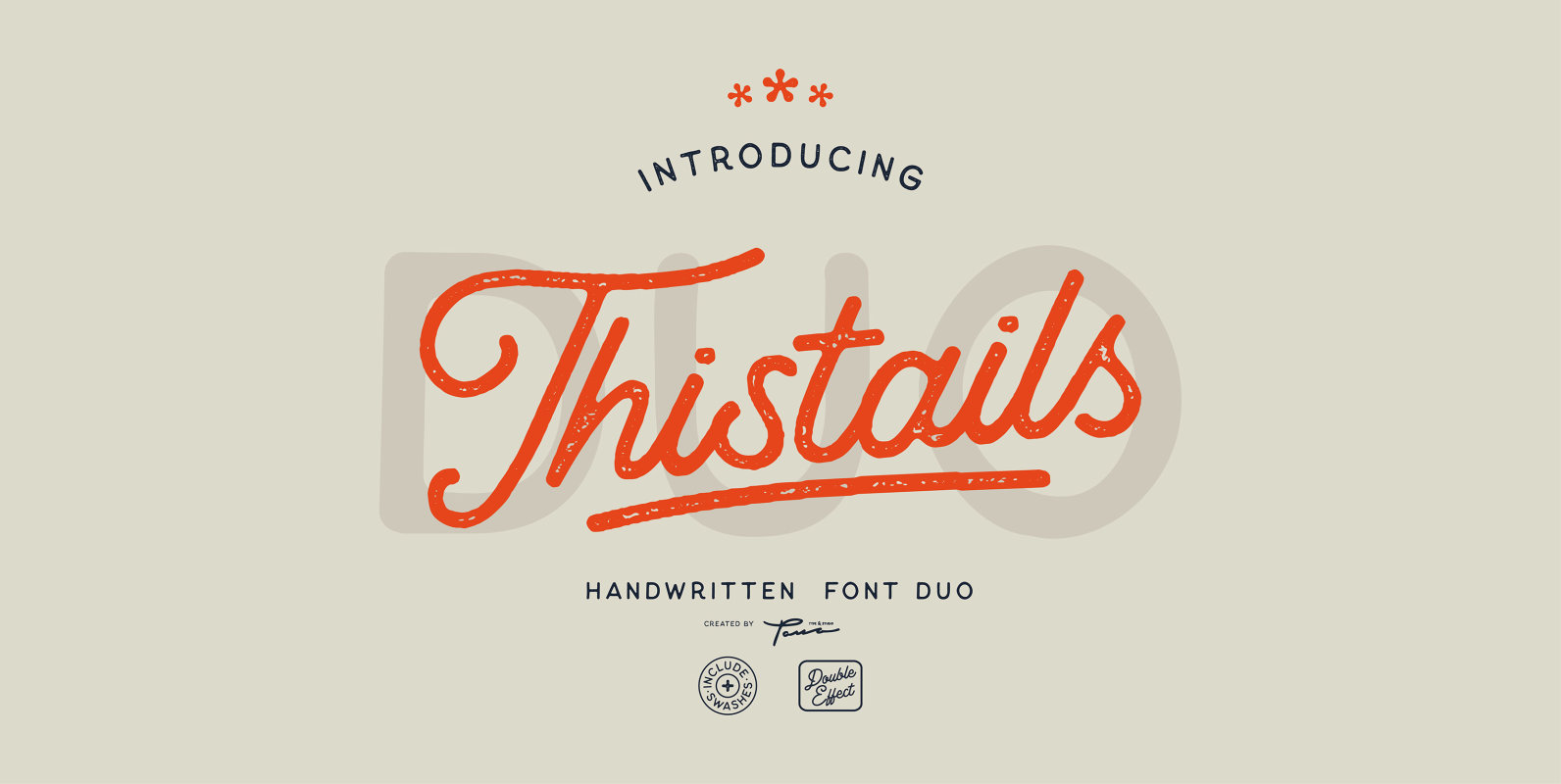
Thistails Font Duo Font
Thistails is font duo with modern vintage look design styles, available on script and Display Sans serif typeface. These two lovely fonts would be perfect to combine in your design. Suitable for digital lettering, logo, t-shirt, print, business cards, branding