Tag: clear
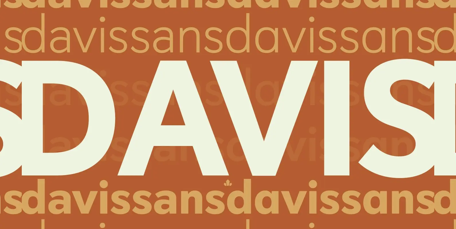
Davis Sans Font
Over the past couple of decades, the many applications that joined print as media requiring design solutions have combined to necessitate a visual evolution that favours controlled optical geometry and careful counter-space consideration over ornamental features traditionally associated with print
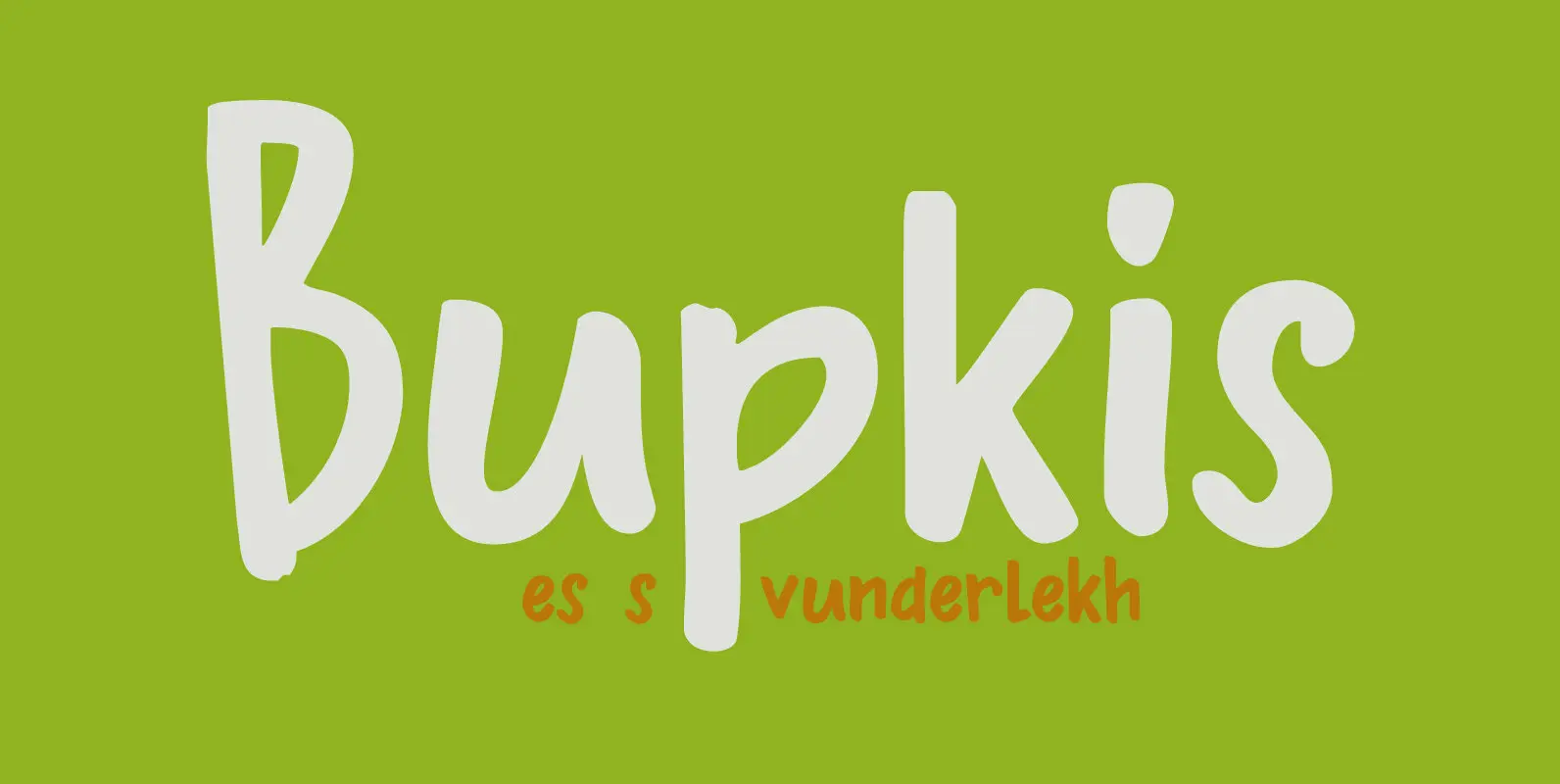
Bupkis Font
Bupkis literally means ‘goat’s dropping’ in Yiddish, but it is used to say ‘nothing, zero, zilch’. Bupkis is a very nice handmade font. A little formal, a little uneven, a little unusual. Use for it whatever you like, but product
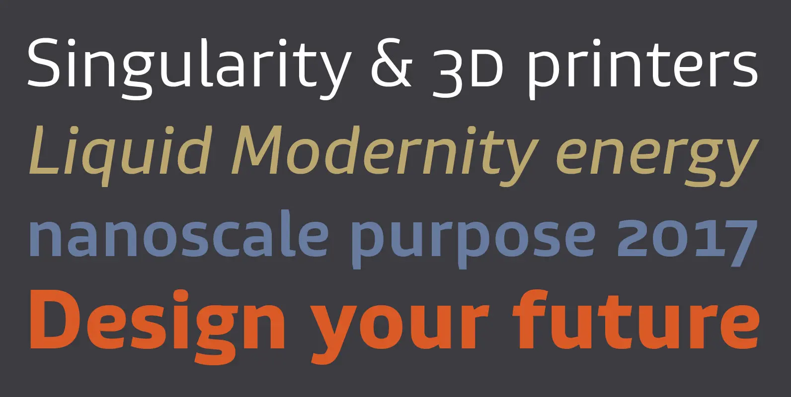
Lembra Font
Named after the Portuguese word ‘remember’, Lembra suggests a crossroad between contemporary forms and the calligraphic origins of writing. Hints of the calligraphic pen break the pristine sans-serif shapes, creating an unique overlapping of expressions. This combination of elements also
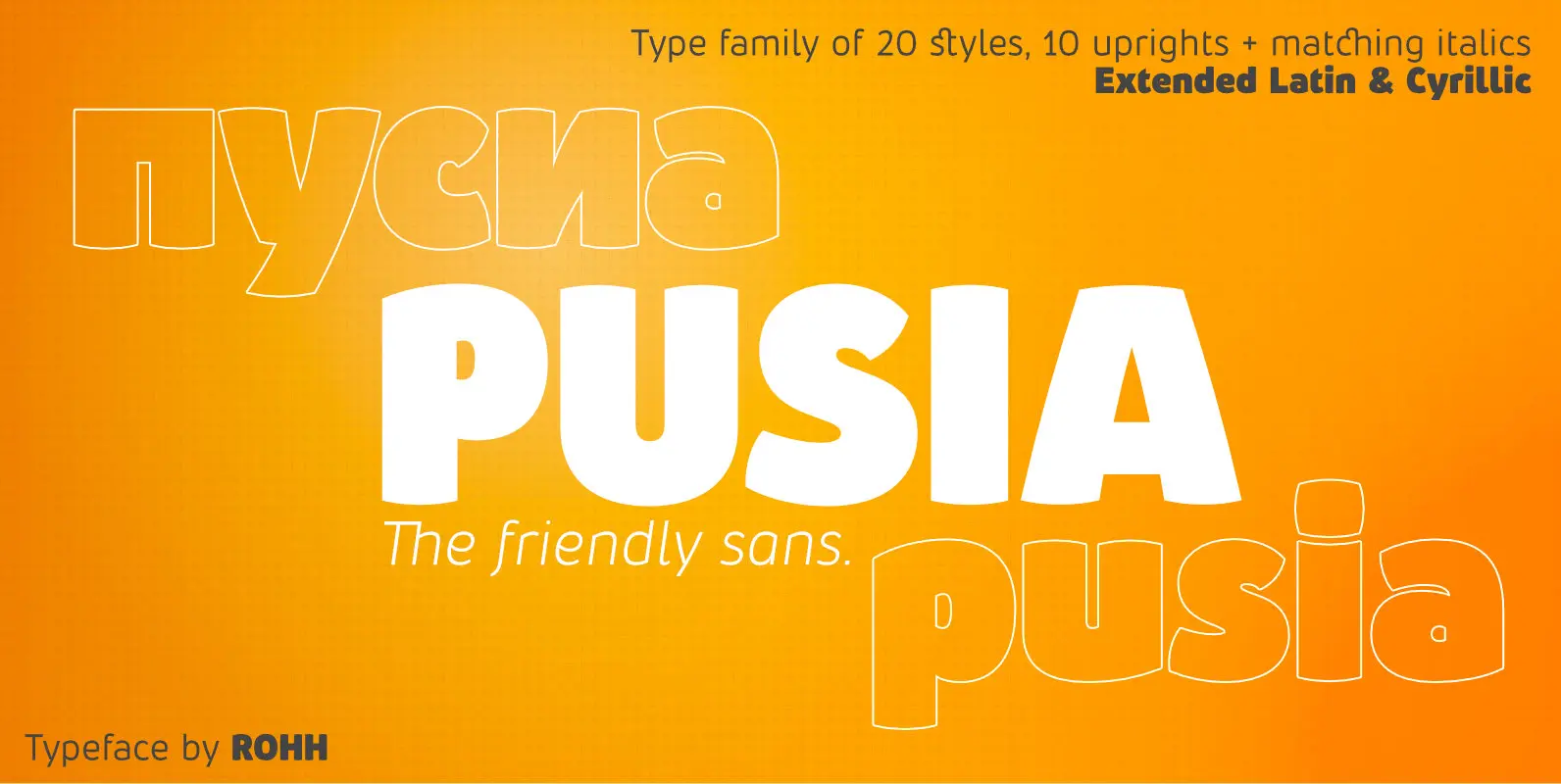
Pusia Font
Pusia is a versatile font family with a lot of character and warmth. It is a professional, contemporary sans serif with original letter forms, friendly and dynamic feel. Its subtle curved shapes and attention to details give Pusia a very
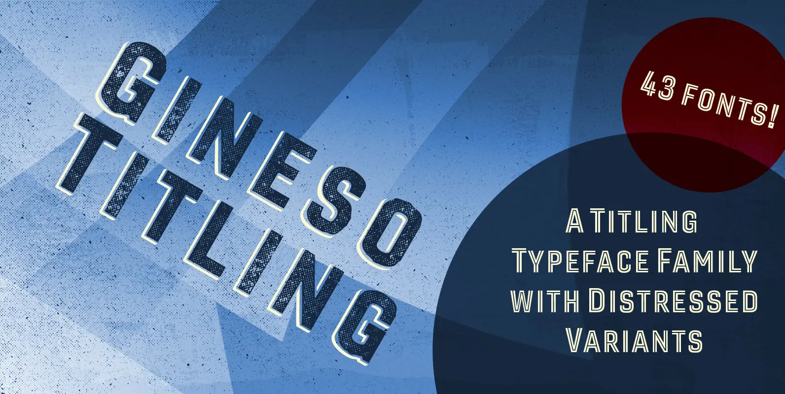
Gineso Titling Font
Before the Great War, there were great posters. Posters of elegance and grandeur. Posters calling people to the pleasures of sunny southern France and to the perfections of northern Italy’s dolce vita. Le Havre, based on a poster by AM

Carina Pro Font
Like Phenix out of the ashes the former Schriftguss hot-metal font “Rautendelein” has come to live again. Carina Pro was carefully extended for multilingual use, and contains a few alternates which can be activated via the swash OpenType feature. Published
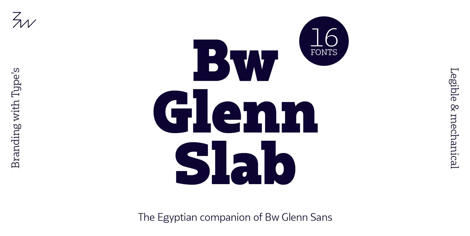
Bw Glenn Slab Font
Bw Glenn Slab is a confident and robust font family with a sturdy feel offering no concessions for ambiguity. Its strict geometry and open shapes provide a very legible and clean texture, performing well on print and screens alike. It’s
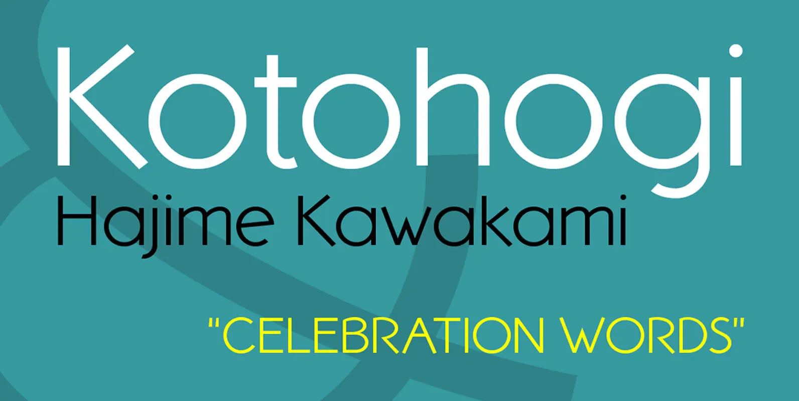
Kotohogi Font
Kotohogi means “celebration words” in Japanese. It is a typeface of a geometric bright image. Published by URW Type Foundry GmbHDownload Kotohogi
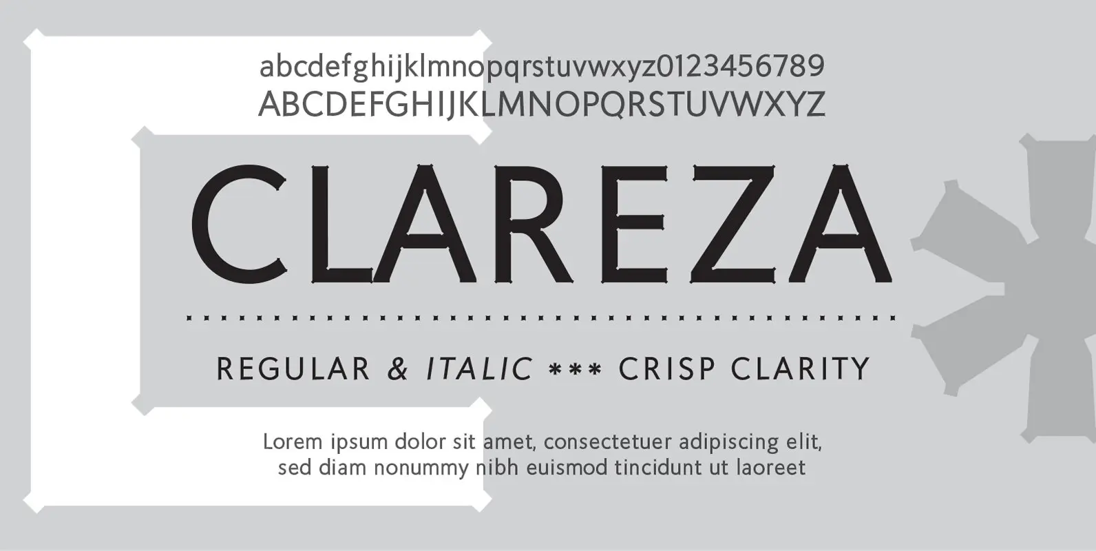
Clareza Font
Clareza means “Clarity” in Portugese. That was exactly the goal in creating this font. We managed to create a font that is crisp and extremely legible at all sizes but then comes to life in an interesting and unusual way
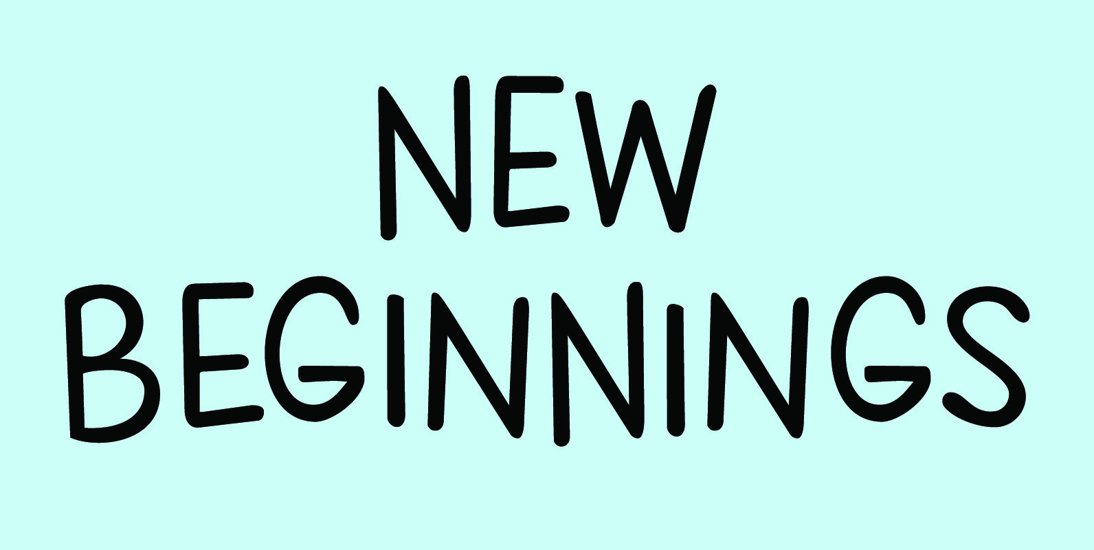
New Beginnings Font
A new year has begun, new resolutions have been made. Fresh ideas are popping up and a new life is about to begin. All in all, I figured New Beginnings was the perfect name for my first font in 2016.
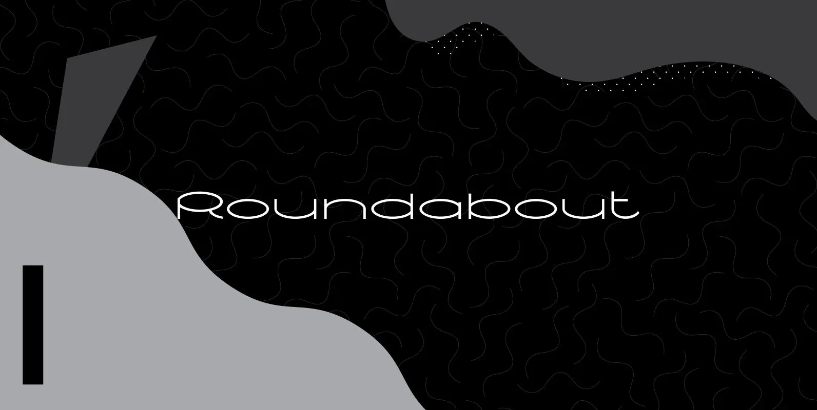
Roundabout Font
Roundabout is a typeface that is extracted from an ellipse shape. Each and every character started at the same geometrical figure. By cutting it up in sections, twist and rotate the separate characters could be build. The ellipse provides this
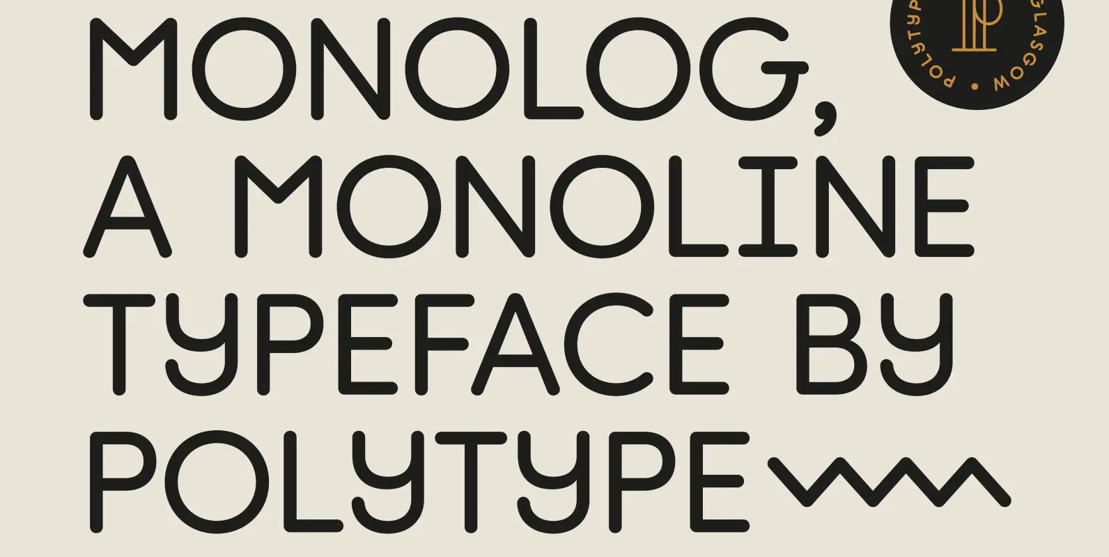
Monolog Font
Monolog is an especially monolinear rounded display typeface, designed to work great alongside monoline illustrations, logos and icons, while still performing well in some text settings. A number of contemporary quirks in its construction establish visual interest, while Monolog’s clean,
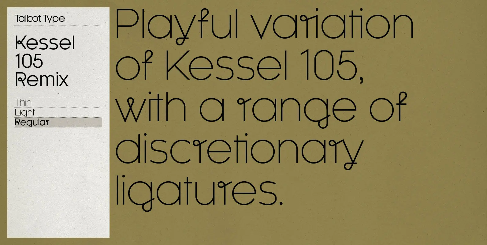
Kessel 105 Remix Font
A remixed variation, available in three weights, of the popular Talbot Type geometric sans Kessel 105. The addition of occasional flourishes at the intersections of strokes, in both upper and lower case, adds character charm, making the font a perfect
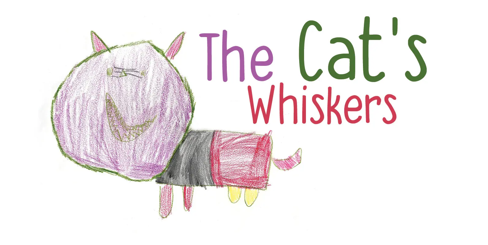
The Cat's Whiskers Font
Ok. Another font with cats in it. I asked my son, Sam (age 4), to draw some cats and I have to say: I’m very proud of what he created. The tiger I asked him for became a spinosaurus mom
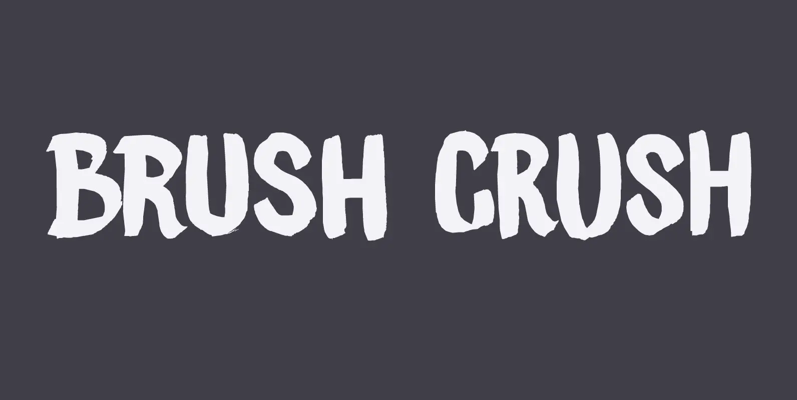
Brush Crush Font
I bought a few new pencils and I tried them out using Chinese ink and quality French watercolor paper. The result is Brush Crush – a very nice brush font. Brush Crush would look perfect on packaging, book covers, posters
