Tag: clear
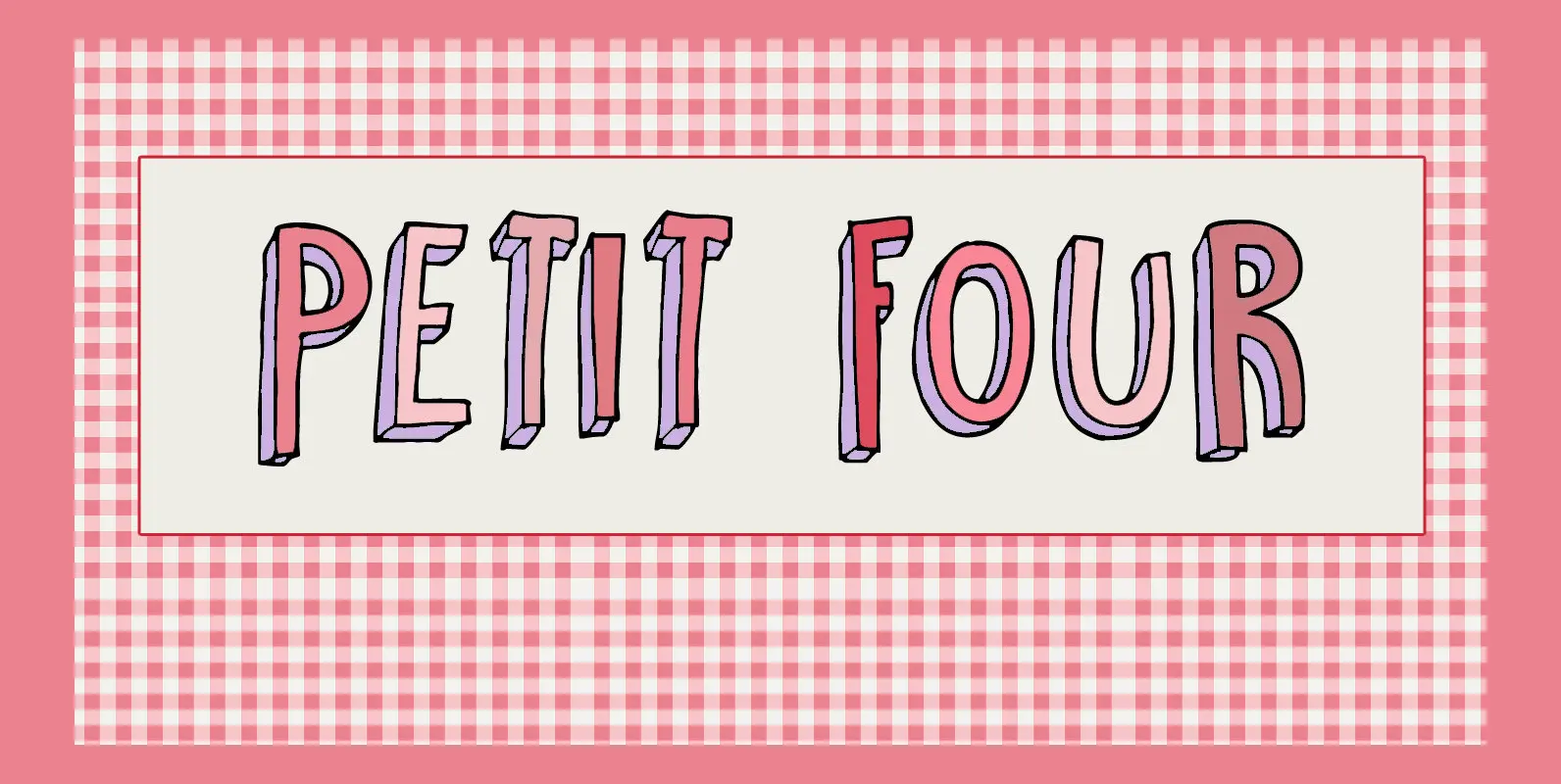
Petit Four Font
A “Petit Four” is a small, bite-sized, French pastry. The font before you is a bite-sized Hanoded original. It is handmade, fun to use and comes with a lot of calories. Like its namesake, use Petit Four sparingly and it
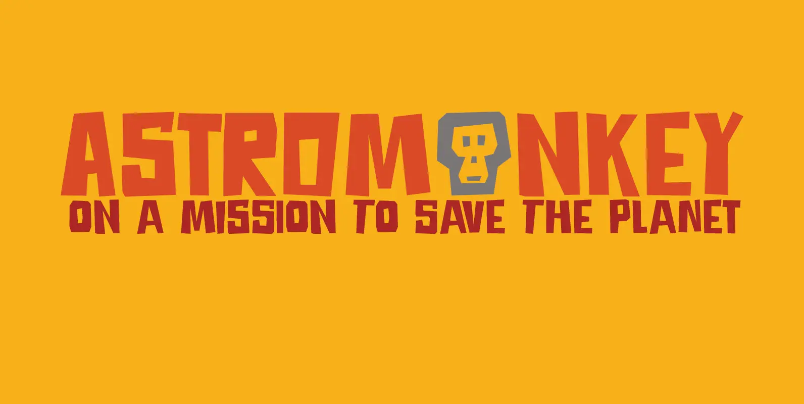
Astromonkey Font
Astromonkey – here he is, all new, all excited to be alive! Astromonkey comes from outer space, where he has rubbed shoulders with the Star Trekkers, the aliens and Major Tom, who is still floating in his tin can. The
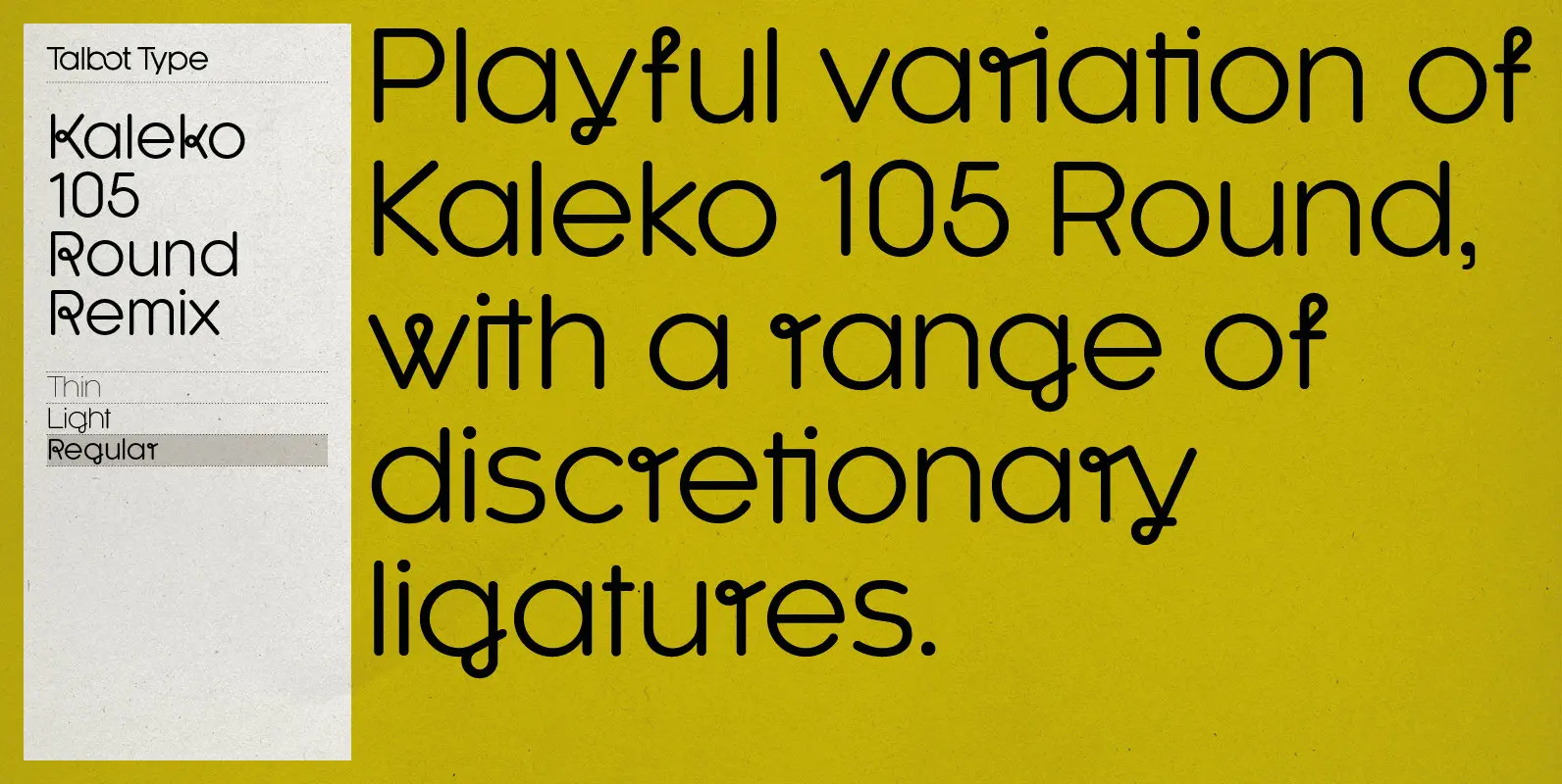
Kaleko 105 Round Remix Font
A remixed variation, available in three weights, of the popular Talbot Type geometric sans Kaleko 105 Round. The addition of occasional flourishes at the intersections of strokes, in both upper and lower case, adds character charm, making the font a
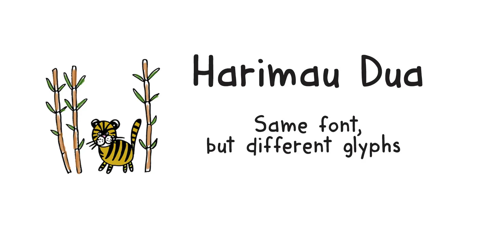
Harimau Dua Font
A while back I created a nice font called Harimau. It is a childish font, with a happy feel to it. Harimau had some unusual glyphs, most notably the ‘g’ and the ‘j’, which, for some designers, were a little
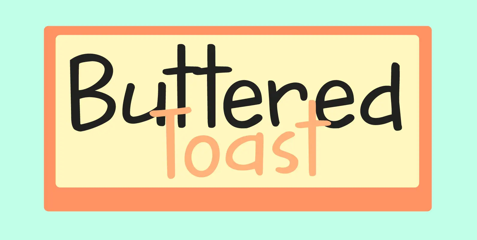
Buttered Toast Font
Buttered Toast is something a lot of people enjoy every day; when I was working on this font I was hoping to create something similar: an uncomplicated font enjoyed by many. The resulting typeface is exactly what is promised on
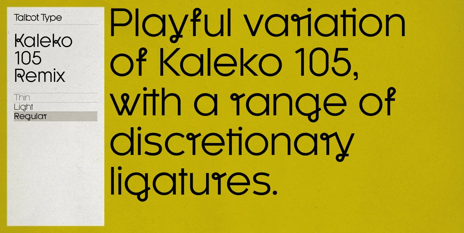
Kaleko 105 Remix Font
A remixed variation, available in three weights, of the popular Talbot Type geometric sans Kaleko 105. The addition of occasional flourishes at the intersections of strokes, in both upper and lower case, adds character charm, making the font a perfect
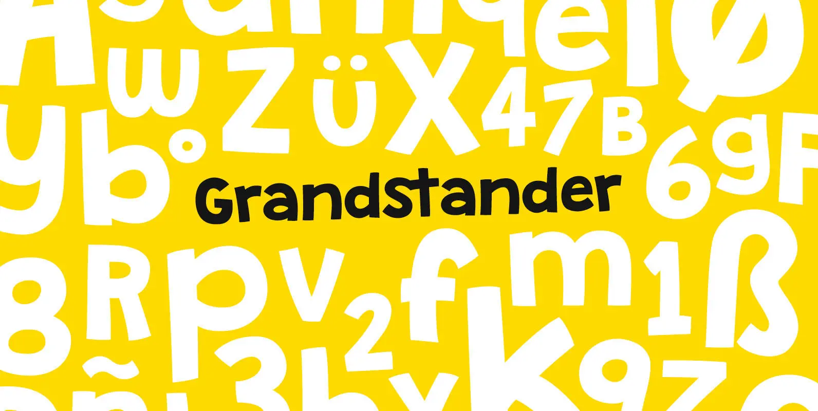
Grandstander Font
Bringing back some handmade block letters. Grandstander contains over 350 glyphs with 20+ ligatures. It was inspired by children's' books, caffeine, and my fun, silly son. Published by Tyler Finck Download Grandstander
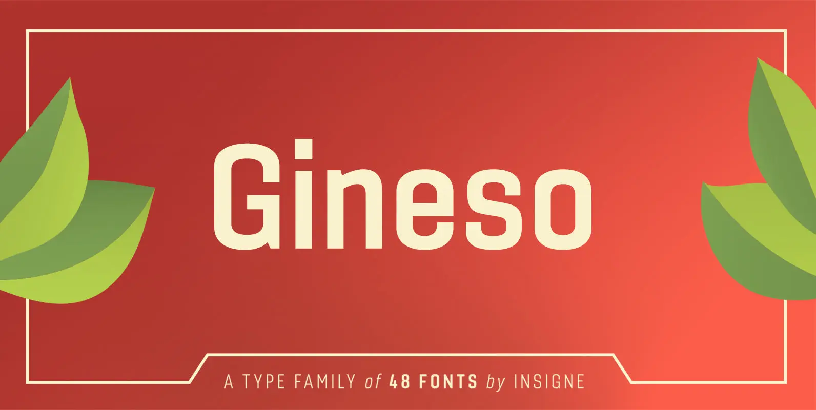
Gineso Font
Michaelangelo. da Vinci. Bellini. Rafael. Masters of Italian art whose names have dwarfed those of many other great Italian artists. Yet relics from these other artists remain, though often unnoticed because of their practical nature. These unknowns are the Italian
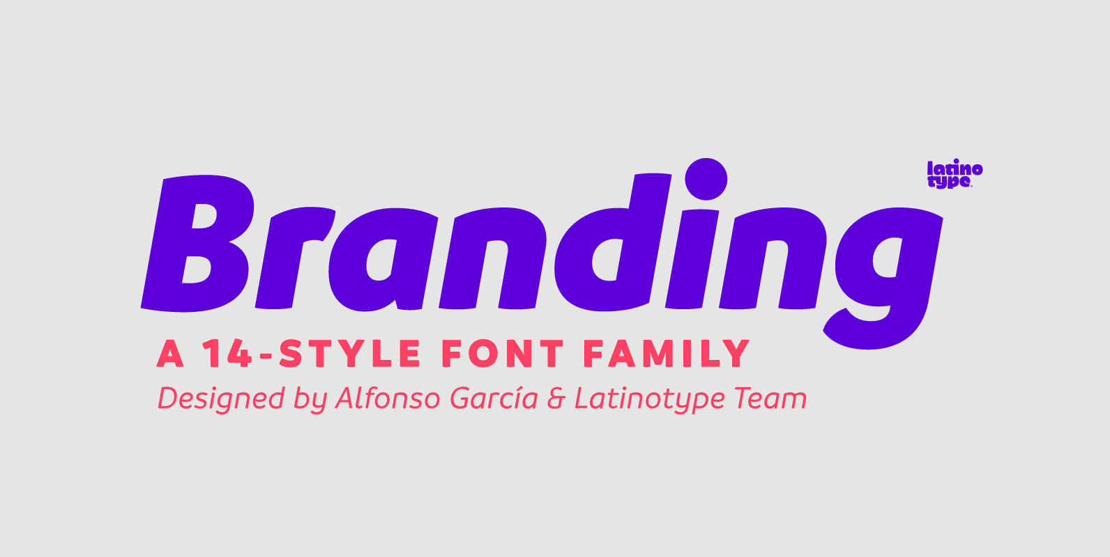
Branding Font
Branding, a modern typeface for modern needs! Branding, especially designed for meeting contemporary aesthetic and functional needs, is the interpretation of a modern typeface from the designer’s own perspective. This typeface encapsulates a wide range of nuances and combines, seemingly,
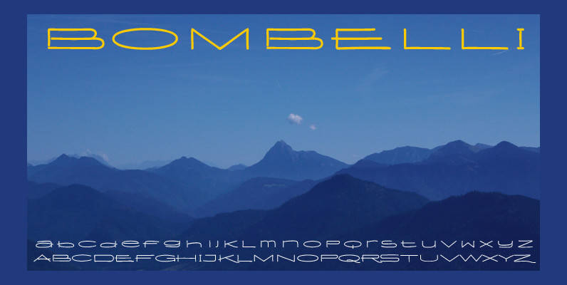
Bombelli Light Hand Font
Bombelli is a font that looks like it has been handwritten by a meticulous architect in one of those hand-drawn blueprints of the old days. I chose the name to honor one of my ex-bosses — a graphic designer-architect who
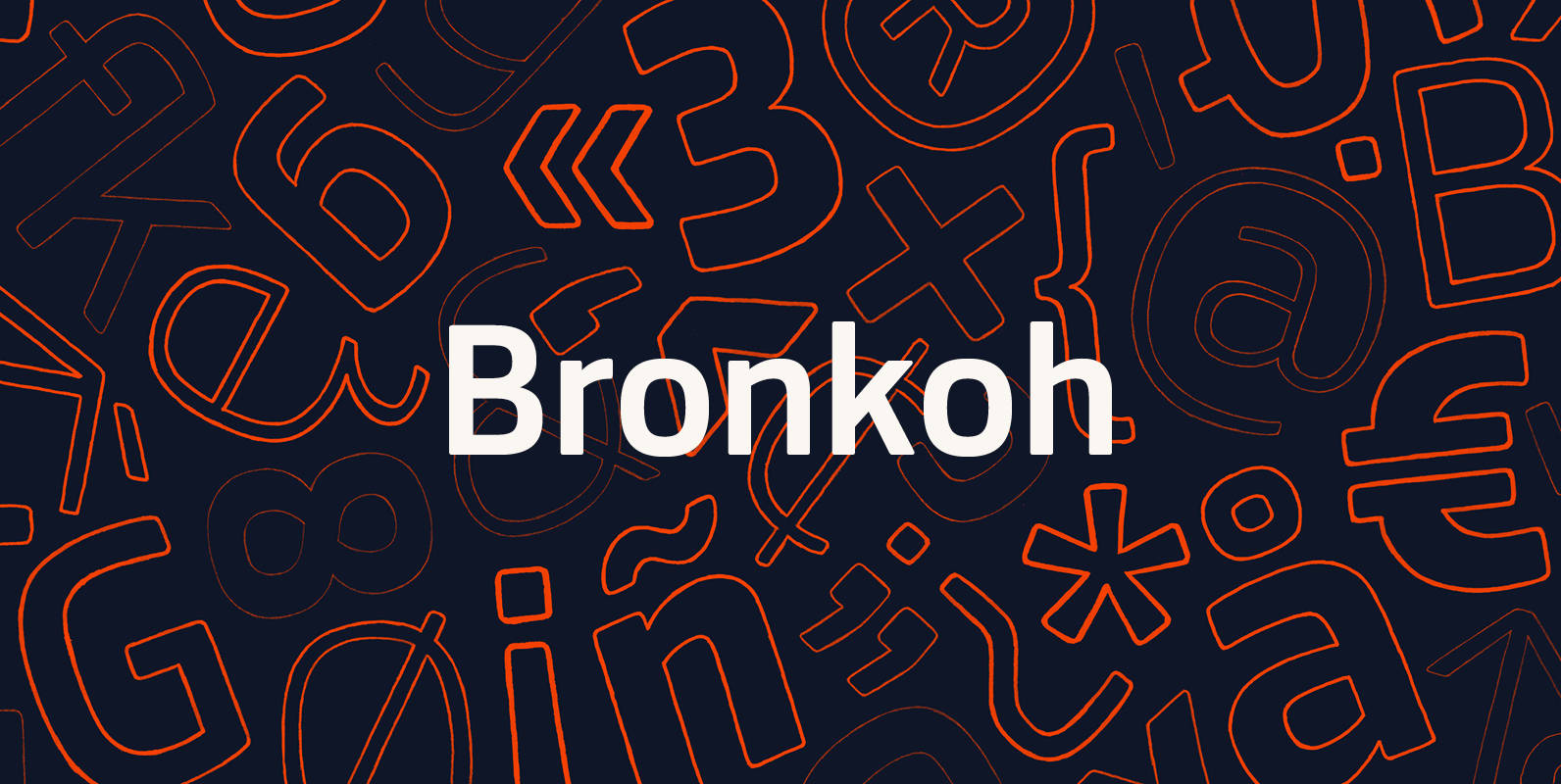
Bronkoh Font
A subtly softened sans, Bronkoh aims to give a friendly face and soft touch to type both onscreen and in print. Humanist forms and generous apertures make this a sturdy and legible face while it's softened curves and terminals give

Semikolon Font
Optimal readability by reduced, distinct letter forms. Appropriate for early readers of any age in schools and other educational institutions. SemikolonPlus minimizes the risk of confusing similar characters and therefore is predestinated for the use in text blocks, work sheets,
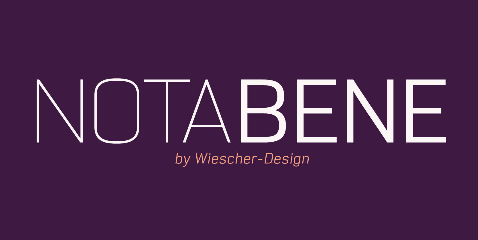
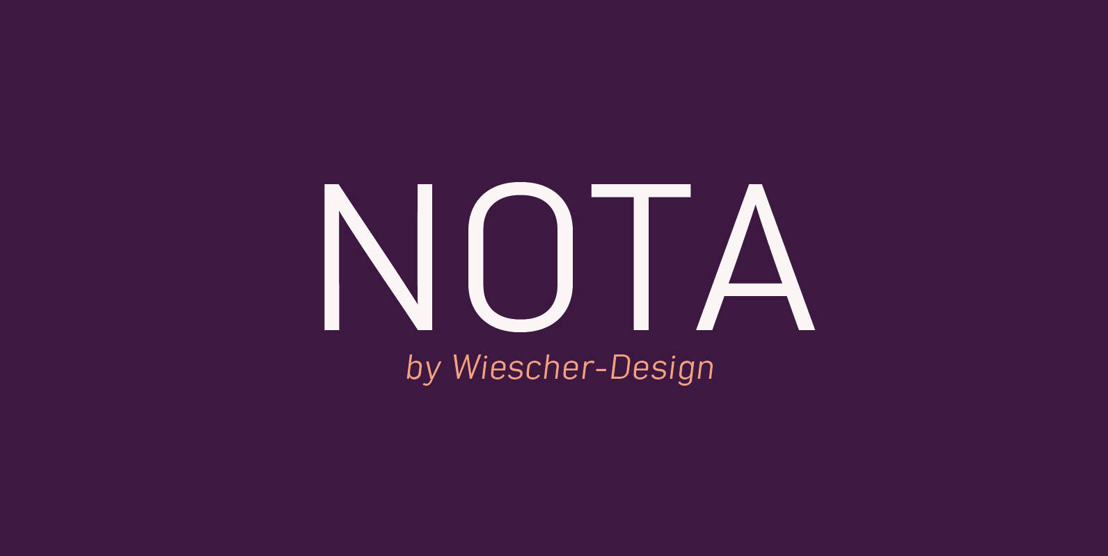
NotaBene Font
“NOTABENE” is a new, squarish, narrow, technical font– designed by Gert Wiescher in 2015 – has 7 weights with corresponding oblique cuts. “NOTABENE” is well suited for advertising, logo, billboards, small text, signage, branding, packaging, editorial, posters, web and screen
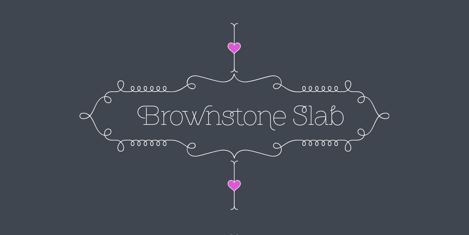
Brownstone Slab Font
Alejandro Paul’s Brownstone Slab is based on his own popular, award-winning, Brownstone Sans typeface. Like the original Sans, Brownstone Slab is a 21st-century design, influenced by the Victorian decorative motifs of the ironwork and carved decorations of New York City
