Tag: compressed

Harry Pro Font
This revival of Harry is based on the original design by Marty Goldstein (and C.B. Smith). Goldstein, born in Chicago in 1939, was the co-founder of the groundbreaking Creative Black Book. He graduated from the Pratt Institute in 1960. Harry,

Regatta Condensed Font
This bold, condensed sans serif typeface has a slightly informal appearance. Regatta benefits from close letter and word spacing in large display sizes. It is an excellent choice for work requiring a friendly, less formal look than most other styles
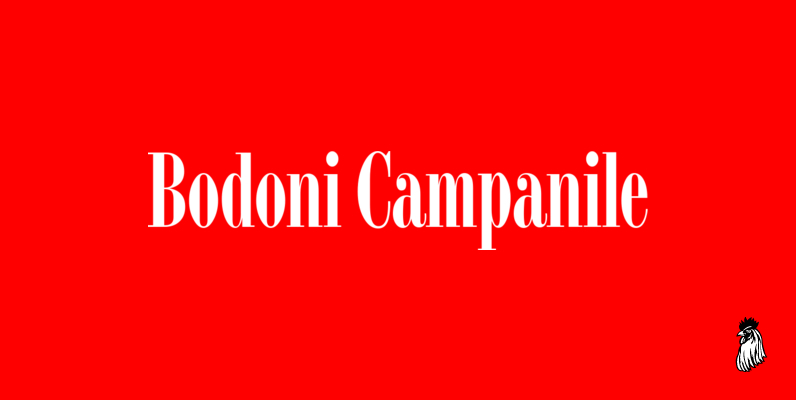
Bodoni Campanile Font
Bodoni Campanile was originally designed by R.H. Middleton for Ludlow, circa 1930. Digitally engineered by Steve Jackaman. Published by Red RoosterDownload Bodoni Campanile

Digitek Font
This futuristic looking typeface was inspired by the appearance of coarse resolution computer bitmap output. Because it is condensed, Digitek is most effective in large headline applications with wide letter and word spacing. An excellent choice where a computer or

Block Gothic Font
Designed by Steve Jackaman, this font release s based on the original Block Gothic series circa 1960. Published by Red RoosterDownload Block Gothic

Impakt Font
This hard-hitting, condensed typeface was inspired by the Soviet constructivist movement of the 1920s. Impakt bears a powerful geometric appearance that makes it an ideal choice when a commanding, masculine effect is required. Created by British designer Leonard Currie. Published
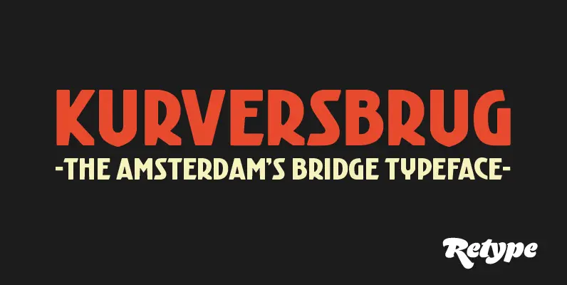
Kurversbrug Font
Since there is little or no true typographic expression of the 'Amsterdam School' of architecture, we have always felt there was a need for fonts that expressed this particular aesthetic. 'Kurversbrug' is a revival of the Amsterdam's bridge letters. The
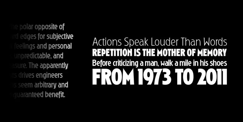
Ryder Gothic Pro Font
Designed by Steve Jackaman & Ashley Muir. A revival based on the Harry Winters design ‘Roslyn Gothic’ released by VGC in 1972. We’ve added a new light weight and several alternate glyphs. Ryder Gothic contains all the high-end features expected
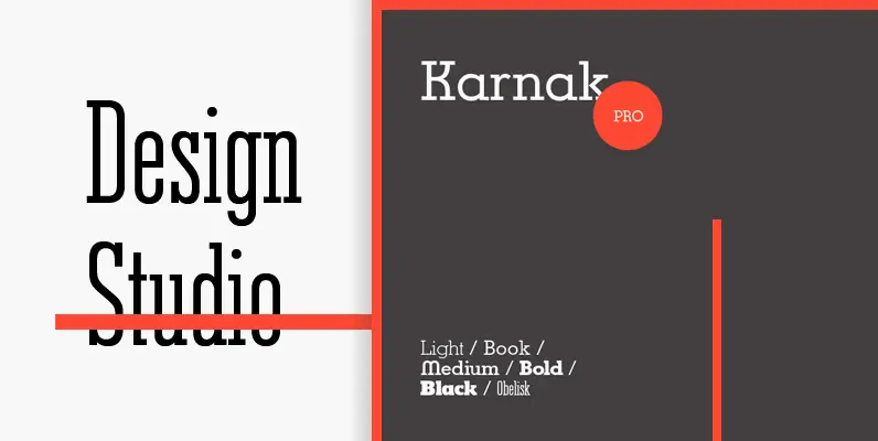
Karnak Pro Font
Based on the original design by Robert Hunter Middleton. We completely redesigned the italic weights of Karnak, because the original versions just did not look right. For good measure, we decided that the family also needed a bold weight. Digitally
Elongated Roman Font
Designed by Steve Jackaman, Elongated Roman is based on the original Stephenson Blake design, circa 1950. Published by Red RoosterDownload Elongated Roman


