Tag: confident
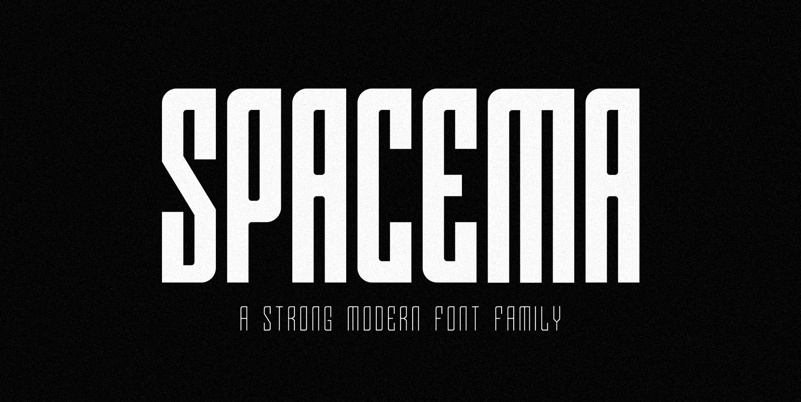
SPACEMA Font
Spacema is a modern condensed typeface with a strong vertical emphasis while maintaining prominent geometric quality to it. With a balance of hard lines and smooth curves, Spacema is an eight-weight typeface which includes uppercase, numerals, extended characters and accents.
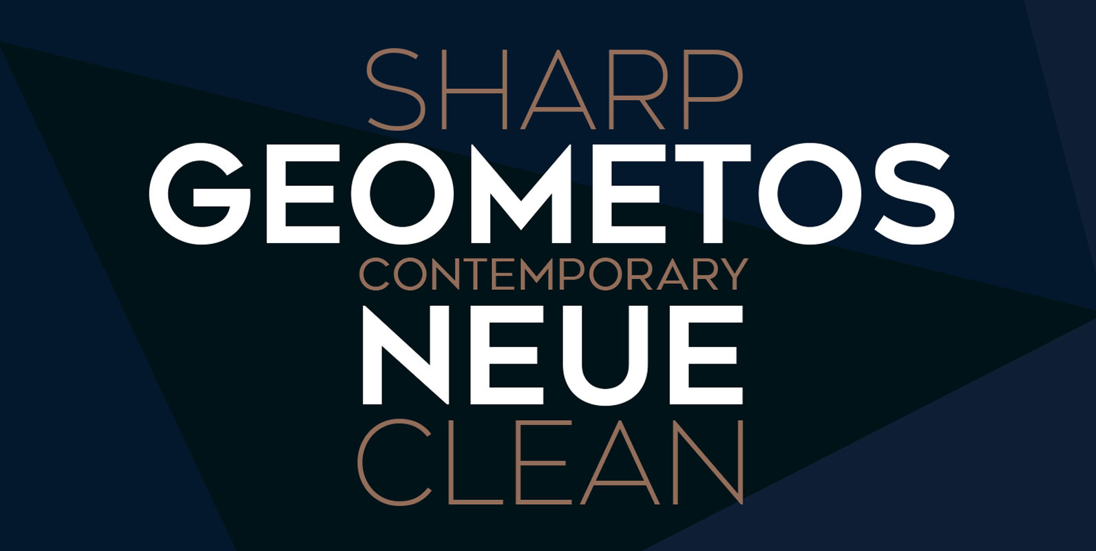
Geometos Neue Font
Geometos Neue is a geometric sans-serif typeface which comes in seven weights. An all caps display font family, Geometos Neue has a clean, sharp and emphatic form especially suitable for headlines, headings, branding, posters, packaging, titles and logos. Published by
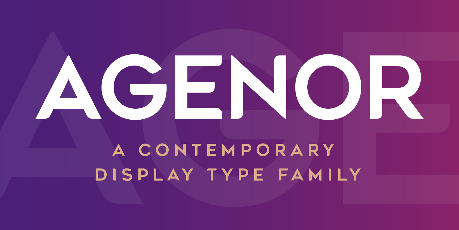
Agenor Font
Agenor is an all caps display typeface family. It comes in five weights and is suitable for headlines, headings, branding, posters, packaging, titles and logos. Published by Deepak Singh DograDownload Agenor
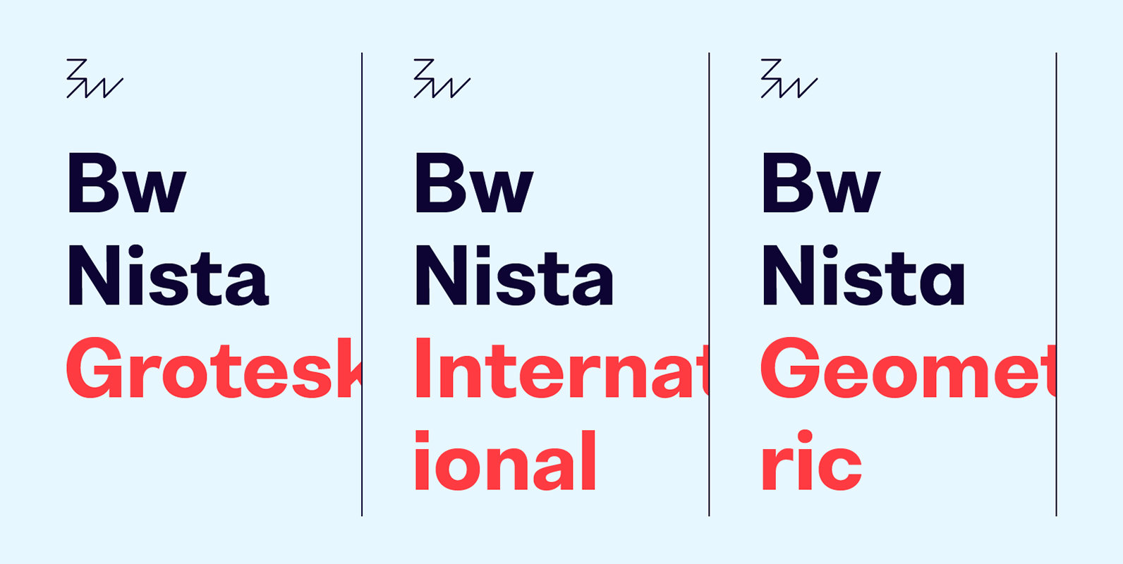
Bw Nista Font
Bw Nista is a clean modernist sans serif font family. Designed to provide a neutral tone of voice, it comes in three different sets each with subtle features portraying different personalities. Bw Nista Grotesk's clean shapes are peppered with subdued
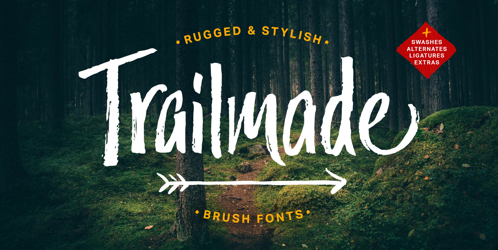
Trailmade Font
Trailmade is a rugged and stylish brush font with regular, italic, and extras styles. Explore an adventurous path with this typeface that ventures a little outside the typical brush script genre but still carries echoes of it. The upright design
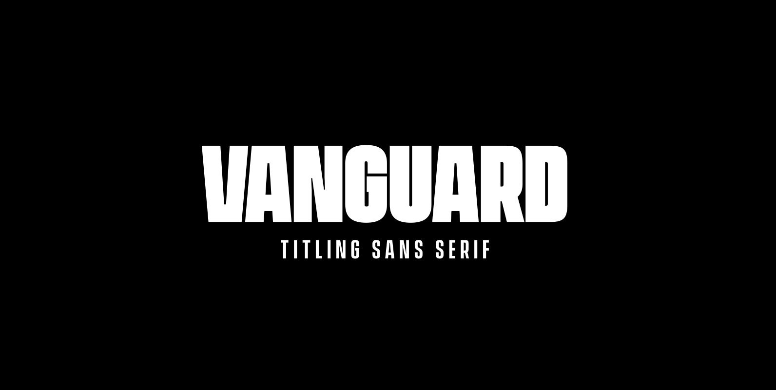
Vanguard CF Font
VANGUARD CF is a powerful and elegant display typeface, constructed to maximize horizontal space. Built from sketches originally drawn in 2012, Vanguard’s eight weights span an elegant Thin to an arresting Heavy, with accompanying obliques. As with its sibling Integral
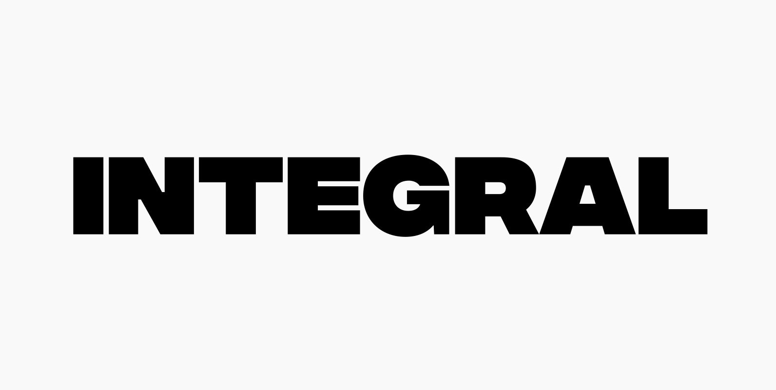
Integral CF Font
INTEGRAL CF is designed for maximum visual and emotional impact. Its six weights excel in posters, social media, headlines, titling, large-format print – and anywhere else you want to be noticed. Hidden among the straight lines and corporate confidence is
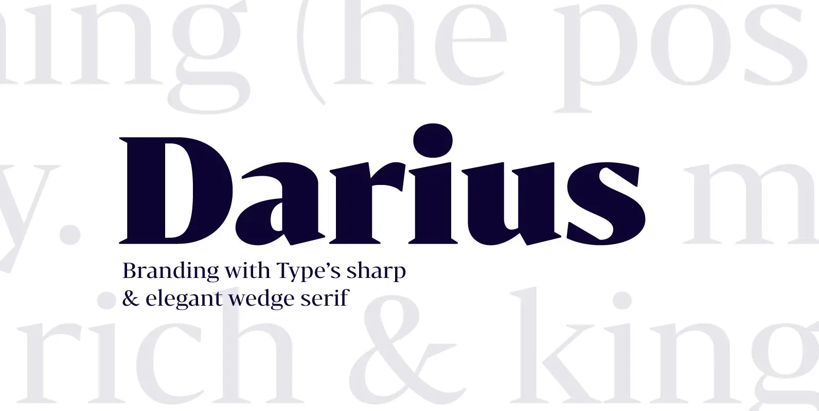
Bw Darius Font
Bw Darius is an elegant wedge serif typeface, halfway between the transitional and didone genres, with a sharper approach to terminals without falling on the stiffness of the didones. The wide skeleton, modern proportions and high contrast, all contribute to
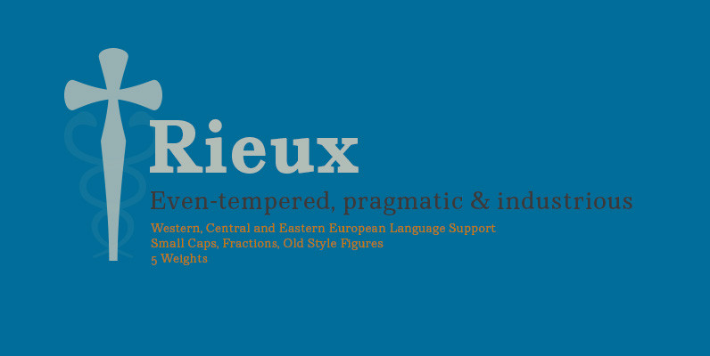
Rieux Font
Named after the steadfast doctor from Albert Camus’ The Plague, Rieux is an even-tempered slab-serif that is confident without being cocky and approachable without being casual. The aesthetic of Rieux is inspired by the industrial age. While the design is
