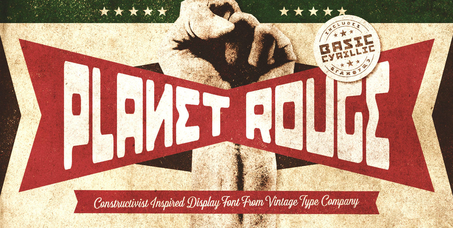
Tag: Constructivist
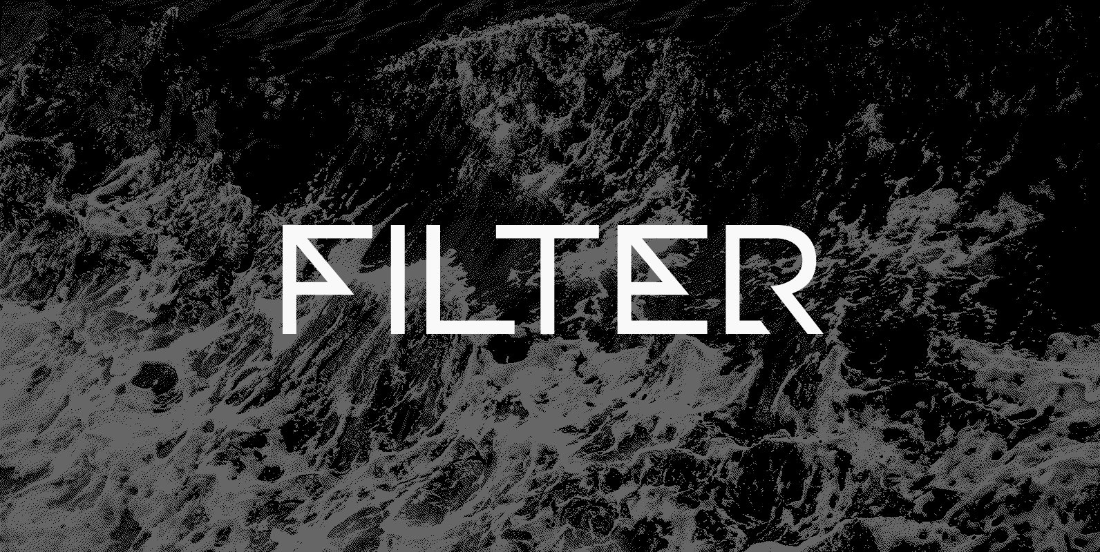
Filter CF Font
Fusing constructivism, fashion, and design, FILTER CF is an experimental display typeface in five weights. Excellent for short bursts of stylized text, Filter features Latin and Cyrillic alphabets with nods to art deco, geometry, and science fiction. Version 2 adds
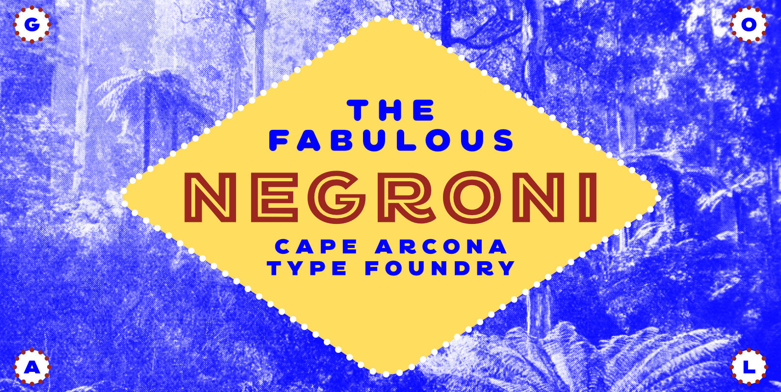
CA Negroni Font
A dinner is not complete without a fine appetizer. Whatever you dinner will be, CA Negroni is the perfect introduction. Delivered in three flavors, Normal (with Light + Black + Fill), Inline and Round. Versatility is proved by the extensive
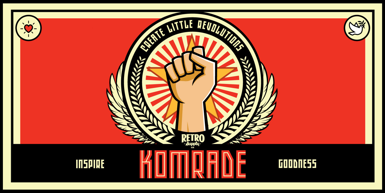
Komrade Font
CREATE YOUR OWN TINY REVOLUTION OF AWESOMENESS WITH KOMRADE! Whether you’re trying to raise money for your daughter’s Girl Scout troop or you’re trying to raise awareness about cancer… Design has the power to inspire the best in people. Komrade
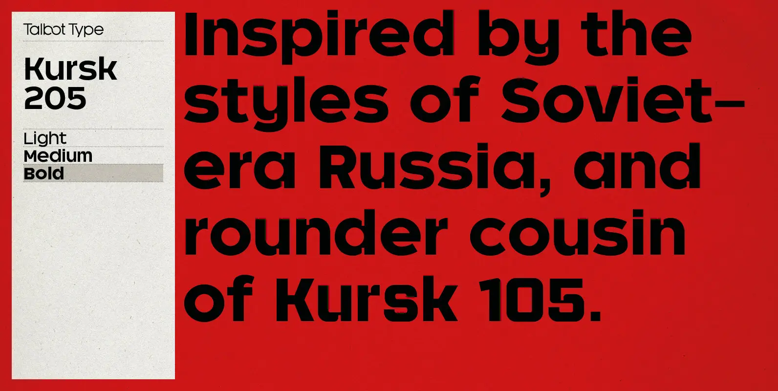
Kursk 205 Font
A text and display font with square proportions, inspired by the type styles of soviet-era Russia. Very shallow ascenders and descenders and a large relative x-height, exaggerate the compact and geometric look. Related to Kursk 105, its squarer-edged cousin. Published
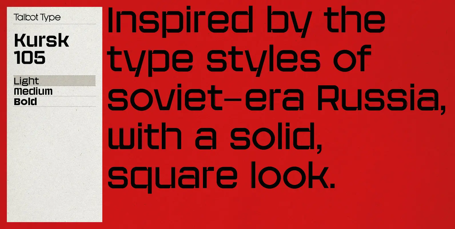
Kursk 105 Font
A text and display font with square proportions, inspired by the type styles of soviet-era Russia. Very shallow ascenders and descenders and a large relative x-height, exaggerate the square look. Related to Kursk 205, its slightly rounder cousin. Published by
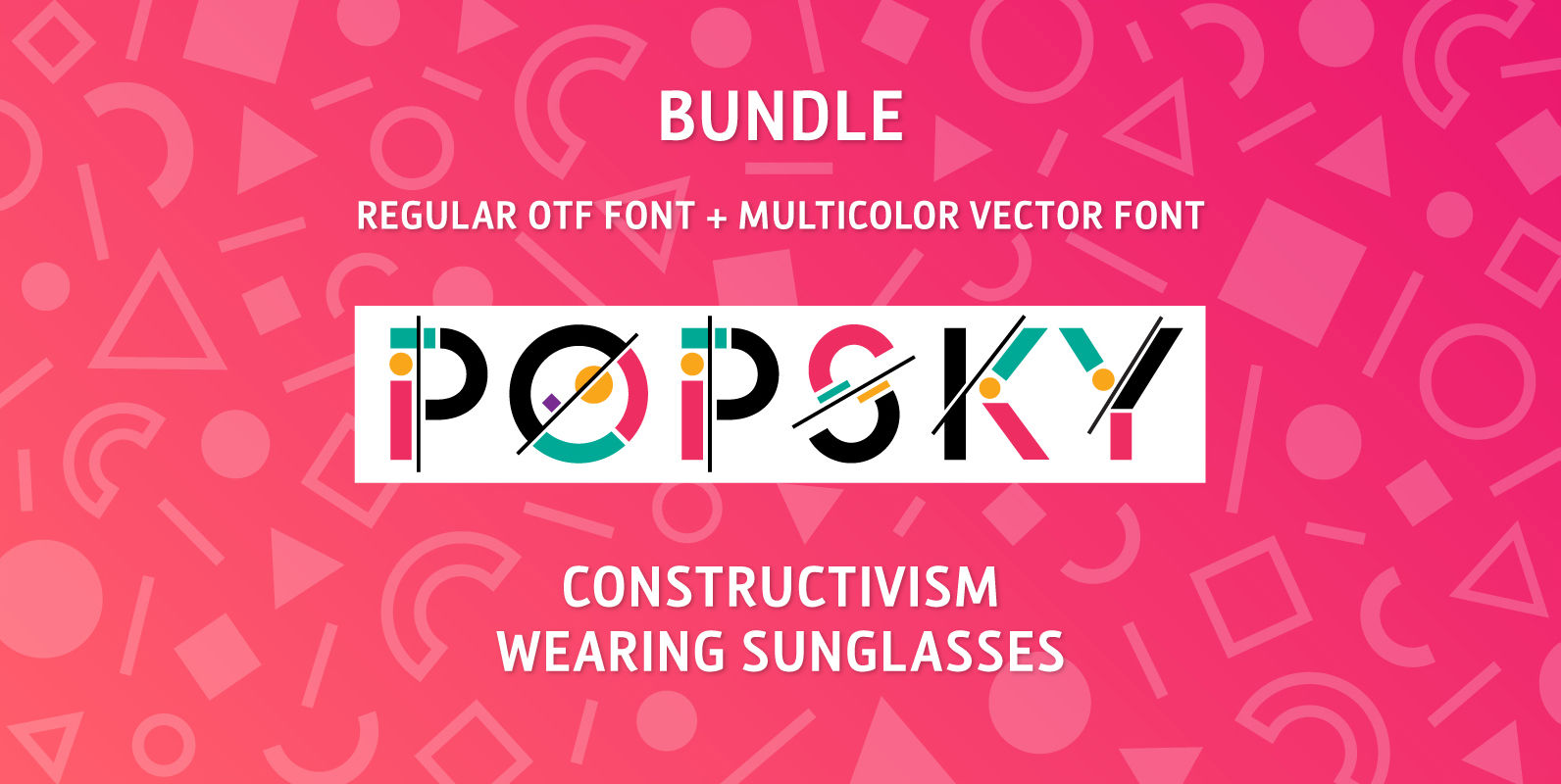
Popsky Font Bundle Font
Meet Popsky, a multicolor font which has optimism and motivation incorporated in its design. It’s super easy to use, just install it like any other font and type your multicolor text! Perfect for eye candy social media posts, logos, or
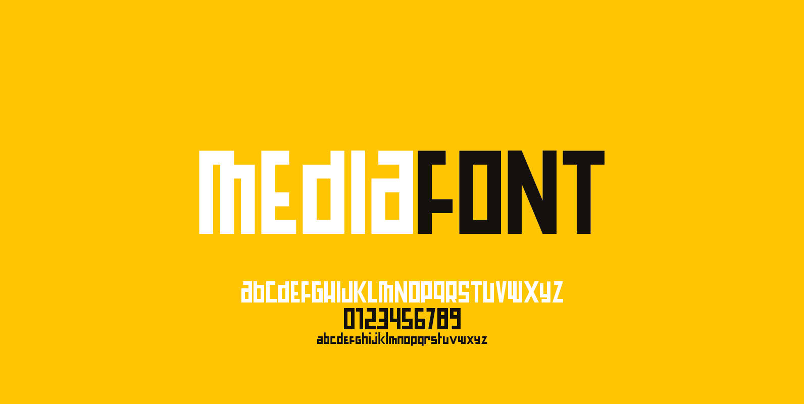
Mediafont Font
A squarish constructivist titling font ideal for branding, poster… Published by La Boite GraphiqueDownload Mediafont

Viata Font
“VIATA” is my new experimental Sans again based on the modernistic, constructivist letterforms of the “Bauhaus” era. The names Herbert Bayer and Paul Renner come to mind as design beacons of that time. “VIATA” has flat tops and round bottoms,
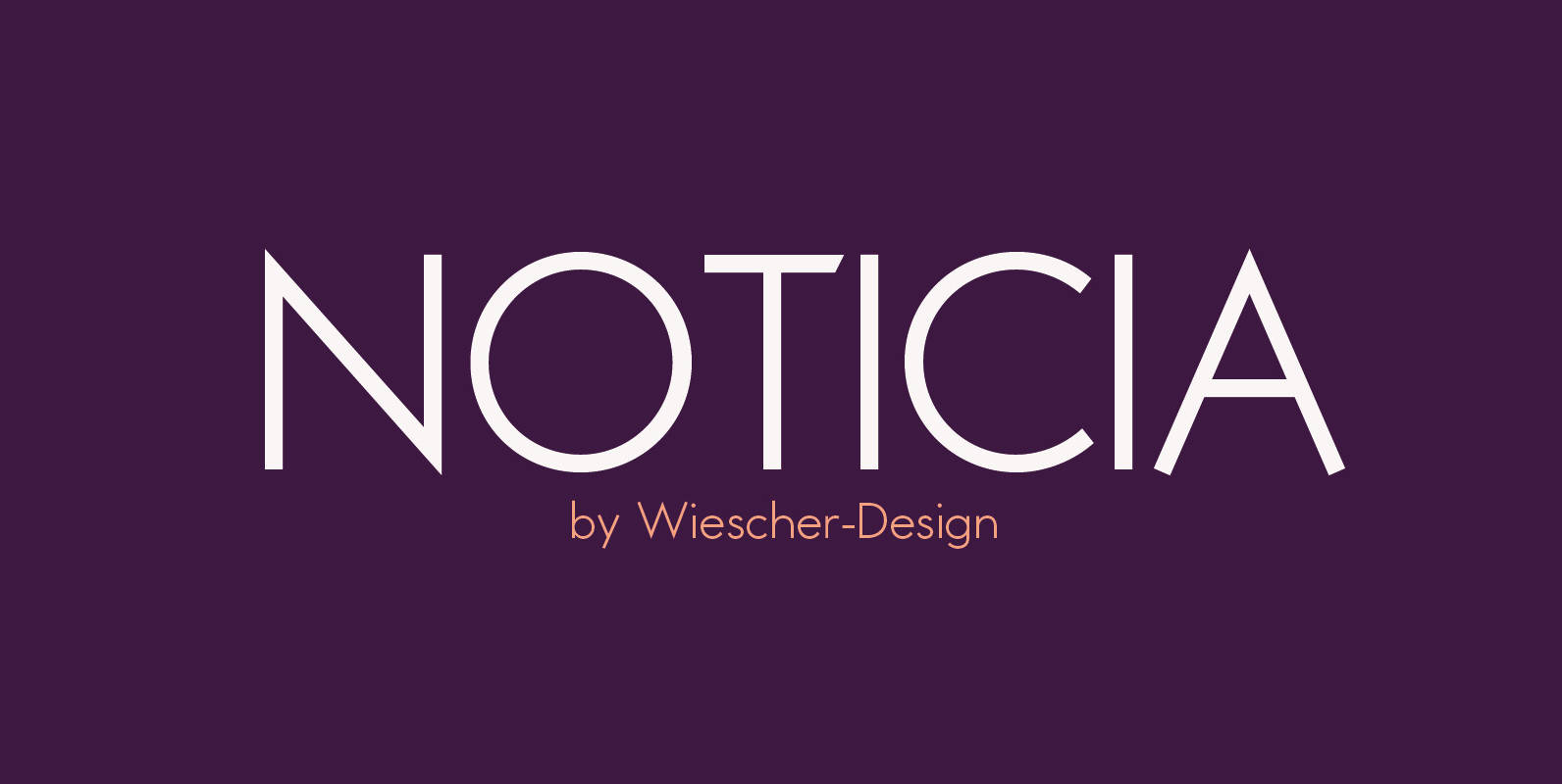
Noticia Font
“NOTICIA” is my new Sans based on the modernistic, constructivist letterforms of the “Bauhaus” era. The names Herbert Bayer and Paul Renner come to mind as design beacons of that time. “NOTICIA” is different in its proportions and long ascenders

Blitz Font
A very glitzy Blitz! I always wanted to design a typeface that was top heavy, but I never new how not to make it look like Antique Olive, until recently I had an idea. My new family is very readable
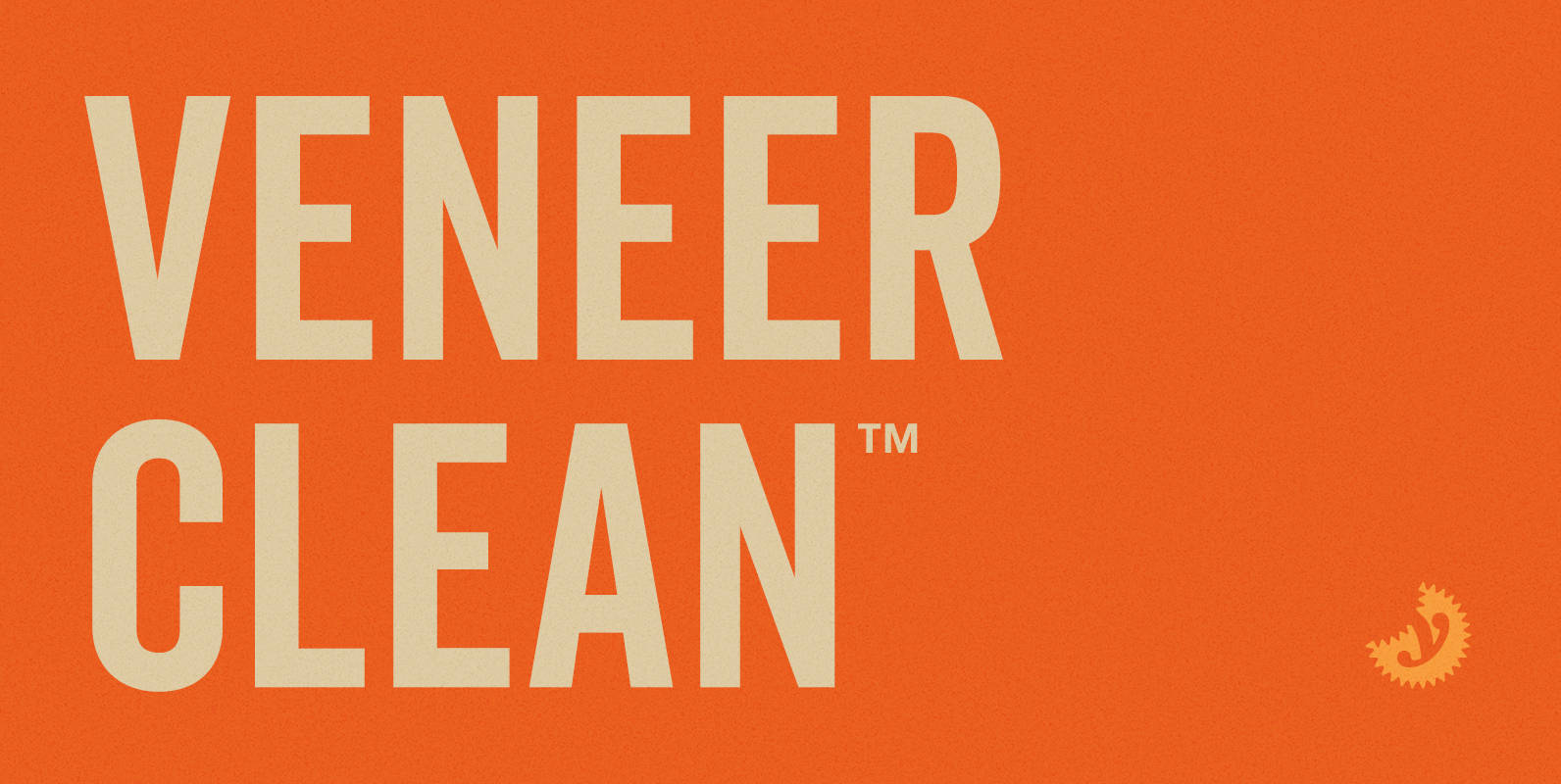
Veneer Clean Font
Veneer Clean from Yellow Design Studio is the non-distressed version of the Veneer letterpress type family. The 8-font family includes Regular, Soft and Round versions with italics plus a free set of funky icons. Published by Yellow Design StudioDownload Veneer
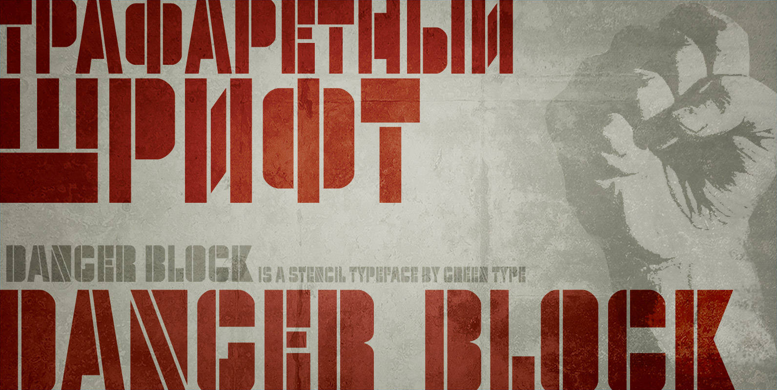
Danger Block Font
Danger Block is a stencil font inspired by Russian Constructivism. Published by Green TypeDownload Danger Block
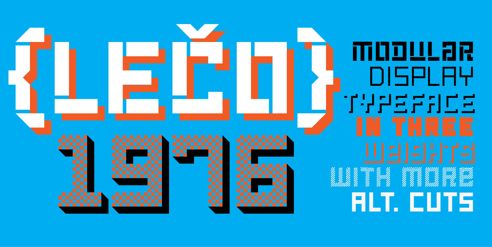
LECO 1976 Font
LECO 1976 is a headline display typeface in OpenType format. The title at the 1976 bottle of Lečo became an inspiration for creating this font. Besides the regular weight of the font, the font is drawn in light and bold

SteamCourt Font
A bit of background if you will: In early 2014, some friends from my college days banded together to form their own game company. Their first launch? A current Kickstarter they named SteamCourt. I love Kickstarter. It’s a fantastic platform,
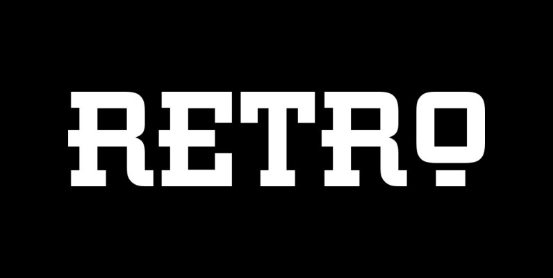
Retro Font
This all capital, slab serif typeface was inspired by elements of early 20th century Constructivist, Bauhaus, Art Deco and Streamline graphic movements. Retro Bold has a strong graphic appearance, a selection of alternative letters and is suitable for a wide
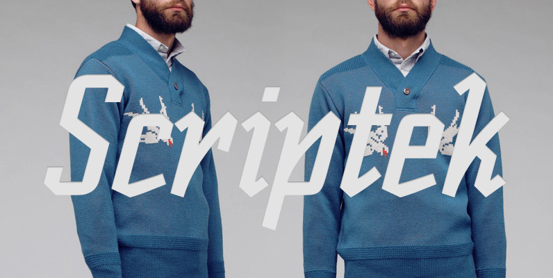
Scriptek Font
British designer David Quay was inspired by the work of the Russian Constructivists and, more recently, by Neville Brody’s influence on display typography when he created Scriptek. This strong, geometric slab serif typeface with its angled element in the lowercase

