Tag: contemporary
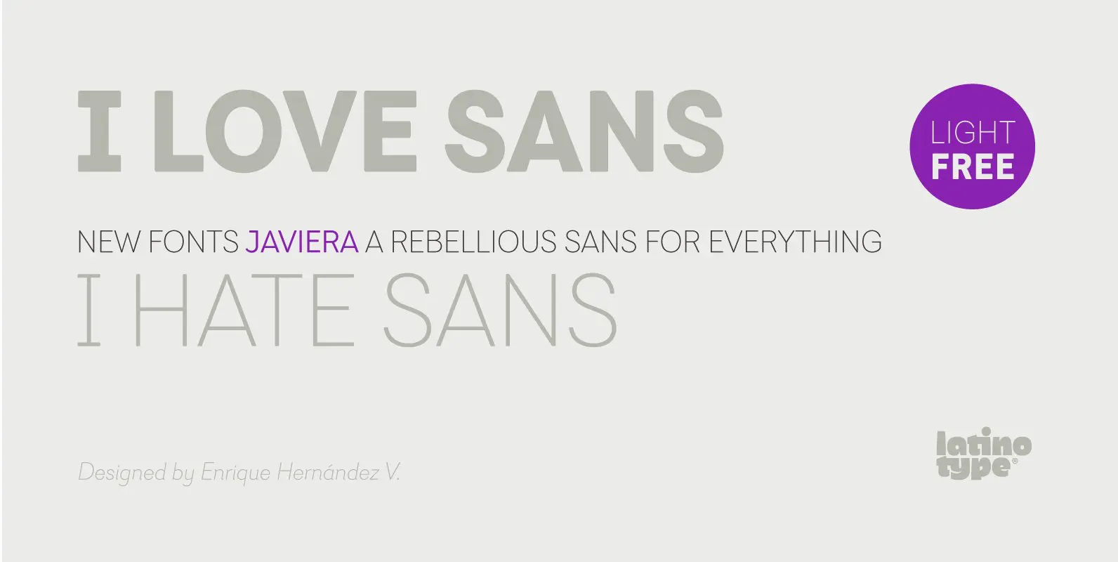
Javiera Font
Javiera is a geometric sans-serif typeface with humanist attributes. One of its main features is its small x-height, which makes ascenders and descenders look longer. The contrast gives the font a more stylised look, typical of humanist fonts. Curves and
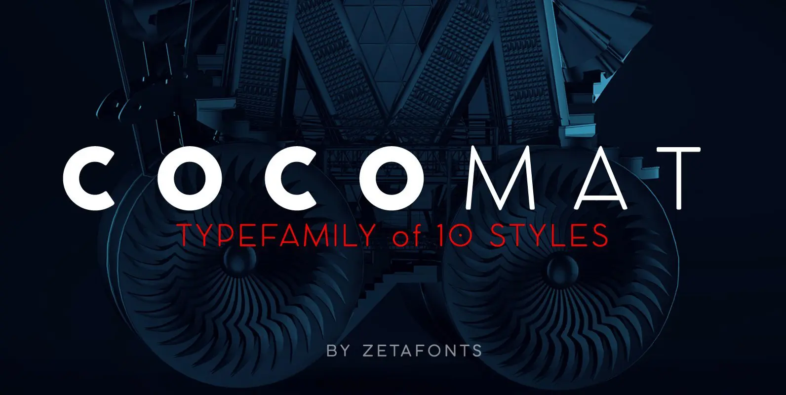
COCOMAT Font
COCOMAT is a typeface variant from the COCO GOTHIC family of sans serif geometric typefaces. It’s inspired by the style of the twenties and the visions of italian futurists like Fortunato Depero, Giacomo Balla and Antonio Sant’Elia. It’s a typeface
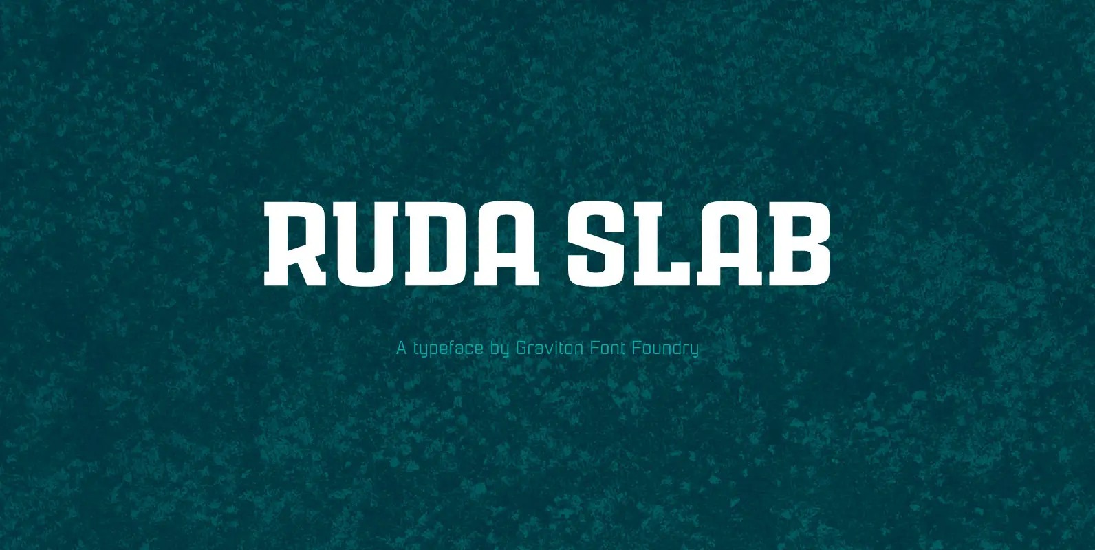
Ruda Slab Font
Rauda Slab font family has been designed for Graviton Font Foundry by Pablo Balcells in 2017. It is a display, slab serif, geometric typeface, with sharp angles that provides a strong and solid appearence. Rauda Slab consists of 8 styles.
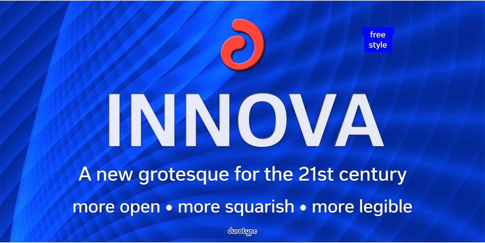
Innova Font
Innova. A new grotesque for the 21st century. More open. More squarish. More legible. After the many grotesques which have been designed over the years, is it still possible to improve this genre? Innova is a new design—a contribution to

Generous Font
Generous is painted with a somewhat dry brush. That’s why it looks so authentic! Comes with contextual alternates (7 different versions of each letter!) and multiple language support! Published by PizzaDude.dkDownload Generous
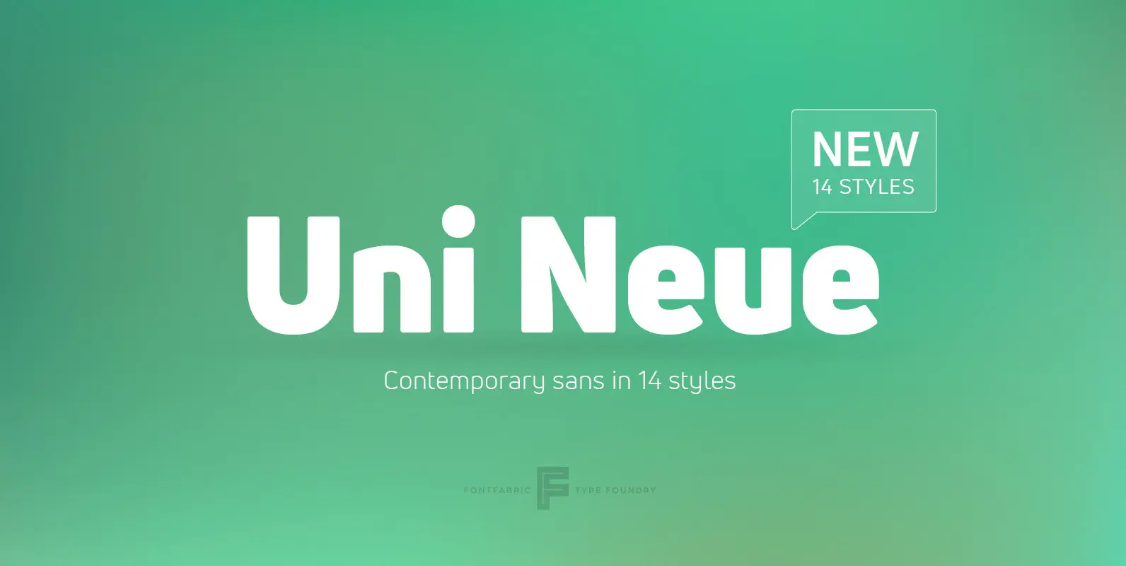
Uni Neue Font
Uni Neue is the whole new redesigned version (remake) of Uni Sans – one the most recognizable and signature font families of Fontfabric type foundry. From major changes like proportions, widths and thickness (weights) to the smaller details, this new
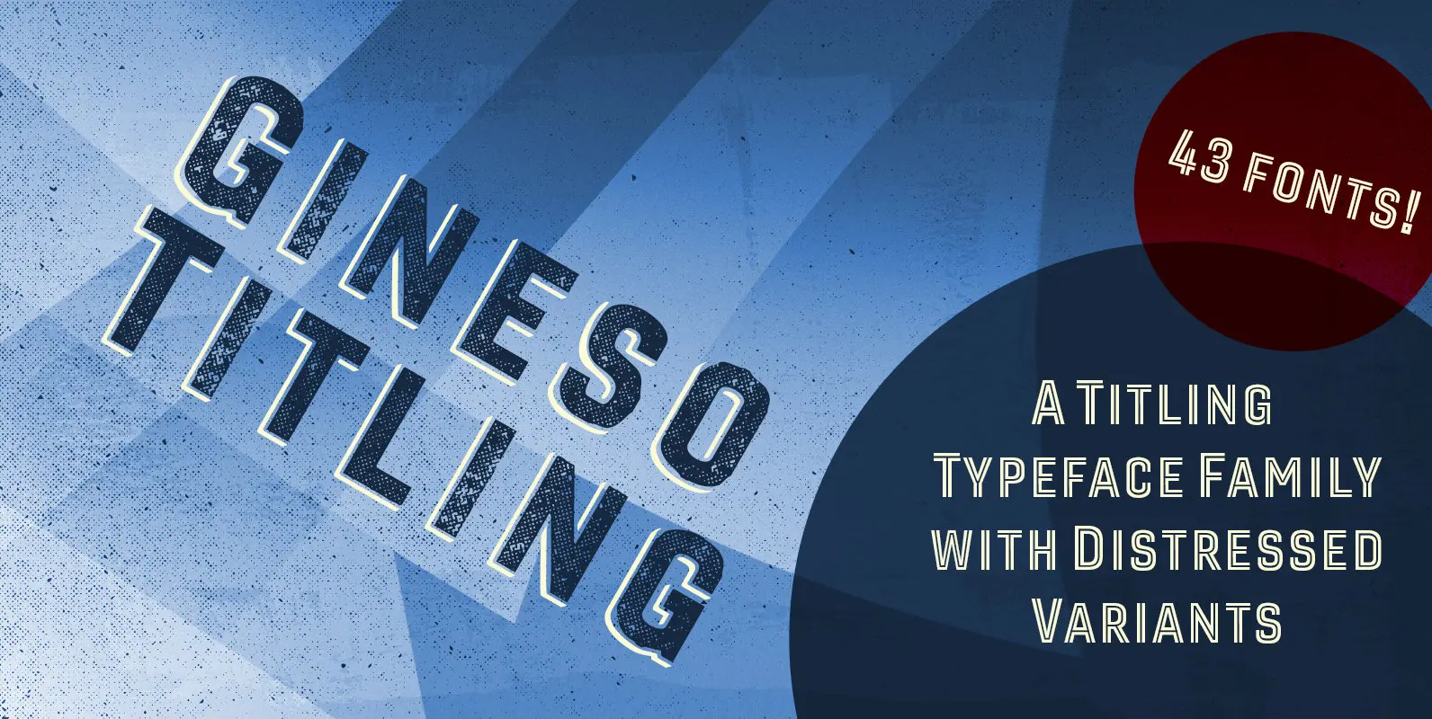
Gineso Titling Font
Before the Great War, there were great posters. Posters of elegance and grandeur. Posters calling people to the pleasures of sunny southern France and to the perfections of northern Italy’s dolce vita. Le Havre, based on a poster by AM
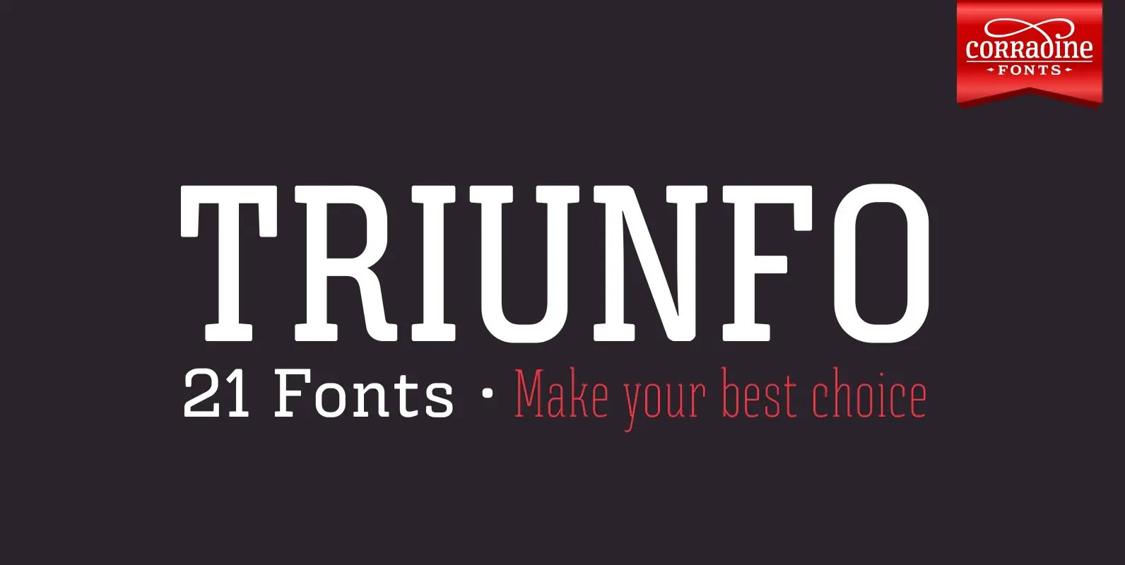
Triunfo Font
Triunfo is a modern slab serif font family with sports flavor. It comes in 21 variants of weight and wide that allows you to choose the best option to use in your work. Published by Corradine FontsDownload Triunfo

Flicker Font
Handpainted font with attitude! An attitude which will help you when designing posters, packaging, headline, invitations and alike, that needs that authentic brush-look! I haven’t got the count of how many pieces of paper I used to make this font.
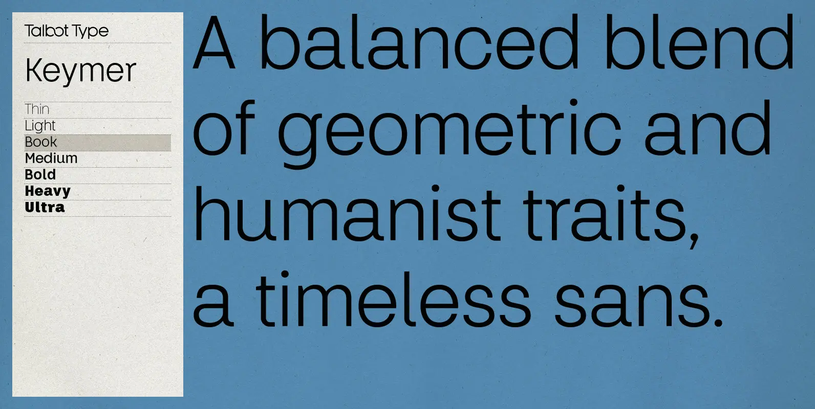
Keymer Font
Talbot Type Keymer is inspired by Margaret Calvert’s Transport typeface, designed for the British road sign system in the early 1960s. Keymer mixes geometric and humanist traits to achieve a modern, clean, elegant appearance. It is a legible and versatile
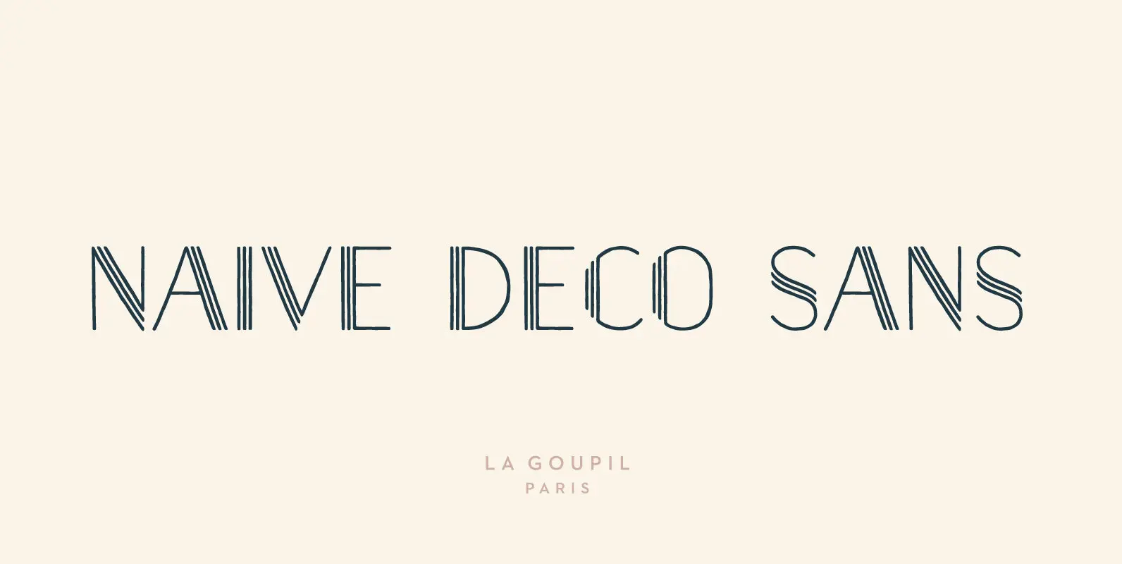
Naive Deco Sans Font
Naïve Deco Sans is a layered sans serif handwritten font designed by Fanny Coulez and Julien Saurin in Paris. Our goal was to draw a font with finely irregular lines that give a human and whimsical feeling. It is available
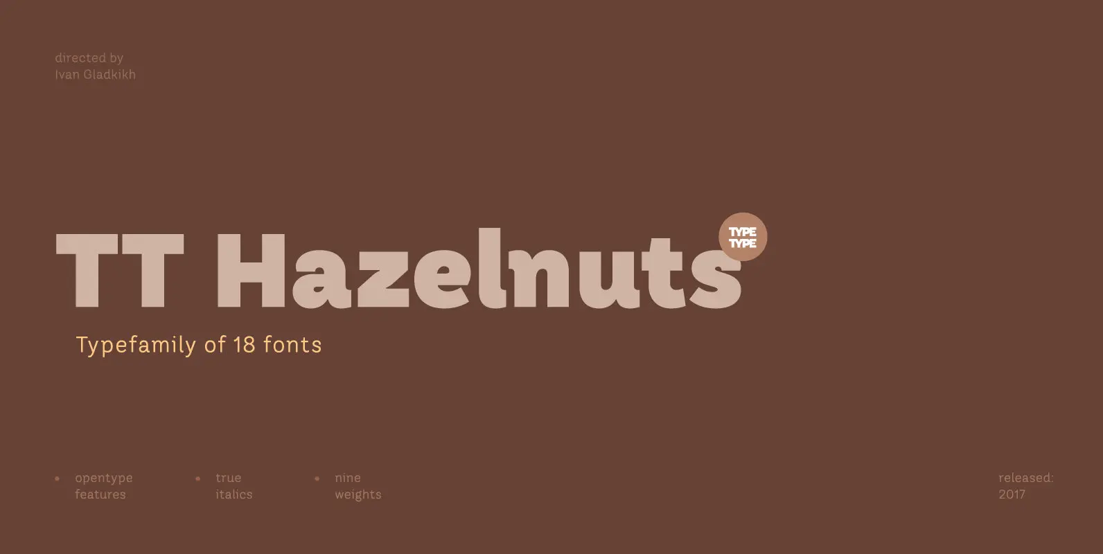
TT Hazelnuts Font
TT Hazelnuts is a display sans-serif font family containing a set of elegant and delicate decorative elements. Initially the family was designed for highly specialized areas, but we’ve decided to extend the number of typefaces and to make the family

Garlic Embrace Font
Ever wanted to be embraced by garlic? Probably not! But this font could surely embrace your designs that need an authentic brush look! Comes with 7 contextual alternates that automatically cycles as you type! Also, Garlic Embrace is FULL of
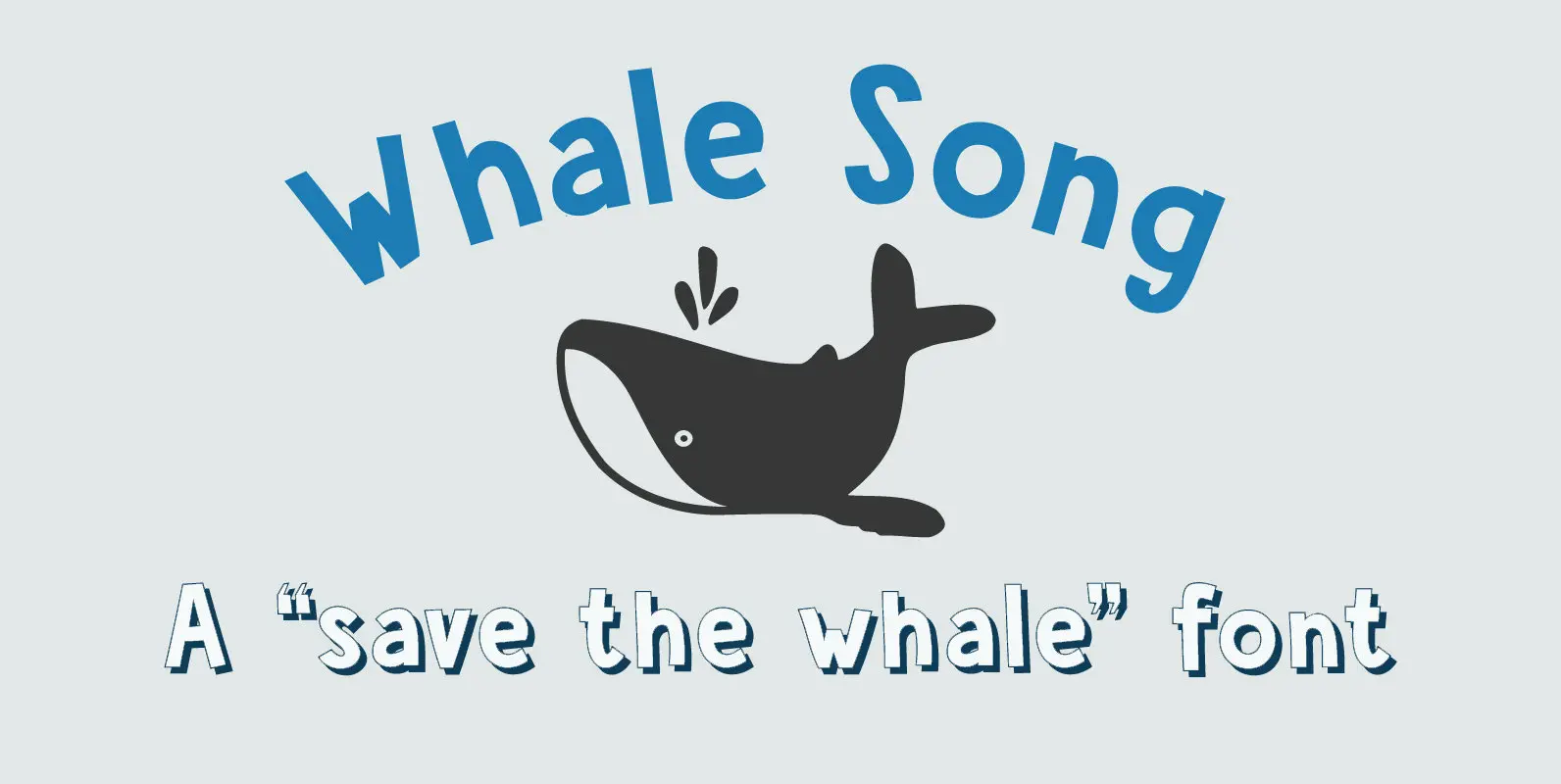
Whale Song Font
I grew up with the ‘Save The Whales’ slogan: I remember watching the news and seeing little Greenpeace dinghies taking on huge Japanese whalers, and activists clinging on for dear life. I haven’t heard that slogan for a while: maybe
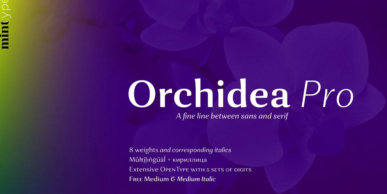
Orchidea Pro Font
Orchidea Pro is a typeface balancing on the verge of sans and serif. Called a stressed sans or a serifless serif, it does not feature any serifs, but resembles a serif typeface by build, and features unilateral nibs that speed
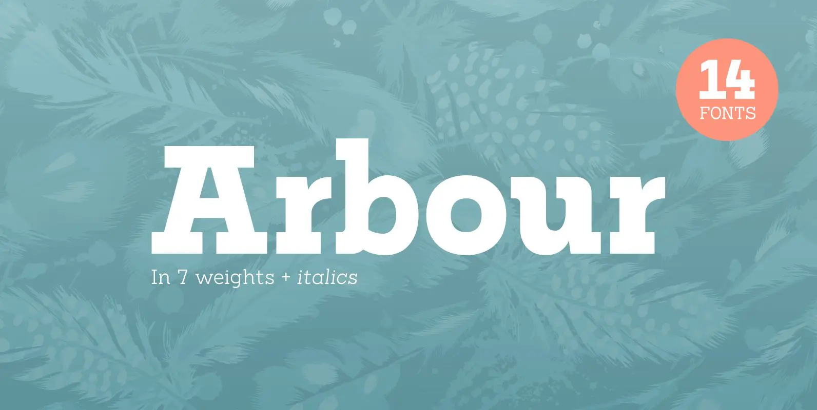
Arbour Font
With its solid slab form, mixed with subtle curved terminals, Arbour is a unique font with the versatility to work in many different scenarios, from branding to digital applications. It comes in 7 weights, from a delicate extra-light to a

Trenda Font
Designed by Daniel Hernández and Paula Nazal. Corrections and review by Alfonso García and Rodrigo Fuenzalida. Trenda is a geometric sans-serif typeface based on the uppercase of Trend—a Latinotype font, released in 2013, that was very well received. This new