Tag: contemporary
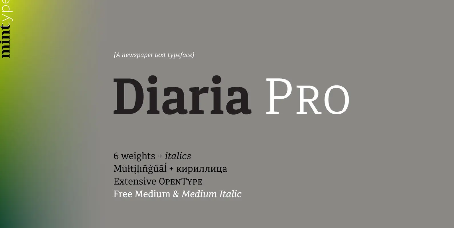
Diaria Pro Font
Diaria started as a project in Typeface Architecture for Master in Advanced Typograghy at EINA, Centre Universitari de Disseny i Art de Barcelona, a course tutored by Laura Meseguer and Íñigo Jerez Quintana. Later it has developed into Diaria Pro,
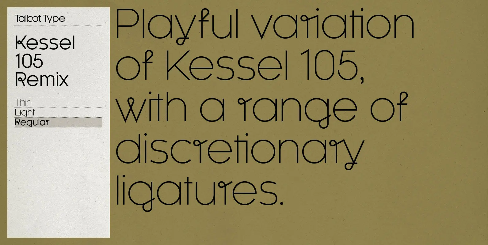
Kessel 105 Remix Font
A remixed variation, available in three weights, of the popular Talbot Type geometric sans Kessel 105. The addition of occasional flourishes at the intersections of strokes, in both upper and lower case, adds character charm, making the font a perfect

Lemon Yellow Sun Font
Lemon Yellow Sun is a line from my favorite Pearl Jam song – Jeremy. It also happens to be the title of a Stiltskin song, so I had to name a font after it. LYS is a tall, all caps
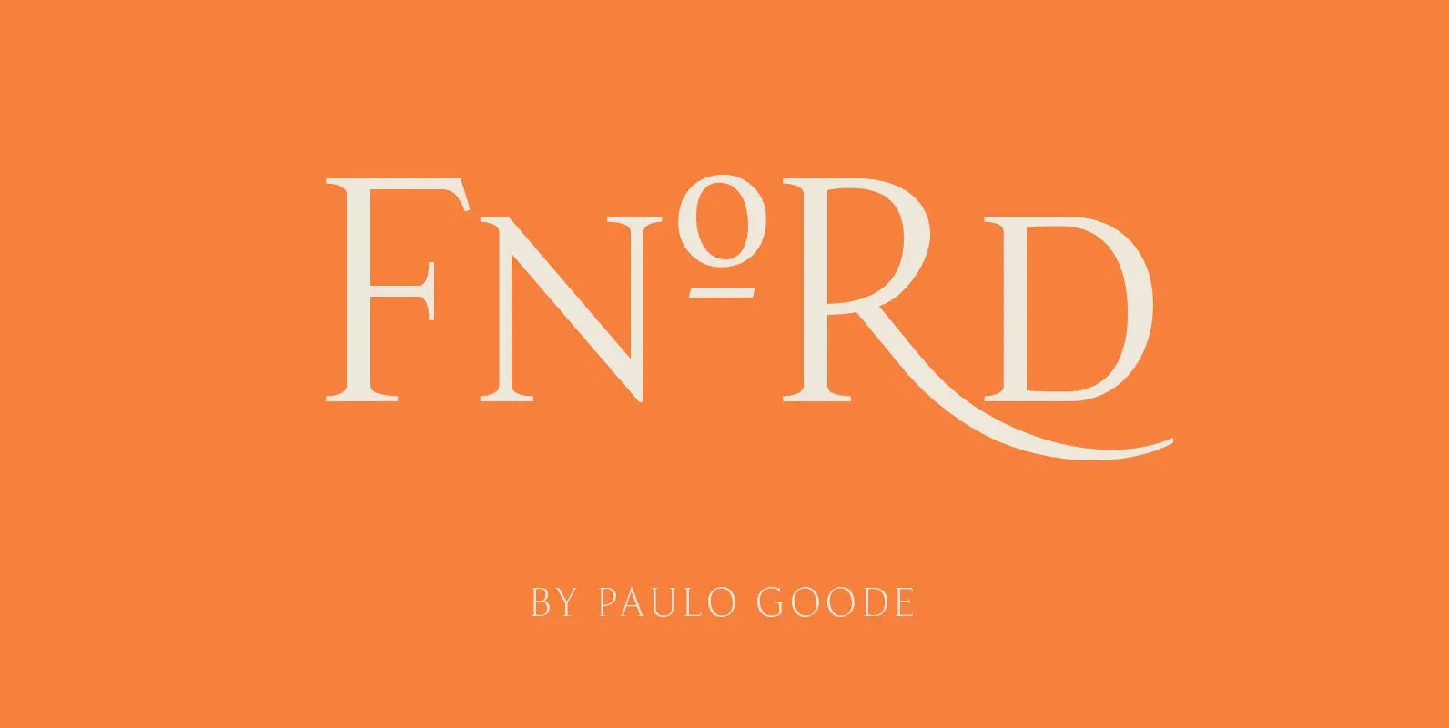
Fnord Font
Fnord is a contemporary humanist serif typeface, it is ideally suited for display purposes and branding. The family has been designed to be highly versatile, containing a total of 23 fonts – each font features discretionary ligatures, swash alternates and
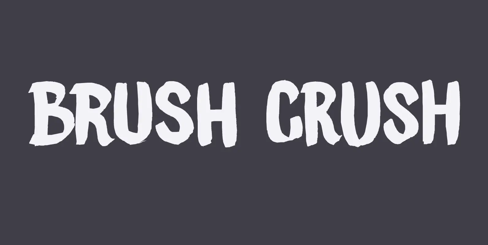
Brush Crush Font
I bought a few new pencils and I tried them out using Chinese ink and quality French watercolor paper. The result is Brush Crush – a very nice brush font. Brush Crush would look perfect on packaging, book covers, posters
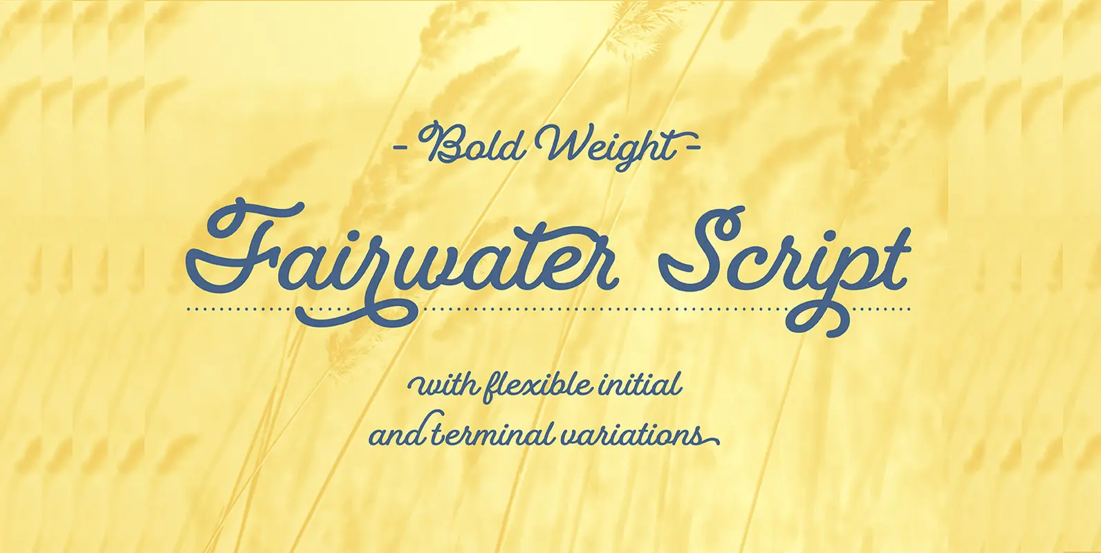
Fairwater Script Font
Fairwater’s aesthetic derives from the cursive handwriting styles popularized in the early to mid 1900s. Friendly, monoline, and casual – available in light, regular and bold weights. As with many of her faces, Laura can’t resist adding a plethora of
Pen Swan Font
Pen Swan is the latest offering from Jen Maton & Great Lakes Lettering. A Pen Swan is the species of an adult female swan. It is a fitting name as it contains ‘pen’ in the name which is the tool
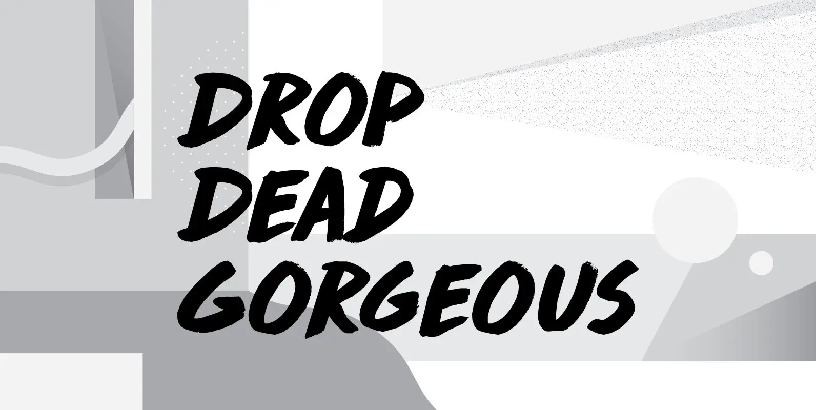
Drop Dead Gorgeous Font
Drop Dead Gorgeous is a slightly slanted all caps Brush font. I made it with the last of my Chinese ink (I ordered a new batch, it should arrive tomorrow). Drop Dead Gorgeous is a very legible font, ideal for
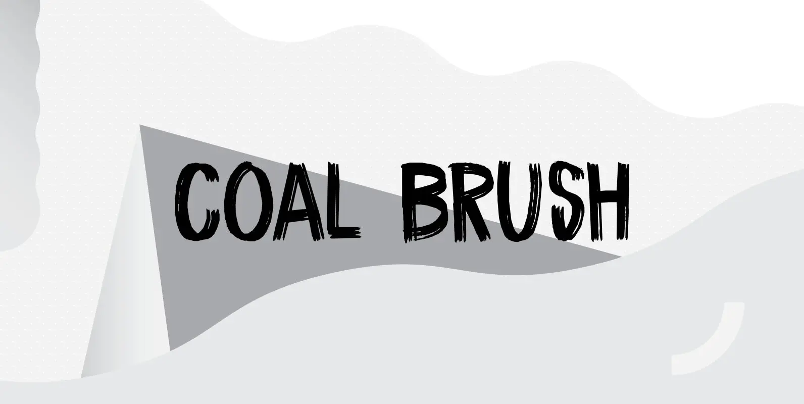
Coal Brush Font
Coal Brush is a bit of a misleading name. It looks as though it was made with a brush, but it was, in fact, made with a almost dried out old marker pen. But a font named ‘dried out old
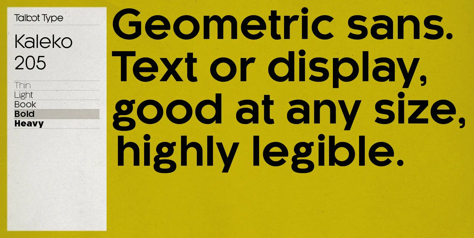
Kaleko 205 Font
Kaleko 205 is inspired by the classic, geometric sans-serifs such as Gill Sans, but has shallower ascenders and descenders for a more compact look. It’s a well-balanced, versatile, modern sans, highly legible as a text font and with a clean,

Ocean Shore Font
Ocean Shore is a modern display sans typeface with stencil characteristics and based on geometric shapes. That when combined gives the font a retro-futuristic look and makes it ideal for big and catchy editorial headlines. The family includes 6 styles,
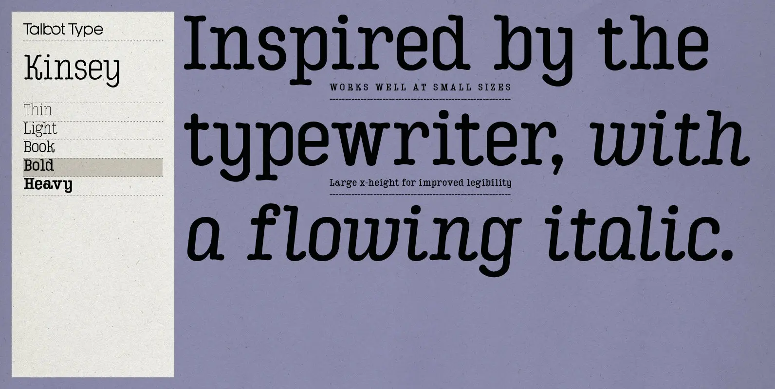
Kinsey Font
Kinsey is inspired by traditional typewriter font styles. Although now largely consigned to history, the bulbous slab serifs and soft curves of typewriter fonts have left a lasting legacy; they’re paradoxically easy on the eye, yet utilitarian and business-like. Kinsey
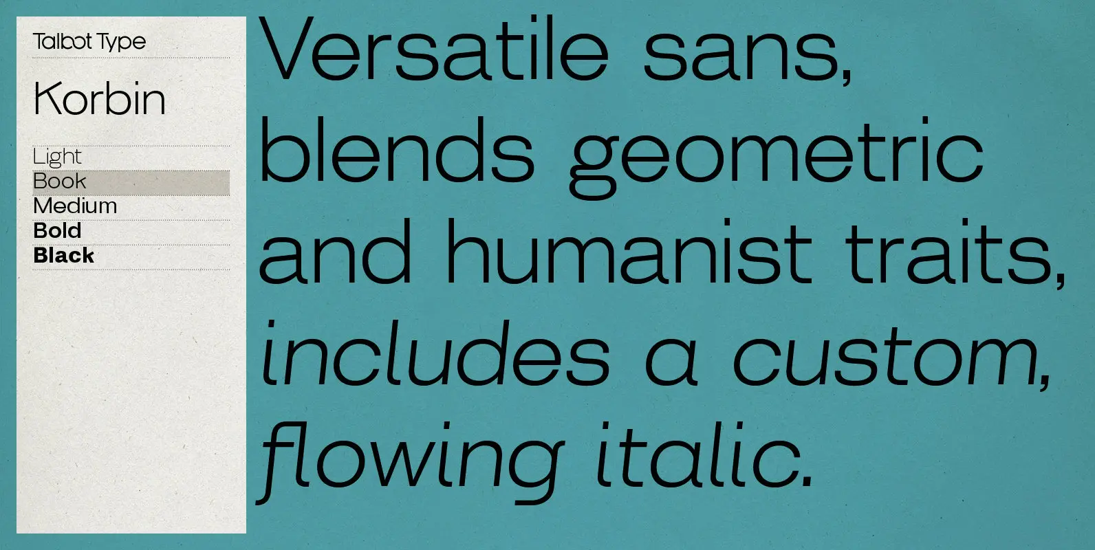
Korbin Font
Inspired by the sans-serifs of the late 19th and early 20th century, Korbin is a legible and versatile text and display face available in five weights. It mixes geometric and humanist traits to achieve a modern, clean, friendly appearance. The
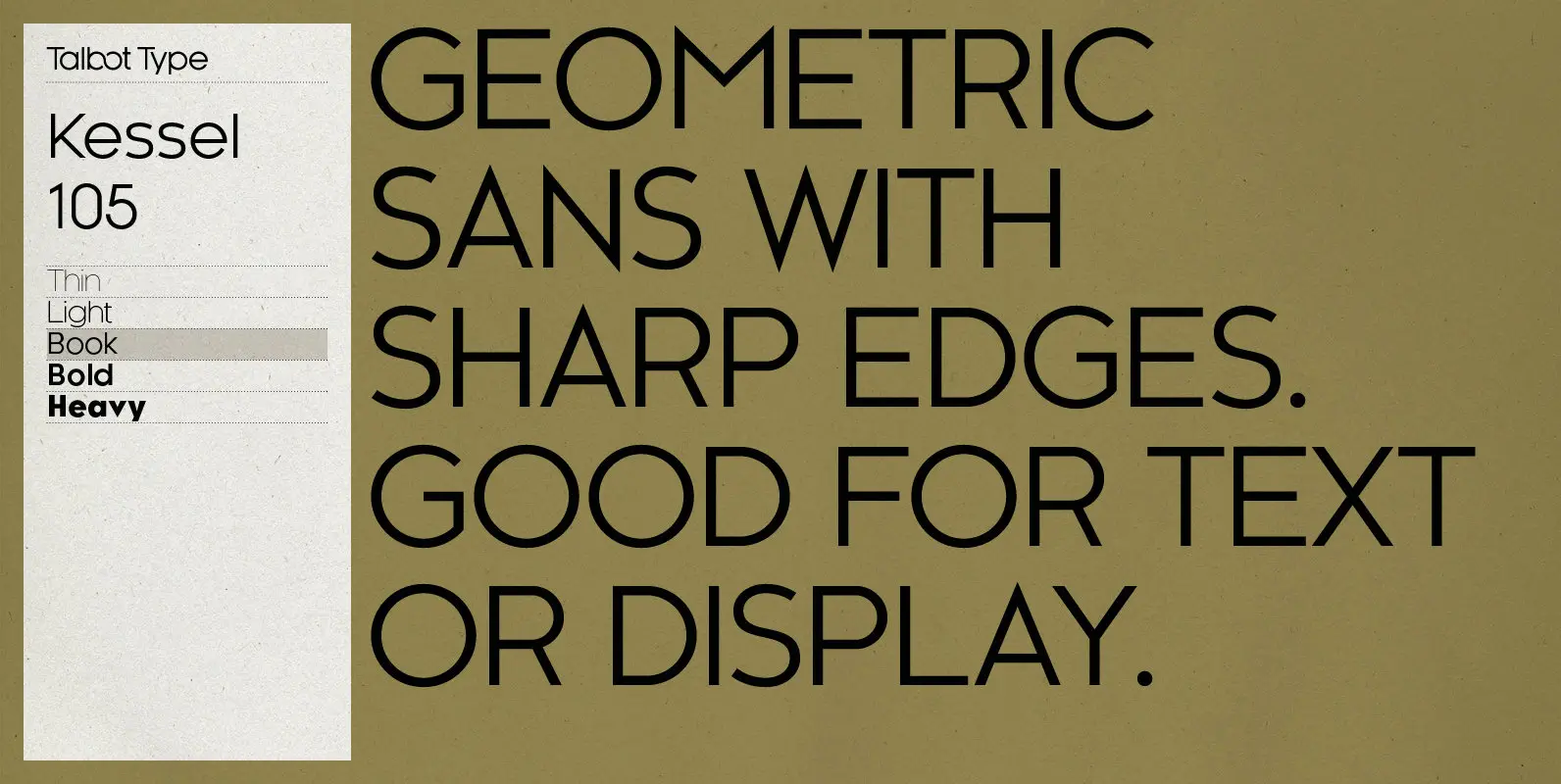
Kessel 105 Font
Kessel 105 is inspired by the classic, geometric sans-serifs such as Futura, but has shallower ascenders and descenders for a more compact look, and features an art deco influence with sharp points at the apex of many characters. It’s a
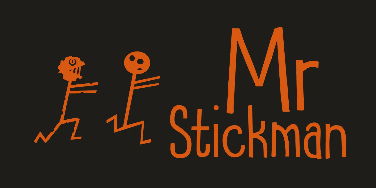
Mr Stickman Font
Mr Stickman is a happy clappy kind of font, inspired by an older font of mine called Oranjerie. Oranjerie is an all caps typeface, but Mr Stickman comes with lower case letters – AND – a Stickman Action Figures pack!
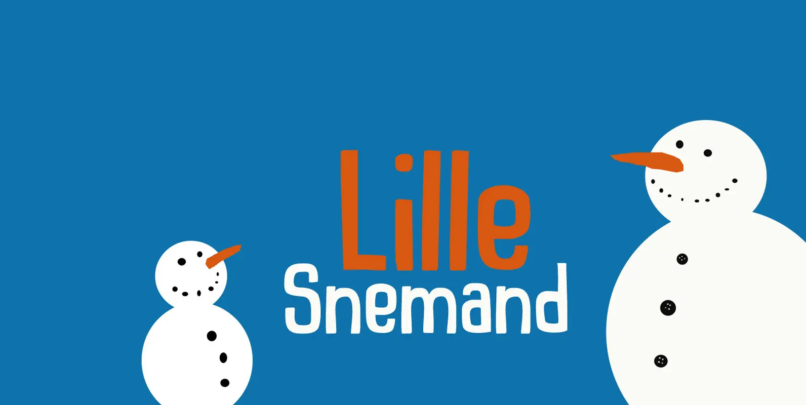
Lille Snemand Font
Lille Snemand, in Danish, means Little Snowman – like the Little Mermaid, but then colder… Lille Snemand is kin to the original Snemand font, which is an all caps typeface, but unlike its big brother, Lille Snemand comes with lowercase
Kamerik 205 Font
Kamerik 205 is inspired by the classic, geometric sans-serifs such as Futura and Avant Garde, but has shallower ascenders and descenders for a more compact look, and features a traditional double-storey lower case a and g. It’s a versatile, modern
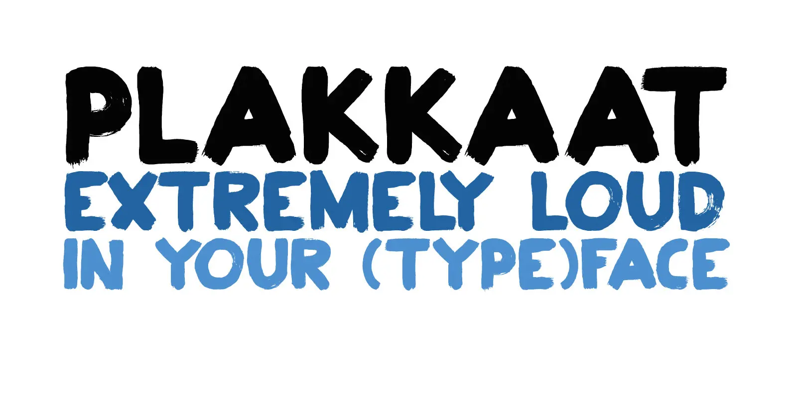
Plakkaat Font
Plakkaat is a fat brushed font, made with wide brushes and paint. Since it is a very easy to read font (and not to be missed), it is ideal for advertising campaigns, or demonstration signs.. This 2019 version comes with