Tag: contemporary
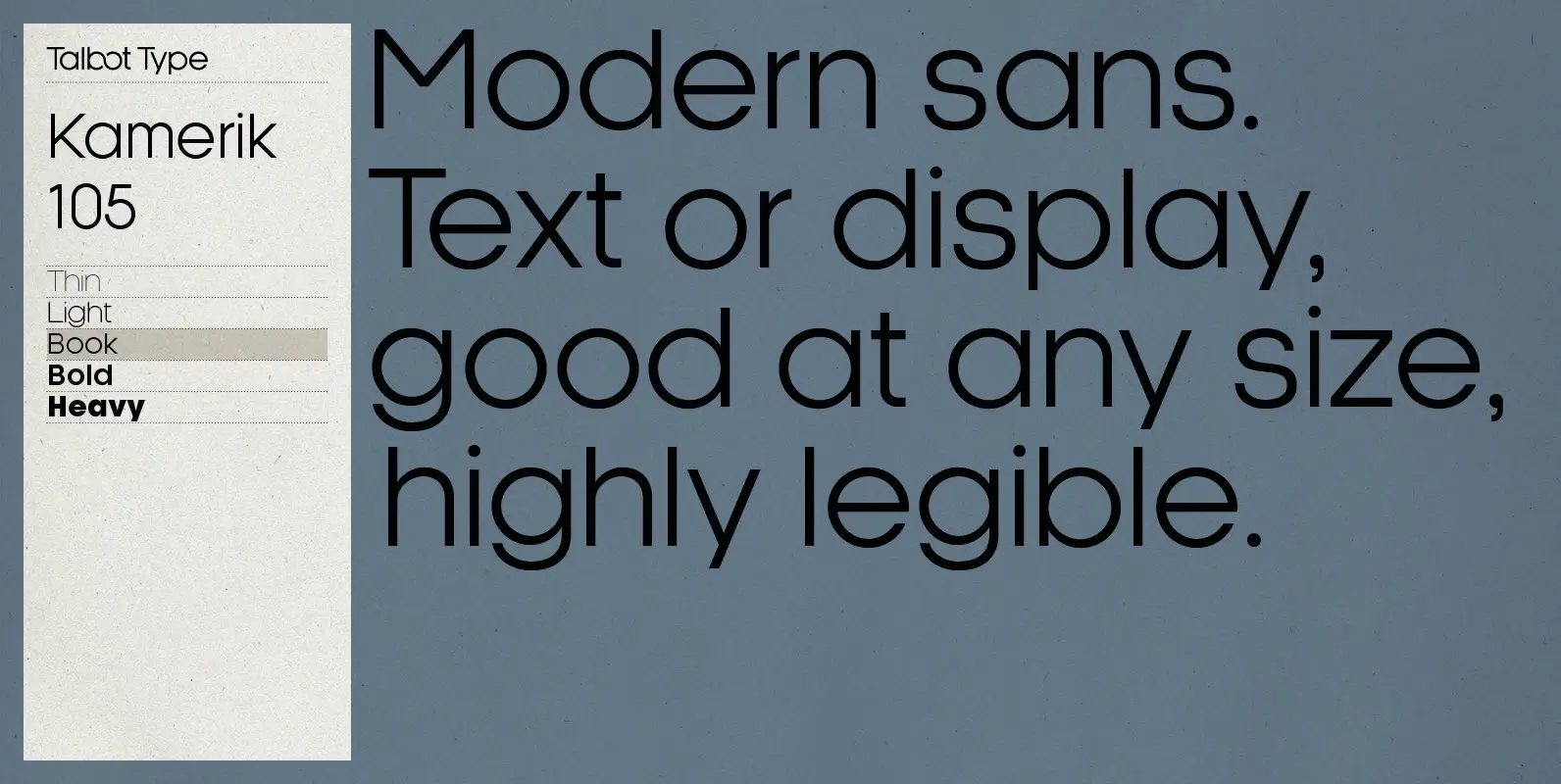
Kamerik 105 Font
Kamerik 105 is inspired by the classic, geometric sans-serifs such as Futura and Avant Garde, but has shallower ascenders and descenders for a more compact look. It’s a versatile, modern sans, highly legible as a text font and with a
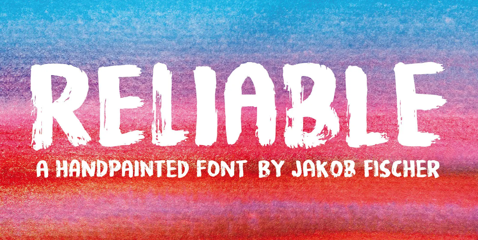
Reliable Font
Reliable was drawn with a somewhat dry brush, and then carefully made into a font. Reliable differs from other brush fonts, because it has got 8 different versions of each letter!!! 8 different letters that cycle while you type! Not
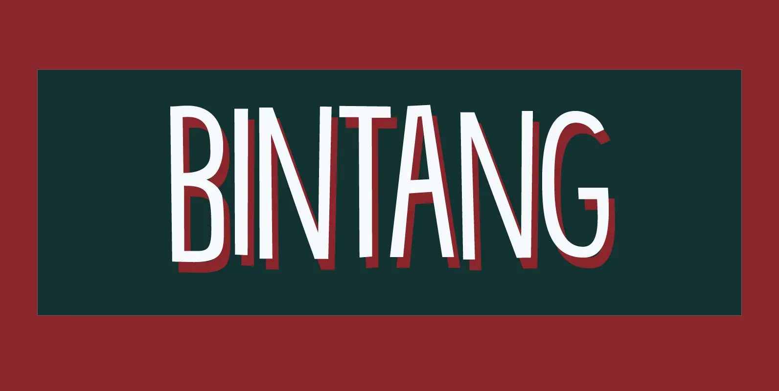
Bintang Font
Bintang means Star in Bahasa Indonesia. Bintang font is a hand drawn, computer enhanced font. It is all caps, but upper and lower case differ and can be freely interchanged. Use Bintang for your product packaging, book covers, posters and
Kaleko 105 Remix Font
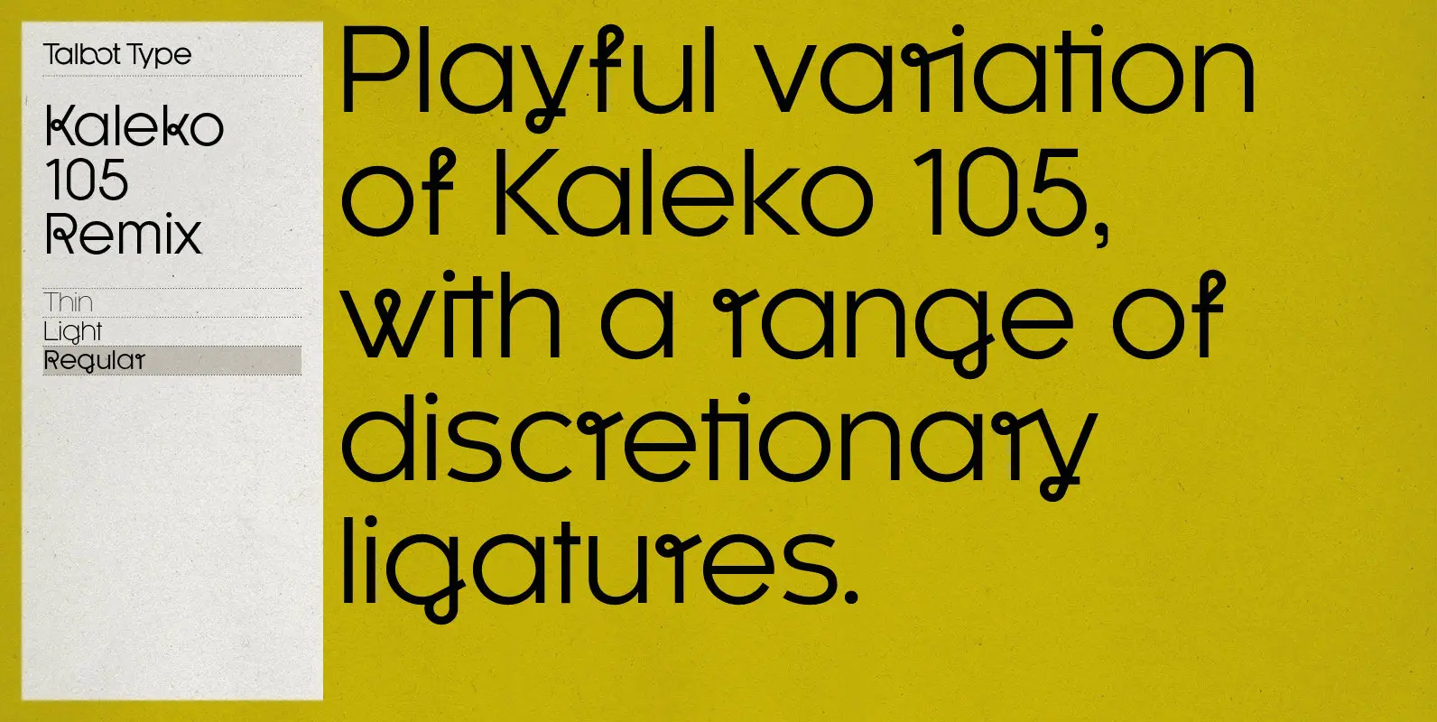
A remixed variation, available in three weights, of the popular Talbot Type geometric sans Kaleko 105. The addition of occasional flourishes at the intersections of strokes, in both upper and lower case, adds character charm, making the font a perfect
Kroppen Round Font
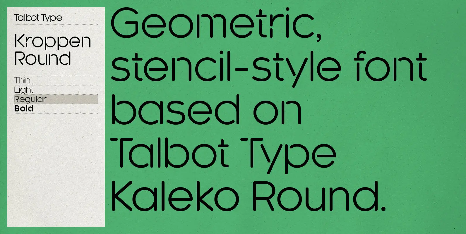
Kroppen Round is a geometric, stencil-style font based on Talbot Type Kaleko Round, and is available in four weights. Kroppen is not strictly a stencil font given that several characters, notably the O, are not stencilled. The design has more
Garden Bed Font
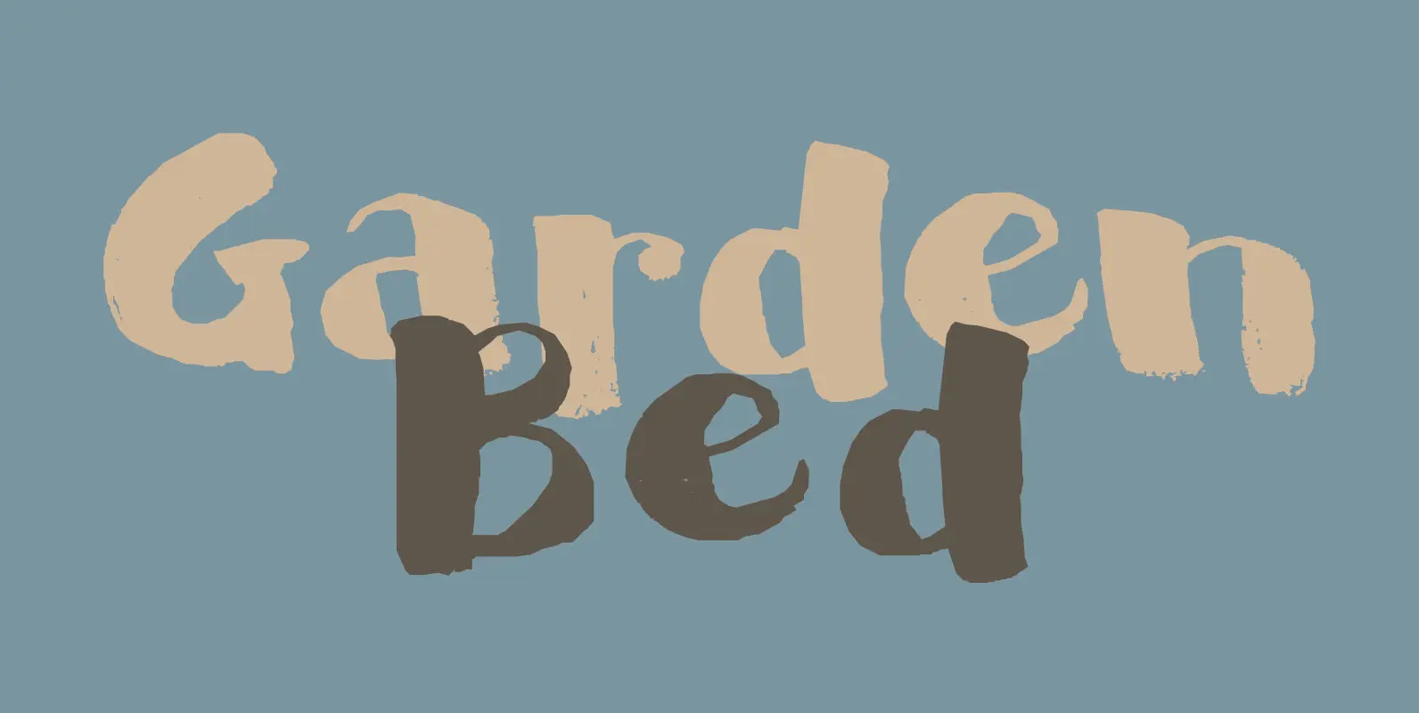
A couple of weeks ago, I found my ink well, which I thought I had lost. I decided (there and then) to create a bunch of inky brush fonts, which resulted in Dirrrty and Scrawny Cat. And now, Garden Bed.
Kaleko 205 Round Font
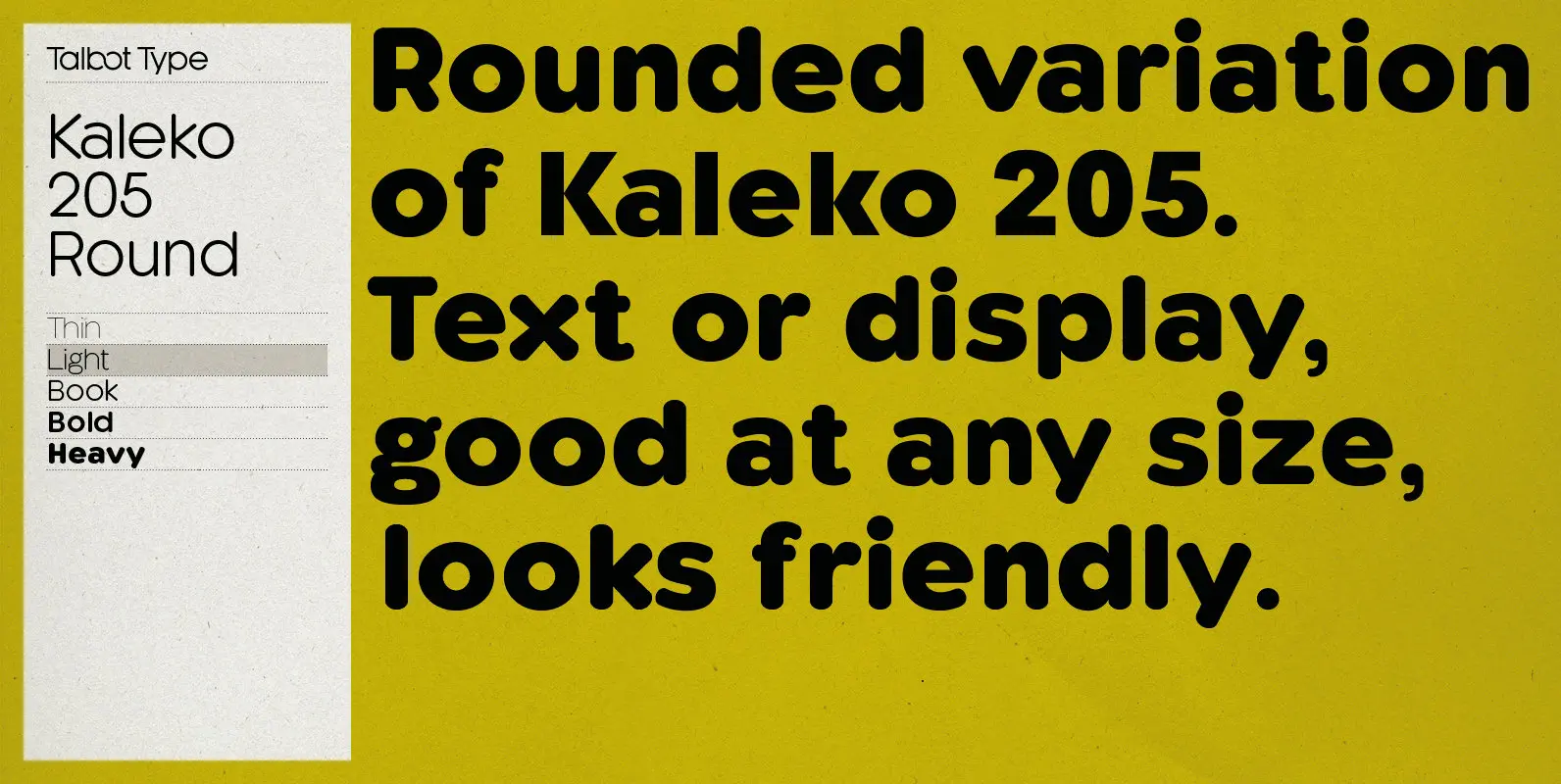
Kaleko 205 Round is a rounded variation of Talbot Type font Kaleko 205. It’s a well-balanced, versatile, modern sans, highly legible as a text font and with a clean, elegant look as a display font at larger sizes. The rounded
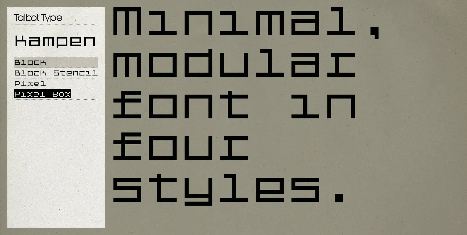
Kampen Font
Kampen is a minimal, modular, monospaced font. There are two variants, each available in two styles. The two variants — Block and Pixel — differ considerably in look, however the characters in both are designed using the same 7 x
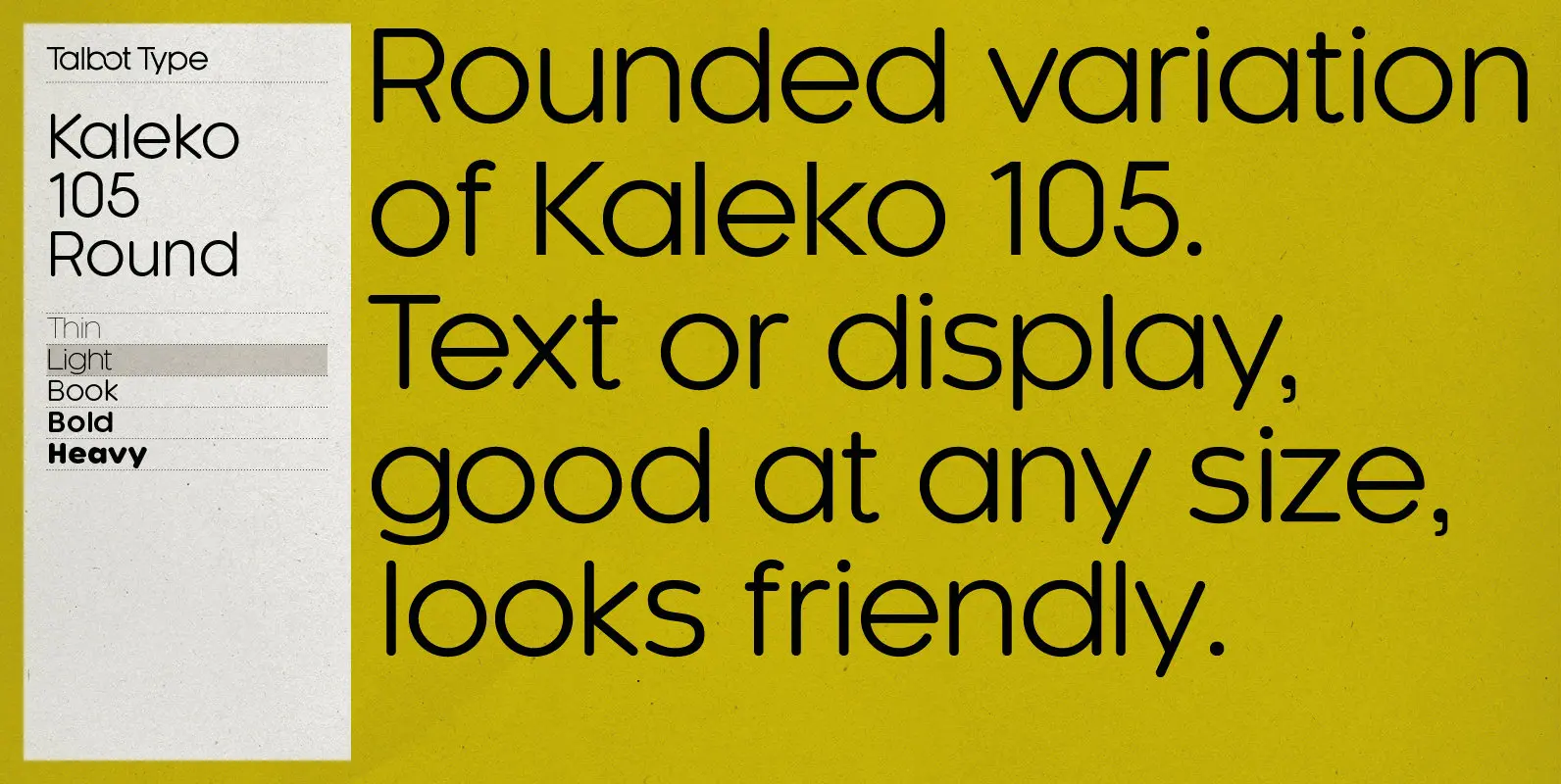
Kaleko 105 Round Font
Kaleko 105 Round is a rounded variation of Talbot Type font Kaleko 105. It’s a well-balanced, versatile, modern sans, highly legible as a text font and with a clean, elegant look as a display font at larger sizes. The rounded
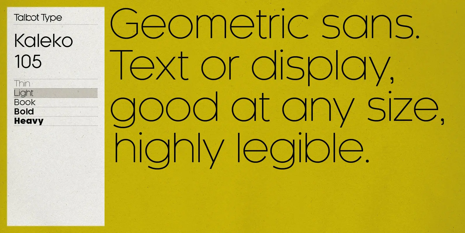
Kaleko 105 Font
Kaleko 105 is inspired by the classic, geometric sans-serifs such as Gill Sans, but has shallower ascenders and descenders for a more compact look. It’s a well-balanced, versatile, modern sans, highly legible as a text font and with a clean,
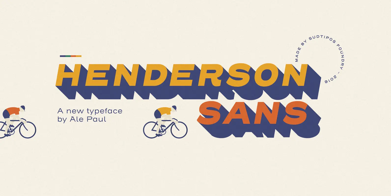
Henderson Sans Font
The first thought that crosses a type designer’s mind upon seeing a slab serif is: I wonder what it would look if it was serifless. And so, after building Henderson Slab, I followed my instincts and gave it a sans

Henderson Slab Font
A few bold caps drawn by Albert Du Bois for the 1906 Henderson Sign Painter book started me in the direction of looking at how sign painters approached slabs after the industrial revolution. The usual happened from there. My exercise
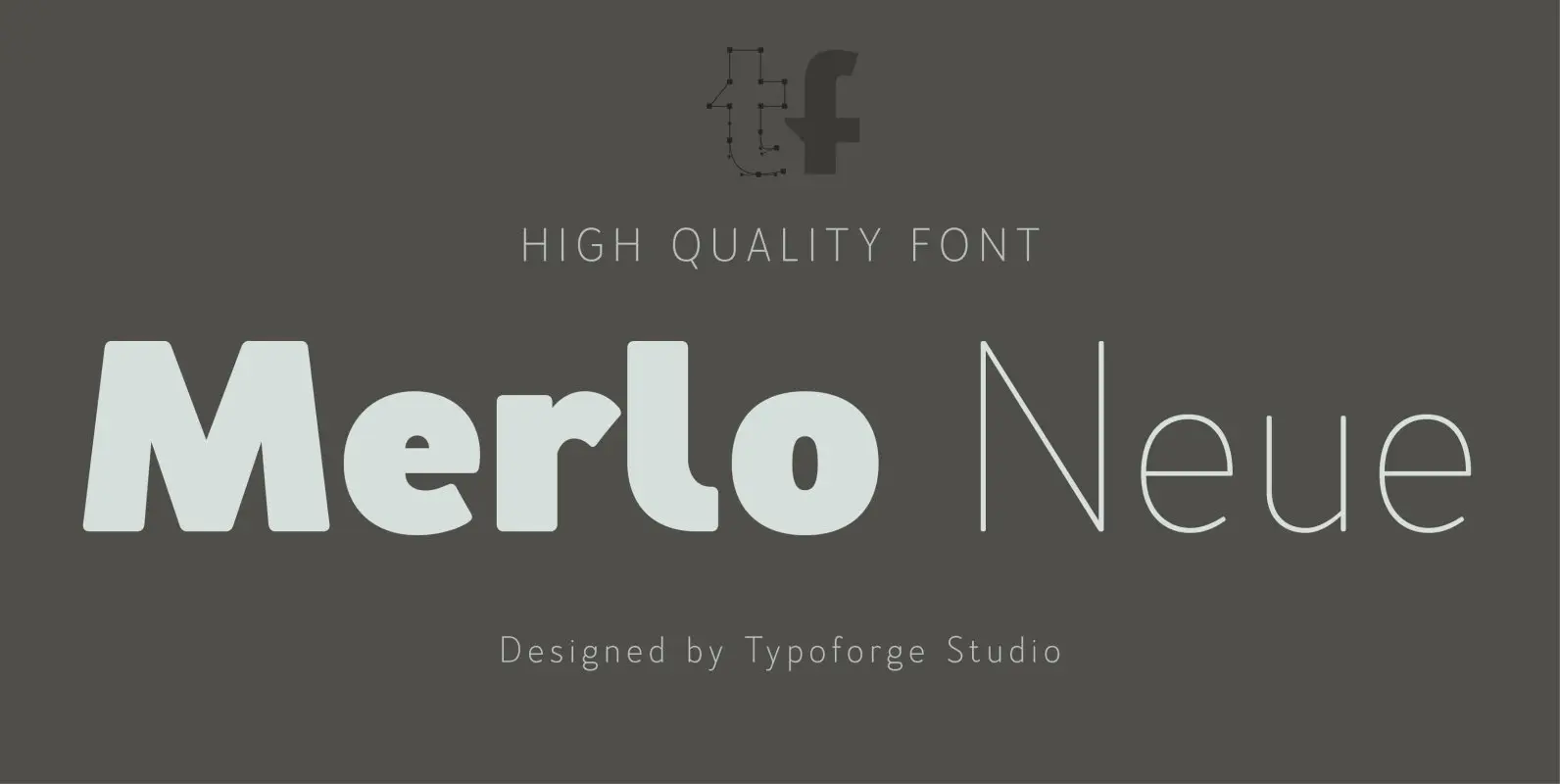
Merlo Neue Font
Merlo Neue is the younger brother of Merlo. New family received refreshed, more square proportions and a new shape of many glyphs. However, what is the most important in new Merlo, is the wide range of instances – nine new weights,
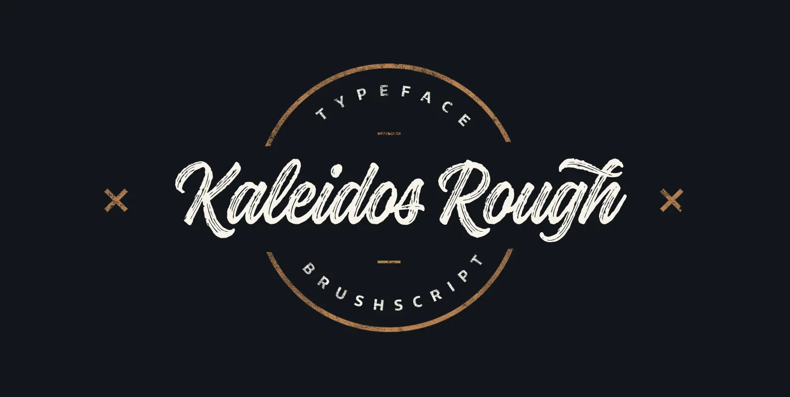
Kaleidos Rough Font
Kaleidos Rough lining brush script. It has two versions; Kaleidos Rough and Kaleidos Textured. Rough version has rough edges to mimic authentic brush strokes. Textured version has also those rough edges and in addition it has brush stroke texture to
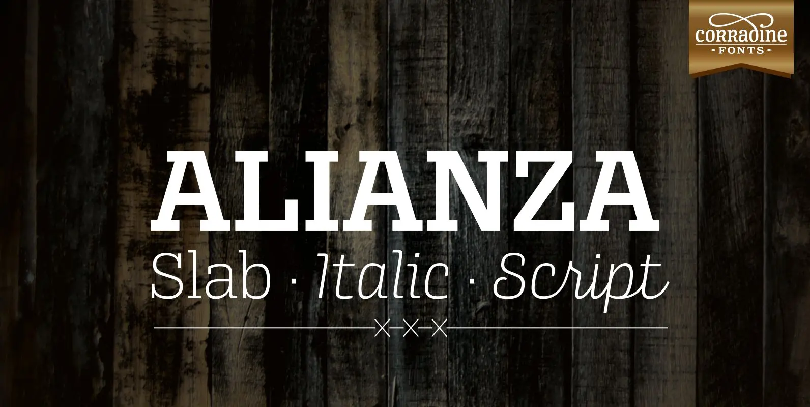
Alianza Font
This is a complex typographic system which includes three different but complementary styles so far: Slab, italic and script, with nine weights each one; plus three sets of ornamental fonts: labels, negative labels and ornaments. The soul of the family
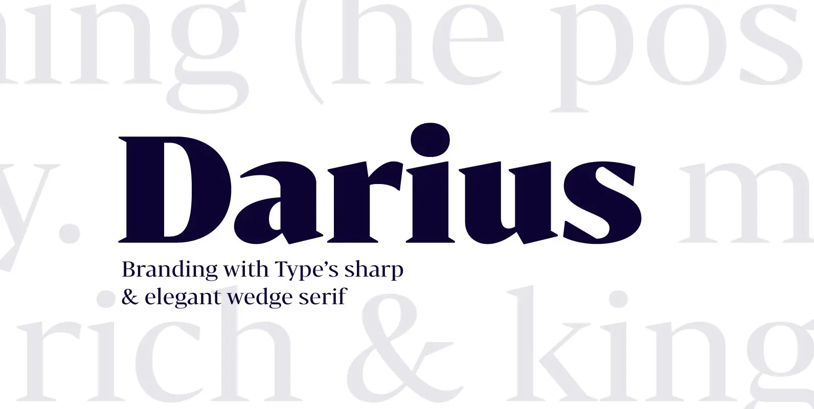
Bw Darius Font
Bw Darius is an elegant wedge serif typeface, halfway between the transitional and didone genres, with a sharper approach to terminals without falling on the stiffness of the didones. The wide skeleton, modern proportions and high contrast, all contribute to
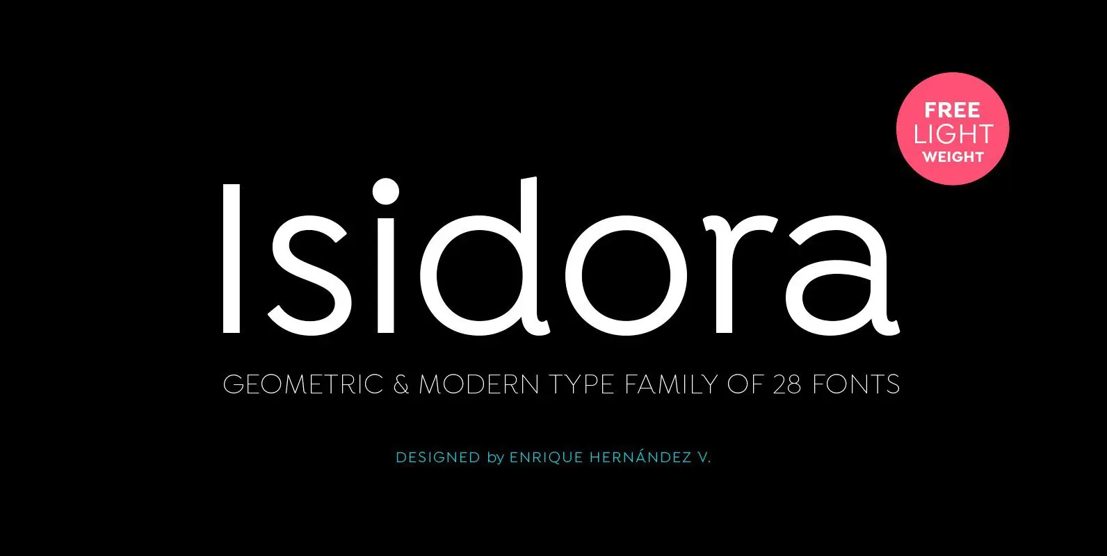
Isidora Font
Designed by Enrique Hernández V. Isidora is a modern geometric font based on the classic typefaces of the early 21st Century yet with a contemporary and functional touch. In spite of its strong and rational structure, the font also looks
