BoRock Font
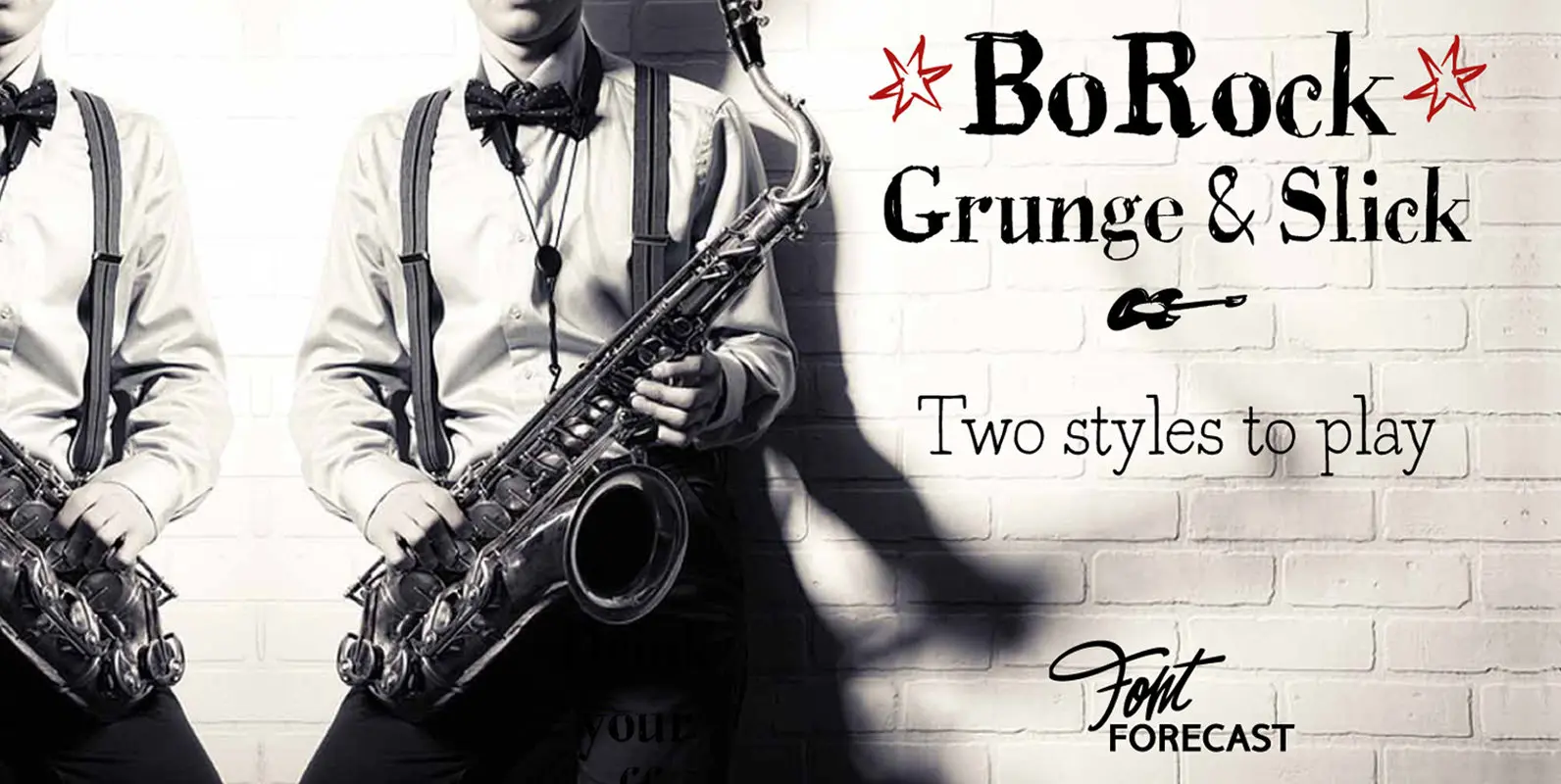
BoRock is a handcrafted font that comes in two pigheaded styles, inspired by the rock music scene. You can use BoRock instead of the usual neat serif fonts. BoRock Grunge is a rough crispy serif font, excellently suited for use
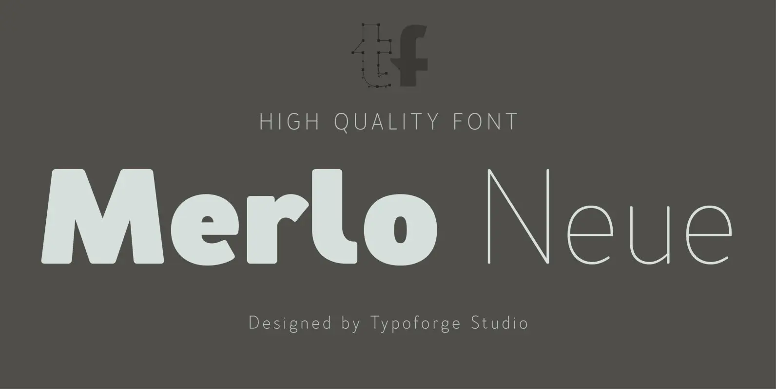
Merlo Neue is the younger brother of Merlo. New family received refreshed, more square proportions and a new shape of many glyphs. However, what is the most important in new Merlo, is the wide range of instances – nine new weights,
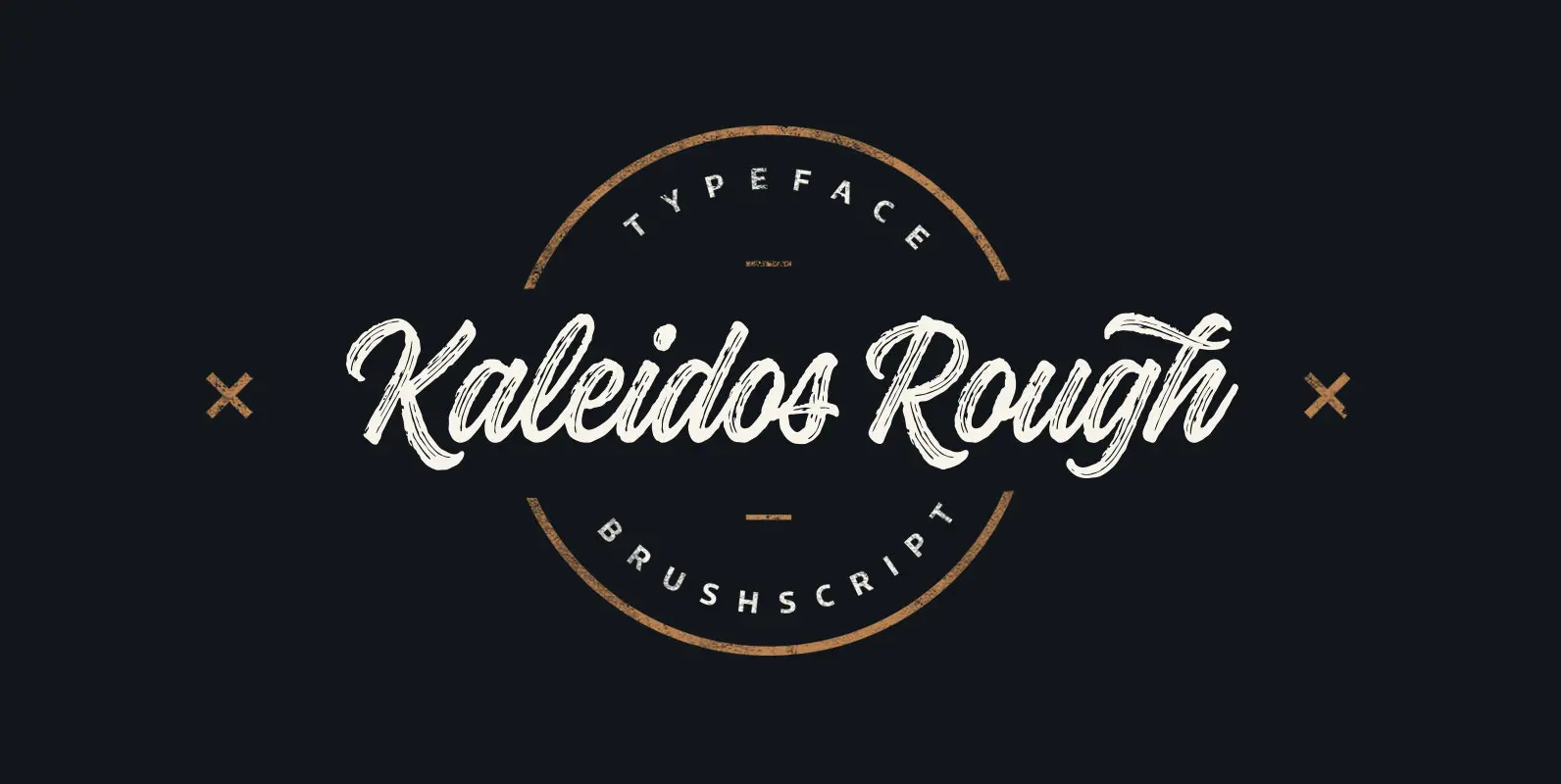
Kaleidos Rough lining brush script. It has two versions; Kaleidos Rough and Kaleidos Textured. Rough version has rough edges to mimic authentic brush strokes. Textured version has also those rough edges and in addition it has brush stroke texture to
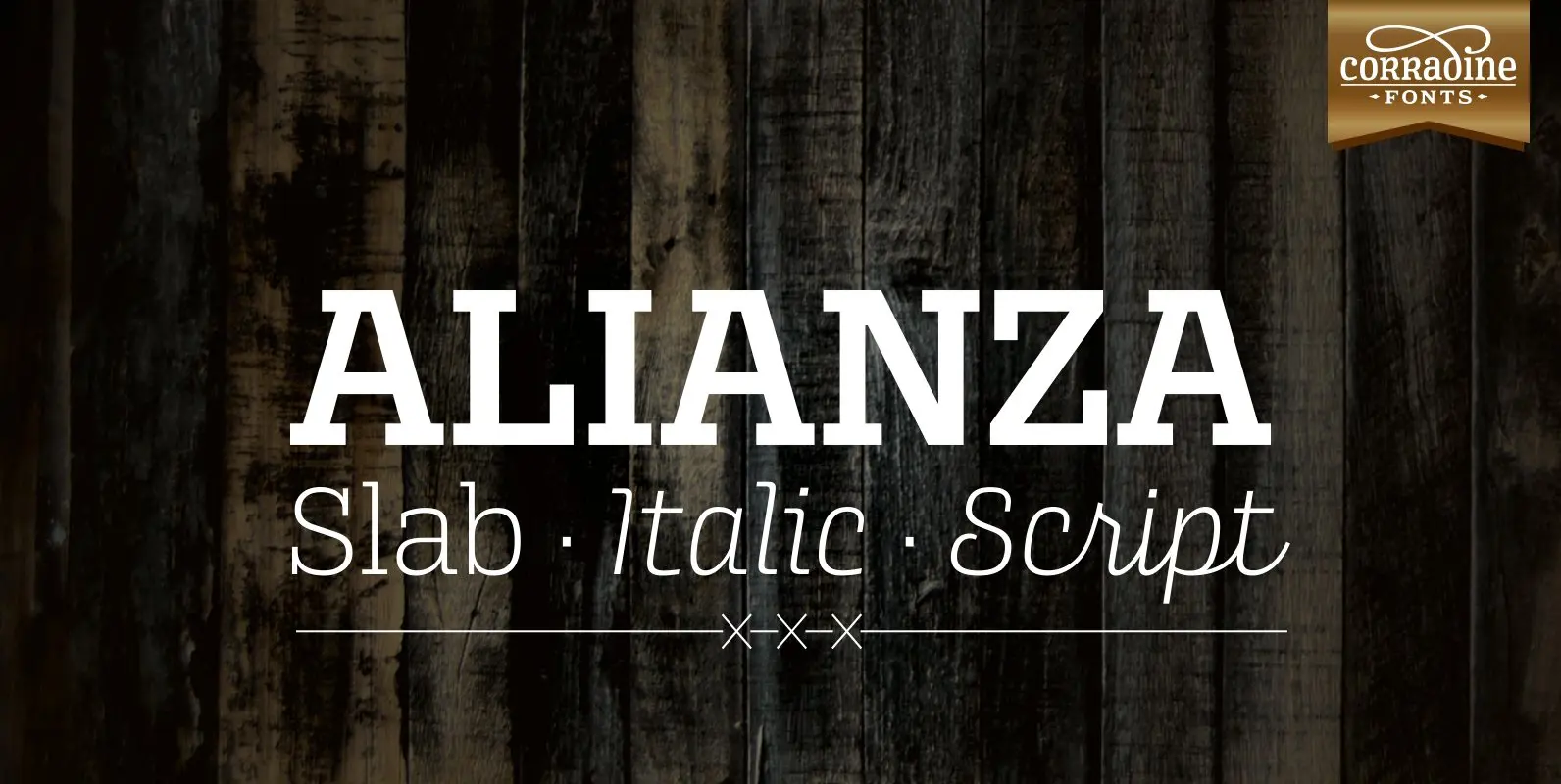
This is a complex typographic system which includes three different but complementary styles so far: Slab, italic and script, with nine weights each one; plus three sets of ornamental fonts: labels, negative labels and ornaments. The soul of the family
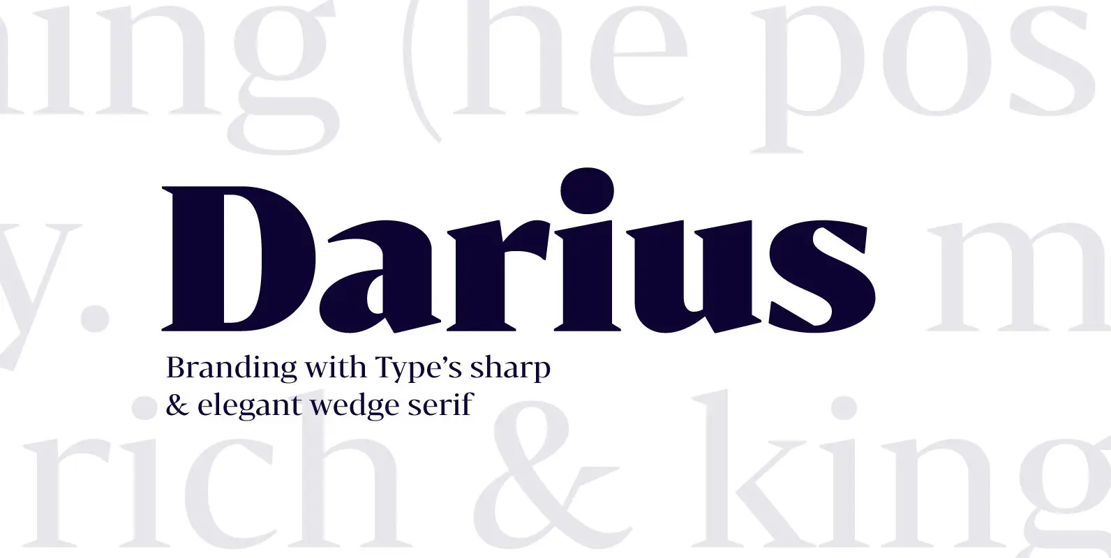
Bw Darius is an elegant wedge serif typeface, halfway between the transitional and didone genres, with a sharper approach to terminals without falling on the stiffness of the didones. The wide skeleton, modern proportions and high contrast, all contribute to
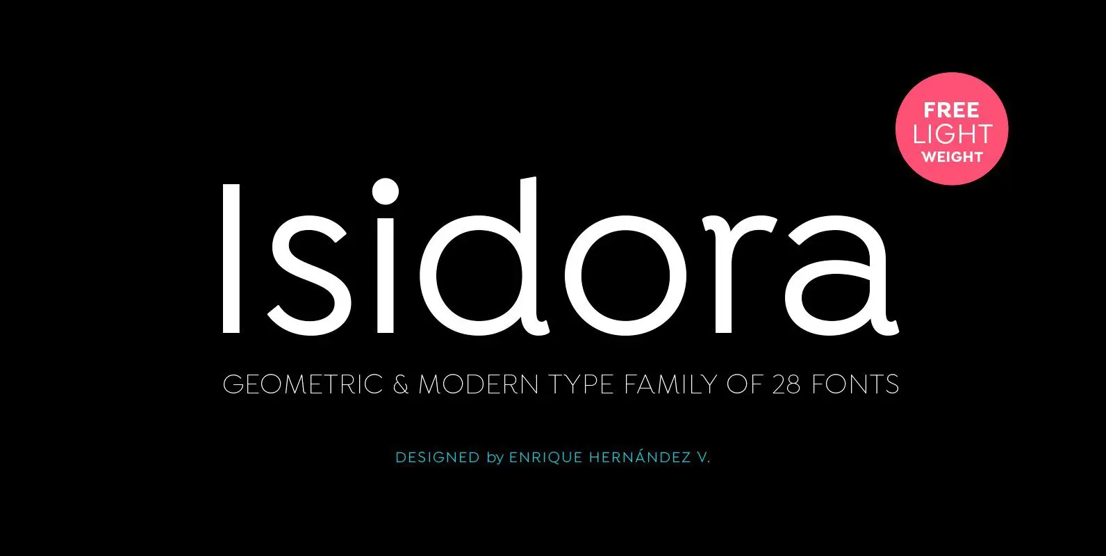
Designed by Enrique Hernández V. Isidora is a modern geometric font based on the classic typefaces of the early 21st Century yet with a contemporary and functional touch. In spite of its strong and rational structure, the font also looks
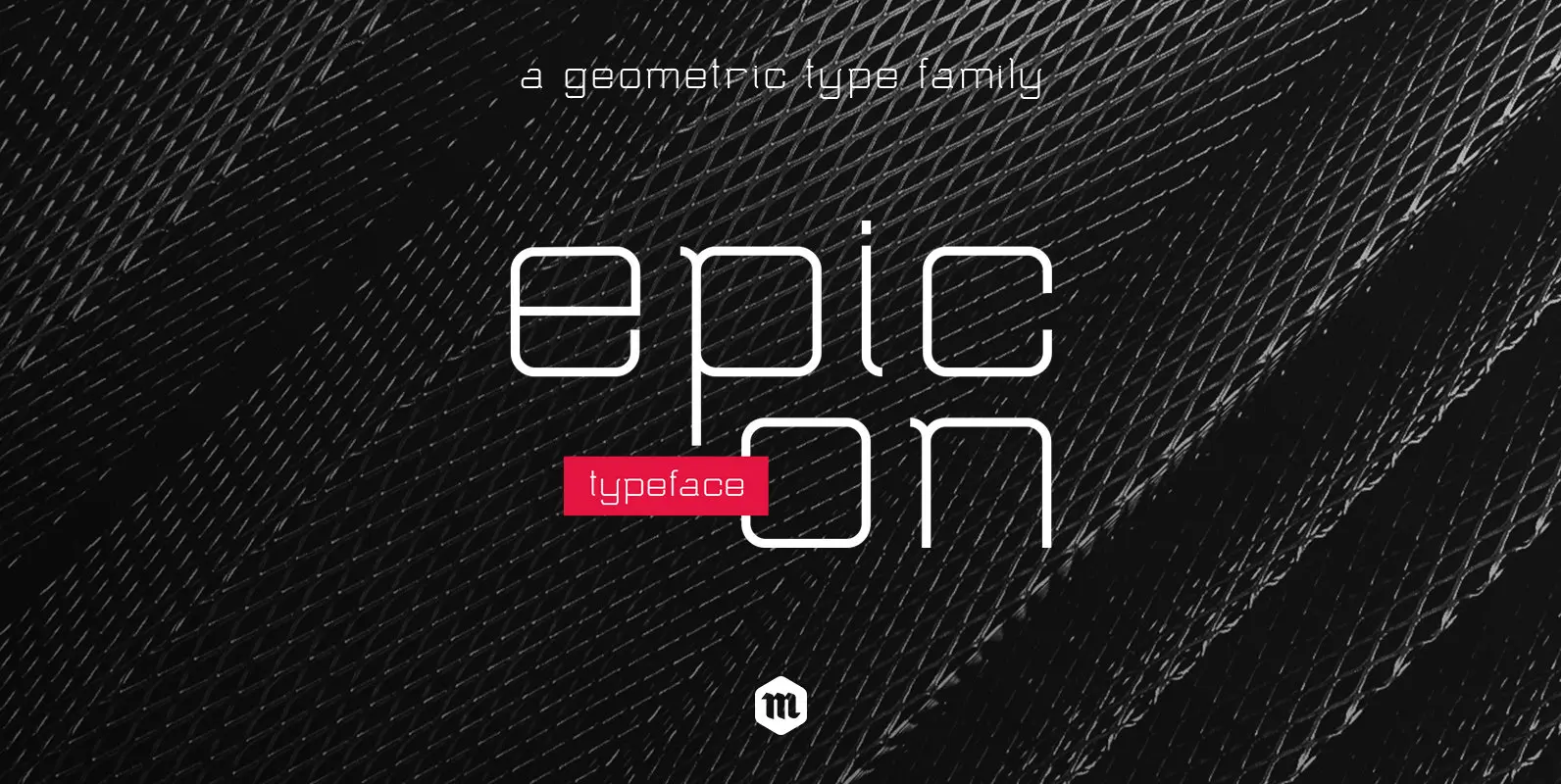
With its geometric shapes and rounded terminals, Epicon Typeface is a modern and functional sans serif family with an air of technology. With 3 weights and their accompanying italics, this contemporary font is well-suited for all kind of application. From
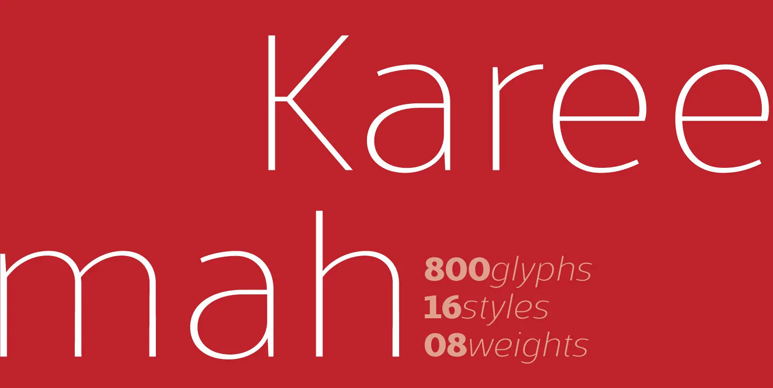
Kareemah is a humanist typography, composed by roman and italics with 16 styles and 08 weights (800 glyphs) including ligatures, alternates, small caps, old styles figures, fractions, superiors, inferiors and more. Perfectly legible and clean in the long, simple texts
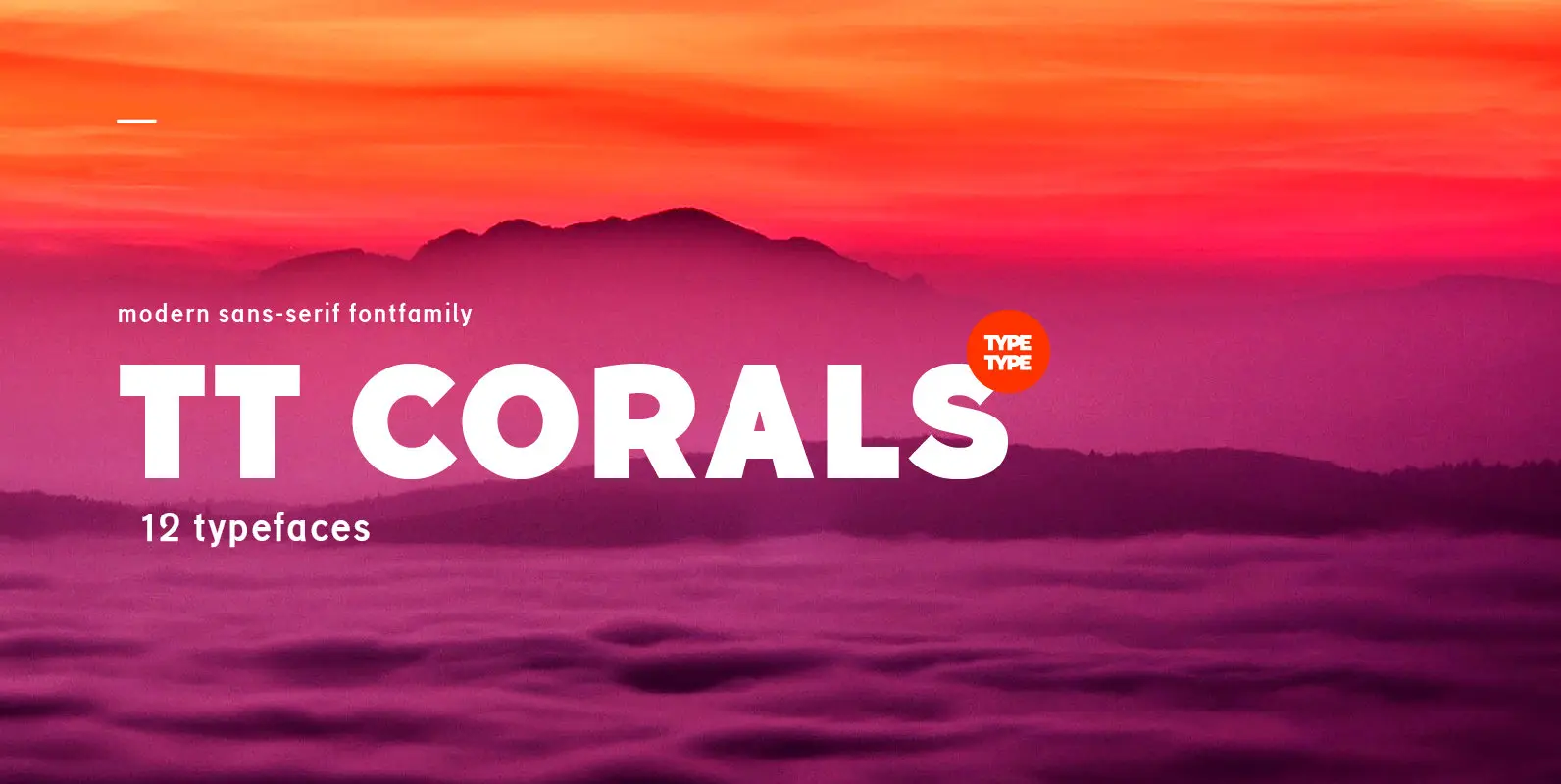
TT Corals is a modern humanistic sans-serif which has many typical traits of the beginning of the 20th century. For an increased functionality of the font family we’ve created 6 typefaces of various weights: Thin, Light, Regular, Bold, Extrabold, Black.
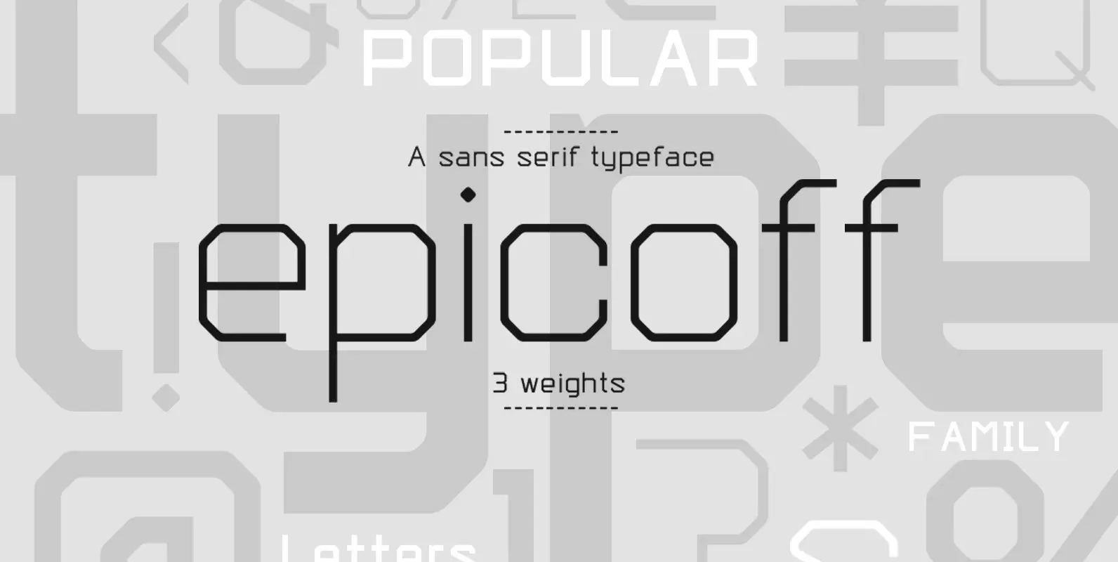
With its geometric shapes and straight terminals, Epicoff is a modern and functional sans serif family with an air of technology. With 3 weights, this contemporary font is well-suited for all kind of application. From packaging to editorial design, from
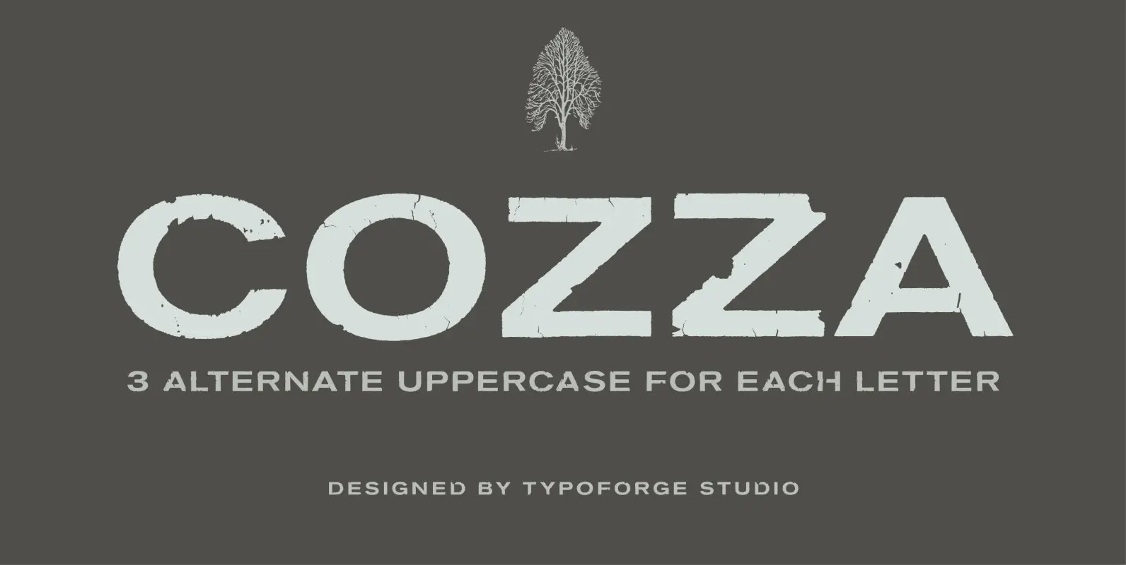
The inspiration for the design of the font Cozza was Unitra Letraset from the 80s. Dry transfer lettering was used by architects from Poland and Czech Republic. Font Cozza, for each character has three alternative characters with their automatic replacement.
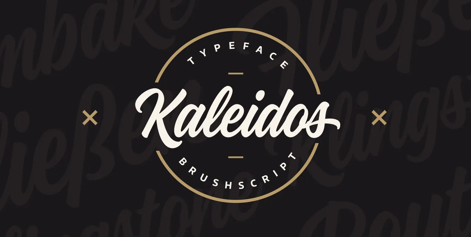
Kaleidos is a lining and clean brush script with soft and round letterforms. It is sketched and drawn with a pointed brush pen. Kaleidos has plenty of alternates, ligatures and swashes so you can build interesting-looking words and headlines. Although
BoRock is a handcrafted font that comes in two pigheaded styles, inspired by the rock music scene. You can use BoRock instead of the usual neat serif fonts. BoRock Grunge is a rough crispy serif font, excellently suited for use

As the foundry’s new flagship family, Gerlach Sans was named after the highest peak in Slovakia. Its functional design is enhanced by a few subtle ingredients, adding life and giving words a more playful voice. The family has eight weights
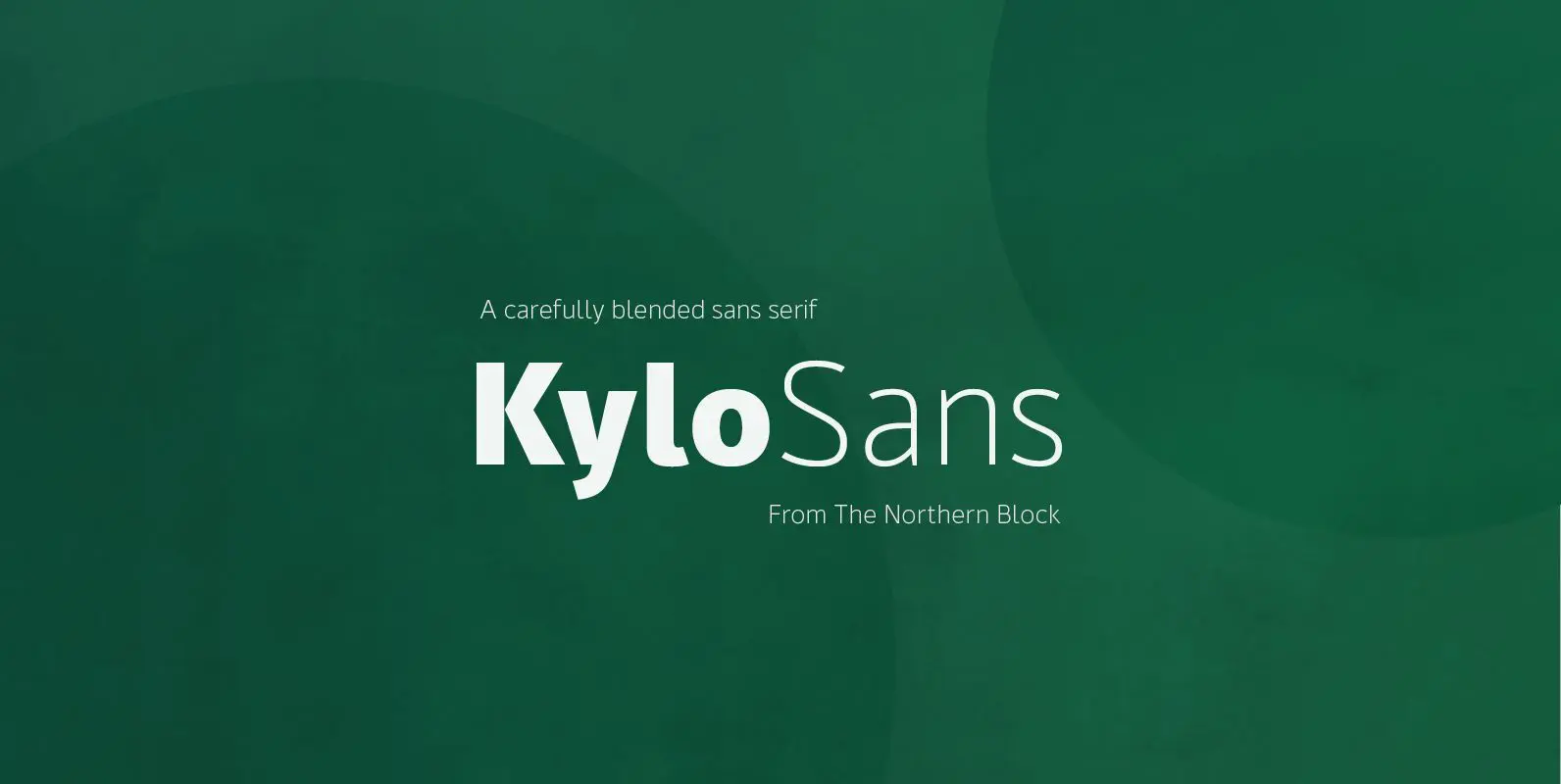
A carefully blended sans serif one part humanist, one part grotesque and a small dose of geometric. Kylo Sans takes the essence of three distinct forms to create a unique, readable typeface with an exact and understated personality. Further, enhancements
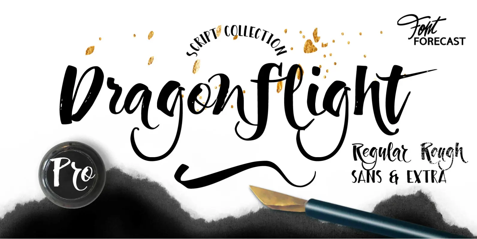
Dragonflight Pro is a script collection of four modern calligraphy fonts. Each glyph was hand-drawn with a brass folded pen dipped in ink. The tip of the folded pen resembles the shape of a dragonfly’s wing, hence the name. By
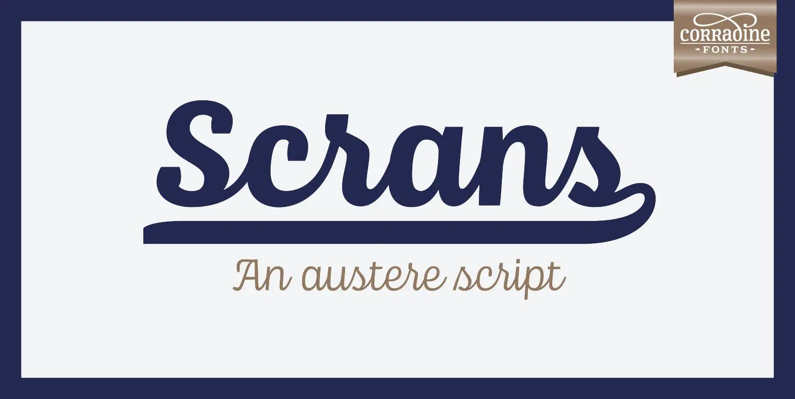
Scrans (Script + Sans) is a modern script family that gets both, conceptual and formal elements, from classic rational and geometric styles. It’s main purpose is to make the difference in an innovative manner. In other words, you can use
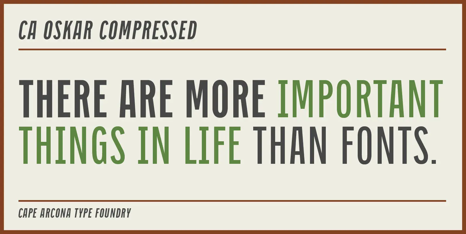
CA Oskar came into being as a custom typeface for the international Traumzeit music festival. As a substantial part of the new corporate identity, it had to be characteristic, but also flexible in use. Starting with the design of compressed

Inky but neat. Flowing but controlled. Modish perfectly balances two predominant aesthetics of fashion and lifestyle: the casually cool hand-drawn look, and the pixel-perfect slickness of digital design. This synthesis might be due partly to how it was created: it’s