Tag: contemporary
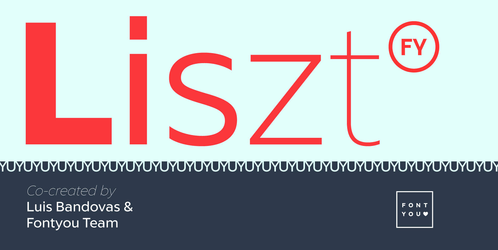
Liszt FY Font
Listz FY is definitely the new sans serif family you were waiting for. With its friendly & sharpened shapes and its big contrasts from hairline to black, this contemporary font family will be perfect for any kind of uses, from
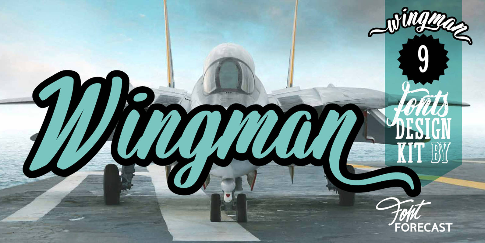
Wingman Font
Wingman consists of nine fonts, that can work together in perfect harmony to create beautiful designs. Like a true wingman they reinforce each others potential and offer mutual support. Wingman Brush takes the lead and is, with its six styles,
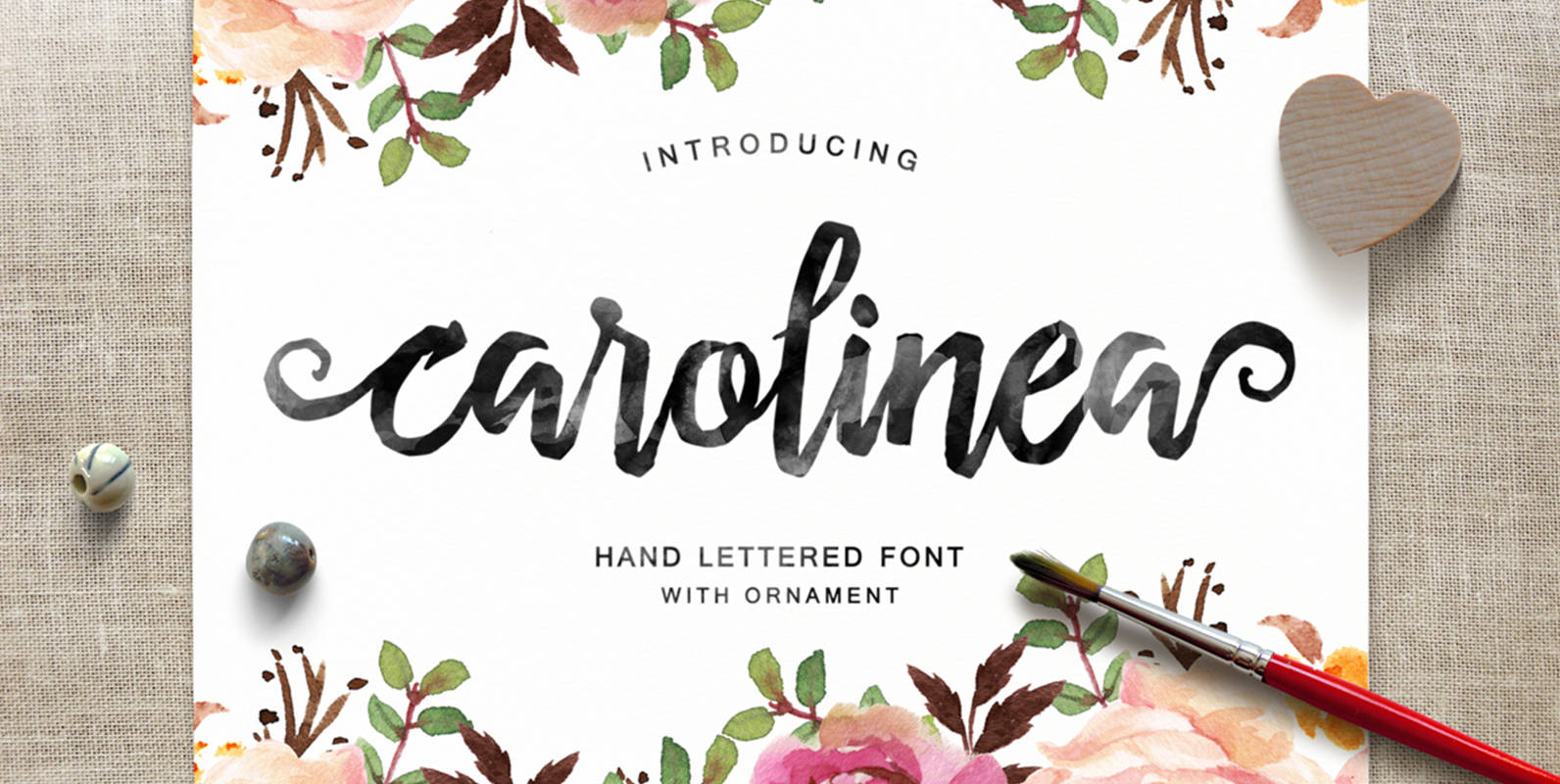
Carolinea Font
Carolinea is a hand lettered script fonts, using brush & ink combines a style brush calligraphy, irregular baseline, a rough edges, bold and organic. Carolinea features 235+ glyphs and 63 alternate characters. including initial and terminal letters, ornament, ligatures and
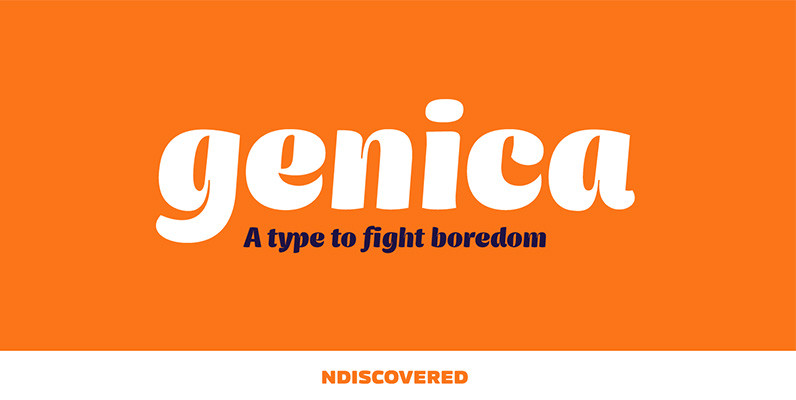
Genica Pro Font
This is the design that was always on the drawer. I designed it when I was bored of designing other typefaces, there was no briefing, I just wildly played with the bezier tool. It was something to relax from more
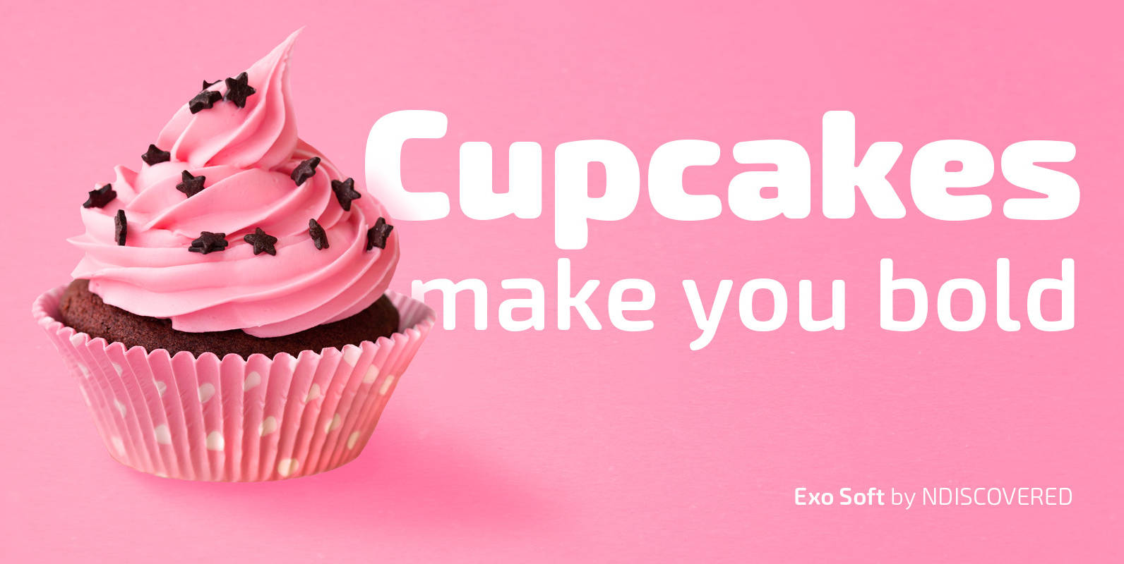
Exo Soft Font
Exo Soft. Technology meets humanity. The geometric design got organic with carefully crafted smoothed edges. Exo Soft is a contemporary sans-serif font with a warm and humane feeling. It has an extended language support (both in Latin and Cyrillic) and
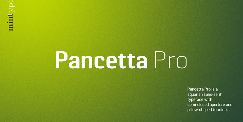
Pancetta Pro Font
Pancetta Pro is a squarish sans-serif typeface with semi-closed aperture and pillow-shaped terminals. The shape of a pillow is furthermore used to enliven the boring horizontal stems which are very frequent in Cyrillic script, and get rid of the right
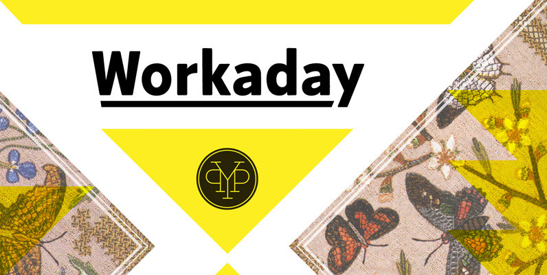
Workaday Font
Workaday from Yes Please is a bold and clean contemporary take on the classic American Sans Serif. Inspired by the wildly varied history of early to mid 20th century American signage, aircraft markings and industrial shipping vernaculars, Workaday exudes a
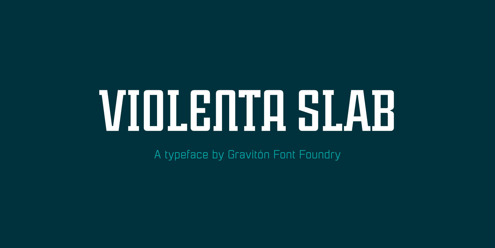
Violenta Slab Font
Violenta Slab font family has been designed for Graviton Font Foundry by Pablo Balcells in 2015. It is a display, geometric typeface, with a condensed design and sharp angles that provides an aggressive and strong appearance. Violenta Slab consists of
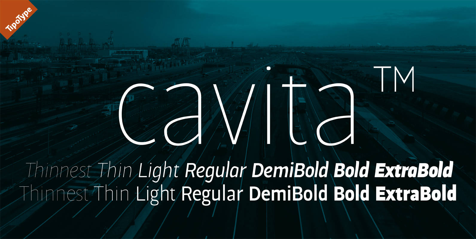
Cavita Font
Cavita typeface is a mix between both grotesque and calligraphic models: regulars have a rough grotesque spirit; while the italics where inspired in calligraphic gestures. All of these details are reinforced with an inverted modulation (horizontals strokes are thicker than
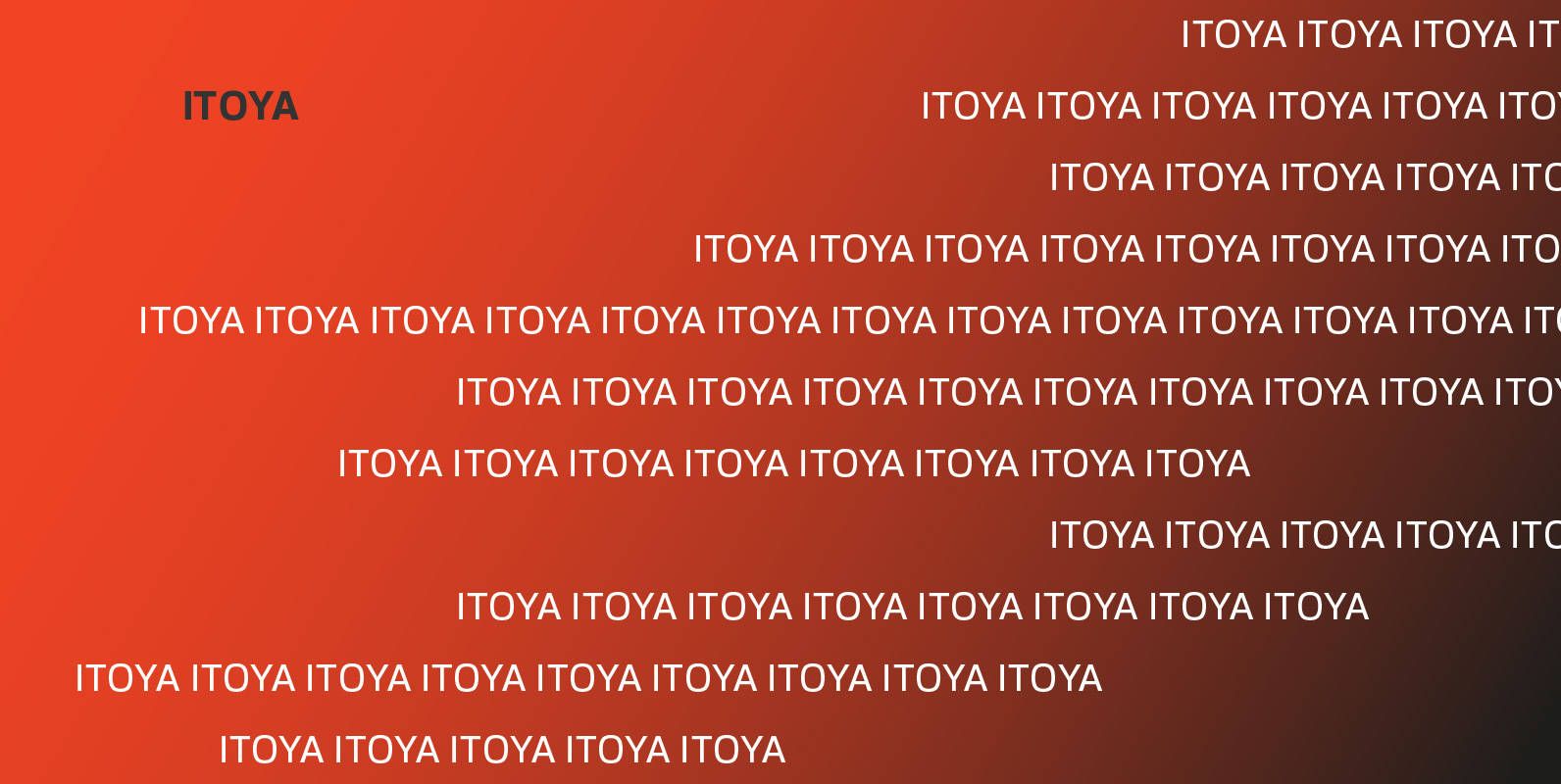
Itoya Font
Itoya is a contemporary sans serif font influenced by Western and Japanese ideologies. A fusion of modern machine-like functions with a warmer, emotional and more spiritual ethic. The marriage of a western precision and eastern expression forms a sharp functional
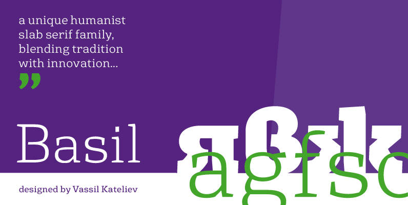
Basil Font
A mix between tradition and innovation, Basil is a unique humanist slab serif well suitable for broad range of design projects – editorial, logotype, poster, etc. With its tall x-height and generous internal spaces, the type family was especially designed
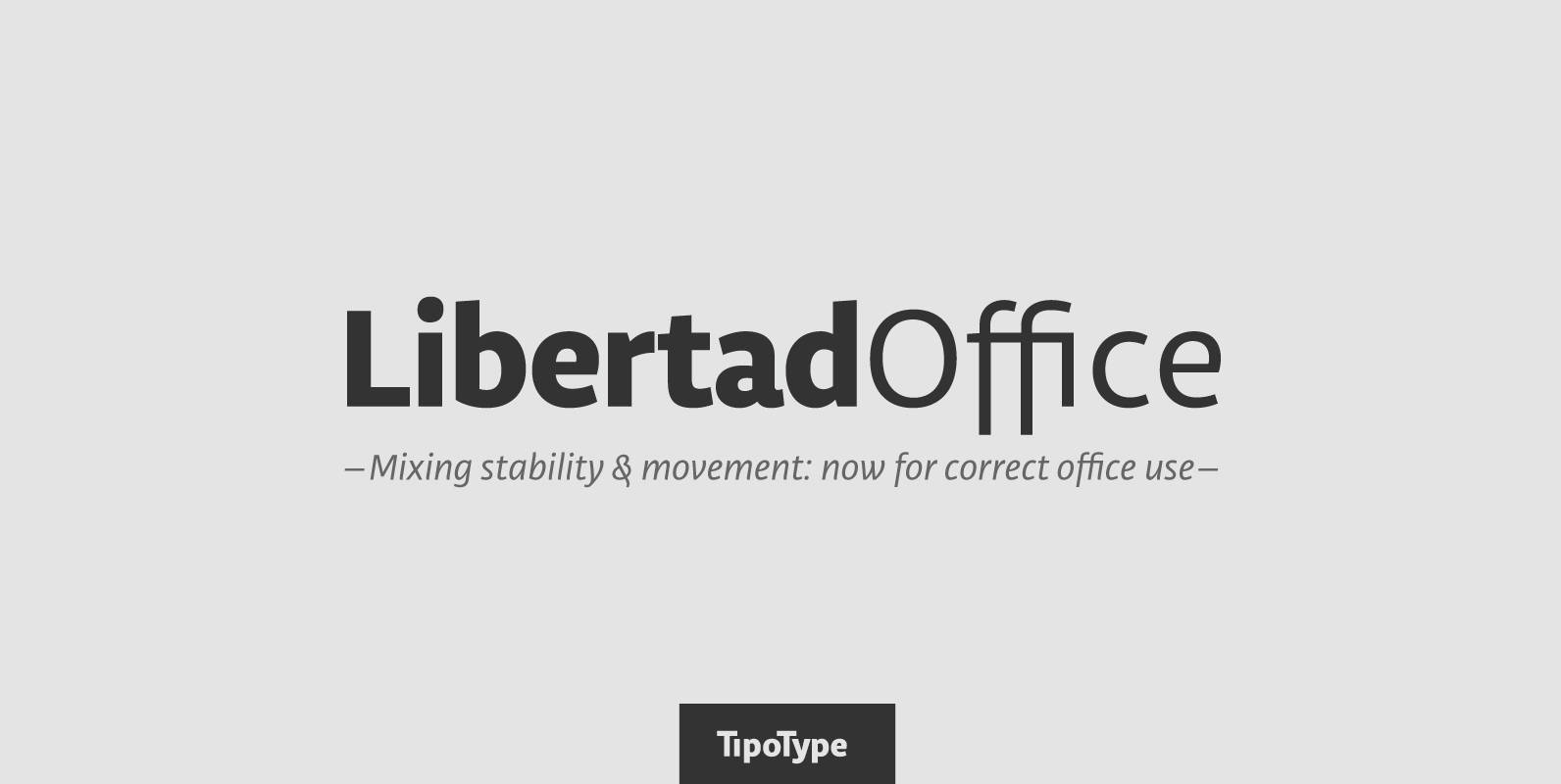
Libertad Office Font
Libertad is a sans-serif typeface that mixes humanist and grotesk models – It’s most interesting feature is the combination of balanced regulars with dynamic italics, which makes it a very versatile font for different uses. This special package is a
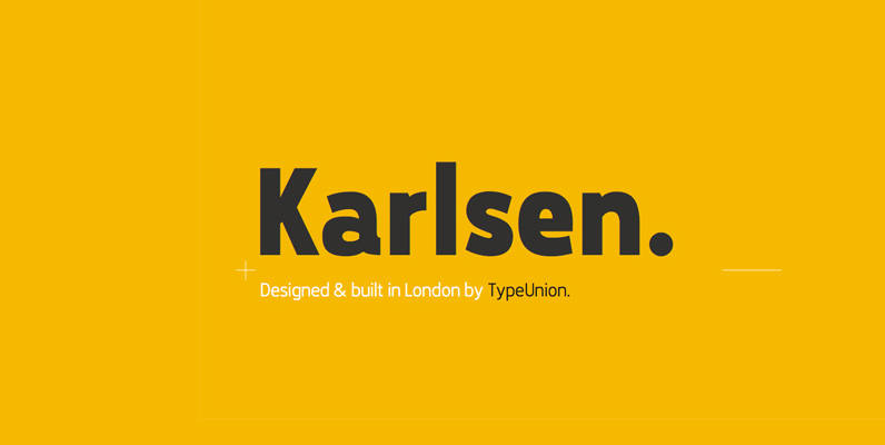
Karlsen Font
Designed and built in London by TypeUnion, Karlsen is a structured, functional typeface which embraces harmony, flow and versatility. The Karlsen Family is made up of 14 styles, which range from a delicate thin, all the way through to a
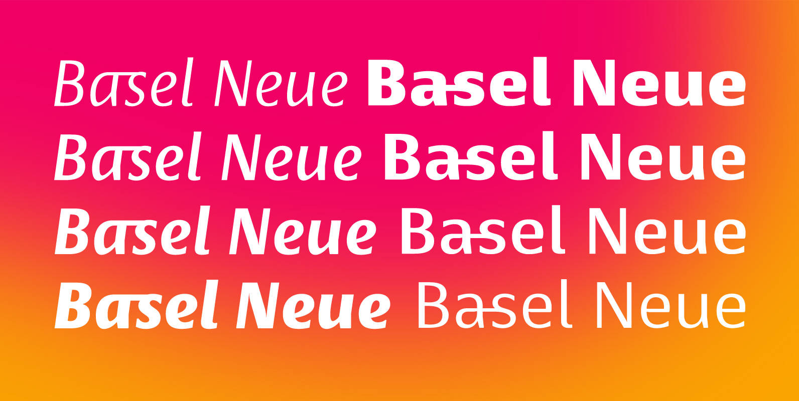
Basel Neue Font
Basel Neue is a legible and discrete typeface, a sans serif with thickness variation and humanistic touch. The family consists of 8 styles, 4 weights plus their respective italic versions. Download the “OT Features” pdf to know and take advantage
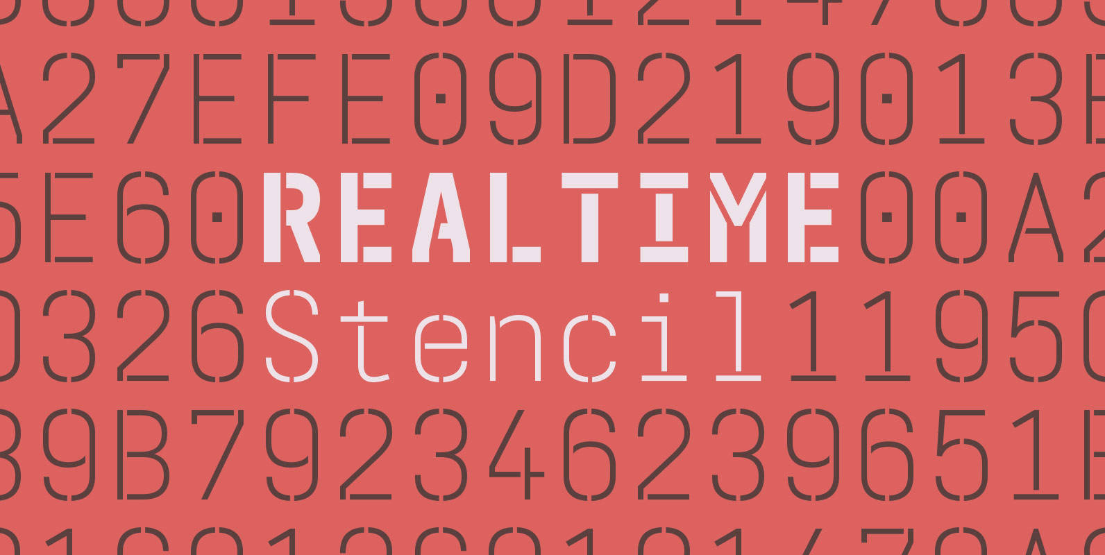
Realtime Stencil Font
Realtime Stencil is part of the Realtime type family which draws inspiration from information displays. The result is a technical yet friendly design with details that serve function and visual impact alike. As a monospaced typeface it lends itself to
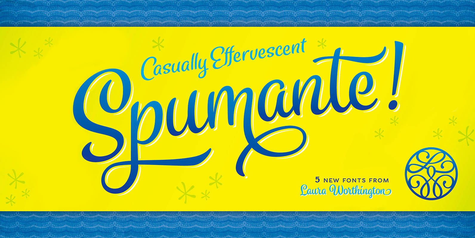
Spumante Font
A slim, semi-connected script with lithely upright curves, Spumante conveys the casual effervescence of its namesake wine. Smoothed brush-script letterforms bounce gently along the baseline, and letters vary slightly in their slant— characteristics that combine to create a very human
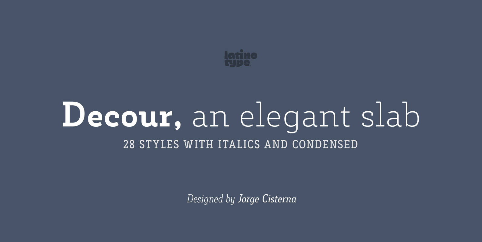
Decour Font
Decour is a Slab Serif typeface that features low contrast between thick and thin strokes and whose proportions were based on those of Art Deco design. A big height difference between lower case and upper case letters makes Decour a
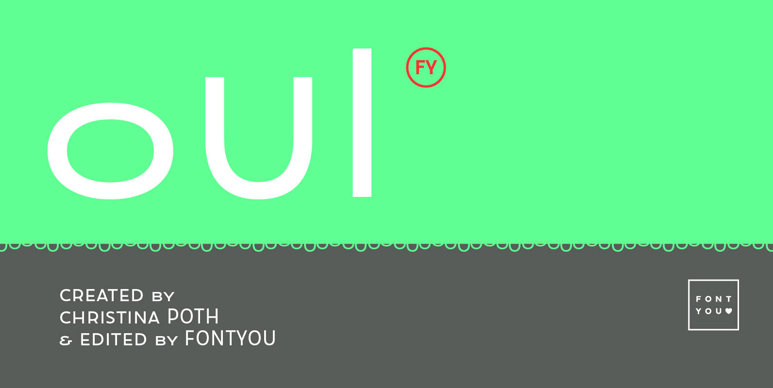
Oui FY Font
Same weight, same width but different heights: Small, Normal and Big… here is the secret of this singular sans serif font family. You can mix and match its friendly and well balanced upper case letters to create original dancing words,