Tag: Contrast
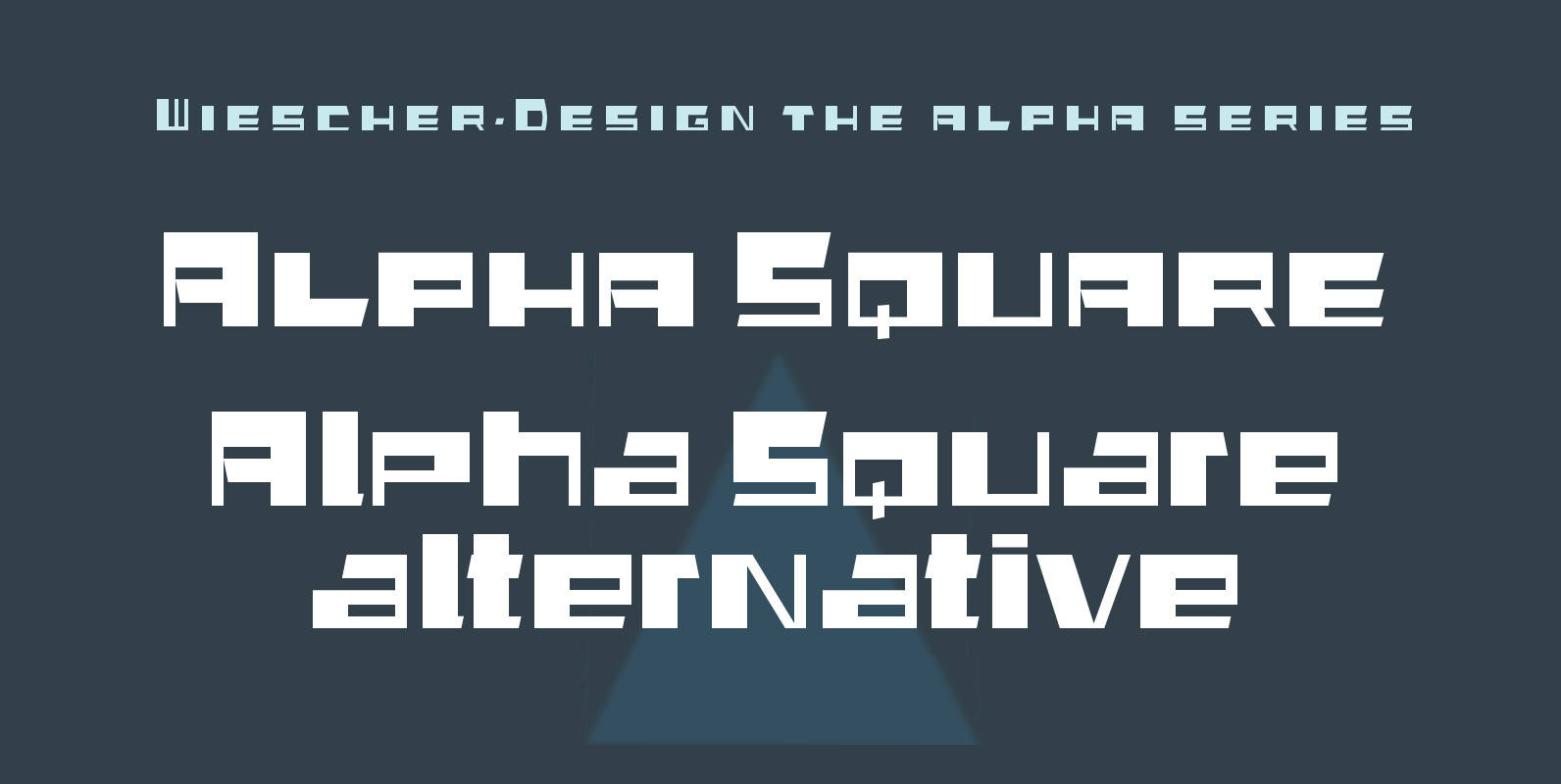
Alpha Square Font
“Alpha Square” is the next font in my alpha-series, my experimental font series. The font is a wider variation of “Alpha Jazz”, it lends itself very good for all kind of modernistic occasions and for Jazz in all forms. You
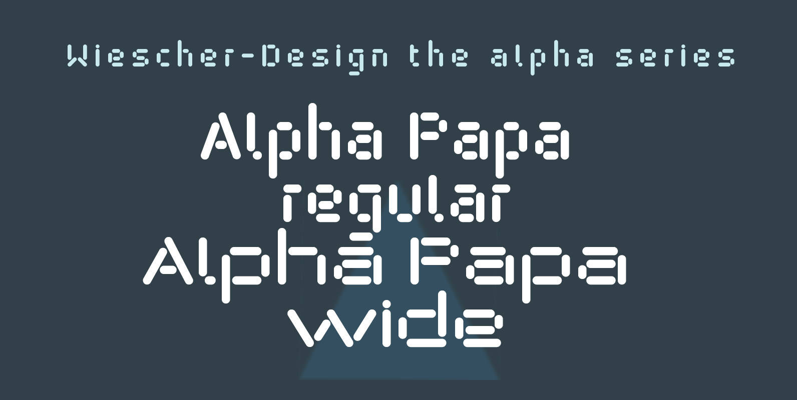
Alpha Papa Font
“Alpha Papa” is another font in my alpha-series, the experimental font series. It lents itself very good for all kind of modernistic occasions in all forms. You get 2 fonts (one alternative width set) for the price of one! Published
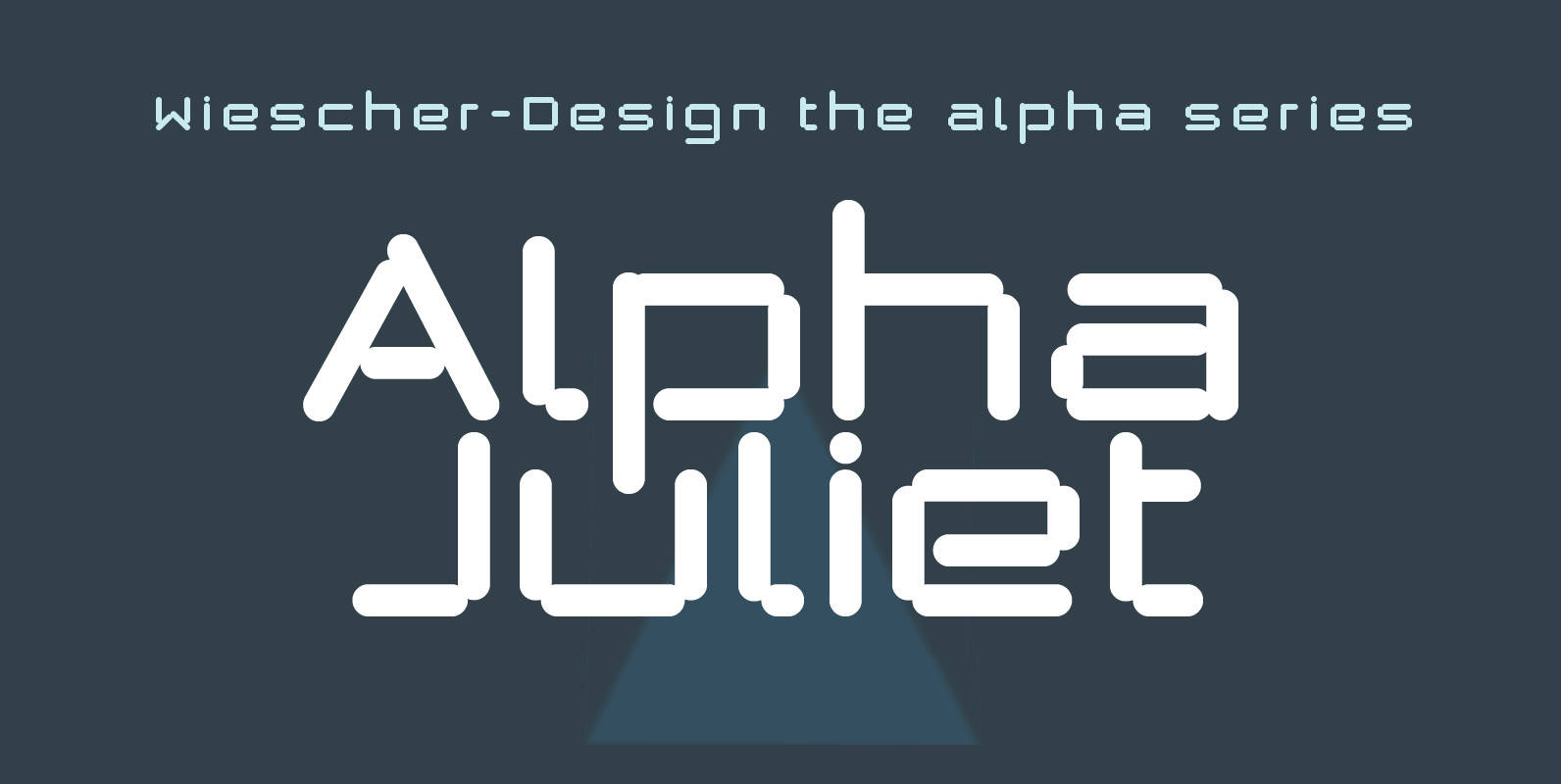
Alpha Juliet Font
“Alpha Juliet” is another font in my alpha-series, the experimental font series. It lends itself for modern designs in all forms. The font can be used together with “Alpha Papa” since it has the same origins. Published by Wiescher DesignDownload
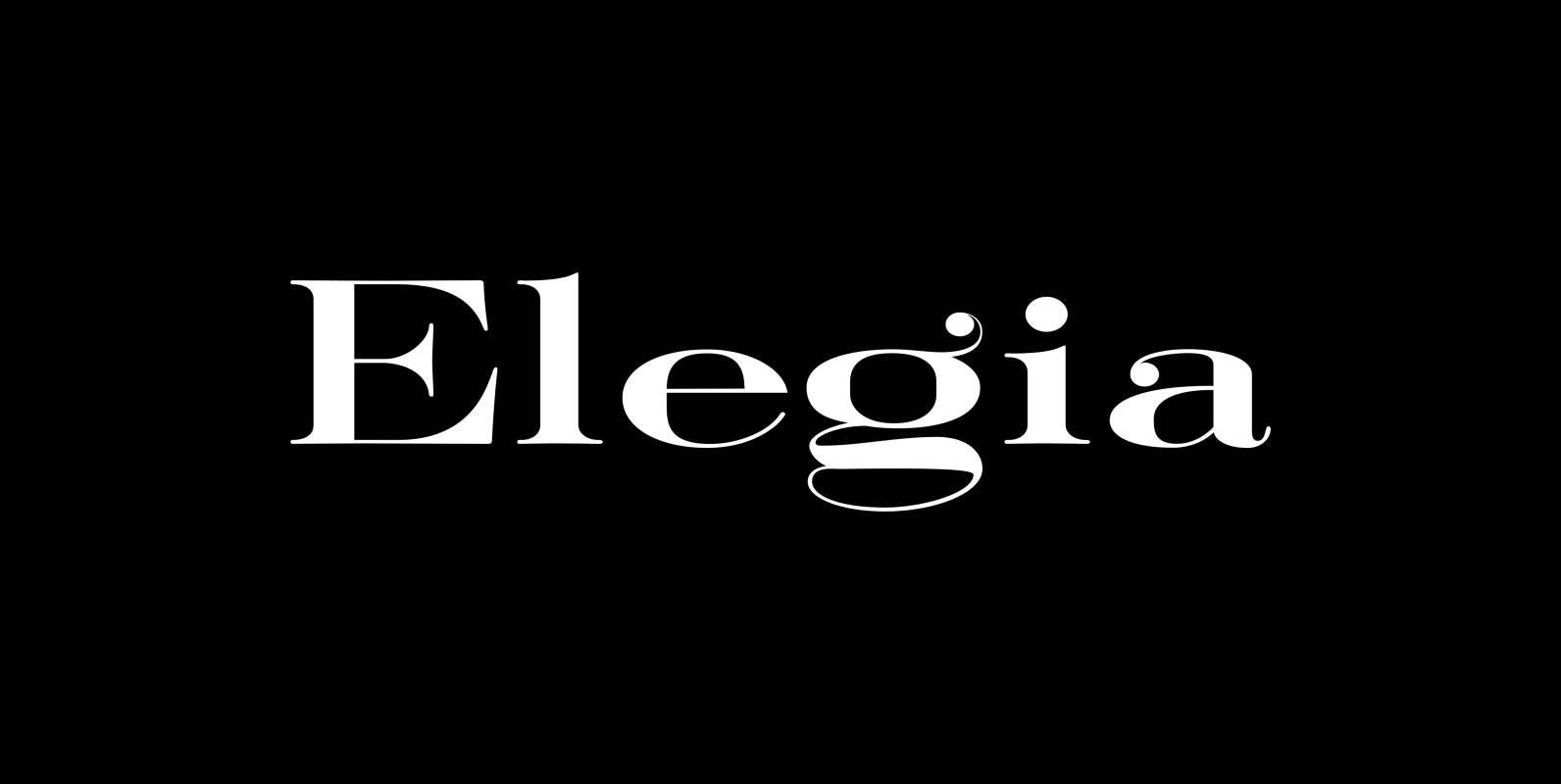
Elegia Font
I designed Elegia on a winter escape in beautiful and sunny Lisbon. That was a very elating experience, friendly people, a beautiful old town, perfect coffee and good simple cooking all that topped by extremely reasonable prices. Since I just
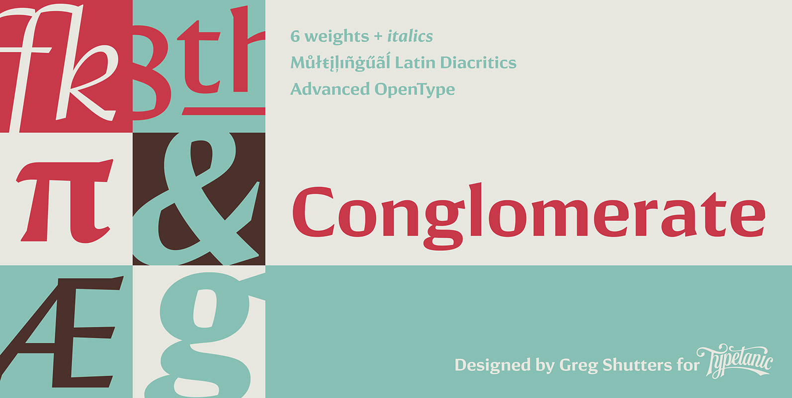
Conglomerate Font
Sans or serif? Square or rounded? Calligraphic or geometric? Conglomerate is both all and none of these things — a subtle yet unorthodox blend of typographic traits resulting in a clean, unique, and versatile font family with large, open counters
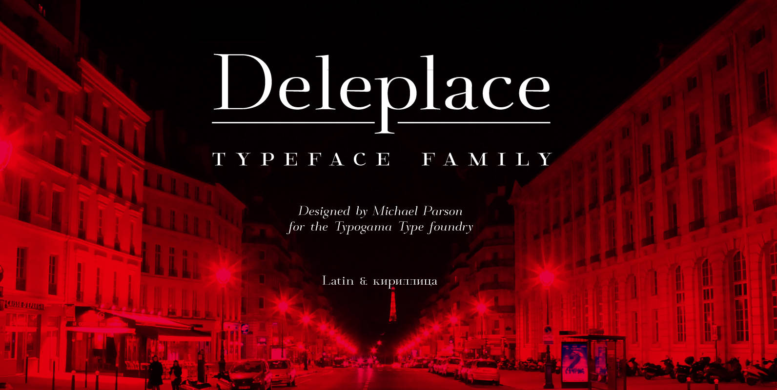
Deleplace Font
Deleplace is a modern, delicate and refined typeface that is both contemporary and hints at a classical past. Featured in 3 weights, this family includes an extended language support that covers extended latin and cyrillic scripts. It equally includes a
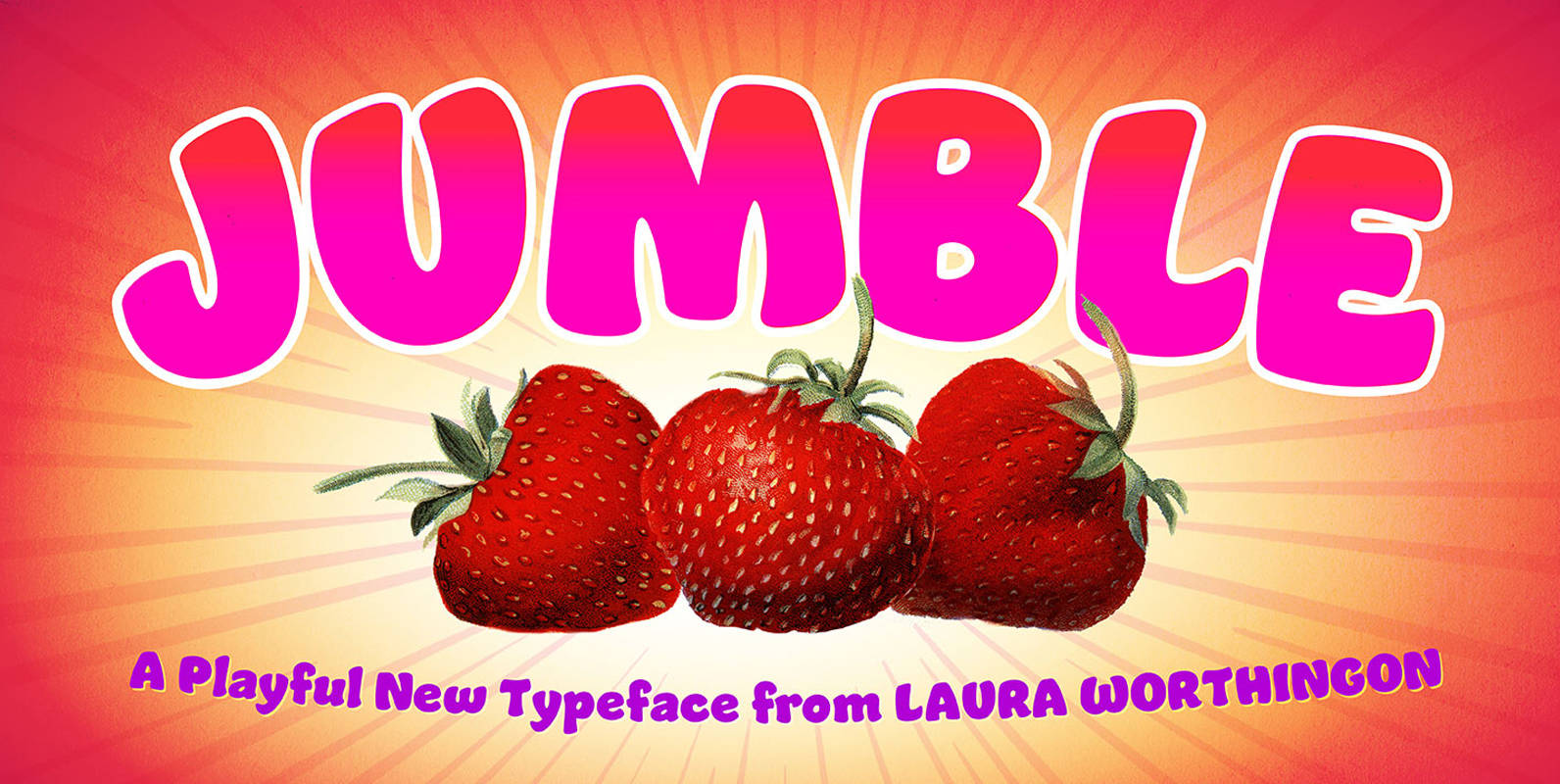
Jumble Font
A font this friendly, welcoming, and easy-to-read is a treat for the eyes. Jumble draws you in with its thick, curvy strokes, jaunty counters, and a whimsical variety of counterforms – no two are alike, even within a single m
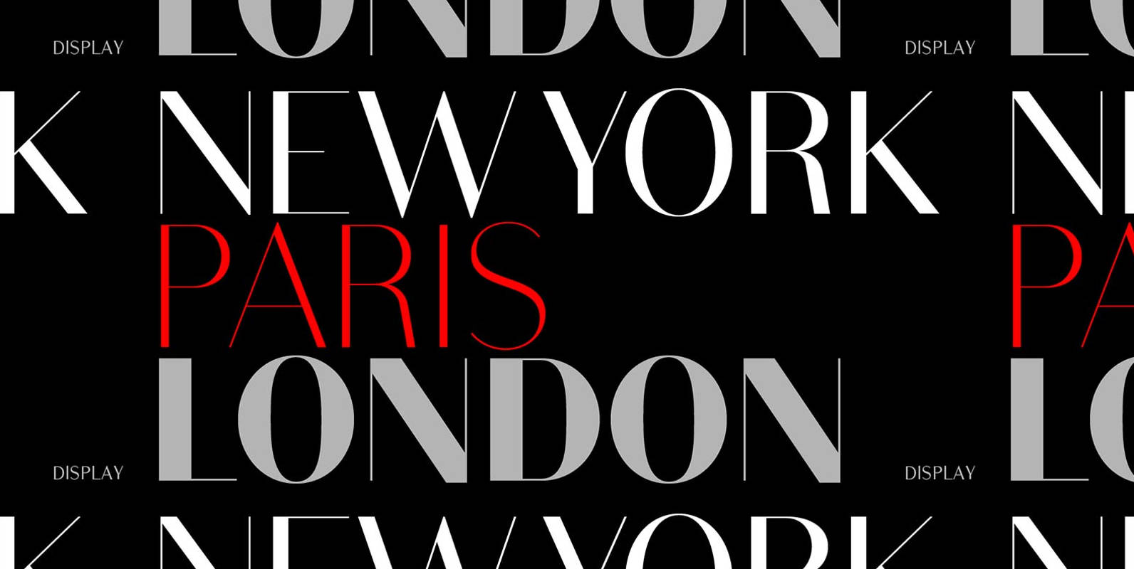
Bodoni Sans Font
Bodoni Sans is a new classic built on the foundation of two centuries of history. Fresh and contemporary, while feeling familiar. Stylish and sophisticated, confident and elegant. Bodoni Sans is more than just chopping off the serifs. The classical proportions
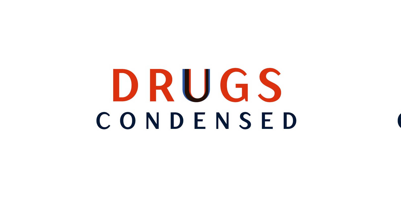
TT Drugs Condensed Font
Drugs Condensed – a modern font family which consists of 5 condensed sans serifs with a special contrast formula of lines and stems. Drugs Condensed is a condensed version of the Drugs Font family. These fonts are perfect for design
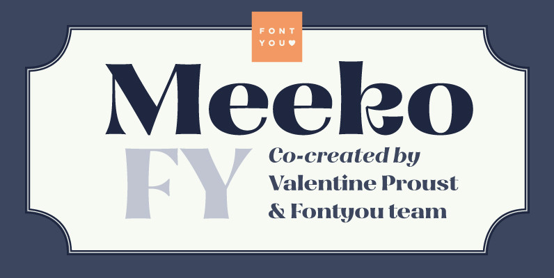
Meeko FY Font
Meeko FY is a singular display type with high contrasted and friendly flared shapes. This font mixes various typographic styles (incised, didone, calligraphic shapes) and has some original letters like R or k which give it lot of personality. This
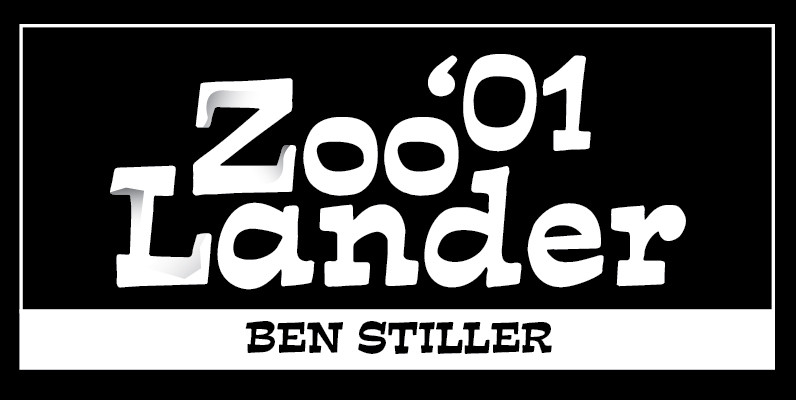
Estro Font
Estro was originally designed by Aldo Novarese in 1961 for the foundry Nebiolo. Estro can maybe be classified a combination of Egyptienne and script. Ralph M. Unger redrew and digitized this font exclusively for profonts in 2003. His work is
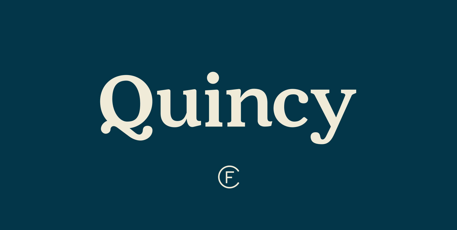
Quincy CF Font
The warm letterforms and medium contrast of Quincy© CF give any text a smooth, flowing motion. Small variations and human touches add charm, with Quincy’s boldest weights especially strong as large and medium display type. New in version 4.1: Quincy
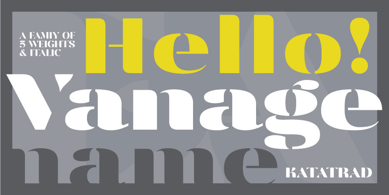
Vanage Font
Vanage is is an elegant high contrast contemporary sans-serif stencil typeface provides advanced typographical support with features such as ligatures and alternate characters. It is rooted in the style of a classic high contest typeface, excluding the typical serifs and
