Tag: contrasts

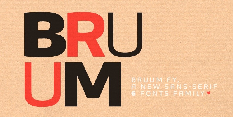
Bruum FY Font
This sans-serif font family alternates between curved and angular shapes, which give its a technical and robust style and make it both legible in small size and powerful in big for headlines. Bruum FY was co-created by Gia Tran, Alisa

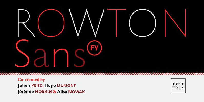
Rowton FY Font
Rowton FY digs its roots in Eric Gill’s views on typography in his book “An essay on Typography”. This typeface has the very British feel of the 20th century. Taking as inspiration the calligraphic illustrations of the book, Julien Priez,

Respublika FY Font
Respublika FY – a Humanist sans serif typeface. With its shapes and contrasts, developed in ten styles, Respublika FY is a humanist sans serif typeface super family. It's weights from light to black, give designers opportunity to set layouts with